Highcharts provides another type of gauge chart, solid gauge, which has a different presentation. Instead of having a dial, the chart background is filled with another color to indicate the level. The following is an example derived from the Highcharts online demo:
The principle of making a solid gauge chart is the same as a gauge chart, including the pane, y axis and series data, but without the dial setup. The following is our first attempt:
chart: {
renderTo: 'container',
type: 'solidgauge'
},
title: ....,
pane: {
size: '90%',
background: {
innerRadius: "70%",
outerRadius: "100%"
}
},
// the value axis
yAxis: {
min: 0,
max: 200,
title: {
text: 'Speed'
}
},
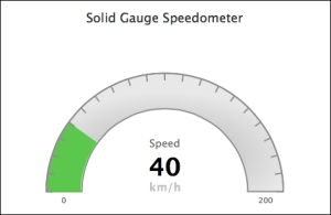
series: [{
data: [40],
dataLabels: {
enabled: false
}
}]We start with pane in a donut shape by specifying the innerRadius and outerRadius options. Then, we assign the y axis range along the background pane and set the initial value to 40 for a visible gauge level. The following is the result of our first solid gauge:
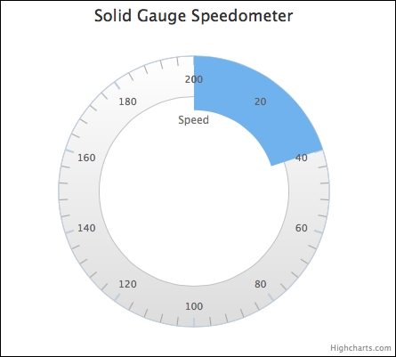
As we can see, the pane starts and ends at the 12 o'clock position with a section of the pane filled up with blue as the solid gauge dial. Let's make the axis progress clockwise from 9 o'clock to 3 o'clock and configure the intervals to become visible over the color gauge. In addition, we will increase the thickness of the intervals and only allow the first and last interval labels to be displayed. Here is the modified configuration:
            chart: .... ,
            title: .... ,
            pane: {
                startAngle: -90,
                endAngle: 90,
                ....
            },
            yAxis: {
                lineColor: '#8D8D8D',
                tickColor: '#8D8D8D',
                intervalWidth: 2,
                zIndex: 4,
                minorTickInterval: null,
                tickInterval: 10,
                labels: {
                    step: 20,
                    y: 16
                },
                ....
           },
           series: ....
The startAngle and endAngle options are the effective start and end positions for labelling on the pane, so -90 and 90 degrees are the 9 o'clock and 3 o'clock positions respectively. Next, both lineColor (the axis line color at the outer boundary) and tickColor are applied with a darker color, so that by combining them with the zIndex option, the intervals become visible with the different levels of gauge colors.
The following is the output of the modified chart:
Next, we remove the bottom half of the background pane to leave a semi-circle shape and configure the background with shading (described in detail later in this chapter). Then, we adjust the size of the color gauge to be the same width as the background pane. We provide a list of color bands for different speed values, so that Highcharts will automatically change the gauge level from one color band to another according to the value:
 chart: ...
            title: ...
            pane: {

                background: {

                    shape: 'arc',
                    borderWidth: 2,
                    borderColor: '#8D8D8D',
                    backgroundColor: {
                        radialGradient: {
                            cx: 0.5,
                            cy: 0.7,
                            r: 0.9
                        },
                        stops: [
                            [ 0.3, '#CCC' ],
                            [ 0.6, '#E8E8E8' ]
                        ]
                    },
                }
            },

            yAxis: {
                        ... ,
          stops: [
                    [ 0, '#4673ac' ], // blue
                    [ 0.2, '#79c04f' ], // green
                    [ 0.4, '#ffcc00'], // yellow
                    [ 0.6, '#ff6600'], // orange
                    [ 0.8, '#ff5050' ], // red
                    [ 1.0, '#cc0000' ]
                ],
            },

            plotOptions: {
                      solidgauge: {
                                    innerRadius: '71%'
                                }
                    },

                   series: [{
                            data: [100],
                            }]
The shape option, 'arc', turns the pane into an arc shape. The color bands along the y axis are provided with a stops option, which is an array of ratios (the ratio of y axis range) and the color values. In order to align the gauge level with the pane, we assign the innerRadius value of plotOptions.solidgauge to be slightly smaller than the pane innerRadius value, so that the movement of the gauge level doesn't cover the pane's inner border. We set the series value to 100 to show that the gauge level displays a different color as follows:
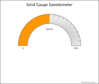
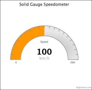
Now we have extra space in the bottom half of the chart, we can simply move the chart lower and decorate it with a data label as follows:
            pane: {
                .... ,
                center: [ '50%', '65%' ]
            },
            plotOptions: {
                solidgauge: {
                   innerRadius: '71%',
                    dataLabels: {
                           y: 5,
                           borderWidth: 0,
                           useHTML: true
                    }
               }
            },
            series: [{
                 data: [100],
                 dataLabels: {
                      y: -60,
                      format: '<div style="text-align:center">' +
      '<span style="font-size:35px;color:black">{y}</span><br/>' +
     '<span style="font-size:16px;color:silver">km/h</span></div>'
              }
            }]
We set the chart's vertical position to 65 percent of the plot area height with the center option. Finally, we enable dataLabels to be shown as in HTML with textual decoration: