Polar (or radar) charts are generally used to spot data trends. They have a few differences from line and column type charts. Even though they may look like pie charts, they have nothing in common with them. In fact, a polar chart is a round representation of the conventional two-dimensional charts. To visualize it another way, it is a folded line or a column chart placed in a circular way with both ends of the x axis meeting.
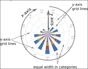
Again, we need to include highcharts-more.js in order to plot a polar chart. The following screenshot illustrates the structure of a polar chart:
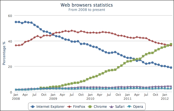
There are very few differences in principle, and the same also applies to the Highcharts configuration. Let's use our very first example of a browser usage chart in Chapter 1, Web Charts, and turn it into a radar chart. Recalling the browser line chart, we made the following:
To turn the line chart into a polar chart, we only need to set the chart.polar option to true, which transforms the orthogonal x and y coordinates into a polar coordinate system. To make the new polar chart easier to read, we set the x axis labels' rotation value to 'auto', as follows:
             chart: {
                 ....,
                 polar: true
             },
             ....,
             xAxis: {
                 ....,
                 labels: { rotation:  'auto' }
             },
The following is the polar version of the line chart:
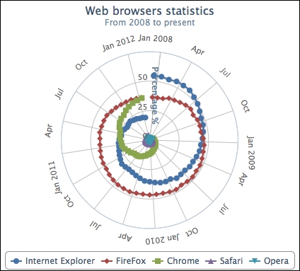
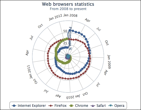
As we can see, one characteristic of a polar chart is that it reveals data trends differently compared to conventional charts. From a clockwise direction, we see the data line "spirals up" for an upward trend (Chrome) and "spirals down" for a downward trend (Internet Explorer), whereas the data line for Firefox doesn't show much movement. As for Safari and Opera, these series are essentially lost as they are completely invisible unless we enlarge the chart container, which is impractical. Another characteristic is that the last and first data points in the series are connected together. As a result, the Firefox series shows a closed loop and there is a sudden jump in the Internet Explorer series (the Chrome series is not connected because it has null values at the beginning of the series as the Chrome browser was not released until late 2008).
To correct this behavior, we can simply add a null value at the end of each series data array to break the continuity, which is demonstrated in the following screenshot:
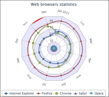
Instead of having a round polar chart, Highcharts supports polygon interpolation along the y axis grid lines. This means that the grid lines are straightened and the whole chart becomes like a spider web.
For the sake of illustration, we set the width of x and y axis lines to 0, which removes the round outline from the chart. Then, we set a special option on the y axis, gridLineInterpolation, to polygon. Finally, we change the tickmarkPlacement option of the x axis to 'on' instead of the default value, between. This gets the interval ticks on the x axis to align with the start of each category. The following code snippet summarizes the changes that we need to make:
            xAxis: {
                categories: [ ..... ],
                tickmarkPlacement: 'on',
                labels: {
                    rotation: 'auto',
                },
                lineWidth: 0,
                plotBands: [{
                    from: 10,
                    to: 11,
                    color: '#FF0000'
                }]
            },
            yAxis: {
                .....,
                gridLineInterpolation: 'polygon',
                lineWidth: 0,
                min: 0
            },
In order to demonstrate a spider web shape, we will remove most of the data samples from the previous chart (alternatively, you can enlarge the chart container to keep all the data). We will also add a couple of grid line decorations and an x-axis plot band (Nov – Dec) just to show that other axis options can still be applied to a polar chart: