
In this chapter, we will explore bubble charts by first studying how the bubble size is determined from various series options, and then familiarizing ourselves with it by replicating a real-life chart. After that, we will study the structure of the box plot chart and discuss an article converting an over-populated spider chart into a box plot. We will use that as an exercise to familiarize ourselves with box plot charts. Finally, we will move on to the error bar series to understand its structure and apply the series to some statistical data.
This chapter assumes that you have some basic knowledge of statistics, such as mean, percentile, standard error, and standard deviation. For readers needing to revise these topics, there are plenty of online materials covering them. Alternatively, the book Statistics For Dummies by Deborah J. Rumsey provides great explanations and covers some fundamental charts such as the box plot.
In this chapter, we will cover the following topics:
- How bubble size is determined
- Bubble chart options when reproducing a real-life chart in a step-by-step approach
- Box plot structure and the series options when replotting data from a spider chart
- Error bar charts with real-life data
The bubble series is an extension of the scatter series where each individual data point has a variable size. It is generally used for showing 3-dimensional data on a 2-dimensional chart, and the bubble size reflects the scale between z-values.
In Highcharts, bubble size is decided by associating the smallest z-value to the plotOptions.bubble.minSize option and the largest z-value to plotOptions.bubble.maxSize. By default, minSize is set to 8 pixels in diameter, whereas maxSize is set to 20 percent of the plot area size, which is the minimum value of width and height.
There is another option, sizeBy, which also affects the bubble size. The sizeBy option accepts string values: 'width' or 'area'. The width value means that the bubble width is decided by its z-value ratio in the series, in proportion to the minSize and maxSize range. As for 'area', the size of the bubble is scaled by taking the square root of the z-value ratio (see http://en.wikipedia.org/wiki/Bubble_chart for more description on 'area' implementation). This option is for viewers who have different perceptions when comparing the size of circles. To demonstrate this concept, let's take the sizeBy example (http://jsfiddle.net/ZqTTQ/) from the Highcharts online API documentation. Here is the snippet of code from the example:
        plotOptions: {
            series: { minSize: 8, maxSize: 40 }
        },
        series: [{
            data: [ [1, 1, 1], [2, 2, 2],
                    [3, 3, 3], [4, 4, 4], [5, 5, 5] ],
            sizeBy: 'area',
            name: 'Size by area'
        }, {
            data: [ [1, 1, 1], [2, 2, 2],
                    [3, 3, 3], [4, 4, 4], [5, 5, 5] ],
           sizeBy: 'width',
            name: 'Size by width'
        }]
Two sets of bubbles are set with different sizeBy schemes. The minimum and maximum bubble sizes are set to 8 and 40 pixels wide respectively. The following is the screen output of the example:
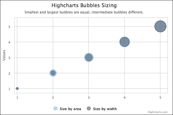
Both series have the exact same x, y, and z values, so they have the same bubble sizes at the extremes (1 and 5). With the middle values 2 to 4, the Size by area bubbles start off with a larger area than the Size by width, and gradually both schemes narrow to the same size. The following is a table showing the final size values in different z-values for each method, whereas the associating value inside the bracket is the z-value ratio in the series:
|
Z-Value |
1 |
2 |
3 |
4 |
5 |
|
Size by width (Ratio) |
8 (0) |
16 (0.25) |
24 (0.5) |
32 (0.75) |
40 (1) |
|
Size by area (Ratio) |
8 (0) |
24 (0.5) |
31 (0.71) |
36 (0.87) |
40 (1) |
Let's see how the bubble sizes are computed in both approaches. The ratio in Size by width is calculated as (Z - Zmin) / (Zmax - Zmin). So, for z-value 3, the ratio is computed as (3 - 1) / (5 - 1) = 0.5. To evaluate the ratio for the Size by area scheme, simply take the square root of the Size by width ratio. In this case, for z-value 3, it works out as √0.5 ≈ 0.71. We then convert the ratio value into the number of pixels based on the minSize and maxSize range. Size by width with z-value 3 is calculated as:
ratio * (maxSize - minSize) + minSize = 0.5 * (40 - 8) + 8 = 24
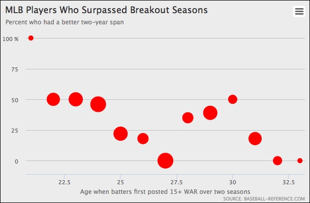
In this section, we will examine bubble series options by replicating a real-life example (MLB Players Chart: http://fivethirtyeight.com/datalab/has-mike-trout-already-peaked/). The following is a bubble chart of baseball players' milestones:
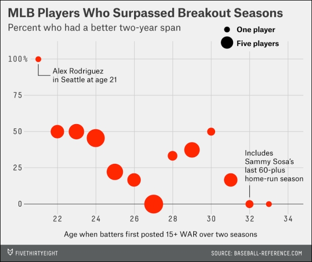
First, there are two ways that we can list the data points (the values are derived from best estimations of the graph) in the series. The conventional way is an array of x, y, and z values where x is the age value starting from 21 in this example:
            series: [{
                 type: 'bubble',
                 data: [ [ 21, 100, 1 ],
                         [ 22, 50, 5 ],
                         ....
Alternatively, we can simply use the pointStart option as the initial age value and miss out the rest:
            series: [{
                type: 'bubble',
                pointStart: 21,
                data: [ [ 100, 1 ],
                        [ 50, 5 ],
                        ....
Then, we define the background color, axis titles, and rotate the y axis title to the top of the chart. The following is our first try:
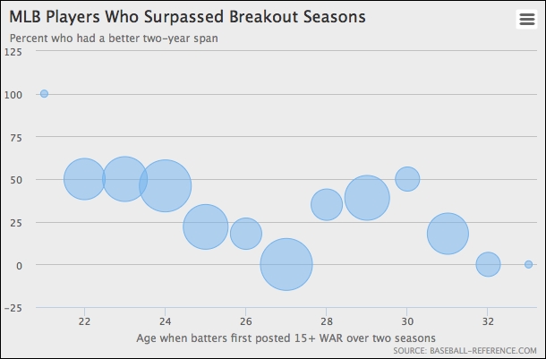
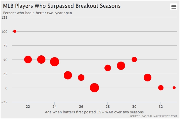
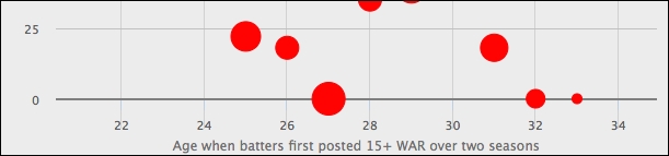
As we can see, there are a number of areas that are not quite right. Let's fix the bubble size and color first. Compared to the original chart, the preceding chart has a larger bubble size for the upper value and the bubbles should be solid red. We update the plotOptions.bubble series as follows:
      plotOptions: {
           bubble: {
               minSize: 9,
               maxSize: 30,
               color: 'red'
           }
      },
This changes the bubble size perspective to more closely resemble the original chart:
The next step is to fix the y-axis range as we want it to be between 0 and 100 only. So, we apply the following config to the yAxis option:
     yAxis: {
         endOnTick: false,
         startOnTick: false,
         labels: {
             formatter: function() {
                  return (this.value === 100) ?
                       this.value + ' %' : this.value;
             }
         }
     },
By setting the options endOnTick and startOnTick to false, we remove the extra interval at both ends. The label formatter only prints the % sign at the 100 interval. The following chart shows the improvement on the y axis:
The next enhancement is to move the x axis up to the zero value level and refine the x axis into even number intervals. We also enable the grid lines on each major interval and increase the width of the axis line to resemble the original chart:
     xAxis: {
         tickInterval: 2,
         offset: -27,
         gridLineColor: '#d1d1d1',
         gridLineWidth: 1,
         lineWidth: 2,
         lineColor: '#7E7F7E',
         labels: {
             y: 28
         },
         minPadding: 0.04,
         maxPadding: 0.15,
         title: ....
     },
The tickInterval property sets the label interval to even numbers and the offset option pushes the x axis level upwards, in line with the zero value. The interval lines are enabled by setting the gridLineWidth option to a non-zero value. In the original chart, there are extra spaces at both extremes of the x axis for the data labels. We can achieve this by assigning both minPadding and maxPadding with the ratio values. The x axis labels are pushed further down by increasing the property of the y value. The following screenshot shows the improvement:
The final enhancement is to put data labels next to the first and penultimate data points. In order to enable a data label for a particular point, we turn the specific point value into an object configuration with the dataLabels option as follows:
     series: [{
         pointStart: 21,
         data: [{
             y: 100,
             z: 1,
             name: 'Alex Rodriguez <br>in Seattle at age 21',
             dataLabels: {
                 enabled: true,
                 align: 'right',
                 verticalAlign: 'middle',
                 format: '{point.name}',
                 color: 'black',
                 x: 15
             }
         }, ....
We use the name property for the data label content and set the format option pointing to the name property. We also position the label on the right-hand side of the data point and assign the label color.
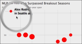
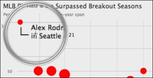
From the preceding observation, we notice that the font seems quite blurred. Actually, this is the default setting for dataLabels in the bubble series. (The default label color is white and the position inside the bubble is filled with the series color. As a result, the data label actually looks clear even when the text shadow effect is applied) Also, there is a connector between the bubble and data label in the original chart. Here is our second attempt to enhance the chart:
         { y: 100,
           z: 1,
           name: 'Alex Rodriguez <br>in Seattle at age 21',
           dataLabels: {
               enabled: true,
               align: 'right',
               verticalAlign: 'middle',
               format: '<div style="float:left">' +
                       '<font size="5">∟</font></div>' +
                       '</span><div>{point.name}</div>',
               color: 'black',
               shadow: false,
               useHTML: true,
               x: -2,
               y: 18,
               style: {
                   fontSize: '13px',
                   textShadow: 'none'
               }
           }
         },
To remove the blurred effect, we redefine the label style without CSS textShadow. As for the L-shaped connector, we use the trick of alt-code (alt-code: 28) with a larger font size. Then, we put the inline CSS style in the format option to make the two DIV boxes connector and text label adjacent to each other. The new arrangement looks considerably more polished:
We apply the same trick to the other label; here is the final draft of our bubble chart:
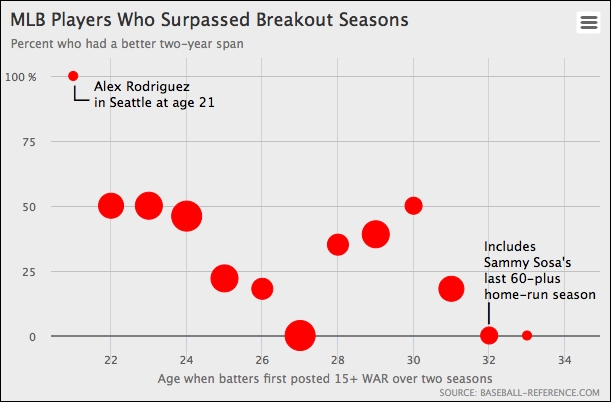
The only part left undone is the bubble size legend. Unfortunately, Highcharts currently doesn't offer such a feature. However, this can be accomplished by using the chart's Renderer engine to create a circle and text label. We will leave this as an exercise for readers.
Technically speaking, we can create the same chart with a scatter series instead, with each data point specified in object configuration, and assign a precomputed z-value ratio to the data.marker.radius option.