A box plot is a technical chart that shows data samples in terms of the shape of distribution. Before we can create a box plot chart, we need to understand the basic structure and concept. The following diagram illustrates the structure of a box plot:
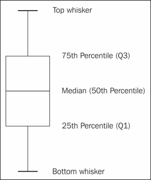
In order to find out the percentile values, the entire data sample needs to be sorted first. Basically, a box plot is composed of top and bottom whisker values, first (Q1) and third (Q3) quartile values, and the median. The quartile Q1 represents the median value between the 50th percentile and the minimum data. Quartile Q3 works in a similar fashion but with maximum data. For data with a perfectly normal distribution, the box plot will have an equal distance between each section.
Strictly speaking, there are other types of box plot that differ in how much the percentiles of both whiskers cover. Some use the definition of 1.5 times the inter-quartile range, that is, 1.5 * (Q3 - Q1), or standard deviation. The purpose is to isolate the outlier data and plot them as separate points which can be put into scatter data points along with the box plot. Here, we use the simplest form of box plot: the maximum and minimum data points are regarded as the top and bottom whiskers respectively.
In order to create a box plot chart, we need to load an additional library, highcharts-more.js:
<script src="http://code.highcharts.com/highcharts-more.js"></script>
Highcharts offers a set of options to shape and style the box plot series, such as the line width, style, and color, which are shown in the following code snippet:
          plotOptions: {
              boxplot: {
                  lineWidth: 2,
                  fillColor: '#808080',
                  medianColor: '#FFFFFF',
                  medianWidth: 2,
                  stemColor: "#808080",
                  stemDashStyle: 'dashdot',
                  stemWidth: 1,
                  whiskerColor: '#808080',
                  whiskerWidth: 2,
                  whiskerLength: '120%'
              }
          },
The lineWidth option is the overall line width of the boxplot, and fillColor is for the color inside the box. The median options refer to the horizontal median line inside the box whereas the stem options are for the line between the quartile and whisker. The whiskerLength option is the ratio that corresponds to the width of the quartile box. In this example, we will enlarge the whiskerLength option for ease of visualization, as there are a number of box plots packed into the graph.
The series data values for a box plot are listed in array form in ascending order, so from the bottom to top whisker. The following shows a sample of series data:
        series: [{
            type: 'boxplot',
            data: [
                   [16.855, 19.287, 26.537, 31.368, 33.035 ],
                   [16.139, 18.668, 25.33, 30.632, 32.385 ],
                   [12.589, 15.536, 23.5495, 28.960, 30.848 ],
                   [13.395, 16.399, 22.078, 27.013, 29.146 ],
                   ....
            ]
}]Before we dive into an example with real-life data, it is worth looking at an excellent article (http://junkcharts.typepad.com/junk_charts/2014/04/an-overused-chart-why-it-fails-and-how-to-fix-it.html) by Kaiser Fund, a marketing analytics and data visualization expert who also authored a couple of books on big data crunching. In the article, Kaiser raises an observation of a spider chart from a video Arctic Death Spiral (http://youtu.be/20pjigmWwiw), as follows:
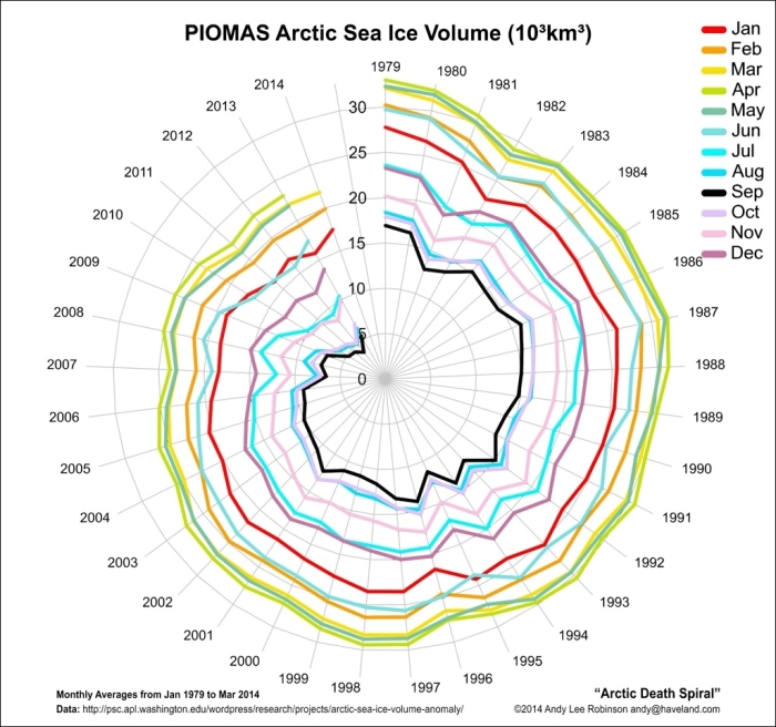
The video demonstrates how the arctic sea ice volume (each month per series over the years) spirals towards the center at an alarming rate. He argues that using a spider chart doesn't do justice to the important message in the data. To summarize his arguments:
- It is difficult for readers to comprehend the real downward trend scale in a circular chart.
- Humans perceive time series data more naturally in a horizontal progression than in a circular motion.
- If the movement of monthly data within a year fluctuates more than other years, we will have multiple line series crossing each other. As a result, we have a plateful of spaghetti instead of a comprehensible chart.
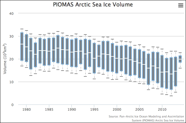
In order to fix this, Kaiser suggests that a box plot is the best candidate. Instead of having 12 multiple series lines crammed together, he uses a box plot to represent the annual data distribution. The 12 months' data for each year are sorted and only the median, quartiles, and extreme values are substituted into the box plot. Although small details are lost due to less data, the range and scale of the downward trend over time are better represented in this case.
The following is the final box plot presentation in Highcharts:
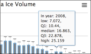
Since the box plot series holds various values, the series has different property names—low, q1, median, q3, high—to refer to them. The following illustrates an example of tooltip.formatter:
      chart: {
          ....
      },
      ....,
      tooltip: {
          formatter: function() {
              return "In year: " + this.x + ", <br>" +
                     "low: " + this.point.low + ", <br>" +
                     "Q1: " + this.point.q1 + ", <br>" +
                     "median: " + this.point.median + ", <br>" +
                     "Q3: " + this.point.q3 + ", <br>" +
                     "high: " + this.point.high;
              }
          },
      series: [{
          ....
      }]
Note that formatter should be added to the tooltip property of the main options object, and not in the series object. Here is what the box plot tooltip looks like: