In this chapter, we explore some of the more unusual charts, such as waterfall and funnel charts, by using simple sales and accounting figures. We experiment with how we can link both the charts together with related information. Then, we move on to investigate how to plot a pyramid chart and assess the flexibility of Highcharts by imitating a financial pyramid chart from a proper commercial report. Finally, we study the heatmap chart and tweak various specific options with real-life statistics in a step-by-step approach. In this chapter, we will cover the following topics:
- Constructing a waterfall chart
- Making a funnel chart
- Joining both waterfall and funnel charts
- Plotting a commercial pyramid chart
- Exploring a heatmap chart with inflation data
- Experimenting with the dataClasses and nullColor options of a heatmap chart
A waterfall chart is a type of column chart where the positive and negative values are accumulated along the x axis categories. The start and end of adjacent columns are aligned on the same level, with columns going up or down depending on the values. They are mainly used to present cash flow at a higher level.
To use a waterfall chart, the highcharts-more.js library must be included:
<script type="text/javascript"
 src="http://code.highcharts.com/highcharts-more.js"></script>
Let's start with a simple waterfall, with a couple of values for income and expenditure. The following is the series configuration:
            series: [{
                type: 'waterfall',
                upColor: Highcharts.getOptions().colors[0],
                color: '#E64545',
                data: [{
                    name: 'Product Sales',
                    y: 63700
                }, {
                    name: 'Renew Contracts',
                    y: 27000
                }, {
                    name: 'Total Revenue',
                    isIntermediateSum: true,
                    color: '#4F5F70'
                }, {
                    name: 'Expenses',
                    y: -43000
                }, {
                    name: 'Net Profit',
                    isSum: true,
                    color: Highcharts.getOptions().colors[1]
                }]
           }]
First, we specify the series type as waterfall, then assign a color value (blue) to the upColor option, which sets the default color for any columns with positive values. In the next line, we declare another color value (red) which is for columns with negative values. The data point entries are the same as a normal column chart, except those columns representing the total sum so far. These columns are specified with the isIntermediateSum and isSum Boolean options without y axis values. The waterfall chart will display those as accumulated columns. We specify the accumulated columns with another color since they are neither income nor expenditure.
Finally, we need to enable the data labels to show the value flow, which is the sole purpose of a waterfall chart. The following is the plotOptions setting with the data label styling and formatting:
      plotOptions: {
          series: {
              borderWidth: 0,
              dataLabels: {
                  enabled: true,
                  style: {
                      fontWeight: 'bold'
                  },
                  color: 'white',
                  formatter: function() {
                      return Highcharts.numberFormat(this.y / 1000, 1, '.') + ' k';
                  }
              }
          }
      },
Here is a screenshot of the waterfall chart:
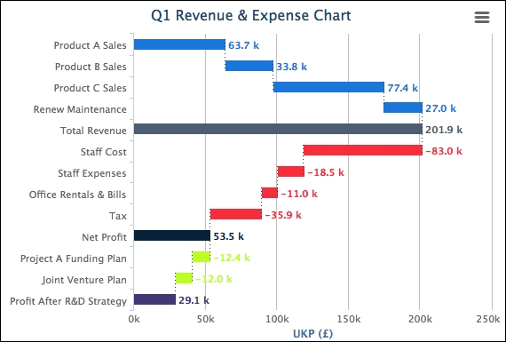
Let's assume that we need to plot a slightly more complicated waterfall chart, as we have a few more figures for revenue, expenses, and expenditure plans. Moreover, we need to display multiple stages of accumulated income. Instead of having a traditional waterfall chart with vertical columns, we declare the inverted option to switch the columns to horizontal. Since the columns are more compacted, the data labels may not fit inside the columns. Therefore, we put the data labels at the end of the columns. Here is a summary of the changes:
            chart: {
                renderTo: 'container',
                inverted: true
            },
            ....,
            plotOptions: {
                series: {
                    borderWidth: 0,
                    dataLabels: {
                        enabled: true,
                        inside: false,
                        style: {
                            fontWeight: 'bold'
                        },
                        color: '#E64545',
                        formatter: ....
                    }
                }
            },
            series: [{
                type: 'waterfall',
                upColor: Highcharts.getOptions().colors[0],
                color: '#E64545',
                name: 'Q1 Revenue',
                data: [{
                    name: 'Product A Sales',
                    y: 63700,
                    dataLabels: {
                        color: Highcharts.getOptions().colors[0]
                    }
                }, {
                    name: 'Product B Sales',
                    y: 33800,
                    dataLabels: {
                        color: Highcharts.getOptions().colors[0]
                    }
                }, {
                    // Product C & Renew Maintenance
                    ....
                }, {
                    name: 'Total Revenue',
                    isIntermediateSum: true,
                    color: '#4F5F70',
                    dataLabels: {
                        color: '#4F5F70'
                    }
                }, {
                    name: 'Staff Cost',
                    y: -83000
                }, {
                    // Staff Cost, Office Rental and Tax
                    ....
                }, {
                    name: 'Net Profit',
                    isSum: true,
                    color: Highcharts.getOptions().colors[1],
                    dataLabels: {
                        color: Highcharts.getOptions().colors[1]
                    }
            }]
The following is the new look of the waterfall chart: