A pyramid chart is the inverse of a funnel chart, but in a pyramid shape, generally used for representing a top-down hierarchical ordering of data. Since this is a part of the funnel chart module, funnel.js is required.
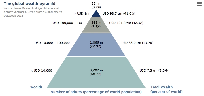
The default order for data entries is that the last entry in the series data array is shown at the top of the pyramid. This can be corrected by switching the reverse option to false. Let's take a real-life example for this exercise. The following is a picture of the Global Wealth Pyramid chart taken from the Credit Suisse Global Wealth Databook 2013:
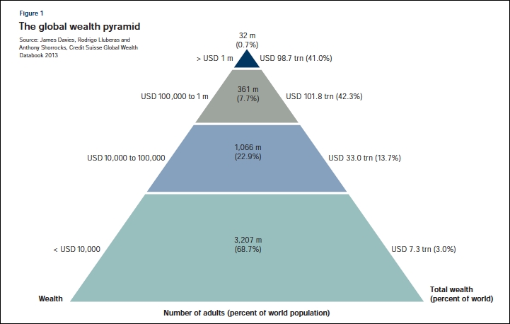
As we can see, it looks stylish with data labels along each side as well as in the middle. Let's make an initial attempt to reproduce the chart:
        title: {
            text: "The global wealth pyramid",
            align: 'left',
            x: 0,
            style: {
                fontSize: '13px',
                fontWeight: 'bold'
            }
        },
        credits: {
            text: 'Source: James Davies, ....',
            position: {
                align: 'left',
                verticalAlign: 'top',
                y: 40,
                x: 10
            },
            style: {
                fontSize: '9px'
            }
        },
        series: [{
            type: 'pyramid',
            width: '70%',
            reversed: true,
                dataLabels: {
                    enabled: true,
                    format: '<b>{point.name}</b> ({point.y:,.1f}%)',
                },
            data: [{
                name: '3,207 m',
                y: 68.7,
                color: 'rgb(159, 192, 190)'
            }, {
                name: '1,066 m',
                y: 22.9,
                color: 'rgb(140, 161, 191)'
            }, {
                name: '361 m',
                y: 7.7,
                color: 'rgb(159, 165, 157)'
            }, {
                name: '32 m',
                y: 0.7,
                color: 'rgb(24, 52, 101)'
            }]
        }]
First, we move the title and credits to the top-left corner. Then, we copy the color and percentage values into the series, which gives us the following chart:
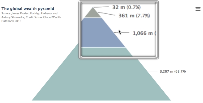
There are two main problems when compared to the original: the scale of each layer is wrong and the data labels are either missing or in the wrong place. As we can see, the reality is that the rich population is actually much smaller than the original chart showed, amusingly a single pixel. In the next section, we are going to see how far we can push Highcharts to make the financial chart.
Let face it. The layers in the original chart do not reflect their true percentage, proved in the previous chart. So we need to rig the ratio values to make them similar to the original chart. Secondly, the repositioning of data labels is limited in a pyramid chart. The only way to move the data label into the center of each layer of a pyramid chart is to disable the connectors and gradually adjust the distance option in plotOptions.pyramid.dataLabels. However, this only allows us a single label per data layer and we can only apply the same positional settings to all the labels.
So how can we put extra data labels along each side of the layer and the titles along the bottom of the pyramid? The answer (after hours of trial and error) is to use multiple y axes and plotLines. The idea is to have three y axes to put data labels on the left, center, and right side of the pyramid. Then, we hide all the y axes' interval lines and their labels. We place the y axis title at the bottom of the axis line with no rotation, we only rotate for the left (Wealth) and right (Total Wealth) axes.
We disable the remaining y axis title. The trick is to use the x axis title instead for the center label (Number of adults), because it sits on top of the pyramid. Here is the code snippet for the configuration of these axes:
        chart: {
            renderTo: 'container',
            // Force axes to show the title
            showAxes: true,
            ....
        },
        xAxis: {
            title: {
                text: "Number of adults (percentage of world population)"
            },
            // Only want the title, not the line
            lineWidth: 0
        },
        yAxis: [{
            // Left Y-axis
            title: {
                align: 'low',
                text: 'Wealth',
                rotation: 0,
                x: 30
            },
            // Don't show the numbers
            labels: {
                enabled: false
            },
            gridLineWidth: 0,
            min: 0,
            max: 100,
            reversed: true,
            ....
        }, {
            // Center Y-axis
            title: {
                text: ''
            },
            // Same setting to hide the labels and lines
            ....
        }, {
            // Right Y-axis
            opposite: true,
            title: {
                align: 'low',
                text: 'Total Wealth <br>(percent of world)',
                rotation: 0,
                x: -70
           },
            // Same setting to hide the labels and lines
            ....
The following screenshot demonstrates the titles aligned at the base of pyramid chart:

The next part is to simply create a plotLine for each y-axis in each layer of the pyramid and set the label for these plotLines. Since we know the data value range of each pyramid layer, we can set the same y value for plotLines across all the y axes to display the labels on the same level. Here is an example of a plotLines option for the left y-axis:
            plotLines: [{
                value: 40,
                label: {
                    text: '< USD 10,000',
                    x: 20
                },
                width: 1,
            }, {
                value: 30,
                label: {
                    text: 'USD 10,000 - 100,000',
                    x: 35
                },
                width: 1
            }, {
We do the same for the center labels instead of using the points' data labels. Note that the x position here caters for the data in this chart. If the graph has dynamic data, a new x position must be calculated to fit the new data. Here is the final look in Highcharts: