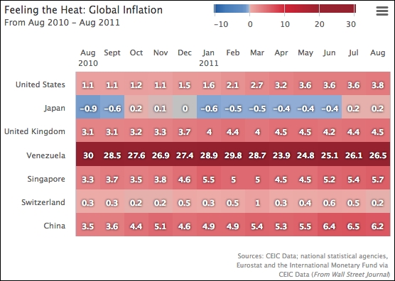
Heatmap is the latest chart addition in Highcharts 4. As its name implies, the data values are represented in temperature colors, where the data is arranged in a grid-based layout, so the chart expresses three-dimensional data. The heatmap appeals to some readers because of the instant awareness of the data trend it generates, as temperature is one of the most natural things to sense. The chart is generally used for demonstrating climate data, but it has been used for other purposes. Let's explore the heatmap chart with some real-life data. Here, we use it to show the inflation of various countries, as in this example in the Wall Street Journal (http://blogs.wsj.com/economics/2011/01/27/feeling-the-heat-comparing-global-inflation/):
In Highcharts, the heatmap module was released as part of the Highmaps extension, which can be used as part of Highmaps or as a module of Highcharts. In order to load a heatmap as a Highcharts module, it includes the following library:
<script src="http://code.highcharts.com/modules/heatmap.js"></script>
First, the months are sketched along the y axis, whereas the x axis holds the country names. So we need to invert the chart:
        chart: {
            renderTo: 'container',
            type: 'heatmap',
            inverted: true
        },
The next step is to set both x and y axes as categories with specific labels. Then, we set the x axis without interval lines. As for the y axis, we position the labels at the top of the cells by assigning the opposite option to true and including an offset distance to make sure the axis lines are not too close:
  xAxis: {
      tickWidth: 0,
      // Only show a subset of countries
      categories: [
          'United States', 'Japan', 'United Kingdom',
          'Venezuela', 'Singapore', 'Switzerland', 'China'
      ]
  },
  yAxis: {
      title: { text: null },
      opposite: true,
      offset: 8,
      categories: [ 'Aug 2010', 'Sept', 'Oct', 'Nov', 'Dec', ...
There is one more axis that we need to configure, colorAxis (see http://api.highcharts.com/highmaps), which is specific to heatmap charts and Highmaps. The colorAxis option is similar to x/yAxis, which shares a number of options with it. The major difference is that colorAxis is the definition in mapping between the color and value. There are two ways to define color mapping: discrete and linear color range.
In this example, we demonstrate how to define multiple linear color ranges. As we can see, the inflation example has an asymmetric color scale, so that it ranges from -6.6 percent to 36 percent, but notice that the color between -0.1 percent and 0.1 percent is gray. In order to imitate the color scale closely, we use the stops option to define fragments of discrete spectrums. The stops option takes an array of tuples of ratio range and color, and we transform the inflation and color values from the example into a number of ratios (we take the range from -1 percent to 30 percent instead because of the subset samples):
          colorAxis: {
                min: -0.9,
                max: 30,
                stops: [
                    [0, '#1E579F'],
                    // -6.6
                    [0.085, '#467CBA'],
                    // -6
                    [0.1, '#487EBB'],
                    // -2
                    [0.2, '#618EC4'],
                    // -1
                    [0.225, '#7199CA'],
                    // -0.2
                    [0.245, '#9CB4D9'],
                    // Around 0
                    [0.25, '#C1C1C1'],
                    // Around 0.2
                    [0.256, '#ECACA8'],
                    // Around 10
                    [0.5, '#D02335'],
                    // Around 20
                    [0.75, '#972531'],
                    [1.0, '#93212E']
                ],
                labels: {
                    enabled: true
                }
          }
Additionally, we replicate the title (top-left), color scale legend (top-right), and credits (bottom-right) as in the original chart, with the following configurations:
    title: {
        text: "Feeling the Heat: Global Inflation",
        align: 'left',
        style: {
            fontSize: '14px'
        }
    },
    subtitle: {
        text: "From Aug 2010 - Aug 2011",
        align: 'left',
        style: {
            fontSize: '12px'
        }
    },
    legend: {
        align: 'right',
        verticalAlign: 'top',
        floating: true,
        x: -60,
        y: -5
    },
    credits: {
        text: 'Sources: CEIC Data; national statistical ....',
        position: {
            y: -30
        }
    },
The final step is to define the three-dimensional data and switch the dataLabels option on:
        series: [{
            dataLabels: {
                enabled: true,
                color: 'white'
            },
            // Country Category Index, Month/Year Index, Inflation
            data: [
                // US
                [ 0, 0, 1.1 ],
                [ 0, 1, 1.1 ],
                ....,
                // Japan
                [ 1, 0, -0.9 ],
                [ 1, 1, -0.6 ],
Here is the display: