There are a myriad of classes in Ext JS, and it is beyond the scope of this book to introduce them. Sencha provides three types of online documentation in terms of both quality and quantity: a reference manual, tutorials (written and video), and working demos. You are strongly advised to spend ample time reviewing these materials. In this section, a very brief introduction is given about some components, especially those that are likely to interface with Highcharts. This chapter is by no means enough to get you started with programming in Ext JS, but should be enough to give you an idea.
An Ext JS application can always be divided into multiple JavaScript files, but they should always start from one HTML file. The following code snippet demonstrates how to start up Ext JS from an HTML file:
<html>
  <head>
    <meta http-equiv="Content-Type"
          content="text/html; charset=UTF-8">
    <title>Highcharts for Ext JS 5</title>
    // At the time of writing, there is no CDN for ExtJs 5
    // Download http://www.sencha.com/products/extjs/download/ext-js-5.0.0/3164
    <link rel="stylesheet" type="text/css"
          href="/extjs5/packages/ext-theme-classic/build/resources/ext-theme-classic-all.css" />
  </head>
  <body></body>
  <script type="text/javascript" src="/extjs5/ext-all.js"></script>
  <script type='text/javascript'>
          Ext.require('Ext.window.Window'),
          Ext.onReady(function() {
               // application startup code goes here
               ....
          });
  </script>
</html>
Ext JS 5 is packaged with various themes. The preceding example demonstrates how to load one of the available themes. We will apply different themes in the examples to show the look and feel of Ext JS 5. The script file, ext-all.js, contains all the Ext JS classes in a compressed format.
Ext.require is to load specific classes used in the application. Ext.onReady is the DOM-ready method, the same as the $.ready jQuery method that the application startup code starts running inside this function.
Out of all the classes in Ext JS, we should start by discussing Ext.Component, which is the base class for Ext JS user interface components. Depending on the characteristics of the component, some of them such as Panel, Window, FieldSet, and RadioGroup can contain multiple components, because they are inherited through another class: Container. We will look at Container in more detail later.
To create an Ext JS object, we use the Ext.create method, which takes two parameters. The first parameter is the string presentation of a class path, for example 'Ext.window.Window', or an alias name such as 'widget.window'. The second parameter is the object specifier, containing the initial values to instantiate a class:
var win = Ext.create('Ext.window.Window', {
       title: 'Ext JS Window',
       layout: 'fit',
       items: [{
            xtype: 'textarea',
            id: 'textbox',
            value: 'Lorem ipsum dolor sit amet, ... '
       }]
});

win.show();
The preceding code snippet is used to create a window widget and its content is defined through the items option. Window is a class derived from the Container class, which inherits the items option for containing other components. When the window is finally created and ready to render, it goes through each object specifier in the items array and creates each component.
The xtype option is the Ext-specific type, which has a short unique name to symbolize the component's class path. In Ext JS, all interface components have their own xtype names (this refers to the Ext.Component manual). The xtype option is commonly used for convenience to create components within the container, as opposed to Ext.create with a full pathname.
The id field is to give a unique ID name to a component. The purpose is to gain direct access to a component at any point inside a program. To retrieve the component with an ID value, we can execute the following line of code:
var tb = Ext.getCmp('textbox'),Alternatively, we can use the itemId option to assign a unique name. The difference is that the ID has to be globally unique to the application, whereas itemId only has to be unique within the parent container, to avoid name conflict elsewhere in the application. To access a component with the itemId value, we need to call getComponent from the immediate parent container, as follows:
var tb = win.getComponent('textbox'),Moreover, we can chain the call all the way from the top level to the desired component, as follows:
var val =
win.getComponent('panel').getComponent('textbox').getValue();
The 'textbox' (with itemId defined) component is constructed inside the parent container, 'panel', which resides inside the window object. Although the getCmp method provides direct, easy access to a component, it should generally be avoided as part of best practices, due to slower performance and undesired effects if a duplicate ID is accidentally used.
Note that Sencha also provides convenient component navigation, up and down methods which search for target component with CSS style selector. Here is an example:
var val = win.down('#textbox').getValue(); As we can see the preceding expression is much more simplified and direct. The down method basically traverses down to its children components and so on until come across the first component with the matching criteria. In this case, the matching expression '#textbox' means a component with itemId specified as a textbox. Many different search expression can be used, another example is down('textarea') which means searching for the first child component with xtype value of textarea.
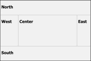
As we mentioned earlier, some types of components have the ability to contain other components, because they are extended from the Container class. Another feature of the Container class is to arrange the layout between the contained components; the layout policy is specified via the layout option. There are about a dozen layout policies: among them 'anchor', 'border', and 'fit' are most commonly used (the card layout is also used often, but through the tab panel). The border layout is widely used in GUI programming. The layout is finely divided into the 'north', 'east', 'south', 'west', and 'center' regions.
When developing an application that requires utilizing the whole browser space, we generally use a Viewport class coupled with a border layout. Viewport is a special type of container whose size automatically binds to the browser. The following is a simple example of using a viewport:
    var viewport = Ext.create('Ext.container.Viewport', {
      layout: 'border',
      defaults: {
         frame: true
      },
      items: [{
          region: 'north',
          html: '<h1>North</h1>'
      }, {
          region: 'east',
          html: '<h1>East</h1>',
          width: '15%'
      }, {
          region: 'south',
          html: '<h1>South</h1>'
      }, {
          region: 'west',
          html: '<h1>West</h1>',
          width: '20%'
      }, {
          region: 'center',
          html: '<h1>Center</h1>'
      }]
    });
The following screenshot shows the border layout in a gray theme:
Panel is a basic container component, and is generally used as a building block with the layout format and then combined with more panels or components. Another general use is to extend the Panel class to a special purpose type of panel, for example PortalPanel in the online portal demo. The most widely used panel types are GridPanel, FormPanel, and TabPanel.
GridPanel is used for displaying data in table format and it comes with lots of useful features, such as drag-and-drop column ordering, column sorting, flexible data rendering, enable or disable column display functions, and many others. GridPanel can also be used with different plugins such as row editor, allowing a user to edit field values on the fly. The class comes with a large set of events settings that can establish smooth coordination with other components. Nonetheless, the most tightly coupled component is the store object, which we will demonstrate in a later section.
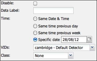
FormPanel is a panel for accommodating field input components in form style, that is, labels on the left-hand side, inputs on the right-hand side, and the buttons array. Ext JS provides a great selection of form inputs, such as date time fields, comboboxes, number fields, sliders, and many others. Underneath the FormPanel layer, there is a BasicForm component, which contributes to field validations, form submission, and loading services with the store's Record class for adding and editing entries.
The following is a screenshot of FormPanel with various inputs:
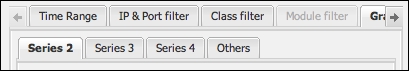
TabPanel, as its name implies, is a panel associated with tabs. It supports creating and removing tabs on the fly and scrolling between tabs. The following code snippet shows how to create a tab panel:
items:[{
      xtype: 'tabpanel',
      items: [{
           title: 'Tab 1',
           xtype: 'form',
           items: [{
                .....
           }]
      }, {
          title: 'Tab 2',
          ....
      }]
}]
The following is a screenshot of tabs within the tab panel, with a scrolling feature:
Window is a special type of panel that is not bound to any parent container and is free-floating within the application. It offers many features found in normal desktop windows, such as resize and maximize/minimize, and also comes with options for adding a toolbar, footer bar, and buttons. Later, we will see the Window panel in action in an example.
The Ext JS framework provides its own method, Ajax.request, for issuing Ajax queries. This is used when the returned JSON data is not required to be converted into table rows and field columns. The method is generally coupled with Ext.decode to convert the returned JSON format string into a JavaScript object and directly access individual fields inside the object.
The following code snippet shows a sample of issuing an Ajax query:
Ext.Ajax.request({
     url: 'getData.php ',
     params: { id: 1 },
     success: function(response) {
          // Decode JSON response from the server
          var result = Ext.decode(response.responseText);
          if (result && result.success) {
              ....
          } else {
              ....
          }
     }
});
Store is a general purpose storage class for modeled data. There are several classes derived from Store, but the most important one for Highcharts is JsonStore. It is a proxy-cached storage class responsible for issuing an Ajax query and unpacks the returned JSON data into modeled data. The JsonStore class is often used for accessing database data that resides on the server side. A store object can bind with more than one component, for example a JsonStore object can bind to a grid panel and a column chart. Clicking on a column order direction in the grid panel can change the row sequence in JsonStore, affecting the order of the columns displayed in the chart. In other words, the Store class acts as a skeleton to hold several components working together effortlessly and systematically.
It is important to note that the load method in the Store class is asynchronous. An event handler should be assigned to the load event if we want to tie an action after the data is loaded. The action can be specified through listeners.click via either the object specifier or store.on method.
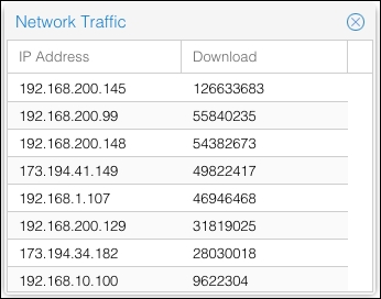
So far, a number of Ext JS components have been introduced; we should see how they work together. Let's build a simple window application that contains a table (GridPanel) showing a list of hosts with their download usage that are returned from the server. Let's assume that we have rows of data returned in JSON format from the server:
{ "data": [
       { "host" : "192.168.200.145", "download" : 126633683 },
       { "host" : "192.168.200.99" , "download" : 55840235 },
       { "host" : "192.168.200.148", "download" : 54382673 },
        ...
] }
First we define the data model to correspond with the JSON data. For the sake of simplicity, we can put all our demo code inside Ext.onReady rather than in a separate JavaScript file:
Ext.onReady(function() {
    Ext.define('NetworkData', {
        extend: 'Ext.data.Model',
        fields: [
            {name: 'host',  type: 'string'},
            {name: 'download', type: 'int'}
        ]
    });
});The next step is to define a JsonStore object with the URL, connection type, and the data format type. We will bind the JsonStore object with the NetworkData data model defined in the preceding code snippet:
var netStore = Ext.create('Ext.data.JsonStore', {
      autoLoad: true,
      model: 'NetworkData',
      proxy: {
        type: 'ajax',
        url: './getNetTraffic.php',
        reader: {
            type: 'json',
            idProperty: 'host',
            rootProperty: 'data'
        }
    }
});
idProperty is used to define which field is regarded as an ID if the default 'id' fieldname is not provided, so that methods such as Store.getById can function properly. The root option tells the reader (JsonReader) which property name holds the array of row data in the JSON response from the server. The next task is to build a Window panel with a GridPanel class, as follows:
var win = Ext.create('Ext.window.Window', {
      title: 'Network Traffic',
      layout: 'fit',
      items: [{
             xtype: 'grid',
             height: 170,
             width: 270,
             store: netStore,
             columns: [{
                 header: 'IP Address',
                 dataIndex: 'host',
                 width: 150
             }, {
                 header: 'Download',
                 dataIndex: 'download'
             }]
      }]
}).show();
We instruct the grid panel to bind with the netStore object and define a list of columns to display. We then match each column to the store's data field through the dataIndex option. The following is a screenshot showing part of a window (crisp theme) with a grid panel inside it: