
So far, we have demonstrated how Highcharts can be applied within the Ext JS framework. However, the demo itself seems rather shrink-wrapped for an RIA product. In this section, we will have a quick glance at a commercial application, Profiler, a tool for profiling companies network scenario developed by iTrinegy. Due to the nature of its business, a stack of diagnostic graphs is required for this type of application. The whole application is designed as a collection of portals for monitoring network traffic from multiple sites. Users can drill down from utilization graph to top downlink usage by IP address graph, modify filter properties to display relative data in multiple series, and so on.
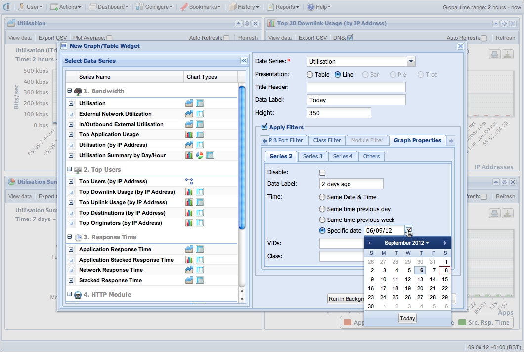
In order to fine-tune the profiling parameters and provide a portal interface, a framework offering dynamic and calibrated user interfaces is needed. For this reason, Ext JS is a suitable candidate, as it offers a rich set of professional looking widget components, and its cross-browser support makes building complicated RIA software manageable. The following is the interface for launching a bandwidth utilization report graph with specific parameters:
The Highcharts events are easily bound with Ext JS components so that a fully interactive navigation style becomes possible. For instance, if a peak appears on the Utilisation graph, the users can either click on the peak data point or highlight a region for a specific time range, then a context menu with a selection of network graphs pops up. This action means that we can append the selected time region to be part of the accumulated filters and navigate towards a specific graph. The following is a screenshot of the context menu, which shows up in one of the graphs:
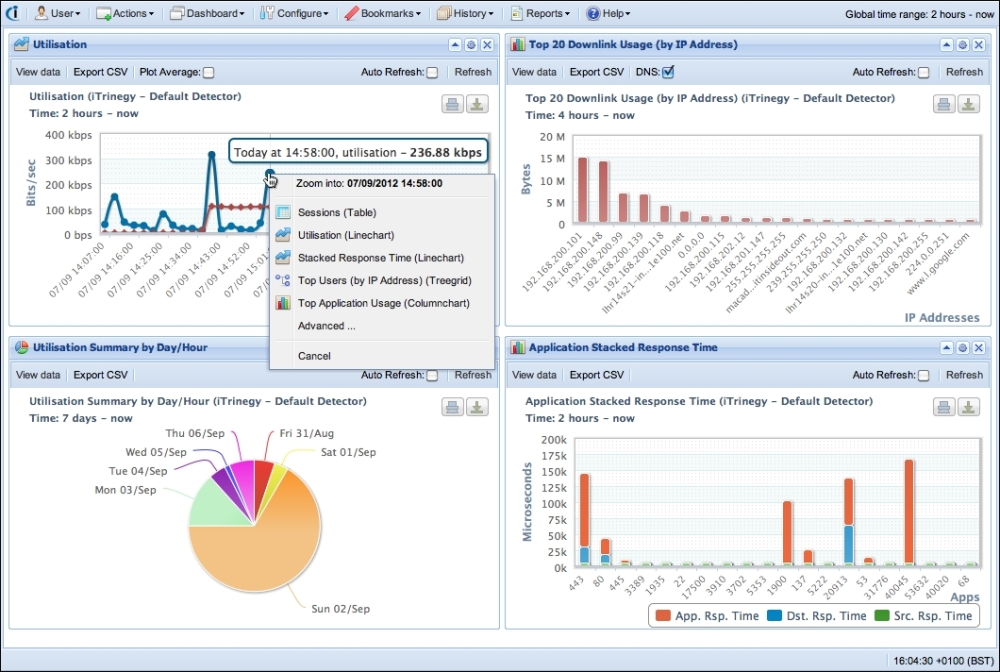
If we proceed by selecting the same graph again, Utilisation, it means we want to zoom into greater detail within the selected time region. This doesn't use the Highcharts default zoom action, which just stretches the graph series and redraws the axes. In fact, it launches another Ajax query with the selected time and returns graph data in finer granularity, so the peak in the graph can be diagnosed further. In other words, the application enables the user to visually filter through a sequence of different graphs. At the same time, the user gradually refines the filters in different dimensions. This process dissects the problem into the root cause in a prompt, intuitive, and effective fashion.