
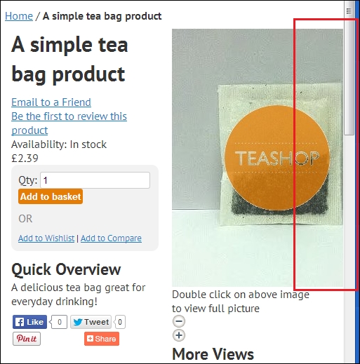
Images are very important on your Magento store to ensure that your customers can see what they're buying. If you look at a product page on your Magento store at the moment, you'll see that the product image hugely overflows the column's width available to it, as you can see from the highlighted portion of the following screenshot:
The easiest way to ensure that your store's images will be resized to sensible dimensions is to set the max-width attribute of the img element to 100% to ensure no image becomes larger than its container.
Open your theme's styles.css file in the /skin/frontend/default/m18/css/ directory and add the following CSS to it to help ensure images are resized to the width they have available in the page's layout, their height-to-width ratio is retained, and images are not stretched out of proportion:
img,
img[height],
img[style],
img[width],
img#image {
height: auto !important;
max-width: 100% !important;
width: auto !important;
}
Once you have saved this addition, refresh your product page again and you'll see that your product photograph is constrained to the width it has available, as follows: