Chapter Two: It’s the stories we tell
Why is branding important? Because people often choose products based on their perceived value rather than their actual value.
Think about the celebrity who drives an Aston Martin instead of, say, a Skoda, which is continually ranked “car of the year” in many European countries and delivers much better mileage at a significantly cheaper price. Sure, Skoda is the logical choice, but it’s Aston Martin’s identity, which conjures images of luxury and status, that usually clinches the sale. Then there’s Lexus versus Scion. Which would most people pay more for, and why?
Scion
By Fresh Machine 2002

Lexus
By Molly Designs
Refined by Siegel+Gale 2002
![]()
With the right branding, businesses can increase their product’s perceived value, establish relationships with their customers that span ages and borders, and nurture those relationships into a lifelong bond.
Of course, it always helps to have a good story to tell. Your job as a designer is to find the story, and tell it wisely. The rest of this chapter shares a few examples of designers who got it just right.
None genuine without this signature
Will Keith (W.K.) Kellogg invented wheat flakes and then corn flakes, spawning a breakfast cereal revolution and helping to develop an industry that has since become one of the most successful on the planet. But we might never have been familiar with the Kellogg name if W.K. hadn’t also been such a smart business strategist.
Kellogg developed marketing campaigns that were years ahead of their time. He used modern, four-color print advertising in magazines and on billboards at a time when other companies were still thinking in black and white. And to distinguish Kellogg’s Corn Flakes from those manufactured by other cereal companies, he made sure all of his boxes bore the legend, “Beware of Imitations. None Genuine Without This Signature, W.K. Kellogg.”
Kellogg’s signature
By W.K. Kellogg 1906

Kellogg still uses the same trademark signature that it has been using since 1906 on the front of every pack of cereal, but these days the signature is a red, stylized version. This consistency built a level of trust and repeat business with consumers through the years, which has helped establish Kellogg as the world’s leading cereal manufacturer.
A logoless company is a faceless man
For thousands of years, humans have needed and desired social identification. Think of the farmer who brands his cattle to mark his ownership, or the stonemason who proudly chisels his trademark.
When you close your eyes and picture McDonald’s, what do you see? Golden arches, perhaps? For those products and services that have a strong brand identity, it’s the identity that people often think of first, rather than the product itself. Think of Microsoft, Apple, Ford, and Target. Chances are good that without even showing you the logos, you’d have a fairly good picture of how they look. Granted, a huge marketing budget is necessary to achieve the recognition rates of such organizations, but it’s important to “put on your best face.”
By Gerard Huerta
Type Directors Club 1994

TIME magazine 1977

Waldenbooks 1979
![]()
Iconic designer Gerard Huerta, born and raised in Southern California, has been producing well-known identities for decades, including those for the likes of TIME, Waldenbooks, and the Type Directors Club. You are probably just as familiar, if not more familiar, with these logos as you are with the products or services themselves.
Seen by millions
By summer 2008, J.K. Rowling’s Harry Potter book series had sold more than 400 million copies and was translated into 67 languages. So when New York design and creative firm id29 was chosen in 2007 to create the campaign and associated identity elements for the seventh book, it was clear that its work would be seen by millions (or even billions).
Harry Potter 7
By id29
Designer and art director: Doug Bartow
Creative director: Michael Fallone 2007
Seen in Times Square, New York

“We came up with a distinctive campaign aesthetic based on a central typographic element that we could use across all different media, from printed posters and bookmarks to rich media and online applications,” said Doug Bartow, design director and principal at id29.
Makes sense. Think about the traffic passing through Times Square. Most people don’t have time to be reading from billboards, so a symbol is much more fitting. Using a simple mark to identify the campaign allowed those taking even the briefest of glimpses to recognize news of the book release.
“The results were phenomenal, with Harry Potter and the Deathly Hallows selling 8.3 million copies in the United States within the first 24 hours of its release,” said Bartow.
Only if the Queen agrees
The Queen of England—head of state and head of a nation—understands the importance of brand identity.
Moon Brand, a branding and communications consultancy based in London, needed final approval from Her Majesty on this design for the Royal Parks.
The Royal Parks
By Moon Brand
Designers: Richard Moon, Ceri Webber, Andy Locke 2006

“The leaves we chose to use in this logo are from indigenous British trees found in the Royal Parks,” said Moon Brand director Richard Moon.
The logo tells the story of the parks using their own language—leaves—and deftly portrays the relationship between the park system and the British crown with one clever picture. This clarity helped the project through to completion.
Moon Brand was told that approval from the Queen can take months, but it came back within 24 hours.
Symbols transcend boundaries
To sell products internationally, your brand has to speak a lot of different languages. Fortunately, easy-to-identify symbols need no translation. Recognizable regardless of culture or language, symbols enable companies to cross language barriers, compete globally, and maintain brand consistency across a wide range of media.
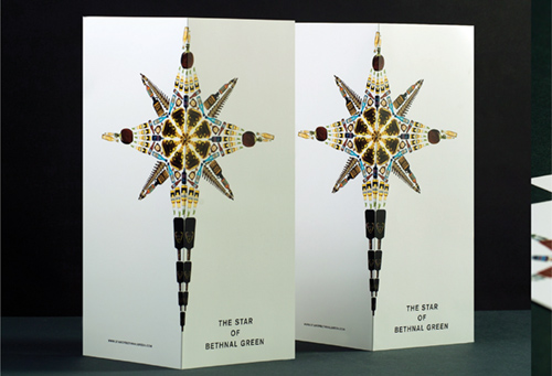
Take, for example, international branding and design agency Bunch. Its designers used a seven-pointed star inspired by the Star of Bethlehem to brand a new two-story club, Star of Bethnal Green (SoBG), which opened in the heart of Bethnal Green in London in 2008. The hard-working star symbol, which is a play on the name of the club and its owner, Rob Star, was used on everything from note cards to pint glasses.
The symbol had to be a star in some guise, said Bunch Creative Director Denis Kovac, so the design team began playing around with the traditional five-pointed star. All too soon they realized that it was too commonplace.
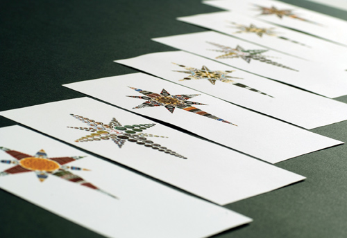
Star of Bethnal Green experimentation

“We figured a five-pointed star would always be reminiscent of national flags, communism, and pagan rituals,” said Kovac. “Rob Star already had a large following through his Mulletover club night, which brought to mind the expression ‘follow the star.’ He wanted the pub to be a shining beacon in Bethnal Green, attracting people from far and wide. The Star of Bethlehem with seven points and a long tail presented itself as a way forward.”
Star of Bethnal Green sketches
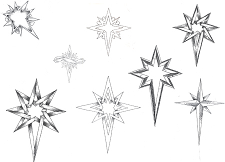
While Kovac and his team produced many possible variations, it was a simple thick-outlined star that was chosen, not only because it was a brilliant design, but also because it could be used as a template and altered to suit any application or theme.
The Star of Bethnal Green
By Bunch 2008

Bunch used the versatile star symbol on bottles, food, DJ paraphernalia, and stationery. Inside the pub, pint glasses are etched with the simplest form of the star, and screen-printed wallpaper features the same design drawn by hand.
Bunch’s project is a classic lesson in versatility. When designing brand identity, you must always ask yourself whether your logo can adapt to different media.
Pint glasses and business cards

Identity design as part of our language
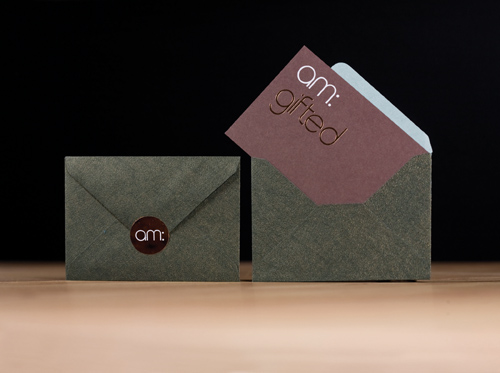
biz-R, a design studio in England, created this logotype with its customized typeface for Amanda Marsden, a lifestyle salon and spa based in Devon, England. The designers then extrapolated the letters “am” from the design, which represent the client’s initials and form the word “am,” to create a contemporary minimalist wordmark.
Amanda Marsden
By biz-R 2008
![]()
The word was then integrated into the various phrases used to promote Marsden’s service, such as “am: beautiful,” “am: relaxed,” and the “am: gifted” card (shown opposite).
Not every brand name will suit such a language-centric approach, but keep it in mind, because it’s one more tool in your design arsenal that you can employ when the time is right.
Rethinking the importance of brand identity
We often do judge books by their covers, whether it’s fair or not. And that’s why the perceived value of a service or product is usually greater than the actual one. The same visual identity seen time and again builds trust, and trust keeps customers coming back for more. It’s kind of like putting a face to a name—logos help people remember their experiences with companies.
You might practice making these very important points during initial discussions with your clients, as a way of driving home the importance of choosing you as their designer.
