When it comes to regression models, our metrics, as shown earlier, don't work anymore. After all, we are now predicting continuous output values, not distinct classification labels. Fortunately, scikit-learn provides some other useful scoring functions:
- mean_squared_error: The most commonly used error metric for regression problems is to measure the squared error between the predicted and the true target value for every data point in the training set, averaged across all of the data points.
- explained_variance_score: A more sophisticated metric is to measure to what degree a model can explain the variation or dispersion of the test data. Often, the amount of explained variance is measured using the correlation coefficient.
- r2_score: The R2 score (pronounced R squared) is closely related to the explained variance score but uses an unbiased variance estimation. It is also known as the coefficient of determination.
Let's create another mock-up dataset. Let's say we are observing data that looks like sin as a function of x values. We start by generating 100 equally spaced x values between 0 and 10:
In [21]: x = np.linspace(0, 10, 100)
However, real data is always noisy. To honor this fact, we want the target values, y_true, to be noisy, too. We do this by adding noise to the sin function:
In [22]: y_true = np.sin(x) + np.random.rand(x.size) - 0.5
Here, we use NumPy's rand function to add uniformly distributed noise in the range [0, 1], but then center the noise around 0 by subtracting 0.5. Hence, we effectively jitter every data point either up or down by a maximum of 0.5.
Let's assume our model was smart enough to figure out the sin(x) relationship. Hence, the predicted y values are given as follows:
In [23]: y_pred = np.sin(x)
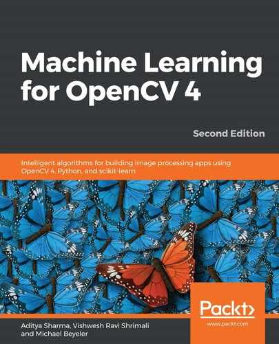
What does this data look like? We can use matplotlib to visualize it:
In [24]: import matplotlib.pyplot as plt
...      plt.style.use('ggplot')
...      %matplotlib inline
In [25]: plt.plot(x, y_pred, linewidth=4, label='model')
...      plt.plot(x, y_true, 'o', label='data')
...      plt.xlabel('x')
...      plt.ylabel('y')
...      plt.legend(loc='lower left')
Out[25]: <matplotlib.legend.Legend at 0x265fbeb9f98>
This will produce the following line plot:

The most straightforward metric to determine how good our model predictions are is the mean squared error. For each data point, we look at the difference between the predicted and the actual y value and then square it. We then compute the average of this squared error over all of the data points:
In [26]: mse = np.mean((y_true - y_pred) ** 2)
...      mse
Out[26]: 0.08531839480842378
For our convenience, scikit-learn provides its own implementation of the mean squared error:
In [27]: metrics.mean_squared_error(y_true, y_pred)
Out[27]: 0.08531839480842378
Another common metric is to measure the scatter or variation in the data: if every data point was equal to the mean of all of the data points, we would have no scatter or variation in the data, and we could predict all future data points with a single data value. This would be the world's most boring machine learning problem. Instead, we find that data points often follow some unknown, hidden relationship, that we would like to uncover. In the previous example, this would be the  relationship which causes the data to be scattered.
We can measure how much of that scatter in the data (or variance) we can explain. We do this by calculating the variance that still exists between the predicted and the actual labels; this is all of the variance our predictions could not explain. If we normalize this value by the total variance in the data, we get what is known as the fraction of variance unexplained:
In [28]: fvu = np.var(y_true - y_pred) / np.var(y_true)
...      fvu
Out[28]: 0.163970326266295
Because this metric is a fraction, its values must lie between 0 and 1. We can subtract this fraction from 1 to get the fraction of variance explained:
In [29]: fve = 1.0 - fvu
...      fve
Out[29]: 0.836029673733705
Let's verify our math with scikit-learn:
In [30]: metrics.explained_variance_score(y_true, y_pred)
Out[30]: 0.836029673733705
Spot on! Finally, we can calculate what is known as the coefficient of determination, or  .
.  is closely related to the fraction of variance explained and compares the mean squared error calculated earlier to the actual variance in the data:
In [31]: r2 = 1.0 - mse / np.var(y_true)
...      r2
Out[31]: 0.8358169419264746
The same value can be obtained with scikit-learn:
In [32]: metrics.r2_score(y_true, y_pred)
Out[32]: 0.8358169419264746
The better our predictions fit the data, in comparison to taking the simple average, the closer the value of the  score will be to 1. The
  score can take on negative values, as model predictions can be arbitrarily worse than 1. A constant model that always predicts the expected value of y, independently of the input x, would get an
  score of 0:
In [33]: metrics.r2_score(y_true, np.mean(y_true) * np.ones_like(y_true))
Out[33]: 0.0