Example three takes on the task of perfecting the color, along with a slight brightness and contrast tweak.
Problem: Often, once an image's brightness has been improved, the contrast looks a bit flat, and so that too requires attention. But in this example, it's the color cast that's the most unflattering aspect.
Solution: We shall use the White Balance tools to fix the inaccurate color, as well as the contrast fixing capabilities of the Levels tool.
Outcome: Recreate the lighting and the color to a more natural state:
Skin Tone Fixing: The following is a press shot of Dr Angela Merkel, one of the world's most recognizable global leaders, sourced from Wikimedia. The color is wrong. It has a green-cyan color cast:

I'm not sure if this is the photographer's fault (White Balance set incorrectly?), but this is unlikely if you have the credentials to be so close to someone so important. It's more likely a result of environmental color. Merkel looks as though she's standing in a room that's tinted in this color, so it's affecting everything else, including the skin tones. Note that incorrect color tends to be most visible in the mid-tones, so if the mid-tone grays are not 100% gray, you'll know there's a color cast issue. Whatever the reason, it's not a very realistic color, and it needs to be fixed.
Possibly the hardest thing for beginners starting out in the confusing world of image editing is deciding what exactly it is that's wrong with any image, if anything.
I spent several years as a color printer in a commercial lab, so I find it relatively easy to identify color problems, while others don't. It's a complex process that requires experience. What's important to remember is that Photoshop Elements is an RGB application (displaying a mix of red, green, and blue). The opposite colors to red, green, and blue are cyan, magenta, and yellow, so if the image is a bit greenish-cyan, I'd need to add the opposite colors to correct it. In this case, adding a bit of magenta and red should do it.
One shortcoming of Photoshop Elements is that it doesn't have as many specific color-tuning tools as you'd find in Photoshop CC. That said, we can first try to fix the problem using the Auto Color Correction feature. As you can see in this screenshot, it didn't work—in fact, it made the image a lot worse:

Dr Merkel will not be amused!
On my second attempt, the aptly named Remove Color Cast tool did a good job of making my subject's color appear a lot more realistic. One click on something that is supposed to be white, mid-gray, or black in the image and the cast is gone—mostly.
This feature is essentially the same tool as the three White Balance eye droppers we sometimes use in the Levels tool - but instead of a white, gray and black eye dropper, there's only one. Your job is to identify one of those three tones in the image and click it. In this instance I clicked on the chancellor's (white) tee-shirt, and the color immediately looked significantly better. Because this process works by resetting the pixels to be white, gray or black (depending on which color is clicked), I also tried clicking in the shadows up her sleeve to see if it might produce a better result. Because the shadows are not 100% black, the color correction was not as effective as the tee-shirt sampling.
Having locked that result away as a win for this semi-auto tool, the image now needs a tiny contrast adjustment (darker shadows) to make it perfect:

As I thought, on closer inspection, although the Remove Color Cast tool has done a good job of removing most of the greenish-blue tint, the image now lacks a bit of contrast:

For contrast, Levels (as shown in the preceding screenshot) is certainly the go-to tool for fixing this (don't bother wasting your time trying Auto Contrast) as it is so easy and immediate. As you can see in this screenshot, in its Input Levels scale, I merely pushed the shadow slider a little to the right to darken the shadows.
An alternative to Levels is the simpler-to-use Brightness and Contrast tool (Enhance | Adjust Lighting | Brightness and Contrast) but, although quite effective, it's just a slider and does not give you the added advantage of being able to read the histogram, as you can using Levels:
Having got the color close to realistic, I can now examine the rest of the shot for possible problems. The only thing I can do now is remove that background line that seems to cut right through the figure.
To remove this line, I can do either of the following:
- Paint it out using a similar color that will be selected from the wall
- Use a retouching brush to select, copy, paste, and blend pixels from the immediate vicinity of the line
The drawback of using the Brush Tool is that you'll have to select the exact color to cover up the line, much as you would if you were in the same room armed with a tin of paint and a brush. This technique will work perfectly in this example because the tones in the wall are all the same. Let's get started:
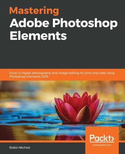
- Choose the brush from the Tool Bar (press the B key or locate it in the Draw section of the Tool Bar). Make sure it's the Brush Tool, not the Impressionist brush or the Color Replacement brush.
- Hold the Alt/Opt key and click in the picture to select a matching color, and then paint over the line to cover it up. To get a smooth result, use a soft-edged brush that is set to a lower opacity (such as 45%). You'll have to use more brush strokes, but as it's effectively watered-down paint, your brush marks will be invisible. As you get near the hard edge of the red jacket, change the brush tip from soft to hard, to avoid bleeding color into the figure, as you see in this example.
Probably the best option is to use the Spot Healing Brush (that's the band-aid symbol on the Enhance section of the Tool Bar):

Note that there are two versions of this: the Spot Healing Brush and the Healing Brush. I used the former with its options set for Proximity Match. Funnily enough, the tool works best with a hard-edged brush. Even when I dragged the cursor over the edge of the red jacket, it painted the wall the right color and ignored the red. It's a brilliant bit of intelligent software.
Elements' Healing Brush Tool is also a great retouching/blending tool—its main difference from the Spot Healing Brush is that you have to specifically elect where it copies from by holding the Alt/Opt key and clicking in the source area first. The Spot Healing Brush simply copies from the pixels immediately around the brush edges.