
Part of what makes certain graphs memorable goes far beyond the data or the layout algorithm used by the analyst. What takes these graphs to the next level is often some relatively simple tweaking of graph attributes using styling options within Gephi. The intelligent use of spacing, sizing, coloring, and labeling can elevate a graph from being merely informative to being both, informative and aesthetically pleasing, and indeed eye-catching. We should not set out to create the graph simply as a work of art, compromising the relationships in the network, but we can and should make the graph visually attractive, in order to successfully convey the meaning of the data. Use aesthetics to enhance, not obscure, the meaning of the data.
In this spirit, we can learn from the information visualization approaches of Edward Tufte and Stephen Few, albeit with some appropriate caveats that apply specifically to network graphs. Some readers will consider their approaches to be rather Spartan, and indeed that might be the case when taken at face value. However, it is the basic principle, suggested by Tufte and Few, as well as Cleveland, Bertin, and other data visualization experts, that we are concerned with, and how best to integrate their ideas into the world of network graph design.
Subsequent chapters focusing on filtering (Chapter 5, Working with Filters) and partitioning (Chapter 7, Segmenting and Partitioning a Graph) will take this to another level, but in the meantime there are some simple steps that can be taken to enhance the appearance of our graph. In the following sections, we'll walk through a makeover process where a plain, uninspiring graph is elevated step by step to a much higher level, simply by using some basic Gephi functions.
For this example, we'll begin with an unadorned dataset, and then make step-by-step modifications using only the tools in the Gephi Preview toolbars. The idea is to demonstrate how easily we can make a graph more attractive, even without utilizing more sophisticated clustering, ranking, and filtering tools. Think of this as graph aesthetics 101, where we will learn to take advantage of base Gephi functionality. Some of you might find this information very basic, and might want to skip ahead to the next chapter, but if you are not in this group, then join me in this basic example.
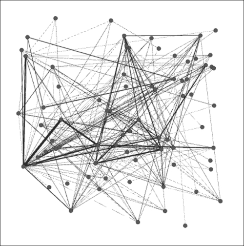
We're going to use the Les Miserables dataset again, but this time it won't be in the neat form we've previously used, but rather in a simple, unformatted version, available from the Gephi website. This can be found in the Gephi wiki under datasets in a .gml format. After opening the file in Gephi, the result is a very plain, somewhat undecipherable network:
Les Miserables .gml
Perform the following steps:
- Our first step will be to choose a layout; at this point, nearly any choice should improve the graph. We'll work with the ARF algorithm, which creates this result:
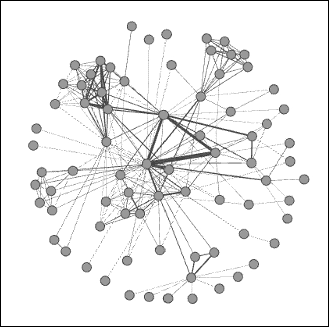
Les Miserables .gml ARF
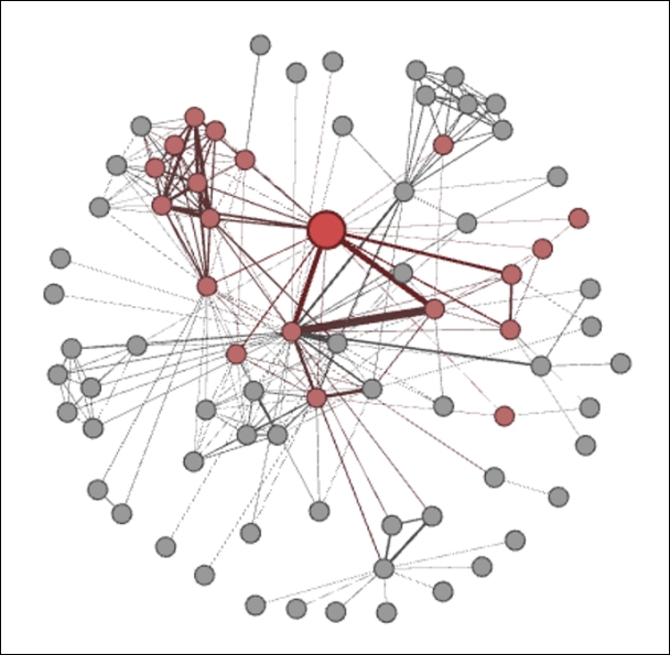
- For the second step, let's size and color a selected node; in this instance, we'll choose node 55, the character Marius (full name Marius Pontmercy). We'll assume that our story revolves around this important character, so all efforts will be made to highlight his network position and connections. These simple steps can be done by using the Sizer tool followed by the Painter tool, both located on the toolbar to the left of the Preview window:
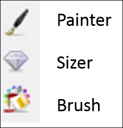
Styling elements in Gephi toolbar
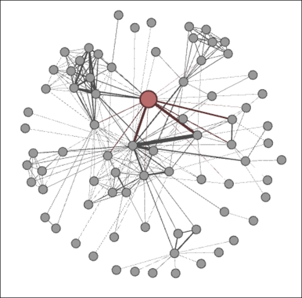
Now we at least have an element that stands out from the remainder of the network:
Les Miserables .gml ARF (Step 1)
- Marius now stands out from the remainder of the network, by virtue of his size and color, which helps to identify him from the more generic nodes that comprise the remainder of the network. Let's learn a bit more about Marius and his connections by using the Brush function, which enhances our graph even further:
Les Miserables .gml ARF (Step 2)
- All the closest neighbors of Marius are now highlighted and stand out from the remainder of the network, providing a clearer picture of his direct influence within the network.
We just created a graph that lays the foundation for a story, all in four simple steps. Imagine what you could do beyond this, using labels, shortest paths, edge coloring, and more. Remember, we haven't even ventured into any of the more sophisticated techniques, yet we have quickly created a useful network graph.