
Over the next few sections we'll walk through multiple examples using a single dataset, starting with the basic partitioning approach, followed by each of our clustering techniques discussed a moment ago. We'll then conclude the section with a recap of what we learned from these examples.
In the next several pages, we will look at some partitioning examples using a new dataset, which is a network derived from some historical baseball data, specifically involving the Boston Red Sox. This dataset covers all seasons from 1901 through 2013 and has a handful of string attributes that can be used for partitioning purposes. There are also a number of numeric variables that can be employed for filtering and other uses, but these are not available for partitioning. Here are the steps to get started:
- To download the data files, go to this location: https://app.box.com/s/177yit0fdovz1czgcecp.
- Import the files using the Gephi Data Laboratory and the Import Spreadsheet functionality. You will wind up with a node table of 1,668 records, and an edges table of more than 51,000 rows.
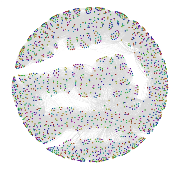
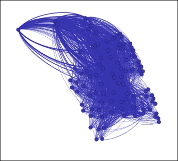
We'll work with multiple partitioning options so that you become familiar with more than one approach. Before we get into any of the partitioning examples, we should take a look at how the network sets up on its own. I will let an ARF process run for about 25 minutes to achieve the following graph, but depending on your preference (and CPU) another layout type might be preferred. I find the ARF layout ideal for visualizing relatively sparse mid-sized networks like this one as it seems to make node clusters highly visible.
Here's my initial instance of the network:
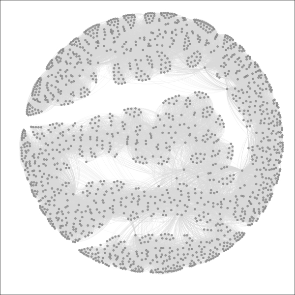
The Red Sox player network
So we have a much more complex network than we used in the previous chapters, but one that is nonetheless manageable, with fewer than 1,700 nodes. Still, this complexity level could prevent us from learning more about the network unless we elect to partition it into meaningful pieces. Let's run through a few examples for fun. If you want to follow along, just remember that you might need to reset the colors after each iteration, using the Reset Colors rectangle icon in the Overview window (you can find this icon at the bottom-left of the graph area). This will return the nodes to a single default color—the color currently seen within the rectangle. Also note that I am sharing each of these using the Preview window, which gives us more refined imagery.
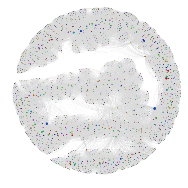
For the first case, we'll look at the Decade attribute, which informs us in which decade a player first played for the Red Sox.
Gephi will also select the colors for you, although you can modify these individually after the update has been applied. So select the Decade attribute from the Partition | Nodes tab, click on the Apply button, and have a look to see the following output:
The Red Sox player network partitioned by Decade
We now have a graph that is visually segmented into 12 groups, each representing 5 percent or more of nodes in the network. As noted a moment ago, the color legend appears in the partition window and allows you to manually edit by selecting a specific rectangle and right-clicking to load the color palette.
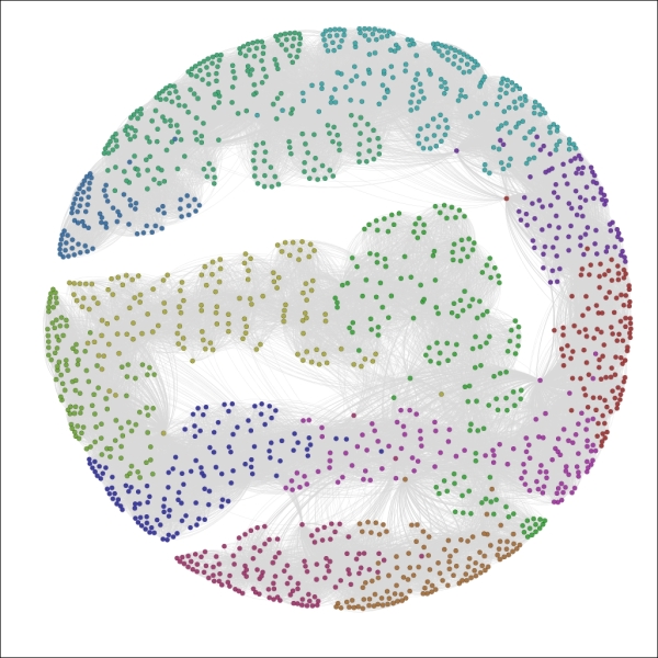
What if we prefer something other than Decades as our partitioning variable? Let's suppose that our goal is to understand birth country patterns. This can be easily done by selecting the birthCountry attribute in the Partition window, as seen in this screenshot:
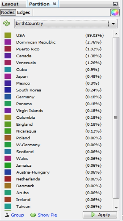
Partition results using the birthCountry attribute
Applying the settings will update the legend and graph colors to look like this:
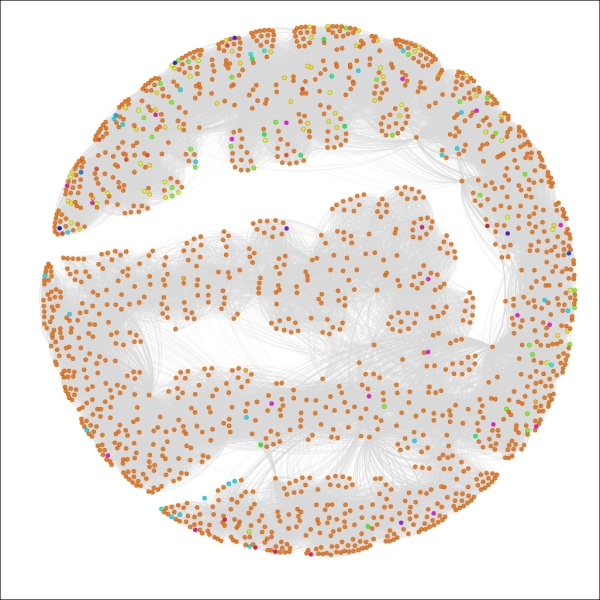
The Red Sox player network partitioned by birthCountry
We now have a graph that is dominated by a single color, as close to 90 percent of all the players in the network were born in the United States. This pattern would change significantly if we were to select only the most recent decades which have seen a major increase in the proportion of players born outside the US.
Let's have one more look, this time in an effort to understand calendar month birth patterns. To do this, select the birthMonth attribute in the Partition window, and click on Apply to see the following results:
The Red Sox player network partitioned by birthMonth
Now we can see that August (8) and September (9) appear to be the dominant birth months for Red Sox players throughout their history, while June (6) is the least likely month to produce major league baseball players, at least for the Red Sox organization.
I think you have the idea by now that partitioning in Gephi is a straightforward yet powerful process that can help us to quickly spot some patterns in our network. Go ahead and play with some other attributes if you wish, and adjust a few colors to get a feel of that process.
We'll now move on to adjusting the graph using the ranking functions, working on numerical rather than categorical attributes.
The Ranking tab, as noted earlier in this chapter, enables us to segment our graph based on the numerical values derived from data attributes and statistical measures. This method provides different results than the partitioning approach just discussed. Partitioning works on categorical values and colors the node values according to a specific value in that data field. Ranking takes a different approach by examining numerical values, and colors or sizes these values on a sliding scale without distinct breakpoints (although this can be implemented using the Spline settings, as detailed here).
To adjust the distribution of the size settings automatically, use the Spline option in the Ranking tab. This function provides multiple settings to size the nodes according to some predefined distribution curves, which can also be customized by moving the x- and y-axis settings in the Spline Editor window.
Let's look at some illustrations that are using ranking, which can then be contrasted with the examples we saw in the prior section. We'll continue using the same network graph of Red Sox players.
In cases where we intend to create custom partitions, Gephi offers the ability to use color and size options to help visually classify a network graph. This process would not fall under the usual guidelines for partitioning (or clustering, for that matter), but is simply an automated or manual means to customize your network to highlight specific patterns.
Let's suppose that we wish to draw special attention to specific elements in the graph that are not addressed through the use of partitions. You might have noticed already that partitions apply only to non-numeric elements. In this particular case, many of our most interesting data fields are integer-based, including the number of games played, home runs hit, or total bases earned. Fortunately, Gephi provides the ability to replicate partitions by ranking our graph nodes according to numeric values. We'll walk through some examples of this, sharing the resulting graphs.
A bit of a caveat before we begin—if your field type is BigInteger, you will be unable to follow this process. To rectify this, you can either make a copy of this field in the data laboratory, setting the type to Integer, or you could also recast the column (using the Recast column plugin) to the integer type.
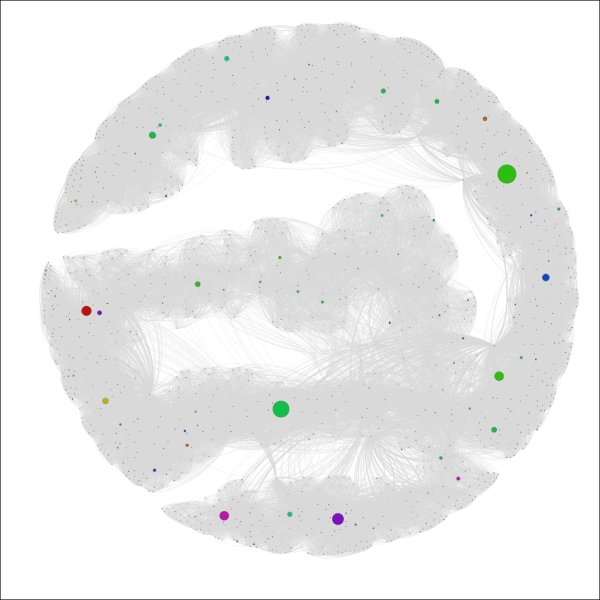
For our first instance, let's assume that we wish to see which players played the most seasons in a Red Sox uniform. Follow these steps to create a graph that is sized based on the tenure:
- Go to the Ranking tab (often at the upper-left of your screen) and select the Nodes tab.
- Choose Seasons (or whatever your equivalent integer-based field is named) from the listbox.
- Apply the sizing based on the values in the data. In this case, we have a minimum of 1 and a maximum of 23. To be consistent with good data practices, we should size the area of each circle using the radius, as opposed to the circumference, which equates to roughly a 5:1 ratio in this example (as the circle with size 1 has a radius of approximately 0.57 while the circle of size 23 has a radius of 2.7 approximately). So we'll use a minimum value of 4 and a maximum of 20 for better visibility while maintaining the 5:1 ratio.
- Apply your settings.
You should wind up with a graph that resembles the following screenshot:
The Red Sox player network ranked by seasons
We can now see a handful of nodes that stand out from the remainder of the graph based on their career longevity, as measured by seasons played. A similar approach could be applied to any integer-based data attribute in the network. One of the nice aspects of this approach is that it lets us see how our graph can change based on the application of measurable data attributes, as opposed to the categorical approach delivered by partitioning.
Let's view one more example before moving onto manual partitioning. In this case, we'll follow the same procedures we used a moment ago, replacing Seasons with 3rd_Base. Make sure your field has integer values or create a copy that does. Follow the same steps as before, but this time adjust the sizing to a minimum of 0.5 (0 is not allowed even when the data value is zero) to 44, based on the high value of 1,521. This should provide great clarity within the graph for which players had the greatest number of games at the third base position, as shown in the following screenshot:
The Red Sox player network ranked by games at third base
Now we can see very clear results, with most of the graph receding to the background while a mere handful of nodes are very prominent. This provides us with great insight into who played most often at that position, without having to deal with a lot of visual clutter. This could also be considered something of an alternative to filtering, with the difference of seeing the remainder of the graph in the background. We should also note that we could have used coloring to rank the games played—typically as a gradient ranging from light (lower values) to dark (higher values).
We have already seen two ways in which we can visually partition a graph in Gephi using built-in functionality to work on either categorical or numeric values. Let's take a brief look at a third method, one which involves a bit more manual effort to create a specific look for our graph. We'll return the graph to its original state by resetting the size and color values, resulting in an unembellished graph where all nodes have identical appearances.
For this example, let's assume that we wish to focus the reader's attention only on players who began their tenure during the 1980s. We already know that we could do this using the partitioning approach working with the Decade variable, as illustrated earlier in this chapter. That approach will give the 1980s nodes a unique color, but we want something more to draw attention to the member nodes who meet this criterion.
Here are the steps we'll follow to arrive at our goal:
- Go to the Filters | Equal | Decade filter and drag it to the Queries window. You should be familiar with this process from Chapter 5, Working with Filters.
- Enter the value
1980sand run the Select and Filter processes using the appropriate buttons. This will take our graph to an intermediate stage where only nodes that correspond to the1980sdecade value will be displayed, as shown in the following screenshot: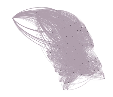
The Red Sox player network filtered by decade equal to 1980s
- Use the Rectangle selection tool from the workspace toolbar—it's represented by a dotted rectangle icon—to select all the nodes displayed on the graph. By the way, this selection will also limit the visible nodes in the data laboratory, allowing you to calculate new statistics or other actions only on the chosen nodes.
- Recolor these nodes using the Reset colors icon on the toolbar.
- Increase the node size using the Reset size icon on the same toolbar—a value of 10 should be sufficient. This results in the following output:
The Red Sox player network filtered and colored using decade equal to 1980s
- Remove the filter, and then open the graph in the Preview window to see the final result; make sure the edges color is set to use the source value:
The complete graph showing highlighted decade equal to 1980s
We now have a graph that begins to tell a story by drawing immediate visual attention to the items of interest.
We have just highlighted a few powerful methods to partition or otherwise visually segment a graph using existing or calculated data values. It's now time to take a look at another approach, wherein various Gephi plugins work to create clusters derived from the intersections of these variables and their values. The next few sections will examine some clustering approaches and the visual results they yield.
The Chinese Whispers plugin is an easy-to-use tool that creates distinct clusters from the values in our network dataset. Several options are provided that will affect the outcome of the algorithm and the resulting cluster structure. In this section, we'll first examine the available options and then work with our familiar Red Sox player network to show how the results differ depending on the settings chosen. You'll find the Chinese Whispers plugin on the Clustering tab.
Let's start by examining the available options, as shown in the screenshot:
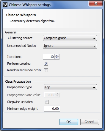
Chinese Whispers options
Starting from the top, here are the choices:
- For the clustering source, either a Complete graph or Visible graph setting can be selected. These are somewhat self-explanatory, based on whether any filters are being applied to limit the visible portion of the network.
- We can choose how to treat unconnected nodes in the case where there are multiple graph components.
- The number of iterations can be adjusted in an effort to increase accuracy. Coloring and node order options are also available.
- Four propagation options exist—Top, Distance, Log Distance, and Vote. We'll examine how they differ using the example illustrations.
- We can also select a minimum edge weight and stepwise updates.
My recommendation is to play with these settings on your own graphs to better understand the impact of each selection. We'll vary a few of these settings in the following examples to help you gain a feel of their application. Changing the propagation setting is the primary means for returning different results, so that's what we'll play with in the following example.
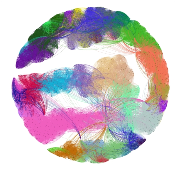
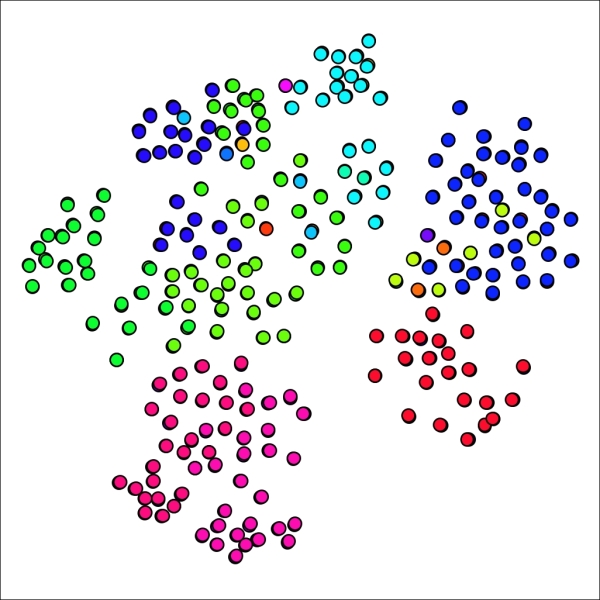
Now let's return to our base graph, with all nodes treated equally. This will give us a clean slate to start applying the clustering. For our first example, we'll use the complete graph with 10 iterations and a Top propagation type. We'll have the algorithm performing the coloring as well, since that will save us a step. Here's our result:
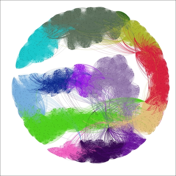
Chinese Whispers using top propagation
These settings segmented the graph into 14 distinct clusters, colored accordingly. The Top method creates clusters based on a summation of neighborhood patterns. It would be interesting to see how closely these clusters correlate with the Decade variable, as they appear to follow a roughly similar pattern.
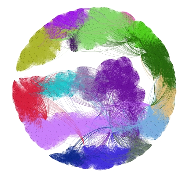
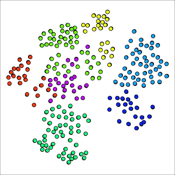
Now let's apply the Distance setting for the propagation type, and see how our graph differs:
Chinese Whispers using distance propagation
Now instead of 14 clusters, we have 42; a significant increase that might deliver a higher degree of precision for this particular network. Individual clusters range in size from just 7 nodes all the way to 104 members. The distance setting differs from the top method by looking at individual neighbors and reducing their level of influence. In this case, it feels as though the algorithm might be detecting relationships (players who played together) at a more granular-level as opposed to the broad neighborhood-based patterns of the first approach.
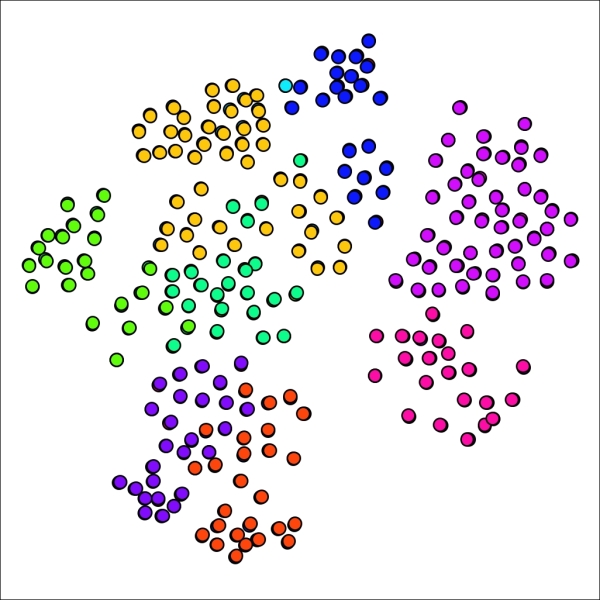
What if we use the Log Distance option? Interestingly, this returns us much closer to the first instance, as we now have 17 clusters to work with, ranging in size from 15 to 214 members. This makes sense considering that taking a log of individual distances will minimize the extreme influence of specific nodes in the network. Here's what our graph looks like using the log distance:
Chinese Whispers using log distance propagation
A cursory examination reveals that the clustering patterns for the Log Distance option resemble those from our initial top propagation.
The fourth and final method uses the Vote method, which works the same as the top approach with the exception of the use of a numerical parameter for creating class changes. In this case, setting the propagation vote value to 0.01 yields a 14 cluster result, just as we previously saw with the Top method. If we increase this value to 0.02, the resulting graph still has 14 clusters, but at 0.03, the number of clusters is reduced to just 7. At values between 0.02 and 0.03, the number of clusters will range between 7 and 14, contingent of the specific value.
If you have been following along with these examples, or using your own data in a similar fashion, you will have noticed the speed of the Chinese Whispers process. This encourages us to test and tinker with the settings to customize the number and size of clusters identified in the network.
Remember that the end goal of using a clustering approach such as Chinese Whispers is to better understand patterns and relationships within your network. For the Red Sox network we just used, each setting provided significantly different results in the number and size of clusters. There is no absolute right or wrong answer in this case—you should take a closer look at your network structure before determining which settings provided the most satisfactory results. In the above examples, I would perhaps stick to the lower-end of the cluster scale, as shown by the first and last examples (14 and 17 clusters, respectively), as the 42 clusters might be over-segmenting the network and separating nodes that should remain together.
We'll now examine an alternative clustering approach using the Markov Clustering plugin.
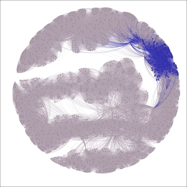
Another clustering option is found in the Markov Clustering plugin, which differs in approach from Chinese Whispers, but should yield generally similar results. We'll walk through a similar process to illustrate how to use this method. We're going to return to the primary school network for this example, as the Gephi version of this algorithm seems most effective with relatively smaller datasets, at least working with the moderate CPU and memory settings on my personal machine.
To start, select the Markov Clustering option from the Clustering tab, and click on Settings to see the default screen:
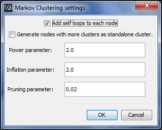
Markov Clustering options
We'll start with the default settings and then customize them to see the difference in our graph results. Here's what the defaults yield, with the edges removed from view for better visibility:
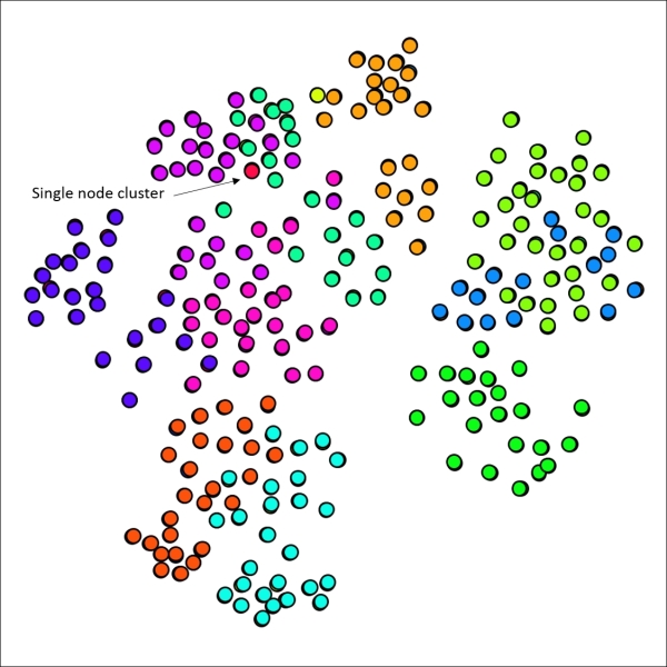
Primary school network with 12 clusters using default Markov settings
No great surprises here, as the 12 generated clusters line up reasonably well with node placement on the graph, suggesting that the school classes are highly predictive of cluster structures. There are a few spots where we might be able to improve results, such as the upper-right area which shows considerable overlap between two clusters. Note that we also have a single node cluster near the top of the graph.
Now let's adjust the settings to increase or decrease the number of clusters. There are a few ways we can achieve this goal:
- Raise or lower Power parameter
- Raise or lower Inflation parameter
- Adjust Pruning parameter to be more or less selective in determining clusters
Lowering the Power and/or Inflation parameters will yield a higher number of clusters, assuming the pruning level is left untouched. Let's start there, by changing each value from 2.0 to 1.8, while leaving the pruning parameter at 0.02. Our new graph looks a bit different, with 18 clusters, versus the 12 we had a moment ago:
Primary school network with 18 clusters using reduced power and inflation values
If you recall the graph results from our original example, you might remember that the graph had only a single cluster with just one member. In our new graph, there are five cases with a single node. Perhaps this is representative in some fashion, but it feels as though we have possibly gone too far in segmenting the graph. Let's see what happens when both the power and inflation parameters are returned to the original level while the pruning parameter is lowered to 0.015. This should result in slightly larger groups, thus decreasing the number of clusters.
Our network now has just seven clusters using this approach—we have made it easier for nodes to join existing clusters:
Primary school network with seven clusters using lower pruning setting
Our smallest cluster is now composed of 22 nodes, a far cry from the single member present earlier. We might have gone too far in the opposite direction, although the graph results display minimal overlap between clusters, generally a good indicator. Let's make one more attempt, this time setting the pruning parameter to 0.175, splitting the difference between our original and revised levels.
As anticipated, our new graph has fallen between the 7 and 12 cluster graphs, yielding nine distinct clusters in this case. What is most interesting is the return of a single cluster with just one member, providing a good illustration for just how sensitive the network can be to small parameter adjustments.
Primary school network with nine clusters after adjusting pruning setting
The Markov Clustering method is another useful tool for understanding network behavior using a clustering approach. I recommend you to adjust the settings and test results on each network you analyze, as opposed to simply relying on the default settings. Trust your eyes when comparing any clustering or partitioning results, and adjust the settings until you see something that makes visual sense.