
We've just learned about the three primary options for exporting an interactive graph to the Web. We'll walk through the process using each of the three choices. I'll also provide some examples of other graphs created using the SigmaExporter option, which I hope will give you an idea of the possibilities.
Let's begin with the Seadragon tool. If you want to follow along, make sure the plugin is installed in your version of Gephi. If not, download and install it using the Gephi plugins option from the Plugins menu under Tools. For this example, we'll use the familiar project I created that explores all 48 studio albums of jazz legend Miles Davis. The file can be found at https://app.box.com/s/177yit0fdovz1czgcecp.
Our first example will be using Seadragon. Follow the process discussed earlier to export the graph by navigating to the File | Export | Seadragon Web menu selection. Set your location, size, and margin options in the dialog screen, and create the graph. Remember that if you export the project to a local file, some browsers will not open the graph due to their restrictions on JavaScript files. If you are a Chrome user, you'll want to switch to Firefox for this example, or you can use a local web server powered by Python or Java, as two possibilities.
Let's display the finished graph in the browser:
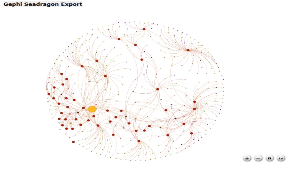
Network output in Seadragon
You can see the controls whenever you hover over the graph. The plus sign enables zooming in, while the minus sign does the reverse. The home icon will return the graph to its original centered position, and the final icon on the right lets you toggle between fullscreen and the original graph size.
Before we move on to the more powerful Sigma and Loxa options, I want to make you aware of the ability to do some style editing behind the scenes for your Seadragon file. All styling information is embedded directly in the .html file created by the Seadragon plugin, although you could create a separate CSS file to refer to if you wish. Here's what the style code snippet looked like when I first exported the above file:
<style type="text/css">
            body {
                margin: 0px;
            }
            #seadragon {
                width: 800px;
                height: 600px;
                background-color: Black;
            }
        </style>
Here you see some very simple settings that instruct the browser how to display the page—simple width, height, and background color elements. If you have experience with CSS styling, feel free to add more elements using your favorite text editor, but given the relatively limited scope of Seadragon this might not be terribly useful. Perhaps a title element and a textbox or legend would be nice, but these will be easier to implement in the Sigma and Loxa solutions.
Seadragon is a fun tool for manipulating the graph, even if it falls short of the feature sets of the Sigma and Loxa exporters. However, if you want to create a quick, simple network graph for the web browser, Seadragon might be sufficient for your needs.
Earlier we saw the many choices available for exporting a network graph using the SigmaExporter tool. Now we'll follow the process right through graph creation. We'll also use the group selection, search functionality, and information pane to learn more about the network. If you wish to follow along, make sure to install the SigmaExporter tool from the available plugins list in Gephi.
So what do we get if we just pursue the initial settings shown earlier in the chapter? Here's the result:
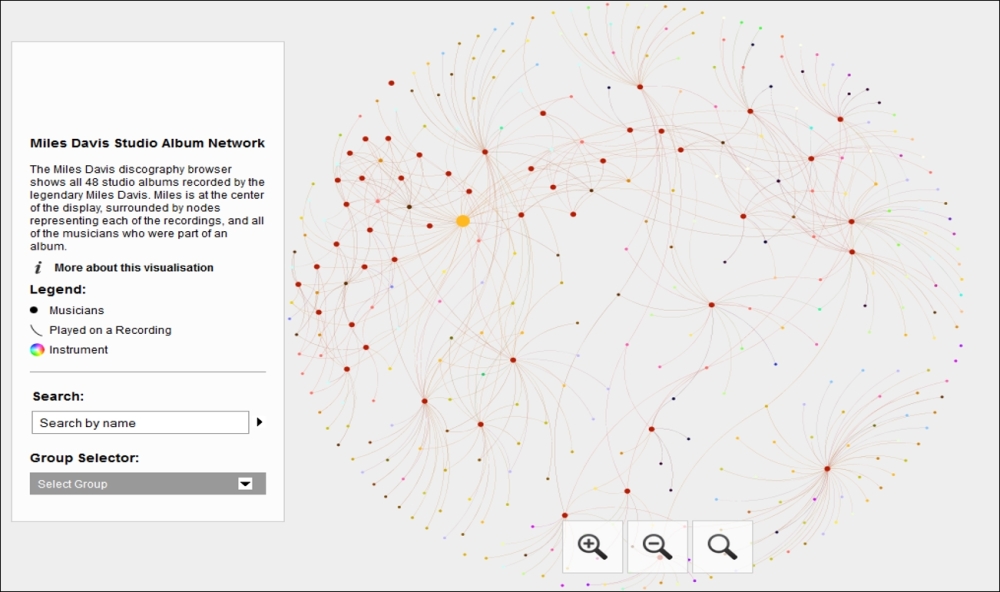
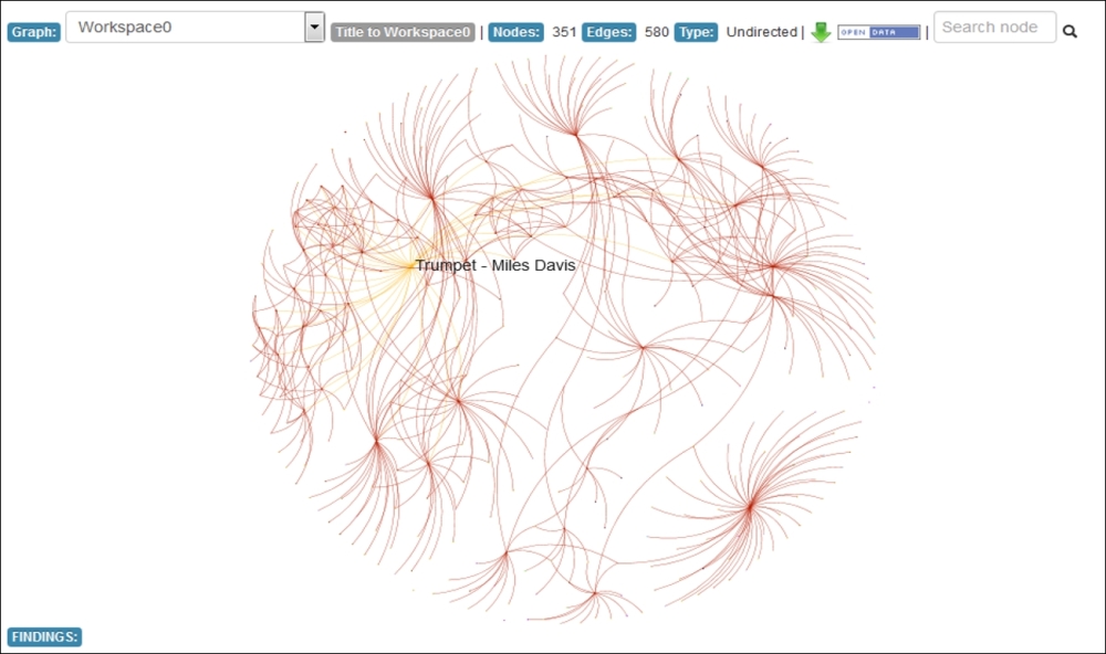
Miles Davis network in SigmaExporter
We have a nice graph that resembles what we just saw in Seadragon, but with additional information courtesy of the template we reviewed in the last section. The graph has an overview, a legend, search box, and group selector based on our partitioning decision (instruments in this case). In addition, if a user clicks on the information icon, the long description text area we saw earlier will be loaded, providing further context on the visualization. So you can begin to see the incremental power these options provide when compared with the Seadragon alternative.
Now let's see how we can tap into some of the Sigma functionality to begin traversing and filtering the network. If we click on the Group Selector drop-down menu, we'll see a host of options to choose from—in this case, they refer to specific instruments:
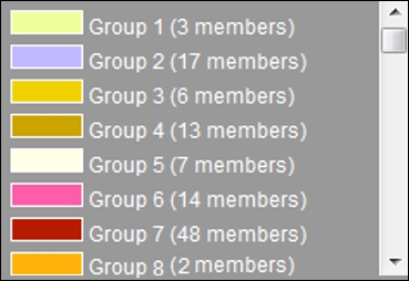
The Group Selector menu
Let's select Group 4 (13 members) and see the results in the information pane:
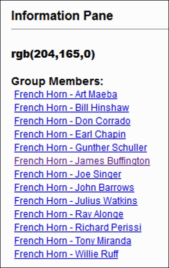
Information pane showing group results
We can now see each of the French horn players employed by Miles Davis on his albums—13 of them, as this was a commonly used instrument in some of Miles' earlier ensembles. We could select any of these musicians using either the information pane or the graph to explore the albums they played on and to which other musicians they are connected. Since this is a bipartite network, each musician is connected directly to albums only, and not other musicians. Selecting any given album will reveal all of the musicians who played on that particular recording, so it's a two-step process to see linkages between musicians.
Now let's use the search tool to learn more about a specific musician. In this example, we'll enter Wayne Shorter into the search box, which results in the following:
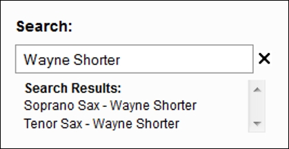
Sigma search option
We have two matches, as Wayne Shorter played both soprano and tenor saxophone on various recordings. Selecting the Soprano Sax - Wayne Shorter item results in the following information pane:
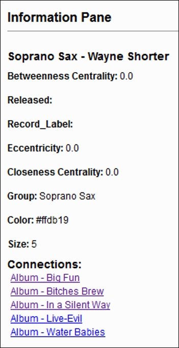
Information pane for individual musicians
Notice that some of the fields here are either empty or meaningless for our analysis. Since Wayne Shorter is a musician, the Released and Record_Label fields are null; if we select any one of the recordings in the network, those fields will be populated. Notice also that two centrality measures return values of 0; this is because of the bipartite nature of the network. We could elect to remove these fields from the final result if we so choose, by editing the underlying data.json file to remove the unnecessary elements.
We will then see the more interesting information we're after, such as the group classification, the color used for the specific group, and most importantly, each of the recordings where Wayne Shorter played soprano saxophone. Each of these album titles is clickable, which will load new information into the graph display when selected.
A moment ago, I referred to how our results would differ in the event an album (rather than a musician) was selected in the graph. Suppose we selected the album titled Walkin' by clicking on the appropriate graph node:
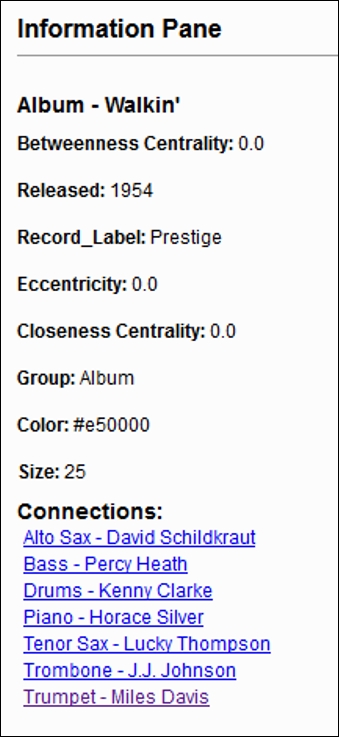
Information pane for albums
Now we will see the year the recording was released as well as the label that produced the album. We will also see each of the musicians who played on the recording, each in the form of clickable links. Selecting the Bass - Percy Heath link will then display every recording he played on, providing further insight into the network content. This ability to navigate the network from either the graph window or the information pane makes for a very powerful, easy to use visualization.
Another powerful capability within the Sigma plugin is the ability to create advanced styling. While there are a few ways to customize the output via the basic template, there are many more options behind the scenes. To access these files, go to the directory where your visualization is parked (it will be an index.html file), and locate the css folder.
Inside the css folder you will find two files—a primary file titled style.css and a second one called tablet.css. Most of your tweaking will be performed in the style.css file, where you have dozens of elements that can be adjusted. If you aren't familiar with CSS, it's worth learning the basics, as it will allow you to truly customize your output in so many ways. Let's have a look at a small snippet of CSS code from the file:
#maintitle h1 {
  display: none;
}

#mainpanel {
  margin-top: 50px;
  margin-left: 25px;
  background:#fff;
  background-color:rgba(255,255,255,0.8);
  border:1px solid #ccc;
  z-index:20;
  position:fixed;
  top:0;
}

#mainpanel .b1 {
  padding: 0px 0 0 0;
}

#mainpanel .col {
  width: 240px;
  padding: 18px 18px 18px 18px;
  margin: 0;

}

#title {
  font-weight: bold;
}

#titletext {
  padding: 6px 0 10px 0;
}
Just in these few selections you begin to get a sense of the possibilities, such as being able to customize the width, margin, and padding for your main information panel. You could also change the positioning of the panel, adjust its coloring, and decide whether to create a border surrounding the panel. This is just a very small glimpse into the style file—there are literally hundreds of adjustments you could make to create a unique look and feel for your published visualization. Even more edits can be made within the config.json and
sigma.js files, for instance. It is important to remember that any edits you make will be overwritten if you need to recreate the network, unless you create a new folder location for each version.
We just used SigmaExporter to create multiple versions of a single network graph; now we'll follow a similar process using the Loxa plugin. If you wish to create your own graphs, make sure to install the Loxa Web Site Export tool from the available plugins list in Gephi. Our primary difference for this example will be the need to edit some of the Loxa files using a text editor, so get your favorite tool ready if you wish to do a little tweaking.
If you wish to follow along, you'll need to have the Loxa plugin installed—you should find it in your available plugins directory. The export process for the tool was detailed earlier, and is just as simple as for the other web exporters. Remember that there weren't a lot of settings to modify in the dialog screen (as there were for SigmaExporter), so we're going to proceed with the default options checked. Depending on the speed of your computer and the complexity of the network, the export could range from a few seconds to upwards of a minute. Locate the exported file and open it up in a non-Chrome local browser session. The results will be along these lines:
Default Loxa display window
Your version might have a darker background; I have adjusted the background color by editing some of the inline styling within the index.html file produced by Loxa. While more than 90 percent of the styles are set using a standalone CSS file, a few of the rudimentary elements are stationed within the main page, like so:
<style type="text/css">
    label {
      display: inline-block;
      width: 5em;
    }
  /* sigma.js context : */
  .sigma-parent {
    position: relative;
    border-radius: 4px;
    -moz-border-radius: 4px;
    -webkit-border-radius: 4px;
    background: #666;
    height: 530px;
  }
  .sigma-expand {
    position: absolute;
    width: 100%;
    height: 100%;
    top: 0;
    left: 0;
  }
  .buttons-container{
    padding-bottom: 8px;
    padding-top: 12px;
  }
  </style>
The initial sigma-parent element had a background setting of #222 (almost black) which I have changed to #fff (white) for the benefit of the print settings in the book. I have also tweaked the label styling by editing the loxawebsite-0.9.1.js file (your version might differ). Node and edge styling can also be manipulated by adjusting settings within this file. Use your own discretion when making changes to the styling.
Taking a look at the Loxa display window, there are a few important items to note:
- Notice that at the top of the graph there are three tabs—the SNA page, About analysis tab, and About us page that can be customized to provide additional information about the network. The SNA page refers to the actual graph, while the About analysis tab is intended for descriptive information about the project, much as the SigmaExporter template that provided descriptive fields. Finally, the About us page serves as a placeholder for information about the authors of the visualization. We'll come back to these in our next example.
- Next, there is a graph dropdown that shows all workspaces belonging to the current project. In this case, we have but a single workspace, but Loxa can accommodate multiple instances within a single project. We will discuss more on this shortly.
- Basic network information is displayed at the top of the graph, such as the numbers of nodes and edges, and whether the network is directed or undirected.
- The download image arrow will convert the network to a PDF file for offline viewing.
- Finally, there is a search box function that assumes that the search functionality is enabled
One of the outstanding features of the Loxa tool is the ability to zoom in using the scroll wheel on your mouse. Seadragon also features this option, but Loxa adds more functionality, including the ability to see node labels at different levels. So where we saw only the Miles Davis label on the initial load, watch what happens when we begin to zoom in:
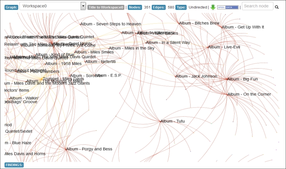
Loxa display with zoom capability
Now we are able to see each of the album titles displayed automatically, but no musicians yet as the visualization would become very crowded. Zooming in another level does just that, however, the individual musicians from each recording are now labeled along with the recordings, as shown in the following screenshot:
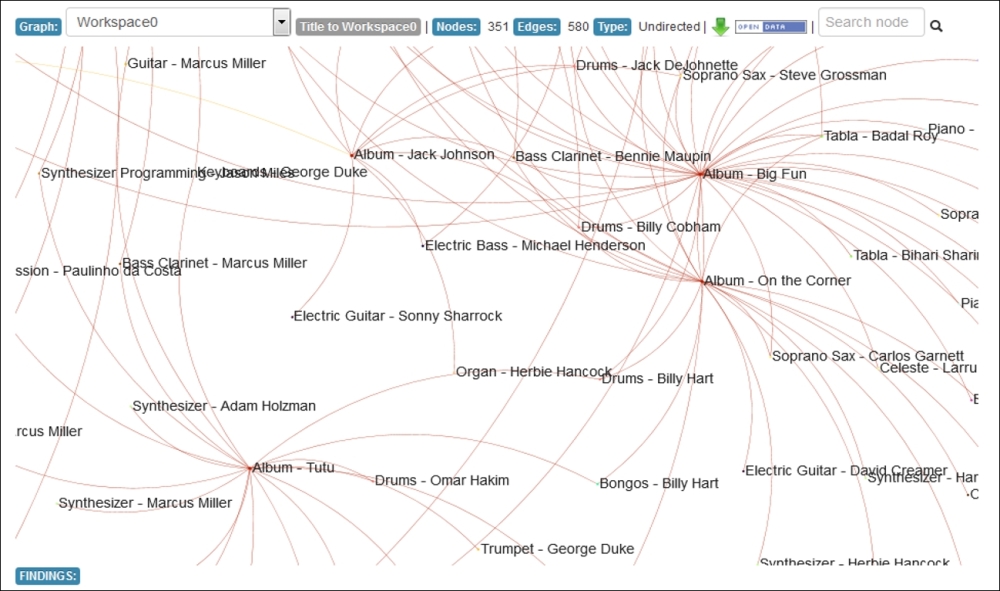
Loxa display with additional level of zoom
This capability, along with the ability to drag-and-drop the graph, makes for a very powerful, highly interactive environment that will provide a great experience for your users.
Before we conclude this chapter, I wanted to go back to a couple of the previously discussed tabs in the Loxa output and show you how these can be customized to make for a more polished visualization. In our initial example, you saw the plugin defaults, which serve as placeholders for additional information. We're now going to provide some of that information by editing the about.html and info.html files found in the project folder. These will be minor edits done in a matter of a few minutes. The capability to provide much more information is at your disposal.
Here is a look at a few of the newly customized pages, with placeholder text updated to match the project:
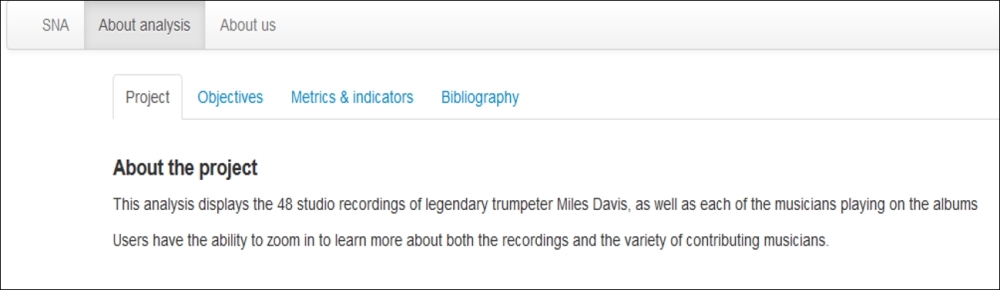
The customized About the Project page
The Objectives tab can also be customized with the goal of stating why the visualization exists, as well as any secondary aims behind the network graph:
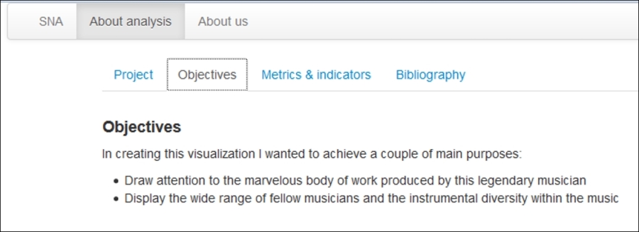
The customized Objectives page
More customization can be done on the About us tab. While I just placed a website link here, much more could be done to tell the world who you are:
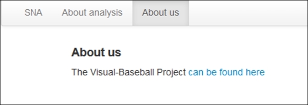
The customized About us page
The sky is the limit for customizing your Loxa project—all you need is some very basic HTML and CSS skills to create a unique, informative and interactive project.