
Now that we've dissected and improved upon some existing network graphs, the time has come to develop our own projects from scratch. This will involve a number of steps, and will allow us to fold in much of what has been covered thus far in this book. Here's a summary level synopsis for everything we'll do to create our projects—it's a long list, but you should be well prepared to handle each of these steps based on what we've covered to this point.
Here are the steps, arranged in a typical order, although some of these steps could be swapped (such as the steps involving statistics and filtering):
- First, we'll locate a dataset that is suitable for network analysis. The data might or might not be in a suitable format when we find it, which will dictate whether the next step is necessary.
- We might need to format the data so that Gephi can read it without issues. Remember that Gephi is able to handle a variety of input sources created in various graph file formats. If we are sourcing data that isn't already in one of these formats, then we'll have to create either a pair of
.csvfiles (one each for nodes and edges) or have the data available via some MySQL (or other database) tables. - When the data has been imported by Gephi, the first thing we see is a random layout. After a cursory inspection of the data in the data laboratory, we'll want to apply one of the many layout options made available in Gephi. This is typically an iterative process, as your initial selection might not deliver the results you are seeking. Stay with this process until you get something that makes you comfortable.
- After finding a suitable layout, it's time to do a visual inspection of the graph. Are there obvious patterns such as homophily, or does the network take on a more random appearance? Do we have a single giant component, or are there multiple disconnected subnetworks? Do we see obvious hubs, or are there many alternative ways to traverse the graph? Does the graph have a large or small diameter? These are just a few of the questions we should ask ourselves as we inspect the graph.
- Now we can further understand the network by employing any of the many filters provided within Gephi. These can be especially helpful when faced with a dense network, but are certainly not limited to just that condition. We can also gain insight by filtering the data based on degree levels, by classifications or partitions, or based on a combination of criteria using an intersect query.
- It's time to apply some statistical measures to the graph to help confirm our initial impressions. The centrality measures are especially important, as they will apply real numbers that can help identify the network influencers, regardless of their placement within the network. Other statistics will help confirm initial impressions about diameter, clustering, and homophily, among other measures.
- From here, we can begin segmenting and partitioning the network using a variety of tools in Gephi. This step will often highlight graph patterns through visual means such as sizing and coloring, making it easier for the graph viewer to understand the message.
- In cases where the network has some sort of time element, we can create dynamic graphs that call out temporal changes in the network. This might come in the form of a node entry and exit as time passes, or it could reflect time-driven changes in status for individual nodes. In either case, dynamic networks can convey a very powerful story to viewers.
- Our final step in most cases will be to make the graph available for external users, often through deployment to the Web. This then makes the network interactive for all users without requiring any knowledge of Gephi. In other cases, we might elect to simply share an image of the network via a
.pngfile, or we could choose to tell a story using the.svgor.pdfoutput formats.
Sounds like a lot, but as you become more comfortable with Gephi, much of this will become second nature. We're going to put this into practice by creating a pair of projects, the first a dynamic network that remains within Gephi, and the second a project that we will push to the Web for user interaction.
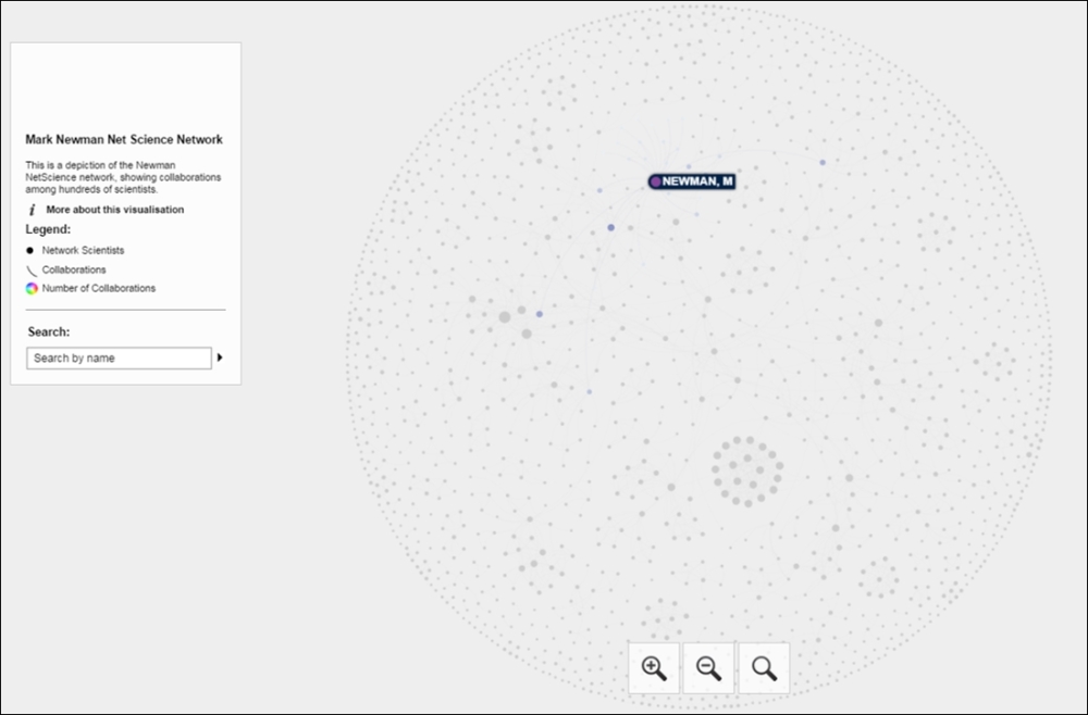
Our first example will use the NetScience dataset created by noted network scientist Mark Newman. Newman's data examines the working relationships between hundreds of academic network science practitioners through a co-authorship network. Nodes represent authors, and edges the connections between co-authors. This data can be found in multiple places on the Web, including Newman's own site. We'll begin with a .gml version of the data, which you can find at https://app.box.com/s/177yit0fdovz1czgcecp.
All that exists at the start of the project are the respective nodes and edges tables, which will give us full control over the ensuing steps. From this raw data, we will create a project that incorporates a wide range of Gephi techniques and methods, resulting in a finished network graph that tells a compelling story. We'll follow the steps outlined a moment ago, although we might make a slight detour here and there.
Once the data has been loaded in Gephi, we'll see the following network in a random layout, as provided in detail in our chapter on selecting a layout algorithm. This won't look like much, but it does provide us with enough to get underway:
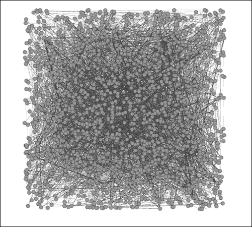
The Newman network science collaboration network
We need to get the data into some sort of layout that will help us to understand the network structure. The context window tells us that the network has 1,589 nodes and 2,742 edges; fewer than two edges per node on average. Thus, our network is not very dense, which might help point us to a specific sort of layout. We also know that the network has enough nodes to perhaps eliminate some other algorithms from consideration—a circular layout might not work effectively for displaying this network.
Given this information, I am going to begin with the ARF algorithm, which I find to be useful for small- to medium-sized networks of this sort. We'll see whether ARF effectively displays the network; if not, then another option will be considered. For instance, if our network turns out to be highly clustered, the ARF might not distinguish the clusters as well as something like Force Atlas (remember that ARF creates largely circular layouts). We'll need to make that determination after seeing the results.
After running the ARF algorithm for nearly 10 minutes (your time might vary) using the default settings, we will be able to see the following output:
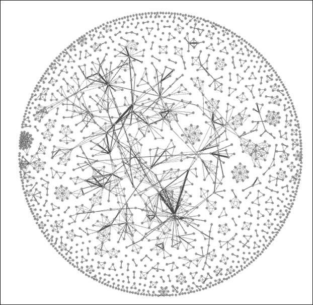
Newman network after applying the ARF layout
Based on these results, I believe we can move forward. The graph quite clearly displays a number of clusters, an indication of network scientists collaborating on projects. We also see some instances where nodes are linked to more distant members of the graph, an indication of some cross-cluster collaborations.
Something else is very clear— this is not a single connected network. Instead, there are multiple cases where smaller subnetworks exist. This is going to influence some of our statistical measures, as we'll see momentarily. For instance, there is no way to calculate a single diameter measure, as it is impossible to traverse the entire graph.
Next, let's begin using some filters to better understand the network. Here are a few questions we can attempt to answer:
- Which nodes are the most influential, as measured by degrees?
- Where are the heaviest edges an indication of frequent collaborations?
- How large is our largest connected component, and who belongs to it?
We will quickly discover an issue—there is no explicit degree measurement in our nodes table, as we had in some prior datasets. Fortunately, we have several easy ways to measure degrees. We could take the data outside of Gephi and calculate a degree value for each node, we can use the Gephi ranking function to size all nodes based on their individual degrees, or we could simply use the filters within the Topology folder to look at Degree Range. So even though we don't have an explicit field for degrees, Gephi recognizes the network structure and lets us filter using the degree attributes. We can note that the degree range runs between 0 and 34, so let's examine all the values of 15 or greater. The graph now shows just 34 nodes, roughly 2 percent of the network, clearly concentrated in three distinct areas of the network.
Now let's look at edge weights to see where the most frequent collaborations occur. In this case, the source file does provide the edge weights, making it very easy for us to filter on. We have multiple ways we can go about this, but using a range would be a sensible approach. Let's set the range to 2.0 or greater, which leaves us just 14 edges from our initial total of close to 3,000. We can easily note who the collaborators are by navigating to the edges table in Data Laboratory.
Finally, let's apply the Giant Component filter to the network to understand what proportion of the network is connected in the largest area of the graph and we will get the following result:
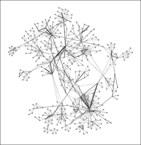
Giant component of Newman network
As you can see, there is a large connected component, but it represents just 24 percent of the entire network, suggesting a very fragmented graph with multiple pockets of isolated activity. So, fully three of every four researchers are not a part of the largest network. This could change significantly if just a few of the external nodes were to collaborate with something in the giant component, and would make for an interesting temporal study to check whether the network evolves significantly over time.
Let's apply some statistical measures to the graph to understand patterns even better. Remember our earlier mention about the difficulty of calculating diameter across the network, due to the many component groups. However, we still have the ability to run many statistical functions, but must recognize their limited meaning in certain contexts (such as a component with just five members). So our primary goal should be to examine the giant component and its member nodes, as this is where the most significant interactions are taking place.
After running a battery of statistical measures, we have the official validation for what we already suspected. Here are a few examples of the official validations:
- Graph density is 0.002, an exceptionally low figure, which confirms what we knew about the low number of connections relative to the node count
- The average clustering coefficient is 0.878, which confirms that the graph is highly clustered, something that is visually apparent
- There are 396 components in the network, which gives further evidence of the fragmented nature of the network
- The average degree is 3.45, which means that a typical member of the network has between three and four collaborations
Everything we note confirms our expectations, with no hidden surprises. Now that we've done our due diligence on the filtering and statistical fronts, it's time to make the graph more accessible and informative for users. We'll do this through the use of partitioning and segmentation, which will bring to our attention the most critical elements and patterns within the network.
For starters, we'll rank the nodes based on their degree level, which will quickly highlight some of the more evident patterns in the network. While we're at it, let's apply color using the same criteria. Set the size range between 2 and 25 and use one of the built-in color themes, and then open the Preview window for improved aesthetics. Let's increase the edge thickness to 2.0 and we see the following result:
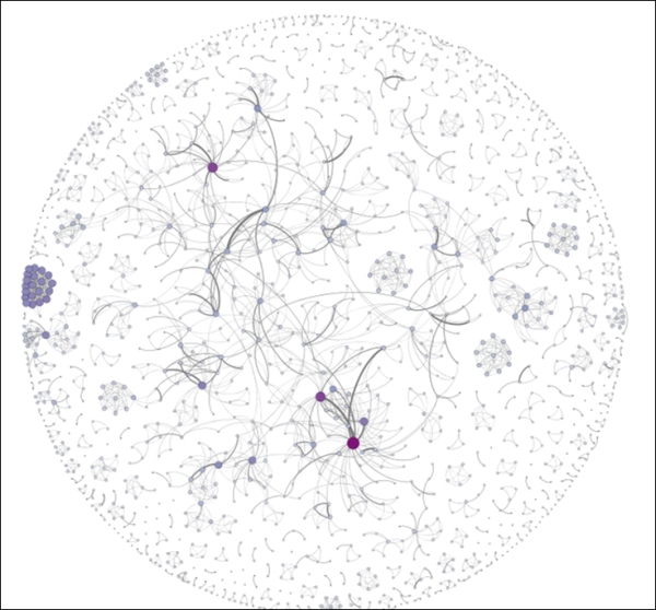
Newman network with node size and color customization
These edits call out the high degree nodes in the graph, and also help to highlight unusual patterns like the tight cluster at the left of the graph. So performing the simple ranking exercise has helped make the graph more understandable at first glance. We could have employed some other approaches to segment the graph, such as using one of the available clustering algorithms, or perhaps through the use of a partition. The latter is a bit problematic with this dataset, as we don't have any information about institutional affiliations, professional credentials, or some other unifying characteristic.
Our next step at this point is to take the graph beyond Gephi, perhaps as an image or a PDF file, or even an interactive web project. Let's make this one interactive, as it will give end users an opportunity to explore the graph and find answers to many potential questions. For this example, we'll proceed using the Sigma.js Exporter to create a straightforward interactive network for the Web.
If you are unfamiliar with the SigmaExporter process, refer to Chapter 9, Taking Your Graph Beyond Gephi, where we employed it to build our Miles Davis example for the Web. As you can recall, we used the template process to fashion an informative network about the 48 studio albums created by the pioneering musician. For our new instance, we'll need to edit the text to tell a relevant story about the network science collaboration network assembled by Newman.
I've gone ahead and edited the template settings to reflect the data in this particular network and published the graph to the Web. You can find it at:
http://visual-baseball.com/gephi/NetScience/network/
Here's a screenshot that shows the familiar layout using ARF and Sigma.js, hovering over the Mark Newman node:
Newman network on the Web using Sigma.js
If we select the same node, we'll see all of Newman's collaborators and then have the ability to view their respective connections through a simple click. This is the same approach we shared with the Miles Davis network in Chapter 9, Taking Your Graph Beyond Gephi. Here's what we get after selecting the Newman node:
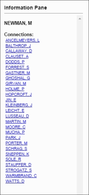
List of collaborators for M. Newman
To recap, we started with a raw graph file and wound up with an engaging, interactive graph out on the Web. Now users have the ability to easily navigate through this network, to learn more about the various collaborations as they go. Had the dataset provided the dates and titles of each of the collaborations, we could have turned this into an incredibly rich experience, but we'll have to be satisfied for the moment with this still powerful visualization.
The output files can be found at https://app.box.com/s/177yit0fdovz1czgcecp.
This gives you the ability to begin playing with the CSS styling and other settings that allow you to personalize the network.
For our second project, we're going to have some fun working with a dataset that shows interactions between students at a high school in France over the course of seven school days. The original dataset can be found and downloaded from http://www.sociopatterns.org/datasets/high-school-dynamic-contact-networks/.
The data provides a history of active contacts between individual students within a single high school, measured in 20 second intervals. As you can imagine, mapping the edges in this fashion could lead to a lot of connections appearing, disappearing, and then reappearing, making for some light entertainment without adding a lot of insight into behavioral patterns. Feel free to create your own time intervals in this fashion if you want to explore this; our finished project will take a slightly different approach.
Rather than mapping the slightly spurious 20 second connections, I wanted to view the patterns that build over the duration of the study. To do this, we will add new connections as time elapses while still retaining previously existing ones. This will give us a better idea of how patterns evolve over the course of a day or a week, while simultaneously drawing attention to frequent connections that might highlight a variety of relationships in the network.
We're going to step through the project using a number of Gephi methods to set up our working project. Once everything is in place, we're going to capture images of the network at the end of each school day to note what changes have taken place. We'll also capture some fundamental graph statistics at a macro level (feel free to explore individual students on your own) to confirm our visual impressions. Finally, we'll pull everything together in an Adobe PDF file that tells a useful story for viewers.
If you wish to start from scratch, the source node and edge files can be found at thiers_nodes.csv and thiers_edges.csv at https://app.box.com/s/177yit0fdovz1czgcecp.
Let's begin by opening the node and then the edge file using the Gephi data laboratory import spreadsheet functionality. Once the files have been imported, we need to create a time interval so Gephi can display a dynamic graph. Remember that we covered this process in Chapter 8, Dynamic Networks. In Data Laboratory, select the Merge columns icon, and then select the Start Time and End Time columns, followed by the Create time interval option from the drop-down menu. Click on OK to load this dialog screen:
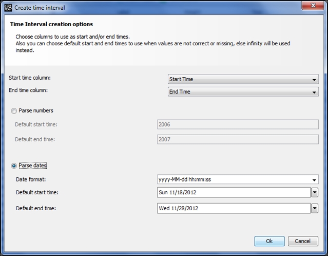
Setting time intervals by merging columns
Select the Parse dates option, and make sure that the format is entered in the same form as in the image. After clicking on the OK button, you should see an Enable Timeline icon at the bottom of the Gephi window. Selecting this will load a timeline that looks like this:
Timeline after creating time intervals
As you can see, Gephi has identified the day of the month element in the data, giving us the range of days from the 19th through the 27th of the month. You'll also see the typical random layout in the Preview window, waiting anxiously for you to provide a proper layout option. To make the project a bit more fun, hide the edges using the Show edges icon (it toggles the edges on and off) in the preview window. This way, we won't spoil the fun for the dynamic edges we'll see in a moment.
Now move to the Layout tab and select the Yifan Hu option if you wish to follow this example to the letter. Feel free to play with other algorithms if you want to create something a little different from this example—the underlying statistics and network structure will remain the same regardless of your selection. I tinkered slightly with the default settings to spread the network out just a bit:
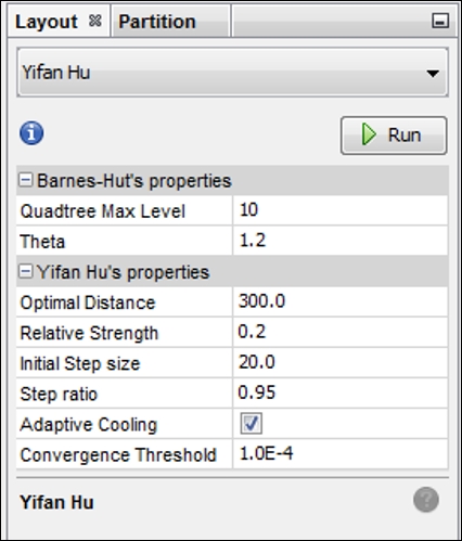
Yifan Hu settings for a dynamic high school network
Here's what the Yifan Hu yields (edges still hidden) using the settings in the prior screenshot:
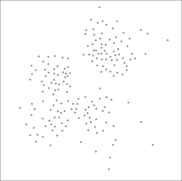
Network graph after applying the Yifan Hu layout
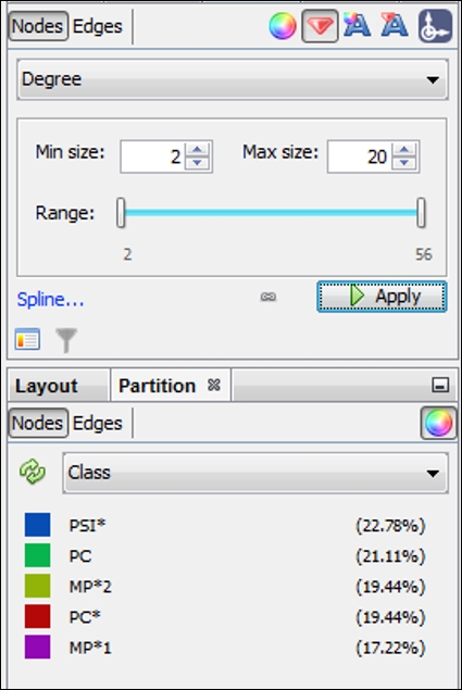
Our next step will be to size the nodes by degree and then to color them according to the Class element in the data. These steps will serve two purposes:
- Sizing will give us an indication for which nodes have the highest contact levels in the network.
- Partitioning by class will provide the formal structure of the network as defined by the school authorities. In this case, we have five classes, so the number of colors in the graph will be quite manageable.
For this example, the nodes have been given a size range of 2 to 20, as shown in the following screenshot, (actual values range from 2 to 56 degrees), which should allow us to see the higher influence members without distorting the graph or obscuring the smaller nodes:
Sizing and partitioning nodes in the high school network
After running each of these steps, we now have a graph that effectively illustrates the formal class structures while also showing the range of influence across all nodes:
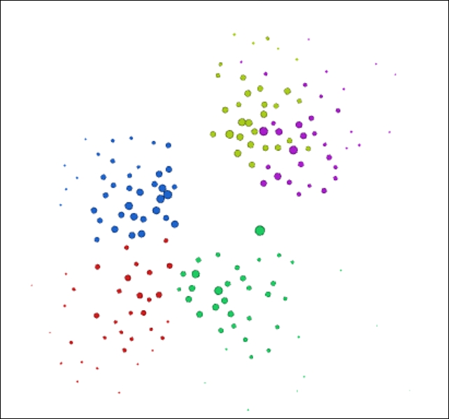
High school network colored by class partitions
It's now time to show the edges between nodes—toggle the Show edges icon to make the connections visible again. Once that's complete, move to the timeline and drag the bar to the very start of the timeline. Shrink it as far as possible, by grabbing the right edge of the bar with your mouse. This puts us at the start of the first day (the 19th). Notice that there are just a few connections showing in the overview window, that reflect the handful of students already connected early in the school day. Now let the timeline run by clicking on the arrow to the left. Watch how connections build as we move through the school week.
If you find the graph moving a little quicker than you prefer, adjust the timeline settings (covered in Chapter 8, Dynamic Networks) to the left of the arrow. Watching the network build over the course of the study period reveals patterns of how members connect within their own class as well as with nodes in other classes. In some cases, there is little interaction between members of two classes, perhaps due to the physical structure of the school building, or perhaps related to the curriculum constraints. In any case, we have a potentially interesting story we can turn into a sort of time-lapse static presentation.
In order to tell a compelling story about a dynamic network in a static format, we're going to have to provide a little more background information than in our interactive web example earlier in the chapter. We cannot afford the luxury of networks where users can zoom and pan for more information. So our approach must be slightly different, in that we have to provide users with enough information to tell the story. Everything is in our hands in this case—the user cannot craft their own story via interaction.
So what will we need to craft a compelling story? Here are a few ideas:
- Our first step will be to create snapshots of the network at the end of each school day to show how the network evolves over the study period.
- We'll also want some essential network statistics to help support the graphs, preferably in a visual format that shows the network trends.
- We might also need to provide more of a narrative than we would in an interactive network situation. As I noted a moment ago, we need to tell the story of this dynamic network.
I'm going to provide a glimpse into what the final visualization will look like. The entire PDF is available at https://app.box.com/s/177yit0fdovz1czgcecp.
Here's one of our visuals that shows the network at the end of day 1 (November 19, 2012):
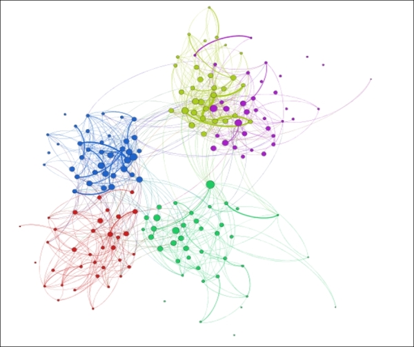
Dynamic high school network at the end of day 1, November 19, 2012
There will be a series of these visuals (one each for the 19th, 21st, 23rd, and 27th), showing the evolution of the network over the course of the study period. Viewers will be able to detect some of the changes, especially when comparing the first and last day. Yet the story would be incomplete without sharing some of the critical graph statistics that fill in the gaps. So with each end of the day snapshot, I also captured several critical network structure measures and pulled them together in a single page. This allows users to see how the network evolved, and when major changes (if any) took place:
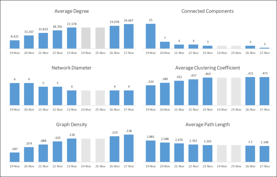
Statistical measures tracking network evolution
Notice that the two weekend days have been grayed out so as not to lead the user to the wrong conclusions. Placing all of these graphs on a single page lets the viewer see the evolution of the network in statistical terms, perhaps confirming their initial visual impression. Key changes in the network are also called out in the final visualization, completing the entire story.