
The basic statistical tools for quality control promoted by Ishikawa (1989) are widely used in manufacturing productions. They have indeed become an integral part of the quality control literature, and have been known as Ishikawa’s seven basic tools. This chapter describes the application of these tools for process and quality control in software development. There are many ways to analyze software metrics; the applications of Ishikawa’s seven tools represent a set of basic operations. Keep in mind that these statistical tools are for process and quality control at the project and organization level and, hence, are useful for project leaders and process experts. In contrast, they do not provide specific information to software developers on how to improve the quality of their designs or implementation. Also, because not all these tools are equally useful for small projects where statistical patterns of parameters of the development process are less obvious, the benefits of statistics may not be realized. The box at the end of the chapter offers specific recommendations for small teams. In addition, although the benefits of these tools have long been proved in manufacturing operations, their use and roles in software development has not been widely recognized. For instance, the use of control charts in manufacturing production can ensure a certain end-product quality once the process is defined and the control limits are set. In software development, however, the process is complex and involves a high degree of creativity and mental activity. It is extremely difficult, if not impossible, to define the process capability of software development in statistical terms. Therefore, achieving statistical process control in software development may mean a lot more than control charting. It may require, for example, new development technology, CASE tools, and the use of defect models and reliability estimating techniques. However, good use of the seven basic tools can lead to positive long-term results for process improvement and quality management in software development.
The following sections begin with a brief description of the tools, followed by a discussion of each tool with examples of its applications. Where appropriate, the influences of these tools on process improvement and on decision making are also described. The examples are either from software engineering literature or from software projects developed at IBM in Rochester, Minnesota. In addition to the seven basic tools, we discuss the relations diagram, which is effective for small team brainstorming and particularly useful in displaying cause-and-effect relationships.
Ishikawa’s seven basic tools for quality control are checklist (or check sheet), Pareto diagram, histogram, scatter diagram, run chart, control chart, and cause-and-effect diagram. Figure 5.1 shows a simple representation of the tools.
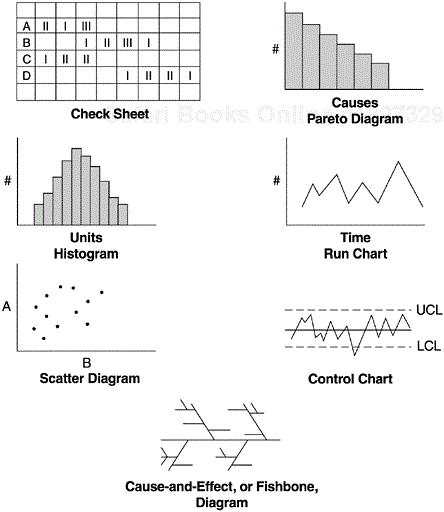
A check sheet is a paper form with printed items to be checked. Its main purposes are to facilitate gathering data and to arrange data while collecting it so the data can be easily used later. Another type of check sheet is the check-up confirmation sheet. It is concerned mainly with the quality characteristics of a process or a product. To distinguish this confirmation check sheet from the ordinary data-gathering check sheet, we use the term checklist. In most software development environments, the data-gathering aspect is automated electronically and goes far beyond the data-gathering checksheet approach, which has been used in manufacturing production. Our discussion on this tool, therefore, is confined to checklists.
A Pareto diagram is a frequency chart of bars in descending order; the frequency bars are usually associated with types of problems. It is named after a nineteenth-century Italian economist named Vilfredo Pareto (1848–1923), who expounded his principle in terms of the distribution of wealth—that a large share of the wealth is owned by a small percentage of the population. In 1950 Juran applied the principle to the identification of quality problems—that most of the quality problems are due to a small percentage of the possible causes. In software development, the X-axis for a Pareto diagram is usually the defect cause and the Y-axis the defect count. By arranging the causes based on defect frequency, a Pareto diagram can identify the few causes that account for the majority of defects. It indicates which problems should be solved first in eliminating defects and improving the operation. Pareto analysis is commonly referred to as the 80–20 principle (20% of the causes account for 80% of the defects), although the cause-defect relationship is not always in an 80–20 distribution.
The histogram is a graphic representation of frequency counts of a sample or a population. The X-axis lists the unit intervals of a parameter (e.g., severity level of software defects) ranked in ascending order from left to right, and the Y-axis contains the frequency counts. In a histogram, the frequency bars are shown by the order of the X variable, whereas in a Pareto diagram the frequency bars are shown by order of the frequency counts. The purpose of the histogram is to show the distribution characteristics of a parameter such as overall shape, central tendency, dispersion, and skewness. It enhances understanding of the parameter of interest.
A scatter diagram vividly portrays the relationship of two interval variables. In a cause-effect relationship, the X-axis is for the independent variable and the Y-axis for the dependent variable. Each point in a scatter diagram represents an observation of both the dependent and independent variables. Scatter diagrams aid data-based decision making (e.g., if action is planned on the X variable and some effect is expected on the Y variable). One should always look for a scatter diagram when the correlation coefficient of two variables is presented. As discussed in Chapter 3, this is because the method for calculating the correlation coefficient is highly sensitive to outliers, and a scatter diagram can clearly expose any outliers in the relationship. Second, the most common correlation coefficient is Pearson’s product moment correlation coefficient, which assumes a linear relationship. If the relationship is nonlinear, the Pearson correlation coefficient may show no relationship; therefore, it may convey incorrect or false information.
A run chart tracks the performance of the parameter of interest over time. The X-axis is time and the Y-axis is the value of the parameter. A run chart is best used for trend analysis, especially if historical data are available for comparisons with the current trend. Ishikawa (1989) includes various graphs such as the pie chart, bar graph, compound bar graph, and circle graph under the section that discusses run charts. An example of a run chart in software is the weekly number of open problems in the backlog; it shows the development team’s workload of software fixes.
A control chart can be regarded as an advanced form of a run chart for situations where the process capability can be defined. It consists of a central line, a pair of control limits (and sometimes a pair of warning limits within the control limits), and values of the parameter of interest plotted on the chart, which represent the state of a process. The X-axis is real time. If all values of the parameter are within the control limits and show no particular tendency, the process is regarded as being in a controlled state. If they fall outside the control limits or indicate a trend, the process is considered out of control. Such cases call for causal analysis and corrective actions are to be taken.
The cause-and-effect diagram, also known as the fishbone diagram, was developed by Ishikawa and associates in the early 1950s in Japan. It was first used to explain factors that affect the production of steel. It is included in the Japanese Industrial Standards terminology for quality control (Kume, 1989). It shows the relationship between a quality characteristic and factors that affect that characteristic. Its layout resembles a fishbone, with the quality characteristic of interest labeled at the fish head, and factors affecting the characteristics placed where the bones are located. While the scatter diagram describes a specific bivariate relationship in detail, the cause-and-effect diagram identifies all causal factors of a quality characteristic in one chart.
The checklist plays a significant role in software development. As a senior software development manager at a major software organization observed, checklists that sum-marize the key points of the process are much more effective than the lengthy process documents (Bernstein, 1992). At IBM Rochester, the software development process consists of multiple phases, for example, requirements (RQ), system architecture (SD), high-level design (HLD), low-level design (LLD), code development (CODE), unit tests (UT), integration and building (I/B), component tests (CT), system tests (ST), and early customer programs (EP). Each phase has a set of tasks to complete and the phases with formal hand-off have entry and exit criteria. Checklists help developers and programmers ensure that all tasks are complete and that the important factors or quality characteristics of each task are covered. Several examples of checklists are design review checklist, code inspection checklist, moderator (for design review and code inspection) checklist, pre-code-integration (into the system library) checklist, entrance and exit criteria for system tests, and product readiness checklist.
The use of checklists is pervasive. Checklists, used daily by the entire development community, are developed and revised based on accumulated experience. Checklists are often a part of the process documents. Their daily use also keeps the processes alive.
Another type of checklist is the common error list, which is part of the stage kickoffs of the defect prevention process (DPP). As discussed in Chapter 2, DPP involves three key steps: (1) analysis of defects to trace the root causes, (2) action teams to implement suggested actions, and (3) stage kickoff meetings as the major feedback mechanism. Stage kickoff meetings are conducted by the technical teams at the beginning of each development phase. Reviewing lists of common errors and brainstorming on how to avoid them is one of the focus areas (Mays et al., 1990).
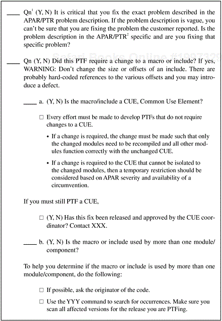
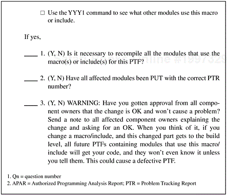
Perhaps the most outstanding checklist at IBM Rochester software development is the PTF checklist. PTF is the abbreviation for program temporary fix, which is the fix delivered to customers when they encounter defects in the software system. Defective PTFs are detrimental to customer satisfaction and have always been a strong focus area at IBM Rochester. By implementing an automated PTF checklist and other action items (e.g., formal inspection of software fixes, root cause analysis of defective fixes, and regular refresher classes on the fix process so that developers can be up to date when they need to develop and deliver a fix), IBM Rochester has reduced the percentage of defective fixes to a mimum, below the 1% level. Note that the PTF checklist is just one part of the fix quality improvement approach; however, there is no doubt it played an important role in IBM Rochester’s fix quality.
The PTF checklist was developed based on analysis of vast experiences accumulated over the years and is being reexamined and revised on a continuous basis. Starting as an online checklist, it has evolved into an automated expert system that is ingrained with the software fix process. When the fix process is invoked, the expert system automatically provides the advice and step-by-step guidance to software developers. As a result the process discipline is enforced. Figure 5.2 shows several items on the PTF checklist.
Pareto analysis helps by identifying areas that cause most of the problems, which normally means you get the best return on investment when you fix them. It is most applicable in software quality because software defects or defect density never follow a uniform distribution. Rather, almost as a rule of thumb, there are always patterns of clusterings—defects cluster in a minor number of modules or components, a few causes account for the majority of defects, some tricky installation problems account for most of the customer complaints, and so forth. It is, therefore, not surprising to see Pareto charts in software engineering literature. For example, Daskalantonakis (1992) shows an example of Motorola’s Pareto analysis for identifying major sources of requirement changes that enabled in-process corrective actions to be taken. Grady and Caswell (1986) show a Pareto analysis of software defects by category for four Hewlett-Packard software projects. The top three types (new function or different processing required, existing data need to be organized/ presented differently, and user needs additional data fields) account for more than one-third of the defects. By focusing on these prevalent defect types, determining probable causes, and instituting process improvements, Hewlett-Packard was able to achieve significant quality improvements.
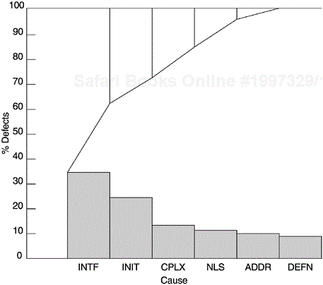
Figure 5.3 shows an example of a Pareto analysis of the causes of defects for an IBM Rochester product. Interface problems (INTF) and data initialization problems (INIT) were found to be the dominant causes for defects in that product. By focusing on these two areas throughout the design, implementation, and test processes, and by conducting technical education by peer experts, significant improvement was observed. The other defect causes in the figure include complex logical problems (CPLX), translation-related national language problems (NLS), problems related to addresses (ADDR), and data definition problems (DEFN).
Another example of Pareto analysis is the problem component analysis conducted at IBM Rochester. The AS/400 software system consists of many products and components. To ensure good return on investment in quality improvement resources, a component problem index based on three indicators was calculated for each release of the software system, and for significant improvements strong focus was placed on the problem components. The problem index is a composite index of three indicators:
Postrelease defects from the new and changed code of the release per thousand new and changed source instructions (defects of current release origin per KCSI). If the components defect rate is
the same or less than the system target, then score = 0.
higher than system target but less than twice the system target, then score = 1.
higher than or equal to twice the system target but less than three times the system target, then score = 2.
three or more times the system target, then score = 3.
All postrelease defects are normalized to the total shipped source instructions of the component (all defects per KSSI). This is the defect rate for the entire component including base code from previous releases, ported code, and new and changed code. The scoring criteria are the same as above.
Actual number of defects categorized by quartiles. If the component is in the first quartile, then score = 0, and so forth. This indicator is from the customers’ perspective because customers may not care about the lines of code for the functions and the normalized defect rates. They care about the number of defects they encounter. This indicator may not be fair to large components that will have a greater number of defects even if their defect density is the same as others. However, the purpose of the index is not for quality comparison, but to guide the improvement effort. Thus this indicator was included.
The composite component problem index ranges from 0 to 9. Components with an index of 5 and higher are considered problem components. From a Pareto analysis of a product, 27% of the components had an index of 5 and higher; they accounted for about 70% of field defects (Figure 5.4). As a result of this type of Pareto analysis, formal line items for improving problem components (e.g., component restructure, module breakup, complexity measurement and test coverage, and intramodule cleanup) were included in the development plan and have effected significant positive results.
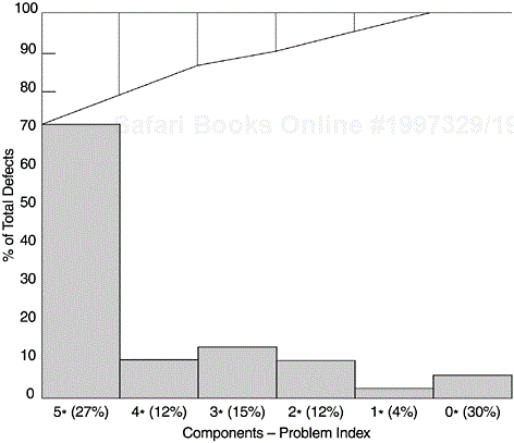
Note: Figure 5.4 is not a Pareto chart in its strict sense because the frequencies are not rank ordered. For a Pareto chart, the frequencies are always in strictly descending order, and the cumulative percentage line is a piecewise convex curve. If we take a two-category view (5* + components versus others), then it is a Pareto chart.
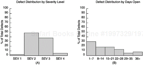
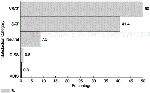
Figure 5.5 shows two examples of histograms used for software project and quality management. Panel A shows the defect frequency of a product by severity level (from 1 to 4 with 1 being the most severe and 4 the least). Defects with different severity levels differ in their impact on customers. Less severe defects usually have circumventions available and to customers they mean inconvenience. In contrast, high-severity defects may cause system downtime and affect customers’ business. Therefore, given the same defect rate (or number of defects), the defect severity histogram tells a lot more about the quality of the software. Panel B shows the frequency of defects during formal machine testing by number of days the defect reports have been opened (1–7 days, 8–14, 15–21, 22–28, 29–35, and 36+). It reflects the response time in fixing defects during the formal testing phases; it is also a workload statement. Figure 5.6 shows the customer satisfaction profile of a software product in terms of very satisfied, satisfied, neutral, dissatisfied, and very dissatisfied. Although one can construct various metrics with regard to the categories of satisfaction level, a simple histogram conveys the complete information at a glance.
As the examples show, the measurement scale of the data is either interval, ratio, or ordinal (reference the level of measurement discussions in section 3.2 of Chapter 3). If the measurement scale is nominal (e.g., types of software and models of development process), the ordering of the X-axis in a histogram no longer has significance. Such charts are commonly referred to as bar charts. Both histograms and bar charts are frequently used in software development.
Run charts are also frequently used for software project management; numerous reallife examples can be found in books and journals on software engineering. For example, the weekly arrival of defects and defect backlog during the formal machine testing phases can be monitored via run charts. These charts serve as real-time statements of quality as well as workload. Often these run charts are compared to the historical data or a projection model so that the interpretation can be placed into proper perspective. Another example is tracking the percentage of software fixes that exceed the fix response time criteria. The goal is to ensure timely deliveries of fixes to customers.
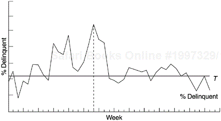
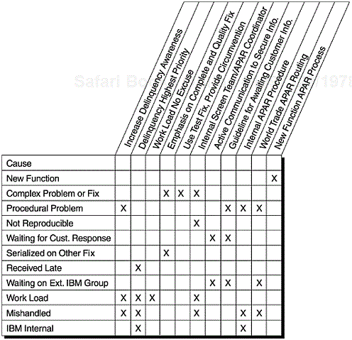
Figure 5.7 shows a run chart for the weekly percentage of delinquent open reports of field defects (defect reports that were not yet closed with fixes by the response time criteria) of an IBM Rochester product. The horizontal line (denoted by the letter T ) is the target delinquency rate. The dashed vertical line denotes the time when special remedial actions were rolled out to combat the high delinquency rate. For each delinquent defect report, causal analysis was done and corresponding actions implemented. A sample of the cause categories and the actions implemented are shown in Figure 5.8. As a result, the delinquent-defect report rate was brought down to target in about one month. The rate fluctuated around the target for about four months and eventually was brought under control. (The acronym APAR in Figure 5.8 stands for Authorized Programming Analysis Report, which refers to reports of postrelease problem.)
Another type of run chart used by many software development organizations for project and schedule management is the S curve, which tracks the cumulative progress of the parameter of interest over time compared to the plan. At IBM Rochester, parameters that are tracked for every project in terms of actual versus planned include:
Completion of design review over time
Completion of code inspection over time
Completion of code integration over time
Completion of component test in terms of number of test cases attempted and successful over time
Completion of system test in terms of number of test cases attempted and successful over time
Other parameters related to project and quality management
Compared to other tools, the scatter diagram is more difficult to apply. It usually relates to investigative work and requires precise data. It is often used with other techniques such as correlational analysis, regression, and statistical modeling.
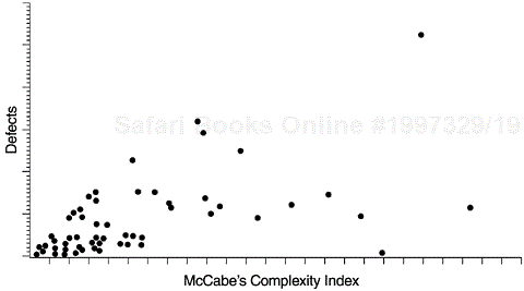
Figure 5.9 is a scatter diagram that illustrates the relationship between McCabe’s complexity index and defect level. Each data point represents a program module with the X coordinate being its complexity index and the Y coordinate its defect level. Because program complexity can be measured as soon as the program is complete, whereas defects are discovered over a long time, the positive correlation between the two allows us to use program complexity to predict defect level. Furthermore, we can reduce the program complexity when it is developed (as measured by McCabe’s index), thereby reducing the chance for defects. Reducing complexity can also make programs easier to maintain. Some component teams of the AS/400 operating system adopt this approach as their strategy for quality and maintainability improvement. Program modules with high-complexity indexes are the targets for analysis and possible module breakup, encapsulation, intramodule cleanup, and other actions. Of course, low-complexity indexes coupled with high defects are clear indications of modules that are poorly designed or implemented and should also be scrutinized.
Other examples of the scatter diagram include the relationships among defects, fan-in and fan-out, quality index of the same components between the current and previous releases, the relationship between testing defect rates and field defect rates, and so forth. We have gained insights in software quality engineering through the investigations of such relationships.
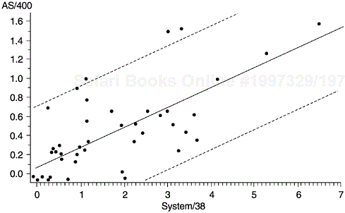
In software development, reuse is perhaps the most significant factor in improving productivity. The quality of the new software, however, is often constrained by the latent defects or design limitations in the legacy code. For the AS/400 software system, some products were developed by reusing components of products on the IBM System/38 platform. To examine the relationship of the defect rate of the reused components between the two platforms, we used the scatter diagrams. Figure 5.10 is a scatter diagram for one product. In the figure, each data point represents a component, with the X coordinate indicating its defect rate in the System/38 platform and the Y coordinate indicating its defect rate in the AS/400 platform. Although there are changes and modifications to the AS/400 product and additional reviews and tests were conducted, clearly the correlation (0.69) is quite strong. Also shown are both the linear regression line (the diagonal line) and the 95% confidence interval (area between the two broken lines).
We then proceeded to classify the scattergram into four quadrants according to the medians of the component defect rates on the AS/400 and System/38 platforms (Figure 5.11). Such classification allows different analysis and improvement strategies to be applied to different groups of components.
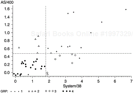
The components in the upper right quadrant (stars) are the chronic problem components. The fact that these components sustained high defect rates in spite of years of aging on the System/38 platform implies that significant actions (e.g., examination of the design structure, a rewrite of error-prone modules, etc.) need to be considered.
The components in the upper left quadrant (triangles) are components with low defect rates on System/38 but high on AS/400. The improvement strategy should focus on the nature of the enhancements on AS/400 and the process the development teams used.
Those in the lower right quadrant (circles) are the components that had high defect rates on System/38 but low on AS/400. The changes to these components for AS/400 and the actions taken during the AS/400 development should be examined to shed light for other components.
In the lower left quadrant (darkened circles) are components that have low defect rates in both platforms. The focus of analysis should be on their usage and if the usage is not low, on their design structure.
The control chart is a powerful tool for achieving statistical process control (SPC). However, in software development it is difficult to use control charts in the formal SPC manner. It is a formidable task, if not impossible, to define the process capability of a software development process. In production environments, process capability is the inherent variation of the process in relation to the specification limits. The smaller the process variation, the better the process’s capability. Defective parts are parts that are produced with values of parameters outside the specification limits. Therefore, direct relationships exist among specifications, process control limits, process variations, and product quality. The smaller the process variations, the better the product quality will be. Such direct correlations, however, do not exist or at least have not been established in the software development environment.
In statistical terms, process capability is defined:
where USL and LSL are the upper and lower engineering specification limits, respectively, sigma is the standard deviation of the process, and 6 sigma represents the overall process variation.
If a unilateral specification is affixed to some characteristics, the capability index may be defined:
where u is the process mean, or
In manufacturing environments where many parts are produced daily, process variation and process capability can be calculated in statistical terms and control charts can be used on a real-time basis. Software differs from manufacturing in several aspects and such differences make it very difficult, if not impossible, to arrive at useful estimates of the process capability of a software development organization. The difficulties include:
Specifications for most defined metrics are nonexistent or poorly related to real customer needs. Well-defined specifications based on customer requirements that can be expressed in terms of metrics are lacking for practically all software projects (more accurately, they are extremely difficult to derive).
Software is design and development, not production, and it takes various phases of activity (architecture, design, code, test, etc.) and considerable time to complete one project. Therefore, the life-cycle concept is more applicable to software than control charts, which are more applicable to sequential data from ongoing operations.
Related to the above, metrics and models specific to software and the life-cycle concept have been and are still being developed (e.g., software reliability models, defect removal models, and various in-process metrics) and they are going through the maturing process. These models and metrics seem to be more effective than control charts for interpreting the software patterns and for product quality management.
Even with the same development process, there are multiple common causes (e.g., tools, methods, types of software, types of components, types of program modules) that lead to variations in quality. The typical use of control charts in software projects regularly mix data from multiple common cause systems.
There are also the behavioral aspects of process implementation (e.g., skills, experience, rigor of process implementation) that cause variations in the quality of the product (Layman et al., 2002).
Many assumptions that underlie control charts are not being met in software data. Perhaps the most critical one is that data variation is from homogeneous sources of variation; this critical assumption is not usually met because of the aforementioned factors. Therefore, even with exact formulas and the most suitable type of control charts, the resultant control limits are not always useful. For instance, the control limits in software applications are often too wide to be useful.
Within a software development organization, multiple processes are often used, and technology and processes change fast.
Even when a process parameter is under control in the sense of control charts, without the direct connection between process limits and end-product quality, what does it mean in terms of process capability?
Despite these issues, control charts are useful for software process improvement— when they are used in a relaxed manner. That means that control chart use in software is not in terms of formal statistical process control and process capability. Rather, they are used as tools for improving consistency and stability. On many occasions, they are not used on a real-time basis for ongoing operations. They are more appropriately called pseudo-control charts.
There are many types of control chart. The most common are the X-bar and S charts for sample averages and standard deviations, and the X-bar and R charts for sample averages and sample ranges. There are also median charts, charts for individuals, the p chart for proportion nonconforming, the np chart for number nonconforming, the c chart for number of nonconformities, the u chart for nonconformities per unit, and so forth. For X-bar and S charts or X-bar and R charts, the assumption of the statistical distribution of the quality characteristic is the normal distribution. For the p and the np charts, the assumption of statistical distribution is the binomial distribution. For the c and the u charts, it is assumed that the distribution of the quality characteristic is the Poisson distribution. For details, see a text in statistical quality control (e.g., Montgomery (1985)).
The most approximate charts for software applications are perhaps the p chart, when percentages are involved, and the u chart, when defect rates are used. The control limits are calculated as the value of the parameter of interest (X-bar or p, for example) plus/minus three standard deviations. One can also increase the sensitivity of the chart by adding a pair of warning limits, which are normally calculated as the value of the parameter plus/minus two standard deviations. As the calculation of standard deviations differs among types of parameters, the formulas for control limits (and warning limits) also differ.
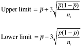
For example, control limits for defect rates (u chart) can be calculated as follows:
where ![]() , value for the center line, is the cumulative defect rate (weighted average of defect rates) across the subgroups, and ni is the size of subgroup i for the calculation of defect rate (e.g., the number of lines of source code or the number of function points). Usually the subgroups used as the unit for calculating and controlling defect rates could be program modules, components, design review sessions of similar length in time, design segments, code segments for inspections, and units of document reviews. Note that in the formula, ni is the subgroup size and therefore the control limits are calculated for each sample. Therefore the control limits will be different for each data point (subgroup) in the control chart. The second approach is to base the control chart on an average sample size, resulting in an approximate set of control limits. This requires the assumption that future sample size (subgroup size) will not differ greatly from those previously observed. If this approach is used, the control limits will be constant and the resulting control chart will not look as complex as the control chart with variable limits (Montgomery, 1985). However, if the sample sizes vary greatly, the first approach should be used.
, value for the center line, is the cumulative defect rate (weighted average of defect rates) across the subgroups, and ni is the size of subgroup i for the calculation of defect rate (e.g., the number of lines of source code or the number of function points). Usually the subgroups used as the unit for calculating and controlling defect rates could be program modules, components, design review sessions of similar length in time, design segments, code segments for inspections, and units of document reviews. Note that in the formula, ni is the subgroup size and therefore the control limits are calculated for each sample. Therefore the control limits will be different for each data point (subgroup) in the control chart. The second approach is to base the control chart on an average sample size, resulting in an approximate set of control limits. This requires the assumption that future sample size (subgroup size) will not differ greatly from those previously observed. If this approach is used, the control limits will be constant and the resulting control chart will not look as complex as the control chart with variable limits (Montgomery, 1985). However, if the sample sizes vary greatly, the first approach should be used.
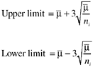
Control limits for percentages (e.g., effectiveness metric) can be calculated as follows:
where ![]() , the center line, is the weighted average of individual percentages and ni is the size of subgroup i. Like the μ chart, either the approach for variable control limits or the approach for constant control limits (provided the sample sizes don’t vary greatly) can be used. If the true value of p is known, or is specified by management (e.g., a specific target of defect removal effectiveness), then p should be used in the formulas, instead of
, the center line, is the weighted average of individual percentages and ni is the size of subgroup i. Like the μ chart, either the approach for variable control limits or the approach for constant control limits (provided the sample sizes don’t vary greatly) can be used. If the true value of p is known, or is specified by management (e.g., a specific target of defect removal effectiveness), then p should be used in the formulas, instead of ![]() .
.
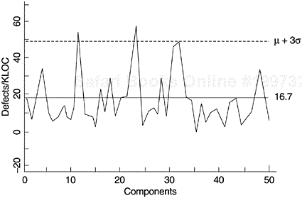
Some examples of metrics from the software development process can be control charted, for instance, inspection defects per thousand lines of source code (KLOC) or function point, testing defects per KLOC or function point, phase effectiveness, and defect backlog management index (as discussed in Chapter 4). Figure 5.12 shows a pseudo-control chart on testing defects per KLOC by component for a project at IBM Rochester, from which error-prone components were identified for further in-depth analysis and actions. In this case, the use of the control chart involved more than one iteration. In the first iteration, components with defect rates outside the control limits (particularly high) were identified. (It should be noted that in this example the control chart is one-sided with only the upper control limit.)
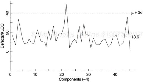
In the second iteration, the previously identified error-prone components were removed and the data were plotted again, with a new control limit (Figure 5.13). This process of “peeling the onion” permitted the identification of the next set of potentially defect-prone components, some of which may have been masked on the initial charts. This process can continue for a few iterations. Priority of improvement actions as they relate to available resources can also be determined based on the order of iteration in which problem components are identified (Craddock, 1988). At each iteration, the out-of-control points should be removed from the analysis only when their causes have been understood and plans put in place to prevent their recurrence.
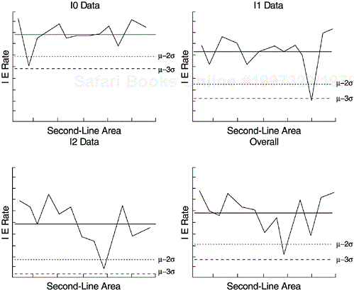
Another example, also from IBM Rochester, is charting the inspection effectiveness by area for the several phases of reviews and inspections, as shown in Figure 5.14. Effectiveness is a relative measure in percentage, with the numerator being the number of defects removed in a development phase and the denominator the total number of defects found in that phase, plus defects found later (for detailed discussion on this subject, see Chapter 6). In the figure, each data point represents the inspection effectiveness of a functional development area. The four panels represent high-level design review (I0), low-level design review (I1), code inspection (I2), and overall effectiveness combining all three phases (lower right). Areas with low effectiveness (below the warning and control limits) as well as those with the highest effectiveness were studied and contributing factors identified. As a result of this control charting and subsequent work, the consistency of the inspection effectiveness across the functional areas was improved.
In recent years, control charts in software applications have attracted attention. The importance of using quantitative metrics in managing software development is certainly more recognized now than previously. A related reason may be the promotion of quantitative management by the capability maturity model (CMM) of the Software Engineering Institute (SEI) at the Carnegie Mellon University. The concept and terminology of control charts are very appealing to software process improvement professionals. A quick survey of the examples of control chart applications in software in the literature, however, supported and confirmed the challenges discussed earlier. For instance, many of the control limits in the examples were too wide to be useful. For such cases, simple run charts with common sense for decision making would be more useful and control charts might not be needed. There were also cases with a one-sided control limit or a lower control limit close to zero. Both types of cases were likely due to problems related to multiple common causes and sample size. The multiple common cause challenge was discussed earlier. With regard to sample size, again, a production environment with ongoing operations is more able to meet the challenge. The subgroup sample size can be chosen according to statistical considerations in a production environment, such as specifying a sample large enough to ensure a positive lower control limit. In software environments, however, other factors often prohibit operations that are based on statistical considerations. At the same time, it is positive that experts have recognized the problems, begun identifying the specific issues, started the discussions, and embarked on the process of mapping possible solutions (e.g., Layman et al., 2002).
To make control charts more applicable and acceptable in the software environment, a high degree of ingenuity is required. Focused effort in the following three areas by experts of control charts and by software process improvement practitioners will yield fruitful results:
The control chart applications in software thus far are the Shewhart control charts. Alternative techniques that could be more applicable to software parameters need to be examined, experimented with, and applied. New techniques may even need to be developed. For example, the cusum (cumulative sum) control chart was developed in the 1950s as an alternative to the Shewhart approach when a small but meaningful change needs to be detected as quickly as possible (Burr and Owen, 1996; Montgomery, 1985). The cusum technique incorporates all of the information in the sequence of sample values by plotting the cumulative sums of the deviations of the sample values from a target value. It is therefore more sensitive to detect differences. The cusum control charts are used in the semiconductor industry. Would they be more applicable than the traditional control charts to the behaviors of some key parameters in software? Is cusum suitable for cases in which the process target is not a constant (e.g., a model curve)? Can control charts be applied to the S-curve type of situations that are rather common in software development (e.g., the testing progress S curves and the defect density curves that are modeled by software reliability models)? Are there better alternatives? Questions like these are important topics that need further methodology research and empirical studies.
Even the basic premise of using the 3-sigma control limits deserves a closer look. Our experience is that even for control charts that are free of problems related to multiple common causes, the 3-sigma control limits are too wide to be useful in software. Judging from some examples in the literature and personal experience, experienced practitioners would have taken actions long before the value of the metric reached the control limits. In general practice, we recommend using warning limits (such as those in Figure 5.14) in addition to control limits, and other criteria that are available in the control chart literature. When control limits are set based on larger sigma values, the risk of false alarm decreases but the control chart becomes less sensitive. On the other hand, when control limits are narrower, the control chart has more power to detect differences but the risk of false alarms becomes higher. There is a need to establish a correlation between the width of control limits and practical experiences based on empirical studies. It will be interesting to conduct experiments with a group of software quality management practitioners, who are experienced in using metrics for project management, to gauge the criteria (or thresholds) for their decision making. The subjects can be asked to assess a group of trend charts with varying degrees of deviation from the targets and to indicate at what level of deviation the cases will become alarming to them. Then control chart techniques can be applied to those charts to derive the control limits and warning limits. The control chart limits then can be correlated with the threshold values of the practitioners.
For software process improvement practitioners, the challenge is to select and develop meaningful process or quality parameters when control charts are to be used. As a hypothetical example, control charting the backlog of opened problems during the final phase of testing of the software (e.g., system test) may not be a meaningful undertaking if some or all of the following conditions are true:
Problem backlog is a function of problem arrivals, which in turn, is a function of test progress. Defect arrival pattern (cumulative form) usually follows an S-curve pattern.
The backlog and related parameters follow the life-cycle or phase concept (e.g., with start, ramp-up, plateau, and end stages). In such cases, they may not be compatible with the control charting approach. For system testing, a cycle of 3 to 4 months is normally regarded as long. Assuming week is the time unit for the control chart, the number of data points is limited. The criteria for backlog may also vary over the testing cycle. For instance, near the end of testing, the backlog criteria are normally much more stringent than at the peak of testing.
The problem fixing task is also done by the same team. In such cases, the team may adopt a strategy that optimizes the overall test process instead of imposing a constant control on one parameter such as problem backlog.
Simple trend charts of several related parameters (e.g., test progress, defect arrivals, defect backlog, and severe problems) are being shown together, with targets specified at several key dates throughout the test cycle if needed. In such cases, the multiple trend chart approach will be simpler and more effective than control charts. If the baseline trends were available for comparison, one could make inferences about the quality of the current project vis-à-vis the compatible baseline. If some form of statistical quality control is desired, a good approach would be to apply one of the software reliability growth models to project the defect arrival pattern and, based on that, to determine the backlog targets over the test cycle.
In general, data from software maintenance is easier for control charting because it meets the basic assumption of time-related sequential data. For the problem backlog example, even for software maintenance data (i.e., field problem backlog), we recommend using a metric in which the effect of a possible second common cause (such as the cyclical pattern of problem arrivals due to the delivery of new products to the customers) is partialled out. (Refer to the backlog management index discussed in section 4.3.1 in Chapter 4.)
As another hypothetical example, we suggest that metrics related to defect removal effectiveness (see discussions in Chapter 6) are candidates for control charting for software development organizations that deliver a number of products or releases of products within a relatively short period of time. In this case, each product or release is a data point in the control chart. The data is still time related and sequential but the data points are farther apart in time so one could call such charts macro-level pseudo-control charts. It is established in the software engineering literature that the higher the defect removal effectiveness, the better field quality a product will have. With a number of products or releases in the field, one can even establish an empirical correlation between the defect removal effectiveness values and actual field quality levels (use nonparametric statistics if sample size is small). The results can be used to reset the center line of the control chart. The process capability of the organization can then be measured directly and expressed in SPC languages. When the process is under control, it means that the organization is able to keep delivering products that meet certain quality levels in the field. If a software development organization developed five products and provided two releases of each product each year, in one year there would be ten data points. Therefore, it would not take long to form such a control chart. For more data points and more granular control, the unit of observation can be applied to development teams so a given project will have a number of data points. In addition to the overall defect removal effectiveness, this approach can be applied to the specific effectiveness metrics such as inspection effectiveness and test effectiveness.
As a real-life example, Lipke (2002) applied the control chart techniques successfully to two indicators in project management, based on empirical data at the Oklahoma City Air Logistics Center. The two indicators are schedule performance index (SPI) and cost performance index (CPI), which are expressed in earned value terminology in the project management literature. Simply put, the project schedule or cost is on target when the index is 1, ahead of plan when the index is higher than 1, behind plan when the index is below 1. Such control charts are meaningful because when the project is under way, as long as the two indexes are under control, the final outcome will be successful—in this case, schedule-wise and cost-wise. Lipke also made adjustments to the indexes so that the assumptions of control charts were met.
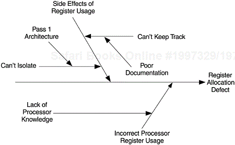
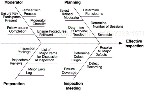
The cause-and-effect diagram is one of the less frequently used tools in software development. Perhaps the best example among fishbone diagrams is the one given by Grady and Caswell (1986). In its quality improvement effort, the development team on a Hewlett-Packard project first used a Pareto diagram and found that defects associated with register allocation were the most prevalent in their project. With the help of a cause-and-effect diagram, they conducted brainstorming sessions on those problems. As Figure 5.15 shows, they found side effects of register usage and incorrect processor register usage to be the two primary causes. Ultimately, both were found to be caused by incomplete knowledge of the operation of the registers. With this finding, that HP division took aggressive steps to provide proper training and documentation regarding registers and processors prior to subsequent projects. Figure 5.16 shows a fishbone diagram relating the key factors to effective inspections. Such a diagram was part of the process education material for a project at IBM Rochester.
Ishikawa’s seven basic tools are also called the seven old tools or the seven quality control tools. In recent years there emerged the seven new quality planning and management tools, which are the affinity diagram, the relations diagram, the tree diagram, the matrix chart, the matrix data analysis chart, the process decision program chart (PDPC), and the arrow diagram. Although discussion of these seven new tools is not in the scope of this book, it would be remiss not to mention that they may also be useful in software engineering. These seven new tools are mostly qualitative and seem more appropriate for project management and structural brainstorming. Rudisill (1992) reports that a large software development company has automated these seven new tools to facilitate the quality function deployment approach in software development and has gained positive experience, especially in gathering and verifying customers’ requirements.
One of the seven new tools that we found very useful over the years is the relations diagram. It displays complex relationships and fosters cause-and-effect thinking. It organizes information from specific to general and surfaces key causes and key effects. It differs from the cause-and-effect diagram in that it displays multiple causes and effects, whereas the cause-and-effect diagram shows one dependent variable (effect) and its cause structure. Figure 5.17 shows a schematic representation of the relations diagram.
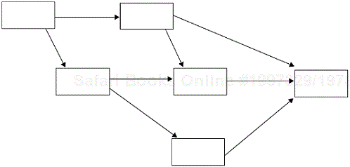
Figure 5.18 shows a loosely constructed relations diagram (which is somewhat different from the schematic representation in form). It displays the complex cause-and-effect relationships among the factors contributing to the number of customer critical situations for a software product. In this example, a critical situation occurred when a customer’s business operations were affected because of issues related to this software product and the customer filed a complaint to the organization that provided the software. The issues could be product quality, the severity and impact of specific defects, technical support issues, ways-of-doing business issues (e.g., e-business issues—business issues related to Internet and this software), and even issues related to business partners.
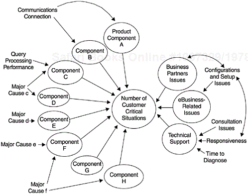
Figure 5.18. A Diagram of Complex Relationships Associated with Customer-Critical Situations of a Software Product
We found the relations diagram very appealing for complex situations like this example. It is flexible and it fits naturally with the small-team brainstorming process in problem identification and problem solving. In fact, the initial form of the diagram in Figure 5.18 was simply the result of a brainstorming session that was captured on a white board. The final form was the cumulative result of subsequent brainstorming sessions, interviews, further analysis, and verifications. The relations diagram can also be supported by quantitative data analysis. For example, the varying sizes of the circles of product components in Figure 5.18 reflect the relative contributions of these components to the number of customer critical situations. For interested experts, multivariate statistical analysis can also be performed to quantify the relationships in a relations diagram because applicable statistical techniques exist. For example, the structural equation models, or path analysis, appear to match well with the relations diagram. Even the two-way relationships among the factors in a relations diagram can be modeled via the recursive structural equation techniques (Duncan, 1975).
In recent years, there has been an emerging trend in the software industry to use scientific methods to achieve precision in managing software projects. Many quality engineering and statistical tools that have been used widely in manufacturing are gaining acceptance in software development environments. This chapter discusses the possible applications of the seven basic tools with real-life examples. In many instances, analysis based on these tools has yielded significant effects on software process improvement.
The degree of application of individual tools varies. Some have been used extensively on a daily basis; others are just now being recognized. These tools can be used with each other or with more advanced methods. For instance, the Pareto diagram, cause-and-effect diagram, and scatter diagram can be used together for identifying the dominant problems and their root causes. Control charts can be put in place to monitor process stability, or to determine whether improvements really occur after corrective actions are taken.
The seven basic tools indeed are basic tools. Their real value lies in the consistent and pervasive use by development teams for process improvement. Their impact can be enormous, especially when they are automated and become ingrained in the software development process, as demonstrated by the example of the automated fix checklist at IBM Rochester.
The control chart has been the center of interest of late, perhaps because its concepts and terminology appeal greatly to process improvement professionals. Given the state of art of this tool and, more important, the state of practice in software environments, ingenuity in both methodologies and applications is required for this tool to become a common practice. It is a useful tool for improving process consistency and stability, and therefore for long-term quality improvement.
Although the seven new quality planning and management tools are beyond the intended scope of this chapter, we include the relations diagram in our discussions. Over the years we found this tool useful for small-team brainstorming and especially for displaying the complex relationships in software environments. We highly recommend it.
Finally, statistical process control (SPC) is not limited to control charting. All the tools discussed in this chapter are important tools recognized in the SPC literature. In software development all these tools, and the many models and metrics discussed in the other chapters, will surely play an ever-increasing role in achieving SPC. We will come back to the discussion on SPC in software development in the final chapter.