
In this section:
Excel gives you lots of ways to change how your numeric data is displayed. You can change the color or font of data you want to emphasize, make your labels bold to set them apart from the body of data in your worksheets, and add graphics to establish your corporate identity. You can use totals and subtotals to summarize your data, making it easier for you and your colleagues to compare values for entire categories of data.
The limitation of working with numbers, even in summary, is that it can be difficult to keep track of several numbers at a time. If you’ve worked for several years in a package delivery company, you might know that November and December are the busiest months of the year and that February and March show the lowest package volume. If you’re presenting the results to colleagues or potential investors who are less familiar with your business, you can use charts and graphs to summarize your data visually. By summarizing your data using a chart, you make it much easier for your colleagues to see patterns and relationships.
When you enter data into a Microsoft Excel worksheet, you create a record of important events, whether they are individual product sales, sales for an hour of a day, or the price of a product. What a list of values in cells can’t communicate easily, however, are the overall trends in your data. The best way to communicate trends in large data collections is through charts and graphs, which summarize data visually.
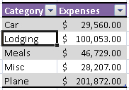
As an example of how charts and graphs can help present your data more effectively, consider the following data table, which lists the travel expenses for a company’s sales force.
In a sense, the data does speak for itself. The total expenses for each category are listed so you and your colleagues can compare them. Each number must be comprehended, remembered, and compared to the other results individually. When you present the results in a chart or graph, as is done with the following column chart, you can compare the values more readily.
If you have trouble deciding which type of chart or graph you should create, you can experiment while you build a chart. The following chart gallery explains which types of data each chart type can be used to represent effectively, but feel free to experiment!
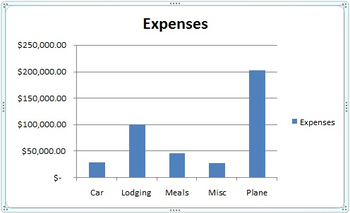
Chart Type | Use |
|---|---|
Column | Compares data in vertical format. |
Bar | Compares data in horizontal format. |
Line | Compares data in a line format. |
Pie | Compares the data in a percent format. |
Scatter Plot | Compares pairs of values in a dot format. |
Area | Compares the trend of values over time or categories. |
Doughnut | Compares multiple series of data in a percent format. |
Radar | Displays changes in values relative to a center point. |
Surface | Displays trends in values across two dimensions. |
Bubble | Compares sets of three values. |
Stock | Displays a chart to compare stock prices and quotes. |
Cylinder | Same as a column or bar chart, but a cylinder is used instead. |
Cone | Same as a column or bar chart, but a cone is used instead. |
Pyramid | Same as a column or bar chart, but a pyramid is used instead. |