
- Microsoft® Office Excel® 2007 Plain & Simple
- SPECIAL OFFER: Upgrade this ebook with O’Reilly
- Acknowledgments
- 1. Introduction: About This Book
- 2. What’s New in Excel 2007?
- 3. Getting Started with Excel 2007
- Surveying the Excel Screen
- Starting Excel
- Finding and Opening Existing Workbooks
- Using File Properties
- Creating a New Workbook
- Working with Multiple Workbooks
- Sizing and Viewing Windows
- Zooming In or Out on a Worksheet
- Viewing a Worksheet in Full Screen Mode
- Saving and Closing an Excel Workbook
- Using the Excel Help System
- 4. Building a Workbook
- Understanding How Excel Interprets Data Entry
- Navigating the Worksheet
- Selecting Cells
- Entering Text in Cells
- Entering Numbers in Cells
- Entering Dates and Times in Cells
- Entering Data with Other Shortcuts
- Creating a Data Table
- Editing Cell Contents
- Inserting a Symbol in a Cell
- Creating Hyperlinks
- Cutting, Copying, and Pasting Cell Values
- Undoing or Redoing an Action
- Finding and Replacing Text
- Checking the Spelling of Your Worksheet
- 5. Managing and Viewing Worksheets
- Viewing and Selecting Worksheets
- Renaming Worksheets
- Moving Worksheets
- Copying Worksheets
- Inserting and Deleting Worksheets
- Hiding or Showing a Worksheet
- Changing Worksheet Tab Colors
- Inserting, Moving, and Deleting Cells
- Inserting, Moving, and Deleting Columns and Rows
- Hiding and Unhiding Columns and Rows
- Entering Data and Formatting Many Worksheets at the Same Time
- Changing How You Look at Excel Workbooks
- Naming and Using Worksheet Views
- 6. Using Formulas and Functions
- Understanding Formulas and Cell References in Excel
- Creating Simple Cell Formulas
- Assigning Names to Groups of Cells
- Using Names in Formulas
- Creating a Formula that References Values in a Table
- Creating Formulas that Reference Cells in Other Workbooks
- Summing a Group of Cells without Using a Formula
- Creating a Summary Formula
- Summing with Subtotals and Grand Totals
- Exploring the Excel Function Library
- Using the IF Function
- Checking Formula References
- Debugging Your Formulas
- 7. Formatting the Worksheet
- Formatting Cell Contents
- Formatting Cells Containing Numbers
- Formatting Cells Containing Dates
- Adding Cell Backgrounds and Shading
- Formatting Cell Borders
- Defining Cell Styles
- Aligning and Orienting Cell Contents
- Formatting a Cell Based on Conditions
- Changing How Conditional Formatting Rules Are Applied
- Displaying Data Bars, Icon Sets, or Color Scales Based on Cell Values
- Copying Formats with the Format Painter
- Merging or Splitting Cells or Data
- 8. Formatting the Worksheet
- Applying Workbook Themes
- Coloring Sheet Tabs
- Changing a Worksheet’s Gridlines
- Changing Row Heights and Column Widths
- Inserting Rows or Columns
- Moving Rows and Columns
- Deleting Rows and Columns
- Outlining to Hide and Show Rows and Columns
- Hiding Rows and Columns
- Protecting Worksheets from Changes
- Locking Cells to Prevent Changes
- 9. Printing Worksheets
- Previewing Worksheets Before Printing
- Printing Worksheets with Current Options
- Choosing Whether to Print Gridlines and Headings
- Choosing Printers and Paper Options
- Printing Part of a Worksheet
- Printing Row and Column Headings on Each Page
- Setting and Changing Print Margins
- Setting Page Orientation and Scale
- Creating Headers and Footers
- Adding Graphics to a Header or a Footer
- Setting and Viewing Page Breaks
- 10. Customizing Excel to the Way You Work
- 11. Sorting and Filtering Worksheet Data
- 12. Summarizing Data Visually Using Charts
- 13. Enhancing Your Worksheets with Graphics
- Working with Graphics in Your Worksheets
- Adding Graphics to Worksheets
- Adding Drawing Objects to a Worksheet
- Adding Fills to Drawing Objects
- Adding Effects to Drawing Objects
- Customizing Pictures and Objects
- Aligning and Grouping Drawing Objects
- Using WordArt to Create Text Effects in Excel
- Inserting Clip Art into a Worksheet
- Inserting and Changing a Diagram
- Creating an Organization Chart
- 14. Sharing Excel Data with Other Programs
- 15. Using Excel in a Group Environment
- About the Author
- Choose the Right Book for You
- Index
- About the Author
- SPECIAL OFFER: Upgrade this ebook with O’Reilly
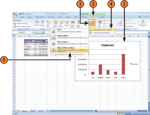
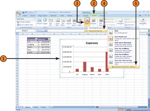
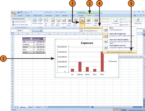
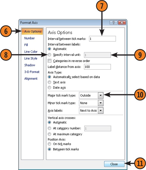
When you add labels, a legend, or annotations to a chart, you change the periphery of the chart, but you don’t affect how the data is displayed. If you do want to change how the data is displayed in the body of the chart, such as by showing or hiding grid lines or changing the scale of the chart, you can do so. Adding grid lines can help viewers make fine distinctions between values, even if they’re viewing the chart from the other end of a conference table, while changing the scale of the chart lets you heighten or downplay the differences among the chart’s values.
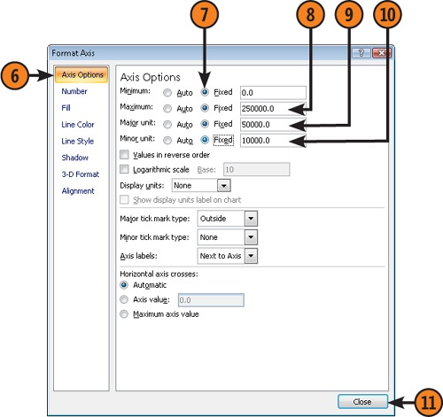
 Click the Minimum row’s Fixed option button and then type a value for the minimum value on the vertical axis.
 Click the Maximum row’s Fixed option button and then type a value for the maximum value on the vertical axis.
 Click the Major Unit row’s Fixed option button and then type a value for the major units to be displayed on the vertical axis.
 Click the Minor Unit row’s Fixed option button and then type a value for the minor units to be displayed on the vertical axis.
-
No Comment