
Chapter at a glance
Modify
Modify and change the style and color scheme of a selected chart, Creating and modifying a chart
Filter
Filter data by using a slicer to focus on a specific category of data, Adding a slicer to a PivotChart
Specify
Specify periods of time by using a timeline, Adding a timeline to a chart
Arrange
Arrange and position objects by using the drawing alignment tools, ???

IN THIS CHAPTER, YOU WILL LEARN HOW TO
Create and modify a chart.
Add a slicer to a PivotChart.
Add a timeline to a chart.
Manipulate objects.
Create and share graphics.
You may not think of Microsoft Excel as the program you go to when you need to create graphics (other than charts), but most of the graphical tools available in Microsoft PowerPoint and Word are also available in Excel. In this chapter, we’ll show you how to create charts, slicers, and timelines, and we’ll show you some tricks that have graphical consequences.
Practice Files
To complete the exercises in this chapter, you need the practice files contained in the Chapter23 practice file folder. For more information, see Download the practice files in this book’s Introduction.
Not surprisingly, charts are the most often used graphics available in Excel, complementing Excel’s number-crunching prowess. Charts can “wake up” dry numeric data, revealing underlying trends and unanticipated fluctuations that might otherwise be difficult to discern.
In this exercise, you’ll explore a new feature in Excel 2013 called Recommended Charts that makes the process of adding a relevant graphic just a little bit easier. After you create it, you’ll use some new chart-formatting controls to modify it.
Set Up
You need the FabrikamSalesTable_start.xlsx workbook located in the Chapter23 practice file folder to complete this exercise. Open the FabrikamSalesTable_start.xlsx workbook, and save it as FabrikamSalesTable.xlsx.
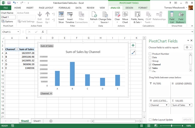
In the FabrikamSalesTable.xlsx workbook, make sure that cell A2 is selected (or any cell within the table).
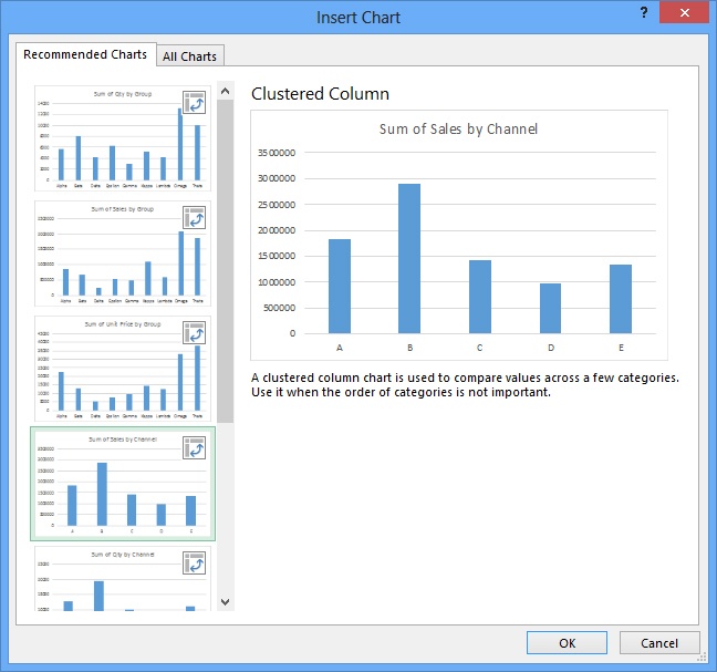
Click the Insert tab, and then in the Charts group, click Recommended Charts to display the Insert Chart dialog box with the Recommended Charts tab selected.
Select the fourth thumbnail, Clustered Column, in which the chart title reads Sum of Sales by Channel. Excel automatically determined that a PivotTable can be used to analyze this data; six of the seven charts offered are PivotCharts, as indicated by the “pivot” icons displayed in the upper-right corner of each thumbnail.
Click OK, and you’ll notice that Excel creates a new worksheet, inserts a PivotChart and a PivotTable, displays the PivotChart Fields pane, and displays three PivotChart Tools tabs on the ribbon.
In the PivotChart Fields pane, select the Group check box.
Clear the Channel check box. You’ll notice that both the PivotTable and the PivotChart change accordingly, although the chart title is now incorrect.
Close the PivotChart Fields pane by clicking the close button (the X in the upper-right corner).
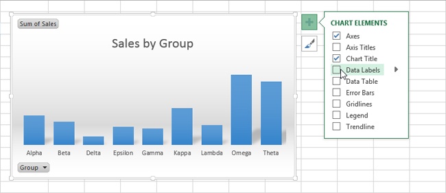
Click the chart title to select it.
Enter Sales by Group; the title does not appear to change, but the text appears in the formula bar as you enter it.
Press the Enter key, and the text in the title changes to match the text in the formula bar.
Click in the white area next to the chart title to deselect it.
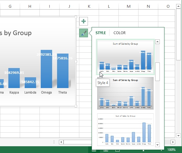
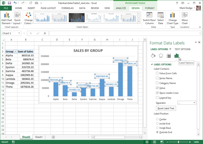
Click the Chart Styles button to display the Style menu.
Move the pointer over any thumbnail to view a live preview of that style displayed on your PivotChart.
Click Style 4, a chart with 3-D shading, and then click the Chart Styles button again to dismiss the pane.
With the chart selected, click the Chart Elements button (the plus sign button above the Chart Styles button) to display its menu.
Clear the Data Labels check box; the sales totals disappear.
Click the chart to select it.
Click the PivotChart Tools Analyze tab.
Click the Field Buttons button in the Show/Hide group to hide the two grey buttons labeled Sum of Sales and Group that are displayed on the chart.
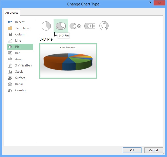
Click the PivotChart Tools Design tab.
Click the Change Chart Type button in the Type group.
Click Pie and then click the second pie type (3-D Pie) from the sketches displayed across the top of the Change Chart Type dialog box.
Click OK.
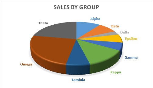
Click the Chart Styles button and select Style 8, a solid 3-D chart with rounded edges.
Click the Chart Styles button again to dismiss the menu.

Tip
3-D charts are great for presentations and publications, but when accurate representation of relative values is more important than cosmetics, use 2-D charts. The foreshortening that is applied to achieve the 3-D effect distorts the shape of the chart. Areas that appear “closer” seem proportionally larger.
The cryptically named slicers feature was introduced in Excel 2010 for exclusive use with PivotTables, but new in Excel 2013, you can also use them with any kind of data table as well. Slicers are interactive filters that make it easy to determine both the cause and the result of changes in your worksheet, PivotTable, or PivotChart.
In this exercise, you’ll add a simple slicer to a PivotChart.
Set Up
You need the FabrikamSalesTable2_start.xlsx workbook located in the Chapter23 practice file folder to complete this exercise. Open the FabrikamSalesTable2_start.xlsx workbook, and save it as FabrikamSalesTable2.xlsx.
In the FabrikamSalesTable2.xlsx workbook, click the chart to activate all the context-sensitive tools and tabs.
Click the PivotChart Tools Analyze tab.
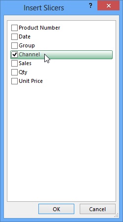
Click the Insert Slicer button in the Filter group; a dialog box of the same name appears.
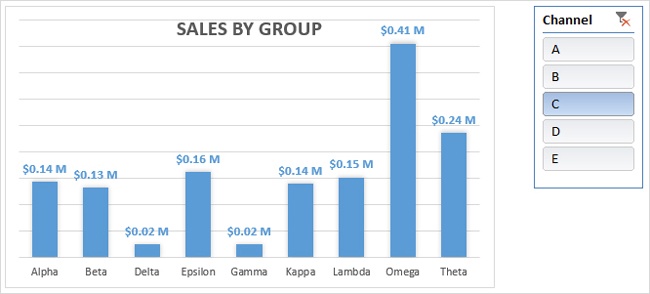
Select the Channel check box.
Click OK to dismiss the Insert Slicers dialog box.
Drag the Slicer box to the side, away from the chart. (We also resized the box a bit by dragging the square handles.)
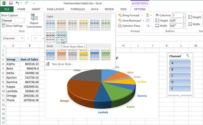
Click the Slicer Tools Options tab that appeared on the ribbon after you created the slicer.
Click the More button (the downward-pointing fast-forward button) in the lower-right corner of the Slicer Styles palette to open it.
In the Slicer Styles palette, click the thumbnail called Slicer Style Other 2.
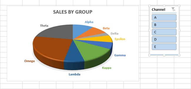
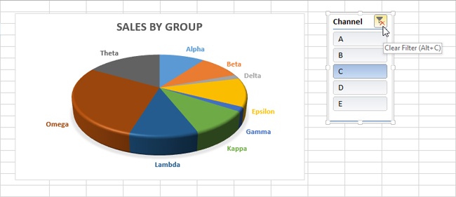
Click the C button in the slicer box to display the result in the chart. After you click, only the sales made through Channel C are represented, the C button is highlighted, and the Clear Filter button in the upper-right corner of the slicer box becomes active.
Click the other slicer buttons and notice the resulting changes made to the chart.
Click the Clear Filter button.
After you create a chart, there is a lot you can do to change it. Sometimes it takes experimentation to arrive at the perfect chart that highlights salient information in a way that gets your point across. When a chart is selected, Excel provides many tools you can use to modify it, including context-sensitive tabs that appear on the ribbon, and the Chart Elements and Chart Styles buttons that appear adjacent to a selected chart.
In this exercise, you’ll try using additional chart elements to look at your data in a different way.
Set Up
You need the FabrikamSalesTable3_start.xlsx workbook located in the Chapter23 practice file folder to complete this exercise. Open the Fabrikam-SalesTable3_start.xlsx workbook, and save it as FabrikamSalesTable3.xlsx.
In the FabrikamSalesTable3.xlsx workbook, click the chart to activate the context-sensitive chart tools and tabs.
Click the PivotChart Tools Design tab.
Click the Change Chart Type button in the Type group.
Click Column, and then click OK.
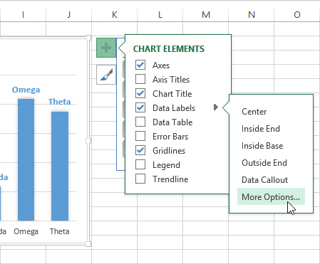
Click the Chart Elements button, point to Data Labels, and then click the small arrow that appears to the right of the option to display the submenu.
In the Label Options section of the pane, select the Value check box, and clear the Category Name check box.
Dismiss the Format Data Labels pane by clicking its close button.
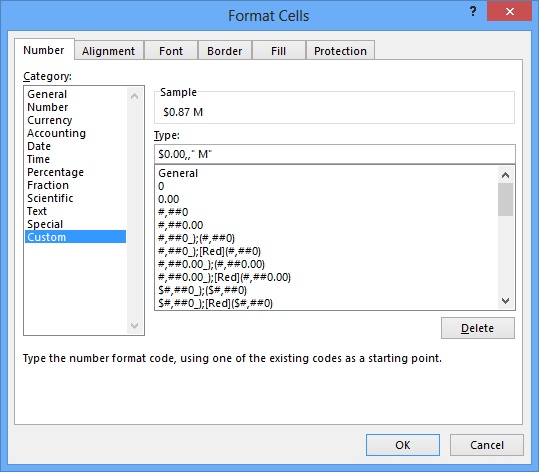
On the worksheet, select all the cells in column B containing values, cells B4:B12; you’ll apply a format that scales them appropriately, so that they won’t take up quite as much space on the screen—for example, using $1.00 M instead of $1,000,000.00.
Press Ctrl+1 to display the Format Cells dialog box, and click the Custom category.
In the Type box, drag through the existing code to select it, and replace it by entering $0.00,,” M”
Tip
In a custom number format code, putting a comma between digit placeholders tells Excel to include thousands separators. But if you put a comma following digit placeholders, Excel scales the number by a multiple of one thousand. Adding one comma scales the number to thousands, adding two commas scales the number to millions, and so on. For example, the format code 0.0,K would display the entry 12345 in thousands as 12.3K.
See Also
For more information about number formatting codes, see Chapter 21.
Click in a blank area of the chart to activate it.
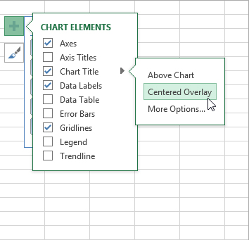
Click the Chart Elements button, point to Chart Title, and then click the small arrow that appears to the right of the option to display the submenu.
Click the Centered Overlay option, which allows the columns to sit a little taller in the chart.
With the Chart Elements menu still visible, point to Axes, and then click the small arrow that appears to the right of the option to display the submenu.
Clear the Primary Vertical check box.
Click the Chart Elements button to dismiss the menu.
Click cell A1 on the worksheet to dismiss the chart controls and PivotChart Tools tabs.
Click the View tab on the ribbon and clear the Gridlines check box in the Show group.
Click the C button in the slicer box.
Click the other slicer buttons and notice the resulting changes made to the chart.
Click the Clear Filter button.
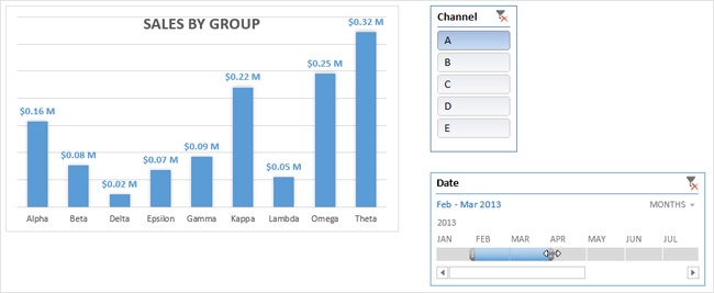
Especially when using slicers, this column chart works better than the original pie chart to visualize the sales of each product group and display the differences among channels.

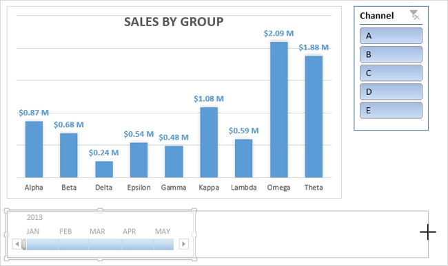
If your data includes dates, you can use Excel’s new timeline feature to zero in on specific time periods, much like the slicer feature allows you to zero in on specific categories of data.
In this exercise, you’ll add a timeline to your evolving chart.
Set Up
You need the FabrikamSalesTable4_start.xlsx workbook located in the Chapter23 practice file folder to complete this exercise. Open the Fabrikam-SalesTable4_start.xlsx workbook, and save it as FabrikamSalesTable4.xlsx.
Click the chart to activate the context-sensitive chart tools and tabs. (You may notice that the PivotTable is no longer visible on the worksheet. It was moved out of the way, to cells X67:Y76.)
Click the A button in the slicer box to display only sales through Channel A.
Click one of the borders of the chart to select it; three PivotChart Tools tabs—Analyze, Design, and Format—appear on the ribbon.
Click the PivotChart Tools Analyze tab.
Click the Insert Timeline button in the Filter group, and then click the Date option (the only option available in the dialog box) to select it.
Click the OK button to create a timeline box; it will most likely appear on top of the chart.
Drag the timeline box to the side, out of the way.
Click in the worksheet to deselect the chart and timeline box.
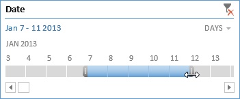
Click the scroll bar at the bottom of the timeline box and drag it to the left so that JAN is visible.
Click the segment of the timeline bar below FEB to select it, and watch while the chart adjusts to display only February sales.
Drag the handle on the right side of the FEB timeline bar segment to expand the timeframe to include MAR.
At this point, you have isolated the data displayed on the chart to include only those sales from Channel A that occurred in February and March.
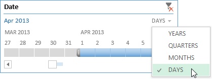
Click the APR timeline bar segment and notice that the chart goes blank, reminding you that data only exists for the first three months of the year in this particular workbook.
In the timeline box, click the small arrow adjacent to the word Months to display its menu, and click Days. Notice that the timeline bar now displays a separate bar segment for each day.
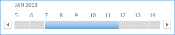
Scroll back to January and click the Jan 7 segment on the timeline bar.
Click the handle on the right side of the selected timeline bar, and drag it to the right until January 7th through January 11th is selected.
The chart changes to display only the selected data.
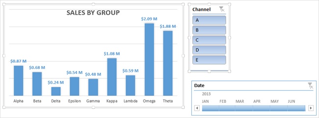
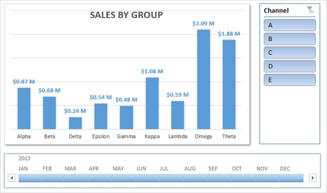
Make sure that the Timeline Tools Options tab on the ribbon is selected.
In the Show group, clear all four check boxes (Header, Scrollbar, Selection Label, and Time Level).
These options are useful for cleaning up the layout and helping to limit user modifications.
In the Show group, select the Header check box (displaying the Clear Filter button).
Click the Clear Filter buttons in both the slicer box and the timeline box.

So far in this chapter, you have created three objects: a PivotChart, a slicer box, and a timeline box. Essentially, anything that does not go into a cell is an object that “floats” above the worksheet. Most of the tools on the Insert tab create objects, including shapes, SmartArt, WordArt, text boxes, and pictures.
When you click an object to select it, the appropriate tabs appear on the ribbon containing tools you can use to format and manipulate the object. An additional Drawing Tools Format tab appears whenever you select more than one object (by holding down the Shift key and selecting multiple objects); this tab contains tools for grouping, stacking, and aligning objects.
In this exercise, you’ll rearrange objects and do a little resizing and formatting, as well.
Set Up
You need the FabrikamSalesTable5_start.xlsx workbook located in the Chapter23 practice file folder to complete this exercise. Open the Fabrikam-SalesTable5_start.xlsx workbook, and save it as FabrikamSalesTable5.xlsx.
In the FabrikamSalesTable5.xlsx workbook, click one of the borders of the chart to select it.
Hold down the Shift key and click the slicer box to add it to the selection; thick borders appear around both selected objects.
Click the Drawing Tools Format tab that appears on the ribbon.
Click the Align Objects button in the Arrange group and click the Align Top command. The tops of the two objects are now aligned. (The Align Objects button is labeled Align if your screen is wide enough to display it. But when you point to it, the ScreenTip says Align Objects.)
Click the timeline box, and then drag it below the chart.
Clear the Header check box in the Show group (which makes the timeline box narrower).
Press the Shift key and click the chart to add it to the selection; thick borders appear around both selected objects.
Click the Drawing Tools Format tab that appears on the ribbon.
Click the Align Objects button in the Arrange group, and then click the Align Left command. The left sides of the two objects are now aligned.
Click anywhere in the worksheet to deselect the two objects.
Click the timeline box.
Click the center square handle on the right side of the timeline box and drag it to the right to make it wider, until it is a little too wide; past the edge of the slicer box above it.
With the timeline box still selected, press Shift and click the slicer box to add it to the selection; thick borders appear around both selected objects.
Click the Drawing Tools Format tab that appears on the ribbon.
Click the Align Objects button in the Arrange group and then click the Align Right command; all the outside edges of the three objects should now be aligned.
Click anywhere in the worksheet to deselect the objects.
Click the lower-left square handle and drag it down and adjust until the bottom edge is lined up with the bottom edge of the chart.
Click the border of the chart to select it.
Click the PivotChart Tools Format tab that appears on the ribbon.
Click the Shape Effects button in the Shape Styles group, click Shadow, and then click the first option in the Outer section (Offset Diagonal Bottom Right).
Click in the worksheet to deselect the objects.
Excel probably doesn’t immediately come to mind when you need to do some graphic design work, but why not? Excel has the same drawing tools that are available in other Microsoft Office applications, including Microsoft Word and Publisher. Excel workbooks can contain multiple sheets, which can be handy for filing graphic elements or sketches into categories. And of course, Excel doesn’t only offer a drawing-grid feature; Excel is a grid that you can adjust.
Although no Office application will replace a dedicated graphics program, there’s still a lot you can do with Excel, and you won’t have to trek a steep learning curve to do it.
In this exercise, you’ll take advantage of a few essential object-manipulation tricks as you create a simple logo.
Set Up
You need the FabrikamLogo_start.xlsx workbook located in the Chapter23 practice file folder to complete this exercise. Open the FabrikamLogo_start.xlsx workbook, and save it as FabrikamLogo.xlsx.
In the FabrikamLogo.xlsx workbook, click the Insert tab on the ribbon.
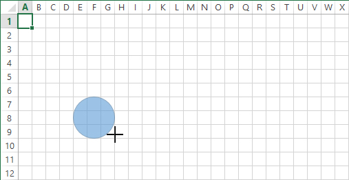
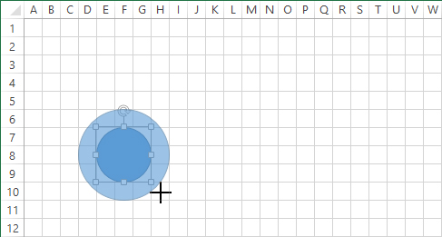
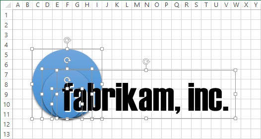
In the Illustrations group, click the Shapes button, and then click Oval in the Basic Shapes group, and the pointer turns into a crosshair.
Position the crosshair pointer near the upper-left corner of cell E7.
Drag a shape while holding both the Shift and Alt keys, and draw a circle that is three cells wide (and of course, being a circle, is also three cells deep); Shift constrains the oval tool to create a perfect circle; Alt aligns (“snaps”) the object to the cell gridlines.
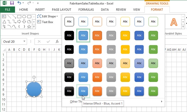
On the Drawing Tools Format tab that appears on the ribbon, click the More button (the downward-pointing fast-forward button) on the Shape Styles palette, and click Intense Effect – Blue, Accent 1.
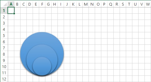
Click the Insert tab, and in the Illustrations group, click the Shapes button, and then click Oval in the Basic Shapes group.
Position the crosshair pointer near the upper-left corner of cell D6.
While holding both the Shift and Alt keys, click and drag to draw a concentric circle that is one cell wider (and one cell taller) than the first circle.
On the Drawing Tools Format tab, in the Shape Styles palette, click Intense Effect – Blue, Accent 1.
On the Drawing Tools Format tab, click the Send Backward button.
Click the Insert tab, and in the Illustrations group, click the Shapes button, and then click Oval in the Basic Shapes group.
Position the crosshair pointer near the upper-left corner of cell C5.
While holding both the Shift and Alt keys, draw a third concentric circle that is one cell wider than the second circle.
Click the Drawing Tools Format tab, and in the Shape Styles palette, click Intense Effect – Blue, Accent 1.
On the Drawing Tools Format tab, click the Send Backward button twice.
Press Ctrl+A to select all three objects.
Click the Drawing Tools Format tab, and in the Arrange group, click the Align button and then click Align Bottom.
Click any cell to deselect the objects.
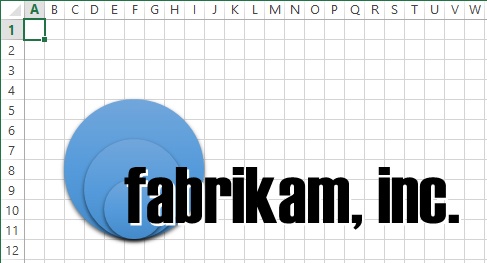
Click the Insert tab, and in the Text group, click Text Box and then click anywhere on the worksheet.
Enter fabrikam, inc.
Press Ctrl+A to select the text.
Make sure the Home tab is active, and then click the Font drop-down list and select your favorite display font (we used Haettenschweiler).
Click the Font Size drop-down list and select a large size (we chose 60 points).
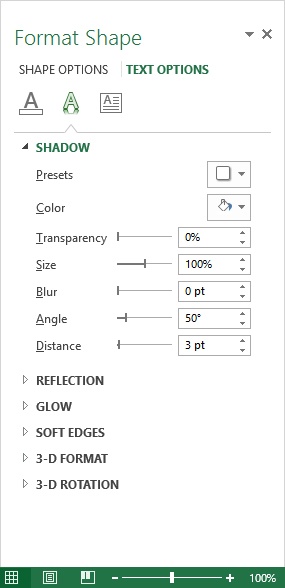
Click the Drawing Tools Format tab, and in the WordArt Styles group, click the Text Effects button, click Shadow, and then click Shadow Options at the bottom of the menu.
In the Format Shape pane, set the color to white, set Blur to 0 pt, set Angle to 50°, and set Distance to 3 pt; this will allow the black text to stand out against the blue circles.
Click the dotted edge of the text box, and drag it so that the f is near the center of the circles.

Over the years, Office applications have become increasingly interoperable, making it easy to leverage the output of an application like Excel for use in other applications like Word and PowerPoint. Today, Office programs share many of the same underlying technologies, such as graphics and charting features, AutoCorrect, fonts, styles, and more. But in terms of graphics, you can usually copy something you want to share, such as a chart, and then paste it where you need it. Doing so will usually work, but not always, especially if you want to scale it—that is, make it smaller (larger often doesn’t work well), as with pictures and clip art.
In this exercise, you’ll use techniques that will allow you to make a static, scalable graphic image from almost anything you can display on your computer. You’ll create it in one workbook and copy it to another, but you can copy the image and use it anywhere.
Set Up
You need the Logo_start.xlsx and the Report_start.xlsx workbooks located in the Chapter23 practice file folder to complete this exercise. Open the Logo_start.xlsx workbook, and save it as Logo.xlsx. Open the Report_start.xlsx workbook, and save it as Report.xlsx.
Activate the Logo.xlsx workbook; if it is not visible, press Alt+Tab to switch windows (hold down Alt and press Tab repeatedly to cycle through all the open windows).
Click any of the blue circles in the logo to select it.
Press Ctrl+A to select all the objects.
Click the Drawing Tools Format tab.
In the Arrange group, click the Group Objects button and then click Group.
Press Ctrl+C to copy the selected, grouped logo.
Press Alt+Tab (repeatedly, if necessary) and activate the Report.xlsx workbook.
Make sure cell A1 is selected.
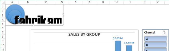
Press Ctrl+V to paste the copied logo at the location of the active cell, and you’ll notice that it’s just a bit too large.
Click the selection handle on the lower-right corner of the logo and, while pressing the Shift key, drag to the left to make it smaller.
Although the circles seem to scale properly, the text does not. You can select the text in the pasted logo and change the font size directly, but that might not work in other situations, so we’ll try a different approach.
With the logo selected, press the Delete key to remove the logo from the report.
Press Alt+Tab to return to the Logo.xlsx workbook.
Click the View tab on the ribbon.
In the Show group, clear the Gridlines check box.
Press Alt+Tab to return to the Report.xlsx workbook.
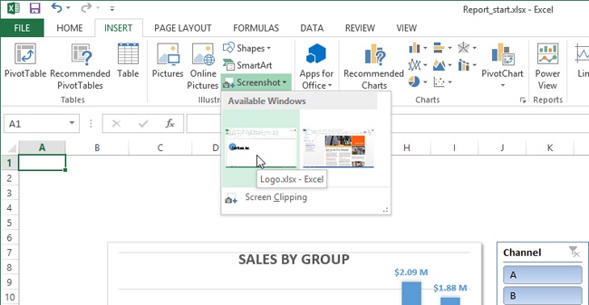
Click the Insert tab on the ribbon.
In the Illustrations group, click Screenshot.
Notice that thumbnail images of open windows are represented in the Available Windows area of the menu that appears, including Excel workbooks and other open applications.
Click the View tab, click the Zoom button in the Zoom group, choose 50%, and click OK, allowing you to view the entire pasted image on your screen.
Click the Picture Tools Format tab and click the Crop button in the Size group.
Drag the center black handles on each side of the image and adjust them to crop out the rest of the image around the logo.
When you’re done cropping the image, click the Crop button in the Size group again to finalize your edits.
Click the View tab, click the Zoom button in the Zoom group, choose 100%, and click OK.
Drag the cropped logo image to the upper-left corner of the worksheet.
Drag the selection handle in the lower-right corner of the logo image and make the logo smaller, so that it fits above the chart.
Click anywhere in the worksheet to deselect the object.


The Recommended Chart feature makes intelligent assumptions about your data and suggests the most useful chart options.
Slicers make it easy to filter underlying chart data with just one click.
Timelines allow you to filter chart data by specifying specific date ranges to display.
Charts and other objects in Excel can be scaled, sized, formatted, and otherwise manipulated just like any other type of graphic.
Excel charts and graphics are compatible with other Office programs and can be copied and pasted directly.
Holding down the Shift key while drawing an object constrains it; for example, pressing the Shift key while drawing with the Oval tool creates a circle; doing the same with the Rectangle tool creates a square.
Holding down the Alt key while drawing an object forces it to align with the cell grid.
You can take screen shots of Excel graphics (and worksheets) that you can easily crop, scale, and share with anyone.