
The Panels in Expression Blend would appear vaguely familiar both to designers and developers. Collectively, they are a mix of tools and property panels that assist in controlling UIElements, storyboards (for animations), events, properties, and Resources.
Some of the panels have hidden areas that contain more advanced features, and some do exactly what they say on the screen.
In this chapter you take a brief view of all the panels and their contents so that you know where you need to look in order to perform given functions.
Upon opening Expression Blend for the first time, you might be intimidated by the number of panels that fill up the Blend user interface. Don’t be. These panels have a lot in common with applications you may have used before, both designer and developer orientated; and after a while, their use will become second nature.
Figure 3.1 shows the two panel layout modes that exist: design and animation. At the time of this writing, user modification of these panels is limited to undocking and resizing, which is quite limited in certain scenarios.
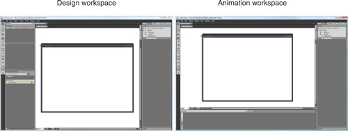
In either mode, you can select to show or hide any and/or all panels from the current view by using the Window menu. In design mode, the Results panel is hidden by default.
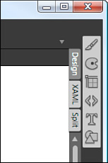
Pressing the Tab or F4 key hides or shows all panels in design/split view and F4 in XAML view only achieves the same. (Tab in XAML view inserts tabs in the editor). In design/split view, the Tab and F4 keys collapse the Properties panel to a ToolBox style menu located on the right side of the screen, as shown in Figure 3.2. What is also interesting about this view is that now when you click an Icon to view a property category, the entire set of properties—including advanced property options—are also shown, so it could be thought of as being an advanced view.
Are the predefined layouts the best layout for the purpose of animating and designing? “Not always,” would be my answer, but for every user out there like me who doesn’t think so, you may find a user who disagrees. It’s about personal preference. Give them both a try, and you will make up your own mind fairly quickly. I personally stay in animation mode 99% of the time; it’s just the way that I prefer to work.
In the next section you look at the most common elements of the panels and their uses so that you can find your way around the samples provided in the rest of this book.
The Interaction panel contains a lot of functionality that is the subject of several chapters. Primarily used for element selection and the creation and modification of Storyboard animations, you need to know where specific items are to increase your productivity with Blend (see Figure 3.3).
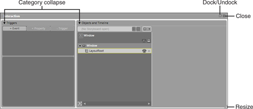
Indicated by a triangle icon, when clicked the category area of the panel collapses. Selecting any part of the collapsed item expands the panel again.
This option is present in all detachable panels, allowing you to dock the panel to its predefined layout position or undock the panel for manual relocation.
Triggers are predefined sets of property values (property trigger) or event listeners (event trigger).
The term Trigger realistically means that an action (or series of actions) will begin when either a property condition evaluates to true or an event is raised.
Imagine, if you will, that you have a button element in your project; and when the user clicks the button you want that button to slowly change its background color from White to Red. This is the job of event triggers; to react to an Event being raised. Event triggers listen for all the events being fired by all the objects within the scope of the parent Window. When the button is clicked and the subsequent Button_Click event is raised, the event trigger then goes about performing its series of actions, which in this case would be to call a timeline that changes the background property of the button from White to Red.
A similar trigger (defined as a property trigger) is watching the property values of the specified object. When the property change notification fires, the trigger evaluates its settings against that of the object. In this case the button property IsMouseDown would be true, so you could also begin a timeline that changes the background color of the button.
Trigger recording is also switched on when editing a property trigger, which means you can set the values of any other properties for that object that will be applied when the trigger evaluates to true. An example of this would be when the button is disabled. You can record all the property values (text color = grey, background = grey) so that they are applied directly to the object. Conversely, you would have a property trigger for when the button becomes active to set its property values to give the appearance that the control is active.
Triggers become clearer as you get your hands dirty to create them, first shown in Chapter 8, “An Example Control Using Just the Tools Palette,” and then in detail in Chapter 14, “Animations with Storyboards” (see Figure 3.4).
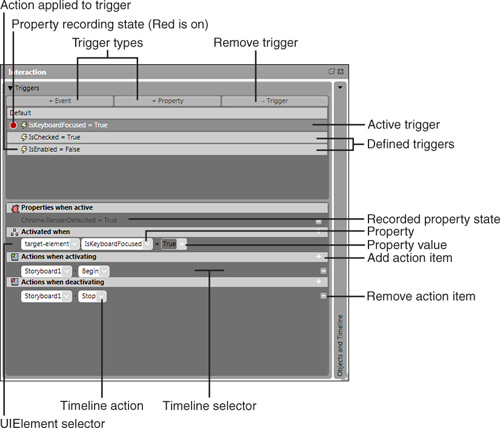
Two types of triggers are supported at present within the Blend UI: Event and Property triggers (see Table 3.1). When enabled, these buttons provide a pop-up box list with the relevant events or properties available.
Table 3.1. Trigger Types
Trigger Type | Description |
|---|---|
Event Trigger | Event triggers provide a method of listening and acting upon the specified event being raised. |
Property Trigger | Property triggers provide a method of implementing actions when a property evaluates the specified condition as true. The code |
The currently selected trigger that defined actions and or recorded property states will be applied to.
When a property trigger is the active trigger, a Red circle indicates that Property Recording is on while an empty circle indicates Property Recording is off.
Property Recording means that any property values changed for any object will be recorded as the required state of the object, when a property evaluates to true.
An example of this is when a Button elements property IsEnabled is set to false. Properties change the way the button looks to show the user that the button is, in fact, disabled.
The lightning icon indicates that a valid action is associated with the active trigger, either a recorded property state or a defined action, such as starting an animation.
When Property Recoding is switched on, property changes will be shown here as the state that all properties will be set to when the trigger is fired.
Selects the element in the visual tree of objects for which the trigger will be applied.
All timelines available within the scope of the parent object will be available to select.
The property that will be evaluated. When an event trigger is specified, this will be the event for which to listen.
The Objects and Timelines panel is where you direct the animation sequences recorded as storyboards in your application (see Figure 3.5a). It is important to note that Blend uses the predefined layout style of Animation workspace to enable you to work more productively with a timeline by placing the Objects and Timeline panel horizontally, allowing you to view more information about your Timeline.
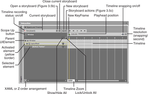
The Objects and Timeline category is one of the most used areas of any of the panels, because you are continually switching between UIElements, activating parents to add children, and so on.
As Figure 3.5a shows, this category has a lot going on. With large collections of UIElements spread throughout the visual element tree, you are advised to group as many controls as possible and where practical. Element naming also plays an important part here, because elements are not named by default when added to the project. You can imagine if you have 10 button objects on the screen and you want to find a specific one, you are going to get RSI trying to find it.
This panel category plays an important role in both design and animation, because you will also use the Timeline functions of the panel to define animated property changes. See Chapter 14 for a detailed look at timelines.
When Timeline recording is On (default), property changes are recorded as KeyFrames. These recorded property changes will transition as an animation. When Timeline recording is off, modifications made to the control properties are not recorded in the Storyboard as animated changes.
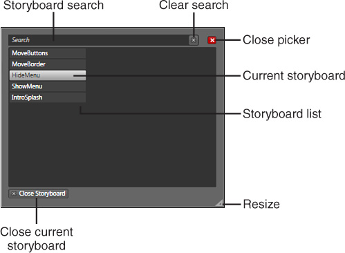
All timelines created within the current scope will be available via the Storyboard Picker dialog box (see the next section, “Storyboard Picker”).
The current storyboard with which the user is working. To change the name of the storyboard, double-click in this panel and edit the present value.
Closes the current storyboard and returns the user to the normal editing features of the application.
Allows you to choose actions associated with the current storyboard, such as duplication and reversal. The Storyboard Actions drop-down menu is shown in Figure 3.5c.
When turned on, the playhead position snaps to equal incremented values specified by the resolution (default is 10).
Shows the current playhead position of the timeline. You can manually adjust the timeline by double-clicking in this area.
Select to add a new KeyFrame at the current playhead position and on the currently selected element.
When enabled against all (or individual) elements, the Element properties are locked completely, so you cannot change the element’s colors or the location. Unlocking the set or single element returns the element to the normal usage state.
Zoom the timeline in or out to control the accuracy of time values and the playhead position shown.
Select to hide or show the element of choice or above the parent element to hide or show all child elements.
View the visual element tree either in order of appearance or in the order that the XAML markup lists elements.
A single mouse click sets an element as the current element to which KeyFrames and animations apply.
Additional elements added become children of the currently activated element. Double-click to activate an element.
See Figure 3.5b for the Storyboard Picker.
When a storyboard is open, as shown in Figure 3.5b, this button becomes enabled, allowing you to close the current storyboard.
See Figure 3.5c for storyboard actions.
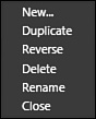
Storyboard actions are available only if you have a storyboard currently selected. If you haven’t chosen one, the only enabled option in the pop-up is the New function.
Creates a new instance of the current storyboard, but with the entire timeline collection reversed.
Figure 3.6 shows all available Resources for the application with no Filter present.
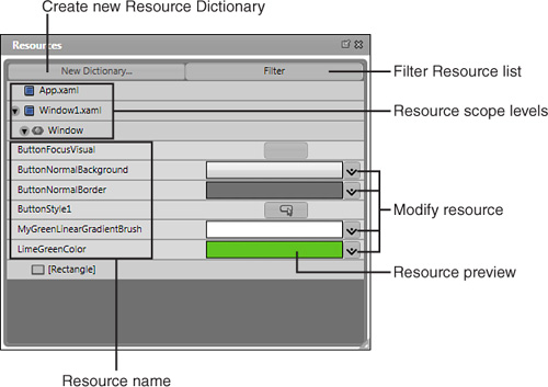
By selecting an element in the Objects and Timeline panel, and then selecting that element again in the Resource List, clicking on the Filter button shows only those resources available to the selected element.
Application level. Resources you designate as being available to all Windows, Forms, and so on.
Document level (Window). Resources stored here are available only to the Window in which they are created.
Object level (element). Resources are available only to a specific object.
Various resources will be shown at one or more scoped levels.
A thumbnail preview of the resource, which can be represented by icons, images, and text.
If available, the Resource property viewer shows to enable live changes to the selected Resource. Any changes are visible instantly in the live UI environment of Blend.
Resources are an integral part of WPF applications and can be made available to other applications by saving resources in a Resource Dictionary (.xaml file).
A resource takes many forms, from a Brush type object, a Style collection, a 3D object material, or even an opacity mask. Almost anything can be created, modified, applied, or consumed as a resource in WPF, so Expression Blend provides a nice way of maintaining what is currently available to the application, as well as what scope the resource is available to.
When talking about scope, you can create a Brush resource, for example, that you want to use only in a specific Window, so that other Window objects can’t see and or use it. You could also add that resource to the Application level scope to make it available everywhere within the project.
You will also note in Figure 3.6 a button showing next to a resource that allows you to modify the base resource type. When elements in your application are using this resource, they are usually dynamically linked to it, so changes you make here will be updated immediately throughout the scope level of the resource usage.
As briefly mentioned, a Resource Dictionary file is an external .xaml file that contains the same XAML you write in your applications as a method of distributing resources. You can create and add items to existing or new Resource Dictionaries throughout the application and not just from this panel.
See Chapter 16, “Using Resources for Skins,” for a look at resources in depth.
Just as other panels (such as the Properties panel) contain separate categories, you can collapse and expand either or both the Files and Data categories. As shown in Figure 3.7, the Data category allows you to import and maintain data sources in your application.
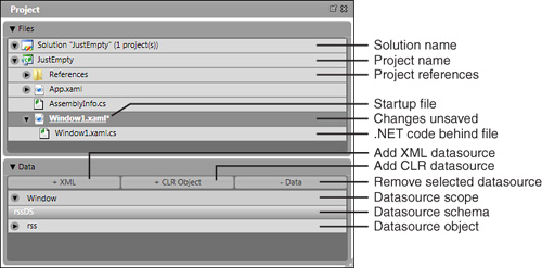
The name of the current Visual Studio Solution (which is a collection of 1 or more projects). If requiring editing the application in Visual Studio, you are advised to right click on the item and select Edit in Visual Studio. This will ensure you have the entire solution available to you as well as proper IntelliSense help.
Valid references may be added to or removed from the context menu of this item. References are connections to .NET .dll or .exe files that contain referable objects (such as class types) inside them.
The current file that starts when you run the application. You may also set a different file as the “Startup” by right-clicking on the item and selecting Startup from the context menu. The Startup object is always shown underlined.
The partial class file associated with the parent XAML file.
The Files category is not dissimilar in layout to that of the Visual Studio Project panel, although you will find a distinct lack of features by comparison. You can add references and so forth, but you have no control over build configurations and real project properties.
You can edit a given file by selecting Edit externally from the context menu, or you can opt to edit the entire solution in Visual Studio, which is the recommended practice as you will then receive full IntelliSense for your solution.
In Blend 1, editing a file externally opened up Notepad.exe, whereas Blend 2 supports full Visual Studio integration.
Select to browse and add a valid XML Datasource. You can manually change the settings and add X-Path Definitions in the resulting dialog box.
Select to browse for a CLR object from referenced assemblies to be used as a Datasource.
The valid Datasource object containing node definitions for drag-and-drop functionality.
A lot of work has been done to ensure a simple yet feature-rich databinding environment in Expression Blend. The Data category allows you to control your databinding to a very fine degree and has a superb drag-and-drop function where you can drag Datasource nodes directly onto the artboard to be shown presentation options based on the data collection type. Blend works out if the data should be shown in a ListBox type control or a Menu type control and gives you the option to choose.
See Chapter 13, “Data Binding,” for a detailed look at data binding.
The default name for elements added to your artboard is <No Name>, (Window is shown in Figure 3.8 for the selected type) which results in the element not being accessible from the code behind page. When objects are used in a storyboard, they are given a new default value—for example, button1—but you wouldn’t want to rely on this naming convention in an application.
You should try to ascertain which elements need to be named for use in code and agree on a naming convention before you start creating your application.
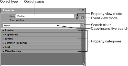
Type a search phrase or combination of letters into the input box to see a list of properties and their categories.
All available property categories for the selected object. These categories change depending on the object definition.
The Property panel and contained categories do take a little while to get used to. Once you consistently use the property search facility, you will be wondering how you ever lived without. The same facility is not present for events, but it is slated for future versions.
Depending on the property categories that are defined by the element/control, the developer(s) determines how many and the type of categories visible. It would be prudent investment of your time to add controls to a blank project and then familiarize yourself with the categories available.
An overview of the most common property categories follows with the most detailed commentary located in those chapters that deal specifically with the category at hand.
The property types are determined by the control type being modified. To modify a particular property, select it and then set the brush type. As shown in Figure 3.9, a Window element is selected and the relevant Brushes properties are shown.
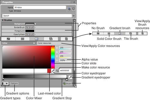
No brush is different from just having an invisible brush filling a property. This is equivalent to specifying null or nothing in the code for this property.
Although you will receive better rendering performance for elements that have No Brush applied to them as opposed to an invisible or transparent brush, you should also understand that mouse events are not raised against elements that have No Brush applied to them. In the case of a Button style, you will need mouse events to understand when the user has clicked on the button.
You can drag these Gradient stops to create differing effects. To create additional stops, click on the gradient bar. To remove stops click, hold, and drag your mouse off the gradient bar.
Allows you to control the applied gradient visual effect, from Pad, Reflected, or Repeat.
Selecting and moving this eyedropper grabs any color in any Window that you can view.
Converts the specified Brush to a resource, either locally within the applications scope levels or in a resource dictionary file.
A strangely cool tool that allows you to click and hold the eyedropper tool and then drag it across to a given point in the artboard. Every color and the distances between them are re-created as a gradient pattern and applied to the current object property.
Converts the currently created color to a color resource, either locally within the applications scope levels or in a resource dictionary file. This is different from a Brush resource, because you can use two Color resources to specify two Gradient stops.
The Alpha value of the current color, which controls the color opacity of the brush, as opposed to the entire object’s opacity, which is a property in the Appearance category.
A strange brush that allows you to apply brush resources as a property and then control their pattern settings. That is, you can Tile, Fill, or UniformFill a specified property with the resources brush.
As shown in Figure 3.9, the Gradient brush allows you to specify multiple colors to be applied to a brush. There are two types of Gradient brushes available in Blend, RadialGradient and LinearGradient brush types.
Controls the entire object’s opacity—0% is invisible, 100% is opaque as shown in Figure 3.10.
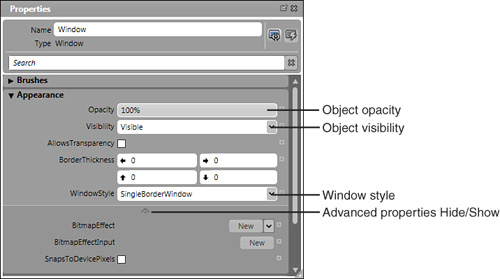
An object can be either the usual visible or hidden values, but in Blend, an object can also be collapsed. This is particularly important not only when you want an object to be invisible but also when you don’t want it to take up any screen space.
You can choose one of the following four options:
None (used for borderless windows)
SingleBorder
ThreeDBorder
ToolWindow
Most property categories contain extended properties, with some containing dozens of additional options. This is another good reason to get used to working with the property search box.
Even though in Figure 3.10 you see only three properties, if you add a Rectangle to your artboard (and select it), you will see 10+ additional properties in the Advanced Properties drop-down. You should review all the Advanced Properties of as many controls as possible to familiarize yourself with additional control functionality.
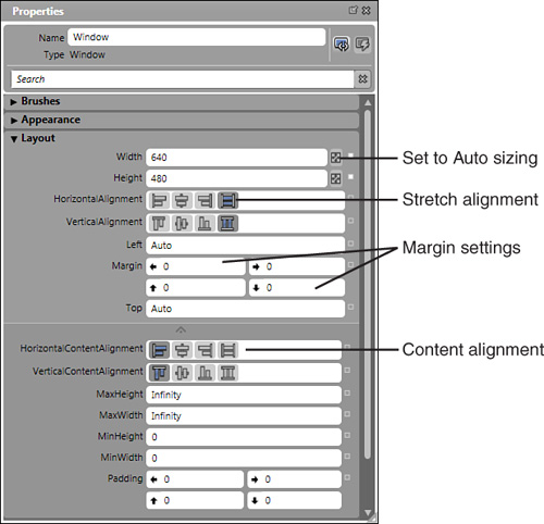
When you need an object to use its Margin and Alignment settings to ascertain Width, or allow a parent to control the object’s Width value, set a Width and or Height property to Auto. The property type is a double, so if you need to set this value in code, you must set the value as double.NAN. NAN stands for “not a number.” It is important to try to set all element Width and Height properties to Auto should you intend to localize your application. For example, label values can vary tremendously among languages, so you want your element(s) to grow or shrink based on their content as opposed to a fixed Width that may truncate their value(s).
Alignment determines how the objects align within their parent containers. Stretch fills the available area, and the actual width is controlled by any additional margin settings.
The Margin values determine how far the edge of an element sits from its parent boundary. It is important to understand the “boundary” meaning, particularly when an element is placed inside a row or column of a parent Grid. The margin determines the distance from the cell boundaries, as opposed to the entire Grid element boundaries. (This is discussed in detail in Chapter 5, “UIElement: Control Embedding.”)
If this object is to contain additional objects, you can control its alignment by default from this property. As shown in Figure 3.11, many controls have a default HorizontalContentAlignment set to Left and VerticalContentAlignment set to Top.
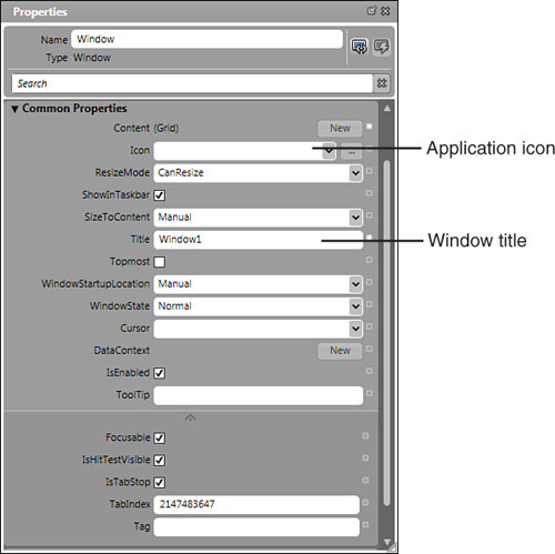
You can either navigate to an icon stored on your machine or use the drop-down arrow to select an image asset that is already stored as a resource in your application. Interestingly, in previous development platforms you were only allowed to use images in a specific *.icon format. In Blend you can select any image type that is supported (such as BMP, JPEG, TIFF, and so on) from any location, and the image will be used as the icon for the application.
As shown in Figure 3.12, by default no value is assigned to the icon property. Your application will use the default application icon defined by your operating system if you leave the property blank.
Various text-based controls allow you to control different property settings for the text that is contained within them, such as a Label control, which has different properties available in the advanced property area compared with a RichTextBox control. The Text property category also allows you to modify the displayed text in controls such as a Button or ListItem (see Figure 3.13).
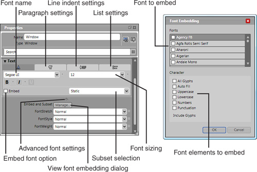
Simply drop down the list to choose the appropriate font or begin typing the font name in the input area of the combo box. Segoe UI is the default font used by Expression Blend when installed on the Vista operating system. Tahoma is the default for Windows XP.
Within this tab you can set line heights and text spacing properties with controls that support such actions.
Set left and right indents from this tab for controls that support such actions.
This option allows you to specify if only the characters used in this element should be embedded into the application (Static) or if all the characters of the selected font should be embedded (Dynamic).
Additional properties become available depending on the control that is currently selected. From with this section of the category, you can also click the Manage button for Embed and Subset, which will open the Font Embedding dialog box, as shown in Figure 3.13. This dialog box is also accessible by clicking the Tools menu and then choosing Font Embedding.
The listbox contains all the fonts available to your application. You can scroll through the list and select which fonts to specifically include.
A font is a collection of various parts that make up the entire font. For example, most (but not all) fonts have both an uppercase and lowercase version of characters. These options allow you to specify exactly which parts (or all) of the font that you wish to embed. Why is this important? Some fonts are very large (20+ MB), so you if you intend to embed that font, your application executable footprint will grow to accommodate it. If you are using only a specific font for numbers, for example, then it makes much more sense to embed only the number parts of the font.
This particular property category varies greatly from control to control and is the default placement of properties that are not given a specific category when they are created. The following is a look at a specific property set for a button control object (see Figure 3.14).
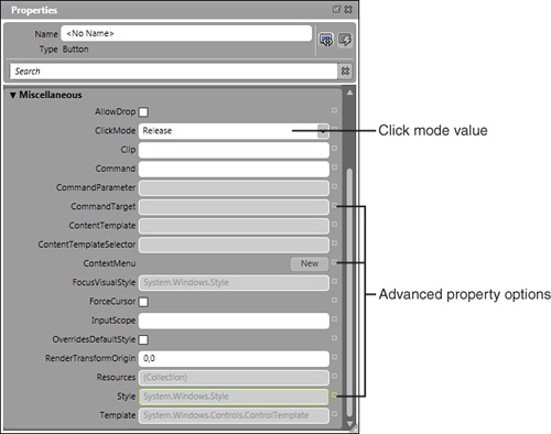
This property is specific to a Button object and lets you decide how to tell when a user has clicked on a button. You could set it to Pressed or Hover, which will raise the click event when true.
Right about now, you might be thinking that there appears to be two places for the Advanced property. Well, there is a difference. I believe that one should have been called Additional property collections, while this particular area I am talking about now should remain as Advanced property options.
Next to every property in every category, there is a little square box. This box allows you to specify advanced property values for the specific property you are modifying.
This is discussed further in the next section.
Depending on the property type and level of access that you are currently in, these options become available; for example, when you are editing the template of an element, the Template Binding can be used. Chapter 13 covers Template Binding.
As previously stated, every property has a little box to the right of the property. When you click on this box, the Advanced property dialog box, as shown in Figure 3.15, displays.
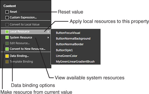
This handy option resets a property to a default value. An example of this is when you modify any (or all) of the margin property values. Instead of selecting each margin input area to return it to 0, simply select the Reset menu option and all of the inputs will be returned to 0.
Similar to when you set a local resource brush or color to a background property in the Brushes category, clicking here when enabled presents all the matching resource types for the property you are viewing, as shown in Figure 3.15.
Similar to local resources, Blend gives you the ability to apply preset system value resources to a property. This is important if you intend for your application to apply user-specified settings for their entire system, which may assist with such things as accessibility.
You can make just about any property value into a resource. For example, if you want a button’s Tooltip property value to match that of the buttons content (string only) property, you could make the content property a resource by selecting this option, giving it an appropriate name. Then, when you select the Tooltip’s Advanced property options, you will see the resource you just created in the Local Resource list to which you can then apply.
If you need to bind the value to a data provider or even a corresponding value type on another object, click here to view the data binding dialogs. See Chapter 13 for more details on data binding.
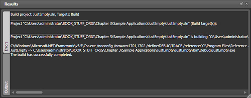
The Results panel is one of those panels that you don’t know is there until something goes wrong. At the time of this writing, Blend had improved with how it delivered bad news, but it still has no serious debugging features incorporated. Visual Studio is the tool of choice when errors arise. F12 hides or shows the Results panel.
The most important part of Figure 3.16 is seeing the statement at the bottom: The build has successfully completed.
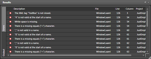
At the time of writing, the error output did little to realistically help in a time of great crisis. I would expect this functionality to improve dramatically as the XAML editor improves. I would not take the Line number value as gospel (meaning they are not always accurate). As previously stated, if you find that you can’t track and trace an error quickly in Expression Blend using this error panel (shown in Figure 3.17), open your project in Visual Studio and build it from there. You will be able to accurately determine build issues in the Visual Studio environment. When an error does show, however, the first thing to do is double-click the error in the Results panel, which most of the time will take you directly to the offending line of XAML for you to fix.
You can dramatically improve the debugging information shown in Visual Studio 2005 by adding an Exception option that is specific for XAML errors as shown in the following steps.
Open Visual Studio. You will need to open a solution as well.
Select Debug from the top menu.
Select the Exceptions menu item.
The Exceptions window should now appear.
Click Add.
In the type drop-down list, select Common Language Runtime Exceptions.
Add the name System.Windows.Markup.XamlParseException and click OK.
You should now see the new Exception highlighted with a check box to the right of the Thrown column. Check this box.
Click OK to exit the dialog.
The Asset Library panel contains a lot of functionality that you will use quite often within your application UI development. Predefined, referenced, and custom controls are all available from this panel (see Figure 3.18).
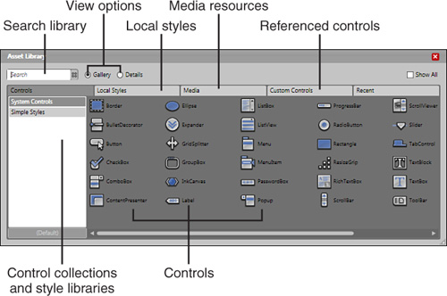
Case-insensitive searching of all the controls in the current Control Collection. Control collections are selectable from the Control collections and Style libraries panel.
System controls represent standard WPF controls that have had a degree of styling or animated properties added to them. As you create Style templates for controls, if you add or define those styles inside a Resource Dictionary, that Dictionary will appear in this panel under Simple Styles.
If you create a control template and define it inside the local file instead of a Resource Dictionary, that Style template will appear in the Local Styles tab.
Each resource dictionary contains collections of controls that have specific styling or templates applied to the base level of these controls. You can select a control directly and drag it onto the artboard, or double-click it to make it available from the Recent Controls button on the toolbox (just above the button you click to view the Asset Library Panel).
When, and if, you create user or custom controls, once referenced to the project, they will be available in this tab for you to view and select from. You can also reference existing controls from third parties or other projects, and those controls will also be available in this tab.
Any resources that you add to your project are available in this tab for you to select and reuse. You will see resources created and added from style templates you add as well.
You have now seen your fair share of Blend panels and the categories that reside within them. Take every opportunity to explore the panels, in particular, the Properties and Object and Timeline panels.
Some objects can contain hundreds of properties, so getting accustomed to using the property search box is a habit that you should quickly form. Just remember to clear the search after you have used it!
Also, take considerable note of the property names as you change them. These names are exactly the same regardless of whether you are entering them into a line of XAML or from code in Visual Studio. For example, the property Width in the Blend Property panel (Layout category) is the same as Width="100" in XAML or Button.Width =100 in code.
Obviously, you explored only certain property groups in this chapter, because it would have taken forever to detail each and every control type and property type. You can find more detailed information on control properties in the Windows SDK or MSDN online. You use quite a few different controls throughout the rest of the book, so you will see more and more property types as you progress.