
As a developer, when you first step into the world of Blend and WPF, one of the biggest changes from WINForms that can be hard to adapt to is the use of different layout scenarios inflicted by your choice of panel-based containers/controls/constructs (PBCs). Some designers might see the layout scenarios as being almost restrictive because each layout container has rules, in terms of how the child elements are laid out as opposed to free-moving controls (which are possible as well).
In this chapter, you learn all about when and what to use as you look at the most common PBCs and the features specific to each type. This chapter gets you working with the panels and understanding the repercussions for your child elements, in terms of their layout positioning.
If you’re a developer, you probably got used to working with anchors in your WINForms developments. If you became really proficient with them, then likely, at some stage or another, you came across their limitations as well. If you come from a designer-orientated background, this might not make much sense. In essence we are talking about how controls/elements are positioned in relation to their parent. That parent could be the main form, another control in the same panel, and so on. It’s been time consuming and not very dynamic in the past.
To overcome the limitations, I used fewer margins and was more concerned about end-client screen resolutions than I was about how far away my button was from the edge of the screen. Now I look back and wonder how I managed to flounder through without a layout system like the one WPF provides.
In this layer scenario I keep going on about, it’s key to always remember that the element you are working on will most likely be the child of a control that has its layouts defined for certain purposes.
Almost all of the common controls in this chapter inherit the System.Windows.Controls. Panel class, which is the base class for all elements (or controls) that support the Layout features of WPF. The Panel class has some very specific features, such as the following:
Content can be one or more UIElement(s).
The primary property for accessing content is
Children.
These features become more important with the development of custom controls and in understanding how your control fits (Layout) in relation to the other controls that are sharing the screen space (or real estate) with it.
Add to the mix the idea of Grid spans, rows, and columns, and you can sometimes find yourself in an unfortunate predicament, where your control just won’t position as you want because the parent control requires that it be organized in a specific manner. On the other hand, you may be creating the parent control, and you may be the one who specifies how its children will be laid out.
A simple example of this was shown in Chapter 5, “UIElement: Control Embedding,” which goes into further detail about how spans can become a problem if you do not consider them when designing your applications and or controls.
The Grid element is arguably the most commonly used panel-based control, because it is the LayoutRoot element added to all new projects by default.
Because the Grid has a number of Layout possibilities, you will now work with the settings of the grid, changing them one at a time to note the effect each has on child elements. Until such time as the rules of the different PBCs are firmly implanted in your mind, you may find that trial and error serves you best, with quite a bit of both being used during your initial design attempts. With some understanding, however, hopefully it will be less error than trial.
You can create a static-sized object by setting Width and Height to a nominal value and setting the margins to 0. You can also set Width and Height to Auto and set the Margins to arbitrary values so that the grid resizes with its parent. Finally, you can set width height and margin properties to ensure the element stays in the same position and size.
In the following steps, you run through several trial scenarios to get you in the zone of using panel-based controls:
Open a new project in Blend.
Select and activate the LayoutRoot element, find the Rectangle control in the toolbox, and double-click it to add a new Rectangle element to the top-left corner of the LayoutRoot parent element. The Rectangle control has a default Width of 100 and Height of 100.
Set the
Backgroundproperty (located in the Brushes category of the Properties panel) to a Red SolidColorBrush.Type “ali” (short for alignment) into the property search box to reveal the
HorizontalAlignmentandVerticalAlignmentproperties. Set these both to Center to center the Rectangle element.If you select the Window element in the Objects and Timelines panel, you should note the resizing grab handles appear at the corners and the centers of each side along the Window. Take a moment to play around with resizing the Window (by dragging the bottom-right grab handle) to see the effect that the current settings have.
Double-click the Rectangle element in the Objects and Timeline category of the interaction panel.
Clear the property search box and enter mar (short for margin) to show the four margin positions that you can set.
With your Red Rectangle centered in the LayoutRoot parent, change the margin values for each, by clicking and holding the left mouse button and then dragging the mouse in a direction of your choice.
You should see that the Rectangle stays the same size but moves around the parent to comply with the margin settings. When the alignment is set to center, the margin value is offset from center.
Clear the property search box and collapse of the category parts except for the Layout category so that you can clearly see the
HeightandWidthproperties as well as the Margins.Double-click the LayoutRoot element to activate it. Select the Rectangle element (so that the LayoutRoot displays with a yellow border around it and the Rectangle is highlighted).
Set the
WidthandHeightproperties to Auto.Set
HorizontalAlignmentandVerticalAlignmentto Stretch.
The Rectangle should completely cover your artboard. Try changing the margins again, as well as selecting the Window element and changing its size to see how these properties have changed the layout logic applied to your grid.
You can probably see that when you set the Width and Height properties to Auto, the Margin and the Alignment properties control both the positioning and sizing of the child element (in this case the red Rectangle) in relation to its parent.
When both Width and Height properties are Auto, the child element shows only when you set both the HorizontalAlignment and VerticalAlignment properties to Stretch or when you set the Min/Max and Width/Height properties to a value greater than 0.
The last setting to look at here—Margin—can be confusing. The following steps demonstrate the effect margins can have on your elements.
With the Rectangle selected, ensure that both the Width and Height are set to 100.
Set HorizontalAlignment to Left.
Set VerticalAlignment to Top.
Set the Left Margin value to 172.
Set the Right Margin value to 317.
Set the Top Margin value to 130.
Set the Bottom Margin to 0.
All looks fine?
Finally, set the Right Margin property to 400.
The Right Margin property now controls the right edge of the Rectangle in relation to the Parent construct. The bounding box does not change size, however, so in this scenario, the Actual Width of the Rectangle remains unchanged.
Now set the mouse on the Left Margin value and drag it down (or left) to reduce the Left Margin value and move the Rectangle to the left.
By default, the LayoutRoot element, which is a Grid, is set to Grid mode, which means that your Red Rectangle is laid out according to the Margins and Alignment properties. But sometimes you may need to use absolute positioning values.
Activate any Grid to see the Button located in the top-left corner of the Grid element (see Figure 6.1). Switch to Canvas mode, and then take a moment to play with the Margins and the Width and Height properties. This time, when you select the Window element and change the size, you should notice different behavior from your Rectangle. Because in Canvas mode the Margin property values act as absolute positions, the Rectangle no longer dynamically changes size and position based on the Parent.
If you want, you can set Grid or Canvas mode as the default by using the Options menu. Open the Tools menu, select Options, and then select Artboard. Here you find a setting under the heading Layout.
Now that you have an understanding of Layout modes, it’s time to take a look at how the Grid panel defines layout constraints for its children by using Rows and Columns.
Reset your LayoutRoot by removing the Red Rectangle and ensuring that it is using Grid Layout mode. Double-click on the Red Rectangle to activate it.
To add rows and columns to your Grid during design time, you have three methods from which to choose. Plus, you can always add more row and column definitions during runtime in code.
The first method is to add a dividing line directly on the Grid during design time. Simply move the mouse over the Grid definition line, as shown in Figure 6.2.
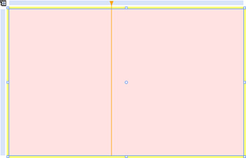
Although this method is not highly accurate, it allows you to define the row or column definitions and then manually adjust the values in XAML, as shown in the Listing 6.1.
As you can see, the Width property values add up to 1 in this case. The reasoning behind this is that the star (GridUnit type) represents a proportion of the available screen area. Therefore, a value of 0.500* would be half, with a value of 3* being three times the available screen area.
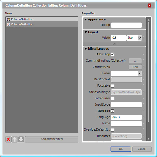
Another method of adding rows and columns to your Grid is found in the properties of the Grid itself. You access these properties by selecting the Grid, opening the Properties panel, and typing def into the property search box, as shown in Figure 6.3.
When designing controls, or perhaps building a new control template, laying them out first on a Grid parent element enables you to check whether everything scales as it should, which saves you a lot of problems down the road.
Experienced WINForms developers probably feel most at home when using this type of panel because it acts the same as CLR forms. This is not a negative feature of the element, however, because sometimes you need to place UIElements in an absolute position. The positioning properties include the following:
Left
Right
Top
Bottom
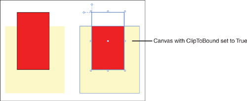
The Canvas is not the only panel that allows you to draw outside the panel bounds, as shown in Figure 6.4.
The Stack panel is extremely useful for controlling tight linear positioning layout of child controls either in a Horizontal or Vertical manner, accessible through the Orientation property of the Stack panel.
The Orientation property of the Stack panel does not control the child alignment in any situation. Alignment remains controlled by the HorizontalAlignment and VerticalAlignment properties of each child, as shown in Figure 6.5.
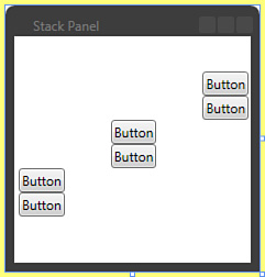
The control is commonplace in WPF applications because the panel reapplies stack layout principles to its children whenever the panel changes size. If you use a Stack panel as a ListBoxItems’ child, rest assured that the Stack panel content always aligns correctly, considering that the child elements have identical layout properties applied.
The XAML in Listing 6.2 demonstrates this by showing a ListBox with three ListBoxItem children, each containing a Stack panel control and two child button controls stacked identically. The child buttons have different alignment settings, but as you can see in Figure 6.5, the items all align.
Example 6.2. Performing Child Element Alignment
    <ListBox IsSynchronizedWithCurrentItem="True" Margin="0,30,0,30"
BorderBrush="{x:Null}">
            <ListBoxItem HorizontalAlignment="Right" VerticalAlignment="Stretch"
Height="Auto">
                <StackPanel RenderTransformOrigin="0.5,0.5"
HorizontalAlignment="Stretch"
VerticalAlignment="Stretch" Width="Auto" Height="Auto"
Grid.IsSharedSizeScope="False"
ScrollViewer.CanContentScroll="False">

                    <Button Content="Button" HorizontalAlignment="Right"/>
                    <Button Content="Button" Width="Auto" Height="Auto"
HorizontalAlignment="Stretch" VerticalAlignment="Center"/>

                </StackPanel>
            </ListBoxItem>
            <ListBoxItem Height="Auto" HorizontalAlignment="Center"
VerticalAlignment="Center">
                <StackPanel RenderTransformOrigin="0.5,0.5"
HorizontalAlignment="Stretch" VerticalAlignment="Stretch" Width="Auto"
Height="Auto" Grid.IsSharedSizeScope="False" ScrollViewer.CanContentScroll="False">

                    <Button Content="Button" HorizontalAlignment="Right"/>

                    <Button Content="Button" HorizontalAlignment="Stretch"
VerticalAlignment="Center" Width="Auto" Height="Auto"/>

                </StackPanel>
            </ListBoxItem>
            <ListBoxItem Height="Auto" HorizontalAlignment="Left"
VerticalAlignment="Top">
                <StackPanel RenderTransformOrigin="0.5,0.5"
HorizontalAlignment="Stretch" VerticalAlignment="Stretch" Width="Auto"
Height="Auto" Grid.IsSharedSizeScope="False" ScrollViewer.CanContentScroll="False">

                    <Button Content="Button" HorizontalAlignment="Right"/>

                    <Button Content="Button" HorizontalAlignment="Stretch"
VerticalAlignment="Center" Width="Auto" Height="Auto"/>

                </StackPanel>
            </ListBoxItem>
</ListBox>The Wrap panel is handy for displaying large groups of elements that you are certain will fill the available space of the parent container but are unsure what the exact number of elements will be in each row or when your content is dynamic. The Wrap panel detects when content elements will touch the outer edge and automatically moves them to the next line in the panel.
Being a dynamic control, you can also see the effects of the Wrap by adding the control to your project. After inserting several child elements, simply resize the parent and watch as the Wrap panel takes care of everything!
Add the XAML in Listing 6.3. Select the Window element to enable resize grab handles and then change the form size.
Example 6.3. A Simple WrapPanel Example Showing Wrapping Functionality
        <WrapPanel Margin="120,100,120,100">
            <Button Margin="5,5,5,5" Width="125.623" Height="104.96"
Content="Button"/>
            <Button Width="125.623" Height="104.96" Content="Button"
Margin="5,5,5,5"/>
            <Button Width="125.623" Height="104.96" Content="Button"
Margin="5,5,5,5"/>
            <Button Width="125.623" Height="104.96" Content="Button"
Margin="5,5,5,5"/>
            <Button Width="125.623" Height="104.96" Content="Button"
Margin="5,5,5,5"/>
            <Button Width="125.623" Height="104.96" Content="Button"
Margin="5,5,5,5"/>
</WrapPanel>Developers are likely already familiar with the concept of docking, because of their use of WINForms and dock properties. But in case you’re a designer and haven’t used docking before, or as a developer you didn’t use the feature much, this section takes a quick look at exactly what this style of panel offers.
The Dock panel, as the name suggests, forces its child controls to dock to an edge of its container or to fill the entire remaining panel region, which includes the panel in its entirety when there are no other child controls. After a control is added to the child collection, the control defaults to “left” dock, which you can change by searching for the Dock property of the embedded child. This property appears only when the child is added to a DockPanel parent.
Interestingly, another property available on the Dock panel itself is LastChildFill. This property is set to False by default (contrary to what the Windows SDK says). If you check this or set the property to True in code, it simply means that any other children that you add to the Dock panel will fill the remaining available space.
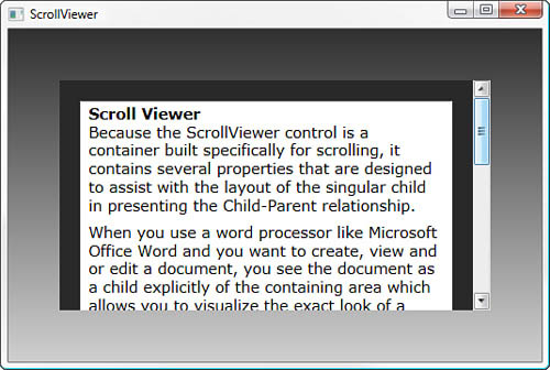
Because the ScrollViewer control is a container built specifically for—you guessed it—scrolling, it contains several properties designed to assist you with the layout of the singular child in presenting the Child-Parent relationship.
When you use a word-processing program, such as Microsoft Office Word, and you want to create, view, or edit a document, you see the document as a child explicitly of the containing area. This allows you to visualize the exact look of a page.
Figure 6.6 demonstrates this exact usage by clearly defining the look of the ScrollViewer container control with a Black background brush and the singular Child (in this case a Grid with a RichTextBox control as its child) as a text-based display item.
The Border element means different things to different people. This is evident between me and my friend, Amir Khella. Amir thinks the Border element doesn’t deserve to be in a chapter about panel-based controls. Your view probably depends on whether you intend to use the Border as a panel, controlling child layouts, or adding cosmetic effects.
The panel-based controls include the Border control because it allows for a single child to be added to its ContentControl. In a previous chapter, you may recall that a suggested good usage for the Rectangle tool is to create rounded rectangle borders for controls. But that would mean adding a rectangle to that control’s child collection (if indeed it had one) or creating a Grid control group with both the Rectangle and the Control added as children.
Hypothetically speaking, what if you want to add a border to a Rectangle element? You could go through the steps listed previously, but why do that when you could use the Border control and then add the Rectangle element as its child? Of course you can always add another panel as the child and then go nuts with content, as well.
Within styles of almost every control that comes with Blend, you find heavy use of the Border control. As you continue the UI creation process and restyle more controls, the more you will work with it.
The Uniform Grid is often overlooked for the functionality that it provides. That functionality includes displaying all its child controls in uniform proportion to each other based on the Grid Row and Column property settings of the parent Uniform Grid (see Figure 6.7).
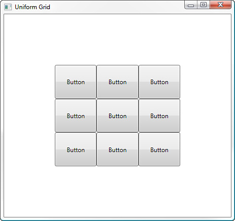
When added via the Asset Library or Common Controls category of the Toolbox palette, the Uniform Grid defines no Rows or Columns by default. Instead, the Uniform Grid assumes dynamic sizing is required of children as they are added.
You can declare the Row and Column properties initially, which constrains the child element sizes regardless of their settings or the number of children that have been previously added to the Uniform Grid.
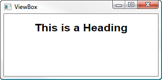
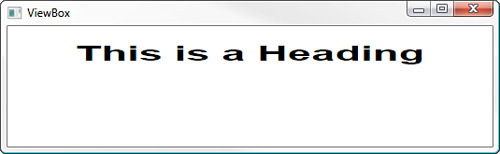
ViewBox is a useful control that stretches the content of its single child and any children of its singular child. Set the StretchDirection property to control how the stretch is applied within the Vertical space of the container. Figures 6.8 and 6.9 show just one use for the ViewBox control, which in this case is creating a Page Heading that dynamically renders the text font depending on the size of the form. The font does not actually change size; the font merely renders according to the layout properties of the parent.
The XAML shown in Listing 6.4 re-creates Figures 6.8 and 6.9.
Example 6.4. The Viewbox Effect on Child Elements
        <Viewbox Margin="50,5,50,50" VerticalAlignment="Stretch" Height="Auto"
Stretch="Fill" StretchDirection="Both">
            <Label HorizontalAlignment="Stretch"
            Margin="5,5,5,5"
            VerticalAlignment="Stretch"
            Width="Auto"
            Height="Auto"
            FontFamily="Arial"
            FontSize="10"
            FontStyle="Normal"
            FontWeight="Bold"
            HorizontalContentAlignment="Center"
            Padding="0,0,0,0"
            VerticalContentAlignment="Center"
            xml:space="preserve">This is a Heading
            </Label>
</Viewbox>As you can see from the vast array of panel-based containers, you can—and should—make a specific choice of which one to use based on the anticipated children of that container.
Obviously some containers are better at displaying items such as Thumbnail images, like the Uniform Grid or Stack Panel; and some of the other controls are better at displaying things like child Label Controls. The ViewBox or the Wrap panel are good choices here.
You will make mistakes about which panel is best suited for the job until you use each one and then instinctively know which one will get you home in your chosen task.
Hopefully, you now understand that having multiple panel types is indeed a good thing. The responsibility is yours to ensure that the correct type is utilized for the given scenario and will take time to get used to.
Perhaps the biggest lesson to be learned is that scaling sometimes throws up ugly results that you just don’t expect and, therefore, Grids in Canvas mode become a danger. Personally, the biggest problems I have faced with scaling relate to embedded multi-point path elements in Blend 1, which did not support animated paths.
A general rule of thumb should always be to look for the simple solution to your panel-based container needs. Don’t overlook the features and benefits that some PBCs have instead of using a Grid or Canvas just because it appears easier to do so at first.