DISCOVERING YOUR SIGNATURE COLOR PALETTE
Color is part of my identity as an artist. I’ll bet that if you looked at your work, you would see a color pattern as well. When you paint, do you have a go-to palette or know how to identify one that is materializing as your own signature color combination? A golden thread runs through your work and your life, and it’s the key to your own signature color palette. The best way to discover your signature color palette is to see the world with wonder. Figure out what lights your soul on fire and then embrace your natural path toward creative expression. Soon you will see color combinations everywhere you go that you simply can’t resist.
My number one tip for both beginners and experts in finding your voice, knowing your style, and choosing your color palette is that you have to make a lot of art to know how to make your art. This is universally true, and there is no magic recipe. You have to make a lot of artwork. You even have to make bad artwork—it’s the best teacher. The more you make, the more you will begin to understand what you like and don’t like, what works for you and what doesn’t, what excites your soul and what bores you. These discoveries will lead you to where you want to go. And as soon as you think you know, you must do it again because we are ever-changing and growing. The willingness to grow and stay open spills into creating a personal style, and eventually your signature color palette will emerge. As you explore your creative process, your lifestyle, and your environment, keep an art journal to record and test your ideas with swatches and thumbnail sketches. Take notice of what lights you up. What common threads keep showing up in your life, your home, your wardrobe? In the things you collect? In the photos you take? Compile the inspiration from things you have around the house, fashion, advertisements, store displays, a walk in your neighborhood, nature, and artwork you love. What do you notice? These are your clues to finding your signature color palette.
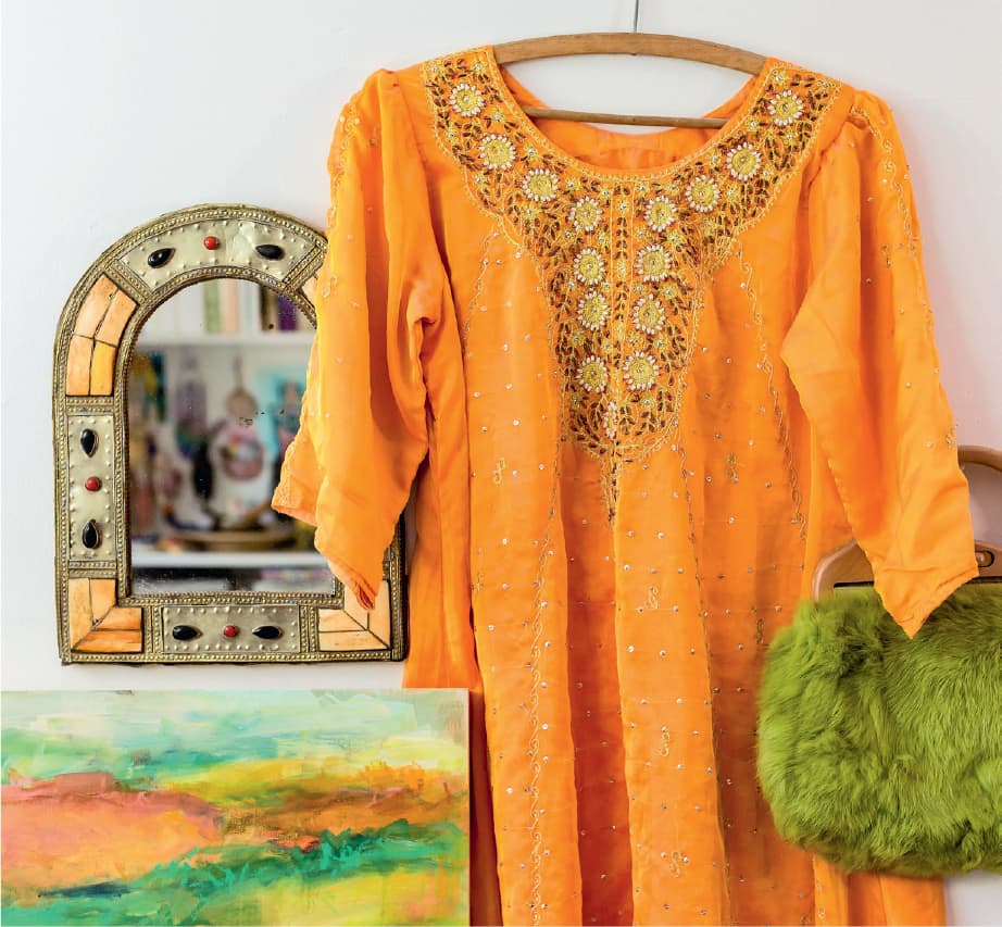
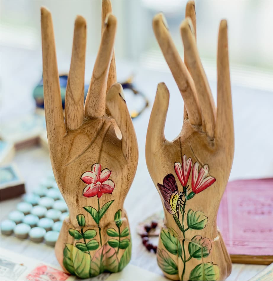
To begin collecting inspiration for your signature color palette, go on a hunt to find examples of what you are drawn to. Snap photos or save images. Group some of your favorites together, and see if you find color palettes that excite you. Here are a few places to look:
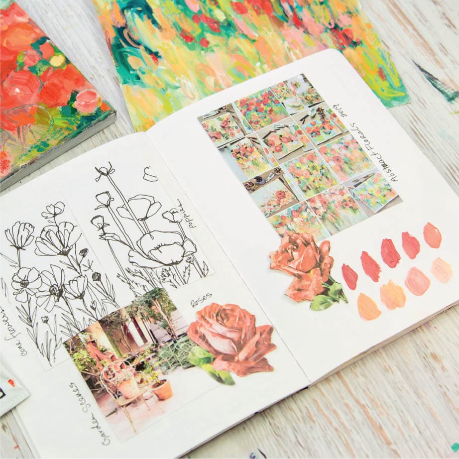
Look for clues in the artwork you’ve made in the last year. What are the most dominant colors you’ve used? Can you identify combinations that work for you? Which pieces are your favorite because of the colors you used? Create a grouping of your work (art journals, small works, big canvases) and re-create the colors you see. This serves a dual purpose for training your eye to see color and for noticing your own patterns emerge. Do you see a common thread throughout your work? Do you prefer warm colors or cool? Do you mostly use a saturated palette, or are you drawn to muted, earthy tones? What sparks you as you look at your work? Create swatches of your discoveries so you can have a record of your favorite combinations. This is a map to you and your signature color palette.
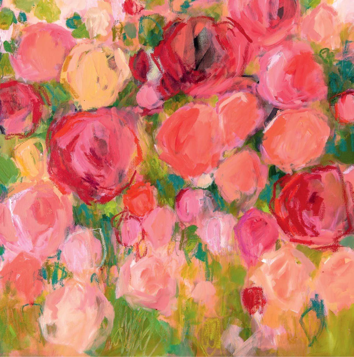
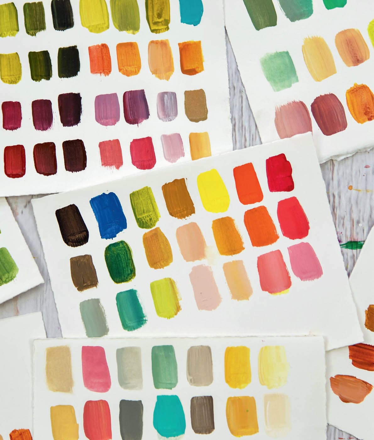
Screen capture some of your photo feed on your smartphone and make prints of the photo collage. I do this regularly to see what patterns appear. I organize a photo file on my phone or use a hashtag on my own posts on Instagram to see the work together. (In the photo below, I’m looking at some of my floral pieces plus some inspiration elements.) This allows you to see a color pattern emerge. Using the new mixing skills you’ll develop in chapter 3, match those shades with paint so you have a permanent record of your favorite color choices. Throughout this book, you’ll see that I’ve created color swatches to remember my paint choices. I often do this in a notebook and include the colors I’ve used. But the more I’ve mixed colors, the more savvy I’ve become in visually identifying which paints I need to achieve the colors I want. While you’re still learning to do this by instinct, I recommend keeping a journal of your favorite paint hues and the color mixes you discover along the way. Practice plus repetition will lead you to becoming a good colorist.
Sometimes I pick offbeat combinations of blues, reds, and yellows for my palette. But more often, I find myself turning to the colors we use in modern color theory, and I’m satisfied with the results every time. With all this experimenting, I have outlined five principles of color that guide me in my artwork and help me achieve the results I’m searching for. 1 | UNDERSTAND HOW COLOR WORKS: Understand it to your core by doing the work. Understanding color is a lot more than mixing—it’s practicing these principles. Knowing how color works in practical application helps you make better artwork. See how the colors react with each other, notice which mixes you like best, observe how they change when you add white or black, and satisfy any other curiosity you have that will propel you toward knowing how color works. 2 | BALANCE THE CHROMA: Chroma is the vibrancy or saturation of your colors. I see pure rainbow colors in paintings all the time, but where do you rest your eyes? If you want your best colors to pop off the canvas, they need to contrast with something subdued. Think about a desaturated rusty orange next to a pop of bright teal. These contrasts in vibrancy create beautiful drama in your artwork. When choosing a palette, consider adding more neutral colors to make bright colors stand out. 3 | COLOR HAS VALUE: Every color belongs somewhere on the value spectrum that goes from light to dark. Yellow is always at the top of my value chart as the lightest hue, and indigo or purple is at the bottom as the darkest. I keep this in mind as I paint so I can push the contrast in my work without using only black or white. Knowing color value ranges helps you select hues with more contrast that offer greater depth to your artwork. 4 | CHOOSE A DOMINANT COLOR: One of the biggest mistakes I see in abstract art is that all colors have the same presence. This leaves nowhere to rest the eye and doesn’t create a dynamic focal point. Think most, some, a bit when selecting your palette, and allocate your color use accordingly. One color family will take center stage in your painting while the others take smaller roles, creating a better composition. 5 | LIMIT YOUR PALETTE: Paint is available in hundreds of yummy, rich colors. When you narrow your selection to no more than six colors, you are more likely to achieve color harmony. Colors will work together more cohesively because the mixes are all derived from the same base. That demonstrates your understanding of how to mix colors, which brings us back to the beginning! Throughout this book, I state one rule over and over again: Variation is key. Don’t make everything the same! If you can do that, you can improve your work. I love to go in depth in my retreats and online workshops about the nuances of how to make a standout design; however, it all falls back on this one guiding principle. Our instinct is to make things symmetrical. But symmetry isn’t as natural as you imagine. Even our faces are not perfectly symmetrical. There is beauty in variety, which triggers interest and draws us closer to a subject. This applies to artwork as well. Consider all the elements that you incorporate in your art, and then examine them to see if they are too similar or if the work is varied and contrasting. Similarity produces a boring painting, and differences create excitement. Here are things to consider to keep your work varied:A GUIDE TO CREATING YOUR PERSONAL COLOR PALETTE

Palette Collecting Exercises
EXERCISE 1

EXERCISE 2

EXERCISE 3


Kellee’s Five Color Principles

My One Guiding Rule of Design: Variation Is Key