MODERN COLOR THEORY
I could tell you how light refracts color and explain the science behind the rainbow, but I’m going to skip right past those and just tell you about paint. Paint colors today are vastly different from what was available during Renaissance times. In the last 100 years or so, we’ve had an abundance of colors to choose from that are available in so many new materials. Previously, color theory included hues such as ultramarine blue, cadmium red, and cadmium yellow. The newer colors of phthalo, quinacridone, and azo yellow are synthetic hues not found in nature and have revolutionized the way we create because they offer an incredible array of colors that you can’t get using the traditional color palette.
Many artists have moved over to new and exciting possibilities with modern synthetic colors. This is where modern color theory comes into play. For printing and graphics, and now on your canvas, you can use primary cyan, primary magenta, and primary yellow. Let’s take a deep dive together into a whole new world of modern color theory.
One of my goals in teaching modern color theory is to provide guidelines to help you make better artwork. I don’t believe in hard and fast rules but I do know that when we have principles we can easily follow, we can better trust our intuition.
Color theory and the color wheel may seem basic, but they’re more than elementary, my dear. They are essential to your growth as an artist and should be practiced and applied. The biggest mistake artists make when learning about color is not taking the time to mix paint colors. You can’t learn by looking. When my students say, “Oh, now I get it!” I know they’ve practiced color-mixing exercises. Mastering color is an action, not an observation.
Using primary cyan, primary magenta, and primary yellow instead of traditional painter’s colors—cadmium red, cadmium yellow, and ultramarine blue—has been revolutionary. I can achieve consistency throughout my work by using these three colors, plus white, and my work turns out more vibrant. Through observation and practice, color mixing has become much like cooking—I usually know how the dish will turn out by using the same ingredients every time. I know how the colors will mix and how they’ll work in my paintings. It feels good to no longer be challenged by color, and my hope for you is to have the same color confidence I’ve been able to gain over the years.
Grab your art journal and let’s work on some essential warm-ups. We’ll put principles to work in these practical exercises.
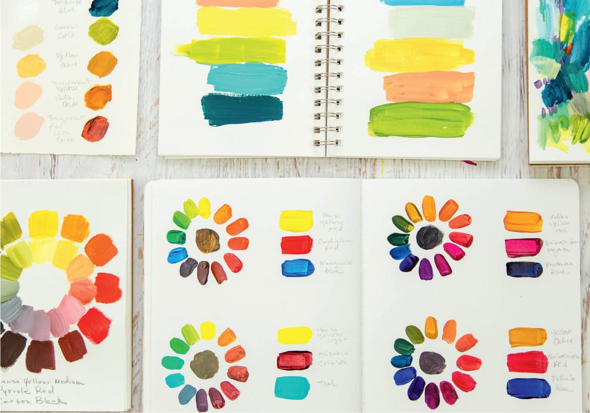
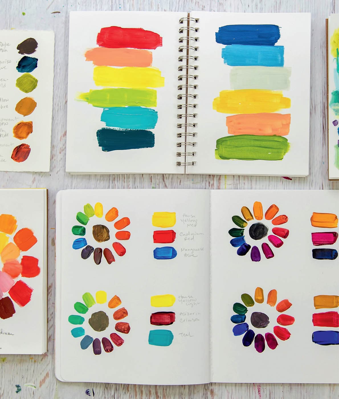
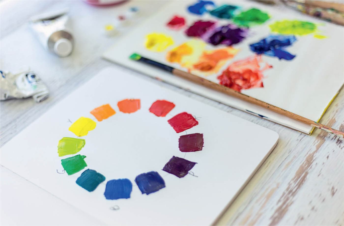
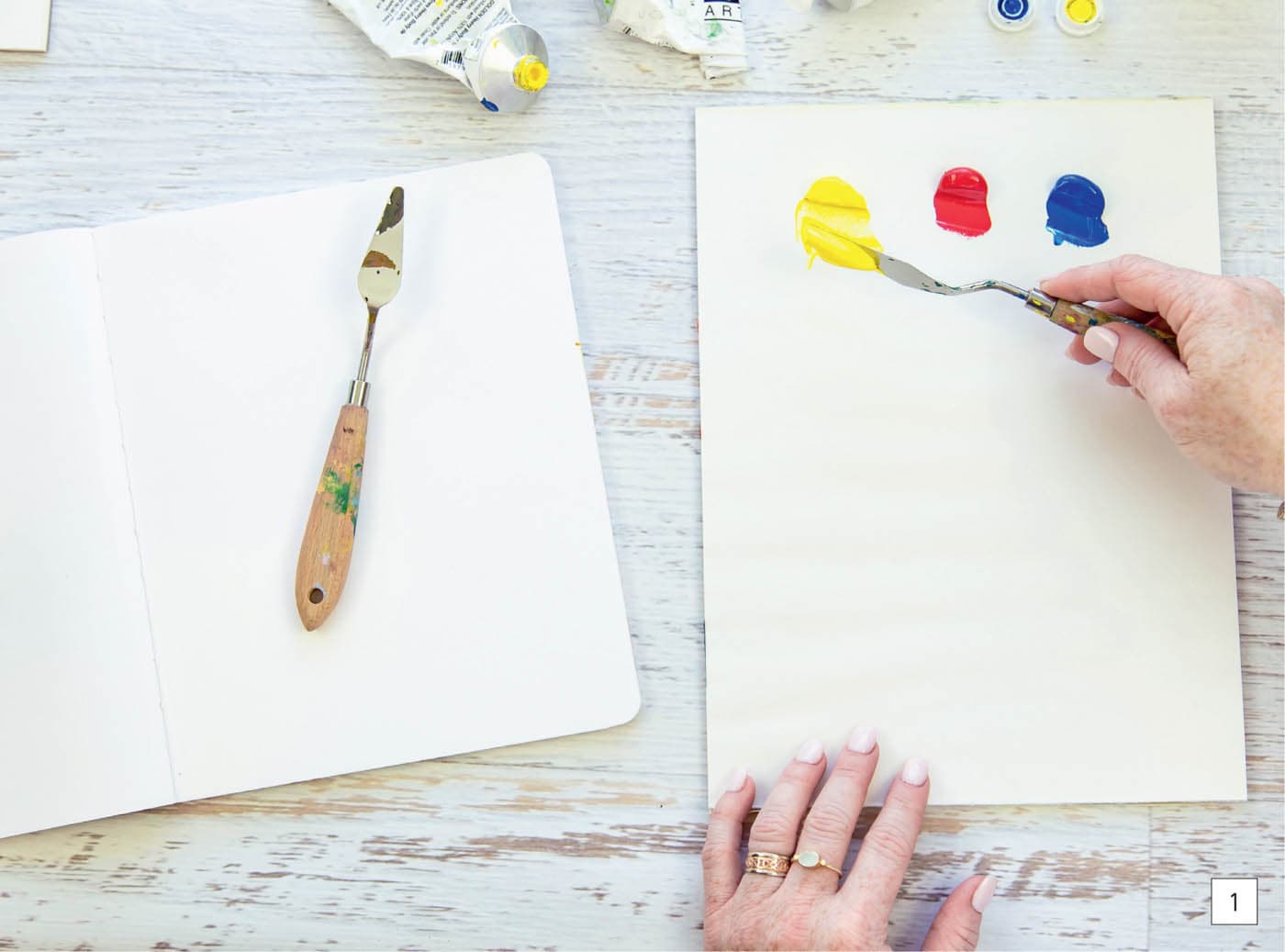
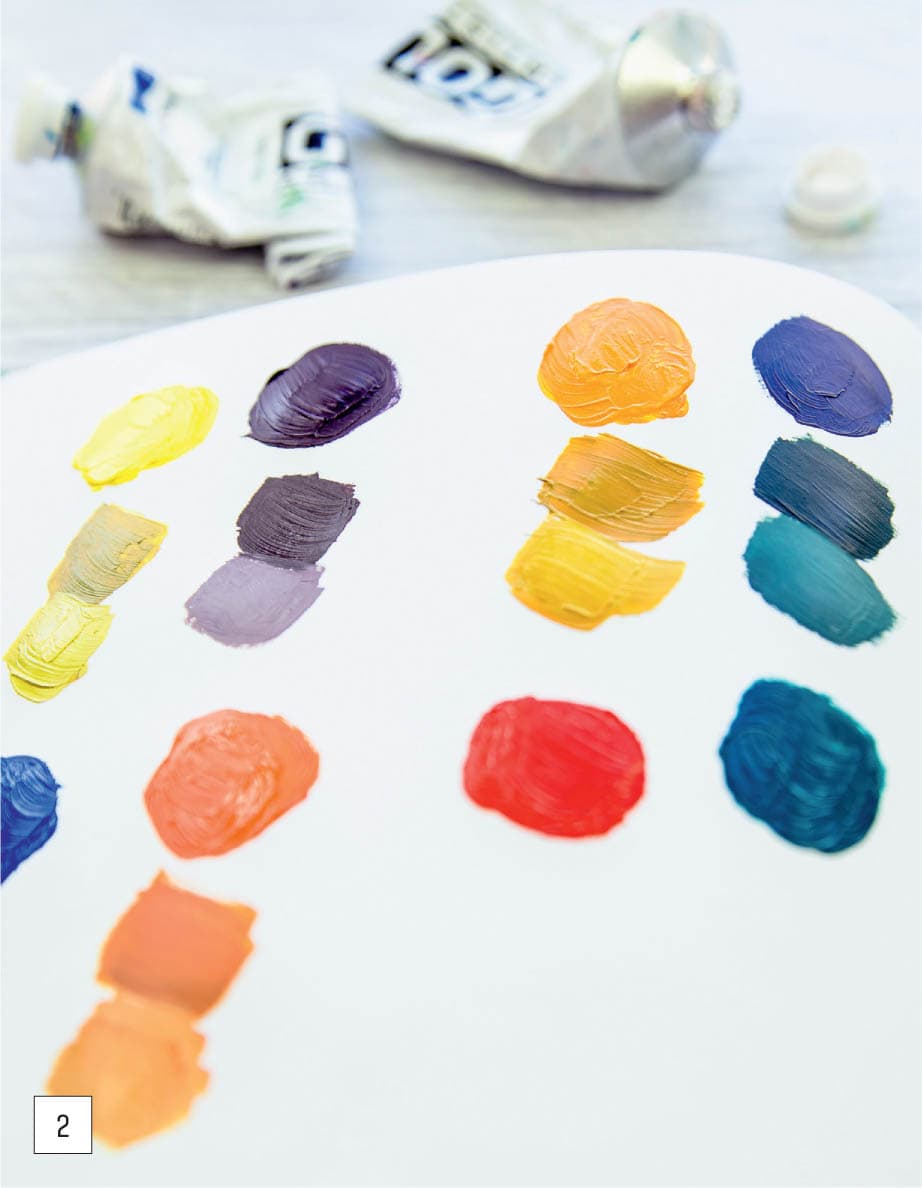
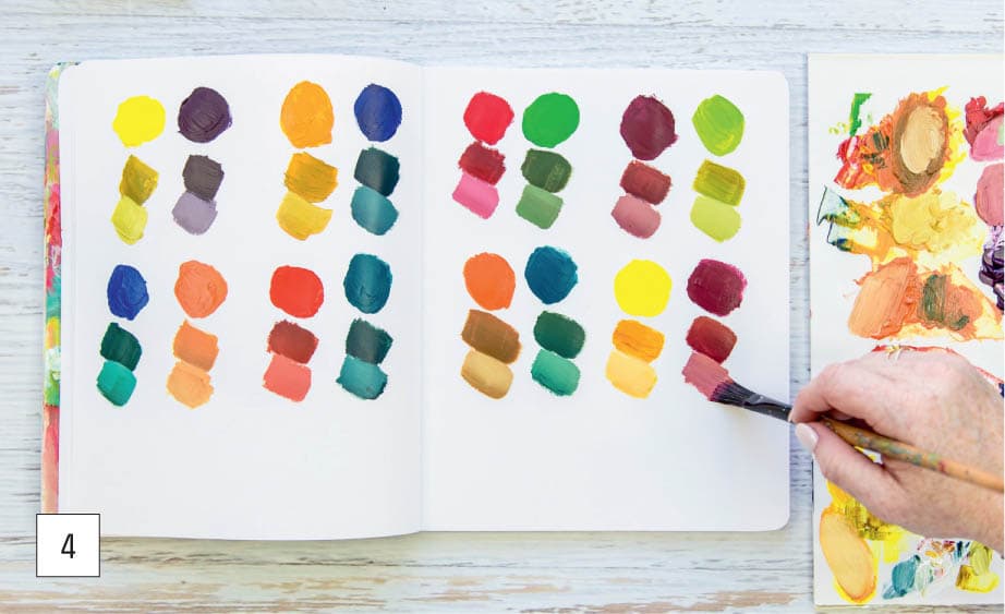
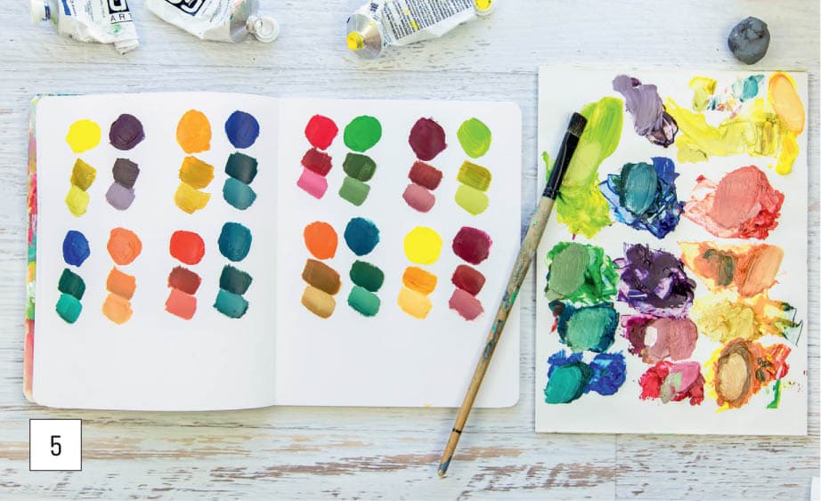
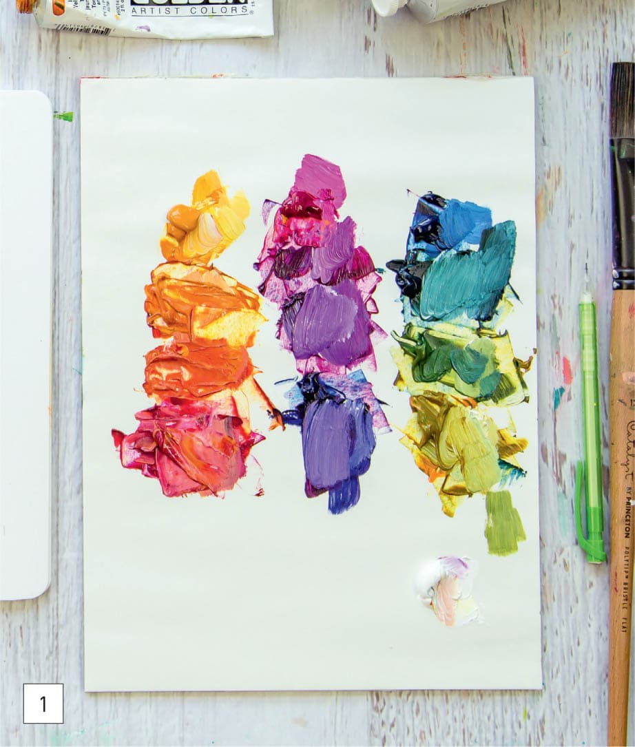
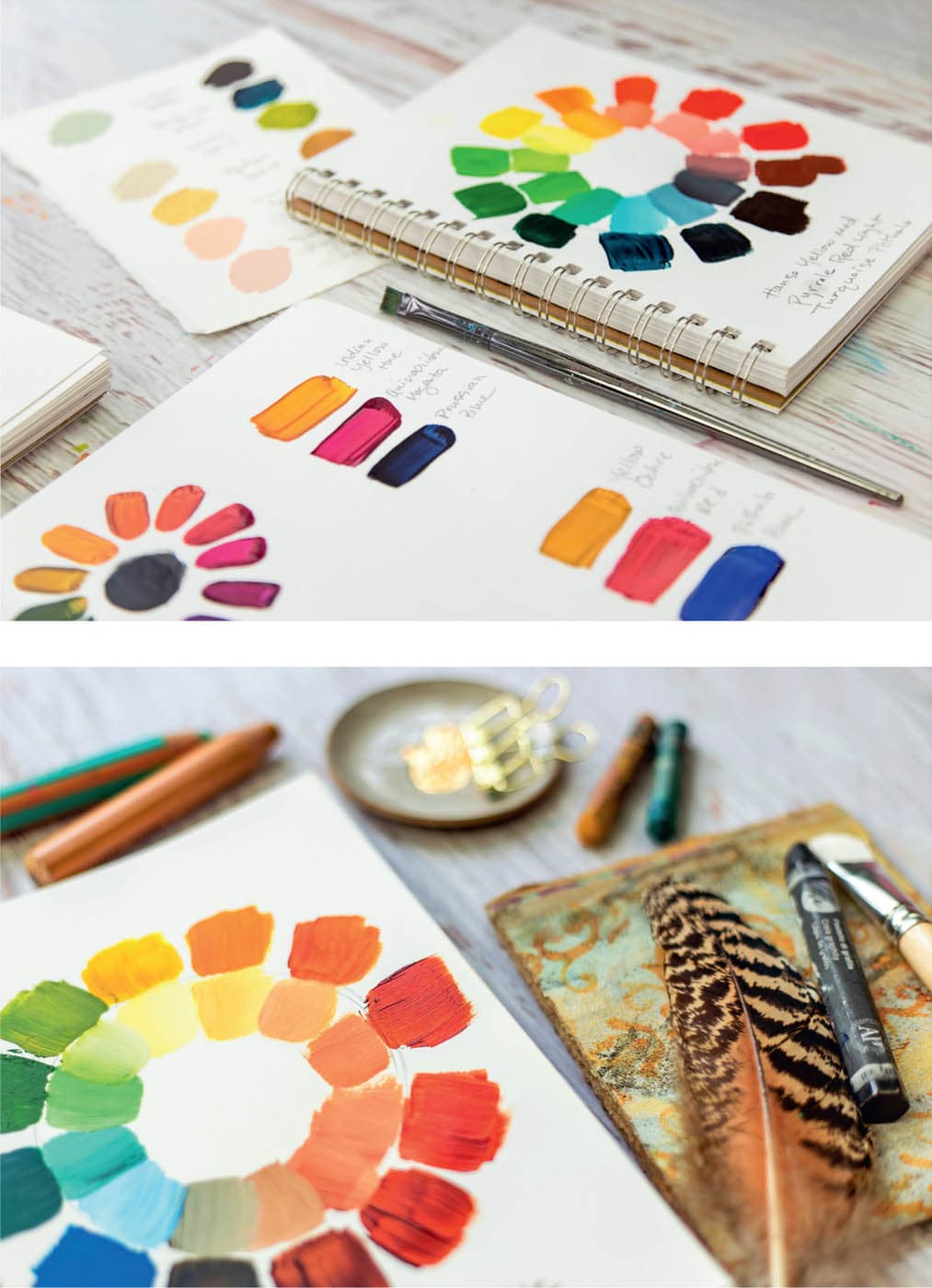
This color wheel exercise is the beginning of your mixing journey and reinforces the first principle: Know how color works. Pure color right out of the paint tube is exciting and easy. But nothing is as beneficial to understanding color and learning how hues work together than mixing colors yourself. This is where mixing your own colors using only primary cyan, primary magenta, and primary yellow comes into play. By using the CMY modern color theory, we can create an almost endless array of colors, including beautiful teals, vibrant violets, and earthy greens. Creating a basic color wheel is the first step. After you mix colors using the modern color primaries, try mixing the earth colors and pastels, as well as the classics (ultramarine blue, cadmium red, and cadmium yellow), to see how they differ. 1 | Add the three modern primary colors (primary cyan, primary magenta, and primary yellow) to a palette.
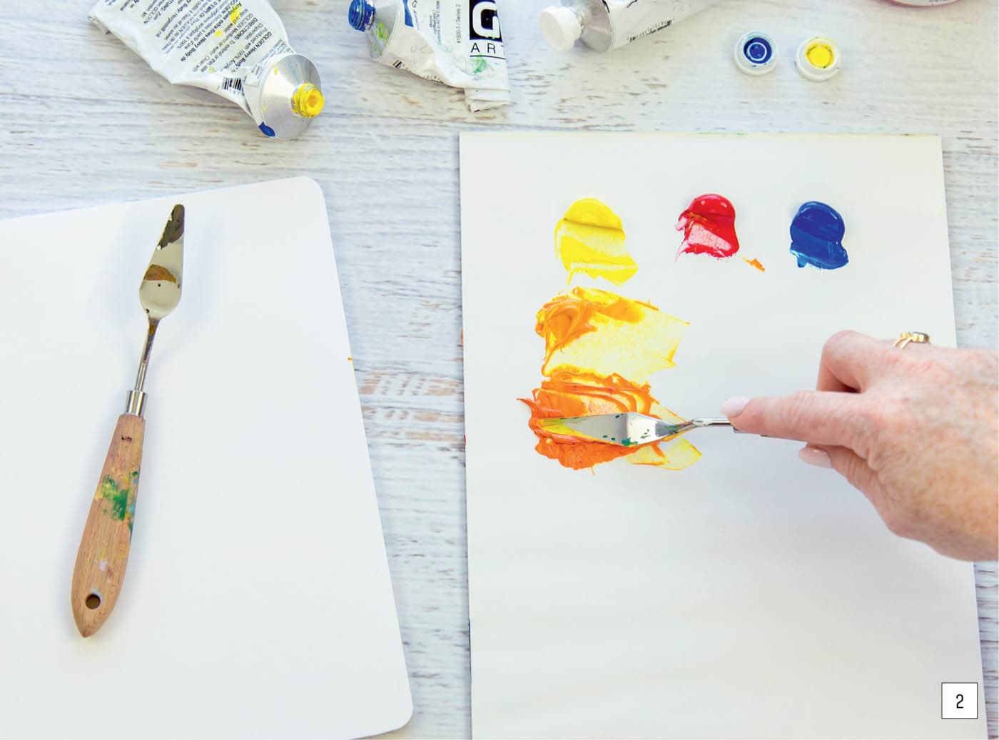
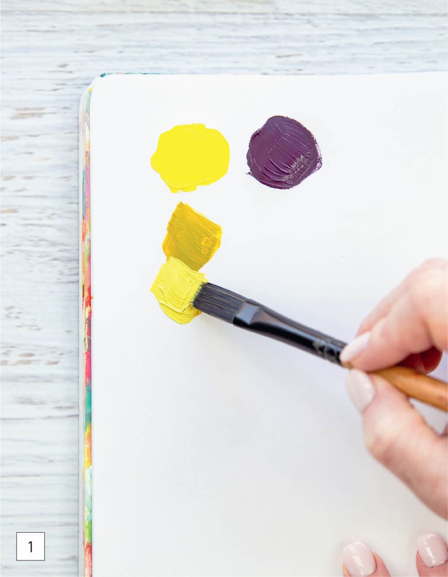
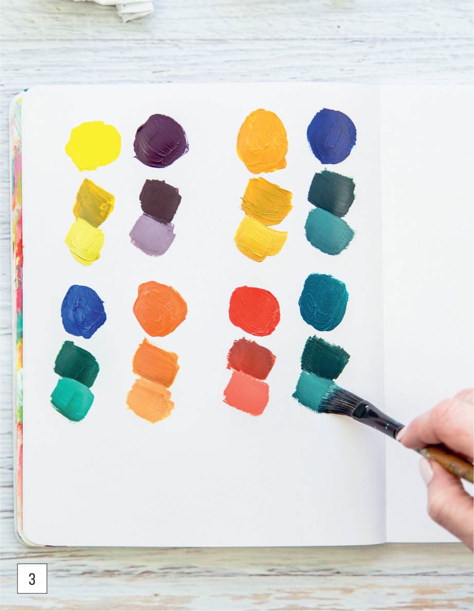
2 | To create secondary colors (orange, purple, and green), mix two of the three paint colors at a time to make a range of colors within each color family. To make the first range of secondary colors, add a touch of magenta to yellow to make a warm yellow hue. Mix more magenta with yellow to make a pumpkin orange, and add just a little bit of yellow to magenta to make a deep orange that is nearly red in hue.
3 | Make three hues of violet by mixing magenta and cyan. Mix a touch of cyan with magenta for a maroon color. For purple, add more cyan to magenta. To make indigo, blend only a touch of magenta with cyan.
4 | For the green variations, mix cyan and yellow. I used mostly yellow and a touch of cyan to make the lightest hue, and then continued adding just a little more cyan to make the darker shades of green. Cyan has a strong tinting strength, so you only need to start with a small amount when mixing with yellow.
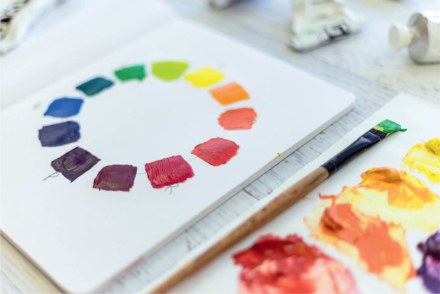
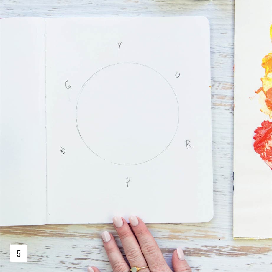
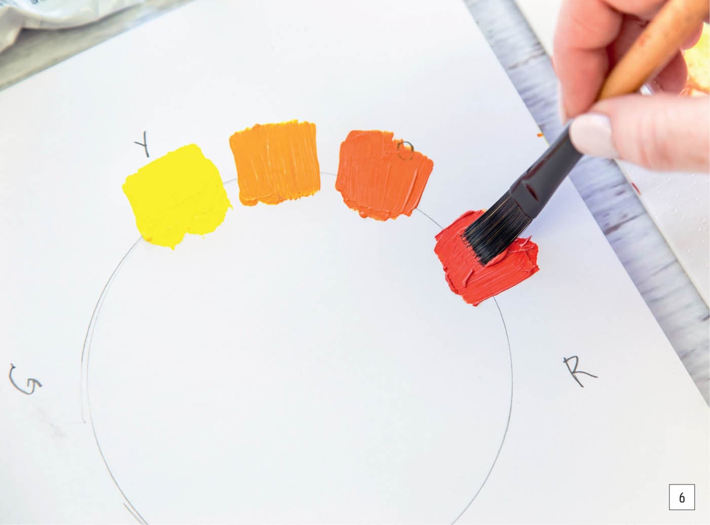
5 | Create a color wheel by drawing a large circle in pencil on art paper or in an art journal. Mark the twelve o’clock position with yellow (Y), the two o’clock position with orange (O), the four o’clock position with magenta (R), the six o’clock position with purple (P), the eight o’clock position with cyan (B), and the ten o’clock position with green (G). I always put yellow at the top because it’s the lightest color value, and arranging the wheel by value will help us later as we plan our palette.
6 | Fill in the wheel, using the three primary shades and the nine colors you just mixed, by brushing swatches of paint along the circle, starting with primary yellow and going clockwise, adding warm yellow, then orange, followed by red-orange, and so on.
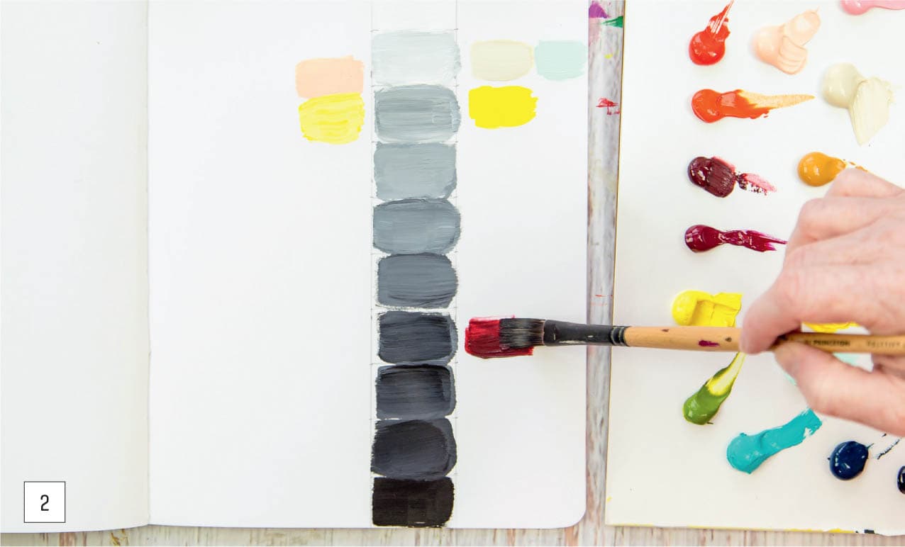
7 | Complete the wheel in the order the colors were mixed, and you’ll have a wonderful reference for all future projects. Color saturation can be a powerful tool in drawing your attention to a focal point in a piece. Saturated colors can also inject your work with vibrancy when paired with muted or desaturated colors, often referred to as mud. If you want to make a statement, just a few dabs of vivid color next to a dull background will make a big impact. Overusing highly saturated colors can be jarring or even boring because there is nothing to contrast with the high-chroma hues. Variation is key. Let’s practice making mud on purpose. By toning down vibrant hues, we can balance our paintings with muted colors. We need all the colors of the rainbow for this exercise, so this is perfect to do after creating a color wheel. In order to desaturate a bright hue, choose complementary colors for mixing. Complementary colors are opposite each other on the color wheel. 1 | Using the color wheel as a reference, swatch each complementary color pair side by side on heavy art paper or in your art journal. I started with yellow and purple and orange and blue.
2 | Mix a small amount of each complementary color into the other to mute the intensity. Continue, adding a little at a time to make incremental adjustments.
3 | For each muted mix, add varying amounts of white to create lighter values.
4 | Continue to swatch new complementary color combinations, going through the entire color wheel.
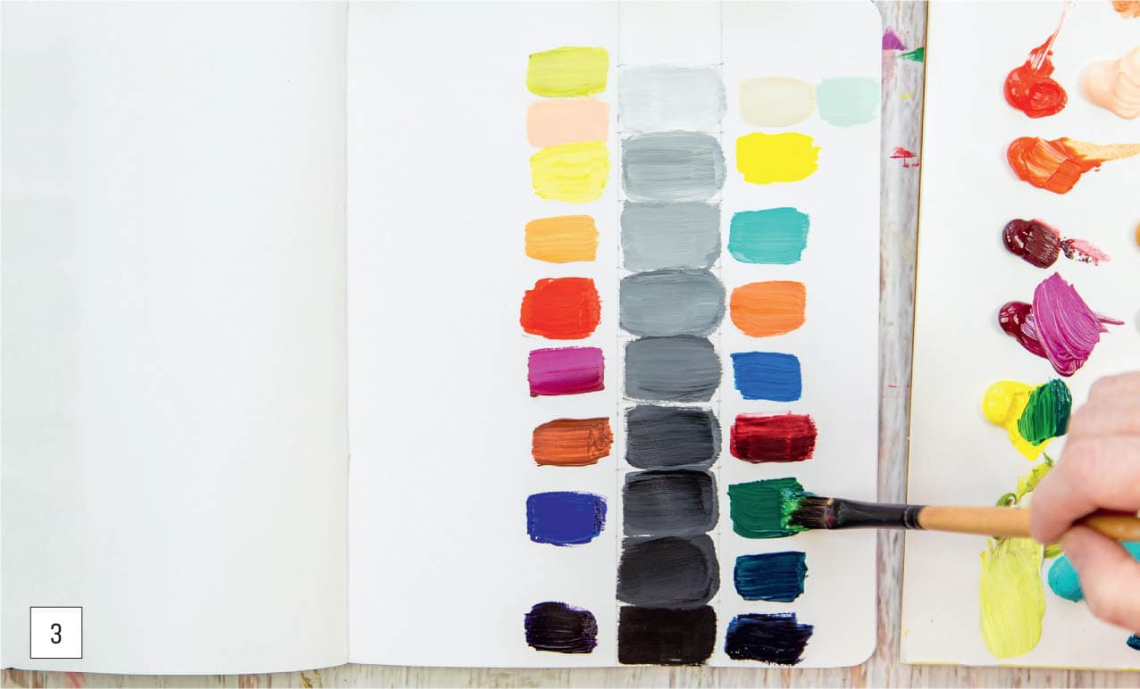
5 | Notice how the muted tones compare with the original shades. You’ll discover a whole new world of possible color combinations. Color value plays a key role in the success of your painting. If we think of color as a superhero, lack of a value range is its kryptonite. Without a dynamic value, your paintings will fall flat. Each color you choose will fall somewhere on the value spectrum. Let’s look at how a value range on a scale of one to ten works with our palette. Doing this assignment will cement the value range in your mind, allowing you to push the boundaries of contrast more freely and create a better work of art. 1 | Using a pencil, create a ten-square vertical grid in your art journal or on a large sheet of paper. Starting with white acrylic paint at the top and black at the bottom, mix black and white to shift the color in each section to make a gradation. Don’t worry if you don’t get it right the first time; you can paint over your previous attempt until you make a workable value chart.
2 | Gather your colors (straight from the tube or mixed) and match each color, value-wise, to a shade on the grid.
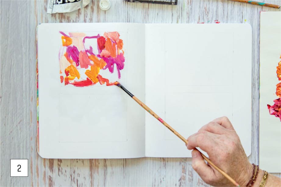
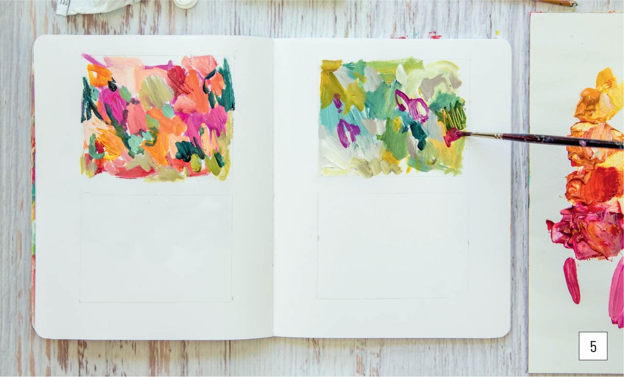
3 | Yellow will be the lightest shade, and purple or indigo will probably be the darkest. Where do the rest of the colors fall on this scale? To achieve overall unity and create emphasis in your artwork, you’ll need to decide which colors should be assigned the largest areas and which the smallest. This exercise highlights the design principle that variation is key (see here). We want to create interest in our work and actively avoid a perfect balance of all colors. If all colors are represented equally, your painting becomes stagnant. The easiest way to vary proportions is by using the gallon, pint, cup method. One color family will be used the most in your artwork (gallon), one used slightly less (pint) and the last used the least (cup). If you’re not familiar with the imperial measurement system, use most, some, and a bit in place of gallon, pint, and cup. If you want to take your work from flat to fab, then try this next exercise, which is designed to improve your composition and use of color. We’ll use the gallon, pint, cup method to create a simple abstract. In this photo, you can see that after I chose my color palette, I didn’t use proper proportions. I see this problem often: repeating colors equally in nearly the same value range and using similar repetitive marks without giving thought to composition or a focal point. This happens when we don’t resist the urge to make everything symmetrical.
1 | Mix a palette of colors using any three primaries, such as the modern color triad or any red, yellow, and blue. I used Indian yellow hue, quinacridone magenta, and Prussian blue, plus titanium white. Optional: Fill out the color wheel with your colors.
2 | Before you begin painting, block out four squares in a spread in your art journal so you can practice this proportion exercise several times. Decide which colors in your palette will be dominant and which will play a minor role for each square. For the first square, I chose to start with warm colors to make a prominent statement with pink and orange. I’m painting in an abstract manner so I can focus on the composition.
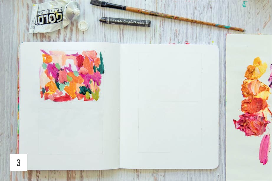
3 | Now that the dominant colors are in place, add colors that play a smaller role. I chose complementary colors of dark green, light yellow green, and pastel blue-green. I added them using smaller brushstokes to avoid painting even amounts.
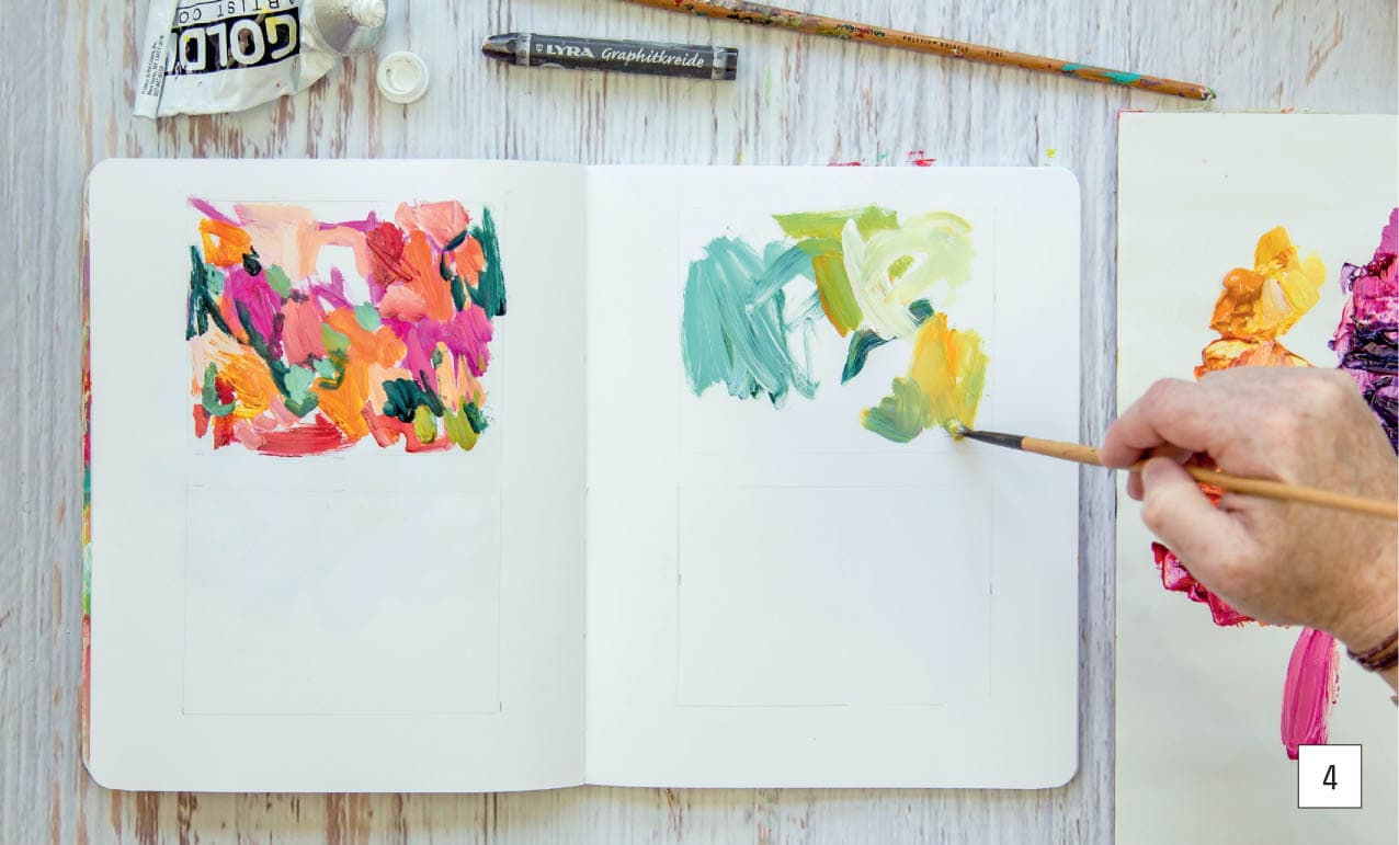
4 | In the second practice square, while the brush is already filled with paint, add the minor colors from the first square. But this time, use them as the major color focus, placing them in a dominant role.
5 | Continue painting the composition for the second square just as you did with the first by choosing complementary colors. This makes our dominant color yellow and violet-red our minor player. Can you see what an impact such a small amount makes?
6 | Continue the same pattern of gallon, pint, cup for the last two sections, choosing different proportions from the same palette each time. It may seem like you’re making random marks as you paint, but pay close attention to your design. The brushstrokes may be intuitive and an expression of your hand, but it’s still important to create a strong composition. This principle of proportion is vital and will instantly help you be more successful. Be mindful of not only the proportions of each color but also their values. Don’t forget to use white to lighten your initial mixes. This exercise can be repeated as many times as you wish and in as many squares as satisfies your need to explore. I love making small-square grids to practice my five color principles (see here) and my variation-is-key principle of design. Now that you’ve learned the foundation of my modern color theory method by mixing primary cyan, primary magenta, and primary yellow, let’s turn the idea on its head and begin creating new and exciting palettes using any three primary colors. We’ll explore color possibilities by mixing up random and unique combinations of blue, red, and yellow—with some strange alternatives. This exercise will be eye-opening and exciting and might revolutionize your understanding of color even more than mixing the traditional color wheel. It will teach you how color works in each mixing experiment and show that you can create great art with a limited palette. By limiting yourself to three colors plus white, you’ll see how many variations you can achieve while still creating a harmonious palette. Try these primary combinations or choose one of your own, and relax into a meditative spell of mixing paint: Now that you’ve created a basic color wheel, it’s time to dig deeper. Let’s see what happens when you mix these colors in new and different ways. There is no better way to learn than to play! Try a few of these ideas: 1 | Mix cyan and a tiny bit of yellow with a touch of white to make a beautiful blue-green. You’ve created a custom shade of teal! 2 | Add white to any violet to create lavender. Do you like a bright lilac, or do you prefer a muted purple? Adding a little bit of the opposite color on the color wheel will tone the color down and make a plum-purple. 3 | Try mixing a unique shade of brown by using all three primary colors. Is the color almost black? What happens if you add white? Which version of brown do you prefer? 4 | Tone down an electric green by adding a touch of magenta or orange. See if you can create a more natural shade of green. 5 | Adding white to red-orange can make a beautiful coral color. 6 | Make gray by mixing colors that are opposite each other on the color wheel: cyan and orange, magenta and green, yellow and violet. Add white, and you’ll have lovely, rich gray tones. 7 | Create perfect tints of pink with red and magenta plus white. Which one speaks to you? 8 | Here are some ideas for changing yellow hues: For greenish-yellow colors, add white to get a cool lemony yellow. For orange-yellow, add white to get a nice buttery yellow. Which of these do you prefer? 9 | How do colors shift if you add a bit of black to them? How does that compare with mixing complementary colors to make gray? 10 | Try your own combinations, record them in your art journal, and share your results.LET’S EXPERIMENT WITH COLOR
Color Wheel Warm-Up


The Benefits of Making Mud
Color Has Value

Color Proportion


Alternative Primaries
Color Mixing Experiments