
Key Terms
Ascender
Baseline
Baseline Shift
Capline
Counter
Descender
Flush Left
Font Family
Gridline
Justification
Kerning
Leading
Legibility
Letterform
Mean Line
Point
Posture
Ragged Right
Readability
Screen Font
Snapping
Text
Tracking
Typeface
Typography
Web-Safe Font
X-Height
Font Styles and Effects
All Caps
Beveled
Boldface
Condensed
Drop Shadow
Embossed
Expanded
Faux Bold/Italic
Italic
Oblique
Small Caps
Strikethrough
Stroke
Subscript
Superscript
Underlined
Typefaces
Blackletter
Decorative
Modern
Old Style
Roman
Sans Serif
Script
Serif
Slab Serif
Symbol
Transitional
Yes, it is a press, certainly, but a press from which shall flow in inexhaustible streams the most abundant and most marvelous liquor that has ever flowed to relieve the thirst of men. Through it, God will spread His word; a spring of pure truth shall flow from it; like a new star it shall scatter the darkness of ignorance, and cause a light hithertofore unknown to shine among men.
—Attributed to Johannes Gutenberg, inventor and pioneer of the modern printing era (1398–1468)
Chapter Highlights
This chapter examines:
- ■ The origins of typography and the modern use of electronic type
- ■ Styles and classifications for electronic typefaces in graphic design
- ■ Tools and techniques for managing the appearance of text
- ■ Tools and techniques for controlling character and line spacing, text placement, and alignment
- ■ Ideas for maximizing the readability of on-screen text in multimedia projects
An Introduction to Typography
The element of text is one of the most important components of a multimedia experience. Text is the visual representation of intellectual thought as expressed through a human language system. Whether it’s in the form of texting, hypertext, Tweeting, email, snail mail, or notes on a napkin at lunch, text plays a big role in our lives. The Age of Enlightenment was predicated on humankind’s ability to share ideas and information through formally agreed-upon conventions of writing. Even in a multimedia age, we continue to rely on text as the primary means of recording, receiving, and transferring human knowledge and ideas. So what is typography? How do you make informed choices about fonts, spacing, and other typesetting and layout options? What makes Times New Roman recognizable and look different from Arial? Let’s start at the beginning and get a few terms and ideas straight.
Type is a character or letterform created for the purpose of communicating written information through printing or electronic means. The term letterform implies letters, but it also applies to other characters, such as punctuation, symbols, and numbers. Typography is the art of designing and arranging type (see Figure 8.1). You’ve heard of fonts and typeface; although some people use the terms interchangeably, they have different meanings. Typeface is about design, while font is about executing a version of that design in a particular size. The term typeface refers to a particular style of type, such as Times New Roman, where the entire set of alphanumeric characters and symbols—perhaps almost 200—conforms to the same design specifications, such as the height of lowercase letters in relationship to capital letters (roughly speaking, the x-height) and whether the characters have serifs (decorative accents added to the end of a stroke).

Figure 8.1
The shape of a tree is formed by the arrangement of stylized text. Here, text is creatively used as an element of both form and content.
Source: Ahmad Faizal Yahya/Shutterstock.com.
A typeface has a unified appearance. The term font, on the other hand, refers to the digital or physical means of creating or displaying that typeface in a particular style and size (though the size may be scalable). Times New Roman, for instance, is a typeface, a set of specifications that make the characters look a certain way, no matter the size or medium, but PostScript 12-point Times New Roman is a font. A collection of related fonts—all the bolds, italics, and so forth, in their varied sizes—is a font family (see Figure 8.2).
Movable type was first invented in Asia, but historians often credit Johannes Gutenberg and his invention of efficient movable type in about 1450 as the starting point of the modern printing era. Gutenberg, a goldsmith and inventor by trade, converted a winepress into a device capable of mass-producing pages of printed text. The Gutenberg press required the printer to manually arrange small pieces of metal type into
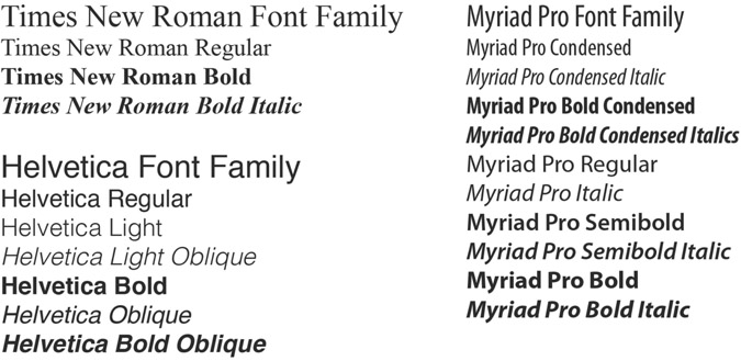
Figure 8.2
A font family includes all the variant styles associated with a particular typeface (bold, condensed, light, italic, oblique, etc.). The “regular” style associated with a typeface is its default look or appearance without any stylistic enhancements. Many typefaces have only a regular style.

Figure 8.3
Prior to the invention of modern electronic typesetting methods, type had to be set by hand. It was a tedious and time-consuming process.
horizontal rows to form an inverted image of a prepress layout. Each metal block was designed with a single raised letterform on the surface. The side of the metal block containing the raised character was called the face, or typeface (see Figure 8.3). The width of the blocks varied, with skinny letters such as l being narrower than wide letters such as m, but the other dimensions were uniform. Other blocks without a raised surface were used as separators between words and sentences. When the layout was complete, the printer would apply a coating of ink to the surface of the blocks. Next, a sheet of paper was placed on top of the blocks. In the final step, the printer would apply pressure to the backside of the paper with the winepress, resulting in a transfer of the ink from the typeface to the surface of the page. As with block printing— carving the text of each page in a block—Gutenberg’s process also guaranteed that each printing would result in an identical reproduction of the original page. While the process of setting the type for a single page was quite time-consuming, the actual printing of the page was very fast, especially when compared to the old-school methods of manual reproduction by human scribes or block printing.
Printing technology has evolved considerably since Gutenberg’s day. Metal type has not wholly been replaced by electronic type, but most typesetting is now done digitally, and digital type is far easier to use and manipulate. With digital type, you have the option of outputting text to a printer, computer screen, or virtually any other type of electronic display. With tens of thousands of typefaces available and so many easy options for customizing text, you might think good typesetting would be a snap. But good typographic design requires knowledge and careful planning. Good design creates an aesthetically pleasing layout that communicates effectively to the user (the reader, the viewer, or the person interacting with the text). Writing involves the crafting of words, while typography applies the complex rules of design to the presentation of words on a printed page or digital screen to not only present written ideas but also set a tone or vibe, establish a visual hierarchy, and attract and maintain users’ interest.
Legibility and Readability
Legibility and readability are related terms. Legibility refers to a typeface’s characteristics and can change depending on font size. The more legible a typeface, the easier it is at a glance to distinguish and identify letters, numbers, and symbols. A number of factors affect legibility, such as x-height and counter size (the size of the open space either fully or partially enclosed in a letter). In Figure 8.4 (left), compare the letterforms in Playbill, Arial, Rosewood, and the other typefaces shown for legibility.

Figure 8.4
Legibility and readability are related. What letters or words are easiest to distinguish? Which ones are easiest to read on a digital display?
Source: Susan A. Youngblood.
Readability refers to how easy text is to read in context, not as isolated letters, and depends on a variety of factors, including typeface characteristics such as italics, font size, style, letter spacing, line spacing, alignment, background, capitalization choices, and contrast. Legibility is a factor, of course: if characters are hard to identify, words are hard to read. Good type designs are usually invisible, meaning the reader’s attention is fixed on the words and the meaning of the text, rather than on the stylistic features of individual characters. When typesetting is sloppy and ill-conceived, the readability of text diminishes. When users begin to consciously notice details of a typeface over content, readability is diminished. When users have to strain to read—and when their eyes fatigue because of typesetting choices—readability is diminished. In Figure 8.4 (right), compare the line spacing, styles, and letterforms in Bodoni, Times New Roman, and Script typefaces shown for readability.
Characteristics that Define Typefaces
Many of the traditions surrounding the design and construction of modern-day type-faces are rooted in earlier times when letters were hand drawn. Typography terms reflect type’s origins, as do some typeface characteristics, especially early ones. Typographers have well over 40 terms to describe the features of individual letterforms. You may wish to study typography in the future, but the terms that follow will give you a good start.
Stroke, Contrast, and Stress
Before the days of movable type, scribes often used a broad-tipped nib pen dipped in ink to individually construct each stroke in a letterform. A stroke could move vertically, horizontally, diagonally, or in a curved direction. In hand lettering, the width of a stroke can vary as the angle and direction of the nib changes with the movement of the pen. This is particularly noticeable in characters with curved strokes, such as in an O, C, and Q.
The transition between the thick and thin areas of a stroke is called contrast (see Figure 8.5). Low-contrast typefaces have little to no variation between the thick and thin portions of a stroke. In high-contrast typefaces, the stroke transitions are more pronounced, often allowing users to read the letters more easily. Stress is the location or angle of a transition from thick to thin or vice versa. In vertical stress fonts, the transition occurs at the top and bottom of the vertical axis. In angled stress fonts, the transition takes place off-axis, either slightly to the left of center (left angled) or to the right of center (right angled).

Figure 8.5
Left: Garamond is considered a high-contrast font because of the stark difference in the width of the strokes used to form a single character. Right: Arial Black, on the other hand, has a consistent width for each stroke segment.
Weight: Regular, Boldface, and Light
Bold typefaces (also known as boldface) increase the width of the stroke and the visual weight of the regular roman letterform. The letterforms, serifs, and character spacing of boldface type are redesigned to accommodate the increase in stroke thickness, so letters have adequate counterform, or white space between and within them. Light typefaces are the opposite of boldface, with small stroke widths.
Posture: Roman, Oblique, and Italic
Letterforms have postures. In typography, the term Roman with an uppercase R refers to the inspiration of certain typefaces and to categories of typeface. The word roman with a lowercase r, however, refers to upright typefaces. Letters with other postures— oblique and italic—usually slant to the right, often by about 12 degrees. Oblique typefaces have letterforms based on roman counterparts. Italic typefaces have features that emulate handwritten forms. A true italic typeface contains visual features consistent with, but not necessarily included in, the roman version of the typeface.
Proportions and Letterform Parts
Figure 8.6 illustrates the basic characteristics of a typeface. In a row of type, the bottom edge of each character’s main body rests on an imaginary plane called the baseline. Uppercase letters have their tops at the capline. Flat-topped lowercase letters have their tops at the mean line, and the relative size of a typeface is denoted by its x-height, or the distance between the mean line and the baseline, most easily measured using a lowercase x. The counter is the enclosed or partially enclosed open area in letters such as O and G. Typefaces with larger x-heights and counter sizes are often easier to read. An ascender is any part of a lowercase character that extends above the x-height, such as in the vertical stem of the letter b or h. A descender is any part of a character that extends below the baseline, such as in the bottom stroke of a y or p. Most typefaces are proportional, meaning the type width for each letterform varies, so an l sits close to neighboring letters, taking up less space than an m. Some typefaces are monospaced: spacing is uniform, so an l and m take up the same horizontal space. Monospaced typefaces are less readable for ordinary purposes, but they are used to illustrate code and in coding applications, such as Dreamweaver for web design, when you need to be able to distinguish each letter.

Figure 8.6
The characteristics, illustrated here, not only define each typeface, but also help determine a typeface’s suitability for various uses.
Source: Susan A. Youngblood.
Serifs are small marks located on the ends of a main character stroke (see Figure 8.7). Serif typefaces contain serifs, while sans serif typefaces do not. Which is better for print, and which is better for electronic display? Even a few years ago, experts would have said that serif typefaces were better for printed materials such as books because the serifs help with horizontal flow, or help guide readers’ eyes across long lines of text. Some of this research on print readability has been called into question; at most, the difference made by serifs is small. Other research suggests that sans serif typefaces are better for electronic displays. Why? Serifs are small, so lower-resolution displays don’t have enough pixels to cleanly render the serifs. Sans serif typefaces are usually better for computer monitors and video. As you make typeface choices, consider specific font characteristics that improve legibility, not just categories. Also consider what your users expect in a given context, which is often serif typefaces for print and sans serif for electronic media.

Figure 8.7
Serifs are decorative accents added to the end of a stroke.
Categorizing Typefaces
Typefaces are generally classified into two main groups depending on whether or not they contain serifs, and those groups can be divided many ways. The classification system discussed here is only one way to name and group typefaces. With so many variables, some typefaces are hard to classify. And different systems use some of the same words, such as Gothic, to mean different things.
Serif Typefaces
There are six main groups of serif typefaces: Blackletter, Humanist, Old Style, Transitional, Modern, and Slab Serif (see Figure 8.8, top). Serif typefaces are the industry standard for body copy that’s printed in books, magazines, and newspapers. Even if new research calls into question readability differences on paper, readers are used to serif typefaces in these contexts. Digital technology can have trouble displaying serifs, so unless you’re using a serif typeface designed for the digital display, such as Georgia, you’re usually better off relying on serif typefaces for large headings or for print media.
From Blackletter to Old Style Typefaces
When movable type was invented, typeface designers simply copied the style of written forms onto the surface of metal type. Since traditional pen-based forms were familiar to the pioneers of printing, it seemed natural to them to design movable type in the same style that had been used for centuries. After all, this is what people were visually accustomed to. Because of Gutenberg’s origins, it’s no surprise that the Gothic script known as Blackletter was the first letterform to be widely adapted to metal type throughout the Germanic regions of Europe. While highly decorative, Blackletter type is composed of heavy angular strokes with few curves, making it a rather bold typeface that’s difficult to read in small print. The Gutenberg Bible, the first book ever mass-produced with a printing press, used Blackletter type. Gutenberg used a two-column design with forty-two lines of text per page. The typeface could be read because the font was big, but the Gutenberg Bible was quite large and heavy when finished.

Figure 8.8
Typefaces and typeface categories have evolved over the centuries. These examples are typical of their categories, but some were created later than the earliest dates listed for a given category.
Source: Susan A. Youngblood.
As printing moved into southern Europe, the more efficient and elegant forms of Roman lettering greatly influenced the design of metal type. Humanist (also known as Venetian) typefaces were the result. Like Blackletter, they are dark on the page and have sloped crossbars in the lowercase e, but despite their low contrast, they were considered an improvement over their Gothic predecessor. Humanist letterforms have more rounded and gentler strokes and are much easier to read in small print than Blackletter, despite having relatively small x-heights. Many of the serifs on lowercase letters are slanted, and serifs tend to be bracketed: the serifs connect to the main stroke with a curve, providing a smooth and gentle transition from the thick to thin areas of a font. Soon after, italic typefaces were developed; they allowed printers to put more words on a line and are still used for emphasis. Old Style (also known as Garalde) typefaces are similar to Humanist typefaces but are distinguished by a somewhat more vertical stress and horizontal crossbars in the lowercase e. Old Style typefaces include Garamond, Bembo, and Caslon and remain popular.
Transitional Typefaces
As the name implies, the design attributes of Transitional letterforms fall somewhere between those of Old Style and what’s to come: modern-era type. Compared to Old Style type, Transitional typefaces, such as Times New Roman and Baskerville, have higher contrast, a larger x-height, vertical stress, wider bracketed serifs, and generally wider letterforms.
Times New Roman is one of the most ubiquitous and well-known typefaces in this category. After being criticized for sloppy printing and the lack of readability in their newsprint, the London-based newspaper the Times commissioned the Mono-type Corporation in 1931 to develop a new typeface. Released a year later, Times New Roman quickly evolved into the industry standard typeface for the newspaper, magazine, and book publishing industries. Today, Times New Roman is still widely popular and is one of a handful of universal fonts that are included with nearly every computer and operating system in the world.
Modern Typefaces
Modern (also known as Didone) typefaces represented the first noticeable departure from typography’s historical dependency on pen-based letterforms. Their designs have an extremely high contrast, a small x-height, thin horizontal serifs with little to no bracketing, and vertical stress in the rounded strokes. Modern fonts are not very readable when reduced to small, lengthy sections of text. Their contemporary features make them a better choice for title text and headers.
Slab Serif Typefaces
Up until the time of the Industrial Revolution, typefaces were largely designed for setting small body type in newsprint and books. With industrialization came the increased need to promote and advertise goods and services for public consumption using large letter type. Slab serif (also known as Egyptian) type-faces were designed specifically for this type of application. Bold and eye-catching, slab serif typefaces are a good choice for posters, flyers, billboards, and other large-format media that demand immediate attention and text recognition. Slab serif typefaces have low-contrast strokes, thick horizontal serifs that can be either squared-off or slightly bracketed, and vertical stress in the rounded strokes.
Sans Serif Typefaces
Sans is a French word meaning “without,” thus sans serif (also known as lineal) typefaces are those that are literally without serifs; they are sometimes also referred to as gothic or grotesque because some earlier typeface designers found them unattractive. Sans serif type was used to emboss pages for blind readers beginning in 1789 and was developed for printing for sighted readers in 1816. The popularity of sans serif typefaces boomed in the 20th century. Type designers strove to create basic letterforms, devoid of the excessive design elements of modern and slab serif type. Sans serif typefaces obviously have no serifs and usually have uniform strokes with little to no contrast and a vertical stress in rounded strokes. These typefaces are also broken into categories: humanist for varieties that have an angled stress, nongeometric counters, and contrast; geometric for varieties that have vertical stresses, geometric counters, and no contrast; and transitional for those in between (see Figure 8.8, bottom).
Sans serif typefaces are ideal for text headings and titles in print and for use in electronic media where lower resolution can make serifs hard to render cleanly. Because of this, sans serif fonts are often the best choice when designing body copy for the Web or other channels of electronic distribution.

Figure 8.9
These decorative fonts were downloaded under a freeware license from urbanfonts.com, a popular font-sharing website that provides access to thousands of free and commercial fonts.
Source: http://www.urbanfonts.com.
Decorative Typefaces
Decorative typefaces connote a sense of mood, emotion, or attitude (see Figure 8.9). They have personality, which is great for attracting attention but does little for enhancing the readability of the text in small form. Decorative typefaces are characterized by unusual features intended to add splash and pizzazz to a design. Because they’re purposely designed to draw lots of attention to themselves, they should be used in moderation.
Script Typefaces
Script typefaces are among the easiest letterforms to categorize because they so clearly attempt to emulate the cursive style of handwriting or the artistic appearance of calligraphy. Script typefaces are slanted, and a stroke connects adjoining letters and preserves linear flow. Script typefaces are popular with commercial printers when they need to create a formal text design such as in a wedding invitation or certificate of achievement, when readability is less of a concern than the overall feel of the document. Because of their thin strokes and angled form, these typefaces generally have a weak appearance when rendered out to electronic displays.
Symbol Typefaces and Special Characters
There will undoubtedly come a time when you need to insert a special character or symbol that’s not found on your keyboard, such as those shown in the following.
€ å ≠ ± é © ® ¢ Ω ß
Many common symbols—such as currency symbols, mathematical operators, accented letters, and copyright marks—are included in the Universal Character Set established by the ISO/IEC standard 10646. Depending on which program you’re using, many special characters can be added to a document by combining a modifier key on the keyboard with a second key or character code (or Unicode). For example, pressing OPTION+G on a Mac keyboard produces ©, the international copyright symbol. On a standard English Windows keyboard, the same character can be inserted by typing ALT+169. The advantage of this method is that the design of the inserted character matches the style of the currently active typeface. It is a part of the same font family and therefore blends seamlessly with the surrounding type. Unfortunately, the Universal Character Set does not include everything. As an alternative, you can use a dingbat (or symbol) typeface, such as Symbol, Wing-ding, Webdings, or Zapf Dingbats (see Figure 8.10). Symbol typefaces are popular because they include many ornamental characters not found elsewhere. However, they will not blend as naturally when mixed with another typeface.

Figure 8.10
Many programs and operating systems include a character or keyboard map that allows you to view, select, and insert special characters into an open document. Here, the Glyphs panel in Adobe Photoshop CC is used to insert symbols from the Wingdings font family.
Source: Adobe product screenshot reprinted with permission from Adobe Systems Incorporated.
Computers and Typefaces
The vast majority of the typefaces (and their fonts) on your computer were designed for the high-resolution medium of printing. When rendered digitally, printer fonts are often difficult to read, especially when they are small, bold, script, or italic or have thin strokes or tricky-to-display serifs. Georgia and Verdana were among the first typefaces created specifically for display on computer monitors. They have good x-heights, large counters, easily distinguished characters (for instance, uppercase i and lowercase l), and distinctive bold. In readability testing for the Web, Verdana consistently scores high marks and is one of the most popular screen fonts used for body copy on the Web.
In order for a web browser to accurately display text in a web page, all the fonts used in its design must reside on the client computer. When the browser is unable to locate a font that’s specified in the HTML code, it will perform a font substitution, swapping out the intended typeface with a local one. Font substitution can significantly change the look of a page from what was originally intended. To ensure font compatibility with other systems, select a font from one of the following families: Arial, Comic Sans, Courier New, Georgia, Impact, Times New Roman, Trebuchet MS, Symbol, and Verdana. These are standard fonts that come with all Windows and Mac computer systems. They’re also considered to be web safe, meaning they are supported by all the most popular web browsers.
Relying solely on safe fonts can limit your creativity. As an alternative, text can be saved as a graphic image and uploaded to the Web in JPEG or GIF format. With the typeface embedded inside the text graphic, users don’t need to have the matching font installed on their local computers to view it. However, use images of text only for titles, headers, and display text: search engines do not have the ability to locate text when it’s embedded in a graphic, and users with disabilities need you to provide alternative text for every image, which can be cumbersome if you have a text-heavy image. If you choose to create limited text in images, consider using an OpenType font: these fonts are scalable and cross-platform, so they’ll look right if you move between a Mac and PC during your project.
Tech Talk
Category Characteristics
A typeface’s characteristics help determine which category it fits in and what it is best used for.


Adding to Your Typeface Collection
Typefaces can be added to a computer system (as fonts) in a number of different ways. An assortment of basic fonts is included with the operating system on your computer. Additional fonts are added to the system when new software is installed (word-processing applications, graphics programs, etc.). Fonts can also be obtained individually from commercial font foundries and third-party software vendors and through freeware and shareware services on the Internet (see Figure 8.11). If you have ample patience and a meticulous personality, you can even create your own fonts using software such as FontLab.

Figure 8.11
The fonts shown here are designed and sold by Linotype, a commercial type foundry that specializes in commercial typefaces for professional designers. Founded in 1886, Linotype designers have created a large collection of fonts including familiar ones such as Gil Sans, Helvetica, Optima, Palatino, and Papyrus.
Source: http://www.linotype.com.
Font Styles
Adding emphasis to keywords, headings, or phrases lets the user know there is a sense of order and importance in the way information is presented. When all the text on a page looks exactly the same, the design becomes visually flat and viewers are left to wander aimlessly through a sea of monotonous pixels. On the other hand, if you emphasize too many text elements at once, the design may appear visually cluttered and confusing. In other words, if you emphasize just about everything, you emphasize nothing. As with all things in design, moderation and balance are important. Text emphasis is most often accomplished by varying the style, size, and color of a typeface (see Figure 8.12).
True and Faux Font Styles
Font styles, or font-family variations, are used by designers to add visual variety and emphasis to text by varying the weight, angle, and width of the typeface. Most font families include the four basic styles of roman (upright), bold, italic, and bold italic. Font styles usually look better when they are true font styles—ones in which the designer carefully changed each glyph during design—rather than faux font styles—computer-generated effects that simulate font adaptations to create faux bold and faux italics. Faux styles often produce a look that’s different from what the designers of the font intended (see Figure 8.13). Professional designers prefer the authentic look of true font styles because the size, shape, and spacing of each letterform are custom designed to be consistent with the overall look of the typeface; they tend to avoid faux styles because they are aesthetically less pleasing than the real thing. Some typefaces have more true font styles than others.

Figure 8.12
The Character panel in Adobe Photoshop CC can be used for modifying the appearance of selected text in a visual design.
Source: Adobe product screenshot reprinted with permission from Adobe Systems Incorporated.

Figure 8.13
The difference between true bold and italic styles and faux effects is quite dramatic when you compare them side by side.
Italics and Boldface for Emphasis
When used in moderation, changing a word or short phrase to italics can be a subtle, effective, and elegant way to emphasize text. Just be sure not to overdo it, and be careful about italics for digital media: they can be difficult to read. If you want to emphasize text using italics, select a font family that includes a true italic. Like italics, boldface type is used to add emphasis to selected words in body text and headings and should be used sparingly within a design. As the name implies, this typeface style is Bold! and will call more attention to the text than its italic counterpart. And some font families—such as Verdana and Georgia—have been designed so the counters (the open spaces in some letters) of their bold versions still appear open on digital displays. These font families also have ample weight differences between their roman and italic fonts, allowing users to pick out bold words easily. Applying a faux bold effect simply thickens the stroke of an existing roman form without changing a character’s style or spacing, producing a proportionally smaller amount of white space in counters and between each character, making text more difficult to read. As with italics, choose a font family with a true boldface.
Condensed or Expanded Type
Some font families include typefaces in which the width and height of the type are purposely disproportional. Condensed typefaces appear tall and thin, while expanded typefaces look somewhat short and fat (see Figure 8.14). Each can be simulated by modifying the selected text with the vertical or horizontal scaling controls in the Photoshop Character palette. For normal scaling, both controls should be set to 100%. To increase or decrease the vertical or horizontal scale of type, adjust the percentages up or down in the appropriate entry field. Vertical and horizontal scaling are virtual effects that merely stretch out type. As a result, they are not nearly as pleasing to the eye as a true condensed or expanded typeface.
All Caps and Small Caps
Normal uppercase letters or caps (short for capitals) are created by holding down the shift key while typing. In the Character palette, you also have the option of formatting text in ALL CAPS or SMALL CAPS. The all caps option sets the selected type in uppercase so the top of capital letters touch the normal capline. The small caps option also sets type in uppercase, but at a reduced height that’s closer to the size of lowercase letters. As a result, small caps are not as visually overwhelming as true uppercase letters. Small caps are often used by designers when it’s necessary to type a string of all uppercase letters, as with certain abbreviations and acronyms (NASA versus NASA). Using small caps instead of all caps helps keep regular portions of narrative text from being unintentionally overemphasized.

Figure 8.14
Type can be condensed, expanded, scaled, and stretched to achieve a desired effect.
The shape of a word—the letter width, counters, ascenders, and descenders— helps us read, so use uppercase letters sparingly. The brain recognizes words by their physical shape as a unit and not by the individual letters they are composed of. In other words, people do not read letters so much as they read composite shapes in the form of words and phrases. Setting type in all uppercase letters (even small caps) takes away distinctive features, hurting readability. Think about street signs: one labeled “Washington St.” is easier to read, especially from a distance, than one labeled “WASHINGTON ST.” When words are composed entirely of caps, their distinctive shape is lost and people have to work harder to discern them. As a general principle, avoid using caps to emphasize text, and also avoid mixing upper and lowercase letters together, except when called for by normal writing conventions, such as at the beginning of a sentence or a proper noun.
While designers tend to agree about the pitfalls of using all caps or mixed caps in body text, there’s less conformity when it comes to the practice of using caps in titles, headings, and display text, especially when designing for multimedia. The Web in particular demands bolder, larger type to help compensate for the low resolution of electronic media, the physical distance between people and the text, and the fatiguing nature of reading off a screen instead of paper. You may be tempted to believe that bigger is better and that caps are justified. All things being equal, though, readability is best served by minimizing the use of caps. All caps also has the stigma of connoting shouting and is considered by many people to be rude and unacceptable in online communication. You be the judge. Which of the following sentences do you think is easier to read?
| All caps | THE GOVERNOR IS ARRIVING TODAY AT VICTORIA STATION. |
| Small caps | THE GOVERNOR IS ARRIVING TODAY AT VICTORIA STATION. |
| Mixed caps | The Governor Is Arriving Today At Victoria Station. |
| Normal caps | The governor is arriving today at Victoria Station. |
Underline and Strikethrough
Underlining applies a line with the same color as the font to the baseline of selected text, while strikethrough adds a line through the horizontal center of type. Neither of these features provides control over stroke thickness or the placement of the line in relation to the text. Underlining text as a method of emphasis is considered taboo by design professionals: it disrupts the shape of the text by cutting through descenders. Like all caps, it makes text more difficult to read. Sometimes conventions have led designers to abandon key principles: for example, on the Web underlining text is a common and standard way of identifying hyperlinks. Readability is impaired, but usability is increased by giving people a visual cue to the clickable text on the page. However, there are many other ways to draw attention to hyperlinks without sacrificing readability. Many sites use code to hide the hyperlink underlines until a cursor moves over them. Using text graphics or visual icons is another way to avoid the unsightly underscores, but be sure to provide alternative text for users who have vision problems and may only hear text descriptions of your images.
Font Size
Digital fonts, whether used to create materials for print or for the screen, are measured in real physical units that correspond to their actual size when the text is printed on paper. But when fonts are displayed in an electronic medium, the actual size of text will vary according to the resolution (in pixels) of the monitor used to view it. You can set font size in several ways, but the point system is the most common method for measuring type. For print, it’s customary to set the font size to 10–12 points for body copy. Research and experience have shown these to be good point sizes for text documents when read by most people with normal vision. But just how big is 12-point font?
To begin with, a point is a unit of measurement used to define the vertical height of a typeface. Originally, point size referred to the vertical height of the metal block with the raised letterform. Regardless of a character’s shape and size, the block for each character in a typeface had the same height. An uppercase Z, though, naturally consumes more surface area on its metal block than does a lowercase i. And for both metal and digital type, point size reflects the distance from the top of the tallest ascender to the bottom of the lowest descender, plus a bit of additional space on either end. There are 12 points in a pica, and 6 picas in an inch. So there are 72 points in an inch. It’s worth mentioning that for many years, computer monitors were made with a native resolution of 72 ppi (pixels per inch). Does this mean that using a 72-point font will always lead to the production of letters that are exactly one inch tall? Well, no, not really. As long as fonts are limited to display purposes only on electronic screens (as opposed to printed out), the fact that points can be converted to inches really doesn’t matter. For the multimedia producer, it’s much easier to think of font size in relative rather than absolute terms. The readability of an impression made by different fonts set in the same point size can vary significantly in terms of their visual weight and impact. Even though different fonts of the same point size may use virtual blocks with the same height, one’s capital letters may be shorter within the block. Or another’s x-height may be greater, making it seem larger. Of course, some fonts, such as Georgia, may have wider letterforms too (see Figure 8.15).
When creating text in graphics software, always be sure to save it to a layer that is editable so you can resize or revise it later. In graphics software, type is initially created as a vector object, allowing it to be scaled to virtually any size without losing detail. Text can be resized with precision by entering or selecting a discrete point size. When a graphic is saved in a bitmap file format such as JPEG, the text elements within it are permanently rastorized, or changed to pixels rather than lines, and can no longer be edited with the type tools or resized without resulting in a loss of image quality and detail.

Figure 8.15
All five lines of type pictured here were set to a 12-point font size in Adobe Illustrator. However, the printed size of each line varies because of variables associated with the design of the each typeface being used. Note: The display size of the fonts shown here was enlarged for comparison.
Font Color
When selecting a font color, be sure to pick a contrasting shade that stands out from the background. Combining a dark-colored font with a dark background, or a light-colored font with a light background, leads to poor contrast and makes the text difficult to read (see Figure 8.16). Dark type on a light background is generally easier for people to read than light-colored type on a dark background. Even electronic books are normally created with black type on a white background.
When you do choose splashes of color, be careful about the combinations. Some color combinations, such as green and red, seem to vibrate, so they are hard to look at and strain users’ eyes. Also, some of your users may be colorblind or have color deficiencies. There are several kinds of problems that affect seeing color, and some color combinations are poor choices. For instance, a person may perceive all red as black, so the black-on-red website marquis you planned won’t work (unless you want the user to see a big black box). Whether you’re working on graphical text or web text, check your color choices with a tool such as Vischeck.com’s online colorblindness simulator.
Baseline Shift
When composing type in a word-processing or graphic design program, the software automatically conforms all the text in a row to a common baseline. Much of the time this works just fine. However, there are other times when the visual aesthetic can be best served by shifting the base of certain characters to a new position. This is particularly true when you attempt to combine different font families, styles, or sizes. You can shift the baseline to move text one point at a time above or below the existing baseline (see Figure 8.17).
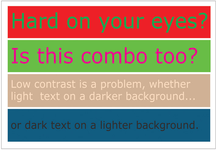
Figure 8.16
The degree of contrast between the font color and background color can dramatically alter the readability of the text.
Source: Susan A. Youngblood.
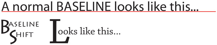
Figure 8.17
Top: Typically, all type in a row of text sits uniformly on a common baseline. Bottom: Shifting the baseline is a creative choice by the designer for achieving a particular visual effect.
Superscript/Subscript
In order to accurately reflect the shorthand notation for special formulas and character symbols, it’s sometimes necessary to apply subscript or superscript formatting to text. Superscript characters have a smaller point size than the surrounding text and are shifted upward above the baseline. Ordinal numbers are often displayed with a superscript modifier (1st, 2nd, 3rd, etc.). Other uses for superscript formatting include footnote references,1 compass bearings (20° W), and mathematical exponents such as 10(2) and (an)−1. Subscript characters also have a smaller point size, but are shifted downward below the baseline as in H 2 O, the chemical formula for water.
Anti-Aliasing
Because screen fonts are rendered out on screen using square pixels, the edges of the diagonal and curved strokes in a typeface often appear jagged. This stair-step effect is called aliasing and is an undesirable consequence of digital typography. Anti-aliasing is a technique used in raster (bitmap) editing to smooth out the edges of type. When anti-aliasing is turned on, transition pixels of an intermediate color are added between the jagged edges of a stroke and the surrounding area. The result is a distinctly smoother edge. Anti-aliasing works best on large type and is not generally recommended for font sizes smaller than 10 points because it reduces the readability of text.
Tech Talk
Font Management Font management software is used for previewing and managing the fonts on a computer system (see Figures 8.18 and 8.19). It can be used to install, remove, view, group, enable, and disable fonts. Fonts are loaded into RAM (random access memory) when your computer is first turned on. The more fonts that are installed, the more RAM your system will need to make those fonts available to running applications. Depending on how many fonts you have, your computer’s performance may be improved by temporarily disabling fonts you rarely use. A disabled font remains in the system but will not appear in the fonts list of your design software. As your collection of fonts grows, managing them will become increasingly important.

Figure 8.18
Suitcase Fusion is a cross-platform font management program that’s compatible with both Mac and Windows.

Figure 8.19
Font Book is Apple’s proprietary font manager utility for computers running OS X. The Baskerville font family is highlighted here as one of 415 resident fonts in the fonts collection.
Character and Line Spacing
Kerning and Tracking
By default, computer graphics programs handle letter spacing automatically according to the built-in design characteristics of each font family. But you often can improve the appearance and readability of text by manually controlling the amount of space between characters with kerning or tracking. Kerning selectively varies the amount of space between a single pair of letters; tracking uniformly adjusts letter spacing across a range of selected text. Each can improve the appearance and readability of text by eliminating distracting white space in a text design. They can also loosen up the appearance of type, making it appear less stuffy and congested. However, you need to be careful. Increasing the distance between letters makes the text more difficult to read.
Leading

Figure 8.20
The amount of leading you apply between lines affects readability. Which of these blocks of text is easier to read? Which is the most difficult to read? Why?
Leading (pronounced ledding) is used to define the amount of space between vertically adjacent lines of text (see Figure 8.20). The term originated during the days of manual typesetting when thin strips of lead of various widths were used to separate the rows of metal typeface. In digital typesetting, leading is measured in points as the distance between the baseline of one row and the baseline of the next. When lines are spaced too closely together or too far apart, readers have trouble advancing their eyes to the next line, and readability diminishes. The computer-generated spacing that’s assigned to type by the graphics program is not always appropriate and should never be blindly accepted. For example, large x-height fonts—such as most sans serifs—usually require additional leading. Extra leading is also needed for longer lines of text and for paragraphs set in boldface type.
Alignment, Justification, and Distribution
The terms alignment and justification refer to the process of lining up objects or text uniformly along their tops, bottoms, sides, or middles. Distribution involves inserting an equal amount of space between the designated edges (left, right, top, or bottom) or centers of visual elements, including text, placed along a vertical or horizontal edge. For example, you’re probably accustomed to seeing menu buttons or text labels on a web page spaced evenly apart. In Western countries, where people read from left to right and from top to bottom, readability is at its best when paragraphs are left justified and the type is evenly distributed. Aligning paragraph text along the left edge produces a consistent starting point for the eye as it shifts to the beginning of each new line. The trend in both print and electronic publishing is to align body copy flush left, leaving the right edge of body copy unjustified, or ragged right. The ragged right edge allows readers to keep track of their place in the paragraph. A ragged edge should be made to look as smooth and natural as possible by controlling the location of line breaks. The technique of curving the right edge inward toward the bottom of a paragraph adds elegance to the visual flow and shape of the text.
The following paragraph alignment options should be used sparingly in digital screen layouts. A paragraph is considered justified when both the left and right edges are aligned (as in this paragraph). In order to achieve a consistent right edge in a fully justified paragraph, the graphics program has to increase or decrease space between the words in each line. The irregular and uneven word spacing creates distracting “rivers of white” in paragraphs; it disrupts reading and reduces white space within the page layout. Right-aligning text with a left-ragged edge can add variety and interest to a design. However, since readability is diminished with this technique, it is best to limit its use to short paragraphs or sentences. Centered text produces a symmetrical look that’s visually balanced but difficult to read since both the left and right edges are ragged. Center alignment is not recommended for body copy and only sparingly with headlines and other short sections of text (see Figure 8.21).
It’s never a good idea to rely upon your eye or your skill with a mouse when aligning and distributing objects—evenly spacing them out vertically or horizontally—within a layout. Alignment needs to be precise, otherwise you may end up introducing irregularities into the design that are visually distracting to the viewer. You can align precisely by using gridlines and snapping tools (see Figure 8.22). A grid is a matrix of evenly spaced vertical and horizontal lines that are superimposed on top of the design window. Most multimedia design and editing software includes gridlines or snapping to make it easier to keep objects and text perfectly aligned. When you use snapping, as you move text close to a gridline, it snaps into place.

Figure 8.21
1) Ragged right or left justified (most common for body copy); 2) ragged left or right justified; 3) centered text; and 4) justified left and right.

Figure 8.22
Most design programs have a set of alignment buttons or menu commands for aligning selected text and objects within the design space. The icons shown here will be familiar to users of Adobe Photoshop and similar design programs.
Font Transformations
You can transform type into an element of design to grab the attention of the viewer or to add interest and variety to a page layout (see Figure 8.23). Visual effects can change the appearance of the shape, fill area, and stroke of a typeface in an endless variety of fun and interesting ways (see Figures 8.24 and 8.25). Be careful, though: if the effects aren’t subtle, they can be distracting. And many effects, such as drop shadows and beveling, can reduce text’s readability.
The following visual effects are fairly common and can be easily applied to text by a designer using a program such as Adobe Photoshop or Illustrator.
- ■ Color gradients and pattern fills: While the conventional type in body copy is usually filled with a single color, type can also be filled with a gradient of colors, a pattern texture, or an image.
- ■ Warping: Warping bends and distorts a typeface. Text can be arched, inflated, squeezed, twisted, and manipulated a number of other ways to create a variety of text-based shapes.
- ■ Drop shadows: Adding a drop shadow is one of the easiest things you can do to add interest and depth to text objects and backgrounds. When applied to text, a drop shadow gives the illusion that words are floating above the background. The more pronounced the drop shadow is, the greater the distance will appear between the text and the background. The perceived foreground-background position of objects in a composite can be manipulated in part by applying different drop shadow settings for each object.
- ■ Stroke: A stroke is a colored outline that’s placed around the exposed edges of type. Adding a stoke effect can greatly improve the contrast between text elements and the background. An inside stroke cuts into the fill area of type, while an outside stroke expands outward toward the background. A center stroke expands it in both directions at once. A stoke can be a solid color, a gradient color, or a pattern texture.
- ■ Bevel and emboss: Beveling rounds off the edges of type, giving it the sculpted, graceful look of a raised letterhead, making it appear three-dimensional. Embossing produces the opposite effect, making type appear stamped or pressed into the background. The illusion created with these effects varies greatly depending on the settings and the color of background.
- ■ Inner and outer glow: An inner glow applies colored shading to the inside edge of type to add internal depth or highlights to the fill area. Outer glow creates a halo effect around the outside of type to improve contrast and background separation.
Visual effects and styles such as these can be mixed and matched in what seems like an endless number of combinations. The potential for creativity is virtually infinite.

Figure 8.23
An assortment of common visual effects you can apply to text for enhancing contrast and impact.

Figure 8.24
Top left: Plain white text (with no font styles applied). Top right: A drop shadow is applied. Bottom left: A stroke/outline is applied. Bottom right: A two-color gradient fill and drop shadow are applied. Which version do you think has the best contrast and visual appeal?

Figure 8.25
A clipping mask was used in Adobe Photoshop to create this colorful font-fill effect.
Some Final Tips
Limit the Number of Typefaces
Most designers suggest limiting the number of typefaces in a design to two. While there are times when more typefaces might be justified, mixing too many typeface families in a design can make it look cluttered and unprofessional. When the need arises to combine typefaces in a design, be sure to choose ones that are totally different from one another. Rather than picking two similar serif typefaces, try combining a serif typeface with a sans serif typeface.
Text First, Type Second
While typeface can convey attitude, emotion, and personality, it’s the text that communicates ideas and information. Any time the message is overshadowed by the design, communication with your audience is disrupted. Remember, the best typography is often invisible and does not seek to be the star attraction. Designing type for maximum readability should always be your first priority.
Less Is More
There’s a popular adage in design circles that says, “Less is more.” With such an abundance of fonts, styles, and visual effects at your disposal, you may be tempted to throw everything in the pot, wave a magic wand, and see what comes out. Less is more suggests that the best styles and effects are often those that are subtle or moderated. You shouldn’t have to SHOUT to get people’s attention. At the right moment, a whisper can be even more effective. So as a final cautionary note, avoid going overboard with all the tools you now have at your disposal. The less is more principle implies that a simple and elegant design that communicates effectively is much more valuable than a visual-effects showpiece with no apparent focus or message.
Tech Talk
Designing Text for Screen Display While the typographical principles of print are generally transferable to multimedia, you should take certain precautions when designing text for display on computer screens.
- ■ For body copy, its best to use a 10- to 14-point sans serif typeface that’s been specifically designed for use on digital displays, such as Verdana.
- ■ Do not use a script typeface or other typefaces with thin-line strokes.
- ■ Constrain lengthy sections of text to shorter widths. When text flows across the entire width of the screen, it is difficult to read.
- ■ Apply anti-aliasing to large type to reduce the jagged edges of type.
- ■ While italics work well as a subtle method of emphasizing text in print, the slanted lines and curves lose detail when rendered out as square pixels. Use them sparingly, and experiment with adding color or bold to reduce the unwanted aliasing.
- ■ Remember the low-resolution limitations of computer monitors, and design type for maximum legibility and readability.
Typography is one of the most important yet frequently overlooked elements in multimedia design. Whether an interactive menu or web page is usable depends on whether the design effectively communicates through text. Text should be designed for maximum legibility and readability. Adding emphasis to text elements in a layout can provide order and focus to the design and can also direct the user’s attention to important visual information and cues. You can add emphasis by varying the style, size, color, and contrast of a typeface. You can also manipulate letter spacing, line spacing, alignment, and distribution to enhance the readability and visual appearance of text while bringing conformity and unity to the layout. Finally, you can also use layer styles and other types of visual effects to create unique text designs that add visual interest and energy to a page.
Note
1 A superscript footnote reference like the one inserted in the text corresponds to a citation or note (like this one) placed at the bottom of the page or at the end of a chapter.