
To paraphrase the old saying, “a graph is worth a thousand numbers.” Fortunately, Excel can easily turn a spreadsheet full of data into a beautiful, colorful graphic, revealing patterns and trends in the data that otherwise might be difficult or impossible to see.
In place of the aged Chart Wizard of Excels past, Excel 2008 presents the new Chart Gallery. When you click its button beneath the toolbar, you can quickly scan through and choose a chart type from Excel’s abundance of styles—and then make it your own by modifying it.
The keys to making an effective chart are to design your spreadsheet from the beginning of charthood, and then to choose the right chart type for the data (see Figure 13-12).
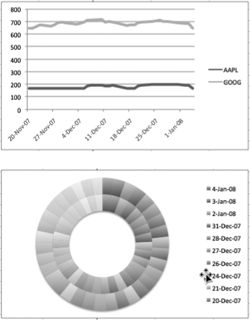
Figure 13-12. Here’s an example of the importance of choosing the right chart type to match your data. Both charts use the same set of data, but the line chart on the top is appropriate for the kind of data presented. Conversely, the doughnut chart below is the wrong way to present this information. All you get is a rainbow of colors that fails to communicate any useful information.
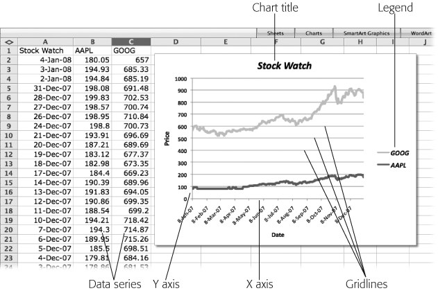
Most charts share the same set of features to display your spreadsheet information as shown in Figure 13-13.
Axes. An X axis (or category axis) and a Y axis(or value access) are the horizontal and vertical rulers that provide a scale against which to plot or measure your data. One axis corresponds to the row or column headings—in Figure 13-13 example, the row headings for date intervals. The other axis is the scale determined by the data series—in this case, dollars. 3-D charts may include a third Z axis (or series axis), at right angles to the other two, appearing to protrude from the plane of your screen right at you. Excel sometimes calls this the Depth axis.
Axis labels. This term may refer either to the tick mark labels (“January, February, March…”) or to the overall title of the horizontal or vertical scale of your chart (”Income, in millions” or “Months since inception,” for example).
Series. Each set of data—the prices of Apple stock, for example—is a data series. Each datum (or data point) in the series is plotted against the X and Y axes of the chart (except for pie and doughnut charts that don’t have axes). On a line chart, each data point is connected to the next with a line. In a bar chart each data point is represented by a bar. Figure 13-13, column B of the spreadsheet contains the data series for Apple, and column C contains the series for Google. The chart data series can be drawn from either columns or rows of a spreadsheet.
Figure 13-13. The parts of a chart. The X axis corresponds to the rows in the spreadsheet. The Y axis corresponds to the units represented in the spreadsheet—like dollars. The data series are the columns—this is the information that gets charted. The legend identifies the data series, and tells the viewer how to interpret the chart.
Legend. Just like the legend on a map, this legend shows what the lines or symbols represent. The legend displays the headings of the columns containing the data series and can also display the symbol used for the data points on the chart.
Gridlines. To help readers align your chart data with the scales of one or both of the chart axes, you can choose to display gridlines extending from the axis across the chart. Gridlines come in two flavors: major gridlines line up with each unit displayed on the axis, minor gridlines further break up the scale between the major gridlines.
The first step is to select the data that you want to chartify. You select these cells exactly the way you’d select cells for any other purpose (see Selecting Cells (and Cell Ranges)).
Although it sounds simple, knowing which cells to select in order to produce a certain charted result can be difficult—almost as difficult as designing the spreadsheet in the first place. Think ahead about what you want to emphasize when you’re charting, and then design your spreadsheet to meet that need.
Here are a few tips for designing and selecting spreadsheet cells for charting:
When you’re dragging through your cells, include the labels you’ve given to your rows and columns. Excel incorporates these labels into the chart.
Don’t select the total cells unless you want them as part of your chart.
Give each part of the vital data its own column or row. For example, if you want to chart regional sales revenue over time, create a row for each region, and a column for each unit of time (month or quarter, for example).
It’s usually easier to put the data series into columns rather than rows, since we tend to see a list of data as a column. Furthermore, the numbers are closer together.
Keep your data to a minimum. If you’re charting more than 12 bars in a bar chart, consider merging some of that data to produce fewer bars. For example, consolidating a year’s worth of monthly sales data into quarterly data uses 4 bars instead of 12.
Keep the number of data series to a minimum. If you’re charting more than one set of data (such as gross revenues, expenses, and profits), avoid trying to fit six different data series on the same chart. Use no more than three to avoid hysterical chart confusion. (A pie chart can’t have more than one data series.)
Keep related numbers next to each other. For example, when creating an XY (Scatter) chart, use two columns of data, one with the X data and one with the Y data.
You can create a chart from data in nonadjacent cells. To select the cells, hold down the ⌘ key while clicking or dragging through the cells to highlight them, as described on Selecting Cells (and Cell Ranges). When you finally click one of the thumbnails in the Chart Gallery, Excel knows exactly what to do.
When you click the Elements Gallery’s Charts tab or choose Insert → Chart, Excel 2008’s new Chart Gallery appears, with its row of buttons for choosing different chart types, and thumbnails that you click to insert a chart (see Figure 13-14). You can also access the Chart Gallery by clicking the Gallery button in the Standard toolbar or just clicking the Charts button in the Gallery bar below the toolbar.
Tip
If you’ve been charting in previous versions of Excel, you may be expecting the appearance of the Chart Wizard. But that Wiz is no more. The new Chart Gallery now does all that wizardry and then some.

Figure 13-14. Click the Gallery button in the toolbar to reveal Excel 2008’s new Chart Gallery. Choose the various chart types by using the category buttons, and then click one of the thumbnails to insert a chart in your spreadsheet. If it’s not exactly what you had in mind, click another thumbnail to recreate the chart in that style.
Your first challenge is to choose the kind of chart that’s appropriate for the data at hand. You don’t want to use a pie or doughnut chart to show, say, a company’s stock price over time (unless it’s a bakery). Excel makes it easy to preview how your selected data looks in the various chart types. Click one of the Gallery thumbnails, and Excel inserts that style chart in your spreadsheet. As you click other thumbnails, the chart display changes to the new style. Once you’ve got the correct chart type, you can resize it and drag it into position, just as you would with a picture. If you later decide you’d like a different style, select the chart and click a different style in the Gallery.
Here are your chart style options, each of which gives several variations:
Area charts are useful for showing both trends over time or across categories and how parts contribute to a whole. 3-D area charts are the way to go when you want to compare several data series, especially if you apply a transparent fill to reduce the problem of one series blocking another.
Column charts are ideal for illustrating data that changes over time—each column might represent, for example, sales for a particular month; or for showing comparisons among items. As you’ll see in the Chart Gallery, Excel offers 18 variations of this chart type. Some are two-dimensional, some are three-dimensional, some are stacked, and so on.
Stacked-columncharts reveal totals for subcategories each month. That is, the different colors in each column might show the sales for a particular region, while 3-D charts can impart even more information—sales over time plotted against sales region, for example.)
3-D Columncharts let you compare two sets of data. You can apply a transparent fill applied to the front data series to make it easier to see the ones behind it.
Cone, cylinder, and pyramid charts are simply variations on basic column and bar charts. The difference is that, instead of a rectangular block, either a long, skinny cone, narrow cylinder, or a triangular spike (pyramid) represents each column or bar.
Bar charts, which resemble column charts rotated 90 degrees clockwise, are as good as column charts for showing comparisons among individual items—but bar charts generally aren’t used to show data that changes over time. Again, you can choose stacked or 3-D bar chart variations.
Bubble charts are used to compare three values: the first two values form what looks like a scatter chart, and the third value determines the size of the “bubble” that marks each point.
Doughnut charts function like pie charts, in that they reveal the relationships of parts to the whole. The difference is that the various rings of the doughnut can represent different data sets (data from different years, for example).
Line charts help depict trends over time or among categories. The Line sub-type has seven variations; some express the individual points that have been plotted, some show only the line between these points, and so on.
Pie charts are ideal for showing how parts contribute to a whole, especially when there aren’t very many of these parts. For example, a pie chart is extremely useful in showing how each dollar of your taxes is spent on various government programs, or how much of your diet is composed of, say, pie. The Pie subtype has six variations, including “exploded” views and 3-D ones.
Radar charts exist for very scientific and technical problems. A radar chart features an axis rotated around the center, polar-coordinates style, in order to connect the values of the same data series.
Stock charts are used primarily for showing the highs and lows of a stock price on each trading day, but it’s also useful for indicating other daily ranges (temperature or rainfall, for example).
Surface charts act like complicated versions of the Line chart. It’s helpful when you need to spot the ideal combination of different sets of data—the precise spot where time, temperature, and flexibility are at their ideal relationships, for example. Thanks to colors and shading, it’s easy to differentiate areas within the same ranges of values.
XY (Scatter) charts are common in the scientific community; they plot clusters of data points, revealing relationships among points from more than one set of data.
Excel creates the chart floating as a graphic object right in your spreadsheet with a handsome, light-blue selection border. Charts remain linked to the data from which they were created, so if you change the data in those cells, the chart updates itself appropriately.
Make sure your chart represents the range of cells you intended. If not, you can go back to Step one and start over again, or click the Edit button in the Chart Data pane of the Formatting Palette (or Control-click the blue chart border and choose Select Data from the pop-up menu). The Select Data Source window appears displaying the current chart data range and the included data series (see Figure 13-15).
If you need to adjust the data range you can edit the contents of the “Data range” fields, where the spreadsheet, starting cell, and ending cell are represented with absolute cell references (see References: absolute and relative). The easier way to do it is to click the cell-selection icon to the right of the “Data range” field. This icon, wherever it appears in Excel, always means “Collapse this dialog box and get it out of my way, so that I can see my spreadsheet and make a selection.”
Now is also your opportunity to swap the horizontal and vertical axes of your chart, if necessary, by clicking the Switch Row/Column button (also available in the Chart Data pane of the Formatting Palette as “Sort by” buttons).
The bottom section of the Select Data Source dialog box displays the data series included in the chart, and it also lets you add or remove a data series. To add another series, click Add. Name the new series by clicking in the Name field, and clicking the spreadsheet cell that labels a series. Then click the Y Values field and indicate the value a range by dragging through the data cells in your spreadsheet (see Figure 13-15).
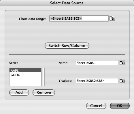
Figure 13-15. The cell-selection icon just to the right of each of the three fields, appears in dozens of Excel dialog boxes. When you click it, Excel collapses the dialog box, permitting access to your spreadsheet. Now you can select a range by dragging. Clicking the cell-selection icon again returns you to the dialog box, which unfurls and displays, in Excel’s particular numeric notation, the range you specified.
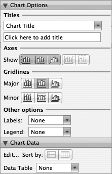
With the correct style chart in place, representing the correct range of spreadsheet data, you can now turn your attention to fine-tuning the various chart parts. Turn first to the Chart Options and Chart Data panes of the Formatting Palette (see Figure 13-16). Their various controls let you change the look of every conceivable chart element, including the chart and axes titles, how gridlines are displayed, where the legend is placed, how data is labeled, and whether the spreadsheet cells used to make the chart are displayed.
The Titles section lets you enter names for your chart’s title, its X axis, its Y axis; and its Z axis and second X and Y axes (if you have them). Select the various items with the pop-up menu and enter your titles in the box below. These names appear as parts of the chart.
The Axes section lets you choose which of your charts and axes appear on the chart. Depending on the type of chart and your data, you can choose to show or hide the Vertical, Horizontal, Depth, Secondary Vertical, and Secondary Horizontal axes.
Use the Gridlinesbuttons to show the Vertical, Horizontal, or Depth gridlines for the Major units—and the same options for the Minor units (see Chart Parts).
The Other options pop-up menu lets you add Labels to your chart data points. You can choose to add labels for either the data Value (the Y-axis value), or the Label (the X-axis value). Use the Legend pop-up menu to include a chart legend and determine where to place it in relation to the chart, to the left, right, bottom, and so on. The legend is the key that tells you what the chart’s elements represent—its lines, pie slices, or dots. It’s just like the legend on a map. After Excel places the legend in your chart, you’re free to move it to another position.
The Data Table pop-up menu in the Chart Data pane tab lets you choose whether your chart shows the actual data that was used to build it, along with the chart itself. If you choose Data Table, this data appears in a series of cells below the chart itself. Choose “Data Table with Legend Keys” to make Excel reveal how each data series appears on the chart. You might find this option helpful should you display your chart separately from the spreadsheet—in a linked Word document, for example.
Like so many computer constructions, creating the content is just the beginning. Once your chart appears on screen, it’s time to cozy up to your mouse and gleefully putter with its appearance using Excel’s abundance of alluring formatting options.
When modifying your chart, start with the most urgent matters:
Move the chart by dragging it around on a sheet.
Resize the chart by dragging any of its corner or side handles. (If you don’t see them, the chart is no longer selected. Click any area inside the chart to select the whole chart, bringing back its blue border.)
Delete some element of the chart if you don’t agree with the elements Excel included. For example, for a simple chart you might not need a legend. Get rid of it by clicking it and then pressing the Delete key.
Reposition individual elements in the chart (the text labels or legend, for example) by dragging them.
Convert a chart from an object to a chart sheet (or vice versa) by selecting the chart and then choosing Chart → Move Chart and making the appropriate choice in the resulting dialog box.
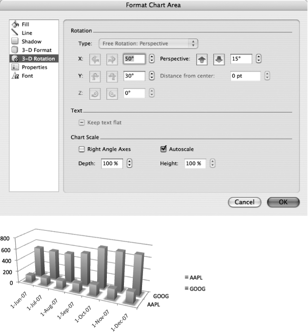
Rotate a 3-D chart by double-clicking the blue chart selection border to open the Format Chart Area dialog box. Click the 3-D rotation tab and use the up and down arrow buttons or type new numbers into the X, Y, and perspective fields (see Figure 13-17).
Move series in a 3-D chart to put smaller series in front of larger ones. Start by double-clicking any data series to open the Format Data Series dialog box, and then click the Order tab. Watch the chart as you click Move Up or Move Down.
To quickly change the appearance of a chart, select it and use the Formatting Palette’s Chart Style and Quick Styles and Effects panes. For example, you can experiment with different chart color schemes using the Chart Style buttons. If you don’t see a color combination you like, head down to the Document Theme palette and choose a different set of theme colors—which re-colors all of the Chart Style options. The Quick Styles and Effects pane lets you apply fill colors to individual chart elements, and add shadows and glows. (Modifying charts with Quick Styles and with the other Formatting Palette panes works the same as with other kinds of objects in Office, as described starting on Rotating drawing objects.)
The most complete chart appearance controls are found in the Format dialog boxes, many of which await your investigation (see Figure 13-18). To open the dialog box, just double-click the pertinent piece of the chart. For example, when working with a bar chart, you have the following options:
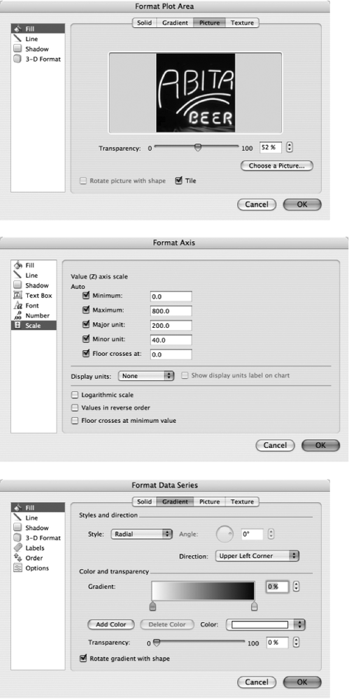
Figure 13-18. By double-clicking the individual elements in a chart, you open a multitabbed dialog box that lets you change every conceivable aspect of them. Top: The dialog box that appears when you double-click a chart background. Middle: The choices that appear when you double-click an axis. Bottom: Additional choices that appear when you double-click a chart bar.
Change the border or interior color of the chart by double-clicking within the body of the chart.
Change the font, color, or position of the legend by double-clicking it.
Change the scale, tick marks, label font, or label rotation of the axes by double-clicking their edges or slightly outside their edges.
Change the border, color, fill effect, bar separation, and data label options of an individual bar by double-clicking it. You can even make bars partially transparent, revealing hidden series at the rear, as described in the next section.
You’ll also notice that when you select a chart, the Formatting Palette has specialized formatting controls relevant to your selection. Using the palette, you can change the chart type, gridline appearance, legend placement, and so on.
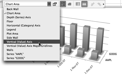
And if you still haven’t found your preferred method of formatting a finished chart, choose View → Toolbars → Chart to reveal the Chart toolbar (Figure 13-19). It has a pop-up menu listing the various chart components (such as Corners, Floor, Legend, and Series Axis). Use it to select one of those items instead of double-clicking the chart itself. Then you can edit or delete that item as you normally would. This selection method can be much easier to work with if your chart is small, cramped, or contains a lot of data series.
Individual bars of a chart can be partially or completely see-through, making it much easier to display 3-D graphs where the frontmost bars would otherwise obscure the back ones.
You can apply transparent fills to most chart types, but their see-through nature makes the most sense in charts with at least two data series, where the front series blocks a good view of the rear (Figure 13-20, top).
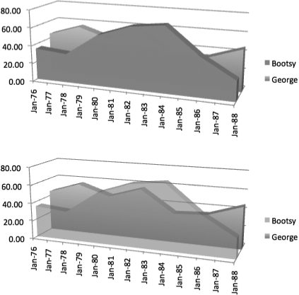
Figure 13-20. This simple transparent-chart example shows how big a difference a little transparency can make. Just compare the opaque bars (top) with the see-through ones (bottom).
Begin applying a transparent fill to a data series by clicking the series (the bar or column, for example) and opening the Formatting Palette’s Colors, Weights, and Fills pane. To make transparency available, you first have to change the color, even if it’s to “change” the color to the current color by using the eyedropper on the object you’re working with. You can then use the Transparency slider to adjust the opacity.
You can do the same thing via the Format Data Series dialog box, which appears when you double-click a series. When you first open this dialog box, the Color pop-up menu is set to Automatic, which prevents you from accessing the transparency option. But as soon as you choose another color from the pop-up menu, the Transparency slider becomes active and you can adjust the transparency of the series.
To format a multi-series 3-D chart for maximum “Wow” factor, you may also wish to rotate it (by double-clicking the blue chart selection border, clicking the 3-D rotation tab and typing new numbers into the X, Y, and perspective fields) or change the series order (double-click a series and work in the Order tab).
The Chart Gallery suffices for almost every conceivable kind of standard graph. But every now and then, you may have special charting requirements; fortunately, Excel can meet almost any charting challenge that you put before it—if you know how to ask.
On some charts—such as those that graph stocks and opinion polls—it’s helpful to graph not only the data, but also the range of movement or margin of error that surrounds the data. And that’s where error bars come in. Error bars let you specify a range around each data point displayed in the graph, such as a poll’s margin of error (Figure 13-21).
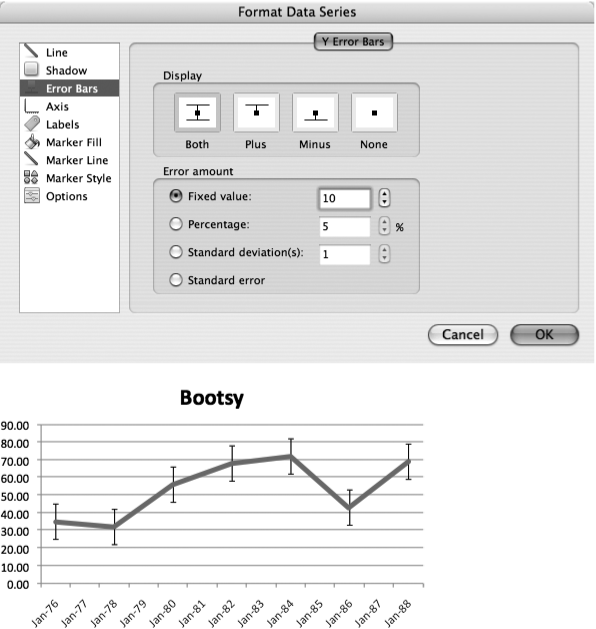
Figure 13-21. Top: Error bars are easy to add to a data series once the Format Data Series dialog box is open to the Y Error Bars tab. In the “Error amount” area, you can select one of several options. Bottom: After you’ve set up error bars and clicked OK, the range bars appear on the graph.
To add error bars to a chart, first select the data series (usually a line or bar in the chart) to which you want to add error bars. Choose Format → Selected Data Series (or double-click the selected line or bar) to bring up the Format Data Series dialog box. To add error bars along the Y axis—the usual arrangement—click the Error Bars tab; then choose display and error amounts for your bars. Click the OK button to add the error bars to your data series. If you want to remove them later, open the Format Data Series dialog box and set the Display to None.
Graphs excel at revealing trends—how data is changing over time, how data probably changed over time before you started tracking it, and how it’s likely to change in the future. To help with such predictions, Excel can add trend lines to its charts (Figure 13-22). Trend lines use a mathematical model to help accentuate patterns in current data and to help predict future patterns.
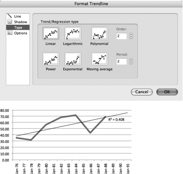
Figure 13-22. Top: The Add Trendline dialog box gives you six trend lines from which to choose. If the trend line allows for it, you can also set the trend line’s parameters in the Options tab. Bottom: Once you’ve applied a trend line, it appears on top of your chart. You can also predict how the data might change in the future by setting the forecast values in the Options tab. If you set your trend line to display the R-squared value (also under the Options tab), Excel displays this value for you below the line.
Note
You can use trend lines only in unstacked 2-D area charts, bar charts, bubble charts, column charts, line charts, scatter charts, and stock charts.
To add a trend line to your chart, click to select one of the data series in the chart—typically a line or a bar—and then choose Chart → Add Trendline. This opens the Format Trendline dialog box, containing the tabs Line, Shadow, Type, and Options.
The Type tab lets you choose one of these trend-line types:
Linear. This kind of trend line works well with a graph that looks like a line, as you might have guessed. If your data is going up or down at a steady rate, a linear trend line is your best bet, since it closely resembles a simple straight line.
Logarithmic. If the rate of change in your data increases or decreases rapidly and then levels out, a logarithmic trend line is probably your best choice. Logarithmic trend lines tend to have a relatively sharp curve at one end and then gradually level out. (Logarithmic trend lines are based on logarithms, a mathematical function.)
Polynomial. A polynomial trend line is great when graphed data features hills and valleys, perhaps representing data that rises or falls in a somewhat rhythmic manner. Polynomial trend lines can also have a single curve that looks like a camel’s hump (or an upside-down camel’s hump, depending on your data). These trend lines are based on polynomial expressions, familiar to you from your high school algebra class.
Power. If the graphed data changes at a steadily increasing or decreasing rate, as in an acceleration curve, a power trend line is the way to go. Power trend lines tend to curve smoothly upward.
Exponential. If, on the other hand, the graphed data changes at an ever-increasing or decreasing rate, then you’re better off with an exponential trend line, which also looks like a smoothly curving line.
Moving Average. A moving average trend line attempts to smooth out fluctuations in data, in order to reveal trends that might otherwise be hidden. Moving averages, as the name suggests, can come in all kinds of shapes. No matter what the shape, though, they all help spot cycles in what might otherwise look like random data.
The Options tab, on the other hand, lets you name your trend line, extend it beyond the data set to forecast trends, and even display the R-squared value on the chart. (The R-squared value is a way of calculating how accurately the trend line fits the data; you statisticians know who you are.)
Incidentally, remember that trend lines are just models. As any weather forecaster, stockbroker, or computer-company CEO can tell you, trend lines don’t necessarily predict anything with accuracy.