The Font panel of the Formatting Palette—the uppermost pane of the palette—deals mostly with the appearance of your letters, numbers, and other characters. You can also access most of these functions via the Formatting toolbar (choose View → Toolbars → Formatting if you don’t see it).
Installing Office 2008 adds 126 fonts to your Library → Fonts folder—an unannounced gift from Microsoft.
To change the font of the text you’ve already typed, select the text first, using any of the methods described on The Many Ways to Select Text. If, instead, you choose a new font in the middle of a sentence or even the middle of a word, the new font will take effect with the next letter you type.
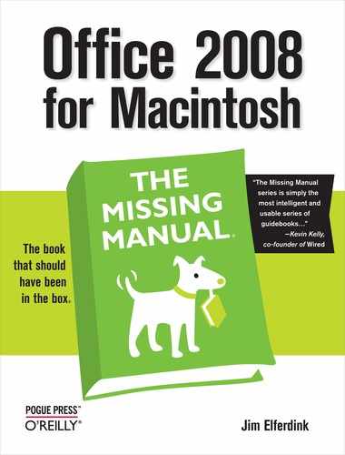
Now, open the Font menu or click the Name pop-up menu in the Formatting Palette’s Font pane to reveal your Mac’s typeface names in their own typefaces (Figure 3-2). This what-you-see-is-what-you-get (WYSIWYG) font menu feature has a few interesting features, such as:
If you have a very long list of fonts, you don’t have to scroll all the way down to, say, Zapf Chancery. Once the menu (or Formatting Palette pop-up list) is open, you can type the first letter or two of the target font. The menu shifts instantly to that alphabetical position in the font list.
You can open the font list marginally faster if you don’t use the WYSIWYG fonts feature. Pressing Shift when opening the Font menu or Fonts list in the Formatting Palette lets you see all the fonts listed in plain type. Honestly, though, unless you’ve got a really slow computer, the difference is negligible. But this Shift-key trick is a helpful solution when you’re trying to figure out the name of a font that’s showing up as symbols. (You can turn off the WYSIWYG feature for good by choosing Word → Preferences → General panel and turning off “WYSIWYG font and style menus,” then clicking OK.)
Once you’ve turned off WYSIWYG font menus, you can still summon the WYSIWYG font when you do want it by pressing Shift when opening one of the Font menus.
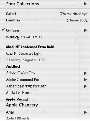
Even the Formatting Palette doesn’t have every possible font manipulation tool; for that, you’ll need the Font dialog box, as shown in Figure 3-3. To open it, choose Format → Font or press ⌘-D. In the following pages, you’ll read about both the Formatting Palette and the more complete controls available in the Font dialog box.
Font sizes are measured in points. A point is 1/72 of an inch in letter height, but you don’t need to know that; what you should know is that most text is printed at 10- or 12-point sizes.
Some fonts look too large at 12 point. Other fonts are almost uncomfortably small at 10 point. Print a test page to be sure, since the font size may look different on paper than on the screen, depending on your monitor’s resolution. (If you have a high-resolution monitor, your tendency will be to make the font too large in order to achieve a comfortable size to read on the screen. Rather than increasing the font size, use the Zoom box [Standard Toolbar] to verify that your font will print out in a proper size.)
To select a font size, choose one from the list in the Formatting Palette, type a size into the Size box in the Formatting Palette, or choose a point size in the Font dialog box (Format → Font or ⌘-D).
Tip
You can always bump selected text to a slightly higher or lower point size by pressing Shift-⌘-> (that is, period) or Shift-⌘-< (comma) for larger and smaller type, respectively. Each time you press the combination, the text grows or shrinks by the intervals listed in the Formatting Palette’s Size box (from 12 to 14 to 16, for example).
You can apply different type styles to your regular, unembellished font for emphasis or effect. Most font styles are available in the Formatting Palette with a single click; a few extra ones reside in the “Font style” box in the Font dialog box (see Figure 3-3, top). Those type styles, as they appear in the Font dialog box, are as follows:
Regular denotes plain, unadulterated text. Not bolded, not underlined.
Figure 3-3. Top: The Font dialog box (Format → Font or ⌘-D). It not only has more font style options than the Formatting Palette, it also gives you a preview at the bottom of the box. If you like what you see, click OK. Bottom: The Advanced section of the Font dialog box has the checkbox to activate ligatures—those conjoined characters (shown in lower example) that improve the appearance of your text, as described on Character Spacing.
Tip
You can return to plain text at any time without even opening the Font dialog box. Just highlight the text you’ve been playing with in your document and choose Edit → Clear → Formats or Clear Formatting from the Style menu in the Formatting Palette (Keyboard shortcut: Shift-⌘-N).
However, with an entire paragraph selected, the Clear Formatting command takes you all the way back to the Normal style (see Styles), which generally means your 12-point body type. (If you select less than a paragraph, it returns your text to the underlying paragraph style.) To strip font effects from a selected paragraph without changing its underlying style definition (such as 24-point Futura for a headline), press Control-Space bar instead.
Italic is commonly used for foreign words and phrases, as well as the titles of books, movies, and magazines. Shortcuts : Click the capital I in the Formatting Palette, or press ⌘-I.
Bold is the most common way of making a single word or phrase stand out from the surrounding landscape. Use bold for emphasis. Shortcuts: Click the capital B in the Formatting Palette, or press ⌘-B.
Bold Italic is a beautiful effect for headings and headlines. Use either method described above to choose both bold and italic, one right after the other. You’ll know you’ve got it when both the B and the I are highlighted in the Formatting Palette. In the Font dialog box, just choose Bold Italic.
Underline. Clicking the underlined U in the Formatting Palette, or pressing ⌘-U (Shift-⌘-D for a double underline), draws a line under the text, as well as the spaces between words. In the Font dialog box, use the “Underline style” pop-up menu to choose from a number of fancy underscores, and to specify whether you want Word to underline the words only, not the spaces.
You can also choose a color for the underline itself in the Font dialog box; see the next section for more detail.
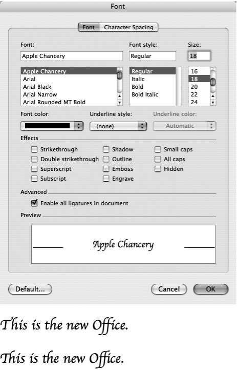
Color is a great way to liven up your documents—an increasingly valuable option in a world where many documents are read onscreen and nearly everyone has a color printer. Click the tiny “Font color” color swatch or pop-up menu in the Formatting Palette or the Format → Font dialog box to survey your selection of 70 colors, as shown in Figure 3-4. To choose a color, just click it.
Tip
When using Word to prepare a document for the Web, remember that colors look different on different computers. For example, someone viewing your page on a Windows machine or an older monitor may see your true colors very differently.
Figure 3-4. From the Formatting Palette’s font color button, Word gives quick access to 70 commonplace colors. To choose from a broader rainbow, click the More Colors button. Doing so opens the Apple Color Picker dialog box, which has several different ways to specify any color under the sun, as described on Fill Color: Standard palette.
Occasionally, you may need to adjust the amount of space between letters, known to typographers as tracking. You use this control, for example, to expand or contract a headline to perfectly fit above a column. Used judiciously the effect is nearly invisible, yet it can make a big improvement to the appearance of your layout. Adjusting tracking by more than a few percent creates an odd appearance.
Office doesn’t include this control in the Formatting palette—only in the Font dialog box. Select the text you want to adjust, choose Format → Font and click the Character Spacing tab (see Figure 3-5). Set the Spacing pop-up menu to Expanded—to increase character spacing—or Condensed—to decrease character spacing. Then use the up- and down-arrow button next to the By box to determine the percentage of expansion or contraction. Keep an eye on the Preview box to see the effect your changes will have.
If you turn on the “Kerning for fonts” checkbox and set the “Points and above” box for the size of text you want to affect, Office subtly adjusts the character spacing between each pair of letters for an even appearance. For example, applying kerning to the word TAP reduces the space between the T and the A, making the letter spacing appear more consistent.
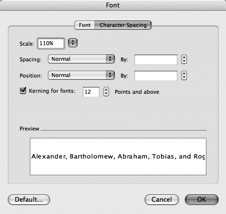
Figure 3-5. The Character Spacing portion of the Font dialog box shows controls for the horizontal and vertical positioning of selected characters. Additionally the Scale control lets you stretch or shrink text horizontally—not the spaces between the letters, but the letters themselves—by selecting a percentage from the pop-up menu, or typing a percentage directly into the box. This control can create a bizarre appearance, but if you limit your adjustments to just a few percent, you can fine-tune the length of your lines of text invisibly.
While the Spacing control sets the horizontal position of the character, the Position control—otherwise known as baseline shift —sets the vertical character position. This adjustment comes in handy when writing chemical formulae or using the trademark (™) symbol. Use the up- and down-arrow button on the Position line to adjust the amount of shift while you watch the Preview panel.
Bold and italic give enough variety for most documents, but many more buttons await in the Formatting Palette, and still more choices in the Font dialog box. Some of them, such as Outline and Shadow, are clearly just for show (they usually look amateurish in printed documents); others, such as Subscript and All Caps, are invaluable tools.
Here are the options, in order, as they appear in the Font dialog box:
Strikethrough and Double strikethrough indicate that something’s crossed out, but you don’t want to delete it outright. (Word’s change-tracking feature adds strikethrough style to deleted text automatically; see Change Tracking.) Shortcuts: Click the ABC button on the Formatting Palette (you can only apply the double strikethrough via the Font dialog box).
Superscript and Subscript shift characters slightly higher or lower (respectively) than the other text on its line and slightly decreases their size—perfect for chemical formulas and exponents. (You don’t need these effects for footnotes, as Word handles footnote formatting automatically, as described on Footnotes and Endnotes.)
You can make letters or symbols super- or subscripted, too, not just numbers—very handy if you like taking things to the Nth degree. Shortcuts: Click the A2 or A2 in the Formatting Palette, or press ⌘-= for Subscript or Shift-⌘-= for Superscript.
Shadow creates a heavier outline that makes the words appear slightly raised, and Outline reverses the color of the type, making the letter white and the outline black (or whatever text color you’re using). Shadow Both was popular when the Mac first appeared, but seems dated now.
Emboss and Engrave make letters appear slightly raised or carved out, as if with a chisel. They work best on a colored background, such as on a Web page. On a white background, the words gain a subtle drop shadow. (These infrequently used effects are available only in the Font dialog box, not on the Formatting Palette.)
Word has several variations on the when-to-capitalize scheme you probably learned in English class. For example, you can apply either of these formats to text you’ve highlighted (or are about to type):
Small Caps creates a formal look for headings and letterheads; all the letters are capped, but “lowercase” letters are shown in smaller capitals, SOMETHING LIKE THIS. Shortcut: Click the ABC button on the Formatting Palette.
All Caps simply converts highlighted text to all capital letters. You can choose “All caps” in the Font dialog box, or click the “a → A” button in the Formatting Palette.
Even though the visual result is the same, there’s a big difference between using the All Caps style and simply typing some words with the Caps Lock key down. Text you’ve formatted as All Caps is still, in Word’s brain, actually mixed upper- and lowercase letters. It thinks you’ve applied the all-cap format just as a visual, the way you’d apply bold or blue or underlining. That is, by turning off the All Caps style, the text reverts to the capitalization you originally used when typing it—something you can’t say about text you typed with the Caps Lock key.
You can therefore search for text in the All Caps style using the “Find and Replace” command, or define it as part of a style (see Styles).
Tip
To change the capitalization of words you’ve already typed—or to fix an email message that arrived IN ALL CAPITAL LETTERS—highlight the text and then choose Format → Change Case. By choosing from the list in the Change Case dialog box, you can make Word instantly “retype” the text as all lowercase (all small letters), all uppercase (all caps), Sentence case (where the first letter of every sentence is capitalized as usual), or Title Case (where the first letter of every word is capped).
(Unfortunately, these options aren’t terrifically smart; Sentence case still leaves names and the word I lowercase, and Title Case doesn’t leave small words like of and the lowercase.)
The most interesting (but least useful) choice here is tOGGLE cASE, which reverses the existing capitalization, whatever it may be.
UP TO SPEED: Un-Typewriter Class
Even though most computer owners haven’t touched a typewriter for years—if ever—many bad habits from that earlier technology persist. Here are a few of the more egregious examples of typewriter style that are obsolete in the computer age.
Underlining. Although Word makes it simple to format text with underlining, don’t use this style for emphasis. Use bold or italics, which are much more professional looking (and equally easy to apply). (When’s the last time you saw something underlined in a magazine article?)
Spacing with the space bar. Use the space bar only for spacing between words. Never use the space bar for aligning successive lines of text; when printed, those spaces will cause your text to tumble out of alignment. Instead, use Word’s tab feature, as described on Tabs.
Special characters and accents are easy to produce correctly on a computer. Don’t write resume if you mean résumé. Are you making copies or using the Xerox™? Don’t put it off until mañana—take that vacation to Curaçao today!
To find out how to produce these special markings, use the Keyboard Viewer—but first you have to bring it out of hiding. Choose Apple Menu → System Preferences → International and click the Input Menu tab. Turn on the checkboxes for Character Palette, Keyboard Viewer, and “Show input menu in menu bar.” From now on, you can open the Keyboard Viewer by clicking the International menulet—the little flag—at the right end of your Mac’s menu bar and choosing Show Keyboard Viewer.
Use its pop-up menu to select the font you’re using and watch the Keyboard Viewer as you press Option—with and without the shift key—to display these hidden characters. When you spot the character you’re looking for, press that key on the keyboard or click it in the Keyboard Viewer to add it to your document at the insertion point.
When you press Option, the Keyboard Viewer highlights five keys—tilde, E, U, I, N—that you can use to add accents to letters using a two-step process. For example, to type the ü in über, type Option-u, followed by u. The same technique works to apply accents to ñ, é, and so on. After you learn a key combination, you won’t need to open the Keyboard Viewer—until you need to type ![]() or π.
or π.
You can only access the complete collection of special characters via the Mac OS X Character Palette; choose → Show Character Palette from the International menulet in the menu bar, or use Word’s Insert → Symbol command. (See Line Numbers for more on symbols and special characters.)
Using two hyphens (--) to represent a dash is passé. What you want is an em dash —so called because it’s the width of an upper-case M. Create it with the Shift-Option-hyphen key combination, or make sure you’ve configured Word’s “Auto Format as You Type” feature to do it for you (see AutoFormat).
Hidden Text
Word’s Hidden Text feature can remove your personal notes and reminders from plain sight in a document. You can make the hidden text reappear only when you want to; you can also choose whether or not you want it to show up when printed.
To turn certain text invisible, first select it. Choose Format → Font → Font tab. (There’s no button for hidden text on the Formatting Palette.) Turn on the Hidden box and click OK; the text disappears until you choose to show it. (To turn hidden text back into normal text, show the hidden text as described next, select it, choose Format → Font → Fonts tab, and turn off the Hidden box.)
When you want Word to display the text you’ve designated as hidden, use either of these techniques:
Either way, hidden text appears with a dotted underline to distinguish it from the rest of the text.