
Chapter 10
Creating Slide Shows
IN THIS CHAPTER
![]() Working with themes
Working with themes
![]() Understanding layouts
Understanding layouts
![]() Using slides and slide masters
Using slides and slide masters
![]() Adding media — SmartArt, charts, images, sounds, movies, and other types
Adding media — SmartArt, charts, images, sounds, movies, and other types
If you’ve read Chapter 9, you may have taken our recommendation to heart and, before you begin creating slides, given some thought to what you want your presentation to accomplish. In this chapter, we show you how to create a slide show. You start by choosing an appropriate theme, and then you explore slide layouts and the concept behind slide masters. You also find out how to make the text in your slides look great. You can add pizzazz to your slides by including SmartArt, charts, images, sounds, movies, and more. Finally, we tell you why everything on a slide should align with everything on every other slide, and then we show you how to make it so.
The goal of this chapter (and the PowerPoint chapters, for that matter) is to help you ensure consistency in every slide show you create. Themes, layouts, and slide masters are all tools that help you be consistent. You almost always want every slide to have the title and bullet points in the same place, the same font for titles, and the same color scheme.
We say almost because these rules have occasional exceptions. But for most slide shows, these rules apply most of the time.
 If you insist on using a different font or color scheme on certain slides, or on changing the position of an object (title, text, or image) from its usual place on a presentation’s other slides, make sure that you have a good reason to do so. Consistency makes your presentation look more professional, and inconsistency makes it look amateurish.
Getting Started
You can start creating your presentation with a blank slate by choosing File ⇒ New Presentation. Or, if you took our advice at the end of Chapter 9 and decided to create an outline, start with that file instead of a new presentation. Next, make sure that you’re in normal view by either clicking the normal icon on the right side of the status bar, pressing ⌘ +1, or choosing View ⇒ Normal from the menu.
As you work your way through the sections in this chapter, remember that you can always go back later and change anything you do. So don’t sweat finding the absolutely perfect theme or slide layout right away. Just find something you can live with for now, and if you later decide that you don’t want it, you can easily change it.
Giving Your Presentation a Visual Theme
According to Microsoft, a theme is a “predefined set of colors, fonts, and visual effects that you apply to your slides for a unified, professional look.” PowerPoint includes a variety of themes you can either use as is or modify to suit your tastes. Furthermore, you can use these themes also in Word and Excel to give all your documents a unified look and feel. In this section, we show you how to do both.
Using a theme as is
To apply a theme to your presentation, select one or more slides in it and then click the Design tab on the ribbon. Move the cursor over any thumbnail in the Themes strip and the theme’s name appears. Click a thumbnail and the theme is applied to all slides selected in the left pane, as shown in Figure 10-1.
To select multiple noncontiguous slides (such as Slides 1 and 4 in Figure 10-1) in the left pane, click the first slide to select it and then hold down the ⌘ key and click another slide. As long as you keep holding down ⌘ , every slide you click is added to the selection. Or, to select contiguous slides (such as Slides 1, 2, 3, and 4 in Figure 10-1), click Slide 1, hold down the Shift key, and then click Slide 4. All slides between 1 and 4 (inclusive) are selected.
Note that if your slide show has a lot of slides, selecting slides this way is somewhat easier in slide sorter view.
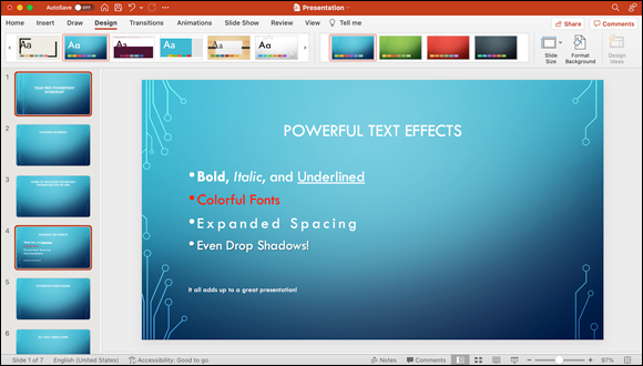
FIGURE 10-1: Applying the Circuit theme to a presentation.
Go ahead and click a few thumbnails to see how the theme looks when applied to your slide or slides. To see more thumbnails, click the arrow on the right side of the Themes strip. Every time you click it, you see another group of themes. To move backward through the strip, click the arrow that appears at the left side of the Themes strip.
You can see all available themes, as well as access others you may have stored on your computer, by hovering your cursor over the Themes strip and then clicking the hidden arrow below the strip, as shown in Figure 10-2. (You may recall running into shy arrows like this one in the chapters about Word.)
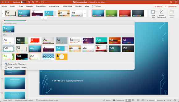
FIGURE 10-2: A whole gaggle of themes awaits if you’ll but click the hidden arrow under the Themes strip!
The number of thumbnails in each group is determined by the width of your window. If you make the window wider, you see more thumbnails in each group. (We always expand the PowerPoint window to fill the entire screen, but laptop owners with smaller screens may be wondering why they see fewer thumbnails than are shown in Figure 10-2.)
Customizing a theme’s colors or fonts
Maybe you like a theme but aren’t crazy about its colors or fonts. No problem: You can modify one or both of those attributes. To modify any theme, follow these steps:
- Click the Design tab on the ribbon.
- Click the down arrow under the Variants strip (you’ll need to hover your cursor over the strip to see it), hover your cursor over the Colors option in the list, and choose a color set, as shown in Figure 10-3.
- (Optional) Create a custom color set as follows:
- Click the Customize Colors option at the bottom of the Colors pop-up menu.
- Click a color box that you want to change to select it, and then select a new color from the Colors palette. PowerPoint updates the preview to show you the change.
- Click in the Name box to specify a descriptive title for your new theme color set, and then click the Save button, as shown in Figure10-4.
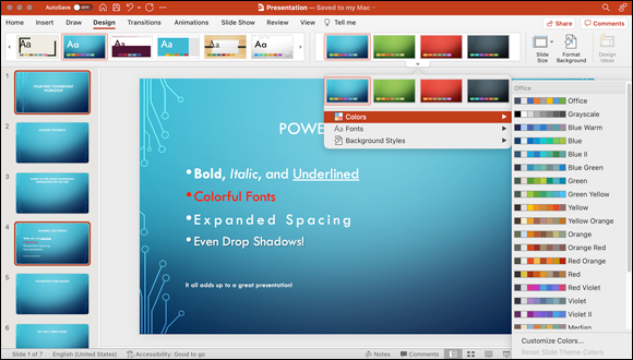
FIGURE 10-3: Choosing a different color set for a theme.
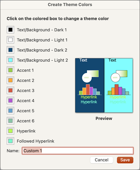
FIGURE 10-4: Create your own color palette for your slides.
-
Click the down arrow under the Variants strip (again, you’ll need to hover your cursor over the strip to see it), hover your cursor over the Fonts option in the list, and choose a font set.
Note that every choice you make is immediately displayed in your slides.
-
When you’re satisfied with your choices of colors and fonts, click the arrow under the Themes strip and then click the Save Current Theme option.
A Save dialog appears.
- Type a name for your custom theme in the Save As field and then click Save.
To use your custom theme later, click the Design tab and then click the custom theme in the Theme strip to apply it to your slides.
When you create a custom theme this way, it’s available also in Word and Excel. To use the theme in one of those programs, click the Design tab and then click the Themes button. Click the custom theme to apply it to your Word or Excel document.
Using Laborsaving Slide Layouts
The layout of a slide defines which objects appear and their locations on the slide. Slide objects include the title box, text boxes, and vertical title and text boxes. To apply a layout, select the slides in the left pane, click the Layout icon on the Home tab, and then click a thumbnail. PowerPoint applies that layout to all slides selected in the left pane, as shown in Figure 10-5.
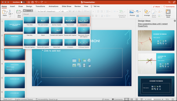
FIGURE 10-5: Applying the Comparison layout to the two selected slides.
 To select noncontiguous slides, click the first slide and then hold down the ⌘ key and click whichever other slides you want; to select contiguous slides, click the first slide, hold down Shift, and click the slides you want.
To summarize: Slide layouts define which objects (such as a title, text, picture, or footer) appear on slides that use that layout and where on the slide those objects appear. That’s all well and good if you’re happy with the layouts available from the Home tab. But what if you want to change something about one or more of these layouts, such as the title font or the footer, or add a logo to every slide in your presentation? That’s where slide masters come into play.
Mastering slide masters
Slide masters ensure consistency between slides, regardless of their layout. To modify a slide master, you must first switch to slide master view by choosing View ⇒ Master ⇒ Slide Master or by holding down the Shift key and clicking the normal view icon on the right side of the status bar. From the keyboard, you can also press ⌘ +Option+1.
In slide master view, the first slide in the Slides pane is the global slide master. Changes you make to this slide master affect all individual slide layout masters, which appear below it, as shown in Figure 10-6.
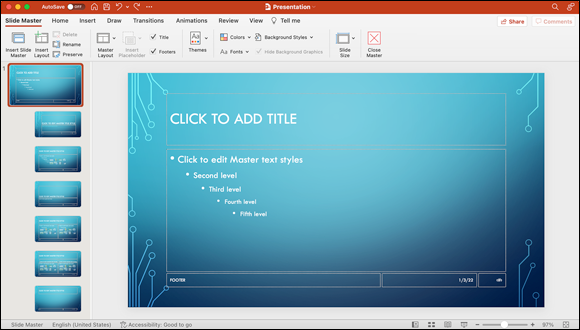
FIGURE 10-6: You can modify the global slide master (as shown) and the slide master for each slide layout.
Note that opening slide master view also causes the Slide Master tab to appear on the ribbon. You can use the Slide Master tab to quickly make changes.
For example, if you change the font of the Master title style on this slide to 48-point Helvetica Bold, the title of every slide layout would be in 48-point Helvetica Bold, regardless of which layout you choose. In other words, if a slide layout includes a title (not all layouts do), that title appears in 48-point Helvetica Bold because it’s the font used in the first (global) slide master.
Here’s another example: If you have an object — such as your company logo — that you want to appear on every slide, regardless of the slide’s layout, add the logo to the global slide master.
Bottom line: If you want an object (such as your logo) to appear on every slide, or you want all objects of a particular type (such as title or text) to be formatted a certain way (such as 48-point Helvetica Bold) on every slide, you add the object or apply the formatting to the object on the global slide master.
Below the global slide master, you find the layout slide masters, each representing a different slide layout. The slide layout determines the location of objects such as titles, text boxes, and images as well as their fonts, backgrounds, color themes, effects, and animations.
If you want an object (such as your logo) to appear only on slides that use a particular layout, or if you want all objects of a particular type (such as title or text) to be formatted a certain way (such as 48-point Helvetica Bold) only on slides that use a particular layout, add the object or apply the formatting to the appropriate layout slide master.
To modify all slides, regardless of their layout, follow these steps to modify the global slide master:
-
Choose View ⇒ Master ⇒ Slide Master from the menu at the top of the screen.
Slide master view appears.
- Click the global slide master, which is the first slide in the Slides pane on the left (refer to Figure 10-6).
-
Make changes to the global slide master on the right.
In other words, add an object (such as a logo) or change the font formatting of the Master title style or Master text style.
The changes you make appear on all layout slide masters (below the global slide master in the Slides pane).
If you were to click a layout slide master or several layout masters (by clicking the first master and then holding down the ⌘ key and clicking the others you want) at this point, your changes would be applied to only those layouts rather than to all layouts.
So imagine, if you will, that you make the following changes in Step 3:
- Change the Master title font to Garamond.
- Change the Master title color from white to red.
- Change the Master text font to Arial Rounded MT.
- Move up the title slightly to add some space between it and the text below it.
- Add a logo by dragging an image file from Finder to the slide and then positioning the image in the lower-right corner.
When you’re satisfied with your tweaks, choose View ⇒ Normal to exit slide master mode. You can then click any slide in the left pane to examine your work.
From now on, every slide will use the fonts, font colors, and logo image that you chose in Step 3, and as shown in Figure 10-7.

FIGURE 10-7: The master slide, after the changes described in the preceding step list were made.
You should know about a few other concepts while working with slide masters:
-
Headers and footers: To view the header or footer, choose View ⇒ Header and Footer. The Header and Footer dialog appears, with check boxes that let you add a fixed or an automatically updated date, automatic slide numbering, and any text that you want to appear on every slide, such as copyright or confidential information. Click the Apply to All button when you’re finished.
You can enable the headers or footers for individual slides and slide layouts, as well as on every slide. To have header or footer information appear on only certain slides, choose View ⇒ Normal or View ⇒ Slide Sorter before you choose View ⇒ Header and Footer. Then select the slides you want to apply the header and footer to and click the Apply button (rather than the Apply to All button). The header and footer information then appear on only the selected slides. Or, to have the headers and footers appear on every slide, enable them on the global slide master.
 The Apply button isn't available in the Header and Footer dialog when you’re viewing a slide master — you can choose only Apply to All. Apply is available only when you’re using a view that allows you to select individual slides (namely, normal or slide sorter view), which makes sense if you think about it. Why? Because if you enable headers and footers for the global slide master or layout masters, they automatically appear on all slides (global master) or all slides with a particular layout (layout master).
 -
Slide Master tab (on the ribbon): When you’re using slide master view, you might notice two items on the ribbon’s Slide Master tab — Master Layout and Insert Placeholders.
Master Layout offers settings for Title and Footers. Simply click the Master Layout button and click either Title or Footers to enable (check mark) or disable (no check mark) them. You could instead select or deselect the Titles and Footers check boxes to the right of the Insert Placeholder button to achieve the same goal.
Insert Placeholder let you add layout objects to your slide master layouts by using the options Content, Content (Vertical), Text, Text (Vertical), Picture, Chart, Table, SmartArt, Media, and Online Image.
- Slide backgrounds: While in slide master view, you can change the background for any or all slides by clicking the Background Styles icon on the Slide Master tab. If you don’t care for any of the default backgrounds displayed there, click the Format Background button at the bottom of the gallery to open the Format Background pane on the right side of the window, which lets you choose from hundreds of different background colors, gradients, pictures, and textures. See Figure 10-8. (While in slide master view, you can jump directly to the Format Background dialog by choosing Format ⇒ Slide Background.)
- Handout and Notes Masters: There are separate masters for handouts and notes, which are discussed in more detail in Chapter 11.
Choose View ⇒ Master ⇒ Handout Master or View ⇒ Master ⇒ Notes Master to edit the handout or notes masters.
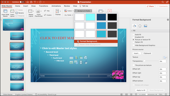
FIGURE 10-8: The Format Background pane opens on the right side of the window.
Working with title and text objects
Boring presentations are a dime a dozen. Want to make yours capture and hold your audience’s attention? This section walks you through various ways to dress up the text on your slides for a stronger effect, to make it easier to read, or to just make it prettier.
Everything you can do with your text on slide masters can be done also on individual slides.
To get started, open a PowerPoint presentation you’ve been working on or create one and then choose View ⇒ Master ⇒ Slide Master.
You can work with the features described in the following sections, whether or not you choose a theme for your presentation. For the examples we provide, we continue to use the modified Circuit theme and layouts that we use previously in this chapter.
The shadow knows: Creating a drop shadow effect
We're big fans of adding a drop shadow effect to text to give it a three-dimensional feeling and improve its legibility. Here are the steps to add a shadow to the Master title for a presentation so that it applies to every slide’s title:
- Click any edge of the Master Title Style object so that it is selected and displays eight handles.
- Select the text within the Master Title Style object.
- Click the Shape Format tab on the ribbon.
- Click the Text Effects icon in the Text Styles group (as shown in Figure 10-9) and choose Shadow from the pop-up menu.
-
Click a thumbnail to add a shadow effect to the title.
The shadow reflects the changes you make immediately, so play with them until the shadow effect looks good to you. Figure 10-9 shows the choices on the Shadow pop-up menu.
To remove the shadow effect, choose No Shadow at the top of the pop-up menu. You can also click Shadow Options to display the Shadow settings in the Format Shape dialog, where you can specify exact values for the color, angle, size, blur, distance, and transparency of your shadow effect.
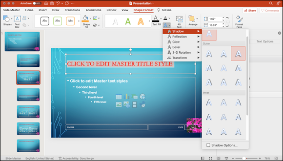
FIGURE 10-9: PowerPoint offers a wide range of drop shadow effects for your slides.
When you project your slides onto a big screen in a large room, the shadow makes the text easier to read even though the effect is subtle.
Getting your point across with bulleted or numbered lists
Chapter 9 talks briefly about bullets and lists, so let’s get a closer look at them here.
Each theme comes with preset options for bulleted lists. As with almost everything about a theme, you don’t have to accept the default options that come with a given theme. For example, although a plain old bullet character (a round dot) may do the trick, other characters might be more appropriate. Follow these steps to change the default bullet style to another bullet style:
- Click any edge of the Master Text Styles object so that it displays eight handles.
- Select a text level (or select the entire block of text to change all levels).
- Choose Format ⇒ Bullets and Numbering to display the Bullets and Numbering dialog.
-
Click the Bullets tab and choose the character you prefer.
Figure 10-10 shows the Master Text Styles object before and after changing the bullet character it uses in the Bullets and Numbering dialog.
FIGURE 10-10: Before (top) and after (bottom) changing the bullet character in the Bullets and Numbering dialog.
You can also change the color, size, and indentation of bullets on the ribbon’s Home tab.
Or, rather than create a bulleted list, you can create a list that numbers its items automatically. To do so, click any edge of the Master Text Styles object so that it displays eight handles, and then select the entire bit of text. Choose Format ⇒ Bullets and Numbering. Click the Numbering tab on the Bullets and Numbering dialog and you’ll notice that it lets you choose from several different kinds of standard numbering (1, 2, 3), roman numerals (I, II, III), and letters (a, b, c).
One more thing: Although everything you may have seen to this point in this chapter has been in the context of slide masters, you can add and customize each of these features on individual slides as well. If you want to make a change or add something to every slide, make the change or addition to a slide master; if you want to make a change or add something to a specific slide or slides, make sure that you're working in normal view and not in a master view.
Working with PowerPoint Objects
In this section, you find out how to create and work with various types of media objects, such as SmartArt graphics, charts, still images, and movies.
In PowerPoint, every item on a slide is an object. The previous section, for example, deals with the Master Slide Title, which is in its own little box. That box is an object, in PowerPoint lingo. Master text styles are in a box; that box is also an object. Every element in the header or footer that’s in its own little box is an object. And every SmartArt graphic, still image, chart, graph, and movie you add to any slide or slide master is an object.
When you create a new, blank slide, you can see that it has eight icons (called content placeholders) in the middle of the text box, as shown in Figure 10-11. These are shortcuts to add media objects, which we describe shortly. Note that some slide types (such as title slide, section header, and blank) do not have a content icon.
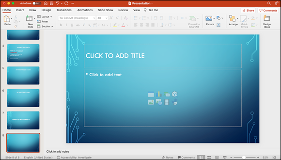
FIGURE 10-11: The icons on most new slides are shortcuts to add media objects.
The top row of icons consists of shortcuts to creating a table, a chart, SmartArt graphics, and 3D models (from left to right). In the bottom row, they're shortcuts to add an image from a file on your hard drive, an image file from online, a movie from a file on your hard drive, and an icon from online.
Just because you can add them doesn’t mean that you should. Before you add any type of media or graphical element to a slide, ask yourself whether it improves your presentation or helps get your point across. If it doesn’t, don’t bother. You can waste a lot of time messing around with this stuff, only to conclude that it’s tacky or doesn’t add any substance to your presentation.
So think before you invest time in creating media objects for your slides. Keep this advice in mind as you read later sections on adding tables, charts, SmartArt, and other media objects to presentations.
Formatting tables
Sometimes, information is best presented in a grid made up of rows and columns, otherwise known as a table. PowerPoint has excellent tools for creating a table. To add a table to a slide, choose Insert ⇒ Table, enter the number of rows and columns you’d like to start with, and then click Insert. The Table Design and Layout tabs appear on the ribbon; choose an appropriate table style from the thumbnails in the Table Styles strip in the Table Design tab.
Voilà! You now have an attractive table on your slide, as shown in Figure 10-12.
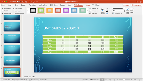
FIGURE 10-12: This table of six rows and six columns reflects choices on the ribbon’s Table Design tab.
For the table shown in Figure 10-12, we typed some values in the cells and then selected the options we wanted from the Table Options group on the far left side of the Tables Design tab. These options are Header Row, Total Row, Banded Rows, First Column, Last Column, and Banded Columns.
Here’s what the options mean:
- Header Row: The header row is the first row and contains the labels for columns (Q1, Q2, Q3, Q4, and Total in Figure 10-12).
- Total Row: The total row is the last row and contains the totals for the columns (640, 540, 580, 840, and 2,600 in Figure 10-12).
- Banded Rows: The Banded Rows option shades alternating rows differently to provide contrast and make it easier to discern individual rows from their neighbors. In Figure 10-12, for example, the East and West rows are slightly lighter than the North and South rows.
- First Column: The first column is the first column (of course) and contains labels for the rows (North, East, South, West, and Total in Figure 10-12).
- Last Column: The last column is the last column (clever, no?) and contains the totals for the rows (500, 600, 700, 800, and 2,600 in Figure 10-12).
- Banded Columns: The Banded Columns option shades alternating columns differently to provide contrast and make it easier to discern each individual column from its neighbors. This option isn't enabled in Figure 10-12.
Choosing the Header Row, Total Row, First Column, or Last Column option changes two qualities about the row or column. First, the values appear in a contrasting color. Second, the row or column is separated from the other values by a line. The idea is that these options make the first and last row and first and last column stand out and appear different from the rest of the data.
After you create a table and add data to it, you can click other thumbnails to try different styles or choose Format ⇒ Font to make changes to individual attributes in selected table text, such as font size and font color. From the Table Design tab, you can change border color and shading fill or add effects to the table frame itself.
The ready-made table styles save you a lot of time. After we clicked Insert in the Insert Table dialog, it took us less than five minutes to create the nice-looking table shown in Figure 10-12, and most of that time was spent entering data. Considering how little time we spent formatting the table, we think it looks darn nice.
Creating a chart
Sometimes, a graphical representation of numerical data conveys information better than a grid full of numbers. If so, a chart may be just the ticket. To add a chart to a slide, follow these steps:
- Click the Insert tab on the ribbon.
-
Choose a chart type by clicking the Chart icon.
Click the appropriate type of chart for the data this chart will represent. Your choices are Column, Bar, Line, Area, Pie, Treemap, Sunburst, Histogram, Pareto, Box and Whisker, X Y (Scatter), Waterfall, Funnel, Stock, Surface, Radar, and Filled Map.
-
Choose a chart style by clicking its thumbnail.
Each chart type has several styles. When you click a thumbnail, Microsoft Excel automatically opens with sample chart data for that chart type and style, ready for you to edit.
Here are the steps to create a simple chart:
- Select the data in the first two columns of the table shown earlier, in Figure 10-12.
- Choose Edit ⇒ Copy to copy the data to the clipboard.
- Switch to Microsoft Excel, which opened automatically when you clicked the thumbnail in Step 3 of the preceding set of instructions.
- Click in the first cell of the sample data (North, in Figure 10-12).
-
Choose Edit ⇒ Paste to paste the data into Excel.
It replaces the sample chart data, and the result should look something like Figure 10-13.
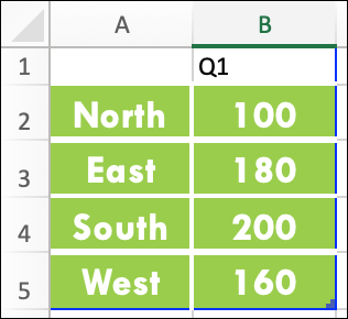
FIGURE 10-13: We pasted this data into Excel to generate a chart.
When we switched back to PowerPoint, a pie chart depicting first-quarter sales by region had been created automatically. We clicked the chart to select it and clicked the Chart Design tab on the ribbon, clicked the Add Chart Element button on the left, and then clicked Data Labels to add data labels, as shown in Figure 10-14.

FIGURE 10-14: Click the Chart Design tab to add data labels.
Next, we clicked the white frame surrounding the pie chart to select it, and then clicked the Home tab on the ribbon, where we made the data label font larger. Figure 10-15 is the final result.
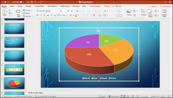
FIGURE 10-15: The finished chart.
Be careful where you double-click items in slides. One of several slightly different panes could open, depending on which part of the chart you double-click. For example, double-click an individual pie slice to display Format Data Point, double-click the pie to see Format Data Series, double-click a data label (assuming that you enabled data labels in the Format Data Series or Data Point pane) to see Format Data Labels, and double-click the box surrounding the chart to see Format Chart Area. In this example, double-clicking the middle of the pie would open the Format Data Series pane, whereas double-clicking an individual pie slice would open the Format Data Point pane.
The point is to make sure that the pane you want is the one that opens when you double-click. Otherwise, your results might not be what you expect.
You can also use the icons on the Chart Design and Format tabs to modify many aspects of your chart. When a chart or any component of a chart, such as labels, pie slices, or the legend, is selected, the Chart Design and Format tabs offer several options you’ll use often:
- Chart element styles: Choose different color schemes for your chart and its background.
- Current selection: After you select the target from the list box, click the Format tab and use its myriad options to enable or disable options specific to that item, including number formats, data labels, and a legend, or change the title of the chart.
- Text styles: Also in the Format tab, the icons in this group make it easy to customize the color, fill pattern, and effects for the text in your chart.
You can see these options in Figure 10-16.
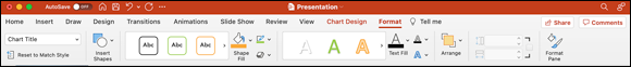
FIGURE 10-16: The Format tab is available when you’re working with a chart.
Because we don’t have the space to cover every chart option on the Chart Design and Format tabs and their subtabs, we encourage you to select different parts of your charts and check out the options. Also, double-click (or right-click) different parts of your charts to open and explore the options you find in the various Format dialogs.
One more thing: If you created a chart in Excel before you started working on a slide show, you can use the chart in your presentation by selecting it in Excel, choosing Edit ⇒ Copy to copy it to the clipboard, and then switching to your PowerPoint presentation and choosing Edit ⇒ Paste to paste it onto the current slide.
Get smart: Use SmartArt
Sometimes, you need to convey information that is more meaningful as an illustration than as bullet points, such as an organizational chart, flow chart, a matrix, a pyramid chart, or a process chart. The PowerPoint feature SmartArt Graphics helps you create these types of graphics quickly and easily. You can start with information from a bulleted list or create a blank graphic and add text to it later. Either way, you end up with a slide that’s more interesting and probably more informative than plain text.
Figure 10-17 shows a slide before and after applying a SmartArt graphic.
With almost no effort on your part, you can change a boring all-text slide into a dynamic graphical slide.
To use SmartArt graphics in a slide, start by selecting existing text — or not. If you select text before you take the next step, that text appears in your graphic. That’s how we did it in Figure 10-17. If you don’t select some text before the next step, you create an empty SmartArt graphic with no text in it yet.
The next step: From the ribbon’s Insert tab, click the Convert to SmartArt button, and then click a style icon to specify the arrangement of the elements in the graphic. In Figure 10-17, we chose the Basic Process style from the pop-up thumbnail display; in Figure 10-18, we clicked Cycle and then chose the Text Cycle style.
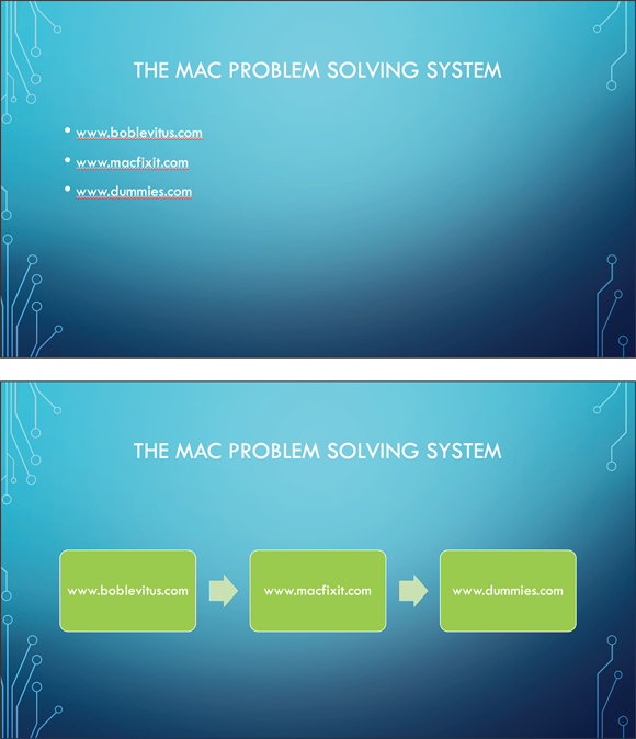
FIGURE 10-17: The original all-text slide (top) is boring; the SmartArt rendition of the same information (bottom) is dynamic and exciting.
Click a SmartArt object to select it and a frame surrounds it (refer to Figure 10-18). The little dots in the corners and the middle of each side are handles; click and drag them to resize the entire graphic.
If you click the little arrow icon hanging off the upper-left corner of the frame, you also see a text pane with a bulleted list of the items that appear in the SmartArt graphic (refer to Figure 10-18). When you select one of them, the corresponding item in the graphic is also selected. Or you can select an item in the graphic by clicking it in the graphic. When items are selected, you can resize them by dragging their handles, or you can apply formatting from the Format tab.
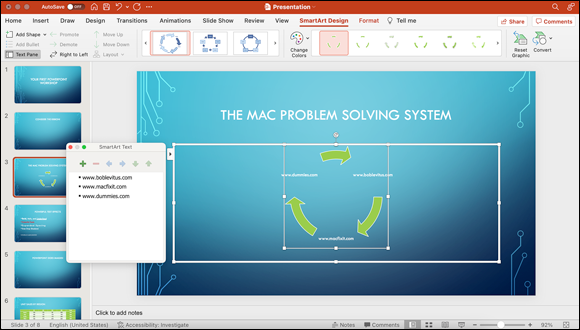
FIGURE 10-18: A SmartArt graphic with the Text Cycle style applied to it.
You can also change the color, style, or shape of SmartArt, using the icons in the SmartArt Design tab and in the SmartArt Format tab.
Finally, if you click a SmartArt graphic on a slide, you can change it to any other SmartArt graphic by clicking a different SmartArt graphic thumbnail from the thumbnail strip on the SmartArt Design tab. If you don’t like it, choose Edit ⇒ Undo (the shortcut is ⌘ +Z) and try a different one.
We encourage you to check out all the icons on the SmartArt Design and Format tabs. Using SmartArt instead of text on some slides makes your presentation stand out and gives it more visual appeal than if it were just plain ol’ text.
More media: Adding images, movies, or sounds
Adding media to your presentation is easy: Just drag an image file, a movie file, or a sound file from Finder onto the slide you want it to appear on.
But wait — there’s more! Alternatively, you can click the content placeholder icon for the type of media file you want to add to the slide. (As mentioned earlier in this chapter, the media file icons are in the bottom row of icons in the middle of most slides.) PowerPoint displays an Open File dialog for photos, clip art, or movies.
Now suppose that you want to select a photo from your Photos library, a GarageBand jingle, or an iMovie project that you're working on? No problem: Microsoft provides the Pictures, Video, and Audio icons on the ribbon’s Insert tab. To select an audio file from the Music library, for example, you would click the Audio icon on the Insert tab and choose Audio Browser. Figure 10-19 shows the snazzy window that appears, where you can listen to tracks and choose just the right audio. (Note that you can also switch to photos, movies, and clip art from the icons at the top of the Media browser window.) After you locate the perfect media, drag it from the Media browser window to the slide.
FIGURE 10-19: Adding a sound file to a slide.
No matter what type of media you’re adding, a subtab appears on the ribbon that provides you with formatting options specific to images, audio, or movies. In the audio file example, we need to specify whether we want the sound file to start automatically when the slide appears or only after we click the file. Click the Playback tab (if you don’t see it, be sure to select the audio file in your slide), and then click the Start pop-up menu to make the call. Because we chose Automatically, the audio file is heard when this slide comes on the screen during a presentation. (If you prefer to trigger the sound or movie manually, click the Start pop-up menu and choose When Clicked On.)
Staying with the Playback tab (shown in Figure 10-20), you can also specify whether the audio should loop and whether the audio icon (which looks like a speaker) should be visible or hidden during your presentation.
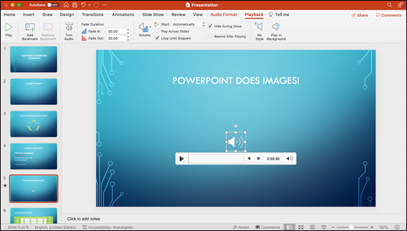
FIGURE 10-20: You can set media-specific options from the Playback subtab.
Which method of adding media to a slide should you use? It’s all up to you — if you know exactly what to add, just drag the file directly from the Finder window. However, if you need to sample your media libraries before making a selection, the Media browser window is the perfect option.
Regardless of how you add the media file, we encourage you to explore the Format tab for that type of media. You'll find a number of helpful options that PowerPoint provides for customizing the media’s appearance and function.
Using Quick Styles and Effects
Here’s a trick for making objects look better on slides. Use the Quick Styles icon on the Home tab. The Quick Styles pop-up menu appears in the Format group and is shown in all its glory in Figure 10-21.
You have a thumbnail menu of Quick Styles to choose from. To use them on any object (or multiple objects) on a slide, select the object(s) and then click an effect button to apply it to the selected object(s).
There are other effects that you can apply to elements in your slides by using the ribbon’s Format tab.
Don’t forget the Undo command (choose Edit ⇒ Undo or press ⌘ +Z) if you decide that you don’t care for an effect after you’ve applied it.
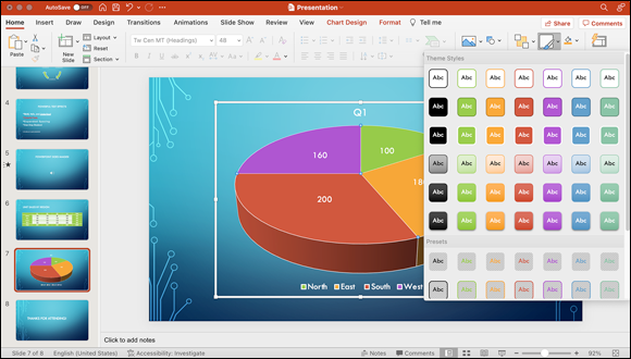
FIGURE 10-21: Quick Styles are just what their name implies.
A picture is worth a zillion words here, so take a gander at Figure 10-22, which shows a bunch of objects on a slide before and after applying effects.
Following is a description of the styles and effects we used for each object:
- Quick Styles Demo (slide title): We selected a thumbnail from the Quick Styles menu on the Home tab.
- Sample Text 1a: On the Shape Format tab (which appears in the ribbon when text or a shape is selected), we chose the Reflection submenu, and then the Full Reflection and Touching options.
- Sample Text 1b: On the Shape Format tab, we chose the Shadow submenu, and then the Outside and Top right options.
- Sample Text 2: On the Shape Format tab, we chose the 3-D Rotation submenu, and then the Isometric Left Down option.
- Image: On the Picture Format tab, we chose the Bevel submenu, and then the Art Deco and 3-D Rotation option and the Perspective Contrasting Left option.
Quick Styles are quick, easy to use, and all you need to spiff up a slide most of the time. In the unlikely event that you can’t find a style or an effect that’s perfect for your needs, apply one that’s close and then right-click the object and click Format Text, Format Picture, or Format Shape. Figure 10-23 shows the Format Picture task pane.
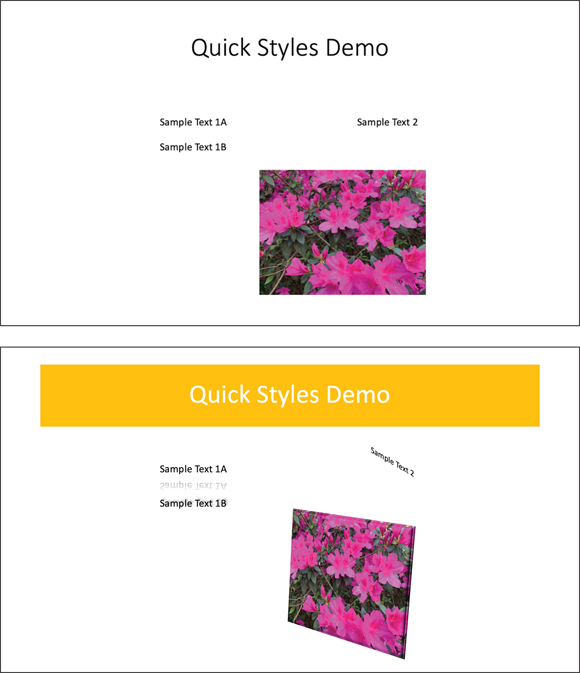
FIGURE 10-22: Before (top) and after (bottom) applying Quick Styles and other effects.
If you can’t make your picture look exactly the way you want by using the Format task pane, it probably isn't possible in PowerPoint.
We recommend that you spend some time clicking objects to select them and then looking at the formatting options available on the Format tab.
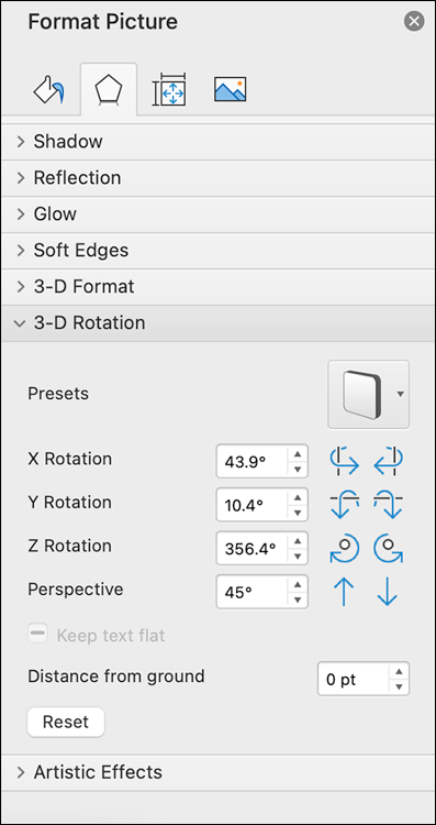
FIGURE 10-23: The Format Picture task pane.
Aligning, arranging, and distributing objects
When working with all the types of objects covered in this chapter, you may want to be able to align them, arrange their stacking order, or distribute them evenly on your slides at some point. Never fear: PowerPoint has tools for doing all three tasks. Plus, it has nifty dynamic guides to help align objects on the fly.
Arranging isn’t just for songs any more
To move objects around on your slide, select the object you want to move. Next, click Arrange on the Home tab to open the Arrange menu and choose one of the following options:
- Bring to Front: Brings the selected object to the front of all other objects on the slide
- Send to Back: The opposite of Bring to Front; sends the selected object behind all other objects on the slide
- Bring Forward: Brings the selected object forward one layer
- Send Backward: Sends the selected object back one layer
For example, suppose that Object C is behind two other objects, but you want it to appear in front of them. No problem: Just select Object C and then, with the Arrange menu open, choose Bring to Front, as shown in Figure 10-24.
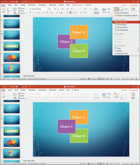
FIGURE 10-24: Object C before (top) and after (bottom) being brought to the front.
Presto! Object C is now in front of both the other objects.
Figure 10-25 shows what happens if you choose Bring Forward instead of Bring to Front. Object C is now in front of Object B but behind Object A, as shown in the figure.
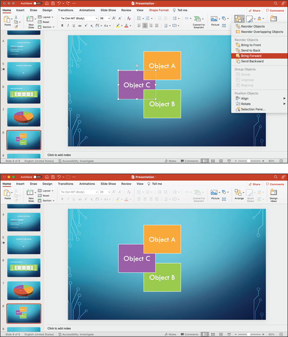
FIGURE 10-25: Object C before (top) and after (bottom) being brought forward.
And that’s that. Those four commands on the Arrange menu are the key to arranging the stacking order of objects on a slide.
Alignment isn’t just for car wheels any more
Suppose that you don’t care about the stacking order but you want the bottoms of three objects to align. Again, no problem. Select the three objects (hold down the Shift key as you click them) and then click Arrange. Now choose Align Bottom from the Align submenu to produce the results you see in Figure 10-26.
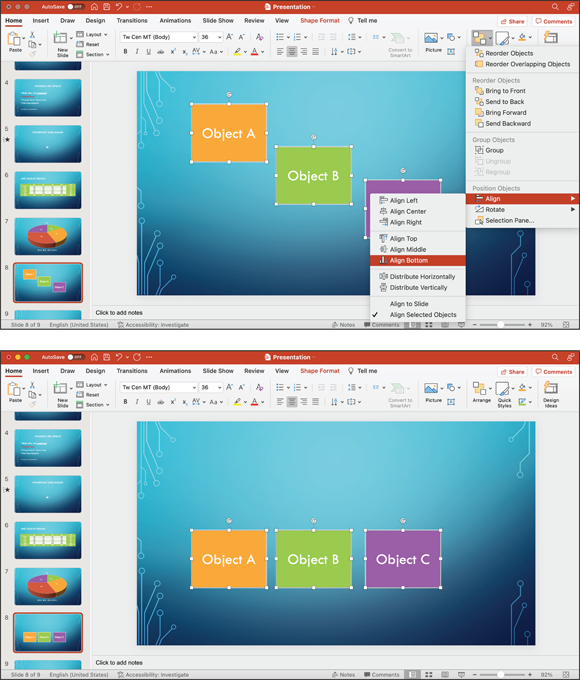
FIGURE 10-26: Three objects before (top) and after (bottom) having their bottoms aligned.
The other items on the Align menu do exactly what you expect them to do: The first six align selected objects on their left, center (horizontally), right, top, middle (vertically), or bottom. If you choose Align Selected Objects, the objects are lined up in the same approximate location on the slide; if you choose Align to Slide, they're aligned with the slide’s left, center, right, top, middle, or bottom rather than with each other.
Distribution isn’t just a mathematical term any more
You may at some point want to distribute objects so that the space between them is equal. In this case, you need to select at least three objects. With the objects selected, revisit the Arrange icon — and then choose Distribute Horizontally from the Align menu to produce the results you see in Figure 10-27.
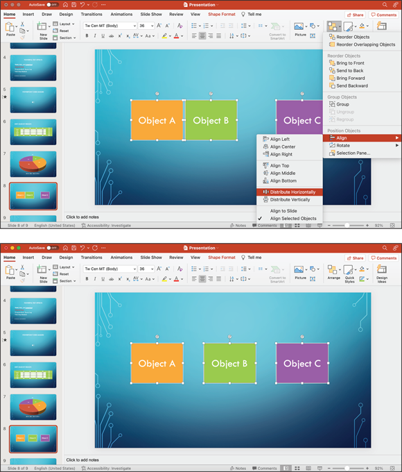
FIGURE 10-27: Objects A, B, and C before (top) and after (bottom) being distributed horizontally.
When you distribute objects, they're spread between the leftmost point on the leftmost object and the rightmost point on the rightmost object — or the topmost and bottommost, if you distribute vertically. Note that Objects A and C have not moved. They define the outer limits. Object B is the only element that has moved, so there's now an equal amount of space between it and Objects A and C.
Aligning objects with dynamic guides
One feature that you might find handy is PowerPoint dynamic guides. They’re turned on by default, but to make sure that they’re active, choose View ⇒ Guides and ensure that the Dynamic Guides item has a check mark next to it. This command is a toggle, so if it already has a check mark, you're good to go; if it doesn’t already have a check mark, select it and the check mark appears.
Dynamic guides are alignment tools that appear only when you need them; hence the dynamic part of their name. When you drag an object or objects on a slide, the dynamic guides try to determine what other objects on the slide you might want to align them with. For example, in Figure 10-28, Object B is being dragged from the middle of the slide toward the right corner. The dynamic guides are the lines indicating that if Object B is dropped now, its top, middle, and bottom are aligned with Object A.
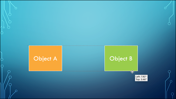
FIGURE 10-28: Using dynamic guides to align objects.
If the slide has only one object, the dynamic guides attempt to align it with the middle of the slide, as shown in Figure 10-29.
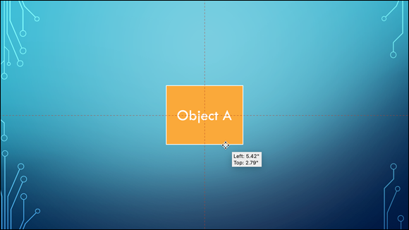
FIGURE 10-29: The dynamic guides indicate that the object is now dead-center on the slide.