
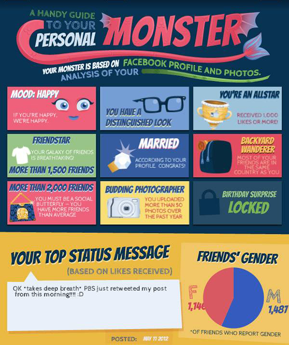
Figure 13-1: My Facebook “Monster” infographic.
Working with Infographics
Knowledge is power, but let’s face it: Some kinds of knowledge, like statistics, can be pretty boring. Visual representations of statistical information, on the other hand, are much more engaging. That’s an infographic — a graphical representation of related (often statistical) information. A true infographic (instead of interesting looking graphic) shows percentages or numbers according to scale so that your reader can immediately get a sense of scale.
Popular subjects for infographics include
![]() Social media trends
Social media trends
![]() Mobile device use trends
Mobile device use trends
![]() Nutritional information
Nutritional information
Any discussion where you want to demonstrate how a bunch of things relate to one another is ripe for an attention-getting infographic. The key difference between an infographic and a simple list of items is the emphasis on the connections and comparisons among those items. To make a good infographic, you need to illustrate relationships among items by making them look larger or smaller on a percentage basis. This usually requires a little help from a spreadsheet.
Infographics are a great way to share your branding online. Every good infographic gives source credits, and you should always include your own brand among them. I suggest inserting the name of your brand below the title so that it can’t easily be cropped out. Add a link leading back to your site on all your infographics.
If you aren’t a designer (and don’t want to pay for one), you can still create fun infographics using any of these five free tools online that vary from interesting to tons of fun.
You can create attention-getting infographics fairly easily via the following sites, though I recommend getting a graphic designer friend to do this for you because they can do it more comfortably. If not, just allow yourself a little time to create a few versions so you can get the hang of it. Once you’ve created your first one, the rest are easy.
![]() Visual.ly (
Visual.ly (http://visual.ly
): Super fun storytelling visualizations in minutes. It’s also a great place to scroll through a wide variety of compelling infographics. It’s fully optimized for social media sharing, which can save you a lot of time. Figure 13-1 was created via Visual.ly in about three minutes.
![]() Hohli (
Hohli (http://charts.hohli.com
): Great resource for creating charts, including line charts, bar charts, pie charts, Venn diagrams (my favorite), scatter plots, and radar charts. You can choose from a variety of backgrounds and color combinations. It’s also optimized for social sharing.
![]() Google Public Data Explorer (
Google Public Data Explorer (www.google.com/publicdata
): Lets you use the power of Google to harness existing data sets. It’s going to take more time and attention to detail to create an infographic with this tool, but you can go into significant detail and know that you are representing something accurately.
![]() Many Eyes (
Many Eyes (www-958.ibm.com/software/data/cognos/manyeyes
): A research tool experiment hosted by IBM research. Like Google, it gives you access to data sets, but the visualizations look a little more compelling and are easy to create. It also gives you the opportunity to participate in communities where people discuss different topics. This can be a terrific way to meet your target audiences.
In the next section, I show you where infographics are a good fit and give you tips for making images a more powerful sharing tool for you online.
..................Content has been hidden....................
You can't read the all page of ebook, please click here login for view all page.