
Up until now, we have just seen data points flowing through our screen that may or may not be very useful to us. Wouldn't it be nice to make something visual to help display this data? There are plenty of options that could be used to plot this data. As an example, let's take a quick look at gnuplot, which is a command-line program that is packaged with most modern Linux distributions. This book has been using Fedora; to install gnuplot, simply yum install it:
undercloud# yum install -y gnuplot
There are options that need to be fed into gnuplot to tell it how to render the graph that it creates. Let's use a configuration file that will be passed to gnuplot. Put the following content into a file. I'm going to name mine memory.cfg because I will plot the memory usage that's already been aggregated by the Ceilometer statistics command:
#memory.conf
set terminal png truecolor
set output "memory.png"
set autoscale
set xdata time
set timefmt '%Y-%m-%dT%H:%M:%S'
set style data lines
plot '<cat' using 2:7 title "Sum"
The set terminal line tells gnuplot to generate a .png image. Set output sets the filename to write to. Autoscale turns on autoscaling. The xdata and timefmt lines define the format to read the time from. The set style line tells gnuplot to make a line graph. Finally, the plotline <cat reads from standard input. 2:7 tells us to use the second column for the x axis, the seventh column for the y axis, and the title "Sum" sets the title for the line that will be drawn. Next, let's execute the string of commands that will clean Ceilometer's output and give it to gnuplot:
undercloud# ceilometer statistics -m memory -q project=<PROJECT_ID> -p 3600 | tail -n +4 | head -n -1 | tr -d '|' | tr -s ' ' | gnuplot memory.cfg
The Ceilometer statistics command uses the memory meter for the project of the ID that is passed and groups the memory measurements into hour-long periods. The Ceilometer output is piped to the tail, which strips off the rows that display the column headers. The head command strips off the last line, which is just another line as the one that was included in the header that borders the bottom of the data. The first tr command deletes all the pipes that are delimiting the columns, and the second tr command squashes all the spaces into single spaces. What we end up with is no pipe delimiting, no column headers, and no special output formatting. This is just the raw data with single-spaced delimiting. There may be a way to make Ceilometer do this automatically for us. Finally, the cleaned-up data is passed to gnuplot, which reads our configuration file and generates .png. Here is an image I generated with some sample data:

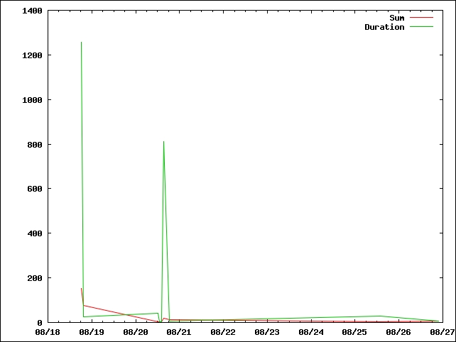
As a second example, let's plot two lines. This can't be achieved by piping data directly to gnuplot. We will have to dump the data into a data file so that the data can be read twice, once for each line. We will use vcpus this time instead of memory and a period of 30 minutes. Also, make a copy of the cfg file so that it can be modified:
undercloud# ceilometer statistics -m vcpus -q project=<PROJECT_ID> -p 1800 | tail -n +4 | head -n -1 | tr -d '|' | tr -s ' ' > vcpus.txt
undercloud# cp memory.cfg vcpus.cfg
Next, update the vcpus.cfg file to use the vcpus.txt file and to plot two lines instead of one. To do this, update the output line to a new filename so that you do not overwrite your memory.png file and update the plotline. The new file's content will look like this:
#vcpus.conf
set terminal png truecolor
set output "vcpus.png"
set autoscale
set xdata time
set timefmt '%Y-%m-%dT%H:%M:%S'
set style data lines
plot 'vcpus.txt' using 2:7 title "Sum", 'vcpus.txt' using 2:9 title "duration"
Once you have the new cfg file and the data file, run gnuplot:
undercloud# gnuplot vcpus.cfg
This will generate a vcps.png file. Here's one I generated with sample data:
Another example that could be worked with is to dump the memory data into one file and have one line plotted from the memory data and the second line plotted from the vcpus data. As illustrated, gnuplot can be a powerful tool. These examples show what can be done with the data that Ceilometer produces. They show the only possible tool to consume and plot the data.