FIG 7.1 This abstract was painted with the Sponge Dense and Acrylics Dry Bristle brushes
Photographers who use Painter primarily take the color from the original photograph, however there are times when we need to add or adjust the colors and this chapter addresses those occasions.
The chapter starts by describing the various palettes in Painter from which color is available; these include the excellent Mixer and Color Sets as well as the frequently used Colors palette, now updated in Painter 11.
It is also often necessary to adjust the tonality of the picture. This is an important part of the final stages of finishing a picture, but is also frequently used to prepare the photograph prior to cloning. The controls look complicated initially so there is plenty of guidance in this chapter on how best to use them.
There are also occasions when a picture needs to lose the original color and have a tone applied, and there are several ways in which this can be done.
Hand tinting has been popular since the early days of photography before color photography was introduced, and I have included some ideas on how this effect can be achieved.
Choosing colors
The Colors palette
The Colors palette is shown in Figure 7.2. If this palette is not visible on the screen, go to Window Color Palettes Colors. Open any photograph in Painter to enable you to work through these examples.
This is the chief color picker for general use in Painter and colors are selected by clicking in the outer ring to select the hue and then in the inner triangle to choose the saturation and value. Within the color triangle the pure colors are on the right-hand side, and as the cursor is moved to the left the colors are mixed with either black (down) or white (up). In Painter 11 the Mixer palette has become resizable, which makes it easier to select precise colors.
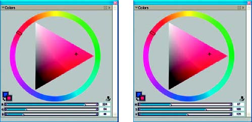
FIG 7.2 The Colors palette with the RGB sliders shown on the left and the HSV sliders on the right
The three sliders below the color wheel show the RGB values of the color chosen; this information is very useful in cases where you need to use the same color again. Go to the Toolbox and make the Eyedropper tool active, then click in a picture and the exact color breakdown will show in both the color wheel and in the sliders. This is often used when you need to enhance a color in your picture: click to identify the color you need, and then move the color wheel cursor to a stronger color and paint into your picture.
The display shows the RGB values by default but this can be changed. Click on the palette menu (small triangle top right in the palette) and select the HSV option.
The two small color squares on the left show the Main and Additional colors. The Main color is the one that is used for painting and is the one in front.
The Colors palette has much improved in Painter 11. The addition of the RGB and HSV sliders is a great help, as is the ability to enlarge the palette to make choosing colors easier.
It is also now possible to make small adjustments by pressing the arrow keys on the keyboard, this will move the color palette cursor by precise amounts.
The square behind is the Additional color and is used for some special brushes that paint with two colors. It is not the same as the Background color in some other graphics programs.
The rubber stamp icon is, of course, the Clone Color option, which we have used many times throughout this book, and which makes the brush pick the color from the clone source instead of the Colors palette. When the Clone Color is selected the colors in the palette are muted; this only operates when you have a clone copy currently active.
Color sets
Color sets, another way of picking colors and, like the other palettes, are displayed via Window>Color>Palettes Color Sets. Figure 7.3 shows the Color Sets palette.
It can be an advantage to choose a color from the Color Sets palette as specific color shades may be more readily identifiable from the individual squares rather than from a continuous color range. To select a color, click on the square and the brush will paint with that color.
The palette menu shown in Figure 7.4 contains options for customizing the display. The first block of options is for creating new color sets from a variety of sources.
New Empty Color Set is for when you want to individually pick a range of colors and store them for future use. This could be useful if you are designing a layout or color scheme and want to keep all the used colors together. Click the New Empty Color Set option in the menu to make an empty set. Use the Eyedropper to add colors, click on a color in the active image, and then click the Color Set icon with the symbol. Click the Color Set icon with the – symbol to remove a color.
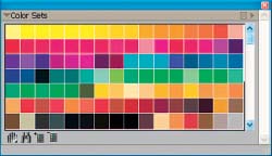
FIG 7.3 The Color Sets palette
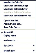
FIG 7.4 The Color Sets palette menu
New Color Set from Image creates a color set from the image currently active on the desktop. You could use this to restrict the number of colors in a new image to those of an existing one. The New Color Sets from Layer or Selection work in the same way but take the colors from the active layer or the active selection.
New Color Set from Mixer Pad takes the colors from the Mixer, which will be covered later in this chapter.
The default color set is only one of many sets available and Open Color Set will replace the current set with a different one. The extra color sets are loaded with the Painter program, and when the Open box appears it will normally take you straight to the relevant folder from where you can choose the new color set. If this does not happen you will need to navigate to the Corel Painter program files and go to the Color Sets folder which is within the Support folder. The default set is called Painter Colors.colors.
There is large selection to choose from, about 50 in all, and Figure 7.5 shows a selection.
Append Color Set will add the new color set without deleting the existing one.
Save Color Set will save sets that you have created.
The other options are all self-explanatory. I will just mention the Swatch Size option, which will show the swatches at various sizes. I find it very useful to enlarge them as the colors can be seen more easily.
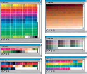
FIG 7.5 Some additional color sets
Mixer
When the Mixer was first introduced in Painter it was a huge advance in recreating traditional techniques – it works like an artist’s palette where paints can be mixed together to blend colors. Figure 7.6 shows the current Painter Mixer palette which, from Painter 11, is resizable to make it easier to select colors.
Click on the second brush icon and select a color from the selection at the top of the palette, or use the Eyedropper in the Toolbox and click in the picture currently open. Paint some brush strokes into the palette then select another color and paint some more. The size of the brush that adds the color can be changed by moving the slider. The paint will mix together as it is layered on top of the previous brush strokes. When you have added several colors click the palette knife icon and mix the colors together.
When you are ready to paint, choose a brush, then click the Eyedropper icon in the Mixer palette; then click in the Mixer to select the color you need and paint into your picture. The Eyedropper icon in a circle is used for brushes like Artists Oils which can pick up more than one color at a time (Figure 7.8 shows the RealBristle Fan Short brush painting with colors mixed in the Mixer palette).
The magnifying glass icon will enlarge the Mixer display to make blended colors more easily visible; double-click the icon to return to full view.
The Hand icon will move the display when the Mixer display is magnified.
The palette menu has controls to save and import Mixer palettes and also the option to create a color set from the Mixer palette.
Click on the Trash can to clear and reset the palette.
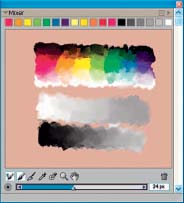
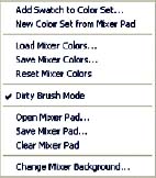
FIG 7.7 The Mixer palette menu
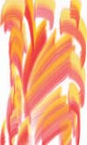
FIG 7.8 Painting with multiple colors
Adjusting tone and color

There are many ways in which tone and color can be adjusted in Painter, and they all have their uses so it is worth getting to know which control is better for which task. Most of the controls are available from the Effects menu with the exception of those in the Underpainting palette. The photograph used in this section (Hydrangea) is on the DVD in the Chapter 9 folder.
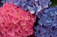
FIG 7.9 The original photograph prior to making any adjustments
Effects: Tonal Control: Brightness and Contrast
This is a very simple control – just two sliders; its main use is to increase contrast. In most cases the process of cloning reduces the contrast and vibrancy so moving the Contrast slider (the top one) to the right will give the finished picture more impact. I would caution against using the Brightness slider for anything other than very small adjustments as this affects all the tones and it is easy to lose detail in the highlights or shadow areas. If you need to brighten your picture use the Correct Color control.
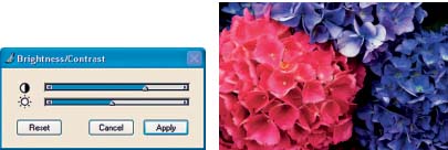
FIG 7.10 The Brightness and Contrast dialog box with the settings applied to the picture
Effects: Tonal Control: Equalize
This is another simple dialog box, which adjusts the black and white points to improve contrast. When the dialog box opens it will automatically set the black and white points to maximum contrast and spread the remaining tones across the dynamic range. You can change the suggested points by moving the black and white point indicators in or out. This is a very useful control to use on a regular basis; it is the equivalent of Levels in Photoshop, but only use it as a suggestion – not all pictures need to have the contrast increases, especially if they have subtle colors. The black shape in the display is the histogram and this shows the distribution of tones in the picture; in the illustration shown in Figure 7.11 the tones are predominantly in the mid-tones with nothing pure white or pure black. The result shows what happens when those mid-tones are stretched; there are now both pure whites and blacks and therefore it looks much more attractive.
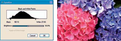
FIG 7.11 Equalize dialog box and the result when applied to the picture
Effects: Tonal Control: Correct Colors
This is a very powerful tool for changing both tone and color. In Photoshop it is known as Curves although in Painter it works slightly differently. If you have never used Curves before it can be very non-intuitive, but it is worth making the effort to understand how it works.
The first confusing thing is that when you open the dialog box there is no curve, just a diagonal line. This line represents all the tones in your picture: the top right corner being the lightest tones and the bottom right the darkest tones, and the middle point being mid-gray. Moving the top slider to the right will produce a gentle S-shaped curve in the display, which increases the contrast. When the curve moves to the left the tones in that area are lighter; to the right and the tones are darker.
Now move the Brightness slider to the right and you will see that the curve has moved mostly in the center; this is the mid-gray point, also known as the Gamma.
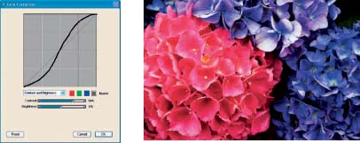
FIG 7.12 Color Correction dialog box showing an S curve to increase contrast and the result when applied to the picture
The key point to remember is that an S curve means increased contrast while an inverted S curve means a reduction in contrast. Figures 7.12 and 7.13 shows the difference.
When the center point moves, the overall brightness of the picture is changed but the end points of black and white are unchanged.
Under the display there are four colored boxes which represent the three color channels plus the Master icon. When the Master icon is active all the colors in the picture will change, but when only one color channel is active then only that color will be altered. Try this out by clicking in the red box and moving the Brightness slider all the way to the left. Figure 7.14 shows the result and, as you can see, all the red has been removed.
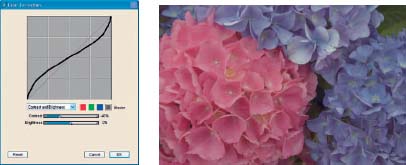
FIG 7.13 Color Correction dialog box showing an inverted S curve to decrease contrast and the result when applied to the picture
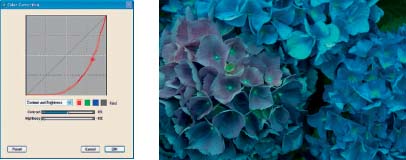
FIG 7.14 Lowering the brightness of the Red channel will remove red from the picture
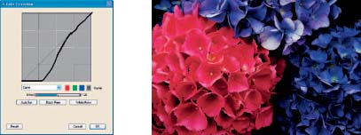
FIG 7.15 Pulling down the curve manually to darken just the darker areas
The default option in this dialog box is Contrast and Brightness and you can only use the sliders in this mode; in order to manipulate the curve directly we need to change to the next option in the dialog box which is Curve. Here we can move parts of the curve without creating an S curve. In the example shown in Figure 7.15 the curve has been pulled down to the bottom, which results in only the dark tones being affected and very little change in the lighter areas. This is used when we need to lighten or darken just one part of the tonal range.
This is a very valuable tool as it allows us to target certain tones very accurately without changing the rest of the tones. The option to select specific color channels is also available here, so you could for example select the Red channel and make the same curve as applied in Figure 7.15; the red flower would darken but the blue ones would change less. The whole picture will change to some extent because the purple flower also contains red.
There are two further options in this dialog box. Advanced allows you to enter values into the various boxes to adjust the tones very precisely.
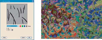
FIG 7.16 The Freehand option produces wild colors
Freehand is where you can go wild with psychedelic colors! The result of drawing vertical lines in the Curves box is shown in Figure 7.16.
Effects: Tonal Control: Adjust Color
This tool is equivalent to Hue and Saturation in Photoshop. The Hue slider will shift all the colors in the picture around the color wheel; this is useful as a quick tool for warming or cooling a picture when a small change is all that is needed. It is also useful for graphic effects, but when accurate color changes are required it is usually better to use either Correct Colors or Adjust Selected Colors.
The Saturation slider is extremely useful and should be used when the colors need boosting, either before cloning or when finishing a picture. It can also be used to reduce color saturation when you need delicate colors, and to remove all the color to make a monochrome picture.
The Value slider affects the overall brightness and should be used with care so that tonal values are not lost.
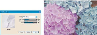
FIG 7.17 Adjust Color is useful for creating delicate colors as well as for strengthening color
There is a further option in this dialog box and that is the choice of the source on which of the color adjustment is calculated. The four options are Uniform Color, Image Luminance, Original Luminance and Paper. These are the same options for applying paper textures and are described in more detail in Chapter 5. The different results can be seen in Figure 7.18 with clockwise from top right: Uniform Color, Paper and Image Luminance. Original Luminance is only available when cloning.
Effects: Tonal Control: Adjust Selected Colors
The Adjust Selected Colors has the same controls (Hue, Saturation and Value) as the Adjust Color tool already discussed, with the addition of extra sliders to restrict the adjustment to specific colors.
The procedure is to open the dialog box and then to click in the main picture to set the color to be changed. Make the adjustment required using the Hue, Saturation and Value sliders and then use the additional sliders to further control the result. Each of the three controls have two sliders each: Extents and Feather. The Extents slider defines how far from the exact color selected the adjustment will be applied; the higher the number, the more colors will be affected. The Feather slider softens the edges of the adjustment; the higher the number the softer the edge is. If you are changing a color with a clearly defined edge the slider should be kept low and vice versa.
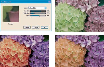
FIG 7.18 The Adjust Color dialog box with examples showing the four different source options
The Adjust Selected Colors tool is a very precise way to adjust colors but it does suffer from the huge disadvantage that you can only see the planned adjustment in the tiny preview window. This is typical of most of the adjustment previews in Painter; usually you can manage OK, but here it is very difficult to assess what you are doing and that makes it very unsatisfactory to use. You are able to pan around within the window which helps a little. Only the Correct Colors tool shows the preview on the actual picture but it cannot specify the tone changed.
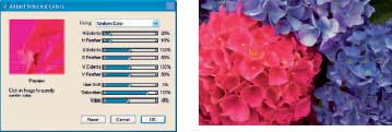
FIG 7.19 The Adjust Selected Colors dialog box with the result of increasing the saturation of the red color
Effects: Tonal Control: Match Palette
The Match Palette lets you take the colors from one image and apply them to another picture. This can be useful if you want to create a set of pictures which all require the same tonal range. In the example shown the colors have been taken from the flower picture and applied to the sand pattern.
The Color slider controls the amount of color transferred. Brightness controls the way the colors are matched; higher settings mean more contrast.
The two Variance sliders, one for Color and the other for Brightness, control the amount of variance from the original image; the higher the value, the wider the range of colors or brightness compared with the source.
When you have found the required settings you can adjust the overall amount of the effect with the Amount slider. The two Match color images are on the DVD.
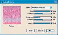
FIG 7.20 The Match Palette takes the color from one image and applies it to another
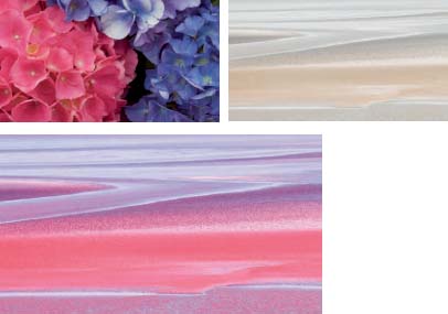
FIG 7.21 Using the Match Palette the colors of the flower picture have been applied to the sand picture. Note that only the colors of the flower picture have been applied and not the shapes
Effects: Tonal Control: Negative
This turns the colors in a picture to negative, which can be useful when creating special effects.
FIG 7.22 The Negative command turns the colors to negative
Effects: Tonal Control: Posterize
The Posterize command splits the colors into a number of levels as determined by the number entered in the dialog box.
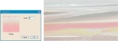
FIG 7.23 Posterize splits the tones into a specified number of levels
Effects: Tonal Control: Posterize using Color Set
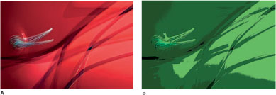
FIG 7.24 Posterize using Color Sets – these samples are from a selection of loaded color sets
AOriginal
B Saturated Greens
C Jacarand
D Flesh Tones
E Using selected colors
F Using another image
This also splits the picture into tones but in this case also applies the colors from the current color set, which makes it a valuable tool for creating new color schemes.
To try this effect open the ‘ Red car handle ’ from Chapter 9 on the DVD and go to Effects>Tonal Control>Posterize using Color Set. There is no dialog box; the effect is purely based on the color set currently active. The number of posterized tones will depend upon the number of colors in the color set.
If you have not previously loaded any color sets your first result will be based on the default color set. Load some different color sets and see the difference; the instructions for loading color sets are given earlier in this chapter.

Toning techniques
There are several ways to tone photographs in Painter and a very simple but effective method is to use Adjust Color in conjunction with Color Overlay.
1. Open ‘ Tables ’ from Chapter 7 folder on the DVD.
2. Effects>Tonal>Control Adjust Color.
3. Move the Saturation slider fully to the left to remove all the color.
4. Make a copy of the Canvas (Select>All, Edit>Copy, Edit>Paste in Place).
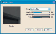
FIG 7.25 Use the Adjust Color tool to remove the color
5. Open the Color Overlay dialog box (Effects>Surface Control>Color Overlay).
6. Use Uniform Color, Opacity 100% and Dye Concentration.
7. Choose a suitable color in the outer ring of the Colors palette and move the cursor to the right corner of the color picker to keep the color pure; the preview window will give some idea of the result.
8. Change the Layer Composite Method to Colorize.
9. Reduce the layer opacity to around 10% or what ever looks right.
10. If the color is not what you want apply the Color Overlay again.
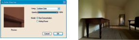
FIG 7.26 The Color Overlay dialog box and the original photograph
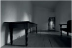
FIG 7.27 The desaturated version
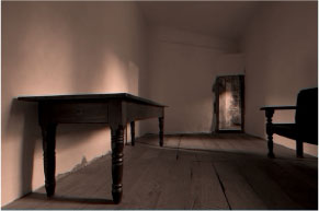
FIG 7.28 Final picture after toning with Color Overlay
Underpainting palette
The Underpainting palette (Window Underpainting) offers a wide range of color controls, and for a quick and easy way to make adjustments it is very useful. It may not have the sophistication of the controls described earlier in this chapter, but the big advantage is that they are all in one place and you can see immediately the effect on the picture.
Figure 7.29 shows the Underpainting palette with the drop down menus.
The Color Scheme options are useful for applying to a photograph to enhance or change the color prior to cloning. When first applied the color schemes may not look very good, but the color change looks better after the clone is finished. They are most useful when you want to create an artistic rather than realistic picture.
Photo Enhance offers shortcuts to alterations in color and tone, and there is a list of changes available. This is an alternative to making the changes yourself with the sliders. You can apply more than one of these by selecting one and clicking Apply and then adding more in the same way.
The six sliders are all self-explanatory and can be easily tried; small changes can be made by clicking on the arrows at each end of the sliders.
If you would like to apply the same adjustments to a series of pictures you can do so by making all the adjustments for the first picture, then clicking on the sign to the right of the Photo Enhance box and giving it a name. This will be saved as a preset for future use.
Edge effects can also be applied from this dialog box and some examples of these effects can be seen in Chapter 14 on printing and presentation.
Figure 7.30 shows the result of making several adjustments together with an Edge effect.
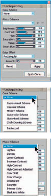
FIG 7.29 The Underpainting palette with drop down menus
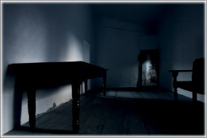
FIG 7.30 Using the Underpainting palette
Hand coloring photographs
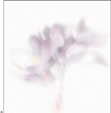
Hand tinting photographs is as old as photography itself, and in recent years has experienced a revival as artists and photographers seek to make pictures that have the very special magic that hand tinting creates. This step by step example begins with the all-important job of preparing the photograph before you start to apply color. The starting point is a full color photograph with solid colors; if it was simply desaturated to remove the color it would be too dense and unsuitable for a delicate picture so it needs to be made much lighter.
1. Open ‘ Crocus ’ from Chapter 7 folder on the DVD.
2. Select>All.
3. Make the Layer Adjuster tool active and click in the picture to lift the canvas to a new layer.
4. Right-click the new layer and select Duplicate.
5. Effects>Tonal Control>Adjust Colors and take the Saturation slider to zero.
6. Change the Layer Composite Method to Colorize.
7. Make the layer beneath active and go to Effects Tonal Control Correct Colors.
8. Select the Advanced option.
9. Enter the following values:
10. Green: 15, 15, 25, 15, 25
11. Blue: 50 ,15, 25, 0, 0

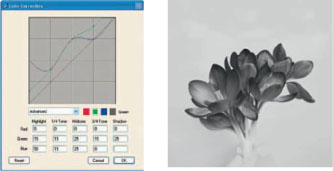
FIG 7.32 Color Correction dialog box and lightened Monochrome copy
12. This will lighten the petals; you will see the difference as you enter the figures. The reason that the monochrome layer was created first and sits on top is so that the original tones can be changed on the underlying layer and the result can be easily seen (Figure 7.32).
13. Click on the top layer, right-click it, and select Duplicate.
14. Change the Layer Composite Method to Default.
15. Choose a brush: Blenders>Grainy Blender, size 127, Opacity 38%.
16. Blend the edges of the petals; brush outwards from the petals towards the corners. Do not blend the center (Figure 7.33A).
17. Duplicate the layer again.
18. Change the Layer Composite Method to Screen.
19. The next step is to blur the layer, which will soften and lighten the picture. Effects>Focus>Super Soften and enter 50 in the box. Repeat this step four or five times to build up the blur (Figure 7.33B).
20. Duplicate the top layer again; this should be in Screen Method, which will double the strength of the effect.
21. Duplicate the top layer again; this should be in Screen Method.
22. Effects>Focus>Soften; Aperture: Gaussian; Amount 68. This will lighten the entire picture.
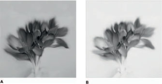
FIG 7.33 ABlending the edges with the Grainy Blender
BDuplicating the layer
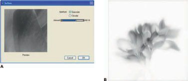
FIG 7.34A Soften dialog box
BLightening at step 23
23. Duplicate the top layer again; this will double the effect again. You should now have a very delicate monochrome version of the crocus (Figure 7.34).
24. The flower looks very delicate, but in my version I have lost the stem. I would like just an indication of it, so on the top layer create a layer mask and, after activating the mask, paint with black into the mask where the stem should be.
25. There is no really good brush in Painter suitable for use on layer masks so I have made my own. Here is how to do it. Go to Cloners Soft Clone, open the General palette and change the Method to Cover and the Subcategory to Soft Cover. Make the size 117 and Opacity 50%. In the Brush Selector palette menu select Save Variant. Give it a name – I suggest ‘ Soft Mask Brush ’. For more details on saving and moving variants to a new category see Chapter 4 on customizing brushes.
26. Continue to create masks from the top layer downwards until the stem is just visible.
27. This completes the preparation of the picture prior to coloring, and is a good time to save the layered version, then Drop All the layers and save again to continue work on the new flattened version, which will make painting quicker.
28. Lift the Canvas to a new layer as previously.
29. Duplicate the layer.
30. Select the French Watercolor Paper from the Papers palette and change the sliders to: Size 313%, Contrast 122% and Brightness 76%.
31. Effects>Surface Control>Apply Surface Texture. Choose Paper as the source and make the Amount 20%. Apply the texture and then reduce the layer opacity to 35% (Figure 7.35).
Should you ever find that you are unable to paint on a layer with any brush, check if the Preserve Transparancy box in the Layers palette has been checked. This option stops you from painting in any area of a layer which does not already have tone. It can occasionally get turned on in error.
FIG 7.35
AApply Surface Texture dialog box
BApplying texture
32. Create a new layer; change the Layer Composite Method to Color and the layer opacity to 50%.
33. Select a new brush; Airbrushes Fine Tip Soft Air brush, size 127, Opacity 2%.
34. Open the Mixer palette (Window Color palettes Mixer), drag it out on its own and then make it larger by dragging the bottom right corner.
35. Click the Apply Color (brush) icon at the bottom of the palette.
36. In the Colors palette choose a purple color in the outer ring and a light purple in the inner triangle; I used R183, G94 and B246 to start. Paint into the Mixer then select other colors and tones in that color range. Add some greens and browns. Figure 7.36A shows the Mixer palette at this stage.
37. Click the palette knife icon and mix the colors on the palette. When you have finished click the Sample Color icon to start painting.
38. Paint the whole of the flower keeping the tones very light. Brush outwards from the center of the flower so that the brush strokes are lighter at the edges. Change the color constantly, picking various colors in the pink and purple range.
39. Reduce the layer opacity to 24%; the Amount will depend on how heavy you have painted. This is the great advantage of painting on many layers as they can be adjusted afterwards – it is quite difficult to get an even delicate tone.
40. Make a new layer – 50% Opacity in Color Composite Method.
41. Paint the center of the open flower on the left with yellow. You can add yellow to your Mixer or just pick the color from the Color palette. Keep it delicate and reduce the layer opacity to blend well. It is a good idea to name these layers as you make them.
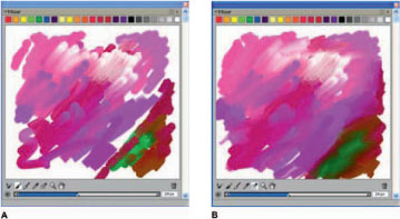
FIG 7.36AMixer palette after adding colors
BMixer palette after blending with Palette Knife
42. Looking at the current result I think that the monochrome layer in my painting is too dark, so, if yours is too, here is one way to lighten it further.
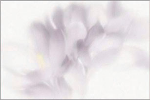
FIG 7.37 Detail of the colors at step 46
43. Create a new layer above the layer with the paper texture. Fill it with white. (Choose white in the Color palette then Edit Fill Current color.)
44. Change the Layer Composite Method to Soft Light; this will lighten the darker areas without affecting the color. If it is now too light, reduce the layer opacity; if it is still too dark, duplicate the layer to double the effect.
45. Create a new layer on the top of the layer stack, Opacity 50%, and change the Layer Composite Method to Colorize. Colorize is another way of applying color which is similar to Color but the effect is different; try both to see the difference.
46. Paint more color into the petals. Use a smaller brush size, about 61, and then reduce the layer opacity when you have finished (Figure 7.37).
47. Create a new layer on the top of the layer stack, Opacity 50%, and change the Layer Composite Method to Colorize. Paint some color into the stalks – use browns and greens. Reduce the Opacity until it is just visible.
48. Create a new layer; this is an optional step which adds a slight color to the background. Change the Layer Composite Method to Color. Select a very light pink in the Colors palette, red 251, green 198, and blue 255, then Edit Fill with current color. Adjust the layer opacity until it is just visible, probably about 10%, and move the layer down until it is over the white layer.
49. Finally, adjust the layer opacities of all the layers to achieve an extremely delicate hand tinted result.
The final Layers palette is shown in Figure 7.38 and the finished picture is below.
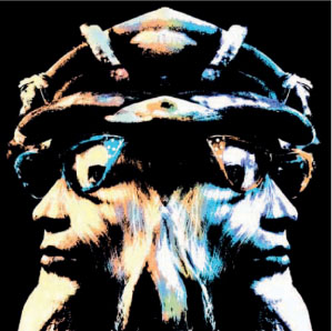
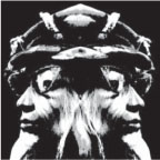
Hand coloring a graphic image
The last example showed how to create a soft delicate picture, but hand coloring can be applied to any style. Here is a vivid example of coloring a very strong graphic image.
1. Open ‘ Twins ’ from Chapter 7 folder on the DVD.
2. Create a new layer; change the Layer Composite Method to Colorize.
3. Select the Tinting>Grainy Glazing Round brush, size 30.8, Opacity 50%.
4. Choose an orange color in the Colors palette, R254, G184 B124, and paint the left side of the picture – all except the spectacles with the cyan color.
5. Create a new layer; change the Layer Composite Method to Colorize.
6. In the Colors palette move the cursor to the opposite side of the color ring and paint the right side of the picture – all except the spectacles.
7. Create a new layer; change the Layer Composite Method to Colorize.
8. Change the brush opacity to 100% and paint both pairs of spectacles in the opposite colors to those already used.
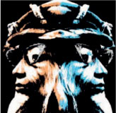
9. Create a new layer; change the Layer Composite Method to Color (not Colorize).
10. Use brush opacity 10%; choose a yellow color and paint the white areas of the face on the left. In Color Method the brush will paint over everything, so keep it light. Reduce the layer opacity to around 30%.
11. Create a new layer; change the Layer Composite Method to Color.
12. Choose a light mauve color and paint the white areas of the face on the right. Keep it light; lower the layer opacity to around 30%.
13. Create a new layer; change the Layer Composite Method to Colorize.
14. Paint over the central areas with the four colors to soften the transition between the colors.
15. Save, then Drop All layers and save again; you will find that the two versions are different. When Painter saves in Photoshop format the Colorize layer blend method is not translated correctly unless the layers are dropped (flattened) first in Painter.