
Chapter 5. Improving Your Pictures
One of the coolest things about digital photography is the fuss-free manner in which you can edit your pictures. Editing film photography required a high tolerance for the color red, locking yourself in a closet laced with smelly chemicals, and sheer bravery—after all, there’s no undo command in a darkroom. Happily, bringing out the best in your pictures in Photos is easy and non-toxic—and if you change your mind, you can always undo what you’ve done.
This is great news because digital photos that don’t need correcting are as rare as kids who impulsively clean their rooms. When you stop and think about all the variables that come into play when you’re snapping pictures, it’s a miracle any of them turn out halfway decent (though the high quality of today’s cameras—even the ones in smartphones—certainly tip the odds in your favor). Most of your pictures will benefit from some quality time spent in Photos’ Edit mode, and there are lots of ways to get creative.
You’ll find that Photos’ powerful editing tools are suitable for any skill level, so don’t be afraid to jump in and start playing around. Most of the controls are slider-based, so they’re incredibly easy to use. Let’s dive in!
Note
Photos is no Adobe Photoshop, so you can’t use it to do advanced stuff like combine photos into a spiffy collage, swap people’s heads, add text, or remove anything much bigger than a blemish. And because you can’t tell Photos what part of a photo you want to change, the majority of your edits affect the whole enchilada. That said, Photos’ editing tools are more than enough to suit the needs of the picture-taking masses. In this chapter, you’ll learn how to wield each of its editing tools so you can turn the pictures you have into the pictures you want.
Editing Basics
Photos’ easy-to-use editing tools are perfect for common photo-fixing chores such as rotating, cropping, straightening, lightening, and darkening; adjusting contrast, saturation, color tint, and white balance; removing red-eye and blemishes; reducing noise; sharpening; and creating a host of special effects, including turning a color photo into a black-and-white image, adding a sepia (brown) tint, applying a variety of popular film looks, and blurring or fading the picture’s edges (whew!). Heck, there’s even a one-click Enhance tool that prompts Photos to perfect your picture’s color and lighting all by itself.
Before diving into using Photos’ edit tools, you need to learn the lay of the land. This section teaches you how to get into (and out of) Edit mode, and how to use Photos’ fabulous Full Screen view and the handy thumbnail browser. You’ll also pick up some slick tricks for zooming and scrolling, learn the secret to viewing before and after versions of your pictures, and find out how to undo your edits anytime you want.
Note
When you edit a picture in Photos, your changes are visible wherever that photo appears—in every album, project, and (if you turned on iCloud Photo Library [Importing from iCloud]) on your iOS devices. However, if you duplicate a a photo, you can edit the two versions independently of each other—if you copy and paste a picture, say, from one album to another, any edits you’ve made tag along with the copy.You can also change how one version of a photo prints (when ordering prints from Apple) without having those changes affect the other version. Details on that trick begin on Cropping, Editing, and Ordering Multiple Copies.
Entering Edit Mode
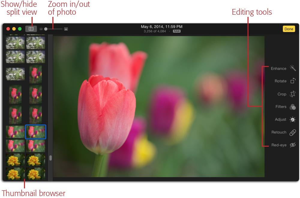
Editing in Photos is a wonderfully intuitive and uncluttered experience. The program’s Edit mode uses a dark color theme (see Figure 5-1) that’s easy on your eyes and lets you see the image’s colors more accurately. On a Mac, the edit tools you’ll use the most are parked on the right side of the screen. If you choose View→Show Split View (Opening Files), the other photos in the album or view you’re currently in appear as thumbnails on the left.
To enter Edit mode on your Mac, do one of the following:
Select a photo, and then press Return (pressing Return again spits you out of Edit mode).
Select a photo, and then choose Image→Show Edit Tools.
Double-click a picture, and then either click Edit in the toolbar or press the E key on your keyboard.
Select a photo, press the space bar to enlarge it, and then either click Edit in the toolbar or press the E key on your keyboard.
To enter Edit mode on an iOS device, tap a picture, and then tap Edit at the upper right of your screen. You don’t see the capture time and date or the raw badge shown in Figure 5-1, and the editing tools appear above and below the image when holding an iPhone or iPod Touch vertically, or on the left and right when holding it horizontally. On an iPad, the tools are parked below or to the right of the image (respectively).
Note
When editing images in Photos for iOS with iCloud Photo Library turned on (Importing from iCloud), you may encounter a message saying that your device is downloading the photo. That means the full-size image lives on iCloud’s servers and your device is downloading it so you can edit it.
Another message you may encounter if you’re not using iCloud Photo Library is “This photo is not editable.” That means the image lives in your My Photo Stream (My Photo Stream) or it’s in a shared album (Using iCloud Photo Sharing). In other words, the image doesn’t yet live on your iOS device. If that happens, simply tap the “Duplicate and Edit” button to save the image to your iOS device, and then edit away.
Going Big: Full Screen View
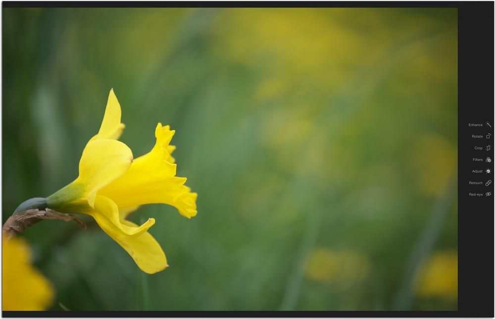
Odds are good that your Mac’s screen isn’t big enough to show an entire digital photo at full size. That’s perfectly fine when you’re organizing, sharing, and assembling projects, but not when it comes to editing. In order for you to see all the details your image contains, you need to view it at 100% zoom level. That’s why the wise engineers at Apple created Full Screen view, which hides Photos’ menu bar, toolbar, and thumbnail browser (Browsing Thumbnails)—if it’s on—and magnifies the picture to fill your whole screen. As Figure 5-2 illustrates, this view is magnificent.
You can use Full Screen view anytime; you don’t have to be in Edit mode. To enter Full Screen view, choose View→Enter Full Screen or press ⌘-Control-F; either way, the current picture takes over your entire screen. The same keyboard shortcut also takes you out of Full Screen view, though it’s easier to just tap your keyboard’s Esc key.
Note
If you enter Full Screen view while you’re in Edit mode, Photos doesn’t let you access other albums or views. To regain those options in Full Screen view, exit Edit mode by pressing Return or pointing your cursor at the top right of your screen and clicking Done, and then point your mouse at the top of your screen again to see those controls.
Browsing Thumbnails
Another useful feature of Edit mode is Split view (Opening Files), which reveals a thumbnail browser parked at the left side of the window. This browser is handy for selecting another photo to edit within the same album or view (you can’t select more than one thumbnail at a time). To toggle the thumbnail browser on or off, (say, to give your picture more elbow room), click the Split view button near the top left of your screen (it’s labeled in Figure 5-1) or choose View→Show Split View.
Note
Unlike iPhoto, you can only view one picture at a time in Photos’ Edit mode. As of this writing, there’s no way to compare multiple shots side by side in order to pick the best of the bunch.
In Split view, thumbnails are shown as uniform squares, regardless of how you held your camera. To view them in landscape or portrait orientation instead, choose View→“Display Square Thumbnails in Split View” to turn that option off (the checkmark to the left of the command’s name disappears).
Adjusting Your View: Zooming and Scrolling
You’ll do a lot of zooming and scrolling within your pictures once you start editing them (especially if you go blemish-zapping with the Retouch tool). To zoom in or out of a photo you’re editing in Photos for Mac, use the zoom slider at the program’s upper left (it’s labeled in Figure 5-1) or press ⌘+ to zoom in or ⌘- to zoom out.
Tip
To fit a photo onscreen so you can see the whole thing, drag the zoom slider all the way left. To view the image at full size (200%), drag the slider all the way right. You can also click the tiny icons at the left and right ends of the slider to toggle between Fit, 100% zoom, and Fill. Pressing the Z key on your keyboard toggles between Fit and 100% zoom only.
Seasoned iPhoto jockeys will remember that iPhoto let you to assign an external editor to that program’s Edit mode. That way, you could organize your photos with ease in iPhoto and edit your images in more powerful programs such as Aperture, Photoshop Elements, and so on.
Alas, Photos doesn’t let you assign an external editor like iPhoto did, though if you’re running El Capitan (OS X 10.11), you can purchase third-party editing tools called extensions that open inside Photos’ editing mode. They let you do things such as whiten teeth, smooth skin, and so on. In fact, one such extension lets you access external editors—it’s cleverly named External Editors For Photos. To locate and purchase a Photos extension, fire up the App Store on your Mac and enter “Photos extensions” into the search field and press Return on your keyboard.
Happily, if you use Aperture—Apple’s pro-level, no-longer-updated-yet-still-functional editor—you have an easier export option. In Photos for Mac, select the picture(s) you want to send to Aperture, and then click the share icon in the toolbar. From the menu that appears, choose “Add to Aperture” (this command only appears if Aperture is installed on your Mac). When you do, Photos exports the image as a JPEG and copies it into Aperture’s database (as you learned on Deleting iPhoto or Aperture Libraries, Photos doesn’t share its library with Aperture). You can then edit the image(s) in Aperture to your heart’s content. Of course, you won’t see the changes you make in Aperture until—you guessed it—you reimport the edited picture(s) back into Photos.
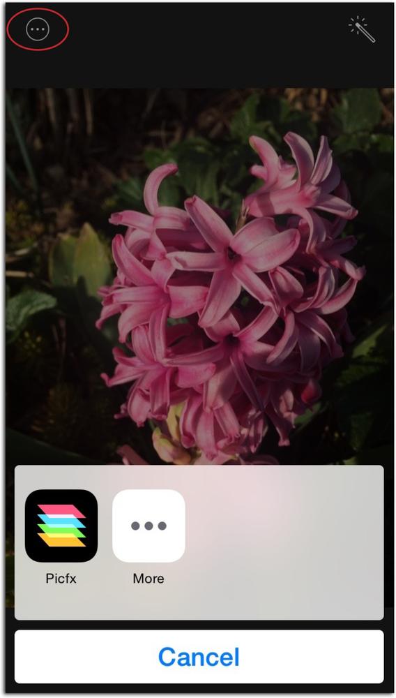
Photos for iOS makes it easy to send a photo to another editing app on the same device (assuming you have any). To do that, open a picture in Photos, and then tap Edit. Next, tap the icon circled here and, in the resulting menu, tap the icon for the editing app you want to use. If you don’t see the app’s icon, try tapping More to reveal a list of photo editors that work with Photos. Tap the green switch of the app you want to use, and from now on it’ll appear in the first menu (shown here). If your favorite editing app isn’t listed, you’re stuck with using that app’s Open command to access pictures on your device.
Once you’ve zoomed into a picture, you can reposition your view within it by dragging with your mouse (your cursor turns into a tiny hand). If you’re used to iPhoto, you may be disappointed to learn that Photos doesn’t include a Navigator panel, nor can you use the numeric keys on your keyboard to zoom.
In Photos for iOS, you use gestures to zoom: Use the spread gesture (move two fingers apart) to zoom in and the pinch gesture (move two fingers together) to zoom out (see The Very Basics if you need a refresher on these gestures). And to move around within your image, simply drag with one finger.
You might be surprised to learn that you can use gestures in Photos for Mac too. If you’ve got a Magic Mouse, you can adjust your settings to let you zoom into a picture by double-tapping your mouse with one finger. To turn this handy feature on, choose ![]() →System Preferences→Mouse, click the “Point & Click” tab, and then turn on “Smart zoom.” With this setting turned on, once you’re zoomed in on a photo, you can scroll the zoomed area in any direction by dragging (swiping) one finger across your mouse.
→System Preferences→Mouse, click the “Point & Click” tab, and then turn on “Smart zoom.” With this setting turned on, once you’re zoomed in on a photo, you can scroll the zoomed area in any direction by dragging (swiping) one finger across your mouse.
Note
You can also point your cursor at the thumbnail browser and use the swiping gestures described here to scroll up and down through it.
If you’ve got a Magic Trackpad or a MacBook, you can zoom in by double-tapping the trackpad with two fingers, and then scroll the zoomed-in picture by dragging (swiping) two fingers in any direction. You can also spread to zoom in on a photo, and pinch to zoom out. If you want to adjust your trackpad’s settings, choose ![]() →System Preferences→Trackpad, and then click the Scroll & Zoom tab.
→System Preferences→Trackpad, and then click the Scroll & Zoom tab.
Comparing Before and After Versions
It’s incredibly helpful to assess the edits you’re making by peeking at before and after versions of your image. That way you can see how much the picture has (hopefully) improved. But if you go rooting around through Photos’ menus, you won’t find any such command. The only way to do it is to use the M key on your keyboard (iPhoto used the Shift key instead).
To see the before version of an edited photo, press and hold down the M key; release the M key to see the after version. Be sure to memorize this keystroke, because you’ll use it a lot.
Tip
Photos is riddled with useful keyboard shortcuts. To see a full list, choose Help→Keyboard Shortcuts, and then in the Photos Help window that appears, click “Keyboard shortcuts” in the list on the left. You may want to print the list and keep it on your desk. When you’re finished, just click the red circle at the window’s upper right to close Photos Help.
Undoing Your Changes
Editing pictures can be nerve-wracking…that is, until you realize that you can undo your edits anytime you want. How cool is that?
While you’re in Edit mode, you can undo the changes you’ve made to a photo, no matter how many edits you’ve made. For example, if you’ve cropped a photo, you can uncrop it in Photos for Mac it by choosing Edit→Undo Change Crop or by pressing ⌘-Z (the Note below explains how to undo edits in Photos for iOS). The only downside is that you have to undo your changes one by one. If you crop a photo, change its exposure, and then apply a filter, you have to use the Undo command three times—first to undo the filter, then to undo the exposure change, and finally to undo the crop. In other words, you can’t pick and choose which edits to undo (and there isn’t an editing program on the planet that lets you do that).
But here’s the catch: If you switch to editing another picture (say, using the thumbnail browser) or leave Edit mode, you forfeit the ability to undo individual edits. At that point, the only way to undo your edits is to click “Revert to Original” at the program’s upper right or choose Image→“Revert to Original.” Either way, Photos strips away every edit you’ve made since you imported that picture.
Note
To undo edits you’ve made in Photos for iOS, before exiting Edit mode, tap Cancel, and then tap Discard Changes on the menu that appears. If you’ve already bailed out of Edit mode, just tap Edit, and then tap Revert at your screen’s lower right; in the resulting menu, tap “Revert to Original.”
If you’ve turned on iCloud Photo Library (Importing from iCloud), undoing the edits you’ve made to a picture on your iOS device removes the edits from that same picture on your Mac, too (and vice versa).
How does the “Revert to Original” command work, you ask? Good question. When you edit an image in Photos, it creates a list of your changes and records them in its database; Photos doesn’t really apply those changes to the image until you export it for use outside of Photos. Because of this, you can remain secure in the knowledge that in a pinch, Photos can always restore an image to the state it was in when you first imported it, whether that’s next week or next year.
On a Mac, to restore a picture to its original state (undoing all cropping, rotating, brightness adjustments, and so on), select a thumbnail, and then either choose Image→“Revert to Original,” or Control-click a photo and choose “Revert to Original” from the shortcut menu. If you’re in Edit mode, a “Revert to Original” button appears at upper right the moment you make a change to the picture. Either way, Photos swaps in the original version of the photo, and you’re back where you started.
Photos’ Editing Tools
Photos for Mac and iOS both approach editing by giving you set of task-based tools, and the ones you’ll likely use the most are visible when you enter Edit mode (see Figure 5-1). But don’t let the simplicity of these tools fool you—there’s editing power aplenty tucked inside them. Instead of bombarding you with every single tool, panel, slider, and whatnot, you can reveal additional editing tools whenever you want. This keeps the program looking streamlined, and prevents casual Photos users from getting overwhelmed.
Photos has everything you need to fix the color and lighting in your images; heck, you can even remove small items from your pictures. And as you learned in the previous section, you can always undo what you’ve done. Photos’ tool arsenal also features eight filters that you can use to add a tasteful burst of creativity to your pictures by mimicking the look of traditional film photography; these filters are also helpful for saving images that you can’t color-correct to your liking. (You may have encountered these filters before in Photos for iOS.)
In the sections that follow, you’ll learn to use all of Photos’ editing tools so you can bring out the best in your pictures. You’ll also find out how to easily apply your changes to other photos, which can save you time. So read on, dear Grasshopper! This is where Photos gets really fun.
Tip
Switching between editing tools in Photos for Mac and iOS is incredibly easy. There’s no need to deactivate the current tool; just click the next tool that you want to use. You can deactivate a tool by tapping its icon again, which, in Photos for iOS, lets you see any editing tools that were temporarily hidden by the active tool’s controls. (Since you can always see all your editing tools in Photos for Mac, there’s no real reason to deactivate a tool in this way.) When you’re finished editing and you’re ready to exit Edit mode, simply click Done.
In Photos for Mac, you can press an edit tool’s keyboard shortcut to pop into Edit mode and activate that tool from whatever view you’re in. For example, pressing C in Photos view takes you into Edit mode and activates the Crop tool. You’ll find each tool’s keyboard shortcut listed throughout this chapter.
The Enhance Tool
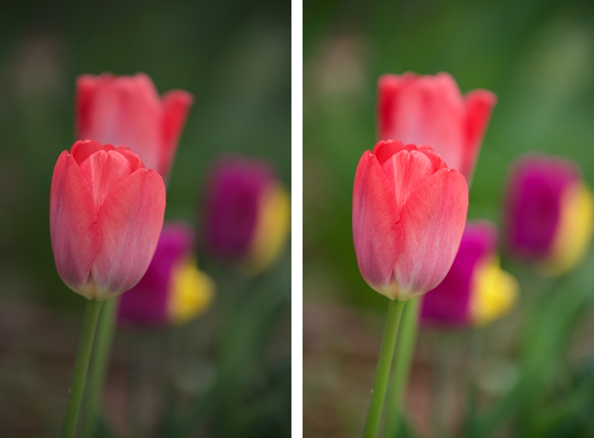
To quickly improve a picture that looks a little dark, dull, or washed out, make sure you’re in Edit mode, and then give the Enhance tool a click. (As you saw back in Figure 5-1, this tool’s icon is a magic wand. In Photos for iOS, all you see is this icon without a label.) When you do, Photos analyzes the picture’s pixels and does its best to improve the image’s overall brightness, contrast, and color. This tool also tries to identify areas that are in focus in an attempt to bring out the subject a little more, as well as make skin tones warmer and details sharper. Depending on the picture, you can end up with richer and more vivid colors than you started with, as shown in Figure 5-3.
Tip
To glean a little insight into what the Enhance tool does, open the Adjustments panel (Advanced Adjustments) and take a peek at the sliders in the Light and Color sections that appear (you’ll need to expand those sections to see all the sliders they contain, as explained on Using the Adjustments Panel on a Mac). In your image’s original, pre-Enhanced state, all the sliders are positioned in the middle of each section. By taking note of which sliders the Enhance tool changed, you can manually adjust them to amplify the correction.
While the Enhance tool can work wonders on some images, it can’t fix ‘em all. When you use this tool, Photos makes its best guess as to what kind of correction your image needs, but it can’t make heads or tails out of the picture’s content. In other words, the Enhance tool can’t tell if you’ve captured an overexposed image of a brightly colored flower or a well-exposed image of a pale flower on a cloudy day. If the image needs more fixing than the Enhance tool applies, reach for the more targeted and powerful controls offered by the Adjustments panel (Advanced Adjustments).
The Rotate Tool
Photos does a great job of importing pictures so they’re oriented correctly. In other words, photos captured while you held your camera vertically arrive right side up, as do images you captured horizontally. But if you need to rotate an image in Edit mode in Photos for Mac, simply select it, and then click the aptly named Rotate tool.
Tip
The Rotate button spins photos 90 degrees counterclockwise. If you want to spin them in the opposite direction, press and hold the Option key before clicking this button (the tool’s icon flips around, too). Unlike iPhoto, you can’t use Photos’ preferences to customize the direction it rotates your pictures.
Technically, you don’t even have to be in Edit mode to rotate photos. You can use the following methods to spin them around no matter where you are in Photos:
Choose Image→Rotate Clockwise (or Rotate Counterclockwise).
Press ⌘-R to rotate selected photo(s) counterclockwise, or Option-⌘-R to rotate them clockwise.
Control-click a photo or thumbnail and choose Rotate Clockwise from the shortcut menu.
Tip
If you need to rotate a photo more than 90 degrees—say, if you took the picture upside down—just keep tapping the Rotate button.
You can speed up this rudimentary editing chore by rotating the pictures that need it as soon as you import them. Just select all the thumbnails that need rotating—say, by ⌘-clicking each one or by dragging a box around them to select them, as described on Selecting and Hiding Files—and then use one of the methods listed above to fix the selected photos in one fell swoop.
In Photos for iOS, the Rotate tool is tucked inside the Crop tool. Grab your device, open an image, and then tap Edit. Next, tap the Crop tool (it looks like two overlapping corner brackets), and then tap the Rotate tool. It looks like a square with a small curved arrow, and you’ll spot it at lower left if you’re holding your device vertically, or at upper right if you’re holding it horizontally. Just keep tapping this tool until the image spins around the way you want it.
The Crop Tool
Cropping and straightening are among the most basic edits you’ll ever make, but that doesn’t mean they aren’t important. A bad crop (or no crop) can ruin an image, while a good crop can improve it tenfold by trimming away useless or distracting stuff around the edges. Slightly crooked pictures—not those captured at a purposefully creative angle—are just plain distracting. The ability to flip a photo horizontally or vertically comes in handy, too, especially when you’re creating projects like a photo book (Creating a Book Project) and you want your subject facing left but he’s facing right. Photos’ Crop tool lets you do all that.
Here are some of the things that cropping lets you do:
Remove wasted space. If you captured something that adds no visual interest to your picture—say, a messy bedroom or random tourists—you can crop that area out. Doing so puts the focus back on your subject and not your subject’s surroundings.
Delete objects. If your ex is on the edge of an otherwise lovely family portrait, you can easily (and satisfyingly) remove him by cropping the picture.
Resize the photo. If you want to print and place your prized photo in a specific-size frame, you may need to change its proportions so it’ll fit. The Crop tool includes a menu that helps you crop to several common sizes (How to Crop, Straighten, and Flip a Photo has details).
Change the composition. There’s a reason professional photos look so darn good; often it has to do with how the shot is composed. Good composition accentuates the picture’s subject, drawing the viewer’s eye right to it. Typically this means cropping tightly around your subject, using the Rule of Thirds (How to Crop, Straighten, and Flip a Photo), or cropping in unconventional ways, as shown in Figure 5-4.
Note
When you crop a photo, you change it in all the albums and projects in which it appears. If you want a photo to appear cropped in one album but not in another, you have to duplicate it (select it, and then choose Image→Duplicate 1 Photo), and then edit each version separately. (You can also duplicate a photo by pressing ⌘-D or by Control-clicking it and choosing Duplicate 1 Photo from the resulting menu.)
How to Crop, Straighten, and Flip a Photo
You can either crop and straighten pictures manually (you’ll learn how in a sec), or you can have Photos do it for you. If the latter method is the way you want to roll, then in Edit mode, click the Crop tool to activate it, and then click Auto. When you do, Photos analyzes the image, rotates it just enough to straighten any lines it finds, and smartly crops the image according to the Rule of Thirds (which is explained in the following list). If you don’t like the results, you can manually fine-tune the crop box to your liking using the techniques described below.
Note
Cropping in Photos for iOS works the same way as it does in Photos for Mac. The only difference is that, in Photos for iOS, there’s no option to flip your image.
To take cropping and straightening into your own hands, follow these steps:
Open an image in Edit mode, and then either click the Crop tool or press the C key on your keyboard. (In Photos for Mac, you can also simply press the C key to enter Edit mode and activate the Crop tool.)
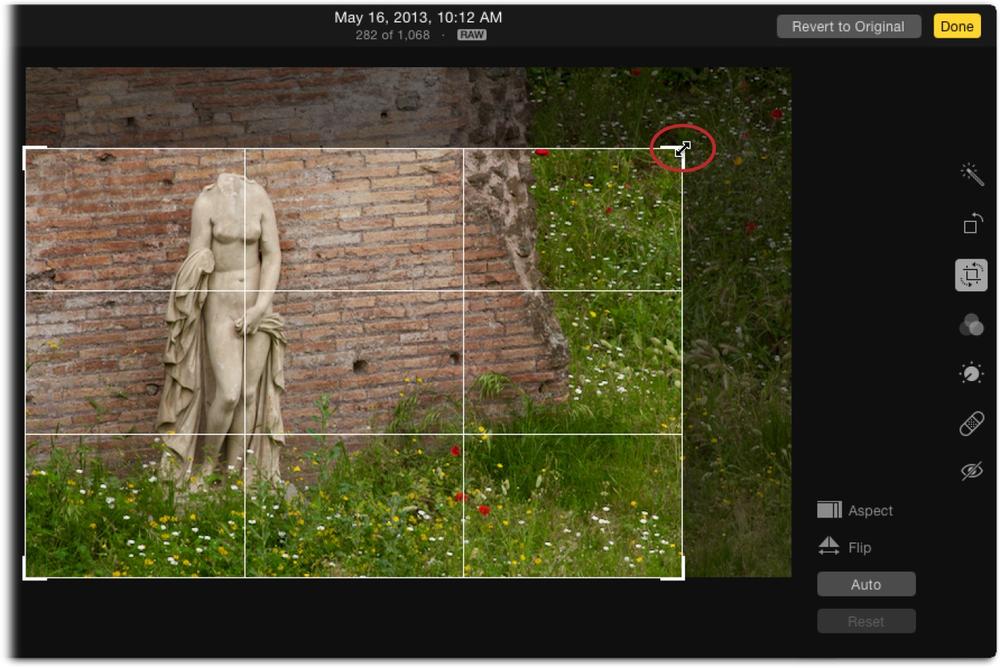
Photos places a light gray, resizable crop box around your image, as Figure 5-5 shows, and a circular dial appears to its right (this dial is visible in Figure 5-6), which you can use to straighten the image. You can resize the crop box by dragging its edges; if you do, the dial temporarily disappears. If you don’t care what aspect ratio (width-to-height ratio) the cropped photo ends up having, go ahead and drag. But if you want to preserve the picture’s original proportions or change them to something specific, skip to the next step.
As you drag, a grid appears to help you crop according to the Rule of Thirds—a compositional guideline cherished by photography and video pros. The idea is to divide the picture into nine equal parts using an imaginary tic-tac-toe grid. If you position the image’s horizon on either the top or the bottom line—never the center—and the focal point (the most important part of the image) on one of the spots where the lines intersect, you (theoretically) create a more interesting shot.
When you’re finished dragging with the crop box, release your mouse button and the circular dial reappears. To straighten your picture, click anywhere on the dial, and then drag up or down.
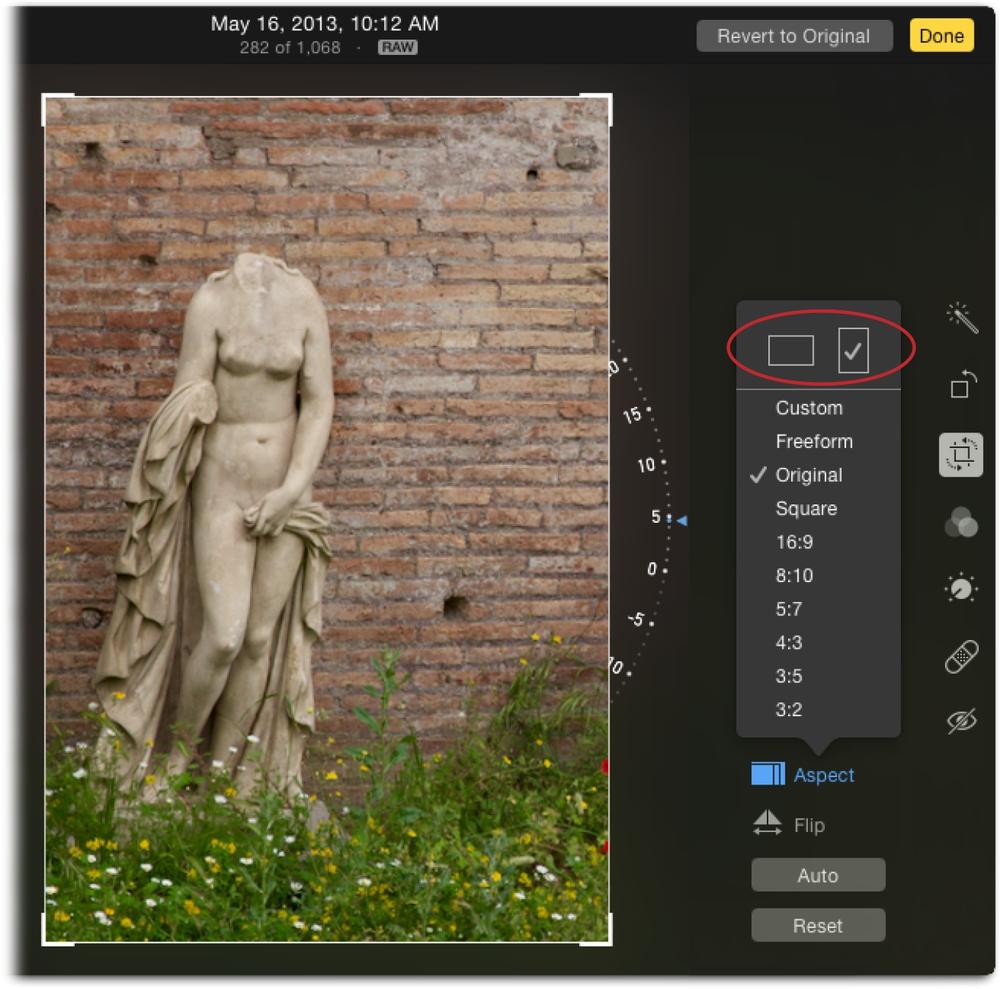
To change the picture’s aspect ratio, click Aspect, and then pick a size from the menu.
When you choose an option from this menu, Photos constrains the crop box to the proportions you pick. Most digital cameras produce photos whose proportions are 4:3 (width to height), which is suitable for lots of things but not for, say, creating a slideshow (see Chapter 6) that you plan to display on a high-definition TV, which uses different dimensions, or for ordering prints (Chapter 7), which only come in standard photo sizes (like 4 x 6, 5 x 7, and 8 x 10). Choosing the appropriate ratio from the Aspect menu means that your cropped photos will fit nicely onto your TV or photo paper. (If you don’t constrain your crop this way, your images will automatically be cropped when you print them—though as Figure 7-4 and Figure 7-11 explain, it’s easy enough to adjust any autocropping that occurs before you hit print. The box on When Aspect Ratios Collide has more on cropping for print.)
Figure 5-5. Point your cursor at a corner of the crop box and the cursor changes to the double-sided arrow (circled); drag inward to shrink the box. If you point anywhere else on the crop box’s edge, your cursor turns into a line with an arrow on either side of it; just drag to resize the box however you want. To reposition the box over your image, click inside it and drag. When you release your mouse button, Photos hides the area outside the crop box to preview what the image will look like once you click Done.The Aspect menu also contains an Original option (which maintains the proportions of the original photo even as you make it smaller) and a Square option (great for posting on Instagram, a popular online photo-sharing site). You can also order square prints from Apple, which makes for interesting wall art. Choose Custom from this menu and two fields appear so you can enter any proportions you want.
Note
Despite its ability to control the proportions of the crop box, Photos doesn’t tell you pixel dimensions of the resulting image. To crop a picture to precise dimensions (say, for posting online), you have to use another program such as Pixelmator, Photoshop Elements, or Photoshop CC.
When you make a selection from the Aspect menu, Photos adjusts the crop box to the proportions you pick. While the box always starts out matching the picture’s original orientation, once you pick a different option from the Aspect menu, you can use the two icons that magically appear at the top of the Aspect menu to switch from landscape (horizontal) to portrait (vertical), as shown in Figure 5-6.
Figure 5-6. To straighten your image, click and drag the circular dial shown here. To flip your crop box 90 degrees, use the Aspect menu’s orientation buttons (circled). This photo was flipped from landscape to portrait orientation and was straightened by about five degrees. In order to access the Aspect menu’s orientation buttons—so you can flip a photo from landscape to portrait (or vice versa)—you have to choose an aspect ratio other than Freeform or Square.If you want to flip your picture horizontally—so your left-facing subject becomes right-facing, for example—click Flip.
If necessary, adjust the crop box’s size and position.
As described in step 1, you can drag the crop box to change its size. To reposition your image within the box, click and drag inside the box to move the image. When you do, Photos displays the whole picture beneath the box to keep you oriented within the image. Remember, the straightening dial temporarily disappears while you’re resizing the box.
When the crop box is just the way you want it, click the Crop tool, press the C key, click another photo that needs cropping, click another editing tool, or click Done to exit Edit mode.
You don’t need to click a button to accept your crop; Photos just applies the crop and deletes the pixels outside the box. If you have another image that needs cropping, click it in the thumbnail browser, and then crop away. If you have more editing to do on the cropped image, click the next tool that you want to use. If you’re finished editing, click Done or press Return to exit Edit mode.
Don’t be alarmed that Photos tosses all those edge pixels—you can always get them back. If you crop an image and then immediately realize you’ve messed up and you’re still in Edit mode, click “Revert to Original,” choose Edit→Undo, or press ⌘-Z to go back one editing step. In Photos for iOS, tap Cancel, and then click Discard Changes. If you regret the crop next week, simply select the photo in Photos for Mac and choose Image→“Revert to Original.” On your iOS device, open the image in Edit mode and tap the red Revert button. After asking if you’re sure, Photos reinstates the original photo, discarding every change you’ve ever made to it.
Applying Filters
Photos offers eight one-click filters that you can use to apply color and lighting effects to your pictures. They’re as handy for adding an artistic feel to an image as they are for camouflaging bad color or lighting. You can use them to turn a color photo into a black and white, oversaturate the colors in an image, create an overprocessed or bleached look, or make the picture look like it was taken with an instant camera.
To access Photos’ Filters, simply press the F key on your keyboard or, if you’re in Edit mode, click the Filters tool. (In Photos for iOS, select a photo, tap Edit, and then tap the icon that looks like three overlapping circles.) When you do, you see the filter buttons shown in Figure 5-7 appear.
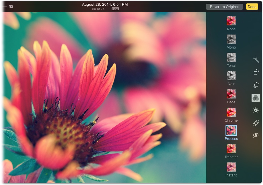
Applying these filters is a piece of cake: Just click (or, on an iOS device, tap) the filter’s button to apply it to your picture. To customize a filter’s effect, you can use the Adjustments panel, which is described in the next section. Heck, while rooting around in the Adjustments panel after applying a filter, you may come up with your own custom filter looks, though there’s no way to save your settings as a canned, one-click affair (say, so you can use the same settings again later on a different image). That said, you can always copy the changes you make to one photo, and then paste them onto another, as Copying Adjustments describes.
Tip
You can apply these same filters to pictures you take with your iOS device’s Camera app, too. In the Camera app, tap the filter icon at lower right (it looks like three intersecting circles), and then tap a filter’s button. From that point on, the Camera app permanently applies that filter to every picture you take. (You can tell when a filter is selected by looking at the three-circle icon: It turns multicolored when a filter is on.) To turn the filter off, tap the three-circle icon again, and then tap None.
To apply a filter after taking a snapshot, in the Camera app, tap the shot’s thumbnail to open it in Photos, tap Edit, and then tap the Filter tool to see the same set of filters.
Making Adjustments
Apple knows that not everyone wants to spend a ton of time correcting images. Heck, lots of people are content with clicking the Enhance tool (Photos’ Editing Tools) and calling it done. But the Enhance tool can’t fix every picture you take, and you can’t use it to apply incremental corrections. For example, if your shot looks too dark, you may need to lighten only the shadows. Or if the snow in a skiing shot looks too blue, you can warm it up by adding some red to it. And if the colors in your sunset shot are blown out (so bright that they turn white), you need to darken just the highlights. To do that kind of stuff, you need the advanced editing power found in Photos’ Adjustments panel.
However, advanced adjustments aren’t for everyone. They’re confusing to most mortals and, honestly, even some photographers. Fortunately, Apple’s design team did a heroic job of simplifying Photos’ advanced editing controls to make using them easy and intuitive.
Using the Adjustments Panel on a Mac
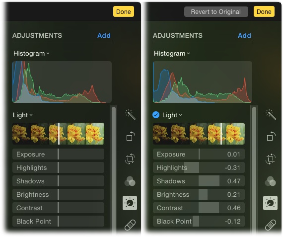
To summon Photos advanced editing controls, open the Adjustments panel by pressing the A key on your keyboard or, in Edit mode, clicking the Adjust icon. When you do, you see three basic adjustment categories: Light, Color, and Black & White (see Figure 5-8). The first two categories contain a vertical slider (it looks like a white line) atop a row of thumbnails of the photo you’re editing. These are called smart sliders, and the thumbnails give you a preview of what that particular adjustment will look like applied to your picture. (The Black & White slider doesn’t show up until you click the row of thumbnails, at which point your image goes from color to black and white.) For example, to darken a photo, simply drag the Light slider toward the darker thumbnails on the left. To lighten it, drag the slider toward the lighter thumbnails on the right. What could be simpler?
Note
Both the Enhance and Filter tools perform their magic by tweaking various settings in the Adjustments panel. So if you’ve used either of those tools, some of the sliders you encounter in the Adjustments panel will already be changed. If you haven’t used those tools, then the sliders will be centered in their factory-fresh position.
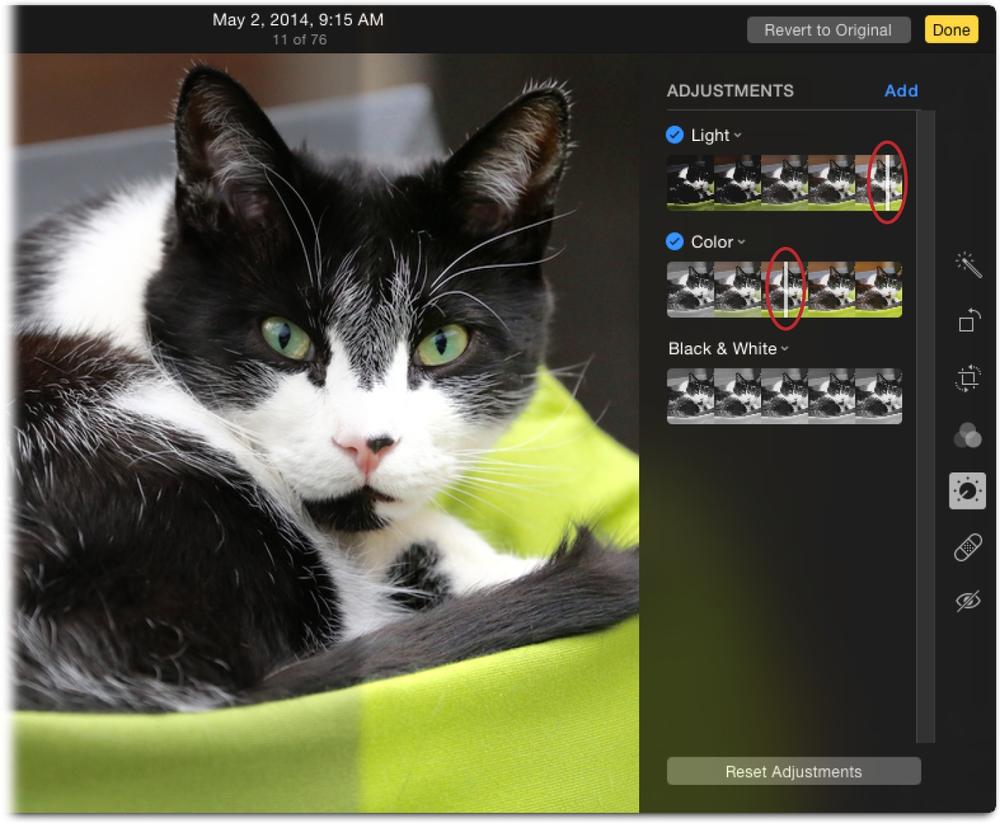
Smart sliders are smart because dragging one adjusts a slew of settings simultaneously. For example, dragging the Light slider adjusts a whopping six settings, including exposure, highlights, shadows, brightness, contrast, and the photo’s black point (which controls how light or dark the color black appears in your image). To expand a smart slider to see—and use—its sub-sliders, point your cursor at the smart slider’s name, and then click the icon circled in Figure 5-9, right. This brilliant two-tier setup lets those who are aren’t comfortable with advanced adjustments fix their images using smart sliders while letting more experienced folks take fine adjustments into their own hands with the sub-sliders. But even if you’re nervous about playing with advanced settings, there’s no reason not to experiment with the sub-sliders, because you can always undo what you’ve done.
Note
Once you make an adjustment, a blue circle with a black checkmark appears next to the adjustment’s name (like the one next to the word Light in Figure 5-9, right). Clicking the checkmark temporarily turns the adjustment off, which is handy for seeing a before and after version of a particular adjustment. Click it again to turn the adjustment back on.
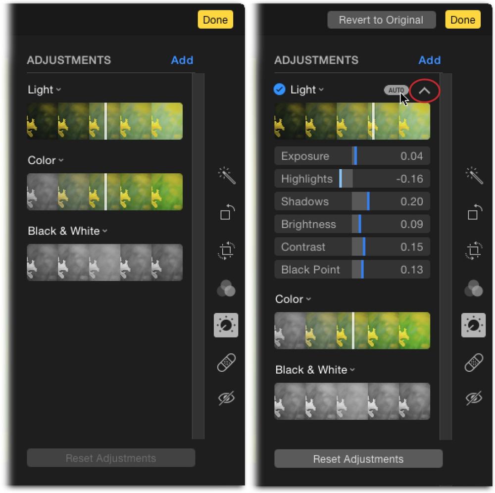
And that’s not all—there’s still more power lurking in the Adjustments panel. To keep the panel uncluttered, Photos initially shows you only three basic correction categories: Light, Color, and Black & White. However, there are several other adjustments worth trying. To see them, click the Add button at the panel’s upper right. When you do, the menu shown in Figure 5-10 appears. This menu contains adjustments that affect your image’s details—sharpen (Sharpen), definition (Definition), noise reduction (Definition), and vignette (Vignette)—as well as advanced adjustments of white balance (White Balance) and Levels (Levels).
Tip
In Photos for Mac, you can set any sub-slider back to its original setting by double-clicking its name. How handy is that?
![Click the Add button to reveal this menu. Adjustments that are currently displayed in the Adjustments panel have checkmarks next to their names. To open another adjustment, click its name in this menu (Histogram [page 127] was added here).To save your current configuration of adjustments so they’re always open in the Adjustments panel, choose Save As Default at the bottom of the menu.](http://imgdetail.ebookreading.net/design/7/9781491927328/9781491927328__photos-for-mac__9781491927328__httpatomoreillycomsourceoreillyimages2255120.png.jpg)
Undoing changes you’ve made in the Adjustments panel is easy. To undo everything you’ve done in the Adjustments panel, click Reset Adjustments at the bottom of the panel. To undo an adjustment in a specific category, click the tiny down-pointing chevron icon next to the category’s name and choose Reset. To remove an adjustment from the panel (so you don’t see it), click the same icon, and then choose Remove Adjustment. (You can always summon that adjustment again using the Add menu, as describe in Figure 5-10.)
To open the Adjustments panel in Photos for iOS, select a photo, tap Edit, and then tap the icon that looks like a little dial. The panel works pretty much the same as it does on your Mac except that it lacks an Add menu, so you can’t display the advanced adjustments that you get in Photos for Mac. Nevertheless, you get smart sliders for the same basic categories—Light, Color, and Black & White—plus you can easily access their sub-sliders. Figure 5-11 has more.
Tip
The smart sliders and sub-sliders in Photos for iOS, which are red instead of white, are really small, even on an iPad. Rather than straining your eyes to aim your finger at a slider, simply tap the adjustment you want to apply (Light, for example), and then drag your finger left or right across the picture instead of the slider.
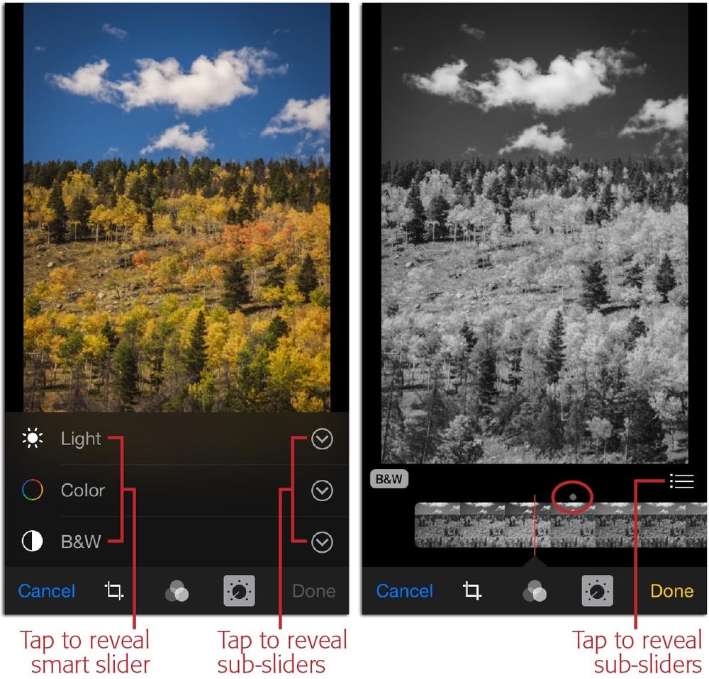
Using the Adjustments panel in Photos for iOS requires a lot of tapping to reveal the hidden controls because the device’s screens are so small, as Figure 5-12 shows. (Things look slightly different on an iPad because the screen is slightly bigger, so the controls aren’t quite so hidden.) When you tap and hold a smart slider or sub-slider, you’re not so much dragging the slider as you are dragging the controls underneath it—the thumbnails of a smart slider or the tick marks of a sub-slider. For that reason, you drag in the opposite direction that you want the slider to go. For example, to move a slider to the right, you tap and drag left; to move a slider to the left, you tap and drag right. It takes a little getting used to but it works really well, and the ability to edit your images in such powerful ways on an iOS device, using a free program, is awesome.
Undoing the changes you make in the Adjustments panel in Photos for iOS depends on what you’ve done. You can undo changes you’ve made with the Light and Color smart slider and sub-slider by tapping Cancel, and then tapping Discard Changes in the confirmation sheet that appears. This strips away all the edits you made to that image during this round of editing, and spits you out of Edit mode. Alternatively, you can undo specific changes by moving each slider that you changed back to its original position, which is indicated by the gray dot circled in Figure 5-11.
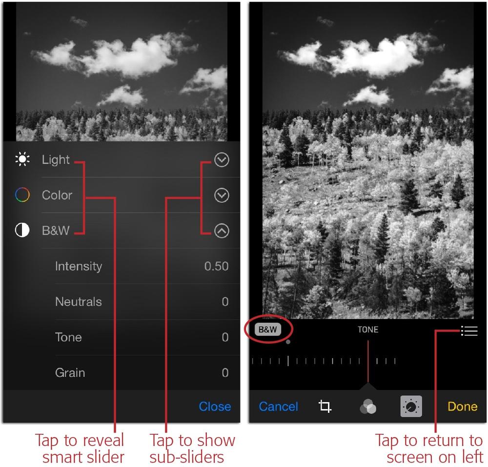
Photos for iOS’s Black & White category, on the other hand, works like an off/on switch, so you can turn off just the black-and-white bit without undoing any changes you made using the Light and Color categories in this editing session. For example, once you tap the B&W icon in Photos for iOS to reveal its smart slider and then you move the red smart slider, your image changes from color to black and white, and the little B&W label itself goes from black to gray (it’s turned on and circled in Figure 5-12). So, to restore your image’s color, you can turn off the black-and-white effect by tapping the label itself (it goes from gray to black).
When you’re finished using the Adjustments panel in Photos for iOS, you can do one of the following:
Deactivate the Adjustments panel by tapping its icon again. When you do, its icon goes from gray to black and you can see all the other editing tools (Enhance, Crop, and Filters).
Save the edited image and exit Edit mode by tapping Done. Photos saves the new version of the image and you return to the view from whence you came. Don’t worry: You can always restore the image to its original state by opening it in Edit mode again and tapping the red Revert button. In the confirmation message that appears, tap “Revert to Original,” and your image returns to the state it was in when you imported it.
Undo your changes by tapping Cancel. In the resulting confirmation message, tap Discard Changes and Photos removes all the changes you made in this editing session (changes you made in prior editing sessions are preserved).
Over the next few pages, you’ll learn what all the settings in the Adjustments panel mean, and how to use them to improve your pictures. The remainder of this section focuses on Photos for Mac because the controls in Photos for iOS’s Adjustments panel work the same way.
The Mighty Histogram
You can indeed improve your pictures by dragging the Adjustments panel’s smart and sub-sliders around, but if you want to understand the changes you’re making and learn to use the sliders more effectively, you need to get cozy with your picture’s histogram: the colorful graph shown in Figure 5-10. Go ahead and add it to your Adjustments panel by clicking Add, and then choosing Histogram from the menu that appears.
A histogram is a self-updating collection of graphs that represent the dark and light tones in your picture. Chances are you’ve encountered a histogram before, say, on the screen of your digital camera. A histogram may look complicated at first, but it’s a terrific tool once you get the hang of using it. The data a histogram displays can tell you if the photo was properly exposed and what the lighting conditions were (harsh or dull, for instance). The histogram gets even more powerful when combined with a Levels adjustment, which you’ll learn about later in this chapter (Levels).
The first step in learning to read a histogram is to understand that digital images are made up of individual pixels (short for picture element) made from a combination of the primary colors: red, green and blue (let’s call these color channels). Within each pixel, each of these three colors has a brightness value that’s represented by the width of the histogram: no brightness is on the far left (0%) and full brightness is on the far right (100%). For Photos to display a histogram of your picture, it counts how many pixels there are at each level of brightness in each color channel. The result is three tiny bar graphs superimposed atop each other in the histogram: one for the red channel, one for green, and another for blue. (You can see an example back in Figure 5-10.) The taller the graph at any given point, the more pixels you have at that particular level of brightness in that particular color channel. If the graph reaches all the way to the top of the histogram, it means that particular color has been clipped—pushed to the highest possible brightness value, meaning you can’t see any details in the area that’s that color.
Tip
Another way to think of a histogram is to imagine that your photo is a mosaic and its individual tiles have been separated into same-color stacks. The taller the stack, the more tiles you have of that particular color.
Within each graph, the scheme is the same: Your picture’s darker tones (shadows) appear toward the left side of the histogram, the lighter tones (highlights) appear on the right, and the tones in between (midtones) appear in the middle. So if you’re working on a very dark picture—a black cat at night, say—you’ll see lots of data at the left side of the histogram, trailing off to nothing toward the right. A shot of a white cat in the snow, on the other hand, will have lots of data on the right side of the histogram and very little on the left. The histogram in Figure 5-13, left, has a bunch of data bunched up on the left, so you can tell that the photo is too dark.
The width of these graphs reveal the picture’s tonal range—the total number of tones possible in the image, from dark to light—which you can compare to the total possible tonal range, which is represented by the width of the histogram. For example, a histogram with data that spans the histogram’s full width indicates the photo has a good balance of dark and light tones. In the histogram for a bad photo—a severely under- or overexposed one—the graphs are all bunched at one side or the other and may have some clipping. Rescuing those kinds of pictures involves spreading the data out across the histogram, as Figure 5-13 shows, and reducing the brightness of any clipped tones so you can see the details in those areas of your photos.
You perform these rescue missions using the Light and Color adjustments (described in the following sections) or a Levels adjustment (Levels). Which method is best? It depends on the picture, how much control you want, and how much time you have. Perfectionists who love to tinker will adore the precise control that only a Levels adjustment can provide (the one in Photos is as powerful as the one in Aperture), and everyone else will be happy using Light and Color adjustments (they’ll spend less time parked in front of their Macs, too). However, if a picture is in really bad shape, only a Levels adjustment can save it.
Light
The Light adjustment, as you might suspect, affects the lighting in your image. Dragging the Light smart slider to the left darkens your picture and dragging it to the right lightens it. That sounds simple enough, but in order to darken or lighten your picture, the Light smart slider actually adjusts six incredibly powerful sub-sliders that are usually found only in pro-level image-editing programs (which makes it impressive that Apple put these controls in a free app). Here’s what all those sub-sliders do (if you need a refresher on how to summon them, see Using the Adjustments Panel on a Mac [Mac] or 124 [iOS]):
Exposure. Exposure is determined by how much light your camera’s sensor captured, and is measured in f-stops (which indicate how much light your camera’s lens lets in). The exposure slider makes your picture lighter when you move it to the right and darker when you move it to the left.
The effect this slider has differs slightly depending on your picture’s file format. If you’re editing a JPEG (the format used by most pictures from most cameras and all the pictures taken with your iOS device), it primarily affects the image’s midtones (the tonal values between the darkest shadows and lightest highlights).
If you’re editing raw files (Fun with File Formats), this slider changes the way Photos interprets the dark and light information your camera captured. The effect is similar to changing your camera’s ISO setting (its sensitivity to light) before taking the picture—except that you can make this change long after you snap the shutter. This is one of the advantages of shooting in raw format: raw files give Photos a lot more information to work with than JPEGs. As a result, you can make exposure adjustments without sacrificing the picture’s overall quality.
Tip
Be sure to watch the histogram as you move the Exposure slider to avoid shoving data beyond the histogram’s edges. If that happens, you’re tossing details in the image’s darkest shadows or lightest highlights. You may also notice that the red, blue, and green graphs move in unison when you adjust the exposure; despite changing shape, they essentially stick together. By contrast, when you make changes using Photos’ Color adjustments (Color), you’ll see the individual color channels move in different directions.
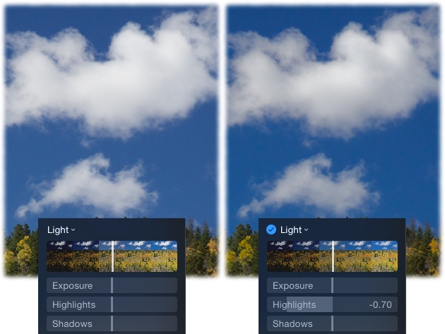
Highlights and Shadows. These two sliders let you recover details (think texture) in areas that look too light or too dark. Drag the Highlights slider left to darken only the highlights, as Figure 5-14 illustrates, or drag it right to lighten them; the shadows and darker midtones remain unchanged. The Shadows slider works the same way: Drag it left to darken only the shadows or drag it right to lighten them; the highlights and lighter midtones don’t change.
Tip
The effects of the Highlights and Shadows sliders are fairly subtle (especially on JPEGs), so if your picture is severely over- or underexposed, those sliders aren’t going to save it. To keep your images looking natural, resist dragging either slider too far in either direction, or your picture will take on a weird, radioactive-looking sheen.
Brightness. This slider is similar to Exposure in that it lightens or darkens your picture. However, it doesn’t change areas that are already bright (in other words, it avoids messing with the lightest highlights). With that in mind, you can drag it rightward to subtly brighten shadows and midtones, or drag it leftward to darken midtones and shadows, while leaving highlights alone, which can produce a dramatic, moody look.
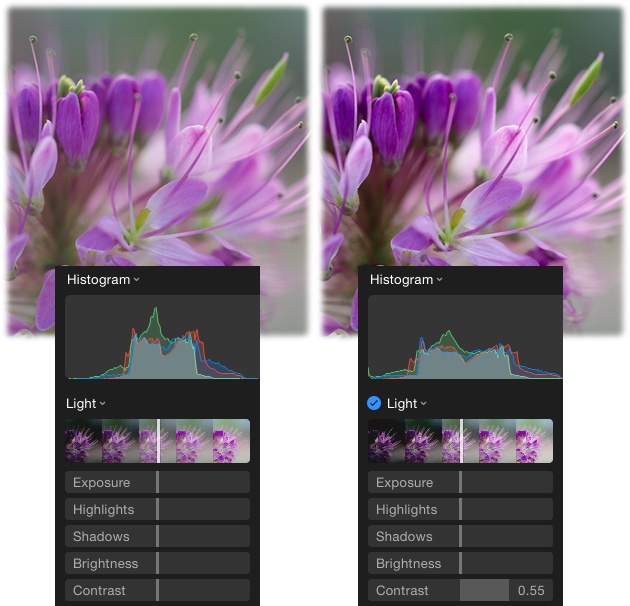
Contrast. This slider adjusts the difference in brightness between the darkest and lightest tones in your picture. When you drag this slider to the right (increasing contrast), you “stretch out” the histogram’s data, creating darker blacks and brighter whites, as shown in Figure 5-15. If you drag this slider to the left (decrease contrast), you scrunch the histogram’s data inward, shortening the distance between the darkest (pure black) and lightest (pure white) endpoints, making the picture’s tones look flat or muddy.
Tip
You can also stretch out a histogram using a Levels adjustment (Levels): Just scoot the outer black and white sliders inward to the edges of the histogram data. Which method is better? If the histogram’s data is centered, then Contrast is the easier adjustment because it pushes the data outward evenly. But if the histogram’s data is skewed to one side or the other—or if you’re correcting a raw image (Fun with File Formats)—then Levels is the better choice because you can adjust the brightness of highlights, midtones, and shadows independently. The details begin on Levels.
Figure 5-15. While the overall lighting in this close-up shot is nice, the picture lacks contrast. Dragging the Contrast slider to the right helps improve things. Notice how the histogram info is bunched in the middle in the original (left) and expanded over a wider tonal range after boosting the contrast (right).Black Point. This slider controls what black looks like in your picture. “Wait a minute,” you say, “how can black be anything other than black?” If you think about it, black can be jet black or it can be a really dark gray that just looks black. When you drag this slider to the left, Photos makes the blacks in your picture darker (more black, if you will). If you drag it to the right, Photos lightens the blacks.
Changing the black point shifts the light values of all the tones in your image to be darker or lighter, depending on which way you drag the slider. If you like the blacks in your pictures to be really black, then drag this slider slightly leftward. Just be careful of dragging it too far left or your shadows will get so black that you can’t see the details they contain (pros call this plugged shadows). Likewise, don’t drag the slider too far right or your shadows will become a dull gray mess.
On a Mac, if you don’t like the effect you’ve created by dragging the Light sub-sliders around, simply click Reset Adjustments at the bottom of the Adjustments panel. On an iOS device, drag the slider back to its original centered position or click Cancel (as you learned on The Mighty Histogram, the latter method nixes all the changes you’ve made during that editing session and takes you out of Edit mode).
Color
This smart slider lets you make the colors in your pictures more or less dramatic. If you drag the Color slider leftward, Photos tones down your picture’s colors; if you drag it all the way left, the colors disappear and you end up with a black-and-white photo. To boost the colors in your picture so they stand out more, drag the Color slider rightward (Photos adds a bit of color contrast, too). Here’s what the Color adjustment’s sub-sliders do (see Using the Adjustments Panel on a Mac if you’ve forgotten how to display them):
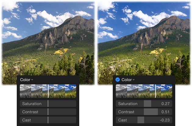
Saturation. This setting lets you control color intensity. Drag it to the right to make colors more vivid, so they pop off the page (see Figure 5-16). The more intense the colors, the brighter (and sometimes more fluorescent) they become, so be careful of using this slider on pictures of people, as skin tones can go hot pink in a hurry. Conversely, you can drag this slider left to tone down colors in your picture so they’re less intense, which is helpful if they look garish or they distract from the image’s composition. For example, you might want to lower the saturation of photos of a festive Latin American market or Hawaiian flowers, whose colors are often so brilliant they make your eyes water. Lessening saturation is also helpful if you’ve got a picture that you can’t color-correct to your liking. By toning down the color, the picture can take on an artistic feel.
Contrast. Similar to the Contrast sub-slider in the Light adjustment (Light), this sub-slider lets you control the differences in intensity between the colors in your picture. Drag this slider leftward to decrease differences in color intensity or drag it rightward to increase them, creating a more vibrant image. However, increasing this setting can easily strip areas of color detail. For example, if you’ve got a lot of variation in color—say, in a picture of fall foliage—boosting color contrast can push all the colors toward the one that’s dominant, so that instead of an intricate forest of yellows, oranges, and reds, you end up with a big blob of mostly yellow (or whatever color was dominant).
Cast. This slider lets you shift a picture’s colors toward green and blue by dragging it left, or toward red by dragging right. That lets you cool down a photo that looks too yellow or warm up a photo that looks too blue. These kinds of color casts are often due to lighting conditions (fluorescent lighting is the worst offender), the time of year you snapped the shot (winter versus summer), or your camera’s white balance setting (explained on White Balance). If this adjustment doesn’t whip your picture’s color into shape, try the more powerful White Balance adjustment described on White Balance.
Black & White
When you want to make a big difference in a picture with one simple change, you can’t beat converting it from color to black and white. This Ansel Adams approach doesn’t just evoke nostalgia, it also puts the focus on the subject in a powerful way, as Figure 5-17 shows. Going grayscale also lets you salvage an image that you can’t color-correct, or beautify a subject whose teeth need whitening (which you can’t do in Photos) or whose skin needs retouching (Retouching Images). Those problems and others all but disappear when you enter the realm of black and white.
If you click anywhere on the Black & White smart slider, Photos dutifully drains the color from your picture. Drag the slider left or right to adjust contrast and produce the look you want. (On an iOS device, you have to tap B&W, and then tap the slider that appears.) Dragging this slider leftward pushes the histogram data rightward, which lightens the picture and gives it an ethereal look (great for camouflaging uneven skin tones in portraits). Dragging this slider rightward pushes the histogram data leftward, which produces a darker and more dramatic feel (you may want to avoid this on portraits, as it emphasizes undereye shadows). Here’s what the Black & White sub-sliders do (flip back to Using the Adjustments Panel on a Mac [Mac] or Using the Adjustments Panel on a Mac [iOS] if you need help displaying them):
Tip
To produce the black-and-white image of your dreams, you may also need to tweak the settings in the Light and Color adjustment categories, though the Tone sub-slider described in this section creates a gloriously high contrast black and white, as evidenced back in Figure 5-12 (right).
Intensity. Think of this slider as strength. Once you find a look you like using the Black & White smart slider, drag the Intensity slider rightward to make the effect more pronounced, or leftward to tone it down.
Neutrals. This slider to adjusts the brightness of the neutral tones in your picture. Neutral tones are those that have nearly the same values in all three color channels (red, green, and blue).
Tone. This slider affects the brightness values of the non-neutral tones in your image, which also affects contrast. To increase contrast, drag this slider to the right, which spreads the histogram data out evenly in both directions, adding drama to your picture. Drag it leftward to bunch the histogram data in the middle of the graph, which decreases contrast.
Grain. If you want to add speckles to your photo that mimic the look of film photography, drag this slider rightward. Unless you’re going for a gritty and grungy look, avoid adding grain to portraits.

Advanced Adjustments
As you learned earlier in this chapter, Photos includes even more controls that you can add to the Adjustments panel. Just click the Add button at upper right to reveal a menu that lets you turn on these advanced photo fixer-uppers. (Sadly, Photos for iOS doesn’t include an Add button. If you want to use the adjustments described in the following pages, you have to use Photos for Mac.)
Tip
Some of the adjustments described in this section—Sharpen, Definition, Noise Reduction, and Vignette—are applied to your image the second you add them to the Adjustments panel. However, if you decide to always keep those adjustments open in the Adjustments panel—by clicking the Add button and choosing Save As Default—then they’re not automatically applied to subsequent pictures you open; you have to drag their sliders to apply them.
If you’re already overwhelmed by the adjustments explained in the previous pages, do yourself a favor and stop reading. Spend some time getting comfortable with what you’ve learned thus far, and then return to this section whenever you’re ready. Why? Most of the adjustments explained in this section were lifted from Aperture, Apple’s short-lived, pro-level image-editing program. While the adjustments are easy to use—they’re all slider-based—understanding what their sub-sliders do is a different story. That said, mastering Photos’ advanced adjustments is incredibly rewarding, and gives you maximum control over the color and light in your pictures.
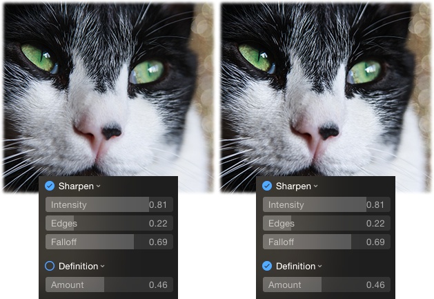
Sharpen
Much like sharpening a knife in your kitchen accentuates its edge, sharpening an image in Photos accentuates the high-contrast edges it contains (that is, places where light and dark pixels meet). This adjustment works by lightening light pixels and darkening dark pixels wherever they appear next to each other.
Note
Sharpening should generally be the last adjustment you make. If you apply other adjustments after sharpening, you may discover that you have to adjust the sharpening slider again (but all in all, that’s really no big deal). Also, sharpening isn’t magic: It can’t fix a blurry, poorly focused image. The only real way to produce sharp images is to stabilize your camera on a hard surface or use Burst mode, as the box on The Benefits of Burst Mode explains.
Photos sharpens your picture the second you add this adjustment to the Adjustments panel—you don’t have to click its Auto button. Before you grab the Intensity slider and increase the sharpening, set your image to 100% zoom level using the zoom slider (Adjusting Your View: Zooming and Scrolling), and then reposition your picture so you’re seeing the most important part (say, the eyes). Next, slowly drag the Intensity slider rightward. Keep in mind that photos with a lot of hard lines—landscapes, architecture, and such—benefit from a stronger dose of sharpening than portraits, where a lot of sharpening makes the subject’s pores leap out of the photo. And if you’re going to print the picture, it’s okay if it looks a little too sharp onscreen because the printing process will soften it a little. It’s a good idea to sharpen all the photos you’ll print or use in book, calendar, and card projects (Chapter 9). Otherwise, they can look unnaturally soft.
In addition to the Intensity slider, the Sharpen adjustment sports two other powerful sub-sliders, which are visible in Figure 5-18 (see Using the Adjustments Panel on a Mac if you need a refresher on how to display them). Here’s what they do:
Edges. This setting lets you restrict the sharpening to certain areas by specifying how much contrast there has to be between pixels for them to quality as an edge. The lower this setting, the fewer areas Photos will sharpen; the higher this setting, the more areas Photos will sharpen. (Drag this slider all the way left and Photos won’t sharpen anything, no matter what the Intensity slider is set to.) For portraits, keep this setting fairly low to avoid sharpening skin. And if you start noticing noise (Definition) in areas that don’t have much contrast, then drag the Edges slider back toward the left.
Falloff. While it may look like Photos sharpens your whole image at once, it doesn’t. When you first mess with the Intensity slider or click the Sharpen adjustment’s Auto button (put your cursor over the word Sharpen to display it), Photos applies one round of sharpening in its initial pass, and then applies two more rounds (it’s impossible to see this; it all happens in the blink of an eye). Those last two rounds are called falloff, and this slider lets you control the amount of sharpening Photos applied during them. (Why so many rounds? By adding smaller amounts of sharpening in multiple passes, you avoid creating sharpening halos, white gaps between contrasting pixels.)
This Falloff slider is measured in percent and is applied proportionally to the last two sharpening passes. For example, a falloff setting of 0.69 means that Photos applies 69% of the original sharpening amount (controlled by the Intensity slider) during the second pass, and then applies 69% of the amount of sharpening from the second pass during the third pass. Generally speaking, everyone except professional photographers who are used to using Apple’s Aperture will leave Falloff at its factory settings. However, if your picture has a lot of defined edges in it (say, a forest, leaves, or lots of small objects) you may want to reduce it a little. Just be sure you’re viewing your image at 100% zoom level or you’ll never see the subtle differences this slider makes.
Tip
One method for using Photos’ extremely advanced sharpening controls is to set the Intensity slider to its maximum value (1.00), and then adjust the Edges slider until you can clearly see which parts of the picture Photos is sharpening (just be careful not to drag it so far right that you introduce noise into your image). Next, adjust the Falloff slider so only the edges you want to be sharpened are actually sharpened. Finally, decrease the Intensity setting until the sharpening looks good to you. Again, you must view your image at 100% zoom level to notice any changes.
Definition
This adjustment is great for accentuating the details in your image without over-doing contrast. It adds clarity by adjusting contrast in the midtones, which is where many fine details reside.
Photos applies some definition to your picture the minute you add this adjustment to the Adjustments panel (Advanced Adjustments tells you how to do that). Dragging this slider to the right can make a flat or hazy picture look sharper, though its impact isn’t the same as using the Sharpen slider (which affects all the tones in your image). You’d be hard-pressed to find a photo that won’t benefit from at a little extra definition (see Figure 5-18)—except for portraits (nobody looks good with extra definition in their skin!). This adjustment is a one-trick pony; it doesn’t have any sub-sliders.
Noise Reduction
In photography circles, the term noise refers to graininess in your images—the colored or grayscale speckles produced by shooting in low-light conditions or at a high ISO, your camera’s light-sensitivity setting. (Typically, any ISO above 800 puts you in the noise danger zone.) This slider reduces noise by blurring your picture, so use the minimum amount necessary. Also, be sure to view your image at least 100% zoom level when using this slider and keep your eyes glued to any dark areas, which is where noise lives. This adjustment doesn’t have any sub-sliders.
Tip
The Noise Reduction slider is also handy to use if you’ve lightened shadows as described on Light, which can introduce noise into photos.
Vignette
If you’ve ever seen a picture with a softly darkened edge, you’re familiar with vignettes. (Technically speaking, vignettes are pictures whose brightness fades from their centers to their edges). Adding a vignette is a great way to downplay a distracting background or accentuate your subject, as Figure 5-19 shows. You’ll likely use this slider on every portrait you take.
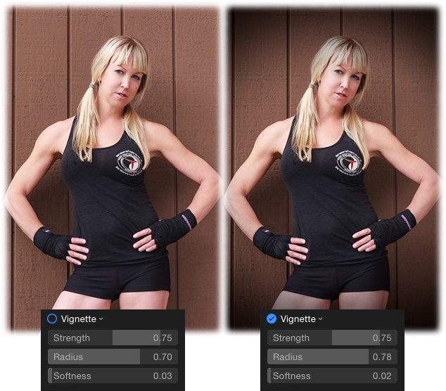
When you add this adjustment to the Adjustments panel (Advanced Adjustments), Photos applies a vignette at 0.75 intensity, though you can adjust that with Strength slider. Dragging rightward increases the amount of dark shading, and dragging leftward decreases the shading. Avoid dragging this slider left into negative numbers; if you do, the edges of your picture turn oddly light. Here’s what the Vignette adjustment’s sub-sliders do (to display them, put your cursor over the word Vignette and click the down-pointing icon that appears to its right):
Radius. This slider change the size of the vignette. Drag it right to make the vignette bigger or left to make it smaller.
Softness. This slider controls the width of the transition between what’s darkened and what isn’t. Drag it right to make the transition wider and softer. But beware: If you drag it all the way right, Photos darkens the whole image.
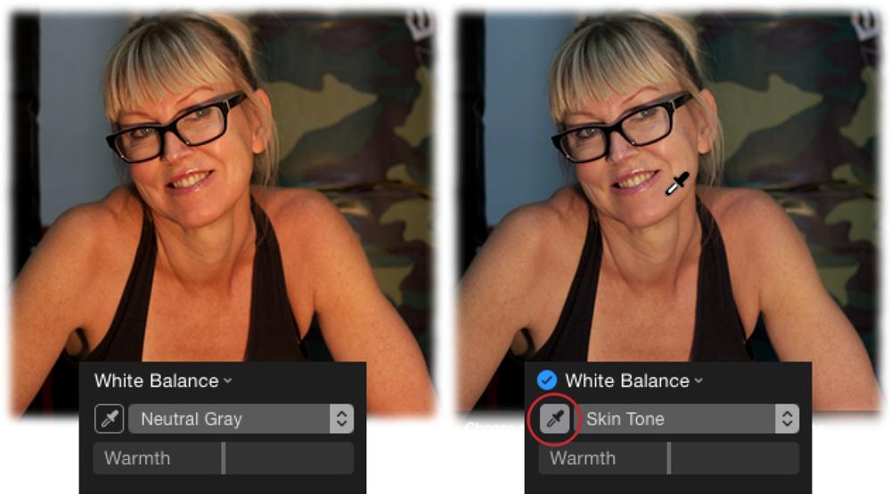
White Balance
This adjustment lets you change the color of light in your shot. Different kinds of light—fluorescent lighting, overcast skies, and so on—lend different color casts to pictures. White balance, both in Photos and in your camera, is the setting that eliminates or adjusts the color cast according to the lighting. But isn’t that what the Color adjustment’s Cast sub-slider does, you might ask? Yes, but Photos’ White Balance adjustment is far more powerful.
Note
For the best results, adjust your picture’s exposure, as described on Light, before adjusting its white balance.
When you first add White Balance to the Adjustments panel, you see an eyedropper and a menu. The menu controls the method this adjustment uses and the eyedropper lets you tell Photos which part of your image to analyze.
There are two ways to use Photos’ White Balance adjustment (see Advanced Adjustments if you need help adding it to your Adjustments panel):
Automatic white balance. To fix your image’s white balance automatically, point your cursor at the words White Balance and click the Auto button that appears. When you do, Photos analyzes your picture and, if it finds a face, it picks Skin Tones from the method menu and then adjusts the white balance in a way that preserves fleshy colors. If Photos doesn’t find a face, it picks Neutral Gray from the method menu and adjusts the white balance based on the neutral grays it finds in your picture. (Technically speaking, neutral gray is a medium gray that has the same numeric values in all three color channels: red, green, and blue.)
If you’re pleased with the results of using the Auto button, pat yourself on the back and continue on your editing journey. If not, click the White Balance eyedropper to activate it and, for the Skin Tone method, click your subject’s face, as in Figure 5-20. For the Neutral Gray method, click an area that should be medium gray. If at first you don’t succeed, grab the tool again and click another spot in your image; rinse and repeat until you’re satisfied with the results. (It would be nice if the eyedropper stayed active until you told Photos that you were finished with it, but that’s not how it works.)
The Skin Tones and Neutral Gray methods have the same Warmth sub-slider; just expand the White Balance adjustment to see it (put your cursor over the words “White Balance,” and click the down-pointing icon that appears). This sub-slider is great for refining the white balance adjustment by cooling or warming the tones in your picture: Drag the slider left to cool your image with bluish/green tones or right to warm it with reddish/yellow tones.
Note
If the Skin Tones method doesn’t get your subject(s) looking quite right, see the box on Producing (Near) Perfect Skin Tones for tips on taking good people photos.
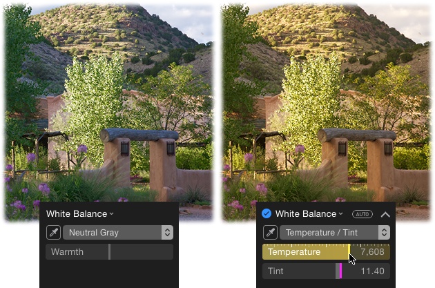
Figure 5-20. Click the White Balance adjustment’s Auto button (not shown) and, if your image contains a human face, the method menu switches to Skin Tone due to Photos’ facial-recognition ability. To fine-tune the adjustment, use the eyedropper (circled) to click an area of skin. Take care not to click a shiny spot or the white balance will be off. As you can see from this before (left) and after (right) example, Photos was able to nix the pesky yellow cast.Manual white balance. If you’d prefer to take white balance into your own hands, then instead of clicking the Auto button, choose Temperature/Tint from the method menu. (Make sure the White Balance adjustment is expanded so you can see its Temperature and Tint sub-sliders.) Next, use the White Balance eyedropper to click a neutral gray in your image, and then use the sub-sliders to finesse the color balance to your liking:
Tip
It’s usually easier to start with the Tint slider and then adjust the Temperature slider, which is why they’re listed in reverse order here.
— Tint. Like the tint control on your computer monitor or color TV, this slider adjusts the picture’s overall color along the red-green spectrum. Drag this slider to the left for a greenish tint (the slider itself turns green), or right for red (the slider turns magenta, as shown in Figure 5-21). As you drag, watch the histogram to see the colored graphs shift. This slider is particularly helpful for making skin tones look natural and for compensating for bad lighting conditions.
— Temperature. This slider adjusts the picture’s overall color along the blue-orange spectrum. Drag this slider right to warm the image, making the tones more orange, as if the sun came out (the slider turns yellow—see Figure 5-21). Dragging left, on the other hand, cools the image, making the tones more blue so the picture looks icy and cold (the slider turns blue).
Tip
The Temperature and Tint sub-sliders are incredibly useful, and you may be able to handle the bulk of your correction chores using nothing but the Light adjustment’s Exposure sub-slider and, say, the Temperature slider. However, some shots—especially those lit with fluorescent lighting—may never look right. The next time you’re shooting a fluorescent-lit scene, head off color problems by using your camera’s flash. Make sure it’s the dominant light source in the scene so it fills in the gaps in the fluorescent-light spectrum, making color-correcting a little easier. Another solution is to change your camera’s white-balance setting to fluorescent light (you’ll need to dig out your owner’s manual to learn how).
Levels
Congratulations! You’ve arrived at Photos’ most advanced adjustment. When you choose Levels from the Adjustment panel’s Add menu, Photos opens yet another histogram, but this one boasts a whopping eight draggable sliders that give you precise control over the brightness levels (hence the adjustment’s name) of the tones in your image. You can adjust the brightness levels in just the darkest shadows, just the midtones, just the lightest highlights, in the tones between shadows and midtones, and in the tones that fall between midtones and highlights. You control all of that in the Levels RGB histogram—the one that shows the red, green, and blue, graphs superimposed on each other—or in each of those channels individually. You also get access to the Luminance channel, which is described in a sec.
As you drag the Levels sliders around (which you’ll learn how to do later in this section), the histogram you learned about on The Mighty Histogram changes to reflect the adjustments you’re making with Levels. For example, if you need to widen your histogram to more evenly spread out the tones in your image, you can tweak the Levels sliders as explained in this section and watch the other histogram widen as you do so.
Note
If you’ve already fiddled with the Light adjustment’s sub-sliders (Light), you won’t need to use Levels. Typically, it’s best to use the Light or Levels adjustment, but not both. While a Levels adjustment works on any file format, you’ll likely get better results on raw images because they contain more data. For that reason, it may work best to use Light adjustments on JPEGs and Levels adjustments on raw files. That said, if you like using one adjustment more than the other, then go for it! The important thing is to understand both methods, as one may work better on some photos than the other.
The Levels adjustment doesn’t have any sub-sliders, but it does have a menu that lets you access other histograms. To see it, point your cursor at the Levels adjustment, and then click the icon circled in Figure 5-22.
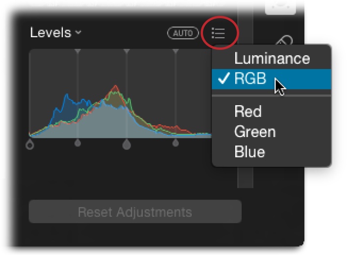
Luminance. Pick this option to display a histogram that’s based on how human eyes perceive color, which differs from how a camera, monitor, or other digital device perceives color. Because our eyes are more sensitive to green light than red or blue light, this histogram looks different than the others discussed in this section (it most closely resembles the Green histogram). The Luminance histogram displays the same data as the RGB histogram (described next), but in a different way: it shows cumulative brightness values for each pixel as opposed to separate RGB values. If you’re attuned to subtle details, you may gain a deeper understanding of the data in your image.
Heck, it’s possible that luminance data is how Photos can turn a color photo into a black and white: By understanding how our eyes perceive color, it’s able to translate data in the individual color channels into a visually pleasing grayscale picture onscreen. The only real use for this histogram is to tweak the contrast of a black-and-white image you’ve made using the aptly named Black & White adjustment (Black & White).
RGB. Straight from the factory, this is the histogram you see when you add a Levels adjustment, wherein Photos superimposes the red, green, and blue channels’ data atop each other. When you have this histogram displayed and make a Levels adjustment, your changes affect all three color channels (red, green, and blue) at the same time. This is the histogram you’ll use the most, and it’s actually the same one you encountered earlier in this chapter (The Mighty Histogram), though this one has sliders that you can use to affect the image’s tonal range.
Red, Green, Blue. These three options give you access to the individual histograms for each color channel. This is handy for controlling brightness levels in a particular color channel without affecting the others, which is handy if, say, your image has a stubborn red cast, or if the blues don’t look bright enough. In addition to fixing problems in a specific channel, you can also use these histograms create artistic effects like the ones you can get with the filters discussed on Applying Filters.
Tip
If you want to use the Red, Green, and Blue histograms to create some fun effects but you also want to keep the full-color version of the photo hanging around, duplicate the photo first. As you learned on Duplicating Files, the duplicate doesn’t take up any additional hard drive space. To do it, choose Image→Duplicate 1 Photo or simply press ⌘-D.
As described earlier in this chapter (The Mighty Histogram), if the data in your histogram covers a good chunk of the territory from left to right, then your image has a good distribution of dark and light tones. However, if the data is bunched in the middle or to one side, or if there’s a gap between the edges of the histogram and where the data begins, spreading the data out a bit can dramatically improve your picture.
There are two ways to spread out the data: You can have Photos automatically adjust the levels in your histogram of choice by clicking the Auto button that appears when you point your cursor at the word “Levels,” or you can do it manually by dragging the Levels sliders labeled in Figure 5-23 (again, in your histogram[s] of choice). Adjusting these sliders yourself will give you the best results, though you can always start with Auto adjustment and then tinker with them.
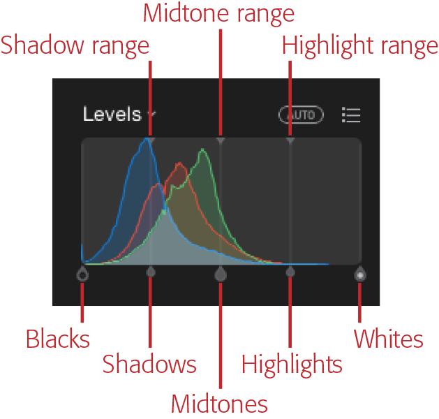
To really understand Levels, it’s helpful to imagine a numeric grid beneath the histogram that ranges from 0% to 100%, which is the brightness range you learned about earlier in this chapter (The Mighty Histogram). The Blacks slider on the left side of the histogram represents the darkest shadows in your picture and starts out at 0% for pure black. The Whites slider on the right side, which represents the lightest highlights, starts out at 100%—pure white. To give your image the greatest possible tonal range and contrast, move these sliders so they point to wherever the data starts to slope upward (at the foot of the histogram mountains, so to speak). In other words, if there’s a gap between the Blacks slider and the left end of the histogram data, drag that slider to the right. And if there’s a gap between the Whites slider and the right end of the histogram data, drag that slider to the left.
When you move the sliders, Photos adjusts the image’s tonal values accordingly. For example, if you drag the Whites slider left to (an imaginary setting of) 85%, Photos changes all the pixels that were originally 85% or higher to 100% (pure white). (Translation: They get brighter.) Similarly, if you move the Blacks slider right to (an imaginary setting of) 5%, Photos darkens all the pixels with a brightness level of 5% or lower to 0% (pure black). Photos also redistributes the brightness levels between 5% and 85%, boosting the image’s overall contrast by increasing its tonal range. If you watch the histogram at the top of the Adjustments panel (the one you learned about on The Mighty Histogram), you’ll see it widen as you change the sliders in this way. Figure 5-24 shows what a difference this can make.
Tip
Instead of dragging the Blacks and Whites sliders, just click the outer edge of the histogram data to move the slider to that location. It’s a wee bit faster and gives you better control over where the sliders land.
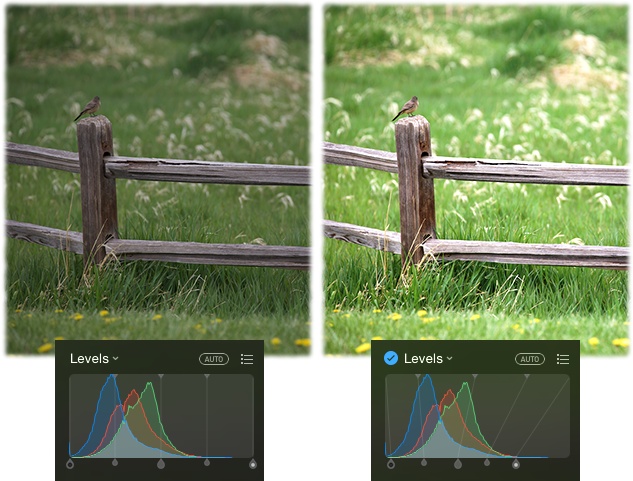
Note
If your histogram doesn’t have gaps at the left or right ends, avoid moving the Black and White sliders inward—doing so destroys any details lurking in the darkest shadows or lightest highlights. Instead, use the Shadows, Midtones, and Highlights sliders described below.
Next, turn your attention to the Shadows and Highlights sliders—they control the tones that fall between black and 50% gray, and between 50% gray and white (respectively). They only appear when you point your cursor at the Levels histogram, and they give you immense control over the entire range of midtones, which is where your picture’s fine details live. For example, if your picture’s shadows look dark, lighten them by dragging the Shadows slider leftward. Or if your highlights look too light, darken them by dragging the Highlights slider rightward. Dragging these sliders doesn’t affect the image’s black or white point, which lets you retain details in the darkest shadows and lightest highlights.
Now focus on the Midtones slider in the middle, which controls your photo’s values smack dab in the middle between 0% and 100% (or rather, 50% gray). Drag it left to lighten midtones or right to darken them. Doing so decreases or increases contrast (respectively) without changing the brightness levels of dark shadows and light highlights.
If you’re happy with your photo at this point, awesome. If it needs more tinkering, follow the vertical lines attached to the Shadows, Midtones, and Highlights sliders up to the top of the histogram and you’ll notice three microscopic triangles (they’re labeled back in Figure 5-23). These sliders let you control which range of tones is affected when you move the sliders they’re attached to. For example, the Shadows and Highlights sliders normally affect tones that are exactly halfway between the Blacks and Midtones, or Midtones and Whites. By nudging the tiny range sliders, you can specify exactly which tonal range you change when you mess with the Shadows and Highlights sliders. Similarly, the Midtones slider normally affects tones that are exactly halfway between the black and white points, but you can change that by nudging its ranges slider left or right, say, to affect the lightest midtone shadows or the darkest midtone highlights (respectively). However, doing so also nudges the other range sliders because the Midtone range slider has to stay between them.
If all this Levels mumbo-jumbo makes you want to head for the hills, you’re not alone—it’s seriously pro-level stuff. Take a deep breath and remember that it’s impossible to ruin a picture in Photos—if everything goes to heck in a handbasket when you’re dragging sliders to and fro, simply click “Revert to Original” and start again. Also, give yourself time to get the hang of using these controls; just because there are eight sliders to scoot around doesn’t mean you should use all of them on every picture. Generally speaking, use the Blacks and Whites sliders only if there are gaps on either side of your histogram. Use the Shadows and Highlights sliders to darken or lighten those ranges, and then adjust the overall contrast with the Grays slider. Lastly, fine-tune the overall brightness of specific ranges using the Shadow, Midtone, and Highlight brightness sliders.
Whew! You can relax—the hardest editing lesson is now over.
Copying Adjustments
As you can see, whipping pictures into shape can involve a lot of time and slider scooting. If you’ve got a bunch of pictures that require the same fixes—they were all shot at the same time with the same lighting conditions, say—it’d be tedious to repeat your efforts on every…single…photo. Fortunately, you don’t have to do that. You can simply copy your adjustment settings from one photo and paste them onto another. This can be a gigantic timesaver if you have a slew of images taken under the same lighting conditions.
Apple put a lot of thought into the Copy Adjustments command. Because you only want to copy and paste general changes—those that affect lighting and color—that’s all the command does. In other words, the only stuff that gets copied are the changes you make with the Enhance and Filter tools and the Adjustments panel. Changes you make with the Rotate, Crop, Retouch, and Red-Eye tools aren’t included. (Those last two tools are covered in the next two sections.)
To copy a change from one picture to another, you have to be in Edit mode. There, simply open a photo you’ve edited (image A) and choose Image→Copy Adjustments or press ⌘-Option-C. Then, open the other picture (image B)—say, using the thumbnails browser (Browsing Thumbnails)—and then choose Image→Paste Adjustment or press ⌘-Option-V. When you do, Photos applies the color and lighting corrections you made to image A onto image B.
Tip
You can also Control-click a photo in Edit mode and choose Copy Adjustments or Paste Adjustments from the menu that appears.
Unfortunately, you can only paste changes onto one photo at a time; you can’t select 100 thumbnails and paste changes onto all of them in one fell swoop. But if you’ve got a bunch of pictures to paste edits onto, you can speed up the process by opening the thumbnail browser and using the arrow keys on your keyboard to navigate through the pictures. Then use the abovementioned keyboard shortcut to paste your changes onto each one!
Retouching Images
There’s nothing wrong with a little vanity, and sometimes an otherwise perfect portrait is marred by small yet annoying stuff like a zit, makeup smudge, or stray hair. Other kinds of imperfections can sneak into digital pictures, too. Historians who scan old prints or negatives may digitize scratches, and scanners themselves are notorious for introducing dust specks. Or maybe your camera’s sensor is a little dirty so you end up with the same spot on every picture. As you likely know, fixing these common problems is called retouching.
Tip
One of the most common retouching tasks is whitening teeth. Unfortunately, you can’t do that in Photos, nor can you add digital makeup, brighten eyes, perform a tummy tuck, inject digital collagen into lips, or slim your subject. Those high-end retouching jobs are reserved for more advanced programs like Adobe Photoshop or Photoshop Elements.
Happily, you can easily fix such problems with Photos’ Retouch tool. It lets you paint away scratches, spots, hairs, or other small flaws with a few quick strokes, as Figure 5-25 illustrates.
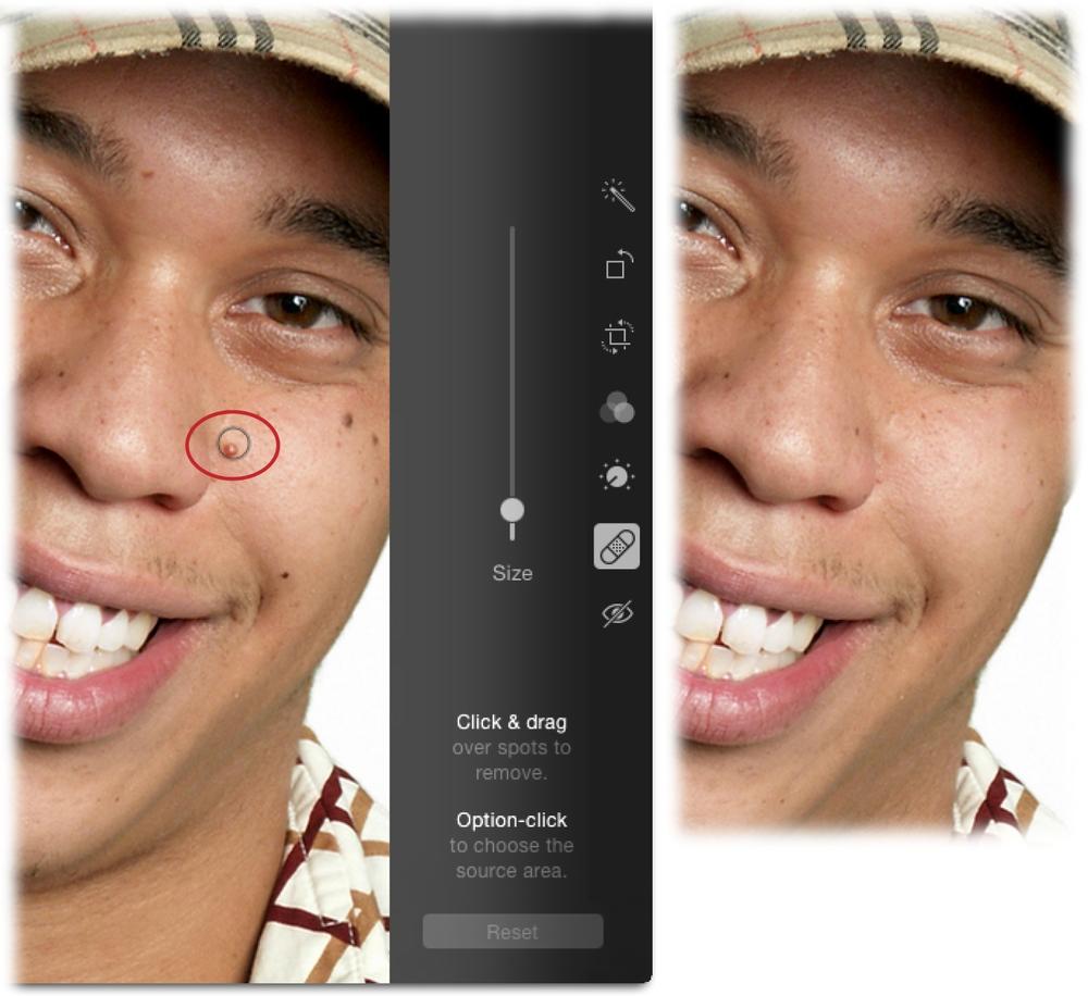
The Retouch tool works its magic by copying pixels from one area of your photo to another and then blending them (blurring, really) into the pixels you click or drag over. To use the Retouch tool, head to the main screen of Edit mode (Editing Basics), and then either click the Retouch tool or press the R key on your keyboard. When you do that, your cursor turns into a black circle rimmed with white (so you can always see the circle atop dark or light colors in your image). As explained in Figure 5-25, use the Size slider to make your cursor roughly match the size of the item you’re fixing. From there, do one of the following:
Copy pixels from just outside the cursor’s edge. If you’ve got plenty of good pixels around the thing you want to get rid of—say, a cloudless sky around a power line or flawless skin around a blemish—then simply paint over it, either by clicking or dragging. When you drag, you see a white overlay that marks your brushstrokes (the overlay is visible at the bottom left of Figure 5-26). When you release your mouse button, Photos blends the copied pixels into the surrounding ones.
Copy pixels from elsewhere in the picture. If you don’t have good pixels around the item you want to remove, you can copy pixels from somewhere else in the image instead. This maneuver is called setting a sample point, and it keeps you from introducing repeating elements when you’re retouching. To perform this task, Option-click the area you want to copy the pixels from (your cursor turns into a plus sign like the one circled in Figure 5-26, bottom left). Next, release the Option key, and then click or drag over the area that needs fixing. As you work, the plus sign marks the area Photos is copying pixels from and you see a white overlay marking your brushstrokes. If necessary, you can Option-click again to set a new sample to remove the item.
Tip
You can adjust the size of the Retouch tool’s cursor using your keyboard: Press the left bracket key ([) repeatedly to make it smaller, or the right bracket key (]) to make it bigger.
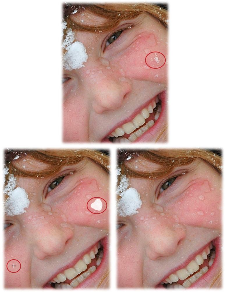
Tip
When you set a sample point, try choosing a spot that’s as close to the problem area as possible so the texture and color match better. For example, you wouldn’t want to repair skin on your model’s nose with skin from her knee.
Don’t overdo retouching: If you apply too much of it, the area you’re working on will look noticeably blurry and unnatural, as if someone smeared Vaseline on it. Fortunately, you can use the Reset button below the Size slider to undo individual brushstrokes (you can also choose Edit→Undo or press ⌘-Z). And if you end up with pixel pudding, you can always click “Revert to Original” to obliterate all the edits you’ve made.
Fixing Red Eye
One of the most annoying things about taking photos with a flash is the creepy red eyes it can give people. This happens when the bright light of the flash reflects back from your subjects’ eyes and illuminates the blood-red retinal tissue there. That’s why red-eye problems are worse when you shoot pictures in low light: Your subjects’ pupils are dilated, which lets even more light from your flash to reach their retinas.
While today’s digital cameras are good at preventing this problem with pre-flash flashes, you can always fix it in with Photos’ Red-eye tool. In Edit mode, click the Red-eye icon or press E on your keyboard to activate this tool. Figure 5-27 tells you how to use it.
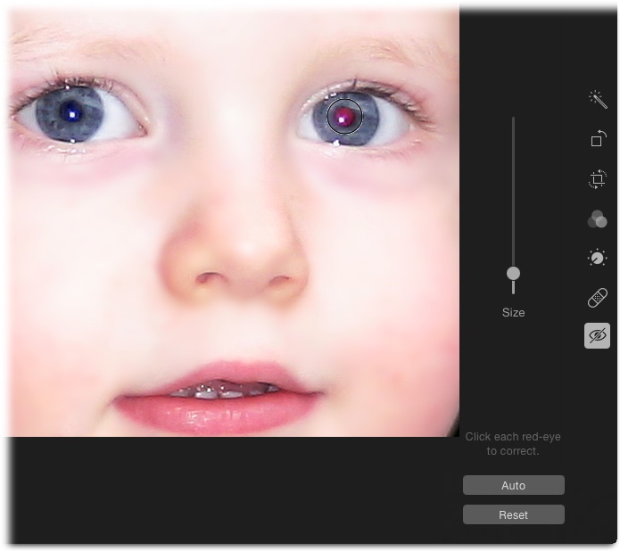
Alas, Photos’ Red-eye tool can’t fix the equivalent problem in animal eyes because their version of red-eye results in white, green, or golden pupils instead. Bummer!
Editing Raw Files
Photos is perfectly happy to work with files shot in raw format—the unprocessed file format you can choose on most cameras over $300 or so. To learn how, pull out your camera’s owner’s manual. (You can’t shoot in raw on your iOS device…at least not yet.)
Raw format gets its name because the data is just that: raw and unprocessed. (The term “raw” isn’t an acronym, so it doesn’t need to be capitalized even though Apple erroneously does just that.) Unlike JPEGs, raw images aren’t subject to any in-camera processing such as color boosting, noise reduction, sharpening, and the like. If you compare a JPEG and raw file of the same image, the JPEG always looks better because of this in-camera fluffing—but that doesn’t mean that, with a little editing work, you can’t get the raw image looking just as good or better. Raw files contain more data than JPEGs, so they consume a lot of space on your memory card and hard drive, but they give you astonishing amounts of control when editing.
Tip
Don’t know which photos are raw files? You could pop open the Info panel to find out (The Mighty Info Panel) or, in Edit mode, take a peek at the top of the Photos window. If you like, you can gather up all your raw files by creating a smart album (Smart Albums): Choose File→New Smart Album and set the menus to “Photo,” “is,” “RAW.” When you click OK, Photos corrals all the raw files in your library into your new album. Slick!
At its heart, Photos is designed to work with JPEGs. So when it grabs a raw file from your camera, it creates a JPEG version of it, but the raw file still exists on your hard drive, deep within the labyrinth known as the Photos Library package (Visiting Your Photos Library). However, when you open the picture in Photos, you see a JPEG interpretation of that raw file. (This conversion to JPEG is one reason Photos takes longer to import raw files than files in other formats.)
This trick of using JPEG look-alikes as stand-ins for your raw files has two important benefits. First, it lets you work with your pictures at normal Photos speed, without the long minutes of calculations you’d endure if you were working with the original raw files. Second, remember that images in your Photos library are accessible from within iMovie, Pages, and so on—programs that don’t understand raw files.
So what happens when you edit one of these raw-file stunt doubles? Photos applies your changes to the JPEG version of the photo. If you want to go back and start over with the original raw file, choose Image→Reprocess RAW.
Speaking of shooting in raw format, some cameras let you shoot in both raw and JPEG formats, meaning that each time you snap the shutter, two files are captured: one in raw format and another in JPEG. (As you may imagine, doing this fills your camera’s memory card in no time flat!) When you import those images into Photos, it considers the JPEG files the originals, and therefore reverts to them when you use the “Revert to Original” command. If you prefer to revert to the raw file instead for a particular image, open the image in Edit mode, and then choose Image→“Use RAW as Original.” (Unfortunately, there’s no preference in Photos that you can use to say, “I always want you to use the raw image as the original.”)
Beyond Photos
Thanks to the incredible power tucked inside the Adjustments panel, you may find that Photos lets you do everything you could ever hope to do with your pictures. But then again, if you really take a shine to image editing, you may want to expand your skillset beyond what Photos can do.
For example, if you want to edit certain parts of an image—say, to lighten or darken certain areas, smooth skin, whiten teeth, or create a partial-color effect—you need a program such as Adobe Photoshop Lightroom ($150 for a standalone version or $10 per month for a subscription that includes Photoshop). It’s a database, just like Photos, so you can use it to import and manage images, plus it includes similar controls to those in Photos’ Adjustments panel, though a whole lot more. You can also use it to create pro-level photo books, slideshows, and web galleries.
If, on the other hand, you want to do stuff like combine images for compositing (think swapping people’s heads, Hollywood special effects, and graphic design projects), collaging (think scrapbooking), and work with text, you need the more advanced editing power of a program that supports selections, layers, and masking. Adobe Photoshop is by far the most popular tool for these kinds of tasks, but it’s also one of the most complicated pieces of software known to man (happily, Photoshop CC: The Missing Manual can ride to your rescue). It’s also available only by subscription. Fortunately, you can save yourself some money by buying Photoshop Elements instead. It’s an easier-to-use, trimmed-down version of Photoshop with all the basic image-editing stuff and just enough of the high-end features. It costs less than $100 and is available without a subscription; you can get a free, 30-day trial from www.adobe.com. Another good option is Pixelmator ($30); you can buy it or download a free trial version from www.pixelmator.com.
Note
Your humble author has written several books and recorded numerous video courses about Photoshop, Photoshop Elements, and Photoshop Lightroom. You can find them all on her website, PhotoLesa.com. Also, watch for her weekly column on Macworld.com, where you’ll find tips, tricks, and tutorials on creative things you can do on your Mac.
As mentioned earlier, Lightroom is a database, so you can easily use it to import and manage your images. However, the other programs listed in this section are not. Photoshop comes with a companion program called Adobe Bridge that can help you keep track of your stuff, but it’s no database (and there are rumors of it being phased out). Photoshop Elements, on the other hand, has a database component called the Organizer, but it’s notoriously difficult to use. And Pixelmator doesn’t include a database at all. So if you want to edit images in those other programs, you may want to keep using Photos to import and manage your collection. As noted at the beginning of this chapter, Photos doesn’t let you easily use other programs to edit images. Instead, you have to export a picture (Exporting from Photos), and then open it in the other program. Then, to make the edited version appear in Photos, you have to reimport it (Importing Other Image Files).