12. Creative Type

In this chapter, you will learn how to make type characters look as if they’re carved into granite, embossed into leather, stamped onto a cracker, illuminated, spray painted, scratched off a surface, cut out of paper, printed on porcelain, screened back, and written in the sky. To accomplish these feats, you’ll use a variety of Photoshop features, such as layer styles, filters, masks, and gradients. You can use these methods as a springboard for developing a personal repertoire of type treatments.
Note: This chapter requires familiarity with the basic typesetting features of Photoshop, which we cover thoroughly in our Photoshop CS4, volume 1: Visual QuickStart Guide.
Tips for designing with type
• Think thematically. Choose a font—be it formal, casual, high-tech, calligraphic, historical, simple, or ornate—that relates to the background image.
• Chubby is good. Chunky letters will give you more surface area to alter or apply effects to.
• Make sure the type is legible, and not a struggle to decipher.
• For a sophisticated, cohesive look, take your color cues from the background image. You can sample a type color from the image with the Eyedropper tool.
• Improvise with Photoshop features in unconventional ways. For example, to create informal “hand” lettering, such as spray paint or chalk, instead of using the Type tool, you could draw the letters by hand with the Pencil or Brush tool (preferably with a graphics tablet and stylus).
• Be concise. To create more than a few words or a short phrase for print output, export your Photoshop image to a page layout program and typeset the text there instead.
• Keep your type treatments editable, if possible, by using flexible features, such as layer effects.
• Keep records. Take notes of your editing sequences and settings, for future reference. Save your favorite layer style settings to the Styles panel, for future use. Or record your successful editing steps in an action (see Chapter 14).
Using layer effects
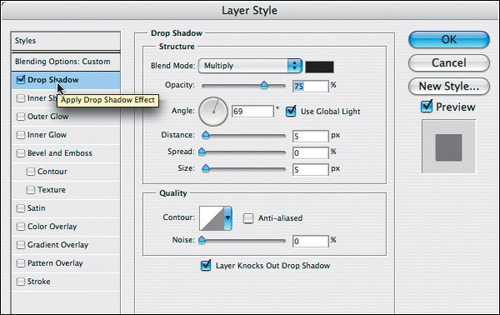
A layer style encompasses all the settings that you can apply via the Layer Style dialog (A–B, next page), including Blending Options, such as layer opacity and fill opacity, and layer effects, such as a Drop Shadow or Inner Glow. Although layer effects can be applied to any kind of layer (image layer, shape layer, Smart Object, etc.), we feature them in this chapter because they work magic on type. They’re easy to apply and edit, singly or in combination, and will transform automatically if you transform the layer they’re applied to.
• As you’ll see from many of the exercises in this chapter, our experience has been that applying layer effects in twos, threes, or more produces the best results. And don’t be afraid to use non-default settings. For example, you can lighten the shadow for a bevel by changing the mode.

A In the Layer Style dialog, click an effect name (the box checks automatically) to view and edit the settings.
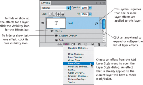
B Layer effects are accessed from the Layers panel.
One way to modify the edges of a layer effect (except for Overlay or Stroke) is by choosing a different contour in the Contour preset picker.
To choose a contour for a layer effect:
1. On the Layers panel, double-click a layer or an effect name to open the Layer Style dialog.
2. Apply one of the first six effects, and click the arrowhead next to the Contour thumbnail ![]() (or for the Bevel and Emboss effect, click the Gloss Contour arrowhead) to open the Contour preset picker.
(or for the Bevel and Emboss effect, click the Gloss Contour arrowhead) to open the Contour preset picker.
• For the Bevel and Emboss effect, you can also click the nested Contour option on the left side of the Layer Style dialog to add an extra contour.A–D
3. Click a contour thumbnail.
4. Click away from the picker to close the menu.
• When applying multiple layer effects, we recommend using the following strategy. Change the contour in just one or two of the effects. If Bevel and Emboss is applied, change its contour first; if Inner Glow is applied, change its contour next; if neither of those effects are applied, change the contour in one of the other “Inner” effects. The contours for Drop Shadow and Outer Glow control how the “Outer” effects follow the edge of an object; change the contour for only one of the two effects.
Using the Contour Option that’s Nested Under the Bevel and Emboss Effect
A This is the default Linear contour for the Bevel and Emboss layer effect (Inner Bevel style).

B The Cone contour reversed the highlights and shadows in the bevel and moved the bevel inward.

C The Gaussian contour rounded and softened the bevel.

D The Ring contour sharpened the edge of the bevel and moved it inward.

Using layer styles
You can conveniently store any collection of Blending Options and layer effects (Layer Style dialog settings) for future use as a layer style on the Styles panel. A saved style can be applied quickly to any layer in any document. To acquaint yourself with this panel, apply a preset style first.
To apply a style to a layer:
1. Show the Styles panel.![]()
• From the panel menu, choose a thumbnail size or a list display mode for the panel.
2. Do either of the following:
Click a layer (not the Background) on the Layers panel, then click a style on the Styles panel.A–C
Drag a style name or thumbnail from the Styles panel over any selected or unselected layer on the Layers panel.
• Styles can also be applied via the Layer Styles dialog (click Styles at the top of the dialog).
• Normally, when you apply a style, it replaces any existing effects on the current layer. To add a style without replacing existing effects, Shift-click or Shift-drag the style. Whether you hold down Shift or not, if the new and existing effects have the same name, the new effects will replace the old.
A This is the original, plain editable type.

B With the type layer selected, we clicked a style thumbnail on the Styles panel.

As you save a layer style to the Styles panel, you have the option to include the layer effects and/or Blending Options settings (such as layer opacity, blending mode, and fill opacity) that are currently applied to the selected layer.
To save a style to the Styles panel:
1. Optional: To give yourself a head start, apply an existing style to type, then modify the settings or apply additional effects.
2. Do either of the following:
On the Layers panel, click a layer that contains the desired layer style settings (layer effects, layer opacity, blending mode, fill opacity, etc.), then click a blank area on the Styles panel or click the New Style button.![]()
On the Layers panel, double-click a layer that contains the desired layer style settings. In the Layer Style dialog, click New Style.
3. In the New Style dialog, type a Name for the new style, check whether you want to Include Layer Effects and/or Include Layer Blending Options in the style, then click OK. If the Layer Style dialog is open, click OK to exit that dialog. Your new style will appear as the last listing or thumbnail on the Styles panel.
• You can load other style libraries from the bottom of the Styles panel menu or from the Styles menu in the Layer Style dialog. To create a library of style presets, see page 112. The preset styles that are supplied with Photoshop are stored in Adobe Photoshop CS4/Presets/Styles.
• To remove a style from a layer (including reverting the layer blending mode to None and the layer Opacity to 100%), right-click/Control-click the layer and choose Clear Layer Style.
C The Swimming Pool layer style in the Text Effects library is applied.

Applying layer effects to type
Next, we’ll show you ways to use layer effects to add depth and volume to type, to make it look three-dimensional. For good-quality print results, choose a resolution for your file of 250–300 ppi.
To create beveled type:
1. Create editable type.
2. From the Add Layer Style menu ![]() on the Layers panel, choose Drop Shadow.
on the Layers panel, choose Drop Shadow.
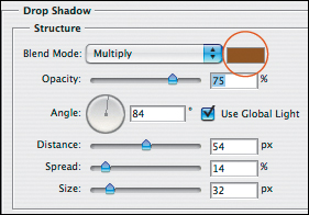
3. In the Layer Style dialog, Drop Shadow is selected; choose Drop Shadow settings.A Keep the dialog open.
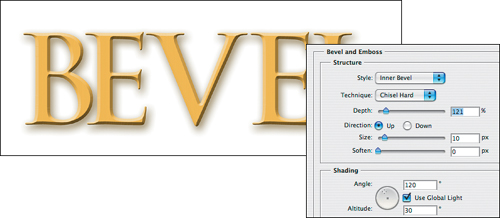
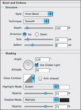
4. Click Bevel and Emboss. Choose Style: Inner Bevel and Technique: Chisel Hard, and choose Depth, Size, and Soften settings.B
5. Click Inner Glow and choose settings (A, next page).
6. Click OK. If desired, you can also apply a gradient to the Background, as we did (B–D, next page).
A We created editable type (Trajan Bold font, 105 pt.), then applied the Drop Shadow layer effect using the settings shown at right.
• While the Layer Style dialog is open, you can reposition a drop shadow manually by dragging in the document window.

B Next, we applied the Bevel and Emboss effect using the settings shown at right. Choosing Technique: Chisel Hard and keeping the Soften value at 0 produced the desired hard-edged bevel.
A The last layer effect we applied was Inner Glow, using the settings shown at right, to add a light sheen to the beveled edges.

B Finally, we added a gradient above the background in coordinating colors via a Gradient Fill layer (see page 228).

C This is the Layers panel for the final image, which is shown below.
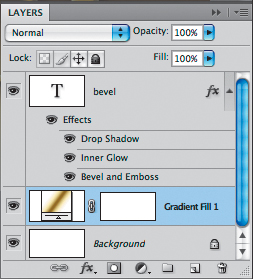
D The final image contains three layer effects, plus a Gradient Fill layer above the Background.

Now that you know how to apply layer effects, you can explore some variations. You’ll need to adjust the settings for your document dimensions and resolution, the colors on the Background, and the font, font size, and type color. The type images in this chapter have a file resolution of 300 ppi.
Carving letters in stone
A We created editable type (Trajan Bold font, 93 pt.) above a photo of granite on the Background. To reveal some of the underlying layer inside the type, we lowered its Fill percentage on the Layers panel (this setting can also be accessed in the Blending Options area of the Layer Style dialog).

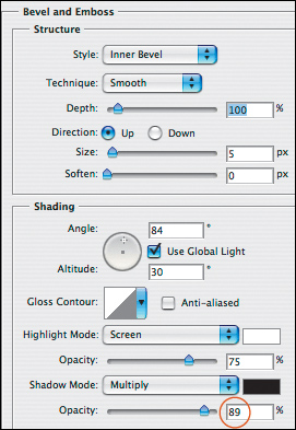
B We applied the Inner Shadow and Emboss effects. For Emboss, note the Opacity setting for Highlight Mode and the Color we chose for Shadow Mode.

C The type looks as though it’s carved into the stone.

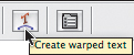
Warping the Carved Letters
A After applying the Inner Shadow and Emboss effects, we chose Layer > Type > Warp Text and the settings shown above.

B The warp text icon appeared in the layer thumbnail.

C To reopen the Warp Text dialog at any time to edit the settings, double-click the type layer thumbnail, then click this button on the Options bar.
D This is the same image as shown on the previous page, except with the Warp Text command applied (Arc style).

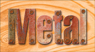
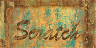
Making type look like rusted metal
Creating Type with a Rusted Metal Edge
A We created editable type (Bauhaus 93 Regular font, 223 pt.) above a photo of rusted metal.

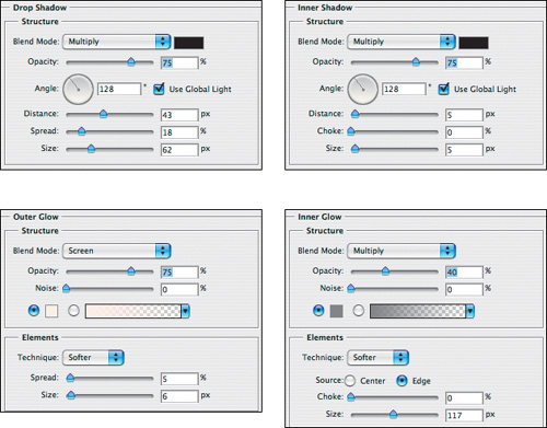
B We applied the Drop Shadow, Inner Shadow, Outer Glow, and Inner Glow effects, using the settings shown above.
A To reveal some of the underlying layer, we lowered the Fill percentage of the type layer. The results are acceptable, but we want to make the letters look more corroded.

B To “corrode” the edges of the type, we Ctrl/Cmd clicked the type layer thumbnail, clicked the Add Layer Mask button, then applied Filter > Brush Strokes > Spatter. This is the Layers panel for the final image, which is shown below.

C The Spatter filter added just the finishing touch we were after. (The Distort > Glass filter would also work well.)
Note: If you followed along with these steps, save your file and keep it open for the instructions on the following page.

Filling Type with a Rusted Metal Texture
As a variation on the previous task, we’ll show you how to fill the type characters with a texture by using a clipping mask, and intensify the texture by applying the Lighting Effects filter in a texture channel.
1. Save a copy of the file from the exercise on the preceding two pages, and make sure RGB Color is chosen on the Image > Mode submenu. Under the Effects bar, drag the Inner Glow listing to the Delete Layer button.![]()
2. On the Layers panel, reset the Fill value to 100%.
3. Duplicate the Background (Ctrl-J/Cmd-J), then restack the duplicate layer above the type layer.
4. Click the Background. Choose a new Foreground color, then press Alt-Backspace/Option-Delete to fill the Background with the current Foreground color.
5. Alt-click/Option-click the line between the top two layers to create a clipping mask.A
A To create a clipping mask, Alt/Option click the line between two layers.

6. Click the Background copy (topmost) layer, then choose Filter > Render > Lighting Effects.
7. In the Lighting Effects dialog, choose Style: 2 O’clock Spotlight and Texture Channel: Blue, then click OK.
8. To roughen the edges of the type, click the mask thumbnail on the type layer, then choose Filter > Distort > Glass. Adjust the sliders, set the Texture option to Frosted, then click OK.
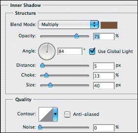
9. Double-click the Effects bar for the type layer. For Drop Shadow, lower the Opacity to around 55% and increase the Size to 85 px. For Inner Shadow, set the Distance to 7 px and the Size to 16 px. For Outer Glow, set both the Spread and Size to 7. Also apply the Bevel and Emboss effect (A–C, next page). Click OK.
Moving Imagery Within a Clipping Mask
Click the Background copy and then, with the Move tool, ![]() drag in the document window to reposition the imagery within the type shapes.
drag in the document window to reposition the imagery within the type shapes.
A Choose these settings for the Bevel and Emboss effect.
B This is the Layers panel for the final image, which is shown below.

C In this final image, the type is filled with the rusted metal texture, and it looks more corroded than in C on page 281.

Embossing leather
Note: For the Outer Glow effect, we clicked the color swatch, then clicked a color in the image.

A To create these embossed letters, we opened a photo of leather, and created type (Trajan Bold font, 112 pt.). We chose the Move tool, clicked the Color swatch on the Character panel, then chose a color for the type by clicking in the image (eyedropper pointer). We chose the Bevel and Emboss and Outer Glow settings shown above, chose Multiply mode for the type layer, and lowered the layer Opacity and Fill settings.

B We saved the settings shown above as a layer style (see page 275), then applied it to a type layer above a Background photo of a leather-covered book.
• We added the fleur-de-lis at the top of this image by using the Custom Shape tool and the Fleur-De-Lis shape preset (see pages 307–308). We copied the layer effects from the type layer to the shape layer by Alt/Option dragging the Effects bar, and then we lowered the layer Opacity to 67%. Finally, for the Outer Glow effect for the shape and type layers, we changed the color to an orangey brown.

Creating metallic type
Adding a Metallic Sheen to Type
A We created editable type above a photo of metal (Gill Sans Ultra Bold Condensed font, 109 pt.), then applied the Drop Shadow effect to the type.

B For the Drop Shadow, we clicked the color swatch, then clicked a dark color in the document window.
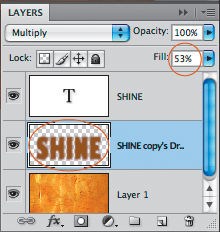
C We transferred the shadow effect to its own layer via Layer > Layer Style > Create Layer. Next, we clicked the drop shadow layer, chose Edit > Free Transform (Ctrl-T/Cmd-T), dragged the midpoint handle downward, then pressed Enter/Return (the fully transformed shadow is shown in C on the next page).

D The drop shadow appeared as a new rasterized layer above the image layer. We chose a Fill value for the shadow layer of 53%.
E Next, we clicked the type layer, then applied the Inner Shadow effect.
A Next, we applied the Bevel and Emboss effect (Inner Bevel style).
Note the Opacity setting we chose for Shadow Mode.
B We also applied the Gradient Overlay style (note the Angle setting). We clicked the Gradient bar to open the Gradient Editor dialog.

C In the Gradient Editor dialog for the Gradient Overlay style, we clicked below the gradient bar to add color stops and, for each stop, clicked a color in the document window.

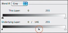
A Finally, in Blending Options, we held down Alt/Option and dragged the right part of the black Underlying Layer slider to reveal some of the image layer within the type (depending on the type color, you may not need to drag your slider as far as ours).
B The shiny metallic type is completed.

Creating Metallic Type with Grommets
1. Open an image to serve as a background, then create editable type.A
2. To create the metal texture, open a photograph of metal and then, with the Rectangular Marquee tool,![]() select all or most of the image.
select all or most of the image.
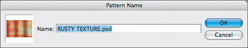
3. Choose Edit > Define Pattern.
4. In the Pattern Name dialog, enter a descriptive name, then click OK.B
A Create editable type (this is the Helvetica Bold Condensed font, 196 pt.).

B Define an area of a background image as a pattern preset.
C Apply the Drop Shadow, Emboss, and Pattern Overlay effects.


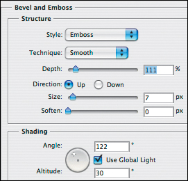
5. Click in the image that contains the type, and click the type layer. Apply the Drop Shadow, Emboss, and Pattern Overlay layer effects (settings shown below).C For the Pattern Overlay effect, choose your custom pattern from the Pattern preset picker. Click OK.
6. To create one of the grommets, click the type layer, then create a new blank layer. With the Elliptical Marquee tool,![]() Shift-drag to create a small circle. Choose a Foreground color (we chose a deep russet), then press Alt-Backspace/Option-Delete to fill the selection with the current Foreground color. Keep the circle selected!
Shift-drag to create a small circle. Choose a Foreground color (we chose a deep russet), then press Alt-Backspace/Option-Delete to fill the selection with the current Foreground color. Keep the circle selected!
7. With the Move tool ![]() (V), Alt-drag/Option-drag as many copies of the selection as you need. To copy it on the same axis, also hold down Shift. Now you can deselect.
(V), Alt-drag/Option-drag as many copies of the selection as you need. To copy it on the same axis, also hold down Shift. Now you can deselect.
8. Alt-drag/Option-drag the Effects bar from the type layer to the “Grommets” layer.
9. For the “Grommets” layer, hide the Pattern Overlay effect by clicking its visibility icon. Double-click the Bevel and Emboss effect, change the Style to Pillow Emboss, click the Down button, then click OK.
10. Apply the Outer Glow effect to the “Grommets” layer (settings shown below).A–C
A In addition to the effects that you copy from the type layer to the “Grommets” layer, also apply the Outer Glow effect.

B This is the Layers panel for the final image, which is shown below.

C This is the final image. We happen to like the contrast that the photo of wood provides as a background, but other texture imagery would also be suitable.
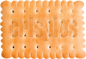
Stamping a product name
A We created editable type above an image layer (a photo of a cracker) in the Helvetica Extra Compressed font, 165 pt. To choose a color for the selected type layer, we clicked the Color swatch on the Character panel, then clicked a medium tan color in the image. Next, we applied the Inner Glow and Bevel and Emboss effects. For the Bevel and Emboss effect, we chose the Pillow Emboss style, clicked the Shadow Mode color swatch, then clicked a dark color in the image. Finally, in Blending Options, we Alt/Option dragged the left part of the white Underlying Layer slider about halfway to the left.

B The type looks as though it’s been stamped into the cracker.
Making type glow
Another way to manipulate type in Photoshop is by applying filters and/or gradients. The possible variations are virtually unlimited. On this page and the next two pages are a few ideas, for inspiration.
To illuminate type with gradients and a filter:
1. Create editable type for the top word in an orange color. Copy the type layer, then hide the original (keep it for potential future edits).
2. Right-click/Control-click the layer copy and choose Convert to Smart Object, then choose Filter > Blur > Gaussian Blur. Adjust the Radius slider to blur the type,A then click OK.
3. With the Horizontal Type tool,![]() type the bottom word, then press Ctrl-Enter/Cmd-Return. Right-click/Control-click this new type layer and choose Rasterize Type from the context menu.
type the bottom word, then press Ctrl-Enter/Cmd-Return. Right-click/Control-click this new type layer and choose Rasterize Type from the context menu.
4. Choose the Gradient tool ![]() (G or Shift-G) and click the Linear Gradient button on the Options bar. From the Gradient preset picker menu, choose Color Harmonies 1, then click Append. Click the Orange, Blue gradient on the picker.B
(G or Shift-G) and click the Linear Gradient button on the Options bar. From the Gradient preset picker menu, choose Color Harmonies 1, then click Append. Click the Orange, Blue gradient on the picker.B
5. Click the Lock Transparent Pixels button on the Layers panel, then Shift-drag a short distance from the top of the new word downward.
6. Optional: Click the Background, then via a Gradient Fill layer, apply a light-toned gradient.C–D
• To customize a gradient, double-click the Gradient preset picker thumbnail on the Options bar, click any gradient stop below the bar in the Gradient Editor, click the Color swatch, then click a color in the Color Picker or in the document window.
A Blur the type layer via the Gaussian Blur dialog.

B We applied the Orange, Blue gradient preset to the type...

C ...and we applied and the Light Spectrum gradient to the Background.

D You can easily create variations on this idea by changing the colors in the gradients (we used the Futura Extra Bold font, 86 pt.).

Creating graffiti
To create graffiti:
1. Open a background image that contains some texture, and create a new, blank layer.
2. Choose the Brush tool ![]() (B or Shift-B), choose a rough-edged brush tip,A click the Airbrush option on the Options bar (so the letters will look spray painted), and choose a Foreground color. Scribble some letters on the new layer.
(B or Shift-B), choose a rough-edged brush tip,A click the Airbrush option on the Options bar (so the letters will look spray painted), and choose a Foreground color. Scribble some letters on the new layer.
3. To create another layer of graffiti, create a new, blank layer, choose a new Foreground color, then scribble more letters.
4. To “corrode” the letters, double-click a graffiti layer and then, in the Blend If area of the Layer Style dialog, Alt-drag/Option-drag the black or white Underlying Layer slider a long or short distance, depending on which works best for the type color and background colors.B–D Repeat for the other graffiti layer.
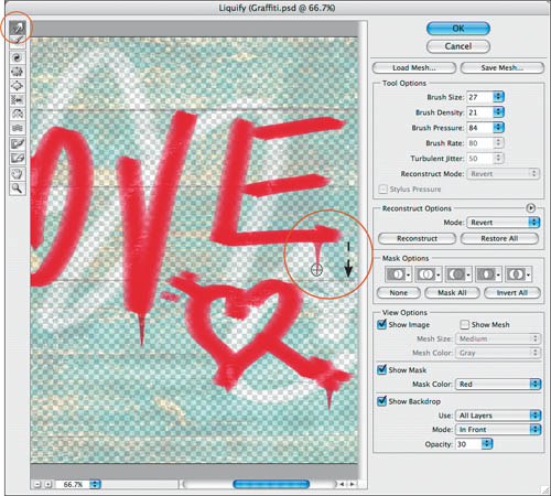
5. Optional: To make the paint “drip,” choose Filter > Liquify. In the dialog, choose the Forward Warp Tool ![]() (W) and choose Brush Size, Density, and Pressure settings. Drag from the end of a few characters downward—multiple times if necessary—to mimic the pull of gravity (A–B, next page).
(W) and choose Brush Size, Density, and Pressure settings. Drag from the end of a few characters downward—multiple times if necessary—to mimic the pull of gravity (A–B, next page).
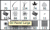
A Click a brush preset on the Brush preset picker. We chose the Oil Pastel Large preset for the white graffiti and the Watercolor Loaded Wet Flat Tip for the red graffiti.
B We moved the left part of the white Underlying Layer slider slightly to the left for the red letters...

C ...and moved the right part of the black Underlying Layer slider to the right for the white letters.

D To create the graffiti in this image, we drew letters with the Brush tool, then used the Blend If sliders in the Layer Style dialog for each graffiti layer to partially reveal the underlying image layer.

Making Drip Marks
A To make the paint drips, we opened the Liquify dialog and dragged downward several times with the Forward Warp tool in a few areas.
B The final graffiti image has paint drips, and the letters look as if they’ve been slightly weathered by the elements.

Making type look corroded
By hiding pixels from a type layer, you can make the type look as if it’s been worn away or eroded. We’ll show you two different ways to do this: by using a layer mask and by using the Blend If sliders in the Layer Style dialog. Shop and compare.
To create corroded type:
Method 1
1. Open a photo of a surface texture, and create editable type in a contrasting color.A
2. Do either of the following:
Choose the Pencil tool ![]() and a very small brush tip.
and a very small brush tip.
Choose the Brush tool ![]() and a small rough-edged brush tip, such as one of the Spatter tips.
and a small rough-edged brush tip, such as one of the Spatter tips.
3. With the type layer selected, click the Add Layer Mask ![]() button on the Layers panel.
button on the Layers panel.
4. Choose an Opacity of 40–50% on the Options bar, click the layer mask thumbnail, make the Foreground color black, then draw quick scratches or scribbles in the document window.B To add variety, switch the tool and/or brush tip and apply more strokes.
• To undo the last stroke, either click an earlier state on the History panel or press X and paint over any unwanted strokes with white (brush Opacity of 100%).
A We created an editable type layer (Brush Script font, 109 pt.) on top of a photo of a textured wall on the Background.

B Pencil and Brush tool strokes that we applied to the mask on the type layer are partially hiding the type and partially revealing the Background.

1. Open a photo of a surface texture, then create editable type in a contrasting color.
2. To distress the type, you’ll force dark or light colors from the image to show through the type. Double-click the type layer to open the Layer Style dialog.
3. If the type is darker than the background, in the Blend If area, drag the black Underlying Layer slider to the right until some dark (underlying) colors start to show through the type layer,A then Alt-drag/Option-drag the right half of the black slider farther to the right.B If the type is lighter than the background, do the same thing with the white Underlying Layer slider instead.
4. Click OK.
A In the Blend If area of the Layer Style dialog, we dragged the black Underlying Layer slider to the right. Dark colors from the texture layer now show through the type layer.

B Next, we Alt/Option dragged the Underlying Layer sliders to enable mid-tone colors from the underlying texture layer to show through the type layer. (If you want to let highlight areas show through, drag the white Underlying Layer slider.)

Cutting up a rasterized type layer
If you can’t achieve the desired type treatment by using layer effects, filters, or masks, another option is to rasterize the type layer, then “attack” the type characters with knives (well, actually, a lasso tool)!
To create a cut paper effect:
1. Create an editable type layer, duplicate it, and right-click/Control-click the layer and choose Rasterize Type. Hide the editable type layer.
2. To select a portion of a type character, drag with the Lasso tool ![]() (L or Shift-L) or click with the Polygonal Lasso tool.
(L or Shift-L) or click with the Polygonal Lasso tool.![]() A
A
3. Choose the Move tool ![]() (V), then drag the selection in the document window or press any arrow key.B–D
(V), then drag the selection in the document window or press any arrow key.B–D
4. Repeat steps 2–3 for other characters to create a pleasing arrangement (A, next page).
A We created editable type (Futura Extra Bold font, 102 pt.), duplicated and hid the type layer, and rasterized the duplicate. With the Polygonal Lasso tool, we created a straight-edged selection of the stem on the letter P.

B We repositioned the selection with the Move tool.

C We used the Lasso tool to create an irregular selection of the top of the letter A...

D ...then repositioned the selection by pressing the up and right arrow keys.

A This is the final “cut paper” image after we moved more straight-edged and irregularly shaped selections of the rasterized type layer.

Putting Sections of Rasterized Type on Separate Layers
B With the Magic Wand tool (Tolerance 0, Contiguous checked), we clicked each piece of “paper” separately, then pressed Ctrl-J/Cmd-J to put it on a separate layer.

C With the sections on different layers, we were able to apply a different Color Overlay and the Drop Shadow layer effect to each one, and move each layer individually. Fun!

Transforming type to fit onto a perspective plane
In this example, we’ll “adhere” type to a photo of a porcelain bowl. These steps would also work with a photo of a vehicle, package, billboard, interior wall—you get the idea.
A We entered type (Sanvito Roman font, 81 pt.) above an image layer, then chose the Move tool. To apply a color to the selected type layer, we clicked the Color swatch on the Character panel, clicked a green area of the napkin in the image (not shown), then clicked OK to exit the Color Picker. Next, we duplicated the type layer, kept the duplicate layer selected, right/Control clicked the layer and chose Convert to Shape, then hid the original type layer.
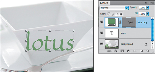
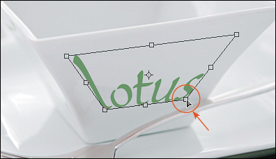
B We clicked the vector mask thumb-nail, then pressed Ctrl-T/Cmd-T to display the transform box for the Free Transform command. To make the type conform to the angle of the top of the bowl, we Ctrl/Cmd dragged the middle handle on the right side upward (a skew transformation).

C To make the type conform even more closely to the bowl shape, we Ctrl-Alt-Shift/Cmd-Option-Shift dragged a bottom corner handle of the transform box inward (to apply perspective).

A The final transformations were to Ctrl/Cmd drag the bottom right and left corner handles diagonally inward to distort the type, aligning it with the inward slant of the bowl; we double-clicked inside the transform box to accept the transformation.
• To scale type horizontally, drag either of the side middle handles.
B To blend the type with the surface of the bowl, we applied the Outer Glow and Satin layer effects and adjusted the Blend If sliders to add reflections and shadows (settings shown below).

C For the Outer Glow effect, we changed the Outer Glow color to a medium dark gray (to match the bowl color) and adjusted the Opacity.

D For the Satin effect, we chose Difference mode, lowered the Opacity, changed the color to a very light gray to match the bowl, and dragged the Size slider just far enough to minimize the dark areas. The effect will be enhanced by changes to the Blend Options settings in the next step.

E Finally, in Blend Options, we Alt/Option dragged the white This Layer and white Underlying Layer sliders to reveal light colors and surface reflections from the image layer through the type layer.

Putting screened-back type on a bar
To create screened-back type on a bar:
1. Open a background image, then create editable type.
2. Ctrl-click/Cmd-click the type layer to create a selection from it, then hide it.
3. On the Adjustments panel,![]() click the Levels button.
click the Levels button.![]()
![]() Move the gray slider to the left.A Note that the type shapes have become white shapes in the adjustment layer mask.
Move the gray slider to the left.A Note that the type shapes have become white shapes in the adjustment layer mask.
4. Choose the Rectangular Marquee tool,![]() then drag a narrow vertical rectangle. Create a second Levels adjustment layer, except this time move the gray slider to the right instead of to the left.B–C (Note: We renamed our adjustment layers.)
then drag a narrow vertical rectangle. Create a second Levels adjustment layer, except this time move the gray slider to the right instead of to the left.B–C (Note: We renamed our adjustment layers.)
5. Optional: Apply layer effects to, or change the Opacity setting for, the topmost adjustment layer.D
A We chose these settings for our “imagine” Levels adjustment layer...

B ...and chose these Levels settings for our “bar” adjustment layer.

C The Levels adjustments are revealed only within the shapes in the layer masks.

D To the topmost (“bar”) adjustment layer, we applied the Inner Shadow layer effect (Distance 8, Choke 0, Size 60). We also lowered the layer Opacity to 60% and its Fill value to 15%.

6. On the Layers panel, Shift-click the two adjustment layers, then click the Link button ![]() (Link icons appear).A Now you can transform (e.g., scale, move) them as a unit.B–D
(Link icons appear).A Now you can transform (e.g., scale, move) them as a unit.B–D
A We linked the two adjustment layers so they will transform as a unit.

B To narrow the bar and type shapes in the adjustment layer masks, we pressed Ctrl-T/Cmd-T, then dragged the center handle inward.
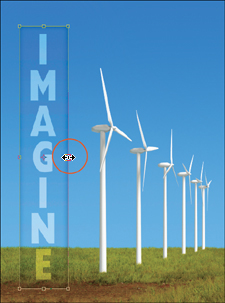
C Finally, to match the perspective plane of the wind turbines, we dragged the upper right handle downward with Ctrl-Alt-Shift/Cmd-Option-Shift held down, then pressed Enter/Return to accept the edit.

D Now the type and bar shapes are well integrated with the photo.

Creating skywriting
To create skywriting:
1. Open an image to be used as the background, and create a new blank layer.
2. With the Pencil tool,![]() and with white chosen as the Foreground color, draw some letters. Right-click/Control-click the layer and choose Convert to Smart Object.
and with white chosen as the Foreground color, draw some letters. Right-click/Control-click the layer and choose Convert to Smart Object.
3. Optional: If you want to make the letters thinner, apply Filter > Other > Maximum.
4. Choose Filter > Blur > Motion Blur, choose a Distance setting of 20–30 pixels, then click OK.
5. Choose Filter > Stylize > Wind, click Wind and From the Right, then click OK.
6. Choose the Gradient tool ![]() (G or Shift-G). On the Options bar, click the Black, White preset on the Gradient preset picker, click the Linear Gradient button, set the Mode to Normal, set the Opacity to 100%, and uncheck Reverse.
(G or Shift-G). On the Options bar, click the Black, White preset on the Gradient preset picker, click the Linear Gradient button, set the Mode to Normal, set the Opacity to 100%, and uncheck Reverse.
7. Click the filter effects mask thumbnail (to the left of “Smart Filters”), then drag from the right edge of the document window halfway to two-thirds of the way across the type.A–B
A This is the Layers panel for the final image. Note that the filter effects mask contains a gradient. (If you need to edit the settings for any filter, double-click the filter name.)

B To produce this skywriting, we drew letters with the Pencil tool (15 px diameter tip), applied three filters, and masked part of the effect by applying a gradient to the filter effects mask.
