10. Tinting & Blending
Sometimes a photo speaks for itself and is best left as is, and sometimes a little extra processing, such as applying a tint or a photo filter, can elevate an ordinary photo into an extraordinary one or help your viewers see a subject from a new perspective.
A few of the tasks in this chapter, such as layering gradients in the background with the Gradient tool, involve adding colors to an image to round out the scene. Most of the tasks, however, involve paring colors down to grayscale in one way or another, and then judiciously reintroducing color by using adjustment layers, such as Hue/Saturation, Black & White, or Photo Filter, or filters, such as Lighting Effects. The final task involves choosing settings for commercial duotone printing, a technique in which a subtle color tint is added to a grayscale print by using an extra plate and ink color.
What formerly took many hours of experimentation in the darkroom can now be accomplished with a few clicks of the mouse in Photoshop. To get good results with the techniques you’ll learn in this chapter, try to choose a method that suits the subject matter of the image. For example, it would be overkill to apply a gradient to a photo of a brightly colored or complex object, but it might add just the right kick to a simple or ordinary one. If you want to showcase a particular area in a landscape or product shot, try the “Restoring color selectively” method on page 238.
Although the technical aspects of photography, such as lighting, exposure, focus, depth of field, and timing—and equipment—do affect the outcome dramatically, no amount of postcapture processing and image editing can compensate for a poorly framed shot. A photo that has “good bones”—meaning a good composition and strong linear elements—will be a great candidate for the color reduction methods covered in this chapter, such as the faux infrared effect, whereas the same technique might just accentuate and magnify the flaws in a weaker photo. When browsing through prospective photos for tinting or color reduction, try to imagine what they would look like in grayscale (see them as a cat would!).
Note: Settings listed in the captions in this chapter were chosen for photos that are approximately 3000 × 2000 pixels.
Layering gradients
In this task, you’ll learn how to create a complex, blended background using multiple Gradient Fill layers. A subject that is silhouetted on a white background, such as a high-tech product or fashion shot, would be an excellent candidate for this treatment. The advantage of using Gradient Fill layers is that you can reopen the Gradient Fill dialog at any time to edit the gradients.
To layer multiple gradients:
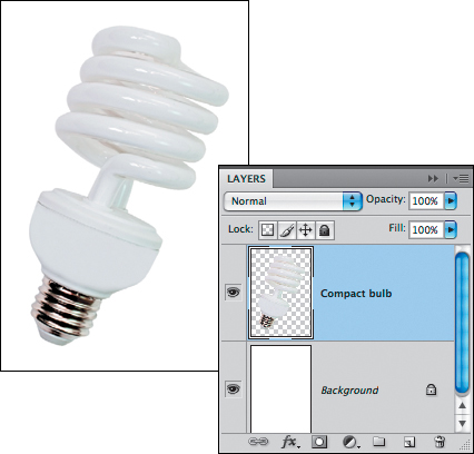
1. Create an RGB document that has a white Background and a silhouetted object on a layer. On the Layers panel, click the Background.A
2. If it’s not already active, click the Foreground color square on the Color panel.![]() Click a color on the Swatches panel; or create a color via the Color panel, then save it to the Swatches panel
Click a color on the Swatches panel; or create a color via the Color panel, then save it to the Swatches panel ![]() by clicking the New Swatch of Foreground Color button.
by clicking the New Swatch of Foreground Color button.![]()
3. From the New Fill/Adjustment Layer menu ![]() on the Layers panel, choose Gradient. The Gradient Fill dialog opens.
on the Layers panel, choose Gradient. The Gradient Fill dialog opens.
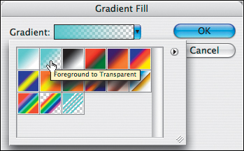
4. Click the arrowhead to the right of the gradient thumbnail to open the Gradient preset picker, click the Foreground to Transparent preset,B then click again in the dialog.
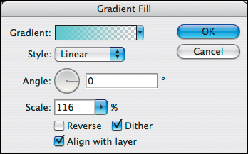
Choose Linear from the Style menu, rotate the Angle dial to set the angle of the gradient, adjust the Scale value via the slider to control where the color transitions to transparency on the image,C keep Dither checked for better print results, and click OK.D
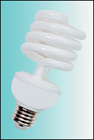
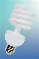
A This photo of a compact fluorescent bulb consists of a silhouetted object on a layer and a white Background below it.
B After choosing a Foreground color, we created a Gradient Fill layer, then chose the Foreground to Transparent preset from the Gradient preset picker.
C We also chose these Style, Angle, and Scale settings for the first Gradient Fill layer.
D The first Gradient Fill layer (Style: Linear) is visible behind the bulb.
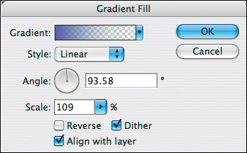
5. To create another fill layer, repeat steps 2–4 on the preceding page. Experiment with different Style, Angle, and Scale settings.A–B
• For added depth or contrast, apply layer effects to the silhouetted object.C–D
• To change the Foreground color in the Gradient Fill layer, double-click the layer thumbnail, click the gradient thumbnail in the Gradient Fill dialog, click the left color stop below the gradient bar in the Gradient Editor dialog, then click the Color swatch at the bottom of the dialog to open the Color Picker. After choosing a color, click OK twice.
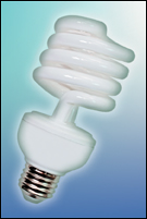
A For our second Gradient Fill layer, we chose these dialog settings and a new Foreground color.
B The two gradient fill layers create a beautiful glow in the background.
C This is the Layers panel for the final image, which is shown at right.
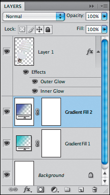
D To add depth and contrast to produce this final image, we added two layer effects—Inner Glow and Outer Glow.
Lighting a background
Another way to enhance a silhouetted object is by adding dramatic background lighting. This is easy to achieve with the Lighting Effects filter.
To apply lighting and create a reflection:
1. Create an RGB document that consists of a Background plus a silhouetted object positioned on a layer approximately two-thirds of the way down from the top.
2. On the Color panel,![]() click the Foreground color square to open the Color Picker. Click to sample a medium-light color in the image, then click OK.
click the Foreground color square to open the Color Picker. Click to sample a medium-light color in the image, then click OK.
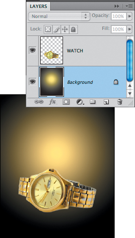
3. On the Layers panel, click the Background.
4. Press Shift-Backspace/Shift-Delete to open the Fill dialog. Choose Use: Foreground Color, Mode: Normal, and Opacity: 100%. Click OK.A
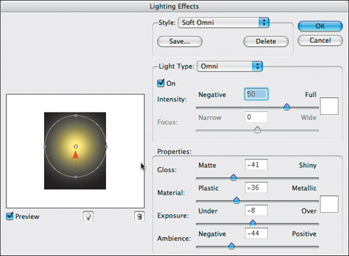
5. To apply lighting, choose Filter > Render > Lighting Effects. The Lighting Effects dialog opens.B
6. From the Style menu, choose Soft Omni. In the lighting preview, drag the bottom handle on the circle downward or upward until the side handles touch the edges of the dark area, then drag the white center point to just above the center of the dark area. Click OK.C
A Via the Fill dialog, we filled the Background with a Foreground color that we sampled from the image layer.
B In the Lighting Effects dialog, we chose Style: Soft Omni. We dragged the bottom handle of the circle until the side handles touched the edges of the preview and repositioned the center of the circle slightly above the middle of the preview.
C The results of the Lighting Effects filter appeared in the Background.
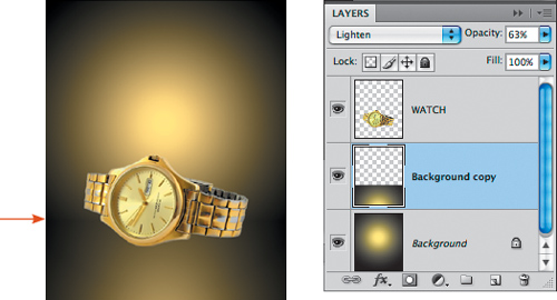
7. Press Ctrl-J/Cmd-J to duplicate the Background.
8. For the duplicate layer, change the blending mode to Lighten. Choose the Move tool (V) ![]() and uncheck Show Transform Controls on the Options bar. Start dragging in the document window, then hold down Shift and continue to drag to move the duplicate lighting layer downward until you see a subtle dark seam.A Lower the layer Opacity to a value that looks good.
and uncheck Show Transform Controls on the Options bar. Start dragging in the document window, then hold down Shift and continue to drag to move the duplicate lighting layer downward until you see a subtle dark seam.A Lower the layer Opacity to a value that looks good.
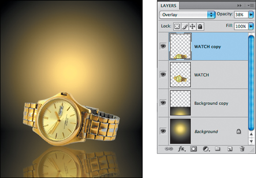
9. Finally, you’ll create a reflection of the object to create the appearance of a shiny surface: Click the object silhouette layer, press Ctrl-J/Cmd-J to duplicate it, then choose Edit > Transform > Flip Vertical.
With the Move tool, Shift-drag the reflection downward until the bottom lines up with the bottom of the duplicate object.
Choose Overlay as the layer blending mode, and lower the layer Opacity to 20–40%. Voilà!B
A We changed the blending mode of the duplicate lighting layer to Lighten, then moved the layer downward until a subtle seam appeared between the two lighting layers (see the arrow at left). We also lowered the layer Opacity.
B We duplicated the object layer, applied Transform > Flip Vertical, and dragged the duplicate layer downward. Finally, we chose Overlay as the blending mode and lowered the layer Opacity to 38%.
Desaturating colors selectively
One way to emphasize part of an image is by desaturating most of the colors while preserving, or even heightening, the saturation in a specific color range. In this task, you’ll use a Hue/Saturation adjustment layer to subdue the less important colors and intensify the more important ones.
To desaturate colors selectively: ![]()
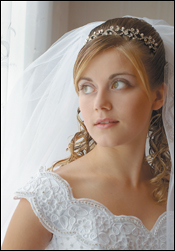
1. Open an RGB image that has strong coloration.A
2. On the Adjustments panel,![]() click the Hue/Saturation button.
click the Hue/Saturation button. ![]() Just to demonstrate a point, with Master chosen on the second menu, move the Saturation slider to the left.
Just to demonstrate a point, with Master chosen on the second menu, move the Saturation slider to the left.
As you can see, this generalized approach to desaturation won’t allow you to de-emphasize some colors while selectively preserving others.B Click the Reset to Adjustment Defaults button ![]() to reset the Saturation to 0.
to reset the Saturation to 0.
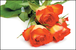
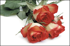
A Because this whole image is highly saturated, no single area is taking center stage. Our goal is to tone down the greens and yellows while preserving some of the reds in the most important part of the image: the flower petals.
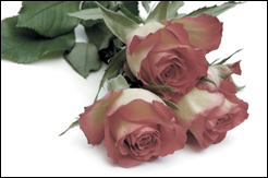
B Via a Hue/Saturation adjustment layer, we tried reducing the Saturation for the Master color range (all the colors). Now the whole image looks dull, including the rose petals, so we’ll reset the Saturation for the Master range to 0 and try a more selective approach instead.
3. From the second menu, choose a color range to be desaturated, then reduce the Saturation.A Repeat for any other ranges.
4. Optional: Try increasing the Lightness value slightly for any range you desaturated.B
5. Optional: To enhance the results, for the Hue/Saturation adjustment layer, choose Saturation as the blending mode.C
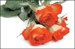
A To subdue the colors of the leaves, we reduced the Saturation for the Greens color range to –80 and reduced the Saturation for the Yellows color range to –60.
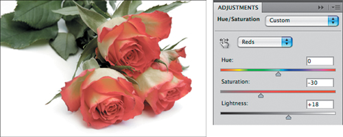
B Next, we reduced the Saturation and increased the Lightness for the Reds color range, using the settings shown above. This improved the coloration in the rose petals.
C Finally, we chose Saturation as the blending mode for the Hue/Saturation adjustment layer, which muted the greens even more and softened the transition between the strong reds and desaturated yellows in the rose petals.
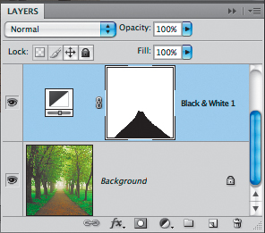
Tinting an image
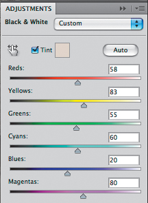
When you replace all the color in an image with a color tint, instead of the color drawing the eye through the composition, the pattern of lights and darks orchestrates the scene. Here, you’ll use a Black & White adjustment layer to convert an image to grayscale and intensify the contrast, and apply a tint and a Photo Filter to neutralize the highlights.
To apply a tint to an image:![]()
1. Open an RGB image.A
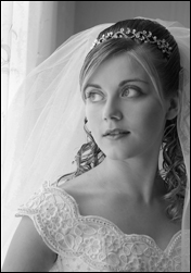
2. On the Adjustments panel,![]() click the Black & White button.
click the Black & White button.![]()
3. The image is converted to grayscale. Do either or both of the following:
Heighten the contrast by moving the sliders.B–C
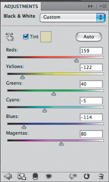
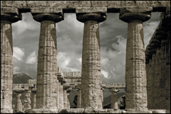
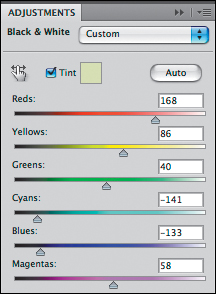
A This image is a good candidate for tinting because it contains strong sculptural forms and has good tonal contrast in the two main color areas (the stone pillars and sky).
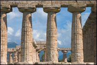
B The Black & White adjustment converted the photo to grayscale. We reduced the Cyans and Blues values to intensify the contrast in the sky.
C Next, we moved the Reds and Yellows sliders in opposite directions to create subtle contrast and to enhance the detail in the columns.
Click the On-Image Adjustment tool ![]() on the panel, then in the document window, drag to the right or left over a grayscale shade that you want to lighten or darken; this will move the corresponding color slider in the dialog.
on the panel, then in the document window, drag to the right or left over a grayscale shade that you want to lighten or darken; this will move the corresponding color slider in the dialog.
4. Check Tint.A Click the color swatch to open the Color Picker, choose a color, then click OK.
• For a sepia or earth-toned hue, try values of H: 38, S: 20, and B: 78.
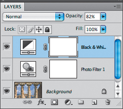
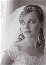
5. Optional: On the Layers panel, click the Black & White layer, and lower its Opacity slightly.B
6. On the Adjustments panel,![]() click the Return to Adjustment List button,
click the Return to Adjustment List button,![]() then click the Photo Filter button.
then click the Photo Filter button.![]()
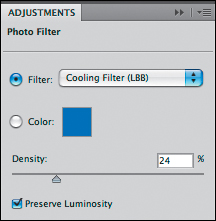
7. From the Filter menu, choose a filter that has an opposite color temperature (warm or cool) from the tint color that you applied. Set the Density slider to 20–30% and check Preserve Luminosity.
8. Lower the Opacity of the Photo Filter layer to around 50–60%.C
See also the optional step and illustrations on the following page, and see also page 237.
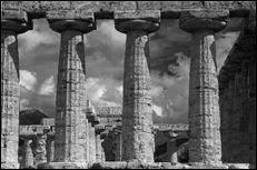
A With the Black & White dialog still open, we applied a Tint (as shown in C on the preceding page).
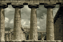
B We lowered the Opacity of the adjustment layer to 82% to reveal a bit of color from the original photo.
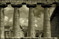
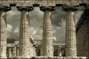
C Finally, to neutralize the colors and counterbalance the warm Tint, we applied a cooling filter via a Photo Filter adjustment layer, then lowered the adjustment layer Opacity to 50%. The tints enhance the stunning architecture.
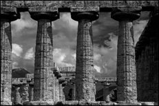
9. Optional: Restack the Photo Filter adjustment layer below the Black & White adjustment layer, and see if you like how it alters the colors.A
A We discovered that the simple step of restacking the Photo Filter layer below the Black & White layer produced better contrast and added a silvery quality to the highlights.
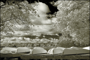
Another Image Tinted the Same Way
A We’ll apply the same “silver” tinting method to this photo, which has two dominant color ranges (oranges and blues) plus white, and strong lighting contrasts.
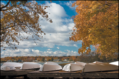
B Via a Black & White adjustment layer, we lowered the Cyans and Blues to intensify the contrast in the sky (as in B on page 234), and increased the Reds and Yellows to lighten the midtones and highlights. We applied a pale yellowish tint, and left the layer Opacity at 100%.
C Just as in C on page 235, we applied a cooling filter via a Photo Filter adjustment layer, then lowered the adjustment layer Opacity to 50%. This time, however, we kept the Photo Filter layer stacked above the Black & White layer.
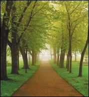
Restoring color selectively
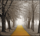
In the photo shown at right,A the path is a strong geometric element that anchors the whole image, but it’s overpowered by all the greenery. We’ll enhance it by applying a sympathetic color tint while desaturating the rest of the photo.
To restore a color to a desaturated image:![]()
1. Open an RGB photo that contains a distinct color area that you want to emphasize.
2. To make it easier to select the area to be tinted, on the Adjustments panel,![]() click the Black & White button.
click the Black & White button.![]() Use the sliders to intensify the contrast between the area to be tinted and the surrounding areas.
Use the sliders to intensify the contrast between the area to be tinted and the surrounding areas.
3. With the Quick Selection tool ![]() or Magic Wand tool,
or Magic Wand tool,![]() click or drag to select the area to be tinted.B
click or drag to select the area to be tinted.B
4. On the Adjustments panel, click the Return to Adjustment List button,![]() then click the Black & White button
then click the Black & White button ![]() to create a second adjustment layer.
to create a second adjustment layer.
5. Display the Masks panel,![]() click Invert, then redisplay the Adjustments panel.
click Invert, then redisplay the Adjustments panel.
A The path in this photo is a strong compositional element. To emphasize it, we’ll heighten its color while converting the rest of the photo to grayscale.
B We used a Black & White adjustment layer to increase the contrast, to make it easier to select the path via the Quick Selection tool.
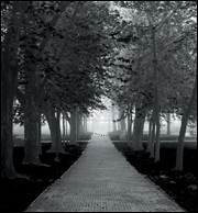
C With the selection active, we created a new adjustment layer and inverted its mask. The selected area (grass and trees) corresponds to the white area in the mask, whereas the black area is masking the path. Next, we deleted the original Black & White layer.
6. Delete the original (lower) Black & White adjustment layer.C For the remaining Black & White layer, use the sliders to create a well-balanced black and white conversion.A
Check Tint. Click the color swatch to open the Color Picker, choose a low saturation color that won’t compete with the color being preserved by the mask, then click OK.B
7. Optional: To boost the contrast and intensity, click the Return to Adjustment List button ![]() on the Adjustments panel, create a Brightness/Contrast adjustment layer,
on the Adjustments panel, create a Brightness/Contrast adjustment layer,![]() and increase the Brightness value. On the Layers panel, change the blending mode for this adjustment layer to Soft Light and change the layer Opacity to 70–80%.C
and increase the Brightness value. On the Layers panel, change the blending mode for this adjustment layer to Soft Light and change the layer Opacity to 70–80%.C
A For the second Black & White adjustment, we used the sliders to lighten the grays in the leaves and grass and also applied a Tint similar to the original path color to unify the image.
B This is the image after we applied the second Black & White adjustment, which includes a subtle tint.
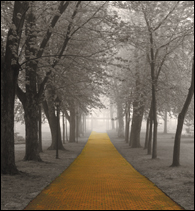
C Finally, we used a Brightness/Contrast adjustment layer (Brightness +100) to lighten the entire photo and chose Soft Light mode for the layer (80% Opacity) to enrich the color and tint. Now the delicate, intricate trees are balanced by the solid geometric path.
Creating an infrared effect
Normally, infrared light waves aren’t visible to the human eye, but photographers can capture images in this wavelength by using special infrared filters. In Photoshop, you can simulate the surreal effect of infrared photography by using the Monochrome option in the Channel Mixer, followed by the Diffuse Glow filter.
To create an infrared effect:![]()
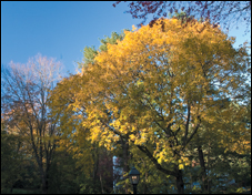
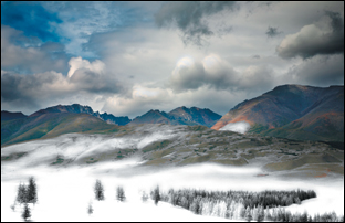
1. Open an RGB landscape photo that has some green areas and good contrast, and is sharp.A Press Ctrl-J/Cmd-J to duplicate the Background, and keep the duplicate layer selected.
2. On the Adjustments panel,![]() click the Channel Mixer button.
click the Channel Mixer button.![]()
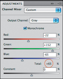
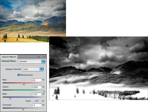
3. Check Monochrome to convert the photo to grayscale. Move the Green slider almost all the way to the right to lighten the greens, move the Red slider slightly to the left or right, and move the Blue slider to the left. The aim is to create contrast between the light greens and the other colors. We’ve gotten good results by keeping the Total of the three sliders (listed below the sliders) at or below 100% B (and A, next page).
If you also want to darken the entire photo, drag the Constant slider to between –1 and –5.
4. Optional: You’re going to merge the adjustment layer downward in the next step, but before doing so, you may want to duplicate it and then hide the duplicate, to preserve the option to edit it later.
5. Select the visible adjustment layer, then press Ctrl-E/Cmd-E to merge it with the duplicate of the Background.
6. Right-click/Control-click the duplicate layer and choose Convert to Smart Object. This conversion will enable the filter that you’re going to apply next to remain editable.
A An infrared treatment is going to transform this ordinary image.
B For the Channel Mixer adjustment, we checked Monochrome. To increase the contrast, we moved the Green slider to the far right, and moved the Red and Blue sliders to the left by differing amounts.
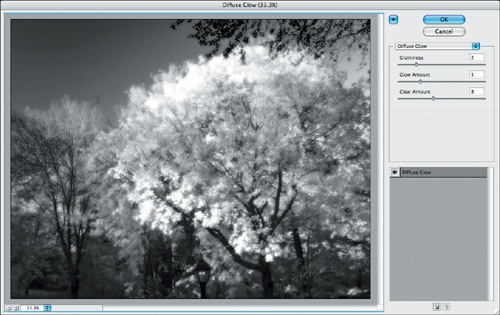
7. To simulate the glow that infrared photos develop (due to the requisite long exposure times), choose Filter > Distort > Diffuse Glow.
8. In the Filter Gallery, do the following: B
Click the Hide Thumbnails ![]() button to hide the pane of thumbnails, and lower the zoom level for the preview.
button to hide the pane of thumbnails, and lower the zoom level for the preview.
Adjust the three sliders to achieve the desired amount of graininess and glow. As you raise the Glow Amount, you’ll also need to raise the Clear Amount. Click OK. Don’t worry if the highlights now lack detail; you can correct that somewhat in the next step.
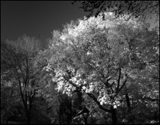
A Our Channel Mixer adjustment produced this grayscale image and a simplified composition. Now the strong highlights (former green areas) are taking center stage.
B In the Filter Gallery, we chose these settings for the Diffuse Glow filter: Graininess 2; Glow Amount 5 (to create a glow without clipping too many highlights); and Clear Amount 8 (to lighten the entire photo).
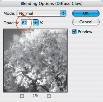
9. If the Diffuse Glow filter clipped the highlights, double-click the Edit Blending Options button ![]() (to the right of the filter name listing on the Layers panel) A to open the Blending Options [filter name] dialog.
(to the right of the filter name listing on the Layers panel) A to open the Blending Options [filter name] dialog.
10. Reduce the zoom level in the dialog, lower the Opacity to restore some detail to the highlight areas,B then click OK.C
• Each Smart Filter can be edited individually: Double-click the filter name to edit the filter settings; or choose a different blending mode or Opacity via the Blending Options dialog; or hide the filter effect by clicking its visibility icon.
A On the Layers panel, we’ll double-click the Edit Blending Options button to open the Blending Options dialog.
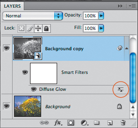
B In the Blending Options dialog, we lowered the Opacity for the Diffuse Glow filter to restore some detail to the highlights.
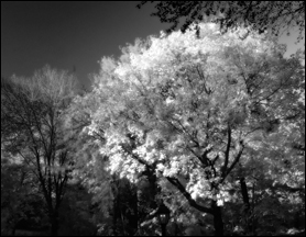
C By simplifying and intensifying the lights and darks, the infrared effect produced this luminous, surreal image.
A Variation on the Infrared Effect
A We followed the steps on pages 240–242 to create this infrared effect. We chose the settings shown at left for the Channel Mixer, then merged it into a copy of the Background.
B To restore some color to the distant mountains and sky (the nongreen areas in the original photo), we chose Lighter Color as the blending mode for the Smart Object layer.
Creating a duotone
To create a duotone, commercial printers use one or more additional plates and ink colors for a grayscale image to lend it added depth and richness and to extend its tonal range (especially in the midtones). Via the Duotone Options dialog, you can specify settings for printing a duotone (two plates), tritone (three plates), or quadtone (four plates). Although you could choose custom colors and control how they’re distributed across the tonal range, it will be easier—and, more important, will help prevent printing problems—if you use a preset.
Note: The only way to proof a duotone is via a press proof (it can’t be done via a PostScript color printer).
To create a duotone by using a preset:
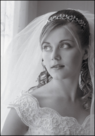
1. Open an RGB image, and make sure it has good contrast, so it will look good after the grayscale conversion in the next step. If you need to adjust (e.g., increase) the contrast, use a Black & White adjustment layer, then merge it downward.A
2. Choose Image > Mode > Grayscale to convert the image to grayscale.B Click Discard in the alert dialog.
3. Choose Image > Mode > Duotone. The Duotone Options dialog opens.
4. Choose Duotone from the Type menu to create a duotone that uses Black and one color.
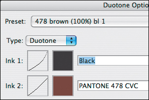
5. From the Preset menu,![]() choose one of the presets that ends in 1. A tint will be applied to the image (A, next page), and swatches will display for the Ink 1 and Ink 2 colors (B, next page).
choose one of the presets that ends in 1. A tint will be applied to the image (A, next page), and swatches will display for the Ink 1 and Ink 2 colors (B, next page).
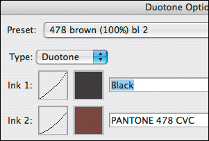
6. To view a preset that has a more muted color scheme for comparison, from the Preset menu, choose a preset that ends in 2.
7. Sample other duotone presets, if desired. When you settle on one that you like, click OK to close the Duotone Options dialog (C–D, next page).
• The duotone presets that end with a 1 apply the most color, whereas the presets ending in 2, 3, and 4 apply progressively less color to a smaller range of midtones.
• To edit the existing duotone settings for an image, reopen the Duotone Options dialog by choosing Image > Mode > Duotone.
B We used a Black & White adjustment layer to correct the contrast before converting the image mode to Grayscale.
• The presets differ not only in the color that they apply, but also in the shape of the curves, which display in the Ink 1 and Ink 2 thumbnails.
A We converted the image to Duotone mode, and applied the 478 brown (100%) bl 1 duotone preset.
B The settings for the 478 brown (100%) bl 1 preset display in the Duotone Options dialog.
C For comparison, this is the 478 brown (100%) bl 2 duotone preset (well...actually, these are simulated duotones).
D Note that although the same PANTONE color is being used for this 478 brown (100%) bl 2 preset as the one shown at left, the Ink 1 and Ink 2 curves have a different shape. This preset applies less color to the midtones (the Ink 2 curve is lower).
To choose a file format for a duotone
If you’re going to print your duotone file directly from Photoshop, save it in the PSD format.
If you’re going to import the duotone file into a page layout program, do either of the following:
To import the file into an InDesign CS3 or CS4 layout for two-color printing (black plus one color), save it in either the Photoshop (PSD) or Photoshop PDF format. For other layout programs, use the Photoshop EPS format (see step 6 in the instructions below).
To import the file into a page layout program for printing with four-color process inks, first convert it to CMYK mode (Image > Mode > CMYK Color), then save it in the PSD, PDF, or TIFF format, depending on which format the layout program supports.
To ensure that your commercial printer outputs your duotone using two plates, tell them the duo-tone is set up with black as Ink 1, and ask which format you should save the file in. The order of inks and the screen angles will affect the outcome, so also ask if they’ll take care of choosing screen angles for the colored ink, or if they would rather provide you with the necessary information so you can do it. In the latter case, follow the instructions below.
To choose options for duotone printing:
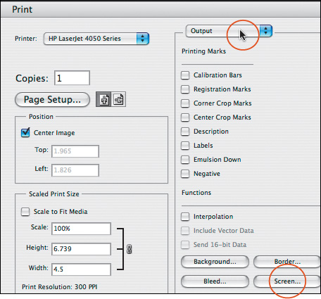
1. With the duotone file open, choose File > Print.
2. In the Print dialog, choose Output from the menu in the upper right, then click Screen.A
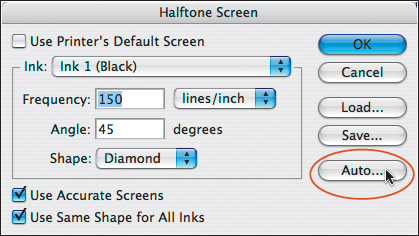
3. The Halftone Screen dialog opens.B Uncheck Use Printer’s Default Screen, then click Auto.
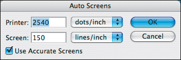
4. In the Auto Screens dialog,C enter the Printer resolution and lines/inch Screen setting as spec-ified by your print shop, check Use Accurate Screens, then click OK.
5. Click OK to close the Halftone Screen dialog, then click Done to close the Print dialog.
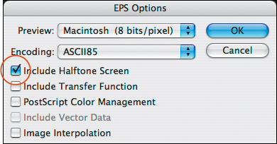
6. Save the file in the format your print shop has specified, which will be either Photoshop PSD (so the print shop can make screen adjustments) or Photoshop EPS. For the latter, when you choose Photoshop EPS as the Format in the Save As dialog, the EPS Options dialog opens;D check Include Halftone Screen to embed the screen settings into the file, then click OK.
A To establish the necessary screen angles for duotone printing, open the Print dialog, choose Output from the menu in the upper right, then click Screen.
B In the Halftone Screen dialog, uncheck Use Printer’s Default Screen, then click Auto.
C In the Auto Screens dialog, enter the Printer resolution and Screen frequency and check Use Accurate Screens.
D If you’re told to save the file in the Photoshop EPS format, check Include Halftone Screen in the EPS Options dialog.