
5. Fine-tuning and Special Effects
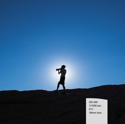
Taking Your Images to Their Full Potential
Recently, I wrote a short article on some of the develop tools available in Lightroom. Someone commented on the article stating, “I love Lightroom because it makes me a better photographer.” I can see how someone might say that, but the reality is that Lightroom won’t make you a better photographer. However, it will help you to unleash the potential that lies in your photographs. Using Lightroom provides you with a method of realizing your vision through the application of image processing. Your photograph is a rough-cut stone, and Lightroom helps you polish it into a gem.
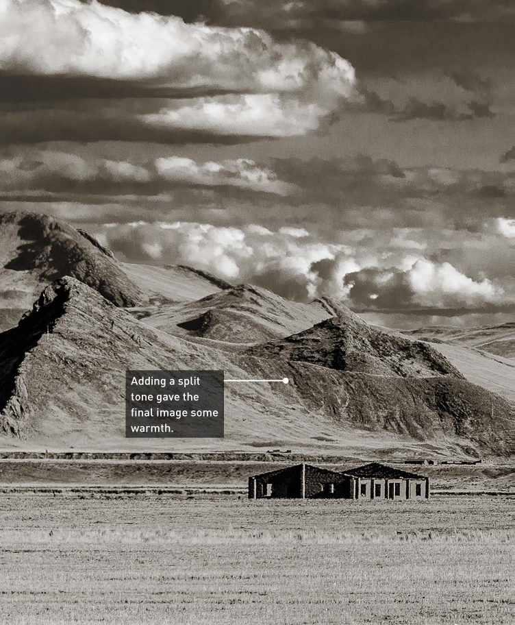
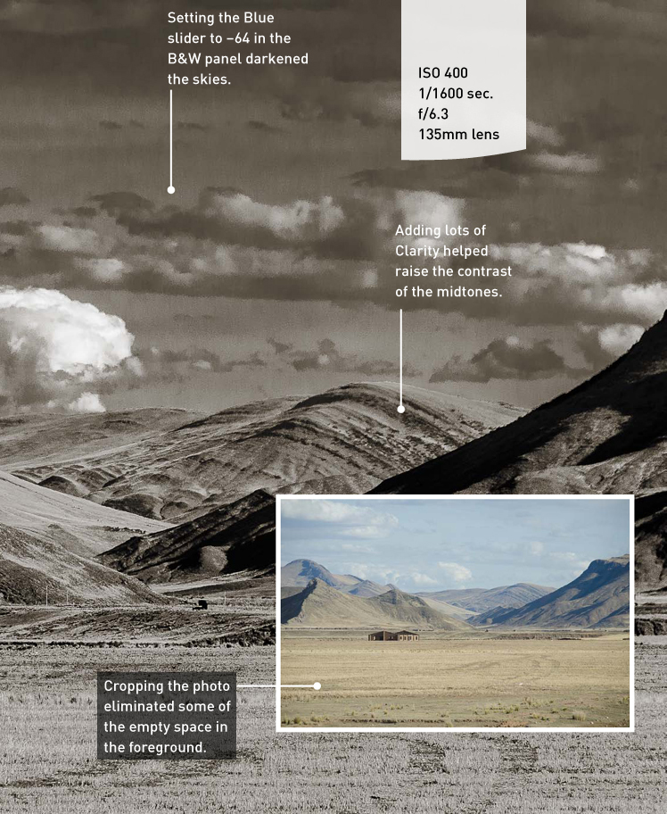
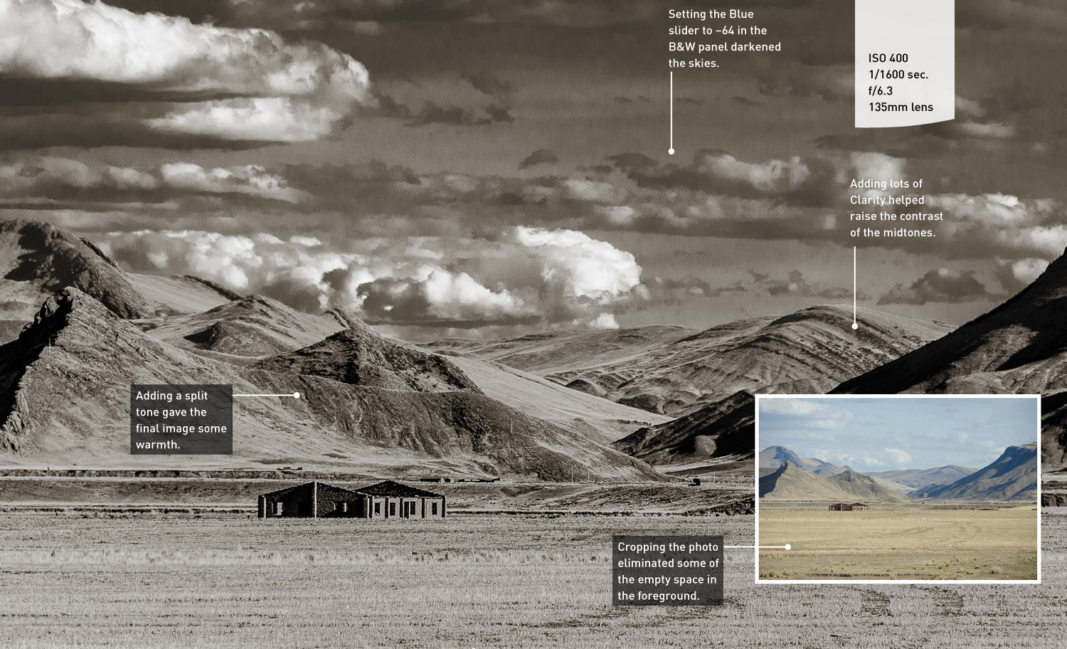
Poring Over the Picture
This image was taken during an 8-hour bus journey across the Alto Plano of Peru. I really liked the solitude of the small house on the plains with the foothills of the Andes rising behind it. Unfortunately, the colors didn’t look as good as they probably would have had I not been shooting through tinted glass. Also, the skies had great clouds, but they ended up being a little washed out in my photo. The easy answer for these problems was simple; make it a black-and-white photo.
Creating Better Skies
Because I already touched on sky processing in the previous chapter, I thought I’d kick off this chapter with some additional tricks to really make the skies in your photos pop.
The problem with skies is that they are usually much brighter than the rest of the subjects in the scene. Even though it may not look like it to your naked eye while shooting the photo, brighter skies will usually appear in your photos.
Dropping the Highlights
The first step to improving the sky in an image is to process your image as you normally would. This means making everything else in the image look good by adjusting Exposure, White Balance, Clarity, and so on. Once that is done, view the histogram and determine whether clipping is occurring in the sky, especially if there are clouds. One of the best ways to improve your image is to start moving the Highlights slider to the left. If you are using an older version of Lightroom, you would use the Recovery slider. Press the J key to turn on your clipping warning, and then start dragging the slider until you bring back details in the clouds and remove all clipping. If you really want a lot of detail in the clouds, move the Highlights slider to −100 (+100 with the Recovery slider) (Figure 5.1).
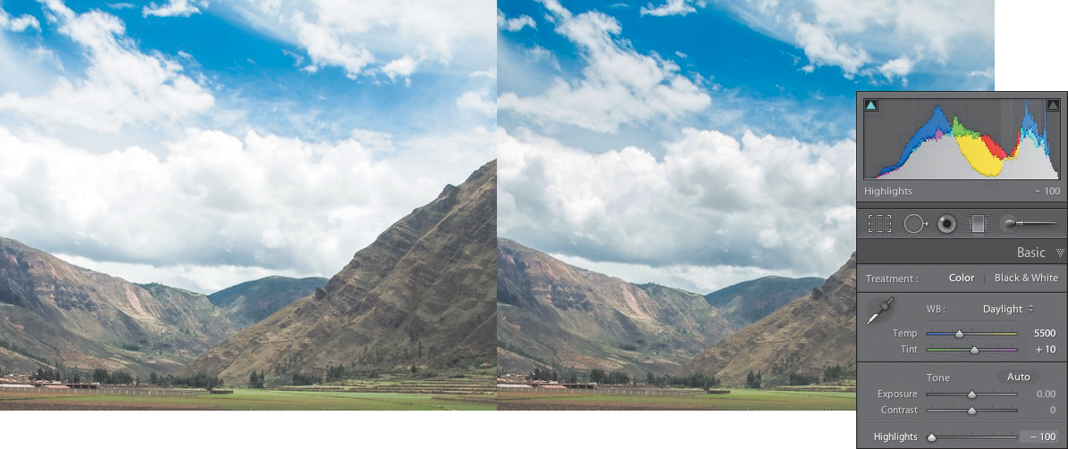
Figure 5.1 Use the Highlights slider to eliminate clipping in your highlights.
Nothing But Blue Skies
Now that you have some nice-looking clouds, let’s improve the color of the sky. This is often necessary because the camera can have a tough time capturing the color of the sky due to the atmospherics. This has to do with the relative angle of the sun and some other factors that are usually out of your control. But here’s a little tip that has been helping landscape photographers for some time—use the HSL adjustment panel. To improve the blue sky, click the HSL panel in the Develop module and then click Luminance. You can make a color change in one of two ways: Drag the blue slider to the left, or use the Target Adjustment tool and click and drag down on a section of blue sky. The key is not to darken the sky too much to the point where you make the photo look artificial.
Then click Saturation at the top of the panel and move the Blue slider to the right or drag up with the Target Adjustment tool. The Target Adjustment tool might actually be the better tool to use at this point because the color in the sky might contain a mix of colors, like blue and aqua. You may need to go back and adjust the Luminance after adjusting the Saturation because the image could become darker. Just find the combination of adjustments that works best for your image (Figure 5.2).
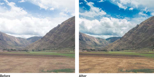
Figure 5.2 Lowering the Luminanace and raising the Saturation of the blues in the HSL panel can have a dramatic effect.
Using the Graduated Filter
Even though I discussed the Graduated Filter in Chapter 4, it’s beneficial to cover it once more as it relates to skies. The key to using this effect on your skies is to have a flat horizon line. If you tried this filter on an image like Figure 5.1, you would darken the sky but also the tops of the hills, which is not where you want the darkening to occur.
1. Click the Graduated Filter icon in the toolbar.
2. Make sure all sliders are set to 0, and then set the Exposure to –2.00. This will make your image very dark where the filter is applied, but it will help you determine how far to drag down the filter.
3. Hold down the Shift key while you click and drag down from the top of the image until you have the adjustment to the point where it is darkening the sky but not affecting the ground.
4. Using the Exposure slider, lighten the effect.
5. Try adding Highlights if any clouds were darkened.
6. Move the Saturation slider to the right to add some color vibrance.
Every image will be different and will need to be adjusted as needed. Just play with the settings until you have the look you want (Figure 5.3).
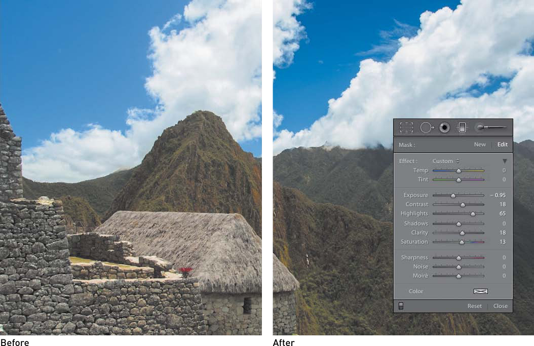
Figure 5.3 The Graduated Filter can help darken the top portion of the sky.
Creating a Classic Black-and-White Image
Recall in Chapter 3 that I quickly covered the B&W panel for making adjustments. Let’s dig a bit deeper into the technique to see how you can transform your photos into classic works of art. When converting an image, I usually create a virtual copy first. If you want to compare a few different looks, just make more virtual copies. Remember that the new copies are virtual so they don’t take up space on your hard drive; instead, they just let you try different effects without having to reset your image.
Adjusting the Tones with the B&W Panel
When you’ve made a virtual copy of your image, press V to quickly turn it into a black and white. The result is Lightroom’s idea of what your image should look like, so you need to take control of the image’s appearance by opening the HSL/Color/B&W panel and then clicking the Target Adjustment tool.
With the Target Adjustment tool active, start clicking and dragging on different areas in your photo to lighten or darken them based on their color (which of course you can’t see anymore). One of the great features of this tool is that as you move your mouse across your image, whatever the underlying color is will be highlighted in the slider panel. So if you have the tool over a section of sky, the Blue slider will be highlighted. As you click and move up to lighten and move down to darken, the slider will adjust in the corresponding direction (Figure 5.4).
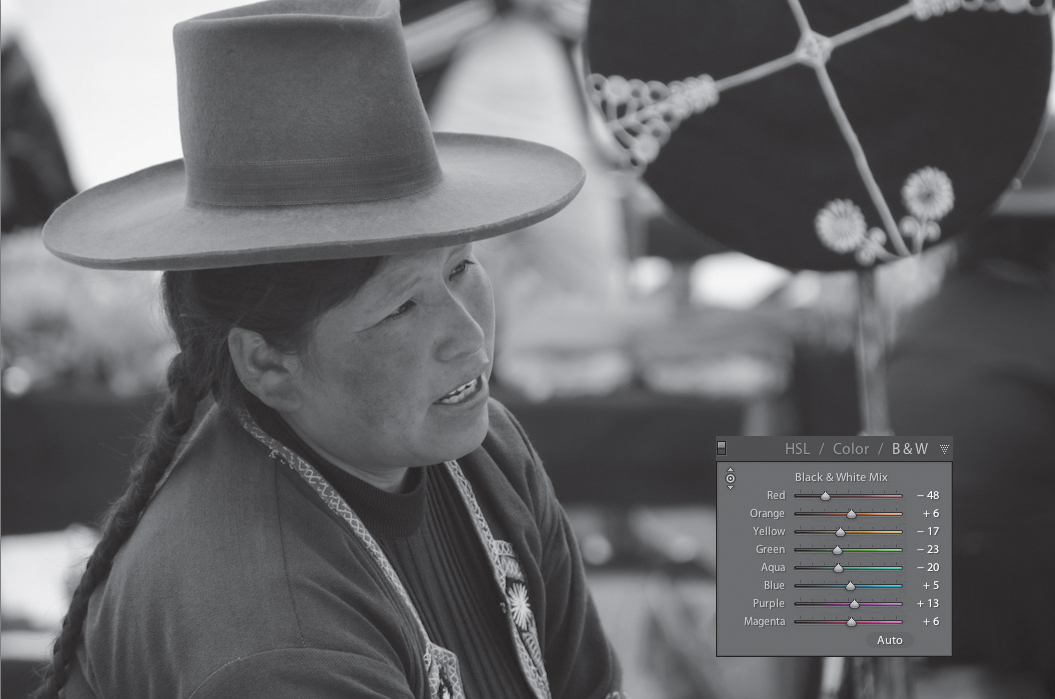
Figure 5.4 Use the color sliders in the B&W panel to adjust the tonal values in your photo.
Back to the Basics
Once you have the black-and-white tonal values the way you want them, click the Basic panel to fine-tune the exposure and contrast. The sliders you want to use in the Basic panel are those in the Tone and Presence sections. Start by adjusting Exposure if necessary, and then adjust the Highlights. Controlling the highlights is important because when you add contrast, it can cause bright highlights to clip even more. The Whites and Shadows sliders will work just as they always do and should be adjusted accordingly. Depending on how gray the overall image is, you might want to raise the Whites slider and lower the Blacks slider to add some contrast while leaving the midtones intact.
Because the image is black and white, you won’t be able to make any adjustments to the Vibrance or Saturation sliders. But you can add some Clarity to your image. Adding a lot of Clarity will give your photo that extra bit of snap or punch that most people want in their black-and-white images (Figure 5.5).
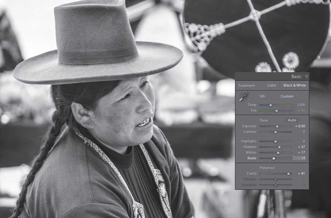
Figure 5.5 Adding Clarity in the Basic panel can add some visual pop to your black-and-white photos.
Tweaking the Curve
It’s my usual practice to adjust the contrast by using the Tone Curve panel. At the bottom of the panel, click the word Linear and change it to Medium Contrast. This is usually a pretty good starting point. Then adjust the Lights and Darks sliders to fine-tune the contrast in the image (Figure 5.6).
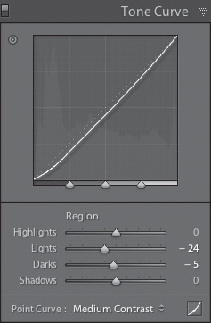
Figure 5.6 Finish the black-and-white adjustments by adding contrast and adjusting the Lights and Darks sliders.
Getting that Film Look
Even though you strive for a clean-looking color photo, that’s not always the case when creating a black and white. Black-and-white images were traditionally created using black-and-white film. The film was made of light sensitive granules that, when processed, were referred to as grain. Digital cameras don’t have grain, but you can add some using the Effects panel to simulate the look of a traditional black-and-white film image. For a classic Kodak Tri-X look, use a setting of Amount 45, Size 25, and Roughness 50 (Figure 5.7). Then adjust the settings to your liking.
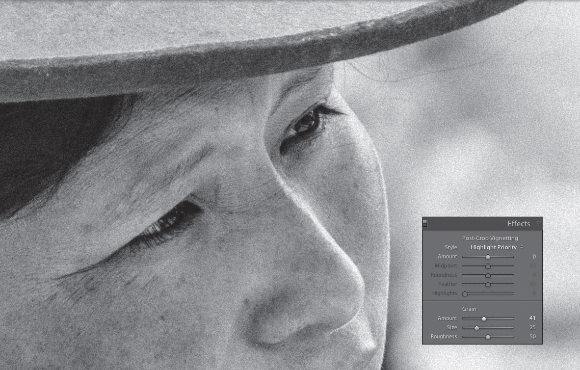
Figure 5.7 You can give your black-and-white photo a film look by adding some grain.
Start with a Preset
Adobe has included some appealing presets in the Develop module, and a majority of them are for converting an image to black and white. The first group in the Presets panel is called Lightroom B&W Filter presets, and they include options to simulate the effect of photographing in black and white using colored filters. The second group is simply a grouping of different black-and-white looks. Some of the presets are high contrast, some are flatter, and some have vignetting. To see how they would look on your image, just place your cursor over the preset name and view the result in the Navigator panel.
The final group of presets is referred to as toned presets and is reminiscent of traditional black-and-white toning processes like Sepia, Cyanotype, and Selenium. Fortunately, you get to skip dealing with all the caustic chemicals by clicking these presets to apply one of these looks to your photo (Figure 5.8).
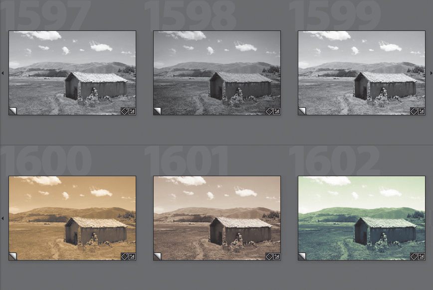
Figure 5.8 You can achieve different looks by using the built-in black-and-white presets.
These presets offer several different effects for your photos, but more important, they can help you jump-start enhancements to your images when you aren’t sure what to do. Because these presets are adjustments, you can always go to the Develop panels and change the sliders until your image looks just the way you want.
A Better-Looking Duotone
One visual effect that is very popular is duotoning, or as Lightroom calls it, Split Toning. This effect adds a color wash to the highlights and shadows in your image (see Chapter 3). Most people will select a color and saturation point for the highlights and then use the same or a similar setting for the shadows. Here’s the real secret to a good-looking duotone: Only add color to the shadows. This will give a nice overall color tone to the image while keeping the effect subtle. A good starting point for a classic duotone is to set the Shadows to a Hue of 50 and a Saturation of 20 (Figure 5.9).

Figure 5.9 You can create a great-looking duotone by using the Split Toning panel.
Dodging and Burning
One way to help guide the viewer’s eyes around your image is to use a technique called dodging and burning. These terms originated from the traditional black-and-white darkroom. When photographers dodged a paddle between the enlarger light and the photo paper, it would hold back light from the image, making it lighter in the dodged areas. To make certain areas darker, they would allow more light to hit the paper in the desired area, thereby burning in the image. Fortunately, this is a much easier process in Lightroom.
Dodging and burning is accomplished with the Adjustment Brush. The idea in the dodging and burning process is that the human eye looks at light areas before dark areas, so you should darken, or burn in, the areas of least importance. You can also lighten areas to help draw the eye to them. In Figure 5.10 the woman is the main subject but is too dark because her hat is shading her, so I’ll lighten her a little. I’ll set the Exposure slider on the Adjustment Brush to +.42 and use a soft brush to lighten the desired areas (Figure 5.11). Next, I’ll create a new adjustment by clicking New, setting the Exposure slider to −.50, and then painting areas that I want slightly darker, like the land in the background and the boat (Figure 5.12). The key to dodging and burning is to try to keep the adjustments subtle (Figure 5.13). Also, use as many brushes as you need to. Not all areas will require the same amount of dodging and burning, so don’t be afraid to treat them separately with a new adjustment. Remember that you can click any of the adjustment pins and change the amount of adjustment using the Exposure slider.
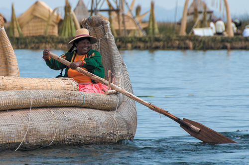
Figure 5.10 This image needs some dodging and burning to help focus attention on the woman rowing the boat.
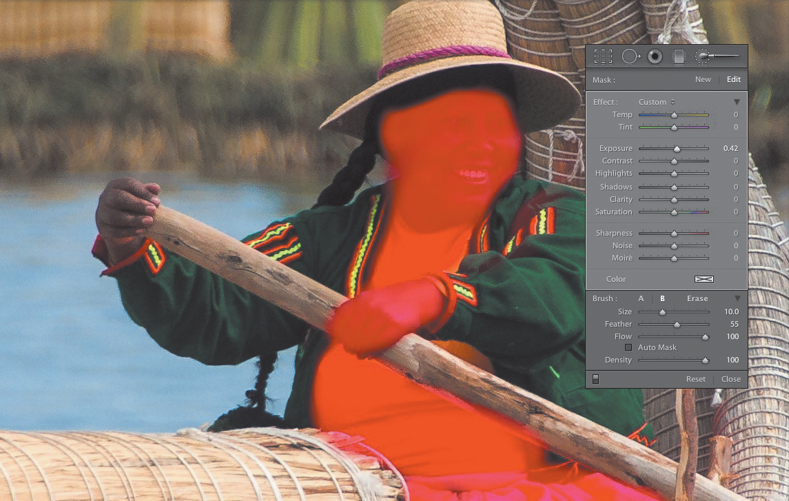
Figure 5.11 Set the Exposure slider to a higher setting and apply the adjustment to areas that need lightening.
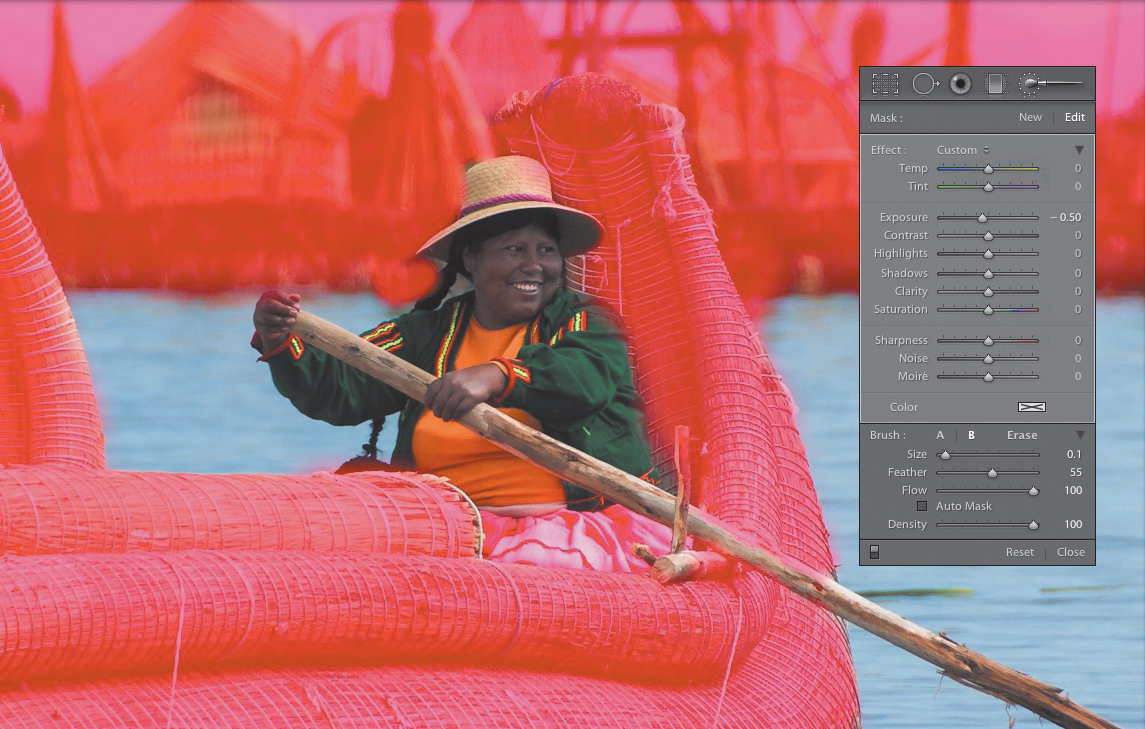
Figure 5.12 Create a new adjustment and paint a darker exposure to burn in background areas.

Figure 5.13 The dodging and burning has refocused attention to the main subject.
Adding Vignettes
Another technique that has become very popular recently is to add a vignette around the outside of your image. This forces the viewer’s eyes towards the interior of the image and away from the outside edges.
The simple way of adding a vignette is to:
1. Click the Effects panel and then move the Amount slider of the Post-Crop Vignetting tool to the left (somewhere between –15 and –30) to darken the corners of the frame.
2. Adjust the Midpoint slider to set how far into the image the vignette will appear.
3. Move the Roundness slider to the right to make the vignette rounder or to the left to square up the sides.
4. Adding a Feather of 50 is usually adequate, but you can set a higher number for a more feathered look or a lower number for a harder edge.
5. Move the Highlights slider to protect some of the lighter areas around the edge of the frame.
You can also create frame effects using the Post-Crop Vignetting tool. Try the following settings for some different looks.
For a grungy edge look (Figure 5.14):
• Style: Highlight Priority
• Amount: -65
• Midpoint: 33
• Roundness: -80
• Feather: 44
• Highlights: 0
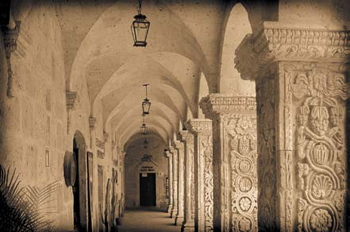
Figure 5.14 Use these settings to get a grungy-looking border.
For a black film-type frame (Figure 5.15):
• Style: Highlight Priority
• Amount: -100 (use +100 for a white frame)
• Midpoint: 0
• Roundness: -100
• Feather: 0
• Highlights: 0
Figure 5.15 These settings will create a film-like border.
For a high-key white vignette (Figure 5.16):
• Style: Highlight Priority
• Amount: +50
• Midpoint: 50
• Roundness: 0
• Feather: 50
• Highlights: 0

Figure 5.16 You can create some high-key vignettes by moving the Amount slider to a positive number.
These are just a few samples of what you can do with the Post-Crop Vignetting tool. Experiment with the styles and sliders, and then create a Develop preset so that you can quickly apply it to other images in the future.
Smoothing Skin
Normally, when I think of the Clarity adjustment, I think of adding contrast. I use it all the time to punch up a flat-looking photo that needs some added midtone contrast. But there is an opposite setting that has a fantastic effect on skin. If you set the Clarity slider on the Adjustment Brush to a negative setting, it actually reduces midtone contrast. This is great for smoothing out skin because that’s what people see when looking at skin texture. Differences in the contrast of the skin surface, the pores, and tiny lines create texture. So, by reducing this contrast, you can create the appearance of smoother skin.
To use a preset for smoother skin, head to the Adjustment Brush presets and select the Soften Skin preset. If you want to set the sliders on your own, set the Clarity slider to -100, the Sharpness to +25, and the Density to 75.
Then just use a soft-feathered brush and paint the effect onto the skin. Try to avoid areas that should not be softened, like lips, eyes, eyebrows, and so on. If you find that the effect is too much, just back off the Clarity slider until you get just the look you want (Figure 5.17).
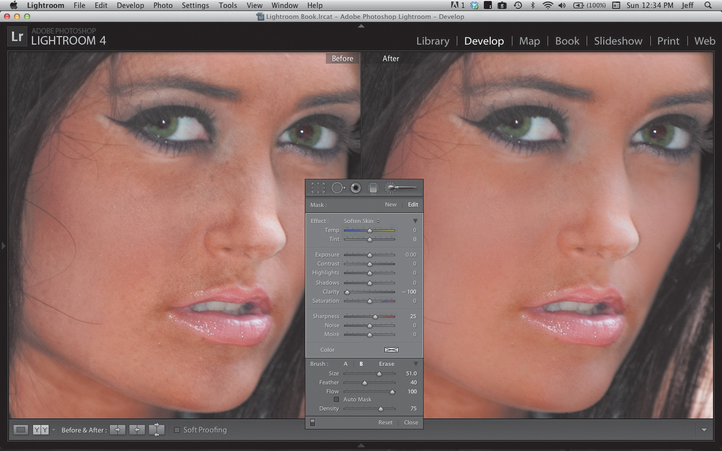
Figure 5.17 Apply negative Clarity with the Adjustment Brush to soften skin.
Creating a Faux HDR Effect
Quite often, I like to apply a faux HDR effect to my photos. There is just something appealing to me about a photo that has crisp, sharp details and expanded tones. To create a real HDR photo, you need to use an external editing program, like Photoshop CS5, Nik HDR Efex Pro, or Photomatix Pro. These programs have features that can combine multiple exposures of the same scene to get maximum detail and information from the shadows, midtones, and highlights. Because you are just using a single image in Lightroom, you really can’t do what those other programs can. But you can cheat a little to get the same “look” that an HDR program can create.
A Tale of Two Methods
When Adobe released Lightroom 4, several changes were made to the sliders in the Tonal section. The changes made were convenient and helpful, but they did change the way this HDR technique is applied. Therefore, I’ll show you two different methods. One uses the 2012 Camera Calibration process, and the other uses the Lightroom 3 process (2010). Of course, if you are using Lightroom 3, the latter will be your only option, but that’s OK because it is the better of the two.
To create the faux HDR look using the Lightroom 4 sliders, go to the Basic panel in the Develop module and apply the settings in Figure 5.18. To finish the technique, add some sharpening and a vignette (Figure 5.19).
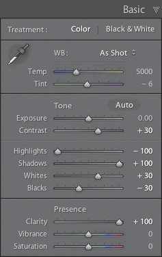
Figure 5.18 Try these settings to get a faux HDR look.
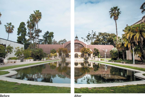
Figure 5.19 Here’s a before and after using the Lightroom 4 HDR settings.
For the second method, Lightroom 3 users will have one fewer step and that is to go to the Camera Calibration panel in the Develop module. Lightroom 4 users need to open the panel, click 2012 (Current) in the Process section, and change it to 2010 (Figure 5.20). This will change the names and behaviors of some of the sliders in the Basic panel.
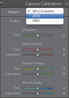
Figure 5.20 The Develop settings can be changed to behave as they did in Lightroom 3.
Next, click the Basic panel and apply the settings in Figure 5.21. As with the previous setup, you should add sharpening and a vignette, and tweak the settings to fit your image (Figure 5.22).
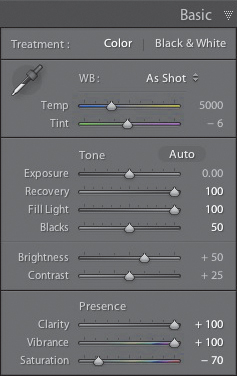
Figure 5.21 Use these settings for a more over-the-top HDR look.
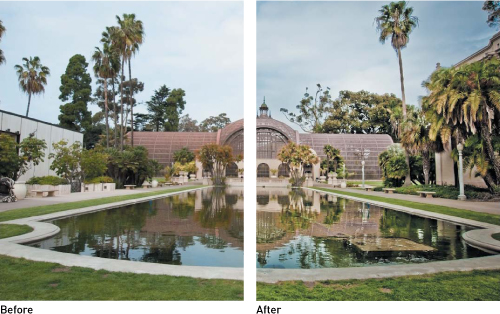
Figure 5.22 Here’s the before and after using the Lightroom 3 HDR settings.
Whitening Teeth
For some reason, taking pictures of people seems to make their teeth yellower than they really are. Or maybe it’s just that you don’t notice people’s teeth that much in a face-to-face encounter. No matter the reason, if you want to whiten someone’s teeth in a photo, you can make quick work of it using the Adjustment Brush. There’s actually a preset in the Adjustment Brush panel that is set up to do this. Click the Brush tool, and then click the Effect pop-up menu and choose Teeth Whitening. The settings are actually pretty simple. The preset lowers the color saturation to -63, which removes the yellow, and it raises the Exposure to +.41, which brightens the area just a little.
To use the preset, zoom in to the mouth by pressing Z, and set a brush size that is smaller than the teeth. Then carefully paint away the yellow. To make this task easier, press the O key to turn on the mask overlay so you can see exactly where you are painting. When you are done, you can adjust the Saturation and Exposure as needed (Figure 5.23).
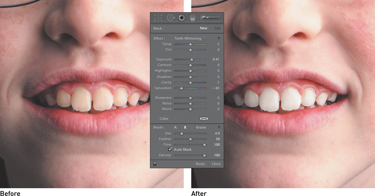
Figure 5.23 You can quickly remove yellow from teeth by using the Teeth Whitening preset in the Adjustment Brush panel.
Using Custom Presets
Thus far, I’ve covered develop presets in a couple of different places in the book, so you should be familiar with how to create your own by now. But did you know that you can upload someone else’s presets? Tons of presets are available on the Internet; some are for purchase, but many are free and cover all sorts of looks and effects that you can add to your own images. Two good sources for presets are www.adobe.com and Matt Kloskowski’s Lightroom Killer Tips blog (www.lightroomkillertips.com). To find them on Adobe’s site, type Lightroom Develop Presets into the search bar at the top of the home page and then look for a link in the results (it’s usually the first result). To locate them on Matt’s page, click the Presets link in the Categories box in the right sidebar.
After you have downloaded a preset, unzip it and place it in a folder. Then open the Develop module in Lightroom. You can then do one of two things: If you want a separate folder for downloaded presets, you can create one by Control-clicking or right-clicking inside the Presets panel and selecting New Folder (Figure 5.24). Then name the folder and click Create. Your new folder will appear in the list with the other preset folders.
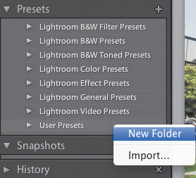
Figure 5.24 To create a new folder for your presets, Control-click or right-click anywhere in the Presets panel and select New Folder.
If you just want to add the presets to your User Presets, you can skip the previous steps and Control-click or right-click on the folder where you want to add the downloaded preset. Then choose Import from the pop-up menu. Locate the preset, highlight it, and then click the Import button (Figure 5.25). When the preset has been loaded, you can access it in the Presets panel.
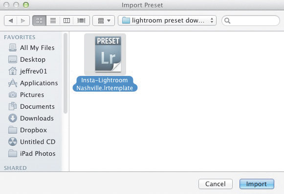
Figure 5.25 Locate the downloaded preset file and click the Import button.
If you want to share a preset with friends, just click the preset, Control-click or right-click, and choose Export (Figure 5.26). Select the location to save the preset to, name the file, and click the Export button. That’s all there is to it. The file will have an extension of .lrtemplate and will be very small in size, so it will be easy to email to your friends. They can install it by using the previously described procedure.
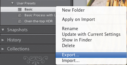
Figure 5.26 To share your preset, Control-click or right-click it in the Presets panel and choose Export.
Chapter 5 Assignments
Sometimes you just want to import your photos and make them look nice. But then there are times when you really want to add some pizzazz. Most likely, you would think of turning to a different program, like Photoshop or Elements. However, Lightroom has some pretty great tools available that can really transform your photos. Be sure to explore those tools by completing these assignments.
Creating Better Skies
I don’t try to enhance the skies in every photo, but I do for those that matter. Create a virtual copy of your sky image, and then head to the HSL panel to start playing with the Luminance and Saturation sliders. Don’t stop there, though. Try using the Graduated Filter to make one of those picture postcard-type skies. Remember that you can hold down the Shift key to keep the filter straight while dragging it out.
Go Black and White
Are you a fan of Ansel Adams or Edward Weston? Well, you are only a few clicks away from creating your own classic black-and-white masterpiece. Press the V key to quickly turn your image into a black and white. Then use the features in the B&W panel. Start playing with the color filters to add custom tweaks to the image. Don’t forget to finish the image by making some adjustments in the Basic panel.
Fix a Portrait
It’s your job as photographers to try to make your subjects look as good as possible. One way to do that is to make small edits that eliminate little details that you don’t see in person but that seem to stand out when you take a photo. Start by using the Spot Removal tool to fix small blemishes. Then use the Soften Skin Adjustment Brush preset to smooth out the skin. Finally, if the subject’s teeth aren’t as bright and white as they could be, hit them with the Teeth Whitening preset. As a little bonus, try using the Iris Enhance preset to brighten the subject’s eyes.
Make a Fake HDR (you know you want to)
Not every image looks good with an HDR effect added to it, but it can be very cool when it’s used on the right shot. I like to use it for architecture and subjects that are already kind of grungy. Try using the settings specified earlier and then tweak them for your image. If you like the look, try saving it as your own HDR preset, and then see how it looks on some of your other shots.
Share your results with the book’s Flickr group!
Join the group here: flickr.com/groups/photoshoplightroomfromsnapshotstogreatshots