
Chapter 2. Setting the Stage: Discovery and User Experience
In this chapter, we talk about one of the most important pieces of the Drupal puzzle, and the one that is often neglected by new site builders. The discovery process helps us gain an understanding of the client, the objectives of the project, and some of the functional issues that we might have to contend with; the user experience process helps us frame the interactions that will need to take place through the website, and helps everyone on the team agree about what we’ll actually be creating.
Breaking Down the Project Goals
Every project, from the most basic promotional site to the most complex online community, should start with a solid discovery process. During discovery, you’re looking to accomplish two things:
Find out everything you possibly can about the clients, their business goals, and why they want to invest in this project.
Create a set of documentation for the project that you can point to down the line to defend your design choices, and to help manage the inevitable “just one more thing...” conversations.
Every designer and team has a different process for discovery. Some like to have a quick meeting, sum it up with a few bullet points, and jump right into visual design concepts. Others need to take a deeper dive, and gather as much information as possible before doing anything other than very quick pencil sketches. I tend towards the deep dive approach. It not only helps me orient myself to the client’s needs more effectively, but it gives me a well of information to draw from if I need to bring the client back to the same page down the road.
Project Discovery
The pre-estimate discovery phase (discussed in Chapter 4) gives you a chance to uncover the client’s goals, establish some early functional priorities, and figure out how much work will be involved in creating their site, so you can provide a fair estimate of costs. During the project discovery phase, you’ll add to that knowledge and wade deeper into the client’s business goals, competitive landscape and other factors that will contribute to the design challenge.
The goal of this process is twofold:
To get a better understanding of the design challenge you’re facing, and
To put together a series of documents that will guide the design process, and to which the client can agree to and sign off.
Getting client sign off on your assumptions is, arguably, the most important part of the discovery process. Whatever your personal opinion of user personas and other types of design documentation, the most important purpose they serve is giving you something to reference in the inevitable event that you have to defend a design decision you’ve made, or redirect a conversation away from “Is it really going to be that shade of blue?”
For example, several years ago I did an e-commerce site for an eco-friendly client. After moving through my standard discovery process and presenting the logo options I had put together, the client had agreed on a specific logo option, and we were ready to move into the next phase of the project. The next day, however, after discussing the logo with a couple of his colleagues, the client came back to tell me that something about the logo “didn’t quite feel right.”
Because we had established the client’s business goals, audience profile and other requirements in the Project Planner (see Appendix A), the client and I were able to keep our conversation about the logo focused on the message that we were communicating (i.e. what this business is and who it serves), rather than on subjective preferences (i.e., whether he likes a particular font). By the end of the conversation, we had moved from having to redesign the logo completely to realizing that a couple of minor tweaks would integrate the design more effectively.
This is one of the most valuable aspects of design documents. Not only do they help you frame your design decisions, you can defend those decisions and more effectively deflect stakeholder requests that will derail the design or throw your production schedule into disarray.
A further note on documents
The type and amount of design documentation that you produce will likely depend on the project, the client and how they communicate. At a minimum, most projects will include any combination of the following:
A Project Brief that establishes the site’s communication goals, functional priorities and establishes standards for signoff and approvals.
Note
In Appendix A, you’ll find the Project Brief I’ve adapted for my studio’s projects.
A set of user personas or scenarios that offer specific profiles of the site’s intended users, mapped to specific goals and tasks that they need to accomplish.
A preliminary site map that outlines the content that we expect to see on the site, and begins to establish a hierarchy for organizing it.
A functional matrix that outlines specific tasks, functions, etc. the site needs to “do.” Preferably, the matrix also prioritizes it against both its relevance to the user scenarios we’ve described, and the budget required to make it happen.
Any number of user flows or concept drawings that help the design team understand how a user will interact with what we’re creating.
All but the last set of documents I share and discuss directly with clients, and require them to approve before moving on. Concept drawings and user flows, although extremely helpful for solving user experience problems, have proven more important for me than for the client. In the next chapter, User Experience, we’ll take a closer look at some of those documents.
Framing the Design Challenge
While the discovery phase sets up the client’s objectives and perceptions of their audience, the user experience (UX) phase focuses on gaining a deeper understanding of the site’s intended users, and works on framing the design challenge you’re facing for the client and the development team.
The tangible deliverables of this phase may vary from team to team, but they often include things like:
User personas or scenarios
An outline, or matrix of functional requirements
Sketches of screen designs or user flows
Wireframes
Paper or digital prototypes
Content strategy documents, including a breakdown of site content, content types and categories. This may also include a breakdown of the site’s user roles (editor, member, etc.) and what content they have permission to access, edit, etc.
The goal of this phase, which can take anywhere from a couple of days to a few months, is for the client and the development team to get on the same page regarding who the site’s users are and why they are there. Additionally, and most importantly, the goal is to identify areas of the project where budget or project scope might need tweaking, and head off any confusion that might occur down the road.
Getting Your Hands Dirty with UX
Being a user experience designer in the Drupal community can be challenging. In many of the conversations I’ve had with designers and Drupal teams across the world, user experience deliverables are combined with project management activities, which can lead to a loss of focus on UX as the project moves forward and attention moves to time and resource management. Additionally, as the term user experience becomes more firmly established as an essential component of the web design puzzle, the question of what user experience actually means has become a topic of debate—and the Drupal community is certainly not an exception.
For the record, when I talk about user experience, I define it as:
A set of design principles that focuses on learning about the actual people using a site in a qualitative, rather than a quantitative, way. Numbers can be useful for segmenting markets and planning a campaign; user experience requires observing real people, and seeing beyond statistics.
A set of design principles that balances the needs of a business with the needs of their customers in a way that encourages a positive relationship.
An activity that every member of the project team—from the official UX designer to project stakeholders—is responsible for, and that is best achieved by working collectively towards a common goal.
I do not, however, define user experience as:
Creating a stack of wireframes or site maps in a vacuum.
Creating and running usability tests.
Creating a set of “personas” based on who you think your customers are without doing any kind of research, prototyping, or testing to back it up.
A front-end developer who understands user experience methodologies, but doesn’t understand the design principles underlying them.
While these different concepts can be components of user experience design, there’s a distinct danger in considering any one of them to be the same idea.
Despite the challenges in defining the term, user experience designers are starting to make their mark on the Drupal community. More and more user-focused design firms are starting to embrace Drupal for projects, and the Drupal 7 redesign saw a huge number of usability improvements, led by UK-based designers Leisa Reichelt (http://www.disambiguity.com/) and Mark Boulton (http://www.markboulton.co.uk/). While there are still many improvements to be made, the fact that design and user experience are key components in the Drupal 8 project (see http://drupal.org/community-initiatives/drupal-core/usability), suggests that this issue is finally starting to gain traction among the Drupal community.
User Experience: Bringing UX Design to an embedded team
If you’re a designer who wants to bring UX principles into your next project, whether it’s for a small project or for a larger team with multiple stakeholders, here’s some advice from my experience working with a variety of clients and design teams. If you find you’re really interested in this stuff, check out the resources at the end of this chapter for a list of articles and books I’ve found useful.
Study the organization you’re working with
Working in any kind of organization requires a certain taste for politics. As designers, we get this already; we’re used to having our work critiqued, and dealing with comments that we find, *ahem*, unhelpful. The trick to selling stakeholders on user experience design is, like visual design, in understanding its value to the organization and being able to back that up with hard facts. Speaking the language of the client also helps. This is where documentation comes in especially handy. If you can point to a specific objective that your approach will help meet, you’re well on your way to selling the idea.
Just as important as figuring out how to sell the idea of UX design to your clients is realizing when the client is a lost cause. In Undercover User Experience Design (New Riders Press), authors Cennydd Bowles and James Box offer some important red flags to watch out for when broaching the subject of user experience:
Design Disinterest. “Many organizations simply don’t care about design, or see it as an expensive luxury rather than a strategic investment.”[1] We’ve all met clients like this; they might focus on engineering more than design, or they might focus on what their competitors are doing to the point where they become little more than a “me too” business. If you can convince them of the value of your approach, supplementing your work with case studies from similar organizations who have been successful with this approach, you can help them make the switch into a design-forward company.
Cash Cows. If the company has a certain product, or area of the site, that generates huge amounts of revenue, no matter how poorly designed, expect a fight when you suggest changes to them. If you’re still trying to introduce the concept of UX design to the company, you’re better off leaving these areas alone unless you can prove your work will have a positive effect on the revenue stream for that product.
Enormous expectations and difficult deadlines. “Sky-high expectations can cause disappointment, paralyzing fear of failure, and poor decisions.”[2] Combining too-high expectations with unreasonable deadlines for delivery is a recipe for failure. If you run into this type of situation, the most important thing to do is understand what’s underneath these expectations, and see if you can shift the focus towards something that’s more reasonable. If stakeholders aren’t willing to budge, it’s time to move on.
In addition to these flags, it’s important to look at the organizational structure and decision-making process within the company. How many stakeholders are you dealing with? What’s the approval process like? Are there any places where you can find an easy win, or does it look like this will be a struggle from start to finish? In time, you’ll get better at figuring out which clients you can help and which will be an uphill battle.
It’s not about looks
This is a tricky subject, coming from the world of brand design as I (and many of you, presumably) do. But if there’s one truth I must impress upon you, it is this: user experience design is not about how something looks; it’s about how it works. Is good UX design pretty? Often, yes. But is pretty design good UX? You’d be surprised how often it isn’t.
Good UX design must balance the needs of the person visiting the site with the business objectives of the client who owns the site. This means, in order to truly create good UX (and I’ve found this true of most design challenges), you must be able to speak to the client’s business goals, and to the path the user will need to take in order to help the client achieve those goals. This often means that, in the beginning stages of a user-centered design process, aesthetic issues (colors, fonts, etc.) will take a backseat to more pragmatic issues of sensible layout, information architecture and functional requirements. It also might mean that you make visual compromises that you really aren’t happy with, if it makes the user’s job easier. Thankfully, this is rare—but it does, and will, happen.
Let go of the outcome
This, admittedly, is a lesson from my yoga practice—but it’s also a valuable lesson from working with clients and development teams. One of the more interesting parts of UX Design for the web is that there are many clients who still don’t understand what it means, or how it can help their business. As such, be prepared for stakeholders who will bring up strong objectives to the approach you’re trying to take, or managers who say they don’t want to “waste time” on personas, user flows, or other common tasks associated with UX work. Also, be prepared to meet a number of people who get UX and UI design confused, and think of UX as playing around with Fireworks and jQuery, with a bit of usability testing thrown in.
User Experience: Techniques for Drupal
One of the challenges inherent in doing UX work is knowing who’s responsible for it. In some teams I’ve spoken to, it’s the project manager’s job to create many of the documents associated with UX (personas, site maps, wireframes); in others, there’s a specific team member who’s completely dedicated to user experience design for the project. The methods and documentation that you use will vary according to project as well. For some clients, you’ll find yourself doing elaborate user personas and backing them up with weeks of research; for others, a quick and dirty approach—where you use existing information on customers to create a persona that you then test as you prototype—is more than appropriate. The point of UX documentation is to always do some, but to only do the things that make sense for the project.
Below are some methods that I’ve found helpful. Many of them are borrowed from traditional UX methodologies; however, most of them have been adapted in one way or another for my Drupal workflow. Over time, you’ll find a method that works for you. If anything, the key to working with UX documentation is to find a balance between an efficient workflow for you and creating something that effectively communicates to the client.
Mind mapping
Mind mapping is a relatively quick and simple way to get a lot of ideas out on the table in one big brain dump, and take a high-level view to recognize the patterns. Whether you’re doing the map in software or with pen and paper, the point of a mind-map is to generate as many ideas as you can related to a specific issue, then to step back and recognize the patterns that pop up (see Figure 2-1).
The times when I find mind-mapping most effective are when the objectives for a project are fuzzy or the client has trouble articulating them. By laying everything out in a visual format—either on a whiteboard or with a pile of post-its—you can often get the client to recognize their own patterns, or the deeper problems underneath the surface problem they’re usually trying to solve. They’re also very effective for outlining user characteristics; I use mind-maps often to find common threads in the clients I work with, for example, when I’m working on my marketing plan.
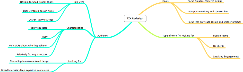
The best thing about mind maps is that they’re quick; good software will often allow you to very quickly create and link thoughts to each other. In many cases, you can even create a mind map during a conversation with a client, and convert the result into a set of bullet points for a project plan. For computer-based maps, I like MindNode[3] for Mac, or MindJet Manager for PC/Mac[4]. MindNode’s basic version is free, and has many of the basic features you might need for efficient mindmapping; MindManager is pricier, but I find the interface and templates much more efficient to work with.
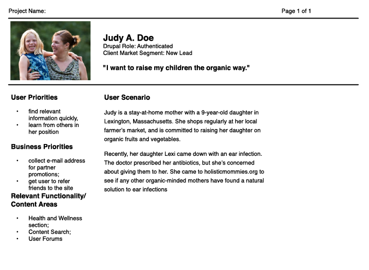
User personas
A good user persona describes a specific person who is visiting your site, and focuses on documenting specific tasks they want to achieve, and the reasons that people are visiting the site. Every team does it differently, but there are a few components that make a persona valuable in the design process:
They involve real data. If you don’t have actual interviews, talk to your client about their clients, and get some real data about how they want to interact with the site.
They help map functional or content areas of the site to specific needs the user has. The point of a persona isn’t to tell a nice story about Judy the housewife; it’s to make sure that everything you’re putting into a given site maps to a specific user need. This makes personas particularly valuable for working with stakeholders who tend to come up with long lists of requirements that aren’t necessarily useful.
They help the design and production team understand what they need to build. A set of well thought-out personas can clarify the overall direction for a site, answer questions about new things that come up, and keep the team on track.
For most sites, you will have anywhere from one to four personas for different user segments. For example, a simple corporate site might have a persona for their target customer, another for the media, and another for others in their industry. If your client has broken up their target customers into different market segments, you may have a persona for each of them, or use your personas to demonstrate the commonality among a set of market segments. Figure 2-2 shows a sample persona for a site for holistic moms.
When building personas, the important thing to remember is that your focus should be not on who they are, but on what they’re there to do. For example, an online banking website could have any number of user types, ranging from 20-year-old college students to retirees. A persona for this application, then, would focus on specific user tasks, rather than age/income demographics. This is not only useful in the beginning of the project, when you’re just getting into the topic of user research, it’s even more useful later in the project, when you have to defend your design decisions to the client.
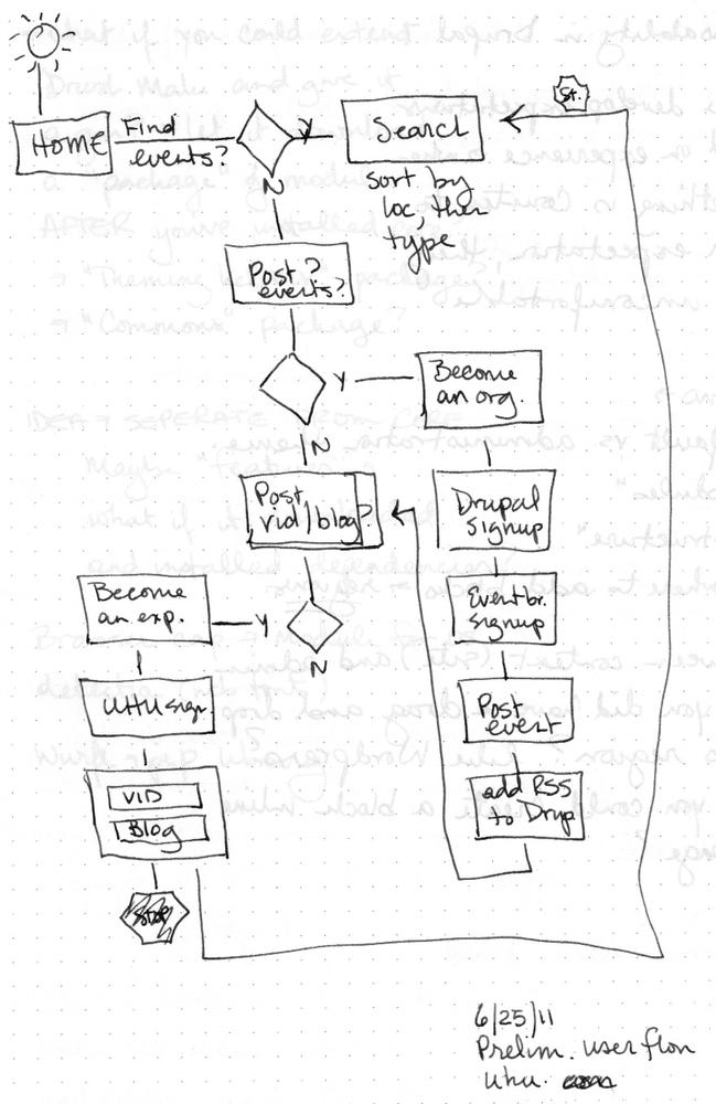
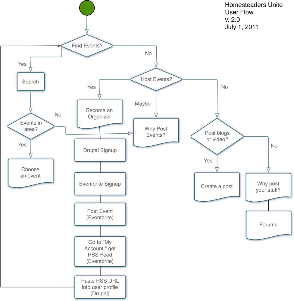
User Flows
User Flows are very similar to user scenarios, with the exception of format; while a scenario tends to focus on prose, a user flow is a visual framework that describes the specific journey a user takes from point A to point B. For example, say you want to understand (or describe to a client) the decision process a user might take for creating an account. What’s their incentive? How do they make the decision? What are the intermediate steps? A user flow can help you walk the client (or yourself) through the process visually.
I often find user flows most helpful when framing a specific design challenge; for example, how a user might decide to make a purchase, or what would lead a person to sign up for an account. The important thing to remember about any type of flow is that they’re often more useful for you than they are to the client; if you do decide to present them to the client, make sure it’s in the context of making sure you understand the design challenge, and not as presenting a possible solution.
Similar to Mind Maps and other visually oriented documents, I tend to start my user flows with pencil and paper (Figure 2-3), and gradually move them into a program such as OmniGraffle or Keynote (Figure 2-4).
Functional Breakdowns
A functional breakdown is about what it sounds like: it breaks down the functionality that you’re creating into manageable chunks. For simple sites, this could be sections of content, such as the blog, or the events page; for more complex sites, this could be the shopping cart, or a particular widget. The key to functional breakdowns is breaking up the site’s implementation into chunks that are easy for stakeholders to recognize and your team to focus on at once. It also helps with identifying Minimum Viable Product, a fancy Agile/Lean programming term that means “the most basic level of functionality that will still be relevant to the user’s goals.”
Note
It’s important to note, as Todd Nienkerk of Austin’s Four Kitchens has pointed out to me, that Minimum Viable Product is less about trying to work less, and more about giving clients a return on their investment by getting them usable code as quickly as possible. This approach also has significant benefits for strategic UX; getting useable code into the world more quickly gives you a better opportunity to have real users interacting with your site quickly. This gives you valuable data that will help you continually improve the user experience of your site.
With Drupal, this concept becomes especially important; setting your bar for Minimum Viable Product too high can lead to exceptionally long development cycles which drive clients crazy; setting it too low can result in a site that always looks half-finished.
When I do a functional breakdown, I like to do it in spreadsheet form, often a Google Doc (or Excel, if there are data security issues around the project) and list sub-tasks underneath the larger banner. For example, on a very simple site, a functional breakdown might start like this:
Major Pages
About Us
Contact Form
Services
Testimonials
Blog
Content received
Content Types created
Views displays created
Content entered and tagged
On top of these basic tasks, I’ll often map functionality to its relevance for specific user personas/scenarios that we’ve identified, and for the complexity it will require to build. This is especially helpful for more complex implementations; if your client wants a component that’s going to be especially tricky to build, but your user research indicates that their users don’t really find it valuable to their activities on the site, seeing the contrast between user needs and the resources required to build non-essential functionality can often help clients re-prioritize in your favor.
Screen Sketches and Wireframes
Screen sketches can be created in Fireworks, Omnigraffle or any other software of your choosing; however, for me, they always start with pencil and paper. The point to starting with paper is the flexibility; when you’re first ideating a web interface, quantity is much more important than quality. My initial sketches, done in pencil, are a mess more often than not. I use them primarily to work out issues of content placement, calls to action, and other basic “why are we here?” issues. As the ideas get refined, and things start making sense, the sketches (still in pencil) start getting more refined as well, and eventually I can put them into a format that makes sense to someone who isn’t me.
We’ll get deeper into Wireframes in the Design and Prototyping guide, including some of the different methodology and tricks that the Drupal community has come up with for creating effective wireframes and visual layouts.
Wireflows
Wireflows are similar to a user flow in the sense that they map out a user’s journey from point A to point B, but instead of simple directives (Build a Product, Create an Account, etc.) they show sample screens that the user would visit on their way to their destination.
Wireflows are especially useful for complex applications that require the collection of user data; for example, a shopping cart or a user registration screen. Rather than trying to wireframe each individual screen in Fireworks, and explain them to stakeholders as individual pages, you can walk them through the entire flow and show them the information you’re collecting as you walk through the flow. This not only speeds up the stakeholder feedback process, but it gives you an opportunity to map out potential interface challenges in a way that you often can’t working with individual screens. If using wireflows, it’s important to manage expectations carefully; as a necessarily low-fi prototype, they can confuse clients who are expecting more high-fidelity deliverables.
Content Strategy Documents
Content strategy document can be anything from an inventory of current content to an in-depth analysis of content types, user roles, and a comprehensive site map. Since working with content can be one of the most complex and time-consuming pieces of working with Drupal (no, really), it’s vital that you take time to understand the actual content you’re working with, and how it all fits together in the user experience.
UX Techniques and Drupal: Practical issues to hammer out
Most of the techniques I’ve laid out here could work for any web project. How, you might be asking, would they be different in Drupal?
The main differences you’ll see working with these documents in Drupal is the pieces of the design puzzle you’re building, and how they fit together. The Drupal framework has certain things baked into it—for example, the concept of Views or Blocks—and these can inform many of your deliverables in ways that aren’t necessarily true for other implementations. At the same time, it’s important to remember that the purpose of deliverables is to communicate; while your developers would probably understand intuitively that content on a particular wireframe would be coming from some Drupal module or field, inserting this logic into client-facing deliverables can cause confusion.
For this reason, many designers have developed a layered approach to client-facing UX deliverables. In a persona, for example, you might include the user’s Drupal role (which determines the permissions they have on your site) under their name, but you might also include the user’s assumed market segment to help the client understand who the persona represents. In a wireframe, you might stick to a more basic boxes-and-labels approach for showing the client, but you might have a separate “annotations” layer that shows the implementation team where specific content is coming from within Drupal.
The Design and Prototyping guide offers a number of these types of adaptations, and also includes links to several Drupal-specific templates that the community has developed for commonly used applications.
Go Deeper: User Experience and Project Management
Books
Bowles, Cannydd and Box, James. (2011) Undercover User Experience: Learn how to do great UX work with tiny budgets, no time, and limited support. New York, NY: New Riders Press.
Brown, Dan. (2006) Communicating Design, Second Edition. New York, NY: New Riders Press.
Krug, Steve. (2005) Don’t Make Me Think: A common sense approach to web usability, Second Edition. New York, NY: New Riders Press.
Brown, Sunni, Dave Gray and James Macanufo. (2010) Gamestorming: A playbook for innovators, rulebreakers, and changemakers. New York, NY: O’Reilly Media.
Norman, Don. (2011) Living with Complexity. Cambridge, MA: MIT Press.
Websites
| 52 weeks of UX. A blog about the process of designing for real people, published weekly. http://52weeksofux.com. |
| UX Magazine. A constantly updated magazine about varied topics of user experience design. http://uxmag.com. |
| UX Matters. Another online magazine about user experience, although not as pretty as UX Magazine. http://uxmatters.com. |