6. Using CSS to Implement Icons
Icons are an essential part of creating web interfaces as familiar signposts, badges of honor, or notifications. They can draw attention to important parts of the page quickly, use less space than words, and can transcend languages. CSS3 offers some useful new tricks to the icon arena; hence, this chapter on icons. After the comparatively heavy learning curve presented by CSS Animations in Chapter 5, you can relax a bit here.
In this chapter you’ll learn some slick ways to implement icons on a web page employing cutting-edge CSS and HTML features, such as multiple background images, web fonts, and data- attributes.
Icons Rock!
You’ll find icons everywhere, helping you find your way and get additional information about people, objects, services, and so on. Often, they are invisible and are used almost subconsciously due to the familiarity everyone has with recognized conventions, such as on/off switches, play and pause buttons, airports and train stations, and toilets (Figure 6.1)! If you think carefully about icons, you’ll find that you use them more often than you realize.
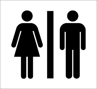
Figure 6.1 Aren’t you glad that conventions such as these exist the world over! Image courtesy of http://thenounproject.com/noun/unisex/#icon-No50.
Since the dawn of man, icons have been used for communication. For example, cave dwellers painted on their caves to record details of meetings and food. And the more recent examples of Egyptian hieroglyphics and Chinese symbols most definitely fall under the moniker of icons.
 Note
Note
I became interested in icons after serving as editor on fellow English gent Jon Hicks’s marvelous book, The Icon Design Handbook (Five Simple Steps, 2012). In fact, this chapter is influenced heavily by Jon’s wonderful work. I highly recommend that everyone purchase his book because it is a real joy to read and provides more in-depth information than I’ve assembled in this short account.
Using Icons on Websites
Similarly to the real world, icons can fill many roles on websites or in applications. Most commonly, they act as signposts, giving users hints on how to get where they want to go and do what they want to do. Icons can impart these hints quicker and more intuitively than textual descriptions, often due to the fact that they follow established conventions, which can break through the language barrier: Mail, home, and shopping basket icons are classic examples (Figure 6.2).

Figure 6.2 Familiar web icons: mail, home, shopping basket.
If you need to create an icon to represent something where no convention already exists, you need to choose an image that is as recognizable as possible, easy to depict in different sizes, and attractive enough to draw in the user. Web icons are typically monochrome with transparent backgrounds so they can be overlaid nicely on top of different backgrounds.
Icons are loosely grouped into three different types:
• Pictograms. These icons convey a location or idea through resemblance to a physical object, for example, a vinyl record to represent “music” or a car to represent “car insurance” (Figure 6.3).

Figure 6.3 Pictogram examples.
• Ideograms. More general than a pictogram, these icons represent ideas or actions, such as “search” or “write a comment” (Figure 6.4). Generally, (but not always) they will be intuitive to a certain degree because of users’ familiarity with the real-world objects.
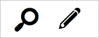
Figure 6.4 Ideogram examples.
• Arbitrary. These icons are more abstract creations that generally don’t directly relate to real-life objects or concepts. Because they are not real-world objects, they must be learned from scratch and so are not immediately intuitive. Figure 6.5 provides a good example: This icon set was created for the W3C as part of its effort to brand HTML5 and other cutting-edge technologies to raise interest and awareness (see www.w3.org/html/logo).
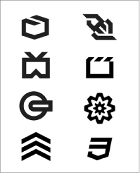
Figure 6.5 Arbitrary icons from the W3C’s HTML5 branding (released under creative commons CC-BY).
I won’t go into a great amount of detail on how to choose and draw icons in this chapter, but for those of you interested in finding ideas and inspiration, a Google images search always brings up many, and you can find a huge number of great free icons at thenounproject.com. The images in this section have been taken from the awesome dingbat sets Modern Pictograms and Heydings Common Icons, available on Font Squirrel.
When to Use Icons
Icons are a great addition when used in the right contexts, and you should give this some careful thought when considering them. If they solve a problem along the lines of allowing users to find what they want or where they want to go faster and more intuitively, and consume less space, you have a good case for using an icon. But if you are just using icons everywhere with wild abandon, their effectiveness is greatly diminished, and you end up with a horrible Christmas tree-type effect!
Places to consider using icons include:
• Navigation. Icons can make great signposts to help direct users to where they want to go. For example, you’ll learn how to build the example shown in Figure 6.6 in the next section “The Basics of Icon Implementation.”

Figure 6.6 Icons in a menu.
• Functionality. Intuitive icons allow users to find functionality easily, for example, playing a video or zooming in (Figure 6.7).

Figure 6.7 Intuitive functionality icons: play and zoom in.
• Status. You need only to look at programs like Skype and messenger applications for good status icon usage, for example, “I’m here,” “I’m away,” “I’m asleep.” See Figure 6.8 for some examples.
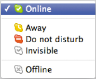
Figure 6.8 User status icons (taken from Skype).
• Comparison. Using icons to compare product features is a good way to give users at-a-glance summaries (Figure 6.9).
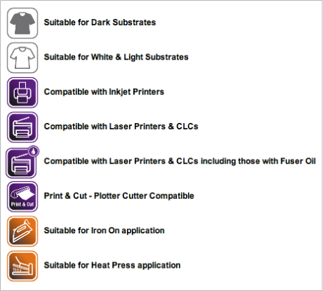
Figure 6.9 Icons to compare product features, taken from yolo.co.uk.
• User feedback. Form icons are the classic example for user feedback (Figure 6.10): “The format is incorrect,” “Missing information,” and so on.
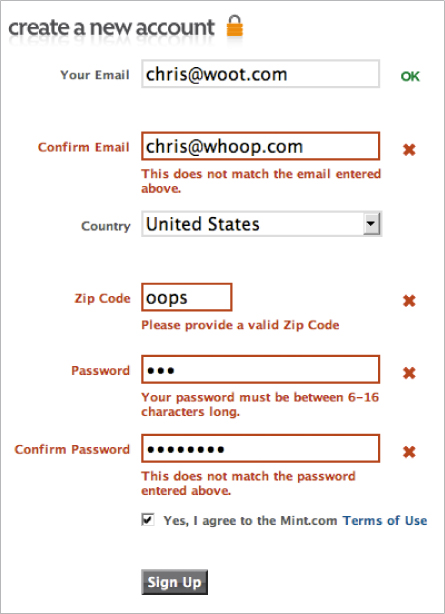
Figure 6.10 The signup form on mint.com makes good use of icons for form feedback.
• Emotion. People use emoticons more and more in communications these days—in text messages, email, chat applications, IRC, and so forth (Figure 6.11).
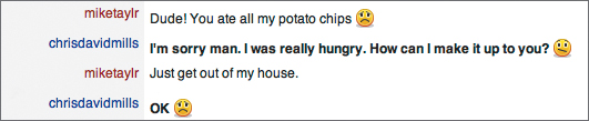
Figure 6.11 Emoticons are used to convey emotion in a textual form.
The Basics of Icon Implementation
To implement icons on a web page, arguably the best method is to use CSS background images. Using the <img> tag is workable, but not the best way, because icons are not really content; rather, they support content, plus <img> elements affect content layout on the page and are more fiddly to place where you want.
Let’s look at a quick example. You’ll find the full code for this in the file basic-icons.html in the chapter6 code download folder. You first need to attach the images to the elements you want them to appear on:
ul li:nth-of-type(1) a {
background-image: url(icons/home.png);
}
ul li:nth-of-type(2) a {
background-image: url(icons/file.png);
}
ul li:nth-of-type(3) a {
background-image: url(icons/circle_info.png);
}
ul li:nth-of-type(4) a {
background-image: url(icons/pencil.png);
}
A bit more styling is needed to finish this off:
li {
...
background-image: linear-gradient(top,rgba(0,0,0,0), rgba(0,0,0,0.4) 70%);
}
ul a {
background-repeat: no-repeat;
background-position: 35% 45%;
padding-left: 5%;
background-color: #D660CC;
behavior: url(PIE.htc);
}
In the first rule you’re setting a gradient on the actual list item to make the styling on the links more flexible. Then in the second rule you’re setting the image to not repeat, because you only want to show it once, and setting a more appropriate position for the icons, because you don’t want them to display in the default top-left corner position. You’re also setting a bit of left padding to make space for the icon so it doesn’t clash with the text and setting a solid background color as a fallback for browsers that don’t support the CSS3 styling features also at work here. Some CSS3PIE magic is also included here to provide support for IE6–8 for extra styling peace of mind. Also, note that I’ve attached Selectivizr to the page to make IE6–8 support the CSS3 selectors I’ve used in this example, such as nth-of-type. Figure 6.12 shows the result.
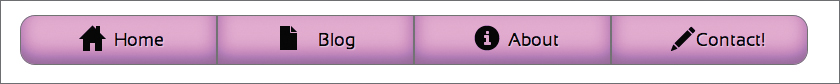
Figure 6.12 A simple icon implementation (icons are taken from www.freeiconsweb.com/Free-Downloads.asp?id=1729 and are published under creative commons unported).
Generated Content for Icons
You could also implement your icons using generated content, like so (see basic-icons-generated-content.html in the chapter6 code download folder):
ul li:nth-of-type(1) a:before {
content: url(icons/home.png);
}
/* Other three icons included in the same way as the first one, but ommitted here for brevity */
ul a:before {
position: relative;
right: 4%;
top: 5px;
}
ul a {
padding-left: 1%;
background-image: linear-gradient(top,rgba(0,0,0,0), rgba(0,0,0,0.4) 70%);
background-color: #D660CC;
behavior: url(PIE.htc);
}
This method is also a viable option, although generated content is not supported as widely across browsers (it won’t work in IE6–7). You’ll explore using generated content more in the “Web Fonts as Icons” section.
CSS Sprites
The preceding examples work well, but what about implementing multiple icons? Having to pull in a separate image file for each icon introduces a whole lot of HTTP requests: To make your code more efficient, you can use CSS sprites. The idea is that you combine all of your images into a single file, and then show the different icons by varying the background-position property. Your code will look like this (see basic-icons-css-sprites.html):
ul li:nth-of-type(1) a {
background-image: url(icons/sprite-set.png);
background-position: 35% 10px;
}
ul li:nth-of-type(2) a {
background-image: url(icons/sprite-set.png);
background-position: 35% -40px;
}
ul li:nth-of-type(3) a {
background-image: url(icons/sprite-set.png);
background-position: 35% -90px;
}
ul li:nth-of-type(4) a {
background-image: url(icons/sprite-set.png);
background-position: 35% -140px;
}
In each rule the background-position has the same horizontal value but increasing vertical values; each increase pushes the image farther and farther upwards, so that you only have to load a single file but can display different icons as you are displaying a different part of the image in each case. The result is shown in Figure 6.13.

Figure 6.13 CSS sprites in action.
Making Your Icons More Bulletproof
In the examples you’ve seen so far, you have a solid implementation that works well. The only trouble at this point is that if you are using percentages for your container widths; the icon can start to look misplaced or become too big for the containers when the screen gets narrower. To remedy this, you can adopt a few different approaches, either separately or in combination:
• Use min-width to limit the shrinking of the containers to an acceptable amount.
• Use Media Queries to serve up some different styling at smaller screen widths, for example, a smaller version of the image used for the icon. You’ll learn more about media queries in Chapter 8.
• Use background-size to constrain the icon to a particular size, proportional to the container.
The solution I considered for my icon set (see basic-icons-background-size.html) incorporates a combination of min-width and background-size. Let’s go through it now: You’ll first set a min-width on the list:
ul {
...
min-width: 750px;
}
Then you’ll give the anchors a background-size:
ul a {
...
background-size: 10% 50%;
}
The effect is shown in Figure 6.14.
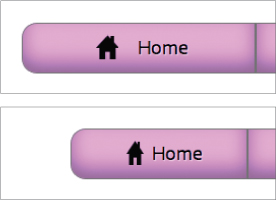
Figure 6.14 Using background-size to scale the icons proportionately to the size of the menu buttons.
So, min-width ensures that the menu doesn’t get too small and break at narrower browser widths. background-size not only forces all images to adopt the same size, but also fixes that size to be a percentage of the button size, so they will adjust as the buttons become smaller. This may or may not be the behavior you want; it is useful to know it is available to you.
Multiple Background Images for Modified Icons
Sometimes you’ll use a base icon and then add extra icons to it to modify the icon’s meaning somewhat. For example, you could add a plus sign to a document icon to create a “New document” icon or add a down arrow to an application icon to mean “Download update.” You could do this by creating each of these separate icons statically, but that would be boring when you have CSS3 at your disposal! Instead, let’s include the base icon and the modifiers using multiple background images, and then size and place them programmatically.
The code to achieve this is very similar to what you used earlier, but it just requires the use of additional multiple background images to include the modifiers. You can see an example of this code in the file modified-icons.html in the chapter6 code download folder. The code looks something like this (Figure 6.15 shows the result):
ul li:nth-of-type(1) a {
background-image: url(icons/plus.png), url(icons/file.png);
}
/* Other three icons included in a very similar way to the first one, but ommitted here for brevity */
ul a {
background-repeat: no-repeat;
background-position: 72px 10px, 50px 10px;
background-size: 13px 13px, 20px 25px;
...
}
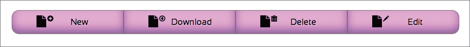
Figure 6.15 Multiple background images used to make additive icons.
As you can see, you now have a set of two background images for each icon: one for the modifier and one for the base icon. Two background-positions and three background-sizes also go along with those images.
Web Fonts as Icons
Another option available to you is using web fonts as icons. Using a single character for the icons and applying a web font to them can give you the look you want. This is a good technique in many ways. The text character will be infinitely scalable when zooming in, and there are a wide variety of Dingbats-style fonts to use to create suitable icons. The downsides are that browsers must support @font-face for them to work, font files can be big, and actually adding the character(s) into your HTML will pollute your content and possibly cause accessibility issues for those using screen readers.
Let’s review these problems one by one. I’ve assembled an example for you to dissect in the file web-font-icons.html in the chapter6 folder. To start, you’ll find your fonts using any of the resources detailed in Chapter 3. I found my fonts at www.fontsquirrel.com/fonts/list/style/Dingbat.
Next, you’ll create the different font formats you need using the Font Squirrel @Font-Face Generator (www.fontsquirrel.com/fontface/generator).
Then you’ll import the fonts in your CSS in the usual way using the bulletproof font syntax:
@font-face {
font-family: 'Heydings';
src: url('fonts/heydings_icons.eot'),
src: url('fonts/heydings_icons.eot?#iefix') format('embedded-opentype'),
url('fonts/heydings_icons.woff') format('woff'),
url('fonts/heydings_icons.ttf') format('truetype'),
url('fonts/heydings_icons.svg#SansationRegular') format('svg'),
font-weight: normal;
font-style: normal;
}
Rather than using images or hardcoding your text characters into your HTML, you’ll create them on the fly using generated content:
ul li:nth-of-type(1) a:before {
content: "H";
}
ul li:nth-of-type(2) a:before {
content: "D";
}
ul li:nth-of-type(3) a:before {
content: "i";
}
ul li:nth-of-type(4) a:before {
content: "w";
}
This avoids the problem of polluting your markup with surplus characters. However, it can be a bit fiddly trying to work out which text character corresponds to which icon you want to use. You could install the font on your system and then open a word processor and just type out characters until you find them, or open the font in an app like Character Map or Font Book and pick them out of there.
It seems that they are mapped to intuitive characters in this case—“H” for home, “i” for the information symbol, and so on—so hopefully other icon font authors will follow suit and start to adhere to some kind of ad hoc conventions.
All that remains to do now is apply the font to your generated content and position it appropriately:
ul a:before {
font-family: Heydings;
position: relative;
right: 4%;
top: 6px;
}
Because you are using fonts, the icons are very easy to size, color, and even add drop shadow effects to. This is awesome!
ul a:before {
font-family: Heydings;
position: relative;
right: 4%;
top: 4px;
font-size: 1.6em;
color: #333;
text-shadow: 1px 1px 1px rgba(255,255,255,0.4);
}
Figure 6.16 shows the effect achieved.

Figure 6.16 Icons made with web fonts.
 Tip
Tip
To mitigate the issue of large font file sizes adding significantly to page load, you could reduce the font file using FontForge to include only the characters you need.
Pure CSS Icons: Peculiar?
As another alternative for implementing icons, I’ll mention the idea of creating icons from pure CSS. Lucian Marin pioneered this technique and created an icon set called Peculiar (http://lucianmarin.com/peculiar). The shapes for these icons were created using pure HTML and CSS. Figure 6.17 shows the icon set.
Figure 6.17 The Peculiar icon set created by Lucian Marin.
As an example, the markup for the Home icon looks like this:
<div class="icon icon-home">
<div class="icon-home-triangle"/>
<div class="icon-home-rectangle"/>
<div class="icon-home-line"/>
<span class="name">
</div>
And the CSS applied to this looks like so:
.icon-home-triangle {
border: 8px solid #000;
border-left-color: transparent;
border-right-color: transparent;
border-top-color: transparent;
height: 0;
width: 0;
position: absolute;
bottom: 7px;
left: 0;
}
.icon-home-rectangle {
background-color: #000;
width: 10px;
height: 8px;
border-bottom-left-radius: 1px;
border-bottom-right-radius: 1px;
position: absolute;
bottom: 1px;
left: 3px;
}
.icon-home-line {
background-color: #000;
width: 2px;
height: 5px;
border-radius: 1px;
position: absolute;
top: 2px;
left: 3px;
}
You can find an example implementation of these icons in the file peculiar-icons.html in the chapter6 folder. To implement the icons here, you need to download the Peculiar icon CSS and HTML from the URL provided earlier, and then copy all the HTML and CSS to your own files. For example, this where I put the Home icon:
<li>
<a href="#">Home
<div class="icon icon-home">
<div class="icon-home-triangle"></div>
<div class="icon-home-rectangle"></div>
<div class="icon-home-line"></div>
</div>
</a>
</li>
You need to make sure the icon HTML is placed inside the container you want it to appear in (in this case the anchor) and that the container will display as a block-level element. In the case of your menu this works fine, because the anchors are already set to display: inline-block; to make the sizing work. Once all the Peculiar CSS is in place, you need to modify it a bit. For starters, the general icon class needs some work:
.icon {
position: absolute;
top: 16px;
left: 48px;
width:16px;
height:16px;
transform: scale(1.5);
}
Here I’ve set the position to absolute so that I can move the icons into position and moved them using top and left. I’ve also used a transform to set the desired size of the icons. This was needed because the icon shapes are dependent on the 16 × 16 width and height. If you mess with those dimensions, the icons become distorted.
The only step left to do is to set the icons’ parent containers—the anchors—to be positioned, so that the position I set on the icons earlier will happen relative to them, not the <body> or another positioned ancestor:
ul a {
position: relative;
...
}
Figure 6.18 shows the result.

Figure 6.18 The menu example using Peculiar icons.
Now, this technique may seem pretty damn complicated for producing a set of simple icons, but it does have its advantages. Creating icons in pure CSS completely does away with those extra HTTP requests needed for downloading images or web fonts, and the file sizes are kept very small.
They are also infinitely scalable and manipulable (you can grab each icon and change its size, shape, color, and so on to suit the situation), and are great for web developers who don’t like to use Photoshop very much. Creating such icons does require using border-radius a lot, which doesn’t work in IE 6–8, but support can be added via the use of your old friend CSS3PIE, which you first met in Chapter 4. The transform also won’t work in old versions of IE, but the overall result looks OK, albeit with smaller icons.
I urge you to learn from these icons and try your hand at creating your own! And please send Lucian Marin flowers and cake, because it is truly a cool idea.
Wrapping Up
And so wraps up the exploration of CSS icons. I hope you’ve found it useful, and you’ll go forward and use icons effectively and responsibly! The examples all work acceptably in IE 6–8, to a greater or lesser degree. Which one works best for you really depends on your particular situation and the browser support needs of your project.