7. CSS3 Layout Chops
Now comes the time to turn to the subject of using CSS to create layouts. Traditionally, users of CSS have been poorly served in this area, because the tools available to produce layouts have been limited. However, CSS3 provides a number of modules aimed at bridging that gap.
In CSS2, all you really have for designing web page layouts in a serious way are floats and positioning. In many situations you must still rely on JavaScript to fix CSS layout limitations.
CSS3 gives your layout abilities a real booster shot in the arm by offering many modules designed to fulfill specific needs. In this chapter you’ll explore those modules and learn how you can successfully use them now. Let’s get this carnival of content contortion started with a brief look at these new features.
CSS3 Layout Modules in Brief
Although CSS3 has a number of layout-oriented modules, I’ll mainly focus on discussing the following modules because of reasonable current support, future importance, and limited page count:
• CSS Multi-column layout (www.w3.org/TR/css3-multicol). Multi-col allows you to split a body of content into a number of different columns with column rules, column breaks, and more.
• CSS Flexible box layout (www.w3.org/TR/css3-flexbox). This module defines new values for the display property to allow for more powerful layout techniques that control the ordering and spacing of the children of a container, which were previously very difficult to achieve without JavaScript. Vertically spacing multiple elements equally inside a parent container is a good case in point. This module has recently had an overhaul, and most browsers don’t support the new syntax at the time of this writing. However, implementation of this module should come quickly, because browser vendors are very interested in it.
• CSS Grids (www.w3.org/TR/css3-grid). Grid systems are very popular for creating neat, consistent, balanced web layouts, but traditionally you’ve had to build your own or use a third-party grid system of some kind. The CSS Grids module provides a standardized, native way to create grids. Again, current browser support is patchy, but more should follow soon.
I’ll also cover the following modules briefly at the end of the chapter. These do not have solid browser support as of yet, but they are damn cool and will be important in the future:
• Regions (http://dev.w3.org/csswg/css3-regions). This module is intended to allow you to define a series of content regions in a document and an order in which content is placed into those regions as it fills them up.
• CSS3 Exclusions and Shapes Module Level 3 (http://dev.w3.org/csswg/css3-exclusions). Shapes allow you to define geometric shapes for content to flow around or inside, whereas exclusions allow you to flow content around those shapes. This module should allow for complicated magazine-style layouts.
• GCPM (www.w3.org/TR/css3-gcpm). The idea behind Generated Content for Paged Media is that you can make a container break into pages, which can then be flicked between in a natural, book-like fashion.
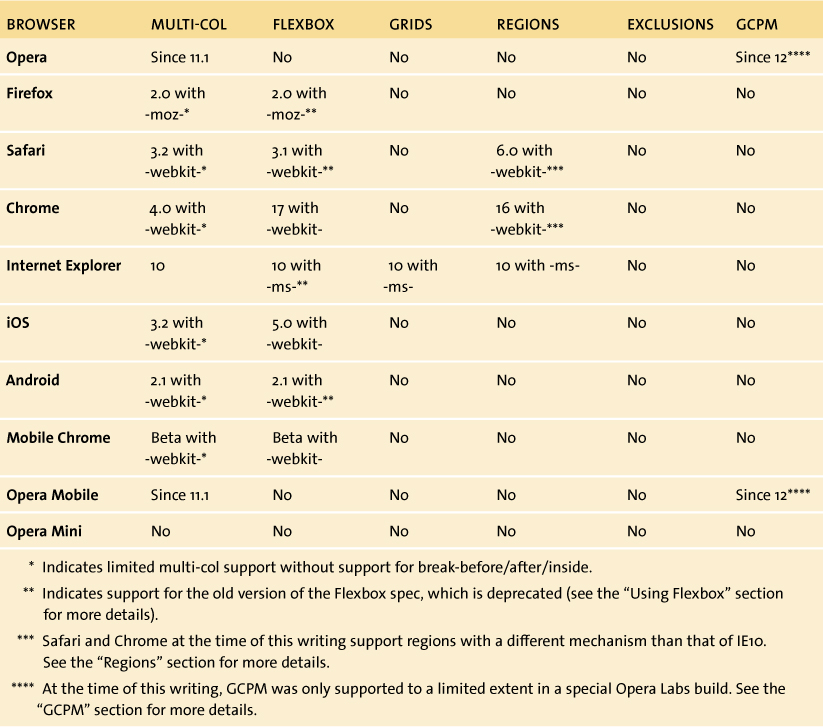
Table 7.1 summarizes the support for these features.
Table 7.1 Browser Support Matrix for CSS3 Layout Features
Multi-col Layouts
The CSS Multi-column layout spec provides you with a small, focused set of tools for breaking a body of content into multiple columns. This isn’t just limited to text: You can create multi-col layouts with it if you like, and do smart tasks like have images or other elements span more than one column. But it isn’t great for full multi-col layouts. For example, you can’t specify different widths for individual columns.
So without further ado, let’s look at a simple example. You can find my finished example in the file simple-multi-col1.html in the chapter7 code download folder. In the file, note that the multi-col-related properties have been specified with prefixes for Firefox, and the WebKit browsers but not for IE and Opera, which supports them without prefixes. Also note that most of the properties are applied to the parent container of the actual content you want to split into columns, in this case the <section> element that contains the main dummy content.
Setting the Number of Columns
To start, you use the column-count property to specify the number of columns you want:
section {
column-count: 3;
}
Specifying a number of columns equally divides your content into that number of columns across the horizontal space available. This produces the effect shown in Figure 7.1.
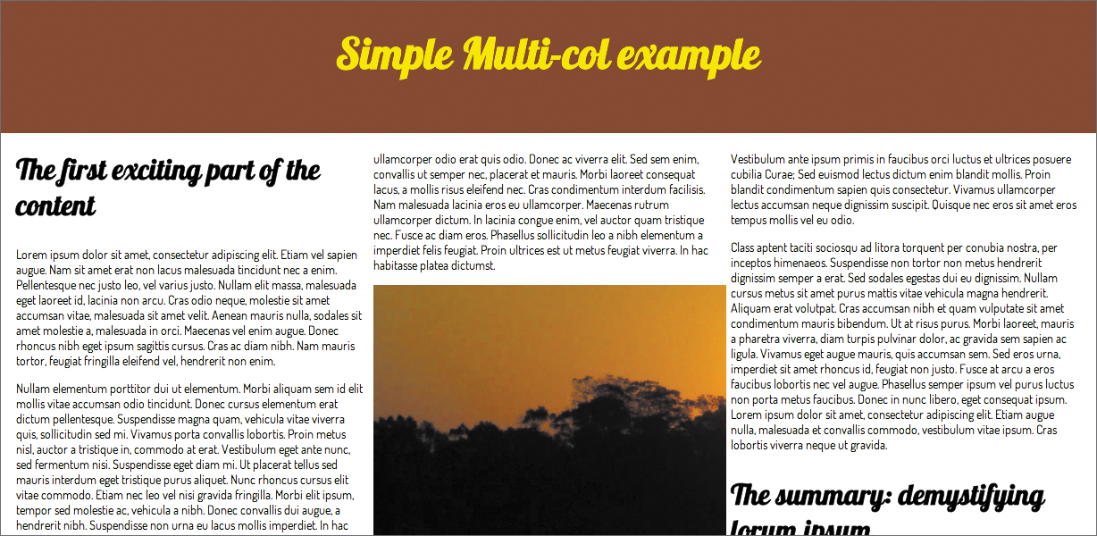
Figure 7.1 Multiple columns were never this easy before!
You can immediately see why this is useful: It is so flexible and easy. Prior to the introduction of this property, you had to break the content into multiple child containers and then float those; if content or layout requirements changed, you had to modify your markup.
 Note
Note
In my code you’ll see that to give the columns some space around the edges and line up at the top, I had to apply some padding to the whole <section> and remove the top padding from the first main content <h2>. You need to think carefully about this kind of styling when trying to get multi-col layouts to look right. You’ll learn more about this in a more complicated example later in this chapter.
Column Width, Not Count?
Another option available to you for indicating the number of columns you want is to specify a column-width property with a unit distance, like so:
section {
column-width: 25rem;
}
The effect this has is to make the columns adopt a best-fit approach. If three lots of the specified distance can fit into the available container width or thereabouts, you’ll produce three columns. If the width becomes narrower or wider, you may end up with two or four, and so on. The actual column width does vary, because the browser tries to fit the columns as neatly as possible. Figure 7.2 shows a comparison of different container widths.
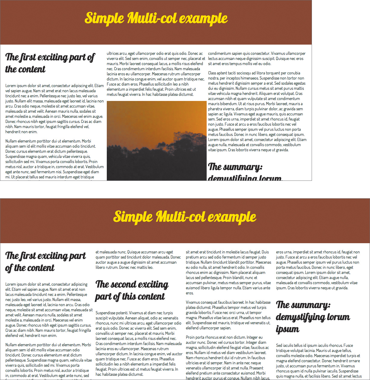
Figure 7.2 Varying numbers of columns as the container width is increased.
Specifying Column Gutters
Next, you’ll add a couple of properties to specify how to divide vertical rules and space between the columns:
section {
column-width: 25rem;
column-rule: 3px solid #8B2101;
column-gap: 2rem;
}
This produces the result shown in Figure 7.3.
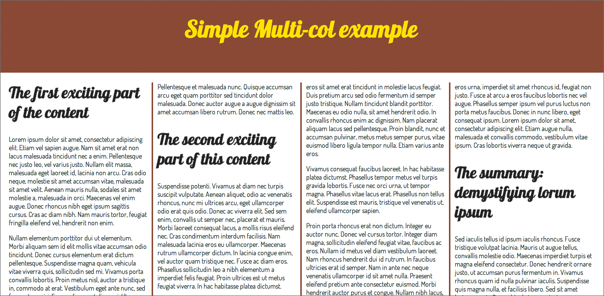
Figure 7.3 A much neater effect. You’ve created dividing rules and column gaps to improve legibility.
Note that the value given to the column-gap property is divided equally on either side of the column-rule. So in the preceding example, in between each column you’ll get a gap of 1 rem, followed by the 3-pixel rule, and then another gap of 1 rem.
Note that the column-rule property is shorthand and works in the same way with the same values as the standard border property. You can even specify the different components in longhand if you like:
column-rule-width: 3px;
column-rule-style: solid;
column-rule-color: #8B2101;
Specifying How the Columns are Filled with Content
Another property you can specify, column-fill, can take two different properties, auto and balance. auto is the default, which just makes the columns fill up left to right and down to a certain length. This can cause an uneven result, as shown on the left in Figure 7.4. The better option is often balance, which fills in the content as equally as possible across the columns, leaving less unsightly gaps, as shown on the right in Figure 7.4.
section {
column-width: 20rem;
column rule: 3px solid #8B2101;
column-gap: 2rem;
height: 85rem;
column-fill: balance;
}
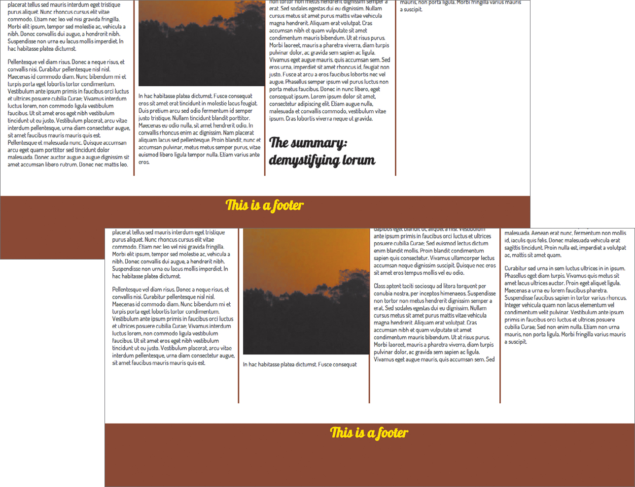
Figure 7.4 Demonstrating the difference between auto column fill (left) and column-balanced column fill (right).
The problem with column-fill is that it only has an effect when you set a fixed height on the container that you are applying multi-col effects to, as you did in this example. From my experience, you’ll almost never want to do this because you can rarely control the exact amount of content you’ll want to show across multiple pages using the same template. So column-fill is of limited use in my opinion. I’ve left the code in the example for you to look at but commented it out.
Span Content Across Multiple Columns
Usually, you won’t want all your content to just sit in one column. The example could definitely do with some sorting out of those top-level headings, and the image is cut off. What can you do, aside from going down to the pub (or better still, logging on to Twitter) and complaining about the web not being print? You can remedy these problems somewhat with the column-span property. Look at the file simple-multi-col2.html. It is the same as the previous example, except that it has an image added into the main content body. Let’s make the main headings and the image span all the columns, like so:
section h2 {
column-span: all;
}
section h2 + p, section img + p {
margin-top: 0;
}
section img {
column-span: all;
margin: 1rem auto;
}
Note that I’ve also given the image some top and bottom margins, and removed the top margin from the paragraphs directly after a heading or image to make the paragraphs line up nicely across the columns. Figure 7.5 shows the result.
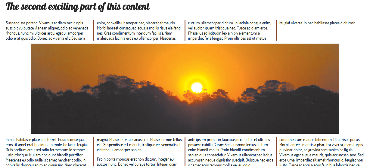
Figure 7.5 Causing selected elements of the layout to span multiple columns.
column-span seems a bit limited in its effects: The only available values are 1 and all, which seems surprising. I would expect it to break items across a set number of columns higher than 1. In addition, it doesn’t seem to work in Firefox at the time of this writing, which limits its cross-browser appeal. In Firefox the headings don’t look too bad in one column, but the image looks rather broken. At the time of this writing, work is being done on implementing column-span in Firefox, but no ETA has been announced.
Controlling Where the Columns Break
A number of properties defined in multi-col are intended to allow you to set where columns will break. To illustrate this, let’s look at the file our-friends-multi-col.html. It is the same as the previous version of this example you saw, but I’ve added some <h3> elements into the mix and an unordered list to experiment with. As is, the situation isn’t great; you’ll tend to get unsightly column breaks in places, such as just after the <h3>s.
To remedy this problem, you need to tell the browser where to break your columns! The available break properties and their values are as follows:
• break-before. Controls breaking before the element(s) being selected. Possible values are auto, always, avoid, column, and avoid-column.
• break-after. Controls breaking after the element(s) being selected. Possible values are auto, always, avoid, column, and avoid-column.
• break-inside. Controls breaking inside the element(s) being selected. Possible values are auto, avoid, and avoid-column.
Note
There are other break property values besides those listed, but they only apply to paged media: avoid-page, left, page, and right.
To stop the columns from breaking after headings, you could use the following ruleset:
h3 {
break-after: avoid-column;
}
It is also best to always break columns before the <h3>s so they appear at the top of the columns. This can be done like so:
h3 {
break-before: column;
}
A Real Multi-column Layout
Let’s finish off this section with a slightly more complicated example—a more traditional multi-col layout with different elements in each column rather than just a single body of text split into columns. Check out the file our-friends-multi-col.html, the first version of my parody Disney movie. It contains more complicated content: six character bios. Each bio consists of a heading, image, and paragraph:
<article>
<h2>...</h2>
<img src=" " alt=" ">
<p>...</p>
</article>
The only multi-col property this uses is column-width, which allows the number of columns to change at different widths without modifying the content.
section {
...
column-width: 36rem;
}
To get the columns to sit well, I set a fixed height on the articles:
article {
...
height: 45rem;
...
}
You are now in possession of a useful little responsive multi-column layout (Figure 7.6). This layout is actually very quick to implement and is flexible, compared to using floats.

Figure 7.6 Try altering the width of the screen, and you’ll see the number of columns adjust from three to two to one—very cool!
Multi-col Problems
Apart from some of the support issues documented earlier, the CSS Multi-column layout module has other problems associated with it. First, it obviously won’t work in older browsers like IE6–9. To remedy this, you could use Modernizr to detect support for multi-col (see Chapter 5 for more information on Modernizr) and provide alternative styling for nonsupporting browsers, perhaps using some kind of slightly more limited floated layouts. Modernizr refers to multi-col as csscolumns. This is what you are testing for.
Second, multi-col has a fairly limited scope in terms of how it can be used: It was created to be used in specific circumstances where you want to put content into multiple columns and the content isn’t too complicated. You can’t create full magazine-style layouts or full multiple-column sites with multi-col, because you can’t specify widths of individual columns, column breaking seems unreliable, and the spec in general is limited in scope. For such tasks, you need a combination of different layout tools.
Using Flexbox
Flexbox (www.w3.org/TR/css3-flexbox) is designed to facilitate some complicated layout techniques involving the spacing and ordering of child containers of a box. It is actually a new type of box model. To lay out some elements using Flexbox, you must set their parent container to use the new box model by using a new value of the display property:
section {
display: flex;
}
Or if you want your container to be inline, you’d use this:
section {
display: inline-flex;
}
Now let’s get cooking with some examples.
Controlling Flexbox Child Flow Direction
Let’s begin by briefly looking at an example of laying out some content using Flexbox. (See the file our-friends-flexbox.html in the chapter7 code download folder.) Three <articles> with varying content are contained in a <section>, and the <section> has been set to be laid out as a flexbox with this code:
section {
display: flex;
flex-flow: row;
}
article {
width: 30%;
padding: 1rem 2rem;
}
This causes the children to be laid out in a horizontal row (Figure 7.7).
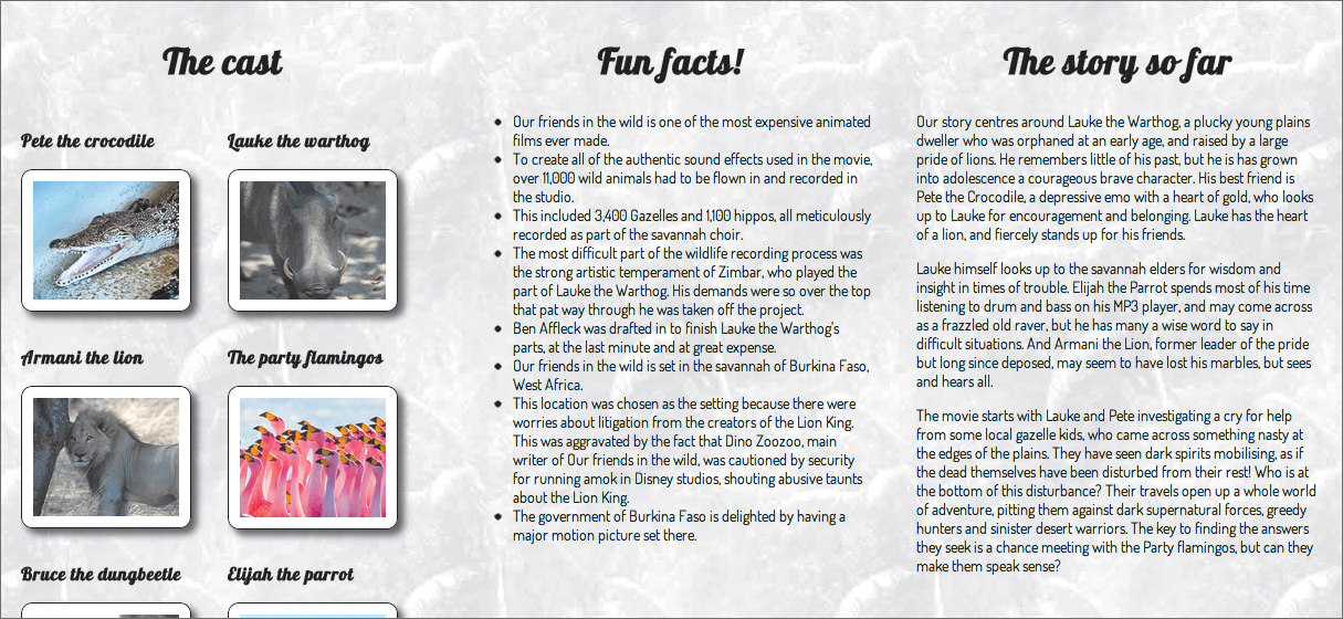
Figure 7.7 Our default, simple layout block is looking OK so far.
If you wanted to lay out your child elements vertically instead in a column, you could do this:
section {
display: flexbox;
flex-flow: column;
}
And the great thing is that you can also reverse the direction the child elements are displayed in, either horizontally or vertically, by using row-reverse and column-reverse. Try these options to see what happens!
Wrapping Elements Onto New Lines
If there are enough child elements to overflow the parent element, you can make them wrap onto multiple lines by adding an extra keyword to the flex-flow property, as shown in the example file our-friends-flexbox-wrap.html:
section {
display: flexbox;
flex-flow: row wrap;
}
This is similar to the previous example but contains six <article>s of equal width, not three. This produces the result shown in Figure 7.8. Note how, when you reduce the width of the browser window, the layout will go from three to two to one column—a cool responsive effect.

Figure 7.8 Using row wrap to make child elements wrap neatly across different rows down the container is very useful in some circumstances.
Note: flex-flow is actually a shorthand property for setting the flex-direction and flex-wrap properties on one line. Their possible values are as follows:
• flex-wrap. nowrap, wrap, wrap-reverse
• flex-direction. row, row-reverse, column, column-reverse
• If you are using flex-flow: row; or flex-flow: row-reverse;, the main axis will be horizontal, and the cross axis will be vertical. This is illustrated at the top in Figure 7.9.
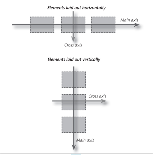
Figure 7.9 An illustration of Flexbox’s main axis and cross axis.
• If you are using flex-flow: column; or flex-flow: column-reverse;, the main axis will be vertical, and the cross axis will be horizontal. This is illustrated at the bottom in Figure 7.9.
Customizing Display Order of Child Elements
Another rather killer feature of Flexbox is that it gives you the ability to change the ordering of your child elements. This is done using the order property. For example, going back to the our-friends-flexbox.html example, if you want to grab the first <article> (“Fun facts!”) and display it last, you could do this:
article:nth-of-type(2) {
order: 1;
}
This initially looks illogical. Surely this code should cause it to appear first, not last. With flex-order, you put your child elements inside ordinal groups: The elements from each ordinal group appear from lowest ordinal group number to highest ordinal group number, starting from 0. If multiple elements appear in the same ordinal group, they will then be ordered inside the group according to their position in the original source order.
In the preceding code you are putting the first <article> into ordinal group 1. But the default ordinal group is 0; therefore, all the other elements will appear before it in their natural source order. If you want to make the fourth <article> appear first inside the flexbox, you could use the following:
article {
...
order: 2;
}
article:nth-of-type(2) {
order: 1;
}
See Figure 7.10 for the result.
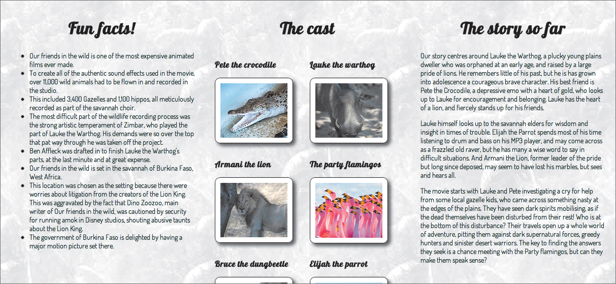
Figure 7.10 Varying the display order of the child elements using order.
Aligning Flexbox Children
Flexbox also rocks big time when you want to align your flexbox children at the start, middle, or end of a column of content, for example. You can use the justify-content property to align your children along the main axis in whichever direction you’ve set that to be. The possible values are flex-start, flex-end, center, space-between, and space-around.
I’ve used this to lay out the <header> content of my example. I wanted the content all centered, horizontally and vertically. This kind of layout is usually quite difficult to do, especially vertically (because you can’t rely on the old margin: auto trick for centering), and you usually end up messing around with positioning and inaccurate measurements.
To start with, you should set your <header> to be laid out like a flexbox in a vertical column:
header {
display: flex;
flex-flow: column;
}
By default this will lay out your elements in a column aligned to the left horizontally and sort of near the top vertically. Let’s first align them in a better position vertically:
header {
display: flexbox;
flex-flow: column;
justify-content: center;
}
Flexbox also makes another property available—align-items, which aligns the children along the cross axis, whichever direction that is at the time. You can use this to center the child elements horizontally, like so:
header {
display: flex;
justify-content: center;
flex-pack: justify;
align-items: center;
}
Figure 7.11 shows the result of this addition.

Figure 7.11 Flexbox makes centering and equally spacing elements inside their container very easy.
Notes
Possible values for align-items are flex-start, flex-end, center, baseline, and stretch.
There is also a property, align-self, which takes the same values as align-items. align-self, when applied to individual children of a flexbox, can be used to override behavior set on all children by align-items.
The Flexibility of Flexbox
The last Flexbox feature you’ll look at is the ability to make child elements and their surrounding whitespace flexible. The property you need to do this is flex, as shown here:
section {
display: flexbox;
flex-flow: row;
}
article {
flex: 1 1 200px;
}
So what do the three arguments inside the function do?
The third value is the preferred size of the child elements. If specified, the size value will be applied to all the children before the other arguments come into effect. So if you set this as 200 pixels, each child element will have a width of 200 pixels (or height, if flex-flow is set to column rather than row).
The first value is the positive flex, a proportion that dictates what share of remaining space available in the parent the children will have. So, for example, if the parent element of the three <article>s was 750 pixels and each one had a positive flex value of 1, as in the preceding code, the extra 150 pixels would be split equally between the children; each one would end up as 250 pixels wide.
If one of the children had a positive flex of 2, it would receive twice as much of the remaining space as the other two, so would end up as (150/4 × 2) + 200 = 275 pixels. The other two would be 150/4 + 200 = 237.5 pixels. The positive flex is the only mandatory argument.
The second value is the negative flex and is also a proportion, except that it works in the opposite direction to the positive flex value. This dictates what happens when the children of the flexbox overflow their parent. In the preceding example, if the parent element was 750 pixels wide and the children had a preferred size of 300 pixels for a total width of 900 pixels, they would overflow the parent by 150 pixels. A negative flex value of 1 given to all of them would cause each one to be reduced by 50 pixels to stop them overflowing their parent; each would end up as 250 pixels wide.
If one of the children had a negative flex of 2, it would be reduced in width by twice as much as the other two, so would end up as 300 - (150/4 × 2) = 225 pixels. The other two would be 300 - 150/4 = 262.5 pixels. So in the case of negative flex, a lower number means less of a reduction and therefore a wider element!
Note: If no explicit negative flex value is set, the default value comes into play, which is 1.
This is complex, so let’s go over the workflow here. If you specify all three arguments, the workflow looks like this:
1. The preferred size is applied to all the flexbox children.
2. The remaining space is divided between the flexbox children according to the positive flex value set.
3. If the combined width (or height) of the children causes them to overflow the parent container, the negative flex values, if set, will shrink them down until they fit in. The ratio of these will dictate how much each child is shrunk by.
Note that flex is actually a shorthand property. You can see the three values it holds individually using flex-grow, flex-shrink, and flex-basis.
Time for an example! Look at the our-friends-flexbox-flexible.html file in the chapter7 code download folder. This is the same as our-friends-flexbox.html but with some experimental flex values applied to the <article>s. Be prepared to follow along and change them if you want to experience the different effects.
Let’s start by setting the following values on the child <articles>:
#cast {
flex: 1;
}
#facts {
flex: 1;
}
#plot {
flex: 1;
}
This code produces the result shown in Figure 7.12. The three <articles> have been given flex: 1, which gives them a positive flex ratio of 1 : 1 : 1, so they will always take up an equal part of whatever space is available.
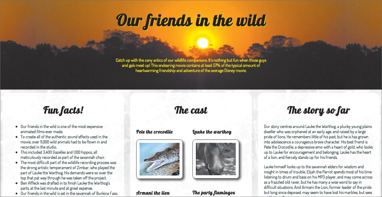
Figure 7.12 In the current layout, The Cast and Facts containers have been given an equal proportion of the flexible space. I’ve included a subtle background on the child elements in this example so you can more easily see what is going on.
Now let’s see what happens when you give the #cast container a flex value of 2:
#cast {
flex: 2;
}
Figure 7.13 shows the effect. The ratio is now 2 : 1 : 1, so the Cast is now given twice as much of the flexible space as the others.

Figure 7.13 The Cast is now taking up twice as much space as the Facts.
Let’s briefly explore the other two arguments and their effects. Try setting these values on your properties:
#cast {
flex: 1 400px;
}
#facts {
flex: 1 250px;
}
#plot {
flex: 1 250px;
}
In this case, you are setting widths of 400, 250, and 250 pixels on the flexible containers; the remaining width is then divided equally between them, because the positive flex is set to 1 for all of them.
Now try these values:
#cast {
flex: 1 400px;
}
#facts {
flex: 1 400px;
}
#plot {
flex: 1 500px;
}
Here, the combined widths would cause the containers to overflow their parent, which would look horrible. Fortunately, a default negative flex value of 1 is set on all of the children, which causes them all to shrink by an equal amount of the overflow, meaning that all is well. If you wanted one of the children to be reduced by a larger amount than the others, you could set an explicit negative flex value on it, for example:
#plot {
flex: 1 3 500px;
}
Now the flexible boxes are shrunk in size until they no longer overflow their container. Because the negative flex ratio #cast to #facts is 1 : 3, #cast will have ¼ of the total width reduction applied to it, and #facts will have ¾ of the total width reduction applied to it.
This would cause the Plot to be shrunk by  ths of the overflow amount, and the other two to be shrunk by only
  th—the shrinking ratio is 1 : 1 : 3.
Cross-Browser Flexbox with Modernizr
As you’ve seen, Flexbox is very useful for solving some specific types of layout problems. The main problem with it right now is the lack of browser support. The new syntax you’ve seen so far in this section is only supported in Chrome Canary at the time of this writing.
To make it work across a wider range of browsers at the moment, you’ll need to feed other browsers the now deprecated 2009 Flexbox syntax that was implemented by Firefox, WebKit browsers, and IE.
Note
The site http://wiki.csswg.org/spec/flexbox-2009-2011-spec-property-mapping provides a fairly useful table showing the mapping between the old and new syntaxes, although this is now somewhat out of date. Peter Gasston, tech reviewer for this book, has written a useful guide to the old syntax at www.netmagazine.com/tutorials/css3-flexible-box-model-explained.
You can put your cross-browser flexbox into action using your old friend Modernizr. Modernizr detects support for the new Flexbox syntax (flexbox/no-flexbox) and the old version (flexbox-legacy/no-flexbox-legacy).
Look at the code download file our-friends-flexbox-modernizr.html. This is the same as the previous example you looked at except that Modernizr is included on the page, and a whole raft of legacy Flexbox properties are applied to browsers that only support the old syntax using Modernizr’s descendant selector system. I won’t list all of the fallback code here, but you can find it under the “Modernizr fallback rules” flag in the our-friends-flexbox-modernizr.html file.
These properties work fairly well and are fairly self-explanatory, although I found that box-flex (the old syntax of flex) seemed to work slightly oddly and unreliably. Hopefully, browsers will support the new syntax soon so that this kind of craziness will become a thing of the past!
 Tip
Tip
To provide browsers that don’t even support the old Flexbox syntax with alternative layout rules, use .no-flexbox-legacy xxx { ... }.
Exploring Grids
The CSS Grid Positioning Module Level 3 (www.w3.org/TR/css3-grid) is designed to allow web designers to lay out web pages neatly in a stable grid. You most likely already do this, but usually you create your own grid system or use a third-party framework, such as 960 (http://960.gs) or Blueprint CSS (http://blueprintcss.org). CSS3 grids offer a simple native way of creating your own grid system, which has to be a good thing.
At the time of this writing, CSS3 grids are only supported by IE10 and nightly builds of the WebKit browsers (with -ms- and -webkit- prefixes, respectively), so I won’t cover them in depth. However, I’ll provide you with a solid example of how to use them, because they are bound to be important in the future.
In this example you’ll put together a simple grid layout using these nu-schule-kool-toolz (technical term.)
Defining the Grid Structure
In a similar fashion to Flexbox, CSS3 grids work by using a custom value of the display property, grid, to designate a container as an area of the page that will be laid out using CSS3 grids (look at the file simple-grid.html in the chapter7 code download folder to follow along with this first example):
body {
display: grid;
}
You then divide this container into columns and rows using the grid-columns and grid-rows properties, like so:
body {
display: grid;
grid-columns: 30rem 40rem 30rem;
grid-rows: 1fr 1fr 1fr 1fr;
}
The grid-columns property specifies three columns in the grid, and they are 30 rems wide, 40 rems wide, and 30 rems wide, respectively. In this case, the grid-rows property is using a new CSS unit called fr (fraction), which means I will be this many parts of the total big. So in this case you have four rows that are all 1fr big for a total of 4fr. Therefore, each row spans 1/4 of the total height of the body.
You could also use percentages, other CSS length units, or auto to specify columns, for example:
body {
display: grid;
grid-columns: 30% 40% 30%;
grid-rows: 1fr 1fr 1fr 1fr;
}
In this alternative version, I’ve changed grid-columns so that the columns are percentages (you can see this alternative example in simple-grid2.html). Percentages work the way you’d expect them to, although you need to be careful about using weird combinations of percentages and absolute unit values: If they end up as less than 100% in one or both dimensions, you’ll waste space and produce unexpected results. If they end up as more than 100%, your content may be cut off.
Fitting Your Content Onto the Grid
Next, you need to start fitting your content onto the grid. This is done by applying some special properties to the child elements of the container that is set to display as a grid. In this simple example, the children look like this:
<header>
<h1>Header</h1>
</header>
<div id="block1">Block 1</div>
<div id="block2">Block 2</div>
<div id="block3">Block 3</div>
<div id="block4">Block 4</div>
<footer>
<h2>Footer</h2>
</footer>
You can fit these elements to the grid you defined earlier using the following properties:
• grid-column specifies the column the child element will be placed in, or start in, in the case of children that span multiple columns.
• grid-column-span specifies the number of columns that the child element will span (optional).
• grid-row specifies the row the child element will be placed in, or start in, in the case of children that span multiple rows.
• grid-row-span specifies the number of rows that the child element will span (optional).
So, for example, you could lay out your content like this:
header {
grid-column: 1;
grid-column-span: 3;
grid-row: 1;
}
footer {
grid-column: 1;
grid-column-span: 3;
grid-row: 4;
}
#block1 {
background-color: blue;
grid-column: 1;
grid-row: 2;
grid-row-span: 2;
}
/* And so on - look at the code file for the rest of it */
This simple grid layout is shown in Figure 7.14.
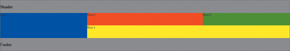
Figure 7.14 A simple grid layout in action.
You can use nested grids if you like to create all kinds of complicated layouts, although if you consider doing this, your information architecture might need revisiting! I’m sure this simple example gives you a good idea of how powerful these grids can be, especially considering that you can create liquid grids as well as fixed grids, and you can place elements wherever you like on the grid regardless of source order and structure.
A Real Grid Example
Now let’s look at a more complex example. Here you’ll go back and re-lay out the “our-friends” in the wild example again using CSS grids. As you follow along, you can look at the file our-friends-css-grids.html in the code download to find the right code if you go wrong at some point.
As grids become more complex, it’s best to start drawing them out on paper (or some other medium) and then refer to the sketch as you start placing your content. The grid you’ll use looks something like the one shown in Figure 7.15.
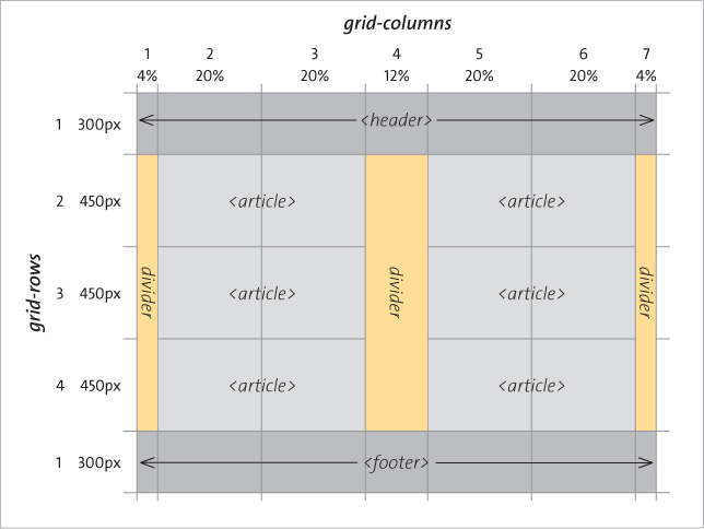
Figure 7.15 A schematic of the example grid.
I’ve provided you with the columns and rows declarations free of charge:
grid-columns: 4% 20% 20% 12% 20% 20% 4%;
grid-rows: 300px 450px 450px 450px 300px;
Now you need to work out rulesets to place all the content in the places shown on the schematic. Look at the example file if you get stuck! The final example looks the one shown in Figure 7.16.

Figure 7.16 Using CSS grids to lay out our lovely animal friends.
Grid Problems
IE10 is the only browser with decent support for CSS grids at the time of writing. However, I believe it was worth talking about them, because all the browser vendors have shown an interest in them of late.
You could also argue that they are not quite as flexible as other layout methods you’ve seen already. One aspect of grids that surprised me is that you can only place immediate children of the grid layout element on the grid. But I think it depends on how you use them. For example, you could use a simple grid to place a header, footer, and three columns easily, and then lay out the content inside them using a different mechanism, such as Flexbox. A combination of these layout methods would prove effective in your layout design.
Other Layout Modules Worthy of Mention
A few other CSS3 layout modules are also worth mentioning, although I’ll just talk about them briefly, because their browser support and finished status is even more nonexistent than those you’ve learned about already.
Regions
The CSS Regions Module Level 3 spec (http://dev.w3.org/csswg/css3-regions) defines a set of functionality for specifying different elements to flow content into. This was supported in IE10 and Chrome/Safari nightlies at the time of this writing. But at the time, the spec looked to be very much in flux and likely to change—hence my unwillingness to cover it in much detail.
However, for completeness I’ll walk you through it. See the file simple-regions-ms.html in the chapter7 code download folder for an example that will work in IE10. Here you have a set of <div>s for laying out content into:
<section id="layout">
<div id="region1" class="region"></div>
<div id="region2"><img src="images/sunset.jpg" alt="sunset image"></div>
<div id="region3" class="region"></div>
<div id="region4" class="region"></div>
<div id="region5" class="region"></div>
</section>
The actual content is stored in a separate file—region-content.html—and included at the bottom of the main example page using an iFrame:
<iframe id="region-content" src="region-content.html">
The region’s magic works as follows: You identify the source of the content (in this case, the iFrame) by its ID and give it a keyword of your choosing:
#region-content {
-ms-flow-into: my-regions;
}
You then dictate where the content should flow into by applying your keyword to the relevant elements. In this case, I wanted the content to flow into the four <div>s that have a class of region:
.region {
padding: 1rem;
background-color: red;
border: 1px solid white;
-ms-flow-from: my-regions;
}
This is how it currently works in IE10, and it produces the layout shown in Figure 7.17. Note how I’ve actually created this layout using a CSS grid. Indeed, you can lay out the page in any way you want, and then put the content into elements of your choosing using regions.
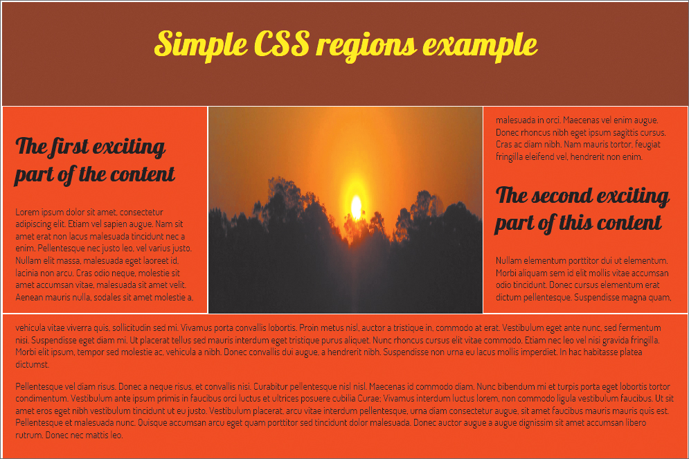
Figure 7.17 Using CSS regions to lay out content into a grid.
Try resizing the browser window and note how the content keeps reflowing inside the regions: The reason is that I’ve set the width of the grid rows using percentages. The content starts to flow into the first region in the source order and then continues to the second region when the first is filled, and so on.
WebKit-based browsers currently support regions but with a different syntax that isn’t limited to using an iFrame to contain the content:
#region-content {
content: -webkit-from-flow("flow_name");
}
.region {
-webkit-flow: "flow_name";
}
An example of this that will work in Chrome Canary only (at the time of this writing) can be seen in simple-regions-webkit.html. Be warned though: To enable CSS regions in this browser, you currently need to type about:flags into the Chrome Canary URL bar, enable CSS Regions in the settings, and relaunch.
Tip
In the same manner as multi-col, you can use break properties to specify where content should and shouldn’t break when it is nearing the edge of your regions. See http://dev.w3.org/csswg/css3-regions/#region-flow-break for more details.
Exclusions
The idea behind the CSS Exclusions and Shapes Module Level 3 (http://dev.w3.org/csswg/css3-exclusions) is that you can define a shape or specify an element and then flow content around that shape/element, thereby creating complicated layouts. You might see these types of layouts in a magazine with text flowing around an image of a mountain or a floated image halfway between two columns of text. You can think of exclusions as a way to create more powerful floats. Indeed, CSS3 did have a feature called positioned floats, which was invented by Microsoft, but this seems to have been merged with the Exclusions spec now.
Exclusions aren’t supported anywhere at the time of this writing, but I’ll at least give you an idea of how they are supposed to work. To make a more interesting float, you could have a simple section with a figure inside it, like this:
<section>
...
<figure> ... </figure>
...
</section>
You should be able to absolutely position the figure inside the section, and then turn it into an exclusion using the wrap-flow property:
figure {
position: absolute;
color: #fff;
top: 30%;
left: 40%;
wrap-flow: both;
}
You can then give it padding and a margin, like so:
figure {
position: absolute;
color: #fff;
top: 30%;
left: 40%;
wrap-flow: both;
wrap-padding: 10px;
wrap-margin: 10px;
}
wrap-flow specifies what side of the exclusion element, in this case the figure, you want the text to flow around. You can specify auto, start, end, both, maximum, or clear:
• auto is the default: If you set this value, the surrounding text will not wrap around the exclusion; it will just sit underneath the exclusion element as if it doesn’t exist.
• start means that content will wrap around the start of the exclusion, but the space after the end of it will be left empty of content.
• end means that content will wrap around the end of the exclusion, but the space before the start of it will be left empty of content.
• both means that the content will wrap around the start and end of the exclusion.
• maximum will cause content to wrap around the side of the exclusion that has the largest amount of space next to it.
• clear means that content will only wrap around the top and bottom of the exclusion; the space to the left and right (start and end) of it will be left empty.
wrap-margin specifies how much margin you want left between the exclusion element and the rest of the content.
wrap-padding specifies how much padding you want left between the exclusion element and the rest of the content.
If you have multiple exclusions interacting inside the same space, they should wrap around one another in reverse order of how they are placed in the document. See http://dev.w3.org/csswg/css3-exclusions/#exclusions-order for more details.
If you want your content to flow around a more complicated shape, you can define what the shape of the exclusion will be using the shapes part of the Exclusions spec: See http://dev.w3.org/csswg/css3-exclusions/#shapes. You’ll be able to create circles, ellipses, and so on to shape your exclusions or even base those shapes on images.
GCPM
Finally, let’s look at the CSS Generated Content for Paged Media (GCPM) module (www.w3.org/TR/css3-gcpm). This module is currently supported only by the experimental “Opera Reader” technology, but it is lots of fun to play with. You can set your whole web page (or a small part of it) to be paginated using rulesets defined in a special paged at-rule:
@media -o-paged {
...
}
To set the whole page content, you can do this:
@media -o-paged {
html {
height: 100%;
overflow: -o-paged-x;
}
}
When you load this page in a supporting browser, the whole page content will be paginated, and you can flick through the pages by swiping left and right on a touch device, and by using arrow keys on a non touch device.
Opera Reader/GCPM has many more features besides. See Håkon Wium Lie’s website at http://people.opera.com/howcome/2011/reader for experimental builds and a more complete treatment.
Wrapping Up
In this chapter you explored some of the new layout features contained among the CSS3 modules, including multi-col, flexbox, exclusions, and generated content for paged media.
A significant number of these features are currently not supported across browsers, and unfortunately, some of them don’t degrade gracefully, causing layouts to completely break in those browsers that don’t support them. However, browser vendors are working hard on adding support for them. In the meantime, you can provide alternative styling to nonsupporting browsers through tools like Modernizr, and you should be prepared for the revolution when it comes.