
C H A P T E R 2
A Rollover Picture Gallery
Artists or retailers of greetings cards may ask you to create a rollover picture gallery. These galleries are also great for almost any project, including retailers with multiple pictures of products, restaurants with menus, non-profit organizations with pictures of events, and so on. The rollover effect works when the cursor is hovered over a thumbnail picture, this causes an enlarged version of the image to pop up. This chapter demonstrates how this can be achieved using CSS without resorting to tables or complicated scripts.
I am most grateful to the portrait artist Ann Roe Jones for allowing me to use the images from the web site I created for her. The cards depicted are based on her superb paintings. These images are used in all the examples in this chapter.
Visit her web site at http://www.annroejones-artist.co.uk. To see the rollover gallery in action, click the Cards button in the menu.
An Introduction to the Technique
The number of columns or rows can vary, and photo sizes cannot always be uniform—some may be wider or shorter. A universal template is, therefore, not possible. You can adopt the solution given next, or resize and/or crop the thumbnail images to a uniform size.
Create two versions of each image, a thumbnail of the image and a large version of the image. I have labeled the pairs in this manner alithumb.jpg and alibig.jpg. Each column of thumbnails is achieved by means of an unordered list. Each list element has a target link, <a>…</a>, which is instructed by the CSS style sheet to respond to the cursor hovering over its thumbnail.
Create the link from each thumbnail image to its large version using CSS, like this:
<ul id = "col-1">

<li>

<a href="#">

<img src = "alithumb.jpg" title="Ali" alt="Ali">

<img class = "hid" src="images/alibig.jpg" alt=" ">

</a>

</li>

</ul>
Some things to note include the following:
- The two lines containing the images are enclosed in
<a>tags. This is so that they can be made to respond to the cursor hovering over the thumbnail.- The line for the larger image contains the
class="hid"and an empty alt, i.e.,alt=" ".- The CSS instructs any
class="hid" element to remain hidden until the cursor hovers over the thumbnail.- The target columns in the markup will be col-1, col-2, col-3, and so forth, so that the CSS can position them on the page.
Image Size and Format
The technique is easiest if all the thumbnails have the same format and dimensions, and all the enlarged images have the same format and dimensions.
However, life is never that simple. You may have some images in landscape format, some in portrait format, and some may have a square format. If you need to use different formats and sizes, see the instruction associated with Figures 2-4 and 2-5 later in this chapter.
A Single-Column Gallery
Figures 2-1 and 2-2 show a single column gallery.
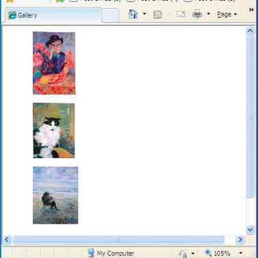
Figure 2-1. Three thumbnails in one column
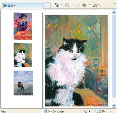
Figure 2-2. Hovering over the cat thumbnail
Listing 2-1a for this example creates a single column of thumbnail images. Each thumbnail image is a live link to a larger version of the image. The larger image appears when the cursor is rolled over the thumbnail. It appears on the same page and in the place reserved for it by the markup.
Listing 2-1a. Creating a Column of Thumbnail Images (gallery-one-col.html)
<!doctype html>

<html lang=en>

<head>

<title>Rollover Gallery, one column</title>
<meta charset=utf-8>

        meta details go here

<link rel = "stylesheet" type = "text/css" href = "gallery-one-col.css">

</head>

<body>

<ul id = "col-1">

        <li><a href="#"><img src ="images/alithumb.jpg" alt="Ali" title="Ali">

        <img class = "hid" src ="images/alibig.jpg" alt=" "></a></li>

        <li><a href="#"><img src ="images/catthumb.jpg" title="Cat" alt="Cat">

        <img class = "hid" src ="images/catbig.jpg" alt=" "></a></li>

        <li><a href="#"><img src ="images/beachthumb.jpg" title="Beach" alt="Beach">

        <img class = "hid" src ="images/beachbig.jpg" alt=" "></a></li>

</ul>

</body>

</html>
 Note No '
alt' is needed for the large image because the image vanishes when the cursor hovers over it.
In the CSS Listing 2-1b, the first block of MouseOut state code reserves a space on the page that will be occupied by the expanded images, but the expanded images are hidden from the user by the visibility:hidden; property. When the mouse is hovered over a thumbnail, the CSS markup in the second MouseOver state block reveals the expanded image.
Listing 2-1b. The CSS Style Sheet for Listing 2-1a (gallery-one-col.css
/*reset browsers to give cross browser uniformity*/

html, body, p, lu, li { margin:0; padding:0;

}

img { border:0;

}

/* Set general thumbnail styles */

/*place the column on the page*/

#col-1 { position: absolute; top: 0; left: 0;

}

/*remove bullets from the list elements*/

li { margin: 10px; list-style-type:none;

}

/* MouseOut state (default) - create a space for the larger images and hide them*/

#col-1 a img.hid { width: 260px; height:390px; position:

absolute; top: 10px; left: 140px; visibility: hidden;

}

/* MouseOver state (hover)- reveal larger image */

#col-1 a:hover { background: white;

}

#col-1 a:hover img.hid { visibility:visible;

}
A Two-Column Gallery
By adding a second column and inserting the appropriate rollover code for it, we can create a two-column gallery, as shown in Figure 2-3.
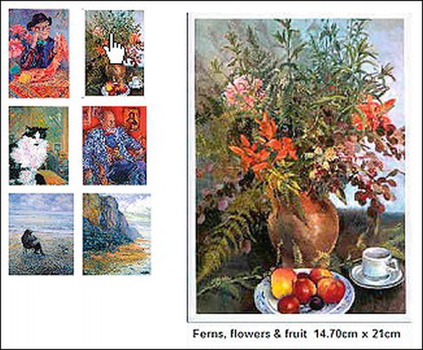
Figure 2-3. A two-column gallery. The cursor is hovering over the top-right thumbnail.
Figure 2-3 has an additional feature, the enlarged image has some descriptive text. To do this, resize the canvas for the enlarged image in your image manipulation software (e.g., Adobe Photoshop, Corel PaintShop Pro, or GIMP). Add about 20 to 30 pixels of white canvas area at the bottom of the image. Add the text using the image manipulation software and take note of the new image height.
Add canvas to give a consistent aspect ratio to the larger images. In this example, all the enlarged images have been created 260 pixels wide. Add canvas to all the enlarged images to give them the same height; this will ensure consistency of appearance—that is, none of the enlarged versions will look squashed or stretched.
It would seem appropriate to use the new <figure> <figcaption> tags here, but sadly, they fail because the caption becomes attached to the thumbnail instead of the large image. If you try surrounding the large image with <figure> <figcaption> using the following snippet of markup, you will see what I mean:
    <li><a href="#"><img src = "images/take-cardthumb.jpg" title="Take a card"

    alt="Take a card">

            <figure>

            <img class = "hid" src = "images/take-cardbig.jpg" alt="">

            <figcaption>Take a card</figcaption>

            </figure></a>

    </li>
Listing 2-3a and its CSS style sheet Listing 2-3b will create a rollover gallery with two columns.
Listing 2-3a. Creating a Rollover Gallery with Two Columns (gallery-2col.html)
<!doctype html>

<html lang=en>

<head>

<title>Two column rollover Gallery</title>

<meta charset=utf-8>

        meta details go here

<link rel = "stylesheet" type = "text/css" href = "gallery-2col.css">

</head>

<body>

        <ul id = "col-1">

        <li><a href="#"><img src =“images/alithumb.jpg" alt="Ali" title="Ali">

        <img class = "hid" src =“images/alibig.jpg" alt=" "></a></li>

        <li><a href="#"><img src ="images/catthumb.jpg" alt="Cat" title="Cat"/>

        <img class = "hid" src ="images/catbig.jpg" alt=" "></a></li>

        <li><a href="#"><img src ="images/beachthumb.jpg" alt="Beach scene"

        title="Beach scene"><img class = "hid" src ="images/beachbig.jpg" alt=" ">

        </a></li>

        </ul>

        <ul id = "col-2">

        <li><a href="#"><img src ="images/fernsthumb.jpg" alt="Ferns" title="Ferns">

        <img class = "hid" src ="images/fernsbig.jpg" alt=" "></a></li>

        <li><a href="#"><img src ="images/nicohumb.jpg" alt="Nico" title="Ferns"/>

        <img class = "hid" src ="images/nicobig.jpg" alt=" "></a></li>

        <li><a href="#"><img src ="images/cliffthumb.jpg" alt="Cliff" title="Cliff">

        <img class = "hid" src ="images/cliffbig.jpg" alt=" "></a></li>

        </ul>

</body>

</html>
Listing 2-3b presents the thumbnails as two columns and creates a space for the expanded images.
Listing 2-3b. The CSS Style Sheet for Listing 2-3a (gallery-2col.css)
/*reset browsers to give cross browser uniformity*/

html, body, p, lu, li {margin:0; padding:0;

}

/*set images to have no borders*/

img { border:0;

}

/*place the column on the page*/

#col-1 { position: absolute; top: 0; left: 0; width:85px;

}

/* Set general thumbnail styles and remove bullets from the list elements*/

li { margin: 5px; list-style-type:none;

}

/* MouseOut state (default) - create and position a space for the larger images

and hide them*/

#col-1 a img.hid { width: 260px; height:390px;

position: absolute; top: 10px; left: 250px; visibility: hidden;

}
/* MouseOver state (hover)- reveal larger picture */

#col-1 a:hover { background: white;

}

#col-1 a:hover img.hid { visibility:visible;

}

/*--THE 2ND COLUMN STARTS 85 PIXELS FURTHER TO THE RIGHT ---*/

#col-2 { position: absolute; top: 0; left: 85px; width:85px;

}

li { margin: 5px; list-style-type:none;

}

/* MouseOut state (default) - hide larger picture */

#col-2 a img.hid { width: 260px; height:390px;

position: absolute; top: 10px; left: 155px; margin-left:10px; visibility: hidden;

}

/* MouseOver state (hover)- reveal larger picture */

#col-2 a:hover { background: white;

}

#col-2 a:hover img.hid { visibility:visible;

}
A Mixture of Sizes and Formats in Three Columns
If the images all have portrait format, or all have landscape format or are all square, the thumbnails should all be created with the same height per row to give neat rows. This way you will have neat rows and columns of thumbnails, a minimum of markup, and very little CSS hassle.
However, the height of each row can vary. The thumbnails may then have different widths per column, but if the widths don’t vary too widely, you will probably have an acceptable display. Column widths can vary to accommodate groups of thumbnail images with almost the same thumbnail width.
If some of the thumbnails have different heights, arrange them so that each row contains similar height images. For instance, if you have twelve thumbnails and four of them have a height of 80 pixels, put those four in one row. If four thumbnails have a height of 90 pixels, put those four in the next row. If the final four thumbnails have a height of 95 pixels, put those in the last row. This way you will create neat rows of thumbnails.
Differing Formats
Real life, however, is never easy: images come in different formats, such as portrait, landscape, and square. If your thumbnails have various formats, put the portrait formats in one column, the landscape formats in another column, and the square formats in another column (as shown in Figure 2-4). Try to match the thumbnail heights to the row heights as described in the previous paragraph. For the expanded versions of the images, the formats (portrait, landscape, and square) will need to be treated differently so that the expanded images are not distorted due to squashing the various formats into one inappropriate size.
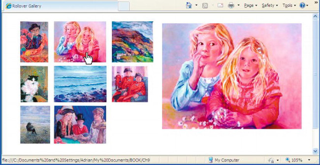
Figure 2-4. Three portrait thumbnails, three landscape thumbnails, and two square thumbnails. The cursor is hovering on the top landscape thumbnail, revealing the large version in landscape format.
Figure 2-4 demonstrates that shapes and sizes can be mixed. Each row has a slightly different thumbnail height: all the thumbnails in the top row have a height of 103 pixels, the thumbnails in the second row have a height of 91 pixels, and those in the bottom row all have a height of 95 pixels.
I made the bottom thumbnail in the first column a little wider than the upper two thumbnails to demonstrate that you need not be ultra fussy about widths.
Three formats of expanded image were created to match the three variations in format (portrait, landscape, and square) of the thumbnails. Three different column widths were provided to take the three formats.
In the third column, the top thumbnail is a 103 × 103 pixels square, the second thumbnail is 91 × 91 pixels square. The last row of thumbnails is the best place to present odd sizes because readers are used to a ragged right. Putting the odd sizes in the final column ensures that the gaps between all the other thumbnails are reasonably consistent.
Figure 2-5 shows the same page as Figure 2-4 but the cursor is hovering over the square image. The space reserved for the expanded images must be able to accommodate various image formats.
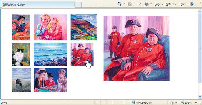
Figure 2-5. The cursor now hovers over the third column, second row to reveal a larger version as a square image. The large versions of the first column will appear as in Figures 2-1 and 2-2.
In Listing 2-5a, which corresponds to Figures 2-4 and 2-5, one thumbnail has been deliberately omitted from the bottom of the third column. This demonstrates that you don’t need to fill every column with thumbnails; for instance, your client may have provided you with an awkward number of pictures for her gallery.
Listing 2-5a. Creating Three Columns of Mixed Format Images with Rollover (gallery-3col-mix.html)
<!doctype html>

<html lang=en>

<head>

<title>Three column mixed image shapes</title>

<meta charset=utf-8>

<link rel = "stylesheet" type = "text/css" href = "gallery-3col-mix.css">

</head>

<body>

<ul id = "col-1">

<li><a href="#"><img src = "images/alithumb.jpg" title="Ali" alt="Ali">

        <img class = "hid" src = "images/alilarge.jpg" alt=""></a>

</li>

<li><a href="#"><img src = "images/catthumb.jpg" title="Cat" alt="Cat">

        <img class = "hid" src="images/catlarge.jpg" alt=""></a>

</li>

<li><a href="#"><img src = "images/beachthumb.jpg" title="Beach" alt="Beach">

        <img class = "hid" src = "images/beachlarge.jpg" alt=""></a>

</li>

</ul>

<ul id = "col-2">
<li><a href="#"><img src = "images/childrenthumb.jpg" title="Children" alt="Children">

        <img class = "hid" src = "images/childrenbig.jpg" alt=""></a>

</li>

<li><a href="#"><img src = "images/seathumb.jpg" title="Seascape" alt="Seascape">

        <img class = "hid" src = "images/seabig.jpg" alt=""></a>

</li>

<li><a href="#"><img src = "images/take-cardthumb.jpg" title="Take a card" alt="Take a card">

        <img class = "hid" src = "images/take-cardbig.jpg" alt=""></a>

</li>

</ul>

<ul id = "col-3">

<li><a href="#"><img src = "images/walesthumb.jpg" title="Wales" alt="Wales">

        <img class = "hid" src = "images/walesbig.jpg" alt=""></a>

</li>

<li><a href="#"><img src = "images/pensthumb.jpg" title="Chelsea pensioners"

alt="Chelsea pensioners">

        <img class = "hid" src = "images/pensbig.jpg" alt=""></a>

</li>

</ul>

</body>

</html>
Listing 2-5b provides the CSS presentation information for a three column gallery
Listing 2-5b. The CSS Style Sheet for Listing 2-5a (gallery-3col-mix.css)
/*set images to have no borders*/

img { border:none;

}

/*place the first column on the page*/

#col-1 { position: absolute; top: 0; left: 0; width:85px;

}

/*remove bullets from the list elements*/

li { margin: 5px; list-style-type:none;

}

/* MouseOut state (default) - create and position a space for the larger images and

hide them*/

#col-1 a img.hid { width: 250px; height:340px; position: absolute; top: 10px; left:

400px; visibility: hidden;

}

/* MouseOver state (hover)- reveal larger picture */

#col-1 a:hover { background: white;

}

#col-1 a:hover img.hid { visibility:visible;

}

/*----------------------------------------------------*/

/* Set 2nd column of thumbnails 85px further over to right*/

#col-2 { position: absolute; top: 0; left: 85px; width:135px;

}

li { margin: 5px; list-style-type:none;

}
/* MouseOut state (default) - hide larger picture */

#col-2 a img.hid { width: 350px; height:265px;  position: absolute; top: 10px; left:

315px; margin-left:0;   visibility: hidden;

}

/* MouseOver state (hover)- reveal larger picture */

#col-2 a:hover { background: white;

}

#col-2 a:hover img.hid { visibility:visible;

}

/*----------------------------------------------------*/

/* Set 3rd column of thumbnails 170px further over to right*/

#col-3 { position: absolute; top: 0; left: 230px; width:108px;

}

li { margin: 5px; list-style-type:none;

}

/* MouseOut state (default) - hide larger picture */

#col-3 a img.hid { width: 260px; height:260px; position: absolute; top: 10px; left:

175px; margin-left:0; visibility: hidden;

}

/* MouseOver state (hover)- reveal larger picture */

#col-3 a:hover { background: white;

}

#col-3 a:hover img.hid { visibility:visible;

}
More Columns and More Rows
Increasing the number of columns and rows is just a matter of adding similar blocks of HTML code and matching blocks of CSS code. The mathematics for positioning columns and hidden enlargements becomes more complex, but if your mathematical skills are low, positioning by trial and error is not too difficult if you have a good WYSIWYG editor.
Placing the Gallery Within a Real Web Page
Figure 2-6 shows a three-column gallery in a practical HTML5 web page.
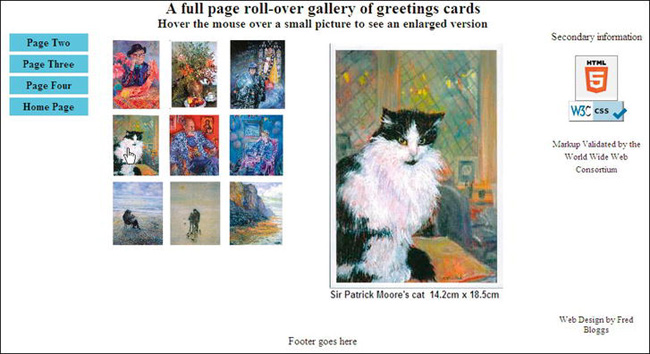
Figure 2-6. A web page with a gallery of three columns and three rows of thumbnails. The cursor is shown hovering on the first image in the second row.
Three semantic tags are used in this HTML5 markup: <header>, <nav>, and <footer>. The Remy Sharp JavaScript snippet is used to ensure that the page is displayed correctly in IE 7 and IE 8. Also, a conditional is used for positioning the gallery block in IE 7. You will notice in Figure 2-6 that I have displayed the new HTML5 validation logo. I have incorporated my snippet of code into the listing to enable users to check that the page validation is genuine. See Chapter 18 for further discussion of HTML5 validation.
Listing 2-6a is the HTLM markup for the rollover three column gallery shown in Figure 2-6.
Listing 2-6a. Creating a Three Column Rollover Gallery with HTML5 Validation Logo (gallery-page-validated.html)
<!doctype html>

<html lang=en>

<head>

<title>Complete Gallery page</title>

<meta charset=utf-8>

<link rel = "stylesheet" type = "text/css" href = "gallery-page-HTML5.css">

        <!--[if lte IE 7]>

        <link rel = "stylesheet" type = "text/css" href = "gallery-ie7.css">

        <![endif]-->

        <!-- conditional Javascript added -->

        <!--[if lte IE 8]>

        <script src="html5.js" type="text/javascript">

        </script>

        <![endif]-->

</head>
<body>

<header>

<h1>A full page roll-over gallery of greetings cards</h1>

<h2>Hover the mouse over a small picture to see an enlarged version</h2>

</header>

<nav>

<ul>

<li class="btn"><a href="#">Page Two</a></li>

<li class="btn"><a href="#">Page Three</a></li>

<li class="btn"><a href="#">Page Four</a></li>

<li class="btn"><a href="#">Home Page</a></li>

</ul>

</nav>

<div id="rightcol">

        Secondary information<br><br>

        <p><a href="http://validator.w3.org/check?uri=referer">

<img src="http://www.w3.org/html/logo/img/mark-word-icon.png" width="64" height="64"

alt="Validated HTML5" title="Validated HTML5"></a>

</p>

<p>

a href="http://jigsaw.w3.org/css-validator/"><img src="images/vcss-blue.gif" width="88"

height="31" title="Valid CSS!" alt="Valid CSS!"></a>

<span class="small"><br><br>Markup Validated by the World Wide Web Consortium</span>

</p>

<br class="clear">

<p class="advert">Web Design by Fred Bloggs</p></div>

<div id="midcol">

<div id="gallery-block">

<ul id = "col-1">

<li><a href="#"><img src = "images/alithumb.jpg" alt="Ali" title="Ali">

<img class = "hid" src = "images/alibig.jpg" alt=""></a></li>

<li><a href="#"><img src = "images/catthumb.jpg" alt="Cat" title="Cat">

        <img class = "hid" src = "images/catbig.jpg" alt=""></a></li>

<li><a href="#"><img src = "images/beachthumb.jpg" alt="Beach" title="Beach">

        <img class = "hid" src = "images/beachbig.jpg" alt=""></a></li>

</ul>

<ul id = "col-2">

<li><a href="#"><img src = "images/fernsthumb.jpg" alt="Ferns" title="Ferns">

<img class = "hid" src = "images/fernsbig.jpg" alt=""></a></li>

<li><a href="#"><img src = "images/nicothumb.jpg" alt="Nico" title="Nico">

        <img class = "hid" src = "images/nicobig.jpg" alt=""></a></li>

<li><a href="#"><img src = "images/childbeachthumb.jpg" alt="Child and Beach"

title="Child and Beach">

<img class = "hid" src = "images/childbeachbig.jpg" alt=""></a></li>

</ul>

<ul id = "col-3">

<li><a href="#"><img src = "images/ancientthumb.jpg" alt="Ancient and modern"

title="Ancient and Modern">

<img class = "hid" src = "images/ancientbig.jpg" alt=""></a></li>

<li><a href="#"><img src = "images/felixthumb.jpg" alt="Felix" title="Felix">

         <img class = "hid" src = "images/felixbig.jpg" alt=""></a></li>

<li><a href="#"><img src = "images/cliffthumb.jpg" alt="Cliffs" title="Cliffs">

<img class = "hid" src = "images/cliffbig.jpg" alt=""></a></li>
</ul><br class="clear">

</div><!--gallery block closed-->

</div><!--midcol closed-->

<footer>

        Footer goes here

</footer>

</body>

</html>
Listing 2-6b provides the CSS presentation instructions for a 3 column gallery set in a real world page.
Listing 2-6b. The CSS Style Sheet for Listing 2-6a (gallery-page.css)
/*set attributes for consistent appearance in all browsers*/

html, body, p, ul, li, h1, h2 { margin:0; padding:0;

}

/*set images to have no borders*/

img {   border:0;

}

/*add display attributes for the semantic tags*/

header, footer, section, article, nav { display:block;

}

/*SET FONTS*/

span.small { font-size:small;

}

h1 { font-size:x-large; font-family:"times new roman"; text-align:center;

}

h2 {font-size:large; font-family:"times new roman"; text-align:center;

}

/*PAGE LAYOUT*/

body {margin:auto; width:970px;

}

header { width:970px;

}

nav { float:left; margin-left:10px; width:115px;

}

nav ul { margin-left:0; border:0; width:115px;

}

/*set far right column for ads*/

#rightcol { width:150px; float:right; text-align:center;

}

#rightcol p.advert {font-size:small; margin-top:190px;

}

/*set middle column for main content*/

#midcol { margin-left:135px; margin-right:155px;

}

/*set gallery block position*/

#gallery-block { position:relative; left: 30px; top:10px;

}

/*set footer*/

footer { clear:both; color:black; text-align:center; width:970px;

}

.clear { clear:both;

}
/*set menu buttons*/

li.btn a { display:block; background-color :#66CCFF; color:black; font-weight:bold;

padding:4px; margin-left:0; text-align:center; list-style-type:none;

text-decoration:none; width:110px;

}

li.btn a:hover { background-color:blue; color:white;

}

li.btn { width:110px;

}

/*SET THUMBNAIL GALLERY BLOCK*/

/* Set general thumbnail styles */

#col-1  { position: absolute; top: 0; left: 0; width:85px;

}

/*place the first column on the page*/

li { margin: 5px; list-style-type:none;

}

/*remove bullets from the un-ordered list elements and create the

MouseOut state (default) - create and position a space for the larger images and

hide them*/

#col-1 a img.hid { width: 260px; height:390px; position:

absolute; top: 10px; left: 330px; visibility: hidden;

}

/* MouseOver state (hover)- this reveals larger picture */

#col-1 a:hover { background: white; }

#col-1 a:hover img.hid { visibility:visible;

}

/*----------------------------------------------------*/

/* set 2nd column of thumbnails 85px further over to right*/

#col-2 { position: absolute; top: 0; left: 85px; width:85px;

}

li { margin: 5px; list-style-type:none;

}

/* MouseOut state (default) - hide larger picture */

#col-2 a img.hid { width: 260px; height:390px;

position: absolute; top: 10px; left: 245px; margin-left:0;visibility: hidden;

}

/* MouseOver state (hover)- reveal larger picture */

#col-2 a:hover { background: white; }

#col-2 a:hover img.hid { visibility:visible; }

/*----------------------------------------------------*/

/* set 3rd column of thumbnails 170px further over to right*/

#col-3        { position: absolute; top: 0; left: 175px; width:95px; }

li { margin: 5px; list-style-type:none;

}

/* MouseOut state (default) - hide larger picture */

#col-3 a img.hid { width: 260px; height:390px;

position: absolute; top: 10px; left: 155px; margin-left:0; visibility: hidden;

}

/* MouseOver state (hover)- reveal larger picture */

#col-3a:hover { background: white;

}

#col-3 a:hover img.hid { visibility:visible;

}
Note position:absolute; is used within the gallery. But to locate the gallery block on the page, position:relative; must be used for the gallery block itself, otherwise the gallery block will overlap the menu on large screens and large resolutions.
Listing 2-6c. Conditional CSS for Listing 2-6a to Support Browser IE 7 (gallery-ie7.css)
/*set the gallery block 10px further to the right*/

#gallery-block { position:absolute; left: 165px; top:50px;

}
Tip Lightbox is an alternative method of creating a gallery. If you are reasonably proficient at using JavaScript, access http://www.lokeshdhakar.com/projects/lightbox2/ There you will find a demonstration, the full code, and detailed instruction. You will also be able to download the various scripts. The pop-up picture unfortunately covers the thumbnails, but some controls are presented to enable the user to move to the next thumbnail rather like a slide show. By pressing the Escape key, you can return to the thumbnails.
Summary
The rollover effect described in this chapter is superior to the older method of enlarging pictures from a gallery of thumbnails. The older method involved clicking a picture that sent you to a new page—if you had 12 thumbnails, you would have to create 12 pages. In this chapter, you explored a rollover gallery that needed only one page to display both the thumbnails and the enlarged image. This method also has the advantage of leaving the thumbnails visible—no additional controls or keystrokes are required.
The placement of thumbnail images in columns was covered, as well as how to accommodate different image shapes and sizes. The process for creating the rollover effect was also demonstrated. Other ways of showing off your photographs, including collages and galleries with captions, are described in Chapter 9.
In the next chapter, you will discover the visual possibilities for styling backgrounds using CSS gradients. You will also learn how to create multiple background images, transparent backgrounds, overlaid images and overlaid text.