
C H A P T E R 8
Drop Shadows
Drop shadows can turn pictures and text blocks into eye-catching illustrations that seem to hover above the surface of the page. The CSS3 recommendations include a new drop shadow facility and this is described first in this chapter. Internet Explorer 7 and 8 do not support CSS3; therefore the rest of the chapter gives instructions for CSS2 workarounds that will enable IE 7 and IE 8 users to see the shadows. Drop shadows for images and text boxes can be achieved by the following three methods:
- Use the new CSS3 drop shadow (this does not work in IE 7 or IE 8).
- Use a graphics package for drop shadows applied directly to the image or text. This chapter gives instructions for producing drop shadows quickly and easily using the free and open source program GIMP (previously known as The Gimp in versions prior to 2.6).
- Use CSS2 and a
.pngbackground image of a shadow that extends or contracts to match the size of the picture (this is Big John’s method; more on this later in the chapter). The shadows can be viewed in all browsers including IE 8. This method will create two- or four-sided shadows by using a shadow background image (or images). The chapter gives instructions for creating the shadow images in the free GIMP graphics program.
CSS3 Drop Shadows do not Need Shadow Images
The CSS3 box shadow module is a new feature for creating drop shadows. It can be applied to any box, such as an image or a paragraph. This module provides a much easier way of creating drop shadows because no shadow images are needed. This feature is supported by all browsers except IE 7 and IE 8.
 Tip For more information on CSS3 box shadows see
 http://www.css3.info/preview/box-shadow/
The attributes specified in the new box shadow module consist of three dimensions (four for a four-sided shadow). Additional optional dimensions are available for the attributes spread, and color. The attributes and dimensions are as follows:
- The shadow’s horizontal offset. Positive offset puts the shadow on the right of the box; a negative offset puts the shadow on the left of the box.
- The shadow’s vertical offset. A positive offset puts the shadow below the box. A negative offset puts the shadow above the box.
- The shadow’s blur radius. The higher the number, the more blurred the shadow will be. If set to zero, the shadow will be sharp cornered.
- The shadow will follow rounded corners when the rounded corner feature of CSS3 is used.
- Optional attributes are available for example, spread (the size of the shadow) and inset (creates an inner shadow). See the web site at
http://www.css3.info/preview/box-shadow/for details.
Caution Be sure to put the dimensions of an image in the style sheet. For instance, an image 296 pixels wide and 196 pixels high would require a CSS statement like this:
#shadow { box-shadow: 6px 6px 6px #888; width: 296px; height:196px; }
The CSS3 drop shadow for a colored paragraph is shown in Figure 8-1.
Figure 8-1. The CSS3 drop shadow added to a colored paragraph
Listing 8-1a creates a simple colored paragraph with a drop shadow on two sides.
Listing 8-1a. Creating a Colored Paragraph with a Shadow on Two Sides (css3-para-shadow.html)
<!doctype html>

<html lang=en>

<head>

<title>This is a colored paragraph with CSS3 drop shadow</title>

<meta charset=utf-8>

<link rel="stylesheet" type="text/css" href="css3-para-shadow.css">

</head>

<body>

<div id="para-shadow">

<p>This is a paragraph with CSS3 drop shadow</p>

</div>

</body>

</html>
The CSS code in Listing 8-1b creates a drop shadow with a blur radius of 4 pixels, positioned 6 pixels to the right, and 6 pixels below the paragraph.
Listing 8-1b. The CSS Style Sheet for Listing 8-1a (css3-para-shadow.css)
#para-shadow p { box-shadow: 6px 6px 8px #888; padding: 5px 5px 5px 15px; width:300px;

background-color:#66FF99; color:black; font-weight:bold;

}
Figure 8-2 shows a CSS3 drop shadow for an image. The Coly River photographs used in this chapter are by kind permission of Colin Haynes.
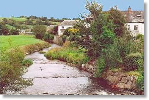
Figure 8-2. The CSS3 for this example gives a drop shadow with a blur radius of 5 pixels, positioned 6 pixels to the right, and 6 pixels below the image.
Internet Explorer 9, Mozilla Firefox, Safari, and Opera support this CSS3 box shadow. In Listing 8-2a, the CSS3 targets the <div id="shadow"> to add the drop shadow to the picture.
Listing 8-2a. Creating a Drop Shadow with a Blur Radius of 5 Pixels ( css3-image2.html)
<!doctype html>

<html lang=en>

<head>

<title>An image with a CSS3 drop shadow</title>

<meta charset=utf-8>

<link rel="stylesheet" type="text/css" href="css3-image1.css">

</head>

<body>

<div id="shadow">

<img alt="Coly River" title="Coly River" height="196" src="images/colrivblu.jpg" width="298">

</div>

<br><br>

</body>

</html>
Listing 8-2b targets the <div> containing the shadow id.
Listing 8-2b. The CSS Style Sheet for Listing 8-2a (css3-image1.css)
body { color: #fff;

}

#shadow { box-shadow: 6px 6px 6px #888; width: 296px; height:196px;

}
The CSS3 drop shadow can also produce a white border, as shown in Figure 8-3.
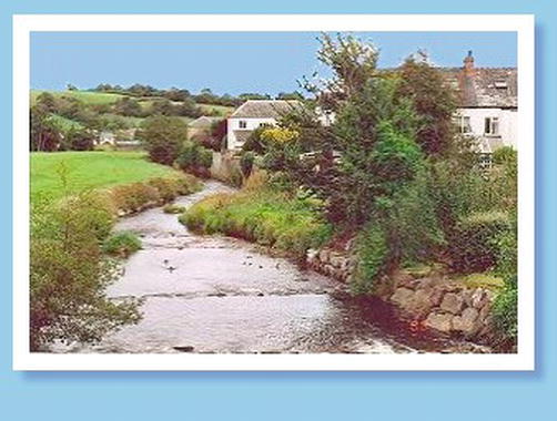
Figure 8-3. The CSS3 code gives an image with a white frame and a drop shadow with a blur radius of 6 pixels, positioned 6 pixels to the right, and 6 pixels below the image.
A background color has been added so that you can see the top of the white frame clearly. The shadow color may need tweaking to match the background color. In Listing 8-3a, the <div> shown in bold type is targeted by the CSS style sheet to produce the shadow.
Listing 8-3a. Creating a Shadow and a White Border Around an Image (css3-image-whitebdr.html)
<!doctype html>

<html lang=en>

<head>

<title>Image with CSS3 drop shadow and white border</title>

<meta charset=utf-8>

<link rel="stylesheet" type="text/css" href="css3-image-whitebdr.css">

</head>

<body>

<div id="shadow-bdr">

<img alt="Coly River" title="Coly River" height="196" src="images/colrivblu.jpg" width=298>

</div>

</body>

</html>
In Listing 8-3b, the white border is created by the markup shown bold; the rest of that line creates the shadow.
Listing 8-3b. The CSS Style Sheet for Listing 8-3a (css3-image-whitebdr.css)
body { background-color:#99CCFF;

}

#shadow-bdr { background-color:#fff; padding:10px; box-shadow: 6px 6px 6px #78b;

              width: 296px;

}
CSS3 Four-Sided Shadow
The CSS3 box-shadow module can provide four-sided drop shadows by means of a zero offset and one extra attribute. A typical example is shown in Figure 8-4. The related code is shown in Listings 8-4a and 8-4b.
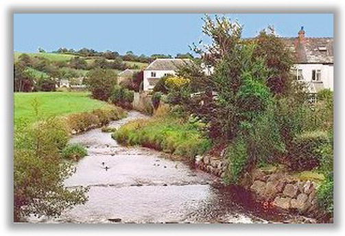
Figure 8-4. A CSS3 four-sided drop shadow
Listing 8-4a. Placing a Shadow Around Four Sides of an Image (css3-image-4sides)
<!doctype html>

<html lang=en>

<head>

<title>Image with a 4 sided CSS3 drop shadow</title>

<meta charset=utf-8>

<link rel="stylesheet" type="text/css" href="css3-image-4side.css">

</head>

<body>

<div id="shadow">

<img alt="Coly River" title="Coly River" width="298" height="196" src="images/colrivblu.jpg">

</div>

<br><br>

</body>

</html>
In Listing 8-4b, compare the styling shown bold (note the two zeros) with the styling of the previous two-sided example.
Listing 8-4b. The CSS Style Sheet for Listing 8-4a (css3-image-4sides.css)
body { color: #fff;

}

#shadow { margin:20px auto 0 auto;

}

#shadow { box-shadow: 0 0 6px 6px #888; width: 298px; height:196px;

}
CSS3 Drop Shadow for Text
This works with all the current browsers except IE 6, IE 7, IE 8, IE 9, and IE 10 beta. In Internet Explorer the shadow code will be ignored and the text will appear as Figure 8-5. Never use a pale color on an equally pale background because, without the shadow, Internet Explorer will not show the text distinctly.
Figure 8-5. The text when viewed in IE 6, 7, 8, 9 and 10 (beta) does not display the drop shadow
The effect in browsers other than IE 6, IE 7, IE 8, and IE 9 is shown in Figure 8-5b.
Figure 8-6. The CSS3 drop shadow as it appears in Mozilla, Opera, Safari, and Chrome
Listings 5a and 5b show the HTML and CSS code for Figures 8-5 and 8-6. In the CSS Listing 8-5b, the <div> shown in bold type in Listing 8-5a is targeted by the CSS style sheet to produce the drop shadow.
Listing 8-5a. Applying a Drop Shadow to Text (css3-text-shadow.html)
<!doctype html>

<html lang=en>

<head>

<title>This gives text with a CSS3 drop shadow</title>

<meta charset=utf-8>

<link rel="stylesheet" type="text/css" href="css3-text-shadow.css">

</head>

<body>

<div id=”banner">

<h1>This is a CSS3 drop shadow on text</h1>

</div>

</body>

</html>
In Listing 8-5b, the drop shadow is created by the markup shown bold.
Listing 8-5b. The CSS Style Sheet for Listing 8-5a (css3-text-shadow.css)
body {background-color:#99CCFF;

}

#banner h1 { color: #fff; padding: 50px 0 0 20px; margin: 0; font-size: 2.6em;

text-shadow: 0.1em 0.1em 0.2em black;

}
This translates as: shadow offset 0.1 em to the right, shadow offset 0.1 em below the image, blur radius 0.2 em, the shadow color is black.
Creating Drop Shadows for IE 7 and IE 8
Because IE 7 and IE 8 cannot support CSS3 drop shadows, an interim technique must be used. There are two possibilities:
- Use a graphics package to add a drop shadow to the image or text.
- Use shadow background images in the background.
Use a Graphics Package
Until recently, creating drop shadows in graphics packages has been a veritable obstacle course. The following describes a typical procedure for some former packages.
- Load an image into the program.
- Add 30-pixels-wide borders all round.
- Select Layers
 New Raster Layer.
 - Return to Layer 1.
- Click the new border with the magic wand and fill it with white.
- Click Selections and invert the selection.
- Select Effects 3D Effects Drop Shadows.
- Set the dimensions and the opacity in the next dialog box.
- Move the image over the shadow until you are satisfied with the appearance.
- Choose Select Select None.
- Select Layers Merge Layers (flatten).
- Crop the top and left white borders.
- Save the image.
Phew! The result was a nice drop shadow that could be seen in IE 7, IE 8, and all newer browsers, as shown in Figure 8-7.
Figure 8-7. A drop shadow produced by a typical graphics package
Most packages involved messing with Layers and the Select feature. Fortunately, the majority of programs are now simplifying the procedure and providing better instructions.
I use GIMP to create drop shadows quickly and easily. This free package is crammed with advanced features and is easy to download and install. The latest release at the time of writing was GIMP 2.6. You can also download an excellent fully illustrated manual. The web site is at http://www.gimp.org/downloads
Compare the following steps using GIMP with the procedure previously described:
- Load an image into GIMP.
- Select Filters Light and Shadow.
- Click Drop Shadow.
That’s it! No fiddling with layers, no selections. Figure 8-8 shows the result of adding a drop shadow with GIMP 2.6 and earlier versions.

Figure 8-8. A drop shadow created using GIMP
If you use a different graphics program, explore the Help files for the instructions on drop shadows. The 500-page manual that came with my other graphics package contained one unhelpful sentence on drop shadows. If your program has a similar manual, you may find useful advice by visiting forums related to your graphics program.
Figure 8-9 shows the result of using GIMP to create a drop shadow on text.
Figure 8-9. GIMP can create a drop shadow on text.
Try the following exercise:
- Open GIMP and Click File New.
- Click the landscape icon; set the width to 500 pixels and the height to 35 pixels.
- Click the A icon in the Toolbox.
- In the Toolbox, click the icon next to Font. From the drop-down list, choose sans bold italic.
- Choose the size and color of the font; let’s try 24pt black. A text box will appear in the edit window.
- Enter your text and then click Filters on the menu.
- Select Light and Shadow then choose Drop Shadow.
- On the next dialog, try the following settings:
- Offset x: 2
- Offset y: 2
- Blur radius: 2
- Leave the color as the default black; set the Opacity to 70 percent.
- Click OK.
- To save the file, choose Save As in the File menu item and save it as a
.jpgor a.pngimage.
Using Background Images and CSS2 to Create Drop Shadows
Background shadow images can automatically expand and contract to accommodate various image sizes. I am most grateful to Big John for publishing this CSS2 technique for drop shadows. Examples 8-10 to 8-15 follow his technique. Be sure to visit Big John’s excellent web site (note the .net domain) at http://www.positioniseverything.net.
This web site has a most helpful explanation of how the method works. The web site is also a treasure trove of practical information on CSS.
By surrounding a block such as a paragraph or an image with <div>s containing shadow images, this method can provide shadows on two sides or four sides. We will start with shadows on two sides.
Two-Sided Shadows Using CSS2 Background Shadow Images
Figure 8-10 shows a drop shadow on two sides of an image. It’s two, associated code examples are shown in Listings 8-10a and 8-10b.

Figure 8-10. A simple image with shadows on two sides
Three <div>s in Listing 8-10a hold parts of three shadow images. These consist of two corner shadow images and the main shadow image. The fourth <div> holds the picture. These <div>s are shown in bold.
Listing 8-10a. Surrounding an Image with a Shadow on Two Sides. (two-shadowfig10.html)
<!doctype html>

<html lang=en>

<head>

<title>2 sided drop shadow Fig 8-10</title>

<meta charset=utf-8>

        meta details go here
<link  rel="stylesheet" type="text/css" href="two-shadowfig10.css">

</head>

<body>

        <div class="top-right-corner">

        <div class="bottom-left-corner">

        <div class="shadowbox">

        <div class="innerbox">

        <img title="Coly River" alt="Coly River" width="298" height="196" src="colrivblu.jpg">

        </div>

</div>

</div>

</div>

</body>

</html>
The CSS Listing 8-10b for Figure 8-10 uses three background images, top-rightcorner.png, bottom-leftcorner.png, and main-shadow.png . Figures 8-10, 8-11, and 8-12 all use the same shadow images. These can be downloaded from the book’s web page. The picture is located within the background shadows by using position:relative; in the CSS.
Listing 8-10b. The CSS Style Sheet for Listing 8-10a (two-shadowfig10.css)
.top-right-corner { background:url(top-rightcorner.png) right top no-repeat; width: 305px;

}

.bottom-left-corner { background:url(bottom-leftcorner.png) left bottom no-repeat;

padding-top:8px; padding-left:8px;

}

.shadowbox { background:url(main-shadow.png) bottom right;

}

.innerbox { position: relative; left:-8px; top:-3px;

}
You may have to tweak the .innerbox position a little to ensure that no white edge appears; for instance, at first I had this setting: .innerbox { position:relative; left:-8px; top:-8px; }, but a one-pixel, white edge appeared at the bottom of the picture. By changing to top:-7px;, the white edge was removed.
Placing a shadow around an image that has a white frame is shown in Figure 8-11.
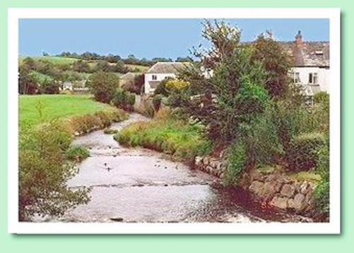
Figure 8-11. An image with a shadow on two sides and a white border
This example has been given a colored background so that the top and left side of the white border can be clearly seen. See the next Listings 8-11a through 8-11d for the associated code.
Method 1: Add the White Frame
The image must first be given a white border. In this example, a 10-pixel, white border was added using a graphics program. The image was then saved with the new name, colrivblu-whitebdr.jpg. These borders increased the dimensions of the image by 20 pixels; the new size is 318 pixels × 216 pixels, and these figures were carefully noted, ready for the next step—Listing 8-11a.
Listing 8-11a. Adding a Drop Shadow and White Border (twoshad-whitebdr1.html)
<!doctype html>

<html lang=en>

<head>

<title>Figure8-11. Two sided drop shadow. Pic has whiteborder</title>

<meta charset=utf-8>

        meta details go here

<link  rel="stylesheet" type="text/css" href="twoshad-whitebdr1.css">

</head>

<body>

        <div class="top-right-corner">

        <div class="bottom-left-corner">

        <div class="shadowbox">

        <div class="innerbox">

<!--set the new image dimensions for the new image-->

<img title="Coly River" alt="Coly River" width="318" height="216"

src="images/colrivblu-whitebdr.jpg">

</div>

</div>

</div>

</div>
<p>Two sided shadow with white border</p>

</body>

</html>
Listing 8-11b. The CSS Style Sheet for Listing 8-11a (twoshad-whitebdr1.css)
body { background-color:#CCFFCC; font:black arial medium;

}

.top-right-corner { background:url('images/top-rightcorner.png') no-repeat right top;

                    width: 326px;

}

.bottom-left-corner { background:url('images/bottom-leftcorner.png') no-repeat left bottom;

                        padding-top:8px; padding-left:8px;

}

.shadowbox { background:url('images/main-shadow.png') right bottom;

}

.innerbox { position: relative; left:-8px; top:-4px;

}
Method 2: Use CSS to Add the White Frame
An image with a ready-made border provides a solution, but CSS can be used to add a white border. The CSS method is preferable as it loads faster and avoids the hassle of having to use your paint program to add a border. However, it may need some fiddling with the style sheet to get it just right.
Listing 8-11c gives the same appearance as Figure 8-11. A class named .frame is added to the image so that the white border can be added; this is shown in bold.
Listing 8-11c. Using a Class to Provide a White Border (twoshad-whitebdr2.html)
<!doctype html>

<html lang=en>

<head>

<title>Two sided drop shadow and CSS white border</title>

<meta charset=utf-8>

<link  rel="stylesheet" type="text/css" href="twoshad-whitebdr2.css">

</head>

<body>

<div class="top-right-corner">

<div class="bottom-left-corner">

<div class="shadowbox">

<div class="innerbox">

<img class="frame" title="Coly River" alt="Coly River" width="298" height="196"

src="images/colrivblu.jpg">

</div>

</div>

</div>

</div>

<p>Two sided shadow with white border</p>

</body>

</html>
The class .frame was used in the HTML to target the image in order to add the white border. This new line, img.frame { border:10px white solid; }, is added to the CSS Listing 8-11d (shown in bold).
Listing 8-11d. The CSS Style Sheet that Defines the Class .innerbox (twoshad-whitebdr2.css)
body { background-color:#CCFFCC; font:black arial medium;

}

.top-right-corner { background:url('images/top-rightcorner.png') no-repeat right top;

width: 326px;

}

.bottom-left-corner { background:url('images/bottom-leftcorner.png') no-repeat left bottom;

                        padding-top:8px; padding-left:8px;

}

.shadowbox { background:url('images/main-shadow.png') right bottom;

}

.innerbox { width:298px; height:216px; position: relative; left:-8px; top:-8px;

}

img.frame { border:10px white solid;

}
CSS2 Two-Sided Drop Shadow for Text
Figure 8-12 shows the effect of adding a drop shadow to a block of text.
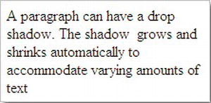
Figure 8-12. A two-sided drop shadow on a paragraph can be achieved using the same technique that was used for images.
The HTML in Listing 8-12a is almost the same as the previous projects, except that a block of text is used instead of a picture.
Listing 8-12a. Placing a Two-sided Drop Shadow Around a Block of Text (two-shadowtext.html)
<!doctype html>

<html lang=en>

<head>

<title>Paragraph with 2 sided drop shadow</title>

<meta charset=utf-8>

<link rel="stylesheet" type="text/css" href="two-shadowtext.css">

</head>

<body>

<div class="top-right-corner">

<div class="bottom-left-corner">

<div class="shadowbox">

<div class="innerbox">

<p>A paragraph can have a drop shadow. The shadow grows and shrinks

automatically to accommodate varying amounts of text</p>
</div>

</div>

</div>

</div>

</body>

</html>
Figure 8-12 has 5 pixels of padding between the text and the sides of the paragraph content box. This is shown in bold in the next Listing. The 200 pixels wide content plus the left and right padding gives a total width of 220 pixels, this is added into the style of the top-right-corner (shown in bold in Listing 8-12b). The text block was given a thin silver border so that the top and left edges were clearly visible.
Listing 8-12b. The CSS Style Sheet for Listing 8-12a (two-shadowtext.css)
body { background-color:#FFF; font:black arial medium;

}

.top-right-corner { background:url('images/top-rightcorner.png') no-repeat right top;

                    width:220px;
}

.bottom-left-corner { background:url('images/bottom-leftcorner.png') no-repeat left bottom;

                      padding-top:8px; padding-left:8px;

}

.shadowbox { background:url('images/main-shadow.png') right bottom;

}

.innerbox { position: relative; left:-8px; top:-8px;

}

.innerbox p { margin:0; padding:5px; width:200px; border:1px silver solid;

}
CSS2 Four-Sided Drop Shadow
A drop shadow can be placed around all four sides of an image using a CSS background image. Wider background shadows may appear less realistic because the radii of the shadow at the corners may appear too big for the shadow of a sharp-cornered picture.
Figures 8-13 and 8-14 show the effect of two different shadows widths.
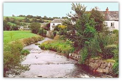
Figure 8-13. Narrow drop shadow on four sides
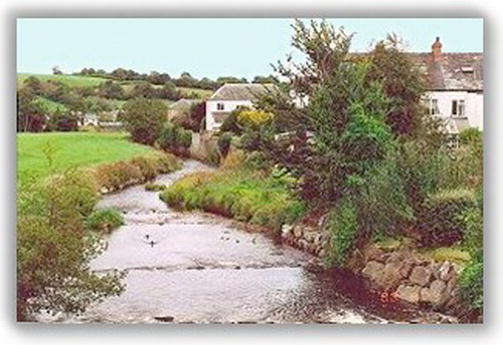
Figure 8-14. Wide drop shadow on four sides
Figures 8-13, 8-14, and 8-15 use only one, rectangular shadow image.
Tip A limited number of drop shadow images can be downloaded from the book’s web page or you can create your own using a graphics manipulation package. The drop shadow image must be a transparent .png file.
Listing 8-13a has four <div>s and again uses the CSS background image property. The positioning of the <div>s and their closing </div>s is extremely important. This example with a 10-pixel shadow works best with an XHTML listing. The shadow works in all modern browsers, but it does not display correctly in IE 6 or IE 7.
Note In the listing, corner a is the top-right corner, corner b is the bottom-left corner.
Listing 8-13a. Surrounding an Image with Four 10 Pixel wide Shadows (fourside-drop10px.html)
<!DOCTYPE html PUBLIC "-//W3C//DTD XHTML 1.0 Transitional//EN" "http://www.w3.org/TR/xhtml1/DTD/xhtml1-transitional.dtd">

<html xmlns="http://www.w3.org/1999/xhtml">

<head>

<meta content="text/html; charset=utf-8" http-equiv="Content-Type" />


<title>A 10 pixel wide drop shadow on 4 sides</title>

        meta content goes here…

<link  rel="stylesheet" type="text/css" href="fourside-drop10px.css">

</head>

<body>

        <div class="shadow-one">

                <div class="corner-a"></div>

                <div class="corner-b"></div>

        <div class="shadow-two">

        <div class="shadow-three">

        <div class="shadow-four">

<img title=”River Coly” alt="River Coly" height="197" src="images/colriv.jpg"

width="301" margin="0" padding="0">

        </div>

        </div>

        </div>

        </div>

</body>

</html>
Listing 8-13b uses a single, rectangular shadow image, shadow10p.png, and CSS positioning.
Listing 8-13b. The CSS Style Sheet for Listing 8-13a (fourside-drop10px.css)
.shadow-one { position:absolute; padding-top:20px; padding-left:20px;

}
.corner-a { position:absolute; right:0; top:0; width:20px; height:20px;

            background:url('images/shadow10p.png') right top no-repeat;

}

.corner-b { position:absolute; left:0; bottom:0; width:20px; height:20px;

            background:url('images/shadow10p.png') left bottom no-repeat;

}

.shadow-two { position:relative; background :url('images/shadow10p.png')

              right bottom no-repeat;

}

.shadow-three { position:relative; left:-20px; top:-20px;

                background:url('images/shadow10p.png') left top no-repeat;

}

.shadow-four { position:relative; left:10px; top:10px;

}
Note In Figure 8-13, the width of the shadow areas on the .png image is 10 pixels. The 20 pixels dimensions in the CSS listing are twice the .png shadow width. Shadow-four is the same width (10 pixels) as the .png shadow areas.
A wider drop shadow was shown in Figure 8-14. Listing 8-14a has four <div>s and again uses the CSS background image property. The positioning of the <div>s and their closing </div>s is extremely important. The shadow works best using XHTML instead of HTML5. The shadow can be viewed in all modern browsers, including IE 8, but it does not display correctly in IE 6 or IE 7.
Listing 8-14a. Placing a 30 Pixel wide Drop Shadow on Four Sides (fourside-drop30px.html)
<!DOCTYPE html PUBLIC "-//W3C//DTD XHTML 1.0 Transitional//EN" "http://www.w3.org/TR/xhtml1/DTD/xhtml1-transitional.dtd">

<html xmlns="http://www.w3.org/1999/xhtml">

<head>

<meta content="text/html; charset=utf-8" http-equiv="Content-Type" />

<title>Wider drop shadow on 4 sides</title>

<link rel="stylesheet" type="text/css" href="fourside-drop30px.css" />

</head>

<body>

        <div class="shadow-one">

                <div class="corner-a"></div>

                <div class="corner-b"></div>

        <div class="shadow-two">

        <div class="shadow-three">

        <div class="shadow-four">

<img title=”River Coly” alt="River Coly" height="197" src="images/colriv.jpg"

width="301" margin="0" padding="0" >

        </div>

        </div>

        </div>

        </div>

</body>

</html>
CSS Listing 8-14b uses a single rectangular shadow image, shadow30p.png, and CSS positioning.
Listing 8-14b. The CSS Style Sheet for Listing 8-14a (fourside-drop30px.css)
.shadow-one { position:absolute; padding-top:60px; padding-left:60px;

}

.corner-a { position:absolute; right:0; top:0; width:60px; height:60px;

            background:url('images/shadow30px.png') right top no-repeat;

}

.corner-b { position:absolute; left:0; bottom:0; width:60px; height:60px;

            background:url('images/shadow30px.png') left bottom no-repeat;

}

.shadow-two { position:relative; background :url('images/shadow30px.png')

              right bottom no-repeat;

}

.shadow-three { position:relative; left:-60px; top:-60px;

                background:url('images/shadow30px.png') left top no-repeat;

}

.shadow-four { position:relative; left:30px; top:30px;

}
Note In Figure 8-14, the width of the shadow areas on the .png image is 30 pixels. The 60 pixels dimensions are twice the .png shadow width. Shadow four is the same width (30 pixels) as the .png shadow areas.
Four-Sided Drop Shadows Around Paragraphs
Paragraphs can be made to appear as if they are floating above the page surface by using a drop shadow. Figure 8-15 shows a paragraph with no border but it is surrounded by shadows.
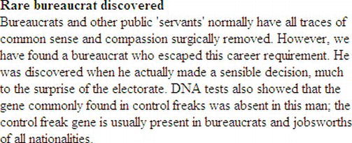
Figure 8-15. When placing a four-sided shadow around a piece of text, use a paragraph and give the paragraph a width so that the shadows have something to attach themselves to.
The process is exactly the same as the previous projects but a paragraph is use instead of a picture (see Listings 8-15a and 8-15b).
Listing 8-15a. Apply a Drop Shadow to Four Sides of a Block of Text (shadow-paragraph.html)
<!doctype html>
<html lang=en>
<head>
<title>Paragraph with shadow round all four sides</title>
<meta charset=utf-8>
<link rel="stylesheet" type="text/css" href="shadow-paragraph.css">
</head>
<body>
<div id="wrapper">
<div class="shadow-one">
<div class="corner-a"></div>
<div class="corner-b"></div>
<div class="shadow-two">
<div class="shadow-three">
<div class="shadow-four">
<p><b>Rare bureaucrat discovered</b><br>Bureaucrats and other public 'servants'
…some text has been ommitted from this markup to save space…
present in bureaucrats and jobsworths of all nationalities.</p><!-- close paragraph-->
</div>
</div>
</div>
</div>
</div>
</body>
</html>
Listing 8-15b. The CSS Style Sheet for Listing 8-15a (shadow-paragraph.css)
/*SET 4 SIDED SHADOW*/

.shadow-one { position:absolute; padding-top:60px; padding-left:60px;

}

.corner-a { position:absolute; right:0; top:16px; width:60px; height:60px;

background:url('images/shadow30px.png') right top no-repeat;

}

.corner-b { position:absolute; left:0; bottom:16px; width:60px; height:60px;

background:url('images/shadow30px.png') left bottom no-repeat;

}

.shadow-two { position:relative;

background :url('images/shadow30px.png') right bottom no-repeat;}

.shadow-three { position:relative; left:-60px; top:-60px;

background:url( 'images/shadow30px.png' ) left top no-repeat; }

.shadow-four {position:relative; left:30px; top:30px; }

#wrapper { width:420px;

}

p {width:400px; padding:10px;

}
Troubleshooting the Shadows in Listings 8-13 through 8-15
If you have any problems with the shadows just discussed, the information in this section should help you out. For starters, always begin with the height for corner a and corner b set to zero, as follows:
.corner-a {position:absolute; right:0; top:0; width:60px; height:60px;

background:url('images/shadow30px.png') right top no-repeat;

}

.corner-b {position:absolute; left:0; bottom:0; width:60px; height:60px;

background:url('images/shadow30px.png') left bottom no-repeat;

}
Corner a is the top-right corner of a box; corner b is bottom-left corner of a box. The zero settings resulted in a problem with corners a and b, as shown in Figure 8-16.
.corner-a { position:absolute; right:0; top:16px; width:60px; height:60px;

background:url('images/shadow30px.png') right top no-repeat;

}

.corner-b { position:absolute; left:0; bottom:16px; width:60px; height:60px;

background:url('images/shadow30px.png') left bottom no-repeat;

}
Figure 8-16 shows faulty corners a and b.
Figure 8-16. A problem with corners a and b
Correcting the Fault
By trial and error, change the top and bottom pixels for corners a and b. In this example, the solution was to change the zeros to 16 pixels.
.corner-a { position:absolute; right:0; top:16px; width:60px; height:60px;

background:url('images/shadow30px.png') right top no-repeat;

}

.corner-b { position:absolute; left:0; bottom:16px; width:60px; height:60px;

background:url('images/shadow30px.png') left bottom no-repeat;

}
The .png Shadow Images
Where can you obtain .png shadow images? A small number can be downloaded from Big John’s web site (www.positioniseverything.net). I have included a few shadows in the download package available from the book’s web page. You can design your own .png shadow images using the free GIMP graphics program. The instructions are rather complicated, but you will not need the plug-ins that are necessary when using some other packages. Information on GIMP is available at http://www.gimp.org/ and you can also download the program and the help files from the GIMP web site.
Creating .png Shadow Images in GIMP
The aim this section is to produce a four-sided drop shadow surrounding an empty rectangle.
- Open Gimp and click File New.
- In the next dialog box, click Advanced Options.
- Click the left icon (located below the Height option) to select Portrait. Specify the size of your required shadow (for instance 640 pixels wide × 400 pixels high). In the Color Space field, select Greyscale (it has the UK English spelling).
- Select Fill With Transparency, then click OK. The empty image is created; it is covered with a checkerboard pattern that denotes transparency. Figure 8-17 shows the GIMP’s Toolbox window.
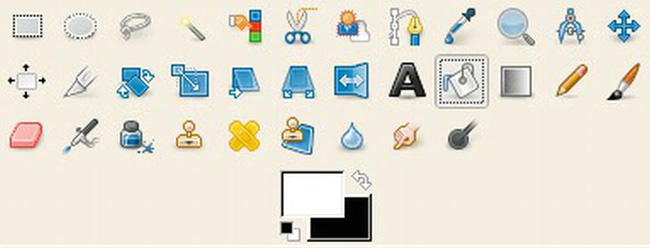
Figure 8-17. The GIMP’s Toolbox window. The white swatch overlaps the black swatch.
- Now select the color white, click the curved double-headed arrow to ensure that the white square overlaps the black square. The top color represents the fill color, whereas the black (on the lower color selected) is the background color. In the Toolbox window, click the Bucket Fill icon. Click the white square then go back to the checkerboard image and left click it to turn it white.
- Click Layer New Layer. Ensure the Transparency radio button is selected, accept all the default settings, and click OK.
- In the menu, click Windows Dockable Dialogs Layers Dialog. This will place a dialog box on the screen showing the layers.
- Ensure that the layer with the checkerboard pattern is always selected (it will have a pale-colored background when it is selected; the unselected layer will be white).
Now we will decide on the width of the shadow image, let’s say it will be 20 pixels.
- Click Select All. You will now see the dashed outline moving like a line of marching ants.
- Click Select Shrink. A dialog box will allow you to choose the amount by which the image is shrunk; let’s say 30 pixels.
- Ensure the box labeled Shrink from Image Border is ticked. Click OK.
- Now you will see that the inner and outer images have dashed borders. Only the inner image will have marching ants. Click Filters Light and Shadow Drop Shadow.
- On the dialog box, set the offsets to zero, the blur radius as 20 pixels, and the opacity as 70.
- Make sure the box labeled Allow Resizing is unchecked. Click OK. You will see a third layer, called Drop Shadow, has appeared; just ignore it. The docked Layers window is illustrated in Figure 8-18.
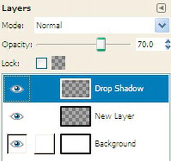
Figure 8-18. The GIMP Layers Dialog
- Do not save it yet, but look at the layers dialog box and click the eyeball relating to the Background layer. Now you can see the drop shadow in the edit pane as the checkerboard is revealed once more.
- Click File Save As and choose where to save it. At the top of the dialog box, name the file and be sure to include the file type by adding
.pngto the file name (example:mydropshadow.png). - Click the Save button. A dialog box labeled Export File will pop up. Ensure that the radio button labeled Merge Visible Layers is selected. Then click the Export button. Accept the default settings on the next dialog box and click the Save button.
The shadow image that this creates can be used in the previous background shadow image examples and it can be sliced to give the image required later in this section for images 8-21a, 8-21b, and 8-21c. Experiment with the various dimensions but always include the two zeros for the offsets. Eventually you could create a library of shadow sizes; remember that large shadow sizes can be used for smaller images as the shadow contracts or expands to fill the <div>s. However, if you use a shadow too small for the image it surrounds, it will be hidden behind the image. The shadow we just created is shown in Figure 8-19.

Figure 8-19. The shadow created using GIMP
Adding a Shadow Around the Main Panel of a Web Page
The technique in this example is best used for fixed-width layouts, but semi liquid pages are possible with a little extra hassle using .png shadow images that grow or shrink to match the box element. Figure 8-20 shows a full page with drop shadows on all four sides of a fixed-width page.
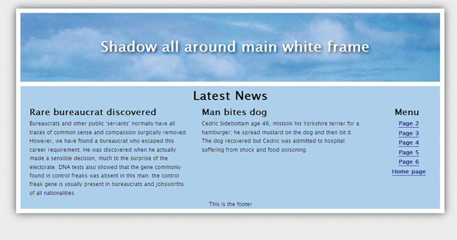
Figure 8-20. The shadow wraps around the entire page’s white border. This works in all browsers.
Note A drop shadow was added to the white lettering in the header panel by using the new CSS3 module. The CSS3 text shadow in Listings 8-20, 8-22, and 8-23 does not work in Internet Explorer 6, 7, 8, and 9. The .png shadows are not transparent in IE 6.
Listing 8-20a is for a fixed-width of 960 pixels and a screen with a horizontal resolution of 1024 pixels. The shadow used is 1024 pixels wide and deep.
Listing 8-20a. Creating a shadow around the Border of a Web Page (shadow-fullpage.html)
<!DOCTYPE html>

<html lang=en>

<head>

<title>Complete page with shadow around wrapper</title>

<meta charset=utf-8>

<link rel="stylesheet" type="text/css" href="shadow-fullpage.css" />

        <!--Add conditional Javascript for IE 7 and 8-->

        <!--[if lte IE 8]><script src="html5.js">

        </script>

        <![endif]-->

</head>

<body>

        <div class="shadow-one">

                <div class="corner-a"></div>

                <div class="corner-b"></div>
<div class="shadow-two">
<div class="shadow-three">
<div class="shadow-four">
<div id="wrapper">
<header><h1>Shadow all around main white frame</h1></header><!-- close banner-->
<div id="mainContent"><!--this panel will contain two columns-->
<h2>Latest News
</h2>
<article>
<h3>Rare bureaucrat discovered</h3>
<p>Bureaucrats and other public 'servants' normally have all traces of common
Some of the text has been omitted here to save space
and jobsworths of all nationalities.</p>
</article><!--close left col-->
<article>
<h3>Man bites dog</h3>
<p>Cedric Sidebottam age 46, mistook his Yorkshire terrier for a hamburger; he
spread mustard on the dog and then bit it. The dog recovered but Cedric
was admitted to hospital suffering from shock and food poisoning.</p>
<p> </p>
</article><!-- close right col-->
<nav>
<h2>Menu</h2>
<ul>
<li><a href="#">Page 2</a></li>
<li><a href="#">Page 3</a></li>
<li><a href="#">Page 4</a></li>
<li><a href="#">Page 5</a></li>
<li><a href="#">Page 6</a></li>
<li><a href="#">Home page</a></li>
</ul>
</nav><!-- close menupanel-->
</div><!-- close mainContent-->
<footer>This is the footer
</footer>
</div><!-- close wrapper -->
<!--close the four shadow divs-->
</div>
</div>
</div>
</div>
</body>
</html>
Listing 8-20b. CSS Style Sheet for Listing 8-20a (shadow-fullpage.css)
body { text-align: center; background: #e6e6e6;

}

/*add display attributes for the semantic tags*/

header, footer, section, article, nav { display:block;

}

#wrapper { margin: -20px auto 0 auto; width: 940px; border:10px white solid; padding:0;

}
header { width: 940px; height: 154px; margin: 0; border-bottom:10px white solid;

background: url(images/bluepan.jpg);

}

article { margin-left:10px; width:40%; display:inline; float:left; text-align:left;

}

#mainContent {margin:0; width: 940px; float: left; background-color:#aac9f6;

}

nav { width: 120px; margin-right:10px; padding: 0 5px 5px 0; float: right;

}

footer { margin:0; text-align:center; clear: both; background-color:#aac9f6;

}

br.clear { clear:both;

}

body { font: 76%/1.6 "Lucida Grande", Geneva, Verdana, sans-serif;

}

a { font-weight: bold; color: navy; text-decoration: none; border-bottom: 1px solid navy;

}

a:hover {color:#906; border-bottom: 1px solid #906;

}

header h1 { color: #fff; padding: 50px 0 0 20px; margin: 0; font-size: 2.6em;

                text-shadow: 0.1em 0.1em 0.2em black;

}

h2, h3, h4 { margin-top: 0; color: black; font-weight: bold;

}

h2 { font-size: 2.2em; margin-bottom:0;

}

h3, nav h2 { font-size: 1.6em; margin-bottom:0;

}

h4 { font-size: 1.2em; margin-bottom:0;

}

p { margin-top:0; margin-bottom:6px;

}

#mainContent p, #mainContent h2, #mainContent h3, #mainContent h4, #mainContent ul,

{ margin-left: 10px; margin-right: 10px; background-color:#aac9f6;

}

nav ul, nav ul li { list-style: none; margin: 0 0 2px 10px; padding: 0;

}

/*SET 4 SIDED SHADOW STYLES*/

.shadow-one {position:absolute; padding-top:60px; padding-left:60px;

}

.corner-a {position:absolute; right:0; top:-20px; width:60px; height:60px;

background:url('images/shadow30px.png') right top no-repeat;

}

.corner-b {position:absolute; left:0; bottom:0; width:60px; height:60px;

background:url('images/shadow30px.png') left bottom no-repeat;

}

.shadow-two { position:relative;

background:url('images/shadow30px.png') right bottom no-repeat;

}

.shadow-three { position:relative; left:-60px; top:-60px;

background:url('images/shadow30px.png') left top no-repeat;

}

.shadow-four { position:relative; left:30px; top:30px;

}
Caution Although this method is effective, it has a big drawback. The vertical length of this page is restricted by your choice of the dimension of the shadow image. The 1024-pixel shadow used in Figure 8-7 restricts the page to a vertical height of 980 pixels and the content panel is restricted to a vertical height of 780 pixels. It would not be a problem on the home page, which should not exceed the height of the browser window; but it might be a severe handicap for subsequent pages.
Overcoming the Height Restriction
The following three solutions are available:
- Use a bigger shadow image. This would mean finding or creating a bigger shadow image; however, even though the vertical height is extended, it would still be restricted.
- Use a sliced shadow image.
- Use shadows on the sides; no top or bottom shadows.
Using a Sliced Shadow Image
This example is adapted from a template created by Andy Budd (http://www.andybudd.com) for the book Blog Design Solutions (Friends of ED, 2006). The example is for an 800 × 600 screen and, although too small for today’s screens, it serves to demonstrate the technique. Using larger shadow files, it can be adapted for big screens and high resolutions.
Figures 8-22a through 8-22c show a shadow image sliced into three items using a paint program.

Figures 8-21a, 8-21b, and 8-21c. Labeled top-shadow.png, middle-shadow.png, and bottom-shadow.png
In this example, the heights of the slices are as follows: the top slice is 20 pixels, the middle slice is 64 pixels, and the bottom slice is 20 pixels. The worked example for an extendable shadow is illustrated by the screenshot shown in Figure 8-22.
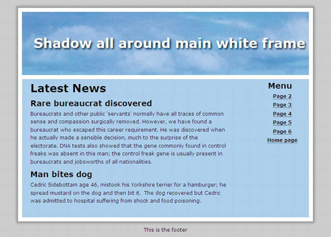
Figure 8-22. A shadow that extends vertically to any height
The top and bottom shadows are fixed. In Listing 8-22a, the CSS style sheet targets the wrapper to apply the side shadows.
Listing 8-22a. Placing an Extendable Shadow Around the Border of Web Page (shadow-fullpage-extendable.html)
<!doctype html>

<html lang=en>

<head>

<title>Complete page with extendable shadow around wrapper</title>

<meta charset=utf-8>

<link rel="stylesheet" type="text/css" href="shadow-fullpage-extendable.css">

        <!--Add conditional Javascript for IE7 and 8-->

        <!--[if lte IE 8]><script src="html5.js">

        </script>

        <![endif]-->

</head>

<body>

<div id="top"><!--place top shadow on page--></div><!-- close top -->

<div id="wrapper"><!--surrounds all elements below the top shadow-->

<header><h1>Shadow all around main white frame</h1></header><!-- close banner-->
<div id="mainContent"><!--this panel will contain two columns-->
<!--<div id="content">-->
<div id="leftcol">
<h2>Latest News</h2>
<h3>Rare bureaucrat discovered</h3>
<p>Bureaucrats and other public 'servants' normally have all traces of common
some text omitted here to save space
usually present in bureaucrats and jobsworths of all nationalities.</p>
<h3>Man bites dog</h3>
<p>Cedric Sidebottam age 46, mistook his Yorkshire terrier for a hamburger; he
spread mustard on the dog and then bit it. The dog recovered but Cedric
was admitted to hospital suffering from shock and food poisoning.</p><p> </p>
</div><!-- close leftcol-->
<nav><br>
<ul><h3>Menu</h3>
<li><a href="#">Page 2</a></li>
<li><a href="#">Page 3</a></li>
<li><a href="#">Page 4</a></li>
<li><a href="#">Page 5</a></li>
<li><a href="#">Page 6</a></li>
<li><a href="#">Home page</a></li>
</ul><!-- close links-->
</nav><!-- close menupanel-->
</div><!-- close mainContent -->
<br class="clear">
</div><!-- close wrapper -->
<div id="bottom"></div><!-- open and close bottom shadow-->
<footer>This is the footer</footer><!--open and close footer -->
</body>
The side shadow slice is repeated vertically to match the length of the wrapper; this is achieved in Listing 8-22b by targeting the wrapper.
Listing 8-22b. The CSS Style Sheet for the Listing 8-22a (shadow-fullpage-extendable.css)
/*This css template is derived from a template created by Andy Budd (www.andybudd.com)

for the book "Blog Design Solutions", and is released under a Creative Commons

Attribution-NonCommercial-ShareAlike 2.5 License*/

body { margin: 0; padding: 0; text-align: center; background: #e6e6e6;

font: 76%/1.6 "Lucida Grande", Geneva, Verdana, sans-serif;

}

/*add display attributes for the semantic tags*/

header, footer, section, article, nav { display:block;

}

#wrapper, #top, #bottom { margin: 0 auto; padding: 0 10px; width: 720px;

}

/*apply shadows*/

#wrapper { background: url(images/middle.png) repeat-y;

}

#top { height: 20px; margin-top: 20px; background: url(images/top.png) no-repeat;

}

#bottom { height: 20px; background: url(images/bottom.png) no-repeat;

}
header { width: 700px; height: 154px; margin: 0; margin-left:10px;

border-bottom:10px white solid; background: url(images/bluepan.jpg);

}

#leftcol { margin: 0 10px; display:inline; /* fix IE double margin float bug */

float: left; width: 500px; text-align:left;

}

#mainContent {margin:0 0 0 10px; border:0 10px 0 10px white solid; width: 700px;

float: left; background-color:#aac9f6;

}

nav { width: 140px; margin-right:10px; padding: 0 5px 5px 0; float: right;

}

footer { margin:0; text-align:center; clear: both;

}

br.clear { clear:both;

}

a { font-weight: bold; color: navy; text-decoration: none; border-bottom: 1px solid navy;

}

a:hover {color:#906; border-bottom: 1px solid #906;

}

header h1 { color: #fff; padding: 50px 0 0 20px; margin: 0; font-size: 2.6em;

        text-shadow: 0.1em 0.1em 0.2em black;

}

h2, h3, h4 { margin-top: 0; color: navy; font-weight: bold;

}

h2 { font-size: 2.2em; margin-bottom:0;

}

h3, nav h2 { font-size: 1.6em; margin-bottom:0;

}

p { margin-top:0; margin-bottom:6px;

}

#mainContent p, #mainContent h2, #mainContent h3, #mainContent h4, #mainContent ul,

#mainContent ol { margin-left: 10px; margin-right: 10px

}

nav ul li { list-style: none; margin:0; padding: 0;

}

</html>
Using Shadows Only on the Sides of a Wrapper
For this technique, the wrapper must touch the top of the browser window. If possible, try to make the bottom of the wrapper touch the bottom of the browser window.
Figure 8-23 shows a page with side shadows.
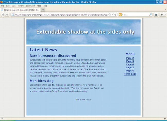
Figure 8-23. A shadow added only to the sides of a web page
In Listing 8-23a, the top and bottom shadow locations are omitted and the wrapper is moved to the top of the page by means of the top margin in the CSS sheet. In Listing 8-23b, the CSS targets the wrapper to place the side shadows as a vertically repeated tile.
Listing 8-23a. Adding a Shadow Only to the Sides of a Web Page (side-shadow-fullpage-extendable.html)
<!doctype html>

<html lang=en>

<head>

<title>Complete page with extendable shadow down the sides of the white border</title>

<meta charset=utf-8>

<link rel="stylesheet" type="text/css" href="side-shadow-fullpage-extendable.css">

        <!--Add conditional Javascript-->

        <!--[if lte IE 8]><script src="html5.js">

        </script>

        <![endif]-->

</head>

<body>

<div id="wrapper">
<header><h1>Extendable shadow at the sides only</h1></header><!-- close banner-->
<div id="mainContent">
<div id="leftcol"><h2>Latest News</h2>
<h3>Rare bureaucrat discovered</h3>
<p>Bureaucrats and other public 'servants'
some text has been omitted to save space
usually present in bureaucrats and jobsworths of all nationalities.</p>
<h3>Man bites dog</h3>
<p>Cedric Sidebottam age 46, mistook his Yorkshire terrier for a hamburger; he
spread mustard on the dog and then bit it. The dog recovered but Cedric
was admitted to hospital suffering from shock and food poisoning.</p>
<p> </p>
</div><!-- close leftcol-->
<nav><br>
<ul><h3>Menu</h3>
<li><a href="#">Page 2</a></li>
<li><a href="#">Page 3</a></li>
<li><a href="#">Page 4</a></li>
<li><a href="#">Page 5</a></li>
<li><a href="#">Page 6</a></li>
<li><a href="#">Home page</a></li>
</ul><!-- close links-->
</nav><!-- close menupanel-->
<footer>This is the footer</footer><!-- close footer -->
</div><!-- close mainContent -->
<br class="clear">
</div><!-- close wrapper -->
</div>
</body>
</html>
Listing 8-23b. The CSS Style Sheet for Listing 8-23a (side-shadow-fullpage-extendable.css)
/*This css template is adapted from a template created by Andy Budd (www.andybudd.com)

for the book"Blog Design Solutions", and is released under a Creative Commons Licence*/

body { margin: 0; padding: 0; text-align: center; background: #e6e6e6;

font: 76%/1.6 "Lucida Grande", Geneva, Verdana, sans-serif;

}

/*add display attributes for the semantic tags*/

header, footer, section, article, nav { display:block;

}

#wrapper{ margin: 0 auto -20px auto; padding: 0 10px; width: 720px; clear:both;

}

/*apply drop shadows to sides*/

#wrapper { background: url(images/middle.png) repeat-y;

}

header { width: 700px; height: 154px; margin: 0; margin-left:10px;

background: url(images/bluepan.jpg); border-top:10px white solid;

}

#leftcol { margin: 0 10px; display:inline; /* fix IE double margin float bug */

                float: left; width: 500px; text-align:left;

}
#mainContent {margin:0; width: 700px; float: left; background-color:#aac9f6;

border:10px white solid; min-height:425px;

}

nav { width: 140px; margin-right:10px; padding: 0 5px 5px 0; float: right;

}

footer { margin:0; text-align:center; clear: both; background-color:#aac9f6;

}

br.clear { clear:both;

}

a { font-weight: bold; color: navy; text-decoration: none; border-bottom: 1px solid navy;

}

a:hover {color:#906; border-bottom: 1px solid #906;

}

header h1 { color: #fff; padding: 50px 0 0 20px; margin: 0; font-size: 2.6em;

                text-shadow: 0.1em 0.1em 0.2em black;

}

h2, h3, h4 { margin-top: 0; color: navy; font-weight: bold;

}

h2 { font-size: 2.2em; margin-bottom:0;

}

h3, nav h2 { font-size: 1.6em; margin-bottom:0;

}

p { margin-top:0; margin-bottom:6px;

}

#mainContent p, #mainContent h2, #mainContent h3, #mainContent h4, #mainContent ul,

#mainContent ol {margin-left: 10px; margin-right: 10px

}

nav ul li { list-style: none; margin:0; padding: 0;

}
Using the Shape Collage Software
This software can produce good borders and shadows, as shown in Figure 8-24.
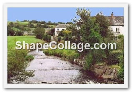
Figure 8-24. A drop shadow and white border created in Shape Collage
A free trial version of Shape Collage can be downloaded from http://www.shapecollage.com. It can produce the drop shadow with or without a white frame, as shown in Figure 8-25 on the left.
If, after exploring it, you think it might be useful, you can buy it for about $29 (£26 UK), and then you will be able to produce images without the watermark, as well as unlocking several extra features. The program can also create collages, as its name implies.
I found Shape Collage tricky to use at first. The following are basic guidelines for testing the free trial version.
- Before opening Shape Collage, write down the following information:
- The size of the image requiring a drop shadow.
- The location of the image on your hard drive.
- The background color of the web page that you intend to place the finished image.
- Open Shape Collage and then close the nag screen.
- On the next panel, under Shape select Rectangle, set the collage size to about 50 percent wider than the image width and set the height to about 50 percent greater than the image height.
- In the example shown, the image was 296 pixels wide and the height was 196 pixels. I set the collage size to 450 × 300.
- Under Photo Size, click Manual, and set the actual image size to 296 pixels.
- Under Photos, change the quantity to one.
- Click the Appearance tab.
- In the Background field, click the white field. You are presented with a color picker. Select the background color of your web page.
- Select the Border color in the same way. Leave the default border width at 3.3 percent. Change it to zero if you do not want a frame around the picture.
- Click the Advanced tab and choose Rotation as None and 0, 0.
- For the Shadow offset, choose 1.
- Click File Add File.
- Navigate to the file’s location and select it, then click OK.
- You will be back at the main screen. At the bottom of the center panel, click the Create button.
- On the next screen, you can choose a folder and you can name the file. You will be given a choice of three file formats
.jpg,.png, or.psd(Photoshop file). - Click Save.
- A small pop-up will appear asking what quality you want. The default is fine, so click Save.
Summary
In this chapter, you learned several ways of creating drop shadows to make your pictures and text blocks seem to float above the page. The chapter first described the new CSS3 box-shadow module and you learned how to apply CSS3 shadows to images and text. Then, because IE 7 and IE 8 do not support CSS3 box-shadows, it was suggested that a graphics package could be used to apply drop shadows. In particular, GIMP 2.6 was recommended as a free comprehensive program with an extremely simple drop shadow facility. An alternative method was then demonstrated; it used shadow background images for drop shadows that could be viewed in all modern browsers and in IE 8.
In the next chapter, you will learn several ways of creating collages and how to construct a picture gallery with captions.