
C H A P T E R 15
Dump Those Deprecated Items
The term “deprecated items” means that the World Wide Web Consortium (W3C) has phased out these items and you should not use them. A page containing deprecated tags and attributes will not validate, nor will it be suitable for handheld devices, screen readers, or search engines.
I sometimes take over the maintenance and redesign of a web site from another web master. Often the web site is old and full of deprecated items. My first task is to replace all the deprecated items with the modern equivalent. You may be required to do similar work. This chapter will help you to update a web site and also show you how to avoid including deprecated items in future web sites.
The chapter includes the following sections:
- Lists of deprecated items and their modern replacements
- The advantages of removing deprecated items
- Avoiding table layout for columns
- Avoiding table layout for an extendable content panel
- Using CSS instead of tables for multiple boxes with borders
- The CSS3 module for multiple columns
The Deprecated Items
Some tags and attributes were deprecated in the early years of HTML4. A few more are deprecated in HTML5; they are all listed together in Tables 15-1 and 15-2. When enhancing or updating a page on a web site you should grasp the opportunity to replace all deprecated items with CSS or with new tags. As previously mentioned, if someone transfers an old web site to you, the deprecated items will need to be replaced.
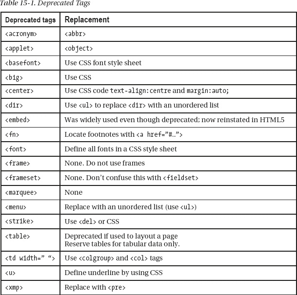
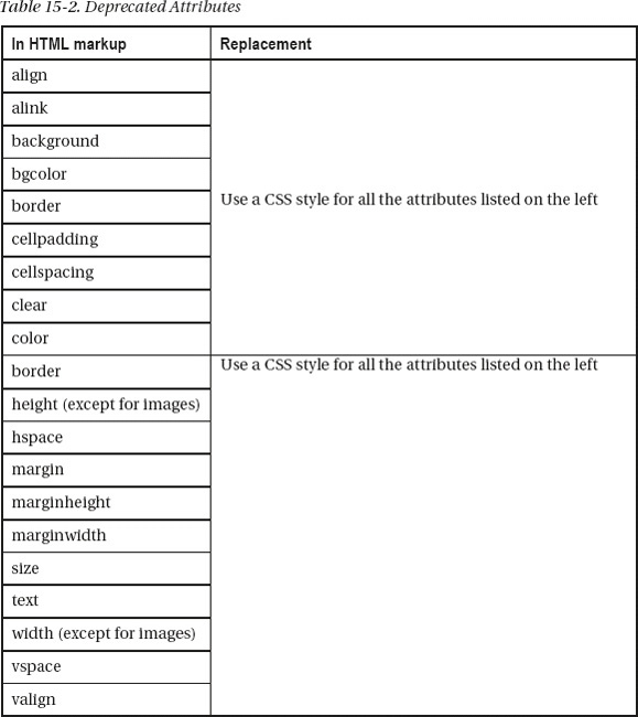
The attributes listed in Table 15-2 must all be replaced by CSS styling.
Replacing Deprecated Items
The amount of HTML markup will be reduced when deprecated items are replaced by CSS. However, the CSS sheet will then contain more markup. This gives a net saving because the CSS sheet is a single page, but many of the HTML pages linked to the style sheet will have less markup.
I usually place an up-arrow on lengthy pages like Figure 15-1. Clicking the arrow makes the cursor jump to the top of the page.

Figure 15-1. An up-arrow and its text
Old HTML markup for the up-arrow would have included deprecated items shown here in bold type:
   <p align="center"><b><font size="3" face="Times New Roman">Go to top of page</font></b>

   <a href="#top">

        <img border="0" title="Go to top of page" src="images/bluearrow.gif"

        align="middle" alt="Go to top of page" width="52" height="44"></a>

   </p>
After removing the deprecated items and using a CSS style sheet, the markup becomes:
   <p><b>Go to top of page</b>

   <a href="#top">

        <img class="up-arrow" title="Go to top of page" src="images/bluearrow.gif"

        alt="Go to top of page" width="52" height="44"></a>

   </p>
The width and height tags are acceptable in the HTML markup when used with an image. The font family details and the class up-arrow would be defined in a CSS style sheet as follows:
.up-arrow { font-family: "times new roman"; font-size:100%; font-weight:bold;

text-align:center; border:0; vertical-align:middle;

}
I use a class rather than an id because I need more than one up-arrow on very long pages.
The markup was reduced from 241 characters to 172 characters and the markup will now validate. In a web site, this saving will be achieved in every page that contains up-arrows.
When more than one up-arrow is located in a side column, create an additional class of up-arrow called class="up-arrow-more".
In the CSS style sheet the additional class would be as follows:
.up-arrow-more { font-family:"times new roman"; font-size:100%; font-weight:bold;

 text-align:center; border:0; vertical-align:middle; margin-top:400px;

}
The additional arrows on the page are given the class up-arrow-more. The margin-top:400px forces the up-arrows apart vertically by a distance of 400 pixels. This avoids the need to insert lots of line breaks <br> or <p> tags between each up-arrow.
Anchors
In earlier times, the landing point at the top of a page was set by the HTML 4 markup as
<a name="top"></a>
The attribute name should now be replaced by id. The code becomes <a id="top"></a>. This is now general practice for all versions of HTML.
The same recommendation applies to anchors on other pages; for instance, to link from one page to a particular place on another page, the link might be
<a href="page3.html#colyton">Click for more information about Colyton</a>
When clicked, the link would take the user to a place on page3.html that would be labeled as
<a id="colyton"></a>
Validation: Pages containing deprecated items will not validate. Hand held devices and search engines can be hindered by pages that will not validate because they contain deprecated items.
The <embed> tag was deprecated in HTML4 and it would not validate. However, it was so widely used (especially in videos) that it has been revived in HTML5. Its return is warmly welcomed.
Bold and Italic Text
Concerning deprecation, the following question often arises: should you now use <strong></strong> instead of <b></b> and <em></em> instead of <i></i>?
The <b></b> tag is not deprecated, the <strong></strong> tag gives a similar result, but a user’s browser settings can override it. The CSS equivalent would be b { font-weight:bold; }.
The <i></i> tag is not deprecated, the <em> </em> tag gives a similar result but the user’s browser settings can override it. The equivalent CSS code is i {font-style:italic;}.
I use them interchangeably when I am busy and I have deadlines to meet because I find the difference too subtle to worry about.
As a general rule, use <i> to italicize a word or phrase without changing its emphasis or mood; for example: “Don’t miss The Depraved Soap Opera on TV channel 123 tonight.”
Use <em> to emphasize a word or phrase; for example: “You mean actually enjoy that show?”
Data Tables Good, Layout Tables Bad
Tables should only be used to present data. Older web sites used tables for page layout and many still do. The World Wide Web Consortium (W3C) deprecated tables for page layout several years back. Mobile devices definitely do not like table layouts. Table layouts result in bloated pages. The HTML for a table layout can be three to four times bulkier than for CSS layout.
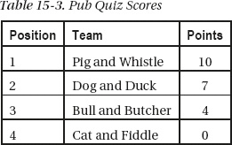
Once mastered, CSS layouts have much greater power and flexibility than table layouts. Table layouts can be a big problem for people using screen readers, speech output browsers, Braille browsers, and text browsers (see Chapter 14). Acceptable tables consisting of rows and columns of data like Table 15-3.
 Note Special rules apply to data tables for assisting the disabled. These are described in Chapter 14.
Multiple Columns Without Tables
CSS2-based, multiple columns can be designed quite easily without using tables. (This section of the chapter can be regarded as a supplement to the multiple column section of Chapter 12.) CSS3 can create columns of text, (see “The new CSS3 module for columns” later in this chapter), but currently, few browsers support this.
A Basic, Three-Column Page with Columns the Same Color
Semantic tags are not used in these examples so that IE 7 and IE 8 can display the results without having to resort to the complication of added JavaScript. If you wish to use semantic tags, be sure to add the JavaScript snippet and change the display instruction in the CSS as described in Chapter 1.
Figure 15-2 shows three columns created by CSS.
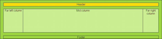
Figure 15-2. A three column page with five sections or divisions
This is achieved by creating five divisions (<div>s): one each for the header and footer and one for each column. Purists will be horrified by my use of presentational markup. Designers are discouraged from using identifiers like leftcol and rightcol; identifiers should indicate content not position. In this and subsequent examples, the presentational words leftcol, rightcol, and midcol are used for clarity. In a real web page, they could be replaced by something like menu-col, advert-col, and main-content.
Listing 15-2a uses CSS presentation to produce three columns instead using a deprecated table layout.
Listing 15-2a. Creating Three Columns Without Using a Table (three-col-no-tables.html)
<!doctype html>

<html lang=en>

<head>

<title>Three columns without tables</title>

<meta charset=utf-8>

        meta details go here

<link href="three-col-no-tables.css" rel="stylesheet" type="text/css" />

</head>

<body>

<div id="container">

        <div id="hdr">Header</div>

        <!--start of main panel that contains the menus and four columns of content-->

        <div id="mainpanel">

                <div id="leftcol">Far left column<!--the far left column starts-->

                </div><!--end of far left column>

                <div id="rightcol">Far right column<!--start of the far right column-->

                </div>

                <div id="midcol">Mid column<!--Start of the middle column-->

                </div><!-- midcol closed-->

        </div><!-- main panel closed--><br>

        <div id="ftr"><!-- start of footer-->

                Footer

        </div><!--footer closed-->

</div><!--container closed -->

</body>

</html>
The CSS layout is provided in Listing 15-2b.
Listing 15-2b. The CSS Style Sheet for the Layout of Figure 15-2 (three-col-no-tables.css)
body {background:white; font-family:arial; font-size:medium; color:black;

margin:auto; padding:7px;

}

#container { width:960px; border:1px black solid; margin:auto; text-align:center;

margin-top:0; background:#a5f400;

}

#hdr {width:920px; height:20px; margin:15px auto 15px auto; background:yellow;

color:black; border:1px black solid;

}

/*THE MAIN PANEL CONTAINS THE THREE COLUMNS*/

#mainpanel {margin:auto; background:#d2ff81; text-align:center; width:920px;

height:140px; border:1px black solid;

}

#leftcol {float:left; width :115px; height: 140px; border-right:1px black solid;

}

#rightcol { float:right; width:92px; border-left:1px black solid; height:140px;

}

*SET MARGINS FOR MID COLUMN. THIS SITS BETWEEN THE FAR LEFT AND FAR RIGHT COLUMNS*/

#midcol { margin-left:120px; margin-right:105px; text-align:center; border:1px black solid;

}

#ftr {width:920px; margin:auto; text-align:center; clear:both; background: #a5f400;

border: 1px black solid;

}
A Basic, Four-Column Page with Columns the Same Color
Figure 15-3 shows the display produced by CSS markup for four columns.
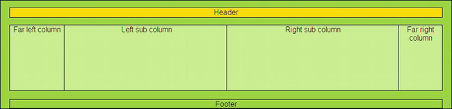
Figure 15-3. Four columns without using tables
Creating four columns is simply a matter of splitting the middle column into two sub-columns using <div>s . The Listings 15-3a and 15-3b identify these as subleft and subright.
Listing 15-3. Creating a Four Column Layout Without Tables (four-col-no-tables.html)
<!doctype html>

<html lang=en>

<head>
<title>Four columns with no tables</title>

<meta charset=utf-8>

<meta details go here>

<link href="four-col-no-tables.css" rel="stylesheet" type="text/css">

</head>

<body>

<div id="container">

        <div id="hdr">Header</div>

        <div id="mainpanel">

                <div id="leftcol">Far left column</div>

                <div id="rightcol">Far right column</div>

                <div id="midcol">

                        <div id="subleft">Left sub column</div>

                        <div id="subright">Right sub column</div>

                </div>

        </div><br>

                <div id="ftr">Footer</div>

</div>

</body>

</html>
The CSS layout for Figure 15-3 is provided by Listing 15-3b.
Listing 15-3b. Providing the CSS Layout for Four Columns (four-col-no-tables.css)
body {background:white; font-family:arial; font-size:medium; color:black; margin:auto;

padding:7px;

}

#container { width:960px; border:1px black solid; margin:auto; text-align:center;

margin-top:0; background:#a5f400;

}

#hdr {width:920px; height:20px; margin:15px auto 15px auto; background:yellow;

color:black; border:1px black solid;

}

#mainpanel {margin:auto; background:#d2ff81; text-align:center; width:920px;

height:140px; border:1px black solid;

}

#leftcol {float:left; width :115px; height: 140px; border-right:1px black solid;

}

#rightcol { float:right; width:92px; border-left:1px black solid; height:140px;

}

#midcol { margin-left:120px; margin-right:105px; text-align:center;

}

#subleft { float:left; width: 49%; height: 140px; border-right:1px black solid;

}

#subright { float: right; width:49%; height: 140px; border:0;

}

#ftr {width:920px; margin:auto; text-align:center; clear:both; background: #a5f400;

border: 1px black solid;

}
Four Columns with Differing Background Colors
Figure 15-4 shows four columns with different colors.

Figure 15-4. Four columns with three colors
Design becomes trickier if you require different colored columns as Figure 15-4. Personally, I much prefer columns to have the same color, it looks classy, concentrates the focus on the main topic, and presents designers with fewer problems. However, if you need columns with different colors, the least complicated method is described next. (Sources for other methods are provided at the end of this chapter.)
Listing 15-4a provides the content on the four column page.
Listing 15-4a. Creating the Content for Four Columns With Three Colors (colour-columns1.html)
<!doctype html>
<html lang=en>
<head>
<title>Colour columns</title>
<meta charset=utf-8>
meta details go here
<link rel="stylesheet" type="text/css" href="style-colourcols1.css">
</head>
<body>
<div id="container">
<div id="hdr"><h1>Header</h1>
</div>
<div id="leftcol">
<p>Far left column</p><p>some content</p><p>some content</p>
<p>some content</p><p> </p><p> </p><p> </p><p> </p>
</div>
<div id="rightcol">
<p>Far right column</p><p>some content</p><p> </p><p> </p>
<p> </p><p> </p>
</div>
        <div id="midcol">

        <h2><b>Coloured columns</b></h2>

        <div id="mid-left-col">

                <p>Mid left column</p>

                <p>some content</p><p>some content</p><p>some content</p><p>some content</p>

                <p>some content</p><p>some content </p>

        </div>

        <div id="mid-right-col">

                <p>Mid right column</p>

                <p>some content</p><p>Some content</p><p>some content</p>

        </div>

        </div>

                <br class="clear"></div>

<div id="ftr">

<p>Footer</p>

</div>

</body>

</html>
The Listing 15-4b is the style sheet that presents the colored columns as in Figure 15-4.
Listing 15-4b. The CSS Style Sheet for Colored Columns (style-colourcols1.css)
/*SETTINGS FOR MAXIMUM CONFORMITY BETWEEN BROWSERS*/

html, body, h1, h2, h3, h4, h5, h6, p, ol, ul, li, form, fieldset, blockquote {

padding: 0; margin: 0; font-size: 100%; font-weight: normal;

}

img { border:0;

}

body { background:#BBD999; font-family:arial; font-size:120%; color:#4B6113;

margin:auto; padding:7px;

}

#container { width:900px; border: 10px white solid; margin:auto; text-align:center;

margin-top:0; background-color:#CEE1BA; color:#4B6113;

}

#hdr { padding-top:18px; height:141px; width:100%; margin:auto;

background-image:url('images/banner.jpg'), background-repeat:no-repeat;

background-position:65;

}

#hdr h1 { font-family: "times new roman"; text-align:center; color: white;

font-weight:bold; font-size: 300%; margin-top:50px;

}

#leftcol { float:left; width :130px; display:inline; background-color:#ACC;

}

#rightcol { float:right; width:92px; text-align:center;

background:url(images/yellow-square.gif) repeat-y right top;

}

/*SET MARGINS ON MID COLUMN*/

#midcol { margin-left:140px; margin-right:105px; text-align:center;

}

/*SET COLUMN WIDTHS FOR CONTENT. THESE SIT WITHIN THE MIDCOL*/

#mid-left-col {width:47%; float:left; text-align:left;

}

#mid-right-col {width:47%; float:right; text-align:left;
}

/*ENSURE DIVS AUTOMATICALLY STRETCH VERTICALLY TO ACCOMMODATE VARIOUS AMOUNTS OF CONTENT*/

br.clear { clear:both;

}

/*SET FOOTER TO CLEAR PRECEDING COLUMNS*/

#ftr {text-align:center; clear:both;

}
An Extendable, Colored, Central Panel with No Tables
For this next example, my thanks go to Mrs. Diana Board for giving me permission to use the home page that I designed for her web site (www.lowerfarmbandb.co.uk).
All the following examples use no tables. Figure 15-5 shows a four-column page. The pale green content panel with a white border needs a tweak to make it expand downwards to match the amount of content.
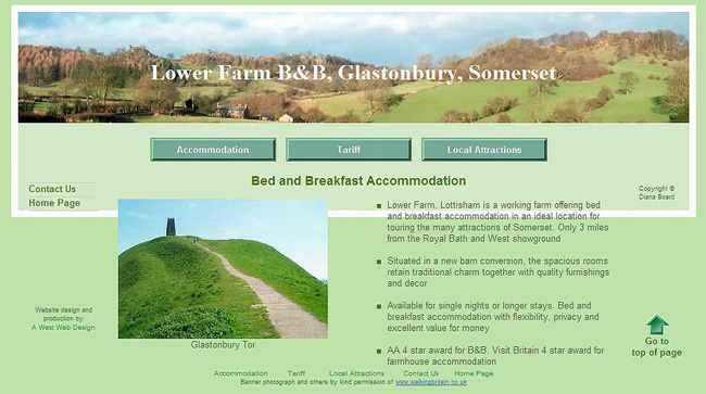
Figure 15-5. The untweaked page
Figure 15-6 shows the content panel extended downwards without resorting to a table layout.
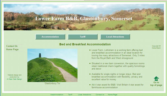
The two photographs used in this home page Figure 15-6 are by kind permission of Walking Britain
(www.walkingbritain.co.uk).
The item in bold type in Listing 15-6 is the tweak that pulls the frame down. In Listing 15-6 much of the content has been omitted as it is not relevant to the point being made. You can download the full listing from the companion web site, http://www.apress.com.
Listing 15-6.Creating the Structure for the Page Shown in Figure 15-6 (tweaked.html)
<!doctype html>
<html lang=en>
<head>
<title>Tweaked page</title>
<meta charset=utf-8>
meta details go here
<link rel="stylesheet" type="text/css" href="style-fixed-sans.css" />
</head>
<body>
<a id="top"></a>
<div id="container">
<div id="hdr"><h1>Lower Farm B&B, Glastonbury, Somerset</h1></div>
<div id="mainpanel"><!--start of main panel and horizonal buttons--><br>
<ul id="hmenew">
The horizontal menu buttons go here
</ul><br>
<div id="leftcol"><!--side menu column starts-->
<ul id="menu">
The two vertical menu buttons go here
</ul>
Web design details and copyright notices go here
</div>
<div id="midcol" ><h2>Bed and Breakfast Accommodation</h2><p> </p>
<div id="mid-left-col" class="cntr">
<img alt="Glastonbury Tor" height="200" src="images/tor300.jpg" width="300"><br>
Glastonbury Tor<br>
</div>
<div id="mid-right-col">
<ul>
<li>Lower Farm, Lottisham is a working farm offering bed and breakfast
accommodation in an ideal location for touring the many attractions of
Somerset. Only 3 miles from the Royal Bath and West showground<p> </p></li>
<li>Situated in a new barn conversion, the spacious rooms retain traditional
charm together with quality furnishings and decor<p> </p></li>
<li>Available for single nights or longer stays. Bed and
breakfast accommodation with flexibility, privacy and excellent value for
money<p> </p></li>
<li>AA 4 star award for B&B. Visit Britain 4 star award for farmhouse
accommodation</li>
</ul>
</div>
</div>
<br class="clear"><br>
</div>
</div>
<div id="ftr">Footer links and photograph permissions go here</div>
</body>
</html>
The tweak for pulling the panel and border downwards is an additional item placed in the CSS style sheet. The code that was added is as follows:
/*ENSURE DIVS AUTOMATICALLY STRETCH VERTICALLY TO ACCOMMODATE VARIOUS AMOUNTS OF CONTENT*/

br.clear { clear:both;

}
Now we will look at boxes containing images and text. These were traditionally presented in a table. But because tables are deprecated, the next section shows you how to dispense with tables by using a CSS style sheet.
CSS Boxes and Borders
In the past, web designers would have used a table to construct Figure 15-7. Now that tables are deprecated, the boxes must be constructed using CSS. Figure 15-7 illustrates a set of boxes constructed entirely by means of CSS.
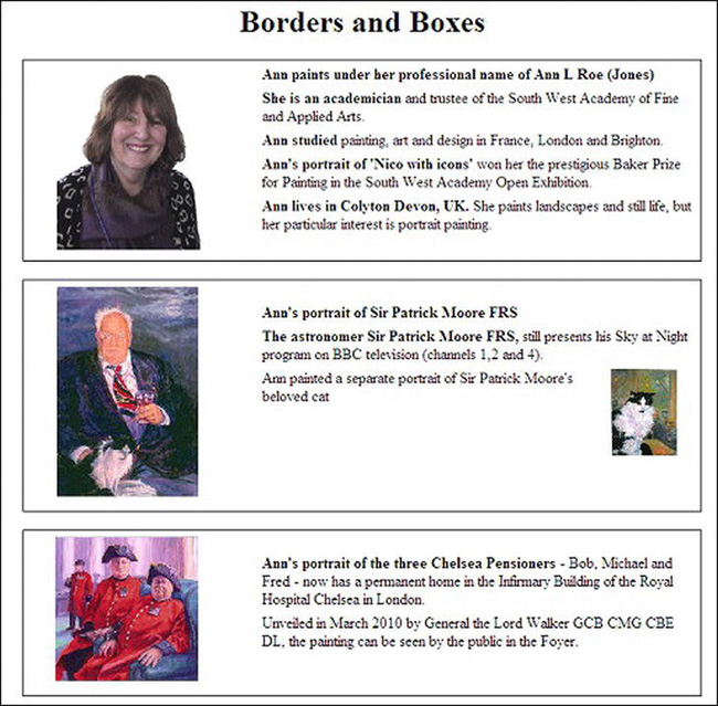
Figure 15-7. Boxes and borders without tables
The portrait artist Ann Roe Jones kindly gave me permission to use items from the web site I designed for her. These are used in Figure 15-7. You can view her web site at www.annroejones-artist.co.uk.
An internal style is used here for clarity only. The boxes are defined in their own <div>s and each of these has the class mainpanel. The panels are separated by the code <br class="clear">.
Listing 15-7. Creating the Structure and CSS Presentaion for a Group of Boxes (borders-boxes.html)
<!doctype html>

<html lang=en>

<head>

<title>Borders and boxes</title>
<meta charset=utf-8>
meta details go here
<style type="text/css">
#wrapper { text-align:center;
}
.mainpanel {margin:auto; padding:5px; font-size:100%; text-align:center;
width:700px; border:1px solid black;
}
.leftcol { float:left; width:30%; text-align:center;
}
.rightcol {float:right; width:68%; text-align:left;
}
br.clear { clear:both;
}
p { margin-top:0; margin-bottom:6px;
}
.img-left { float:left; }
.img-right {float:right; }
#cat { float:right; margin-right:20px; margin-left: 5px;" width="69"
}
</style>
</head>
<body id="wrapper">
<a id="top"></a>
<div id="hdr"><h1> Borders and Boxes</h1></div>
<div class="mainpanel">
<div class="leftcol">
<p><img alt="Ann Roe Jones" height="194" src="images/ann150.gif" width="150"></p>
</div>
<div class="rightcol">
<p> <b>Ann paints under her professional name of Ann L Roe (Jones)</b></p>
<p><b>She is an academician</b> and trustee of the South West Academy of Fine
and Applied Arts.</p>
<p><b>Ann studied</b> painting, art and design in France, London and Brighton.</p>
<p><b>Ann's portrait of 'Nico with icons'</b> won her the prestigious Baker Prize
for Painting in the South West Academy Open Exhibition.</p><p><b>Ann lives in Colyton Devon, UK. </b>
She paints landscapes and still life, but her particular interest is portrait
painting.</p>
</div>
<br class="clear">
</div><br>
<div class="mainpanel">
<div class="leftcol">
<p><img alt="Sir Patrick Moore FRS" height="222"
src="images/patrickmoore150.jpg" width="150"> </p>
</div>
<div class="rightcol"><br>
<p><b>Ann's portrait of Sir Patrick Moore FRS</b></p><p><b>The astronomer
Sir Patrick Moore FRS, </b>
still presents his Sky at Night program on BBC television (channels 1,2 and 4).</p>
<p id="cat"><img class="img-right" alt="Sir Patrick Moore's cat" height="91"
src="images/catthumb.jpg" >Ann painted a separate portrait of Sir Patrick Moore's
beloved cat (see inset on the right)</p>
</div>
<br class="clear">
</div><br>
<div class="mainpanel">
<div class="leftcol">
<p><img alt="Chelsea Pensioners" height="153" src="images/pensioners150.jpg"
width="150"> </p>
</div>
<div class="rightcol"><br><p><b>Ann's portrait of the three Chelsea Pensioners</b>
- Bob, Michael and Fred - The painting now has a permanent home in the Infirmary
Building of the Royal Hospital Chelsea in London.</p>Unveiled in March 2010 by
General the Lord Walker GCB CMG CBE DL, the painting can be seen by the public in
the Foyer.<br>
</div>
<br class="clear">
</div><br>
</body>
</html>
The next section discusses the new CSS3 module for creating multiple columns.
The New CSS3 Module for Columns
Now that layout tables are deprecated, designers must abandon the traditional way of displaying columns of text by means of a multi-cell tables with invisible borders. Earlier in this chapter, I described how to use CSS to achieve multiple columns for containing text.
CSS3 has new module for multi-column layout, this is perhaps the most exciting time saver of all the proposed modules. When it is fully adopted, we might see an end to those ghastly web sites where the text spreads right across the screen. It will certainly be the death of table layout for columns.
The width and number of columns can be defined. The new style keywords as you would expect are, column-width and column-count. A space can be created between columns using a width called forcolumn-gap. A vertical line between columns can be created using column-rule. Content will flow from column to column like it does in publishing software.
At the time of writing, only Mozilla Firefox, Chrome, and Safari support the new multi-column module. However, Firefox, Chrome and Safari manage this by means of their own idiosyncratic hacks: -moz- for Firefox and -webkit- for Safari and Chrome. Sadly, IE 7, IE 8, and IE 9 (and Opera at the time of writing) ignore the CSS3 column styling. Therefore, CSS3 multiple columns may not be used by web designers for several years until IE 7, IE 8, and IE 9 are extinct.
Note CSS3 is not dependent on the HTML version. CSS3 enhancements will work in HTML4, XHTML, and HTML5 but only if the browser supports them. Firefox, Safari, and Chrome support multiple columns. Microsoft stated in September 2010 that IE 9 will not support CSS3 multiple columns.
Figures 15-8 and 15-9 show how the CSS3 multiple columns appear in various browsers.
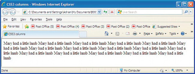
Figure 15-8.The CSS3 multi-column markup fails to display in Internet Explorer 6, 7, 8, 9, and Opera
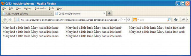
Figure 15-9. How CSS3 multi-column displays in Mozilla Firefox, Safari, and Chrome
In Listing 15-8, the code in bold type establishes the way that supporting browsers display the columns in these two figures.
Listing 15-8. A Template for Content that can be Displayed in Columns Using CSS3 (css3-columns.html)
<!doctype html>

<html lang=en>

<head>

<title>CSS3 mutiple columns</title>

<meta charset=utf-8>

        meta details go here

<style type="text/css">

#content { -moz-column-count: 3; -moz-column-gap: 1em;

-webkit-column-count: 3; -webkit-column-gap: 1em;

}

</style>

</head>

<body>

<div id="content">
Mary had a little lamb Mary had a little lamb Mary had a little lamb Mary had a little lamb

Mary had a little lamb Mary had a little lamb Mary had a little lamb Mary had a little lamb

Mary had a little lamb Mary had a little lamb Mary had a little lamb Mary had a little lamb

Mary had a little lamb Mary had a little lamb Mary had a little lamb Mary had a little lamb

</div>

</body>

</html>
CSS3 can provide vertical rules, that is, lines that separate one item from another. Figure 15-10 shows that CSS3 can provide dividing rules between paragraphs.
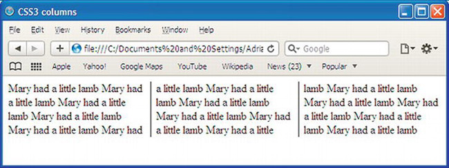
Figure 15-10. How CSS3 multi-columns displays the rules in Mozilla Firefox, Safari, and Chrome
At the time of writing, the vertical rules require the hack -moz- for Mozilla Firefox and -webkit- for Safari. In the following code snippet, the new CSS3 column module keywords for rules are shown in bold type.
#content { -moz-column-count: 3; -moz-column-gap: 1em; -moz-column-rule: 1px solid black;

-webkit-column-count: 3; -webkit-column-gap: 1em; -webkit-column-rule: 1px solid black;

}
Listing 15-10. Introducing Vertical Rules Between the CSS3 Columns (css3-3col-rules.html)
<!doctype html>

<html lang=en>

<head>

<title>CSS3 mutiple columns</title>

<meta charset=utf-8>

<meta details go here>

<style type="text/css">

#content { -moz-column-count: 3; -moz-column-gap: 1em; -moz-column-rule: 1px solid black;

-webkit-column-count: 3; -webkit-column-gap: 1em; -webkit-column-rule: 1px solid black;

}

</style>

</head>

<body>

<div id="content">

Mary had a little lamb Mary had a little lamb Mary had a little lamb Mary had a little lamb

Mary had a little lamb Mary had a little lamb Mary had a little lamb Mary had a little lamb
Mary had a little lamb Mary had a little lamb Mary had a little lamb Mary had a little lamb

Mary had a little lamb Mary had a little lamb Mary had a little lamb Mary had a little lamb

</div>

</body>

</html>
When the browser window is shrunk horizontally, the three columns reduce in width to match. They also extend downwards to accommodate all the content. If the content container has a fixed width then the columns stay the same width when the browser window is shrunk.
One wonderful day we will be able to omit the hacks and just use the following CSS3:
#content { column-count: 3; column-gap: 1em; column-rule: 1px solid black;

}
The multiple-column module will be remarkably flexible when the browsers eventually implement the next batch of features; for instance, the next snippet of CSS markup will fix the width of the columns and will adjust the number of columns to fit the content space. The column-width markup sets the column widths to at least 15 em wide. The exact number of columns will depend on the available content width.
#content { column-width: 15em;

}
In the next piece of CSS3 markup, the number of columns will be fixed, but the width of each column will change to suit the width of the content area.
#content { column-count: 3;

}
The columns can be made equal length, as follows:
#content { column-fill: balance;

}
A heading can be made to span the columns, as follows:
h2 { column-span: all;

}
The column rule (a vertical line between the columns) can be omitted or it can have various widths and colors, as follows:
#content {column-rule: thin solid blue;

}
Many other multi-column features are in the module’s pipeline but are not yet finalized; nor are they available in browsers at the time of writing. They include the following:
column-space-distribution,    break-before:column;    break-inside:avoid-column;

and break-after:avoid-column;
Tip See the A List Apart web site www.alistapart.com/articles/css3multicolumn/ for a comprehensive treatment of the new CSS3 multi-column module. See alsohttp://developer.mozilla.org/en/docs/CSS3_Columns and www.w3.org/TR/css3-multicol/.
Summary
This chapter provided a list of deprecated tags and attributes— items you should avoid as you design or redesign web sites. The up-arrow device was used to demonstrate the advantages of dumping deprecated items. Because tables are deprecated, several solutions were described for replacing them with CSS styling. The chapter gave solutions for problems that might arise from using CSS layouts. A way of constructing a series of boxes with borders without tables was described. Traditionally, tables with invisible borders were used to display columns of text; the chapter gave instructions for using CSS2 to replace tables and then demonstrated the new CSS3 multi-column solution.
In the next chapter you will learn how search engines work, and you will be introduced to methods for optimizing your web sites so that they will appear higher up in the search engines’ results.