The Message Widget
The message widget displays a long text string by formatting it onto several lines. It is designed for use in dialog boxes. It can format the text into a box of a given width, in screen units, or a given aspect ratio. The aspect ratio is defined to be the ratio of the width to the height, times 100. The default is 150, which means that the text will be one and a half times as wide as it is high.
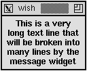
Example 29-3 creates a message widget with one long line of text. Backslashes are used to continue the text string without embedding any newlines. (You can also just type a long line into your script.) Note that backslash-newline collapses white space after the newline into a single space.
Example 29-3 The message widget formats long lines of text.
message .msg -justify center -text "This is a very long text line that will be broken into many lines by the message widget" pack .msg |
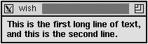
 | A newline in the string forces a line break in the message display. You can retain exact control over the formatting by putting newlines into your string and specifying a very large aspect ratio. In Example 29-4, grouping with double quotes is used to continue the string over more than one line. The newline character between the quotes is included in the string, and it causes a line break: |
Example 29-4 Controlling the text layout in a message widget.
message .msg -aspect 1000 -justify left -text "This is the first long line of text, and this is the second line." pack .msg |
One disadvantage of a message widget is that, by default, you cannot select the text it displays. Chapter 35 describes how to define custom selection handlers, so you could define one that returned the message string. The message widget predates the text widget, which has many more features and can emulate the message widget. If selections, multiple fonts, and other formatting are important, use a text widget instead of a message widget. Text widgets are described in Chapter 33.
Message Attributes
Table 29-3 lists the attributes for the message widget. The table lists the resource name, which has capitals at internal word boundaries. In Tcl commands these options are specified with a dash and all lowercase:
| anchor | Relative position of the text within its packing space. |
| aspect | 100 * width / height. Default 150. |
| background | Background color (also bg). |
| borderWidth | Extra space around the edge of the text. |
| cursor | Cursor to display when mouse is over the widget. |
| font | Font for the message's text. |
| foreground | Foreground color (also fg). |
| highlightBackground | Focus highlight color when widget does not have focus. |
| highlightColor | Focus highlight color when widget has focus. |
| highlightThickness | Thickness of focus highlight rectangle. |
| justify | Justification: left, center, or right. |
| padX | Extra space to the left and right of the text. |
| padY | Extra space above and below the text. |
| relief | flat, sunken, raised, groove, solid or ridge. |
| takeFocus | Controls focus changes from keyboard traversal. |
| text | Text to display. |
| textVariable | Name of Tcl variable. Its value is displayed. |
| width | Width, in screen units. |
Arranging Labels and Messages
Both the label and message widgets have attributes that control the position of their text in much the same way that the packer controls the position of widgets within a frame. These attributes are padX, padY, anchor, and borderWidth. The anchor takes effect when the size of the widget is larger than the space needed to display its text. This happens when you specify the -width attribute or if you pack the widget with fill enabled and there is extra room. See Chapter 37 and the section on Padding and Anchors for more details.