They are named so due to the loss of the decorative serifs, in French "sans" stands for "without". Sans Serif is a more recent invention, since it was born in the late 18th century.
They are divided into the following four sub-families:
It is the earliest of the bunch; its appearance is similar to the serif with contrasted strokes but without serifs and with angled terminals
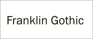
Franklin Gothic is one of the most famous typefaces in this family.
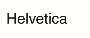
It is plain looking with little to no contrast, small apertures, and horizontal terminals. They are one of the most common font styles ranging from Arial and Helvetica to Universe.
They have a friendly tone due to the calligraphic style with a mixture of different widths characters and, most of the times, contrasted strokes.
Gill Sans being the flag-carrier.

Based on the geometric and rigorous shapes, they are more modern and are used less for body copy. They have a general simplicity but readability of their characters is difficult.
Futura is certainly the most famous geometric font.

They are usually classified into two sub-families based upon the handwriting, with cursive aspect and connected letterforms. They are as follows:
- Formal script
- Casual script
- Monospaced typefaces
- Display typefaces
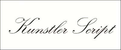
They are reminiscent of the handwritten letterforms common in the 17th and 18th centuries, sometimes they are also based on handwritings of famous people.
They are commonly used for elevated and highly elegant designs and are certainly unusable for long body copy.
Kunstler Script is a relatively recent formal script.
This is less precise and tends to resemble a more modern and fast handwriting. They are as recent as the mid-twentieth century.
Mistral is certainly the most famous casual script.

Almost all the aforementioned families are proportional in their style, (each character takes up space that is proportional to its width). This sub-family addresses each character width as the same, with narrower ones, such as i, just gain white space around them, sometimes resulting in weird appearances. Hence, Due to their nature and their spacing, they aren't advised as copy typefaces, since their mono spacing can bring unwanted visual imbalance to the text.
Courier is certainly the most known monospaced typeface.