We have learnt all the basics of typography, and now we will learn how to apply them to the Web through simple HTML and CSS.
We'll learn how to stylize the written content on your website by creating the page and going through CSS properties.
In this chapter, we will cover the following topics in detail:
- Creating the page
- Using CSS properties
- Ligatures
- Hierarchy
- Example and exercise to use the typography rules!
Before exploring the wonderful world of online typography, we need to set up the space for it to fully develop; so we are going to create a simple HTML5 page to populate with our written content.
<!DOCTYPE html>
<html lang="en">
  <head>
    <meta charset="utf-8">
    <title>Your typography resource</title>
    <link rel="stylesheet" href="../style.css">
  </head>
  <body>
  </body>
</html>
See? No complex data, import nothing. Just an empty page.
Since we're going to concentrate on type and type alone, we're not going to add a variety of elements or a complex layout.
Just a couple of simple lines of text will do, they will show you exactly what we are working on and how it's working.
So we're adding a <p> tag to the body:
<!DOCTYPE html>
<html lang="en">
<head>
<meta charset="utf-8">
<title>Your typography resource</title>
<link rel="stylesheet" href="../style.css">
</head>
<body>
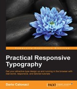
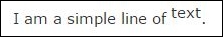
<p>I am a simple line of text. I am a simple line of text.
I am a simple line of text. I am a simple line of text.</p>
</body>
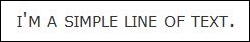
</html>A P element in HTML stands for
Paragraph. It's a basic CSS1 selector, supported by all the browsers; it's used to encapsulate text. As a default property, it is packed with 1em margins that can be specified and modified through CSS. It is a block element, meaning that it won't allow other portions of the page to sit next to it (by default). When the HTML5 standard was introduced, the align property (specifiable by left, right, center, and justify), for the inside alignment of text, was deprecated. The </> closing tag can be omitted for elements like <address>, <article>, <aside>, <blockquote>, <div>, <dl>, <fieldset>, <footer>, <form>, <h1>, <h2>, <h3>, <h4>, <h5>, <h6>, <header>, <hr>, <menu>, <nav>, <ol>, <pre>, <section>, <table>, <ul> or another <p> element, or if there is no more content in the parent element and the parent element is not an <a> element.
The following image shows the standard output for the preceding code on any browser:
As you can see, it's pretty straightforward; no line break, no spacing, and nothing more than pure text.
Adding another <p> after it will add another text line. Please note that the correct way to address the space between them is with the margins CSS property and not by adding <br> elements or empty paragraphs between them.
It's time to add some CSS properties to the preceding <p>.
They are generally divided into three big groups: font, text and letter, and finally the other ones; where the latter are single properties without a prefix.
Font is a group dictating the general characteristics. It is the overall style and weight of the text and letter; it deals with single characters, spaces, words, and so on.
Also, as a difference between the two groups, the font declaration can be minimized in one single big declaration, while text and letter all are single specific calls to determined properties.
So lets take a look at them in our CSS.
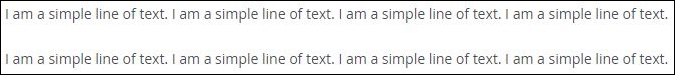
Font-family is used to define the typeface you want for your content. It can either contain one or more specifically aimed typefaces, with the exact family names enclosed between "" (double quotes), generic family names instead can be written without quotes; its application depends on each computer, on its installed typefaces and on the browser support of that particular request. Your first choice will have to be written first, followed by the substitutive families in case the loading or finding on the guest computer of the specifical font fails; 'if it fail, the browser will then move to the next declared family until the very last one, which being generic will tell the browser to load a web-safe font of that family.
Relying on the web-safe fonts is a good thought, but as of today that limitation is disappearing. We'll learn more about this in the next chapter. The following code is an example of the font-family:
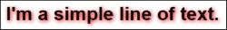
p { font-family: "Georgia", "Times New Roman", Times, serif; }In this case, we made the change from a standard sans to a more classic serif, Georgia, with some generic backup. As in the preceding section, the browser will first search for the font named Georgia on the computer; if it doesn't find it, it will search for Times New Roman and then for the Times family; and last, if all else fails, it will apply a generic serif.
In fact, finding Times New Roman on our computer will display the sample text as the following image:
Font-style is generally used to define italic portions of text – since its variables are limited to: normal, italic and oblique - whereas oblique is a slanted version of the normal weight and style, also called faux-italic.
Italics generally differ from the regular style, as they serve a different purpose and visual and the type designer have addressed that matter in the best way possible; sometimes by modifying or copying faux-italics shapes as well, if the aim of the font is to reminiscence a certain era when they were present. Even in that case, the italic typeface that has been designed, render, print, and feel better (last one thankful to optical corrections) than its slanted brother.
Unfortunately, people today are so used to faux-italics and bolds that they don't even notice anymore, all thanks to Microsoft Office that prior to recent versions enlisted just one regular font from an installed typeface and when clicked (as well as bold) just slanted it. The following code is an example of font-style:
p { font-style: italic; }It will render as follows:
Ironically, the default text it took without any other declaration has no italic, so it reverted to faux one.
Font-size is easy to understand; it sets the size of the font. It can be expressed in pixels, em, and percentages, differences between them will be looked at later.
The declaration is straightforward and there is no need to explain it.
p { font-size: 24px; }
If it's not defined, the browser will give it the default value, usually 16px. Also other values are available, like xx-large, x-large, larger, large, medium, small, smaller, x-small, xx-small, and so on. You get them by the name, each of them referring to the very first defined, or not-defined, value. But you'll probably never use them, as simple as they are.
Font-variant is straightforward tool and it defines the usage or not of small-caps. It can be declared as the latest or as normal.
p { font-variant: small-caps; }
Font-weight allows you to choose the weight of the font, with values as light, lighter, and normal, 100, 200, 300, 400, 500, 600, 700, 800, 900, bold, and bolder.
Numbers of course refer to specified weights of your chosen typeface, but you'll generally end up using bold or light, never lighter or bolder.
p { font-weight: bold; }
Font-stretch is a newborn CSS3 property that defines the stretching of the font on your website. It can be declared as normal, condensed, and expanded (condensed and expanded with the addition of ultra, extra, and semi for different levels of amusement).
p { font-stretch: semi-expanded; }
Sadly it seems like neither the last version of Firefox nor Chrome supports this property, as it can be seen in the preceding image. But believe me, it exist!
As mentioned at the start of the chapter, all of the preceding properties can be combined into a single-giant declaration, usually called shorthand and still respect the CSS standards.
The following are the rules:
- Font-size and family must be declared, otherwise the overall will be ignored
- Font-family must be declared last
- Every other font property can be declared without order, as long as it come before font-size
- Remember to add spaces between each property, to enclose the exact name families between double quotes, and to divide a generic one with a comma
Let's take a look at:
p { font: bold small-caps italic expanded 24px Times, serif; font: bold small-caps italic 24px Times, serif; }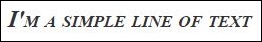
The second, almost-the-same, declaration is really important. As font-stretch is a recent and unsupported property, it can get the browser to ignore your whole declaration and not render the P as you want to.
Making a CSS3 fallback shorthand is a must, if the first gets ignored as a whole then the second won't and your font will be rendered correctly as requested.
Now that we explained the font subgroup, we can jump to the letter, text, and more. As a quick rule, remember that these are more specific, aimed at single characters than font.
Color will allow you to choose the text color, with values as:
- Names, for web-safe colors, such as yellow, red, black, green, cyan, and white.
- Hexadecimal values (
#ff0000,#000000– or#000since couple of same characters can be combined into one, saving bits in your CSS file). - RGB and RGBA values are simple numeric values. The A in RGBA stands for transparency, it varies from 0 (transparent) to 1 (completely opaque).The following code shows exactly that: the first line color is expressed trough name, then hexadecimal and hexadecimal compressed formula; after that RGB and RGBA values.
p { color: red;
  color: #ff0000;
  color: #f00;
  color: 255, 0, 0;
  color: 255, 0, 0, 1;}
All the preceding parts of code are various ways to write and obtain the same result, such as this:
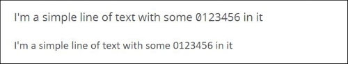
Letter-spacing is usually seen as the application of Kerning on the Web. While its not a completely correct definition (as it doesn't really work on single letter kerning, it touches spacing in the whole word). It defines the space between each letter in the words and as such, it kind of works. Values run from normal, number 0 to prevent justifying and numerical/percentage values. It can also be used with negative ones.
p { letter-spacing: 5px; }CSS3 added a rule, which is currently not well supported and is a little bit different from letter-spacing: Font-kerning.
Font-kerning allows the adjustments of inter-glyph spacing, as written inside the current font, it won't allow for the letter-to-letter adjust, it's a mere specification between the usage and the choice to not use kerning as provided by the used font.
An image is better than thousand words, so let's take a look at the following image:
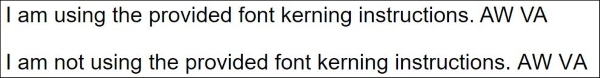
The first example is:
p { font-kerning: normal; }The second is:
p { font-kerning: none; }This rule allows for no values other than the on/off ones (and an auto, discretionary one that leave the choice to the browser), but the difference is clearly visible in the last couple of letters in the preceding image. As the second p is not using the inside written kerning rules, AW and VA start to spread around.
Text-align is born after the deprecation of the align element. Its values are the same: left, right, center, and justify.
p { text-align: center; }This is how it looks:
Text-decoration serves to focus or define some appearances in the informational text. Values are: none, underline, overline, line through, and blink
For the sake of brevity, I'm going to write multiple p's and id each one of them to show you the different decorations in one single image. Blink requires a screen to be seen, it cannot be made visible on the printed page since it will be an animation: in one instant text will be visible, in the next it won't. It was used in the ancient times of the Web to display links.
It is also now deprecated and it doesn't work anymore.
p { text-decoration: underline; }The following image shows the output of the underline command:
The following image shows the output of the overline command:
p { text-decoration: overline; }
The following image shows the output of the line through command:
p { text-decoration: line through; }
Text-indent serves to move inward the very first line of text of a paragraph. The value can be based on pixels (absolute) or percentages and it can't be a negative value, or else it will be ignored.
p { text-indent: 20px; }This is how an indented line looks:
Text-transform serves to control the appearance of the letters in a determined text. You can choose between none, capitalize, lowercase, and uppercase. Each value is self-explanatory.
p { text-transform: capitalize; }This is how it looks after capitalization:
In the modern times, the property Font-variant-caps have been introduced with CSS3 but it is still missing a wide, safe support to use it.
The numerous values are built inside, like normal, small-caps, all-small-caps, petite-caps, all-petite-caps, unicase, and titling-caps.
- Small-caps explains itself
- All-small-caps will apply small-caps to the first letters and the capitalized ones, giving it a better and coherent appearance
- Petite-caps allow the visualization of petite capitals
- Unicase allows the mixture of uppercase characters (when typed as) and lowercase ones
- Titling-caps are a variety of all-caps, since they are designed to be less strong than the text set in all capitals
The following is the code which explains font-variant-caps with its values:
p { font-variant-caps: all-petite-caps; }This is how it looks:
Text-shadow is a CSS3 property to stylize your content. As the name says, it simply adds a shadow to the text. The values can be either positive or negative and they can be mixed; they must be expressed in numerical absolute characters, followed by the color name or hexadecimal or rgb/rgba definition. The first value is horizontal, second is vertical, and an optional third for Blur can be specified as well.
Also, the multiple shadows can be combined by just writing them on, or after, the other in the same declaration will do the trick and all will be applied.
p { text-shadow: 2px 2px 8px #FF0000; }This is how it will look:
Use this property subtly for best results, don't abuse it.
Text-overflow is the CSS3 property that allows you to give an indication that more content is underlying, but that is breaking its inline boundaries given by the container a little bit like the Read more… segment that is visible in WordPress posts.
The Text-overflow values are the following ones:
- Clip is the default. It truncates the word whenever an overflow occurs, even in the middle of a character.
- Ellipsis shows a "…" for the clipped text. It will take space inside the content, thus displaying even less text than before. Also, if enough space is not available for it to be visible, the ellipsis will be truncated too!
- Visible: The over flown text will be left visible, expanding outside the content area
- (''"): Text enclosed in double quotes or empty string between double quotes will behave as clip, but it will truncate in-between two characters, single characters will be left untouched and won't be cropped.
- String inserts any value between single quotes and will show it as the truncated text signal.
The following is the code which explains text-overflow with its values:
p { text-overflow: clip; }This is how it looks:
Direction serves to control the appearance of your writing in the browser. Ltr is the default value, meaning left-to-right text; Rtl does the opposite, rendering your text from right to left. The following code shows how direction works:
p { direction: rtl; }This is how it looks:
This doesn't seem like much is changing, but the dots are now placed before the text (at least in our appearance, seems we read from left to right) and text will be automatically aligned on the right edge.
White-space is explained by the name itself and it's tracking plus blank space addition in Web Design. The values are strange and need a bit of explanation:
- normal: The sequence of white spaces will collapse and the text will wrap to the next line when needed
- nowrap: The sequences will collapse but the text will never wrap to the following line, practically staying on one single line and breaking your elements
- pre will take all the white space and the line breaks and force the browser to show them, not allowing for any wrapping. This is useful if you're displaying a code.
- pre-line and pre-wrap practically act as normal, with words wrapping when necessary and on defined line breaks
Tip
Detailed steps to download the code bundle are mentioned in the Preface of this book. Please have a look.
The code bundle for the book is also hosted on GitHub at https://github.com/PacktPublishing/Practical-Responsive-Typography. We also have other code bundles from our rich catalog of books and videos available at https://github.com/PacktPublishing/. Check them out!
The following code shows how white-space is implemented:
p { white-space: nowrap; }This is how it looks:

As you can see, words won't wrap and will exit your div with a set width. Pre-wrap will practically add a lot of white space before the line. You better leave this property as default, not specifying it in 99% of the cases.
Word-wrap is similar to the preceding case but it's a CSS3 only introduced rules and it's way better than white-space. It also addresses a different properly (but in your end result sometime it will appear that the result is the same). It does not address the surrounding white spaces and is aimed at the longer words, thus allowing them to break into syllables when the browser feels that they're going to break the container element width (as seen in the preceding example)
The values are really interesting and useful (when the browser supports it of course)
As you can see, the long and unbreakable word with no white-space has been broken completely, respecting your container width. Useful, isn't it?
Word-spacing only addresses the white space between couples of words, leaving tracking and kerning untouched. Negative values are allowed, normal is default or specific pixels or percentages value.
p { word-spacing: 50px; }This is how it looks:
Line-height is an extremely important rule for your design, as explained in the first chapter of this book. Normal value, the default one, will apply the line-height that is defined in the font file.
You can define it as single, double, or multiple using the fixed 1, 2, n numeric values; you can define it with a fixed, pixel value as 10px, 20px, and so on or the best way to use it, especially for our future look into a responsive Web design is to use percentages.
On the Web, the default print rule of 120% seems a little too cluttered, while perfectly readable. I usually suggest implementing it from 130%/150% on, especially for a small amount of text.
p { line-height: 150%; }This is how it looks:
Transform is a CSS3 property that is not specifically made for the text part of a website but is clearly applicable and useful in that case as well, so it's better for us to study it.
It allows for 2D and 3D transformation of a given element, such as rotations, scale, skew, movement, and so on.
Default value is none, otherwise you'll need to transform them with the addition of one of these suffixes:
- scale: (x value, y value) as fixed ones or percentages
- scale3d (simply add the z value) x, y, z values can also be used separately
- rotate (angle); angle expressed for example, as 10deg
- rotate3d (x, y, z values)
- skew (x-angle, y-angle); if you want to express them separately you need to write: skewX and skewY as two separate properties
- translate (x, y) or translate3d (x, y, z) or translateX translate as separate properties
Note that the preceding section, while we're referring to text, indicates pure movement and not a language translation.
p { transform:rotate(45deg); }This is how it looks:
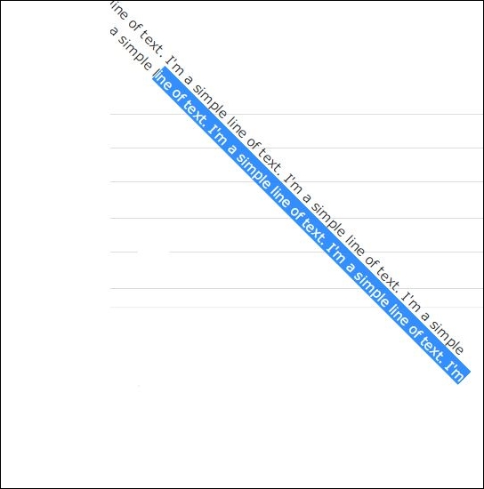
As you can see in preceding the image, the text is rendered by the browser and it is selectable and readable by SEO bots without any problem. With prior decisions and design aid out, this allows for some graphical page without the use of images. You'll just have to experiment with it. Keep in mind that the mobile browser support may be low at the time of writing.
You can learn more on CSS transform on the w3school dedicated page:
http://www.w3schools.com/cssref/css3_pr_transform.asp
Or on the Mozilla developers' page:
https://developer.mozilla.org/en-US/docs/Web/CSS/CSS_Transforms/Using_CSS_transforms
Vertical-align is the other property that is not only for text but can be extremely useful for typesetting. As the name indicates, it defines the alignment of an object on a vertical base based on the appearance and characteristic of its container. So it's directly applicable to the p and not to the container itself.
The values are easy and are top, bottom, middle, and baseline (they explain themselves pretty well) with two additions:
Also for text, there is the super value that will make the text behave similar to a superscript:
.s { vertical-align: super; }This is how it looks:
Of course it does its best with numbers, but you get the idea
Recently with CSS3, the font-variant-position property has been made, which allows for natural, stylistic super, and subscript
Values are normal, sub, and super:
.s { font-variant-position: sub; }This is how it looks:
When the time will be right, the numeric control will be a breeze over the Web, giving even a better look to your pages, thankful to font-variant-numeric property.
- Normal is the standard, unapplied value
- Lining-nums enables the use of lining forms
- Oldstyle-nums shows the numbers in old style
- Proportional-nums show proportional number values
- Tabular-nums is called when a table alignment is needed
- Diagonal-fractions shows the fractions properly, not as numbers with a slash in between
- Stacked fractions allow the display of lining stacked fractions
- Ordinal acts as the name says
- Slashed-zero uses the alternate zero where available
All of the preceding is possible as a beautiful mixture of property, just remember that each one will slow down the page loading time and that you need to leave a blank space between each couple.
p { font-variant-numeric: lining-nums slashed-zero }This is how it looks next to a font that doesn't support it:
font-variant-alternates is a way to achieve alternate glyphs and decorative swashes and it's a kind of long, complicated property, since it aims for specific characters inside the fonts.
Other property's values are:
- Historical-forms is a simple activation of display features
- Stylistic, styleset, character-variant, swash, ornaments, annotation requires more work, since they need specific values
@font-feature-values Bookmania {
  @swash { flower: 1; chosen: 2; }
}
The preceding call for example searches and displays the first and second alternate swashes inside the Bookmania font and will display it as shown:
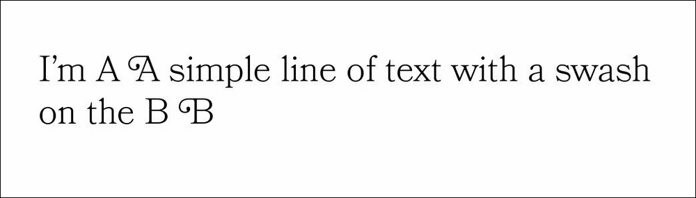
The flower and the preceding name is chosen by you, who writes the code for each font, to be able to address it specifically later.
The rule, written like the following exampleH1:first-letter { font-variant-alternates: swash(chosen); }It will define that the first Heading will place the desired swash (the second in the whole font) as the first letter for stylistic purposes.
Other rules are available but won't be useful, so we're not going to take a look at them.
Instead, let's explore ligatures.