Now that you have learned how to write your rules by hand, what each property means, and how to locally call for custom fonts it's time to discover one of the more powerful, related websites on the Internet – that will help you with all of the above.
Font Squirrel is a website that provides free fonts for commercial use, getting them from every corner and every type-house on the Internet. (Despite that introduction, I advise you to actually read each font license when you download them from the site, cause their use and allowance may vary.)
Understanding the website and navigating it for desktop purposes is a breeze – and frankly, that's not why we're here talking about it.
We're here to talk about the Web and how Font Squirrel can help us with it – and it's easily explained.
You got one desktop font you love – and you're sure its license allows you to use it online? Great, go on and write your CSS, it's easy and fun.
But what if your loved font only came in .otf or .ttf?
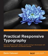
You go up to the website and look: on the right of the navigational menu there is one choice, Generator.
You select the choice you're interested in:
- Basic for straight conversion of the typeface, with minimal compression but no subsetting or anything
- Optimal for a little more work in compression, with automatic removal of missing glyphs, better compression and so on
- And Expert, for which I'm now going to explain the various options:
Font Formats explains itself. EOT compressed is the original font with only compression, EOT Lite is the original font stripped of missing glyphs, space and additional features, such as line height.
WOFF2 as we've said, is just a more recent, better compressed version of the original WOFF – but it's very unsupported, so choosing both versions would be the best way.
TrueType Hinting selects the hinting method for the font: calculated by Font Squirrel, the one built into the font (which is sometimes lacking) and one particular source, command-line or standalone built – that's TTFAutohint; built by Werner Lemberg, with help both, financially and supportively, by Google, Microsoft, and many others. It's a software that helps type designers automate the hinting construction for their web fonts – and it's a precise tool. You won't regret choosing this option.
Rendering contains different values as follows:
- X-height Matching is a long, technical and boring discourse of which you just need to know the essence. Basically, the inner values inside the sets are the height of the ascenders, depth of the descenders, and the optimal gap between the two in two different lines. This setting makes sure that those values are uniform in every system, making your text act and appear all the same in every system and application. You better check that.
- Gasp table is a series of instructions that will tell the browser how to render the typeface when seen on grayscale-capable devices. Checking this setting will optimize it across the majority of platforms.
- Remove kerning explains itself – and while some fonts are given bad kerning instructions, the vast majority of type designers do nifty work with them, way better than the standard rules that a browser can apply – so you want to leave it unchecked for the font to use its internal set of kerning instructions.
Fix missing glyphs is one kind of subsetting that will remove any blank glyph in the font files, saving space and bandwidth. I dare you not to click them.
X-height matching serves the special purpose of defining the font's x-height to match one of the web safe fonts to avoid any "flashing" while your website loads the custom font; in fact, while this happens, the browser will show your page with standard fonts, like Arial, Courier, Georgia, Times New Roman, Trebuchet, Verdana. After the load the text-affected sections will be refreshed, "jumping or flashing" to the visitor's eye also modifying the page layout, margins, and so on to the ultimate set of design instructions.
Believe me, it sounds worse than it is: there are ways to avoid this with JavaScript and other technologies while using @font-face, but they would need another book by themselves.
First you have to learn all the typography terminology and rules, then their applications to the web including the boring, technical stuff like hhea (short for horizontal header) and so on – after that you still need to master CSS, @font-face, and other typography rules and to learn JavaScript. Only then will you be able to encounter this particular topic.
Protection uses HTTP requests, indexes, and referrer checks (meaning you see the actual ID of the incoming request) and other technical data to make sure that the .ttf font can't be downloaded from external sources/devices for desktop installation and use.
It works in theory, it's a lot harder in practice – and it can easily be bypassed or get broken meaning that the user won't actually see (in some rare cases) your custom font.
The only true protection for your bought fonts, if you're going to use them on the web, is to actually use only the WOFF and EOT formats.
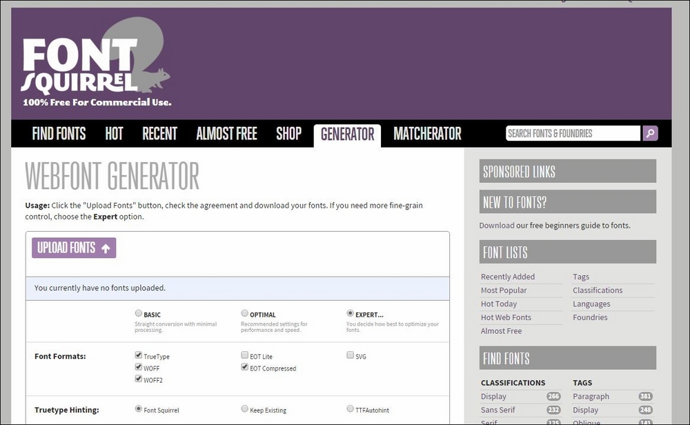
Subsetting of course offers a no value, a basic one (meaning it will strip your font of everything but Latin characters) and a more complex, user driven option:
You must know exactly what you're doing here: An error won't be fatal at all, but will make your efforts useless when selecting wrong/empty options. Everything here should be focused toward the audience of your website – so that you can easily eliminate unused languages and characters from the equation.
If your website is aimed at the west – then a basic subsetting will be all you need.
OpenType features is an easy choice: checking the Keep all features value will be best – because declaring each option separately will require that you actually know them and how they are named – for example liga is usually a subset of every type of ligature, not only the standard ones; and how the subsetting feature specifically works in this very case. So it's easier to keep every feature, including fractions and sups and so on.
OpenType Flatting is really interesting and innovative. Let's say for example you're interested in the built-in, small caps. Sometime, this feature is impossible by web coding – and even CSS3 properties aimed at them sometimes fail, since support of CSS3 is still in progress.
So, if you select this option – and you specifically select it for Small Caps – they will be moved to the lowercase positions allowing you to obtain one web font specifically usable for small caps. (Of course, what's valid for small caps is valid for all the other available features)
Please keep in mind this is to be used as a second passage – firstly save the web font in a regular style, so that you can use lowercase – and do this particular selection in a second instance, saving two separate files for two different uses of the same font. Otherwise you'll risk losing some basic, needed features.
CSS, of course, refers to the stylesheet creation and to three basic properties of it, one being its name:
- Base64 is a binary-to-text conversion that represents the usual binary values in some ASCII text inside your CSS. Basically, when everything else fails for the browser in loading your font externally (may it be a firewall, or an alien invasion) this will step-in and visualize your font everywhere.
- One understandable drawback is the fact that it adds a lot of weight to your CSS – so the best solution remains using it as a standalone property in a separate CSS file to be called after all others.
- Style link of course is the norm of naming each font-family the same for different weights and styles, as explained earlier. It is your choice to keep it or leave it, whatever you prefer to work with – earlier we discussed pros and cons of every approach in painstaking detail.
Advanced options are quite a thing: I usually remove the -webfont name suffix, as I prefer my type names shorter; other options are better left as standard, especially the Em Square Value.
Shortcuts explain itself: are you going to do any heavy use of this website and features now that I have explained it to you?
Of course you are! It's so useful, it's inexplicable!
But are you completely sure the setting you're using for this font is optimal for the next time you visit it with a completely different font? It's better to leave it unchecked.
Agreement is important, as you're telling the website owner and runner that you know that the license for the font you're submitting allows you to use the fonts on the web and to modify their original values.
What it doesn't say is that if the license doesn't allow it, you're committing a crime for which (rightfully so) you're responsible, not Font Squirrel and the type maker and original owner will search for solutions, sometimes monetary ones, directly to you, the owner of the website where the fraud has been perpetrated.
So don't check it light-heartedly – and always read the EULA.
Now it's time for you to download your package (a button will appear, after the correct upload of the file, in the lower-right); click that button and every necessary transformation will happen in a matter of minutes, if not seconds.
Then you'll download your .zip file, containing an .html example page, every selected format – and your .css file, where you can copy the values to the one for your website giving birth to the magic implementation of self-hosted, CSS custom fonts – for free!
To close the free instrument chapters: there are quite a few handy tools. So why did we only concentrate on Font Squirrel? It's not like they pay us to name-drop them. I wish they did (would have meant more money for me).
Simply, it's the best free tool available out there – always up to date; it's even been the first to adopt the best, more correct, and least problematic solutions every time they came out. Like Paul Irish's smiley, correct syntaxes, or anything else – always giving birth to the best CSS @font-face declarations for the end user.
So it's completely useless to look at other sources – if you own the font and you're looking for local-hosting, that's the tool for you.