Since these element problems, or better, unwanted behavior, became known, the geniuses at the W3C worked hard and with the CSS3 specification they evolved and rewrote the em element again. To not cause harm to the innumerable tons of websites coded with the previous specification, they re-released it as a new element, called rem.
Rem stands for Root em, specifying that the element and sizing is indeed tied to the root of your document. No more contextual behavior, no more inherited sizing: every font-size expressed in rems will be resized accordingly to the HTML or body specified one.
To calculate a rem element is simpler: you won't have to remember every container and their sizes- you'll just define the base, divide the next desired values by that and you're good to go!
Let's see an example:
Body { font-size:1em; }As we know, 1em is equal to 16px. So, having decided, for example, our primary header will be 32px high, the transformation in rems is quite simple:
32 / 16 = 2 or 2rem
We'll just have to write down the following:
h1 { font-size: 2rem; }Our header is now the desired size.
But what if the h1 is contained, let's say, in an article, which we forgot that we set to 0.625rem, clearly referring to the standard text in it and not to the headers?
Well that's a no-brainer and not a problem, since rems will always refer only to the root defined measure – and not to the above element. Our header will act and render as expected.
Surely, this element is a dream for every web designer – but like every latest release, it's only supported by more modern browsers and onward – past ones will act weird on things they don't understand.
The simpler solution is to implement rems in your project – and provide a fallback measure by giving a second, pixel set declaration in the same element.
All abroad the rems train! Woot woot!
So, why the long run off-topic on elements and their definitions?
Because talking more about responsive typography, no longer about typography itself is a talk that was really needed. Now you know the basic differences between pixels, ems and rems – and from now on I'll be writing code and text size for the web in rem units. This will of course affect our math on scales too, so our little essay was mandatory.
As we said earlier, web type is usually seen as a standard of 16px – and the Golden Ratio is a number close and expressible as 1.618. So, how we can mix the two numbers together – to achieve rhythm and flow in our text, using a scale? This requires a little math for every element we're going to need. As we've seen, general text usually requires three levels – so we'll need at least three elements.
Let's add a fourth, in case a subtitle or a small paragraph of explanation of a footer of some sort is needed:
- We'll start with the basic text, which will be a standard, well readable 16px.
- How do we obtain one header that will be in harmony with our text? We choose our ratio, a Golden one actually, so let's apply it to our text value:
16 * 1.618 = 25.8888
We'll adjust it accordingly to 25.9px
- Now we'll need to transform it to rem – so a division per our base element will be needed.
- After the first arithmetical operation, we'll find that our h2 is 1.6 times our text, so
h2 { font-size: 1.6rem; } - Easy, isn't it? Now onto our first level, or
h1. - Since the modular scale, we'll need to multiply our last value for our ratio to obtain the next value:
25.9 * 1.1618 = 41.9px
That translated into rems is:
41.9 / 16 = 2.6rem
so:
h1 { font-size: 2.6rem; } - We'll need a bigger element? No problem, we'll take our last value and multiply it by our ratio. A smaller one? We'll take our last value and divide it by our ratio.
- After that, it's time to take every value and divide it per our baseline – and we have a rhythmical, easy to apply and visually appealing typographic scale.
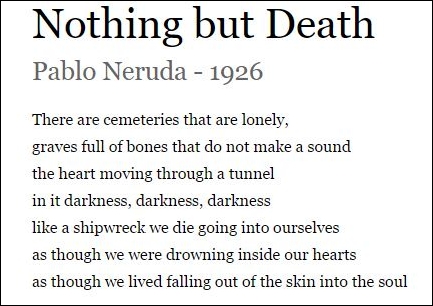
Let's apply it to our previous example/exercise poem and look at the differences, shall we?

While the design and proportions are pleasant enough, the H2 is almost as big as the H1, apparently. Did we break the Golden Ratio? Is such a rule non-existent? Did I do something wrong?
Reality is that every scale, every design – has to be tested on the field – and every scale, every rule, has to be applied to the specific project. In this case, our font selection of a sans with a higher x-height than our serif almost nullifies the hierarchy of our document. Applying the same font as the rest with the same letter-spacing looks and feels completely different:
Our hierarchy is better defined and reliable – and more pleasant to the eye.
We'll just have to select a different typeface for the second level and we'll be good – or, another meaningful solution would be to select a smaller-than text value, like the design we achieved in our first exercise. After all, the subtitle is less important than our text, so it would be a good solution too.
You may encounter some huge gaps from value to value – this will be explored next. Hopefully this example taught you a good lesson on web design: even when everything has been settled up and seems perfect, always test it many times before launching your project to the public or sending it to the client.
Believe me, it's a valuable lesson. So, we have just seen a simple calculus of a scale to apply it to our design: while useful and interesting, is it all there? There is actually more – more complicated things when writing and applying code and a scale for a responsive design. And we're now going to take a look at it.