Since this exercise will be more complex, we will bring the application of a modular scale, forward from our little beginning. We'll do our best to maintain at least the same initial values, so some math has already been covered. We are going to make a responsive structure out of rems.
We have talked about rhythm for quite some time, it's time for a little pause in the exercise aimed at a better study of it. VR in text should be a strong, regular, repeated pattern of words and sounds. It's harder than it sounds. Keeping it consistent enough on our webpage will define a more readable, relaxing experience. In this specific case, the majority of the work is up to font-size and line-height.
Right in the middle sits 1.5 – which seems a comfortable, easy to implement value, since having a base of 100% (16px) for our text, the line height will translate perfectly to 24px. Starting from there, we must make sure that every margin, text, padding, and so on just adds up to that measure.
For example – if you have one element you want with less space on top and more on the bottom, this code will keep it on the baseline initially defined:
p.subtle { font-size: 1rem;
line height: 1.5rem;
margin: 1rem 0.75rem 0.5rem 0.75rem;
}
Yes, it's simple and believe me – it works. It can be done by dividing multiples too, since our example will probably be too restricted. But who cares? We're experimenting, and experimenting should be fun and a travel into the unknown at first: we'll have time to refine and define later.
To be fair, we should already have been applying single-direction margins, which are a genius way to maintain vertical rhythm: since in this case we'll be probably moving each element downward, applying a margin-bottom to any of our block elements will make sure that, every time we create a new element and drop it on the page, it will fall exactly at the same distance from the rest, keeping the baseline intact:
h1,h2,h3,h4,h5,h6,hgroup,
ul,ol,dd,p,figure,
pre,table,fieldset,hr { margin-bottom:1.5rem;}
Quite a time saver, huh? The same can be done and calculated for left/right margins too. Working with images is quite easy as well: we have the value, we just need their heights to be a multiple of that – and to add the same bottom-margin.
For example, we scale one image to 240px (24 * 10) and have the standard 1.5rem bottom-margin.
Or if the image is longer and we don't want to cut it, let's say 252px – we can add a smaller bottom margin of 12px/0.75 rem and still being alright! This will also fix the collapsing-margins issue, so why not use it?
Note
The collapsing-margin issue usually happens when two vertical margins are next to each other – and the browser applies only the greater one of the two, leaving your design not exactly the way you wanted it.
It can also happen when the parent element margin overrides the child vertical margin, keeping only its own one.
Ok, now we know how to basically maintain vertical rhythm through our design. What about our scale?
Time to get back to it.
We already have some values for our text – 1, 1.6, 2.6 rems and now we have found out about our margins, which are 1.5 rem. Let's explain another thing about scales in general: if we want our design to be based on them, we won't use them only for our text and their hierarchies: we'll use our values, in different and sometimes in random ways until we think it's right – on every part of our design. This includes margins, paddings, widths, blank spaces, and so on. So, it does look like four values are not enough for our project. Luckily, enlarging the scale is simple: we just take the last values and divide/multiply them as needed.
This will allow us to use more values, as 4.2, 0.6, 0.3 rems. So our scale now looks like this: 0.3 – 0.6 – 1 – 1.6 – 2.6 – 4.2 – 6.8 – 11.
Way more useful already. But what if the progression and the numbers were unforgiving? What if we needed more values? What if we don't want to achieve the beautiful mess it produced above with our poem, due to the similarities in our values and fonts?
The solution would have been to work on a double-stranded scale, which means that will be two starting point values or two different ratios mixed up to enlarge our possibilities – in just one scale.
To choose the second value, you should find something that's important and related to your project – and that is different enough from the first value.
Now, let's imagine we're working on a responsive website – and that we sketched it out on paper. Let's imagine our base structure being composed of six columns, for a maximum width of the layout to the standard 1140px measure.
Dividing it by 6, the number of our columns, we find out the 190px value - so we could have used that for our double-stranded scale.
The math from there would have been simple enough to obtain the rest of the values. We know the numbers, we know the ratio, it's just the boring job of divisions and multiplications – and after that it's time to convert them to rems, keeping in mind that our base value has always been 16 – so each number should have been divided by that very one number.
But luckily, as of today we can save some time and headaches in our project by going on the wonderful website that is: http://www.modularscale.com/. insert our values, finding the remaining ones to fulfill our double stranded scale.
Keep the double-stranded scale in mind, it will surely turn out useful in the future. Right now we're just in need of knowing our 190px as rems – and it's simple as:
190 / 16 = 11.875
All that's left now is to define a basic page structure, apply the rems value to it and use some fictional text to fill it up and test it inside our browsers:
body { font-size: 100%; }
.column #1   {   width: 11.875rem; }
.column #2   {   width: 23.75rem; }
.column #3   {   width: 35.625rem; }
.column #4   {   width: 47.5rem; }
.column #5   {   width: 59.375rem; }
.column #6   {   width: 71.25rem; }
The result we expect from the above is something like this:
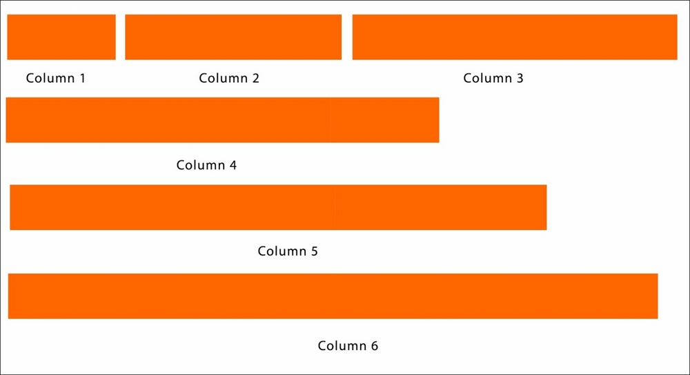
This will define our basic page structure. You'll simply find out that our column six will cover the entire 1140px grid, being 71.25 rems the value of 1140 on a 16px base.
h1 { font-size: 4.2rem; }
h2 { font-size: 2.6rem; }
h3 { font-size: 1.6rem; }
p { font-size: 1rem; }
.footer { font-size: 0.6rem; }
We will then add basic properties to our columns to float – and a little padding:
.column { float: left;
padding: 1em 0 0 1em; }
Adding a little container for our content with little-to-no basic properties and some text – with the first column one being shorter in width, otherwise it will break the small width column, (despite the break-word property applied owing to the difference in rems,) will result in something like this on the web:
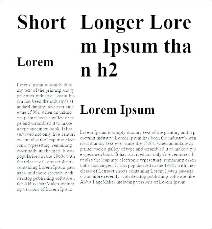
As you can see, everything is there and is well balanced to the eye. Of course, fine tuning is needed in removing the base applied margins to H2, applying line-height, and so on.
Balancing a text block always needs a lot of trial and error. Keep in mind to check the overall density of the paragraphs and the readability of the text, through line height and width of the column.
To wrap up this modular scale lesson, remember one important thing: they're just a tool, nothing is mandatory. Using them with the values you like is efficient, time-saving – and beautiful. If you start using them today it will make your text and structure well balanced, rhythmical, and harmonious for sure. But they are nothing more than guides. They are no substitute for your eyes and experience.
If there are numbers you feel are better than the ones provided by the scale, (for example, H2) use them without feeling ashamed about it. Or if you want, you can use a double-stranded scale, or you can combine the values that are already present, to get close to the desired one.
This approach basically transforms the way you work with the web: content and type will define the structure, instead of the contrary – and they will be really tied together. Without your specific font and your specific font size, structure will become meaningless. So, remember to always provide pixel measures and default font line-height and margins as a fall-back, in case any problems with the loading of your font arises.
You surely noted that our structure is not built by pixel, but in relation to text. This makes content – and typography – king. Writing structures and columns by ems allows us to always provide the best reading experience as possible, in width of the sentence and in number of characters. This approach has never been possible through the pixel-fixed layout.
As everything is built to a relative size, if we zoom in or out from our page, font-size will change. In pixel size this would mean complete changes in paragraph widths and readability – while with ems any change to the font size will keep readability at its best, with always the optimal line length.
A game changer indeed!