CSS3 brings to the table some new units that aren't really relative to the content they are applied to—they are tied to the actual viewport they're currently seen in.
A little bit like rems, if you want a quick comparison for a better understanding.
Named as viewport percentage lengths, they are as follows:
vh: Viewport heightvw: Viewport widthvmin: Viewport minimum lengthvmax: Viewport maximum length
Viewport units are actually represented by percentages. 1vh means 1 percent of the visible area height.
Vmin instead is 1% of the smallest side, while Vmax is 1% of the largest side.
If you set measures with them, your layout can drastically change, for example, when the phone is held in portrait or landscape mode, so be careful.
It seems impractical, but it comes in handy in today's web design world.
Previously, such measures were handled by percentages, which are referred to the containing element, so you have to set measures for every item from the top to the bottom for them to apply. Otherwise, they would go unnoticed.
Now, think of styling a sidebar and a top bar and making them 25 percent and 100 percent of the visualized window respectively.
Doing it with vw is easy as it gets.
And, think about vertical centering (keep in mind that your window is 100vh), diving it to an equal bottom and top margin and giving it a height; well, it will stay in the vertical center no matter what.
Here is an example:
#try {
    width: 60vw;
    height: 60vh;
    margin: 20vh auto;
    background-color: #a4dd3c;
}
This will produce the following result:

Using them to overcome Bootstrap, and every other framework, for a full width result can't get easier.
If you want 4 columns, apply 25 vw to each one of them. If you want 8 columns, 12.5 vw, and so on.
While, it's easy to think of them for popups, bars, informative windows, and so on, one of the natural uses for these newborn units is indeed in typography. In fact, using these kinds of measures for your website typography makes sure the optimal line length of the paragraph is saved on all screen sizes.
Unfortunately there is no way of transforming previous pixels or ems measure into viewport percentage ones, they are too much different for us to achieve this. So the only real way is to build the measures by scratch, trying and adjusting them on the road.
Luckily, the scale method and previous values are still valid, so we can try to transfer them to the current typography (whereas if a number is too big, you can try adding a comma, for example, 20 rems can be 2 vw) so as to retain a perfect balance between type elements.
Unfortunately, with every new release and idea, support varies completely from browser to browser. Being supported since Chrome 20 and Safari 6, they are readable and render correctly, but they won't resize on window transformation. A complete refresh of the page in the new resolution is needed for typography to act properly.
The best solution is to use jQuery to force a refresh of the element itself while resizing. You can do this through something as small and simple as the following:
$(window).resize(function() {
    $("#object").css({ "font-size": "3vw" });
});
The preceding fuction is simply taking into account every window resize, forcing our defined viewport measure to be applied to the font-size property.
Another common solution is to play with something completely irrelevant to our object, such as z-index, again with simple jQuery:
refreshType = $("h1, h2, h3, p");

$(window).resize(function() {
  refreshType.css("z-index", 1);
});
This solution force the browser to refresh and apply the new z-index every time the window is resized, therefore refreshing the whole viewport area. Like the first, a beautiful solution too.
Luckily, this issue has been fixed for versions up to Chrome 34 and Safari 7, so it's up to you to integrate such solutions or not—it all depends on the backward compatibility of some specific features of your website.
Needless to say, Microsoft only supports them on its latest release, IE 10, while Firefox started with version 19, Android on its 4.4 release, and iOS since its sixth installment. But still, I don't know how many people resize the browser windows on their mobiles, so maybe back compatibility doesn't apply in that case.
Again, this approach isn't much different from what we previously encountered—such as ems, percentages, and rems.
After all, having just one percentage for type in the body tag that makes everything scale seems like a good solution. But still, from time to time, some manual adjustment may be needed, especially if you use big headings. With this new set of measures, adjustments won't be needed so much, not even a fixed starting point!
Still, we may encounter some cases where our type seems to get too big or too small. How can we act in those cases?
Here comes another CSS property (or function, which defines it better)!
Calc() is a native way for CSS to do simple math. It has four operators: + (add), – (subtract), * (multiply), and / (divide).
It's necessary to use a white space between the operators, otherwise the math formula won't work.
It certainly comes in handy when you need to do simple math on your CSS. And when is that ever needed?
Well, now is a time that it is.
To act and set a minimum and maximum font size, we need to know under which resolution they shrink or grow over those limitations—and this is something that involves a lot of trial and error, dragging windows, taking screenshots, and so on.
This is all boring and time consuming; as if bulletproof web developing wasn't taking enough time by itself.
Knowing the exact size we want our minimum to act in px, ems, or rems will suffice.
The following CSS formula will add one percent of the viewport size at every resolution/scaling, when the type falls within the set limit—whatever you want it to be:
body { font-size: calc(16px + 1vw); }And, it's done!
Again, support still varies, so if you want to support, for example, IE8 and downward, you may declare a fallback measure before the calc rule (or before the vh ones too):
body { font-size: 1.2em;
  font-size: calc(0.85em + 1vw);
}
Getting a max is a little bit more complicated—we need to keep our max in mind and divide it by the result of our approximate similar value of viewport units divided by 100.
It goes something like this:
font-size / ( viewport units / 100)
Using a 24px value and a similar 3vw value will mean that our font won't grow more than 24px on 800px sized viewports.
The way to apply this limit will be explored in the next chapter; we don't want to throw too much knowledge at you altogether; it will cause a mess.
It is better to proceed step by step.
Also, as of today, the min-font-size and max-font-size are slowly being introduced in the CSS specifications.
You can check the current state of requested implementation here https://lists.w3.org/Archives/Public/www-style/2014Jul/0051.html.
And this will surely turn out useful—but still, even with them, the preceding calculus of each of those values remains valid. It will only change where they need to be placed.
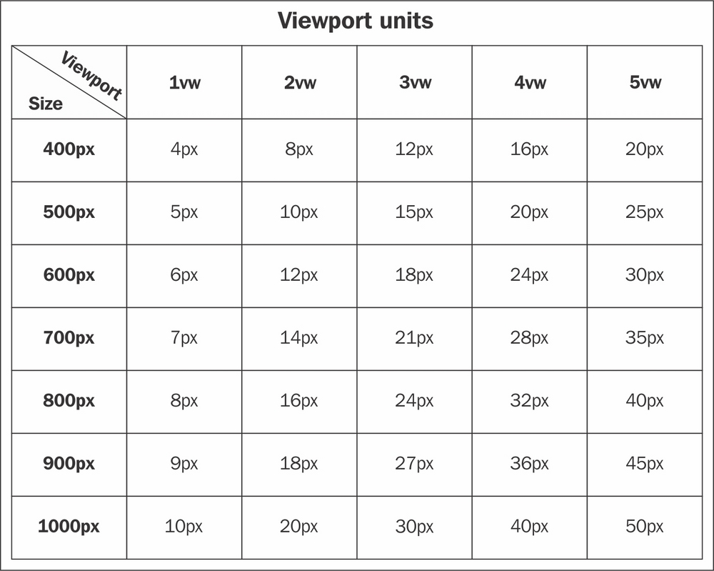
Let me thereby conclude this chapter by including a useful thing for you: a table of general vw measures at general breakpoint so that you can be more precise with your type proportions.
As a final tip, let me get back to the calc() function.
Sometimes when we code our way trough a website, we create a framework – or a multi-column structure – from scratch. Using calc() we can make our single columns handling a lot easier.
For example, the next function will show exactly that – dynamically calculating the width of a 7 columns structure trough simple divisions and multiplications.
.columnOne {
   width: calc(100% / 7);
}
.columnTwo{
   width: calc(100% / 7 * 2);
}
.columnThree {
   width: calc(100% / 7 * 3);
}
Doing so will allow your columns, rows, and divs, among others, to be responsive without any even measure that will leave undesired spaces, while also being auto-adjusting.
Sure, writing a complex structure like this takes time at first, but it will surely save you time and headaches in the long run.
Think about it, you won't regret it.