After a mandatory introduction and overview, it's time to see what can be achieved using media queries today – and where they fit our process as responsive designers and developers.
Turns out they are the most powerful weapon inside our arsenal. Let's see them together.
Using the regular, standard compliant syntax, we can set up custom rules, called break-points, in our standard CSS without additional sheets.
When the content encounters those rules – the most common one being tied to the dimension of the screen – the layout/behavior of your website/element will change accordingly.
Let's start with something simple:
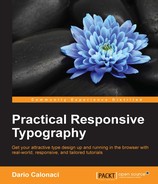
body{
  background-color: red;
}
@media only screen and (max-width: 500px) {  body {
    background-color: lightblue;  }}
This code – which can be written anywhere in your CSS – simply tells the browser to render the background in a light blue only when the screen is equal or less to 500px.
This is the situation when the page is first loaded:
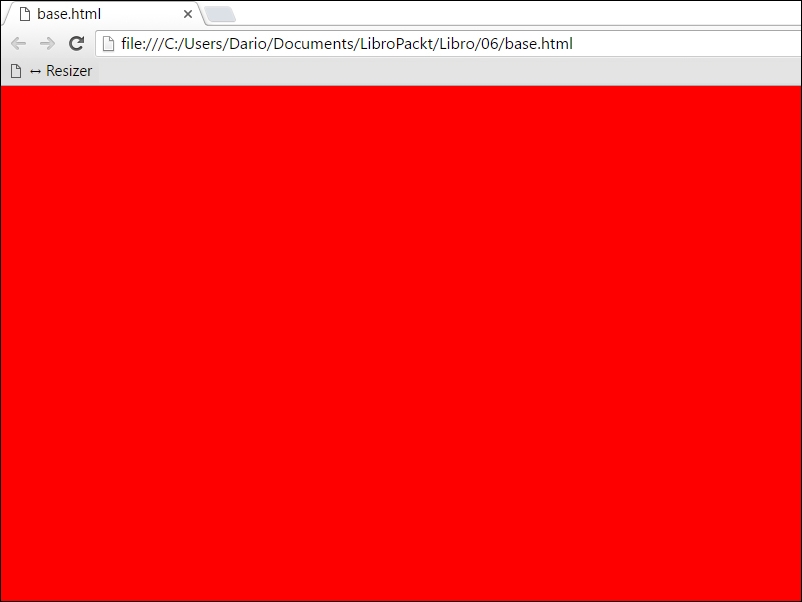
And this is what happens when the browser window gets resized under 500px:
This can be useful for a variety of reasons, most of all, readability – for example changing background to a more contrasted one or completely scrapping the loading of a background image, reverting instead on colors when seeing your website on a mobile.
Of course, to set a median point you should just combine min and max-width like this:
@media screen and (min-width: 480px) and (max-width: 800px) { }This will apply the code only to the resolutions between 480 and 800 pixels.
Can you already see the potential?
Imagine using them for moving and scaling around parts of our website, scaling fonts for mobile and so on. Well, that's exactly what we're going to do now.
First and foremost, we must apply the initial default (so feel free to change it as you see fit for your project) in the <head> of the html document:
<meta name="viewport" content="width=device-width, initial-scale=1">
The browser will make the page at the largest available width (the entire device width) with an initial zoom factor of 1:1 – which will keep the page the way you want it.
Without that crucial line, the mobile browser will take the entire page and squeeze it inside your device width without proper scaling, applying variable zoom values as it sees fit, like the old browsing on a mobile, when a lot of pinching to zoom was required.
Ok, time to get back to our CSS – but don't forget that line for all your responsive projects.
While breakpoints can be a multitude, they aren't standard anymore. In the recent past working with them meant designing for the iPhone, iPad and a Samsung flagship phone – so three/four resolutions were needed – and they were precise ones.
As of today, hundreds of different devices have entered the market, from the well-known ones, to their Chinese counterparts and beyond, each one with different screen and resolution sizes. So to have a standard like the old, beloved 480px or 960px means nothing anymore.
As of today, defining and writing responsive breakpoints means to work on content and layout first, scaling it later.
There are a variety of methods to do so – we settled on the Mobile First one, which focuses a lot on hierarchy and streamlining your websites as much as possible for it to be used on a smartphone, which is always a good idea. After all, a website is made to understand and experience, it is never just one or the other. Other UX enhancements may come – and be added – later.
Enough for the chit-chat, let's code!
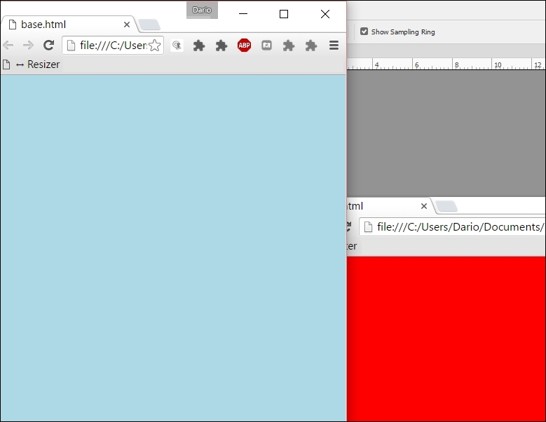
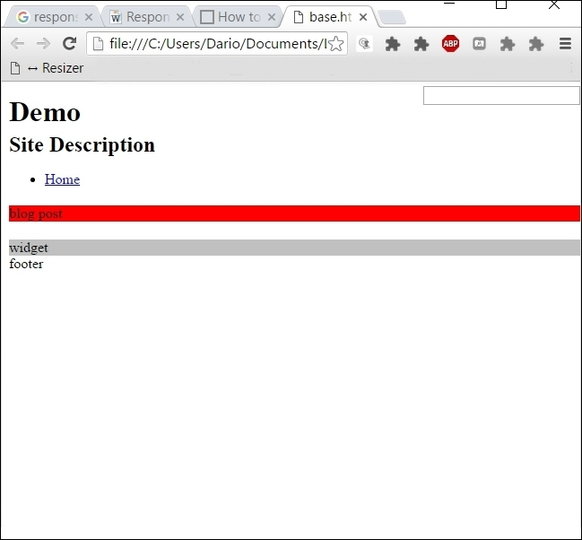
We'll assume we're building a marketing website – so we lay down a bit of underlying structure:<div class="pagewrap">
  <header id="header">

    <hgroup>
      <h1 id="site-logo">Demo</h1>
      <h2 id="site-description">Site Description</h2>
    </hgroup>

    <nav>
      <ul id="main-nav">
        <li><a href="#">Home</a></li>
      </ul>
    </nav>

    <form id="searchform">
      <input type="search">
    </form>

  </header>

  <div class="content">

    <article class="post">
      blog post
    </article>

  </div>

  <aside id="sidebar">

    <section class="widget">
       widget
    </section>

  </aside>

  <footer>
    footer
  </footer>

</div>
This is a simple page with a sidebar and footer.
Tip
Remember that if you want to tackle earlier IEs than version 9 you can do so with this simple line of code – inserted in the head as always:
<!--[if lt IE 9]>
<script src="http://html5shim.googlecode.com/svn/trunk/html5.js"> </script>
<![endif]-->
It's a standard script that will make them recognize the new elements as <footer>, <section> and so on.
You can code it yourself, but why waste your precious time for such things – even more now that the death of supporting every IE prior to version 11 has been announced by Microsoft?
As we were saying – simple website, simple structure. It's time to define some basic CSS for it too:
pagewrap {
  max-width: 980px;
  margin: 0 auto;
}

#header {
  height: 160px;
}

.content {
  width: 80%;
  float: left;
  background-color: red;
}

#sidebar {
  width: 20%;
  float: right;
  background-color: silver;
}

footer {
  clear: both;
}
This is the simple page we have right now – yes, a marketing blog like we've seen before thousands of times. But this one is special: it is natively responsive and it's all ours.
Now it's time to input our mystical CSS3 media queries for responsive design.
And again, if you want them to work on earlier IE versions, just add this to your masthead:
<!--[if lt IE 9]>
  <script src="http://css3-mediaqueries-js.googlecode.com/svn/trunk/css3-mediaqueries.js"></script>
<![endif]-->
So we'll just go and add these lines of code to our CSS:
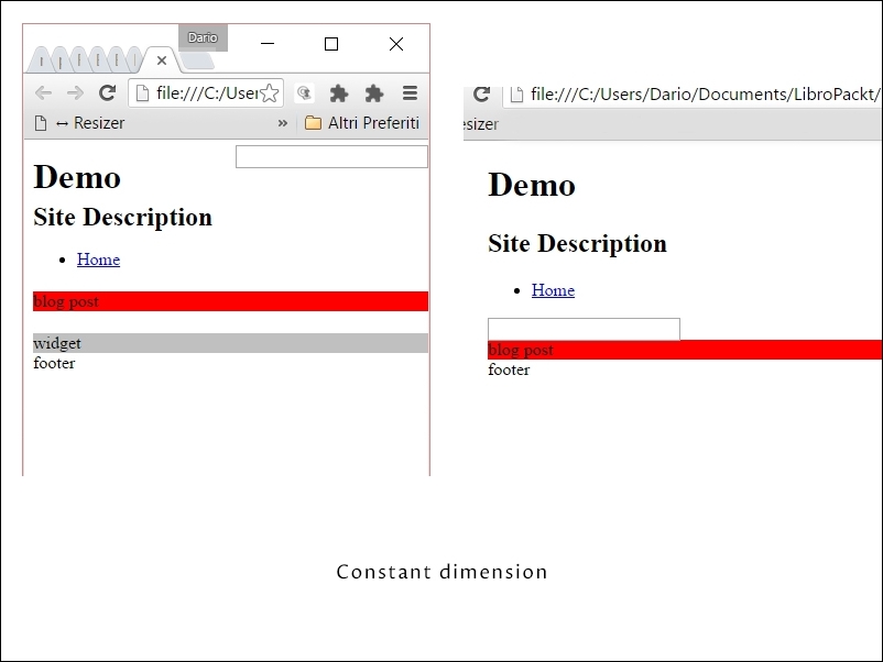
@media screen and (max-width: 650px) {

  #header {
    height: auto;
  }

  #searchform {
    position: absolute;
    top: 5px;
    right: 0;
  }

  #main-nav {
    position: static;
  }

  #site-logo {
    margin: 15px 2% 5px 0;
    position: static;
  }

  #site-description {
    margin: 0 0 15px;
    position: static;
  }

  #content {
    width: auto;
    float: none;
    margin: 20px 0;
  }

  #sidebar {
    width: 100%;
    float: none;
    margin: 0;
  }

}
Doing so will completely transform our structure as shown in the following screenshot:
Simply add this line of code:
@media screen and (max-width: 650px) {Then, add some properties, like positioning and change of width values. We have transformed our website behavior.
To make your images act responsive is simple. Set max-width: 100% and height: auto to make your images scale smoothly preserving their appearance and report.
And we could do more, like "erasing" the sidebar with its content from the mobile.
How? Just adding the value: display: none; with JavaScript – or your preferred language - to make it collapse (since the simple display solution will still have it taking up space, just being invisible) will work.
Of course there are bugs here and there in the implementation –the percentage rounding, for instance, which is not precise. But this can be resolved using calc(), that we've seen earlier.
Other known bugs that we feel obligated to mention are:
- The inclusion of the scrollbar in Firefox (which is not a bug, it's advised by the W3C itself – but it makes no sense. Basically, you'll have to consider around 15/20px to every absolute width measure since Firefox will consider the scrollbar as part of the user view area.
- The non-refresh of some display styles if the window gets resized. Corrected now, it was present in the early days of responsive web design.
- As it was thought, responsive is for native resolution – a website that is loaded once on one device with a fixed width, not for designers which literally passed the time altering their browser window, testing their and other developer's creations. The data download: since images aren't automatically resized – and since content remains the same, mobile users download a lot of data that make the experience worse without being used. Avoid this so you can tackle the selectiveness of resources by Sass, Less, Ruby or any other language.
While all of the above is magical, you may think that this is a typography book and that I've actually lost my mind. Luckily not, since what stands true for the simple tutorial, stands true for typography: as content, it's tied to the container measure and behavior – and every rule and writing of the above applies in the same way to typography.
We are now in fact going to work with a little typography.
Addressing type with precision is a complex job that requires hours of work on any specific project – but to start, let me give you a couple of overhaul rules.
Limiting font scale below a specific threshold is really useful to limit the set of rules without many media queries.
Use:
html { font-size: 16px;  /* default below 600px */ }
@media (min-width: 600px){
  html {
    font-size: 3vw;
  }
}
Of course your desired breakpoint here is 600px. This will make sure that when the viewport is getting under your limit, your text appearance will be constant and fixed, without scaling or moving.
It can be useful to keep a constant character number, like the following image illustrate, whereas the red area keep its width despite the change in resolution
If you want to apply the above trick – but only when reaching a specified scaled type dimension, you can do so with a little math.
You first need to know which font size is the desired one, then you'll apply the following expression:
Font-size / (number of viewport units / 100)
For example, if we want our font up-scaling until 24px, we use the following expression
24 / (3 / 100) = 800px
So we'll set the code like this – always having the HTML font-size set at 16px:
@media (min-width: 800px){
  html {
    font-size: 1.5rem;  /*above 800px */
  }
}
Next time your website is seen at a resolution over 800px your text won't scale, keeping its appearance and character count per line.
After working all these years in the field, I have a table that I compiled with general values for readability that I'd like to gift to you.
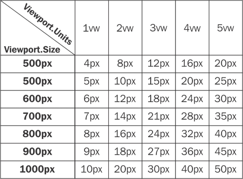
Using these values – both in font size with the above media queries expression will ensure an optimal legibility for your works.
Just remember that each project is different and that you can and should change the values according to your content